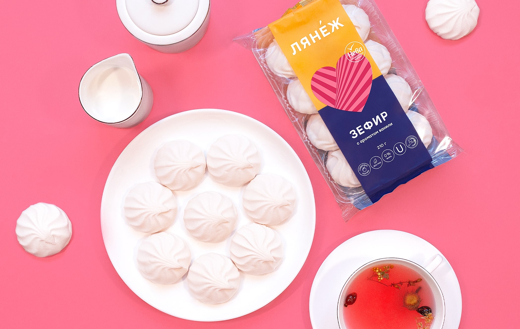
From airy marshmallows to a mesmerising dessert. The Saint Petersburg-based marshmallow label “Lanezh” is well known by people of different ages in Saint Petersburg and this popularity expands far beyond the city borders. Despite the fact that the brand is one of the leaders on the marshmallow market, product sales began to fall at some point. The reason is that the trademark “Lanezh” has been on the market for a long time, but their packaging solution was outdated. During that period, many new and more innovative competitors have blossomed on that market. Our task was to update this “Lanezh” packaging.
Product: “Lanezh” is a line of marshmallows with different flavours and additives, which is produced by the Saint Petersburg factory Neva. In a sense, this is a classic foodstuff since Saint Petersburg’s marshmallows are well known by people of different ages and this popularity expands far beyond the city borders.
Market and competitors: Most manufacturers are very conservative in the choice of a visual solution when it comes to the packaging. Most of the time girls and women are used in the design as an emphasis on the target audience and food zone. There are also no good product differentiation solutions within the lines. Brand images are blurred. There is either no positioning at all or it is predominantly emotional.
Consumers: The greatest connoisseurs of this dessert turn out to be women. We found out that they were not united by their age or social status as they were completely different people, having different professions and lifestyles. However, we discovered that they shared a common attitude to this product. A marshmallow is an opportunity to pamper yourself, lift your spirits and make you feel good. Also, a marshmallow is a guilt-free treat as it has a more natural and healthy composition than sweets or chocolate. Based on the conclusions of the analytics, we came up with a variety of proposals for the client in order to improve the product.
Transparency: Every person we spoke to said how important it is to be able to see the product in the package. By the appearance of the product, customers can determine its freshness. If there is no transparency, it feels like you are buying a pig in a poke. Sugar: One of the main insights of the project is that customers hate the fact that a huge amount of sugar is added to today’s marshmallows. “It literally crunches on the teeth” or “It seems that you are chewing sand” are some of the phrases we heard over and over again. Plastic: It is amazing to observe that the world is really changing and more and more people are sincerely getting worried about the environment. A marshmallow packaging usually consists of a pallet and a wrap. That’s too much plastic for six marshmallows, and this has been highlighted by many of the people we spoke to. Consumers feel guilty for being forced to harm nature.
Design: As part of the analytics, we came to several conclusions. Firstly, it was decided to move away from pastel colours because almost every manufacturer goes for these hues in their designs. We definitely had to focus on something brighter and juicier. Secondly, the food zone is actively represented by everyone and this was one of the possibilities for rebuilding. Thirdly, we had to abandon those complex, old-school graphics. The new design had to be relevant and meet the needs of modern consumers.
The idea was born thanks to the insights that we discovered among the audience: the desire to pamper yourself, cheer up and be pleased without feeling guilty. All of this led us to associate these marshmallows with natural lollipops parents usually buy for their children instead of sweets while taking a stroll in the park. Then we noticed the unusual colours of the sweets, which are reminiscent of mesmerising illusions.
The idea with the dessert can be found up in the air. We wanted to move the “Lanezh” products from the marshmallow category to a more complex dessert segment, especially since the company has an experimental line of desserts. By combining the mesmerising pattern of sweets with the taste of a dessert, we reached the metaphor of “a mesmerising dessert”.
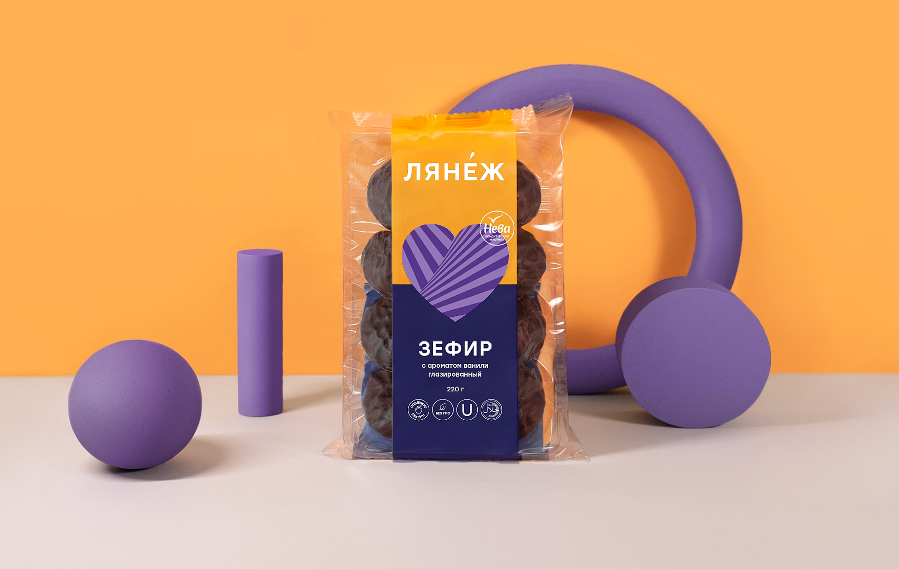
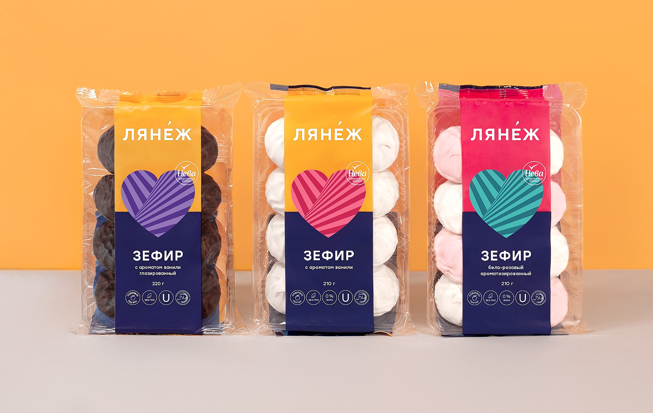
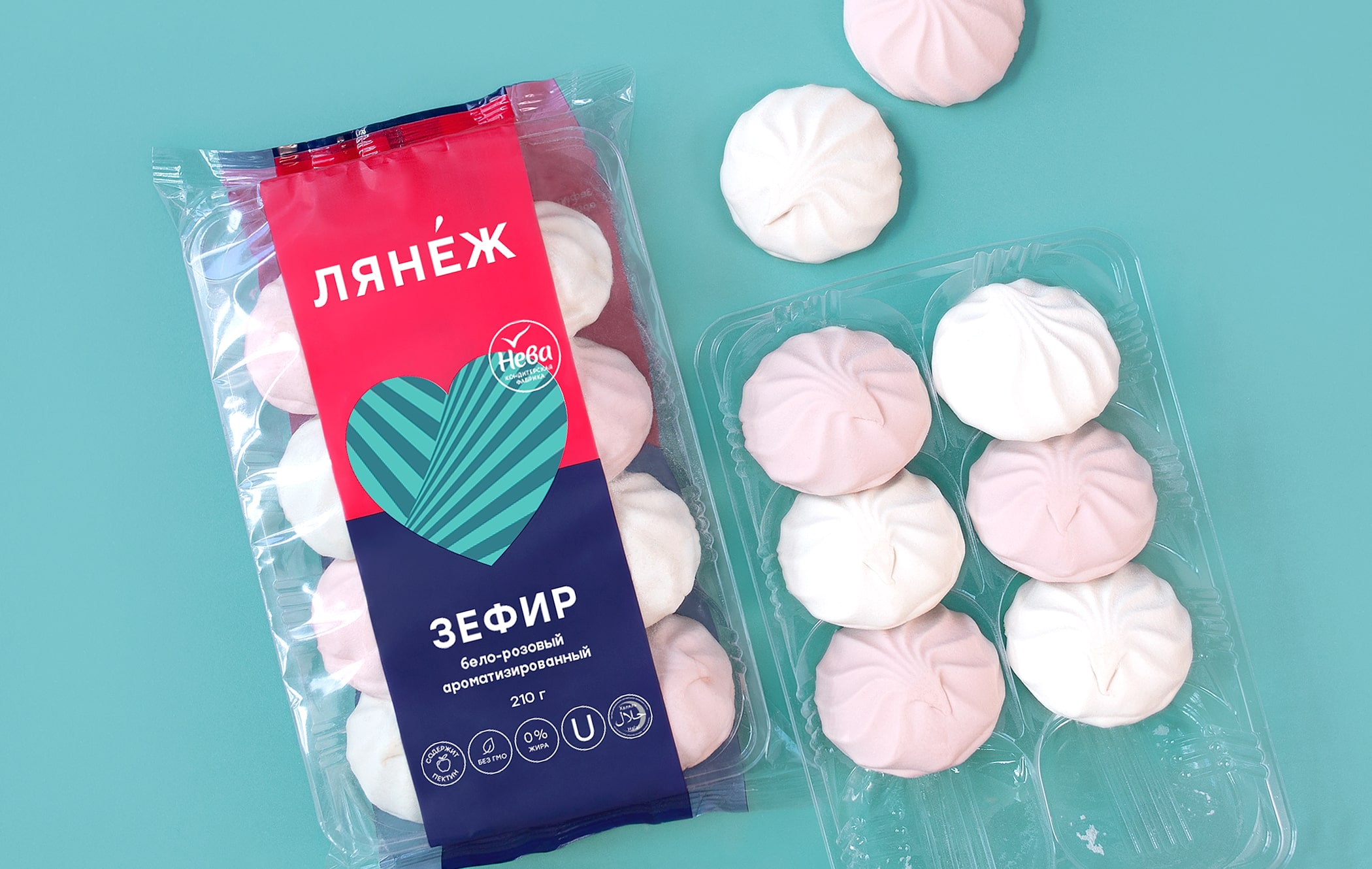
Bright and dynamic but laconic and simple at the same time, the packaging design forms a vector for a young audience while distinguishing the product from other competitors on the shelf. The design preserves continuity and the packaging uses a recognisable brand element: the heart.
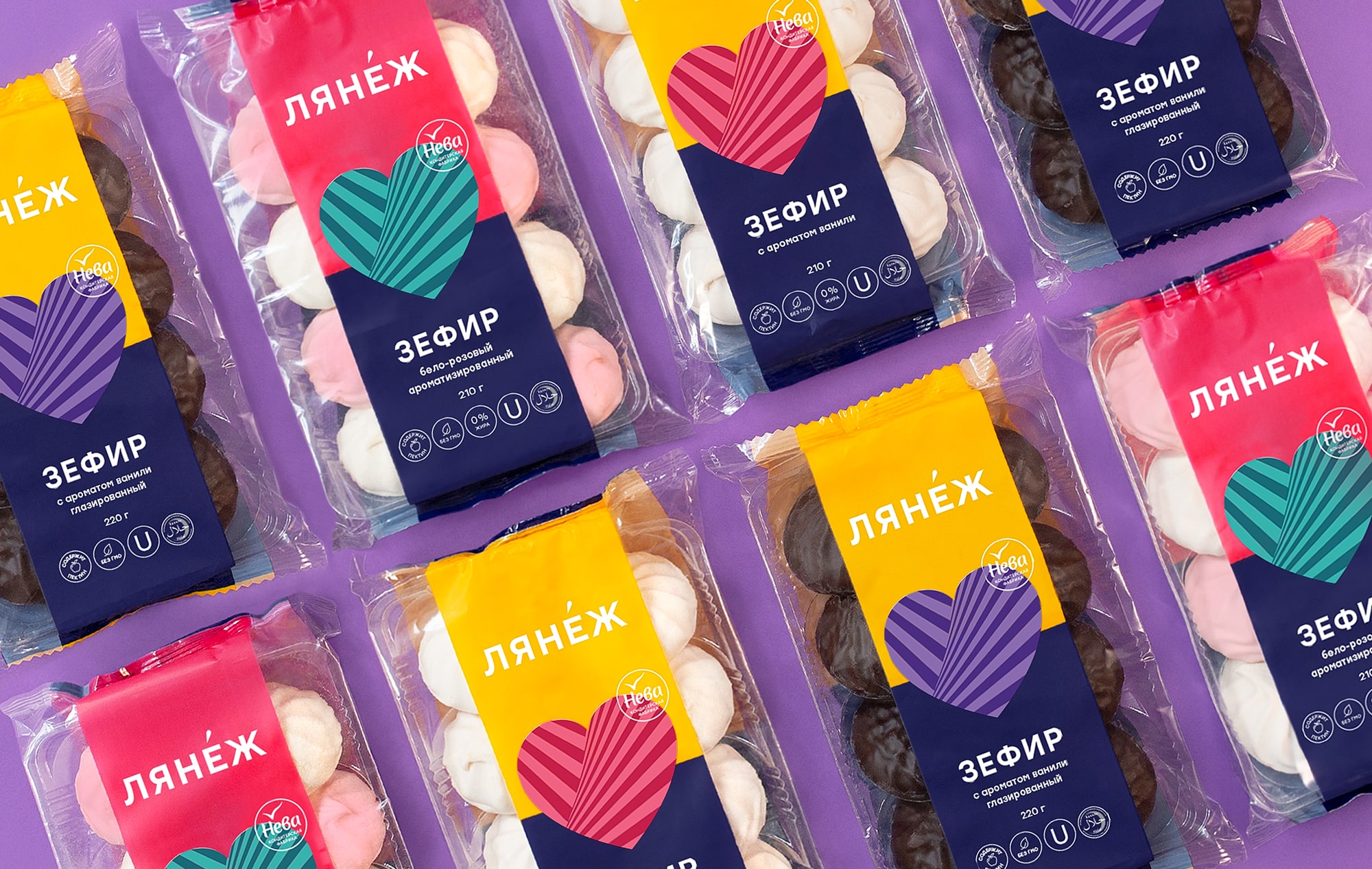
The colour palette was chosen in contrast to the product, which creates an additional focus on the marshmallow and packaging. The patterns are located in the centre of the package support copyright and the modern visual solution is easily replicated for different SKUs.
The modular design allows the manufacturer to quickly and easily assemble the packaging for the development of a new line. This will preserve the unity in the visual image of the brand without supervision from our side.
CREDIT
- Agency/Creative: Ferma Branding Agency
- Article Title: Ferma Branding Agency Create New Design for Marshmallow Label Lanezh
- Organisation/Entity: Agency, Published Commercial Design
- Project Type: Packaging
- Agency/Creative Country: Russia
- Market Region: Europe
- Project Deliverables: Brand Identity, Brand Redesign, Brand Strategy, Branding, Packaging Design, Rebranding
- Format: Box
- Substrate: Plastic


