


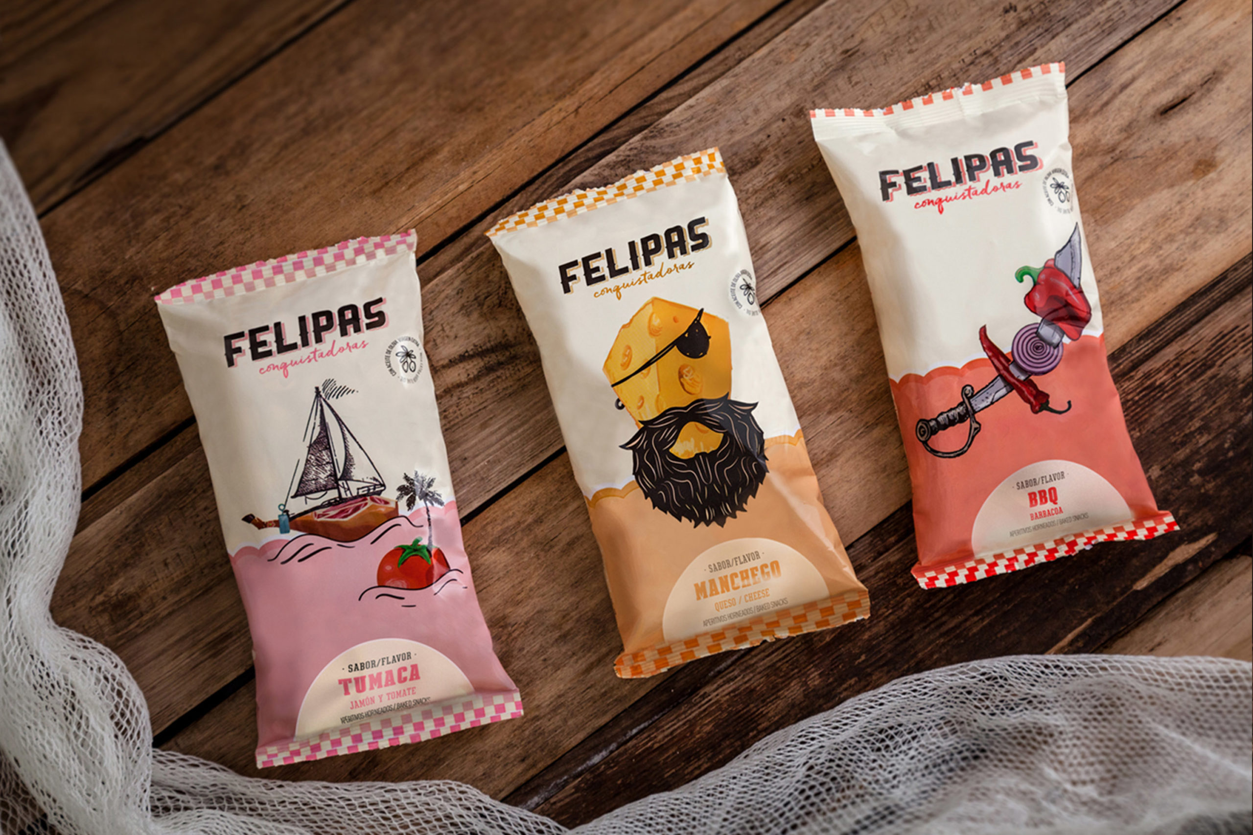
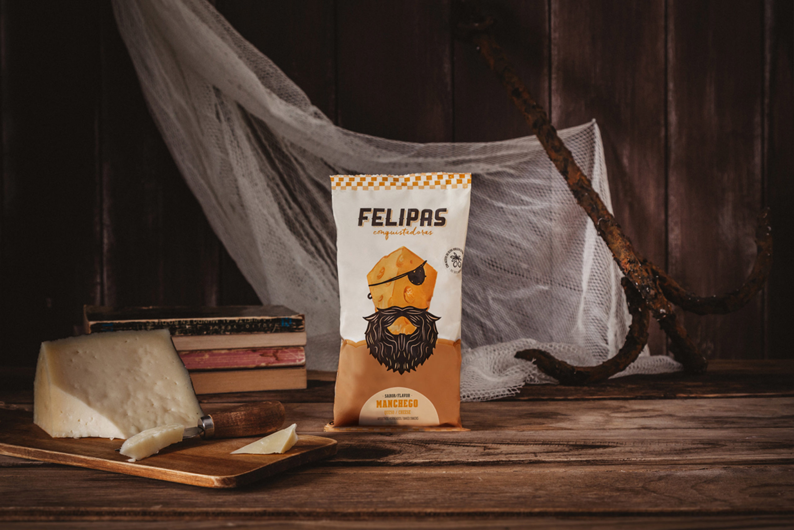
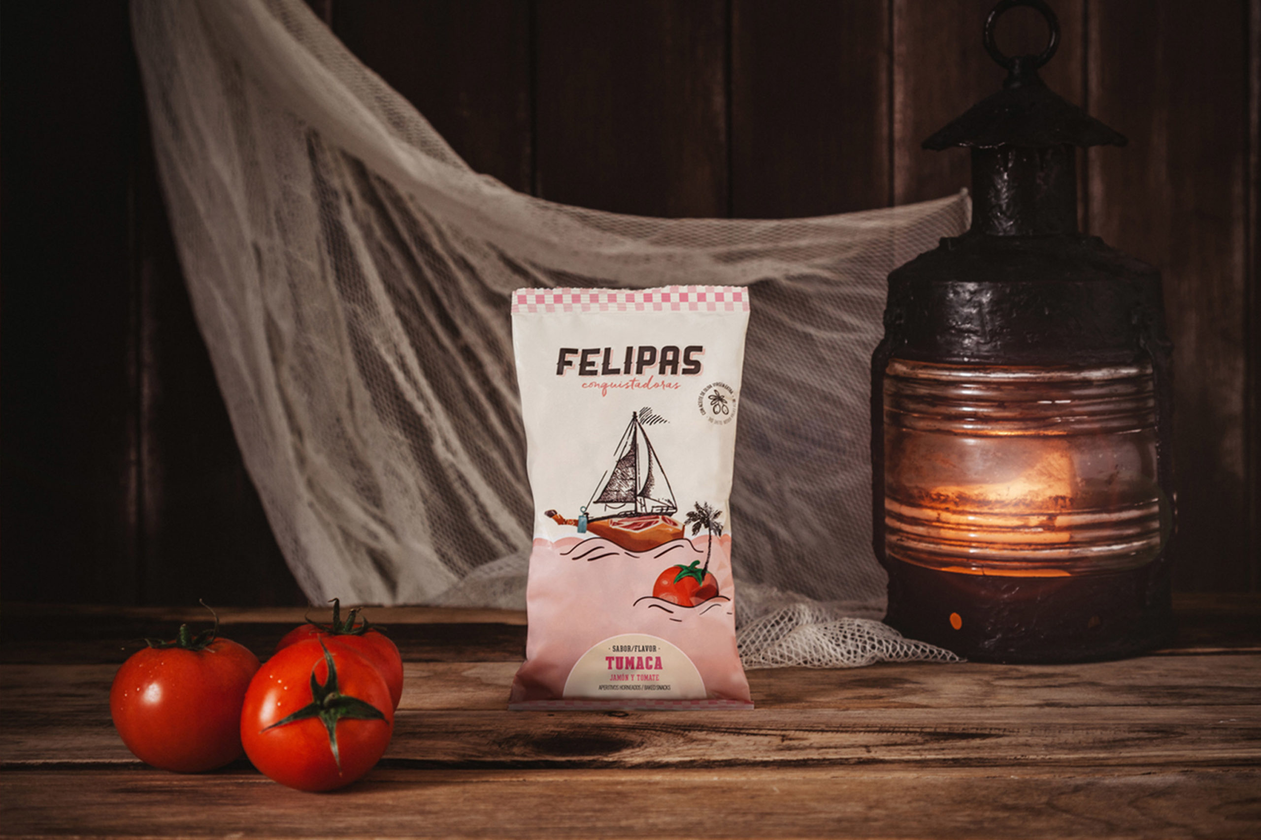
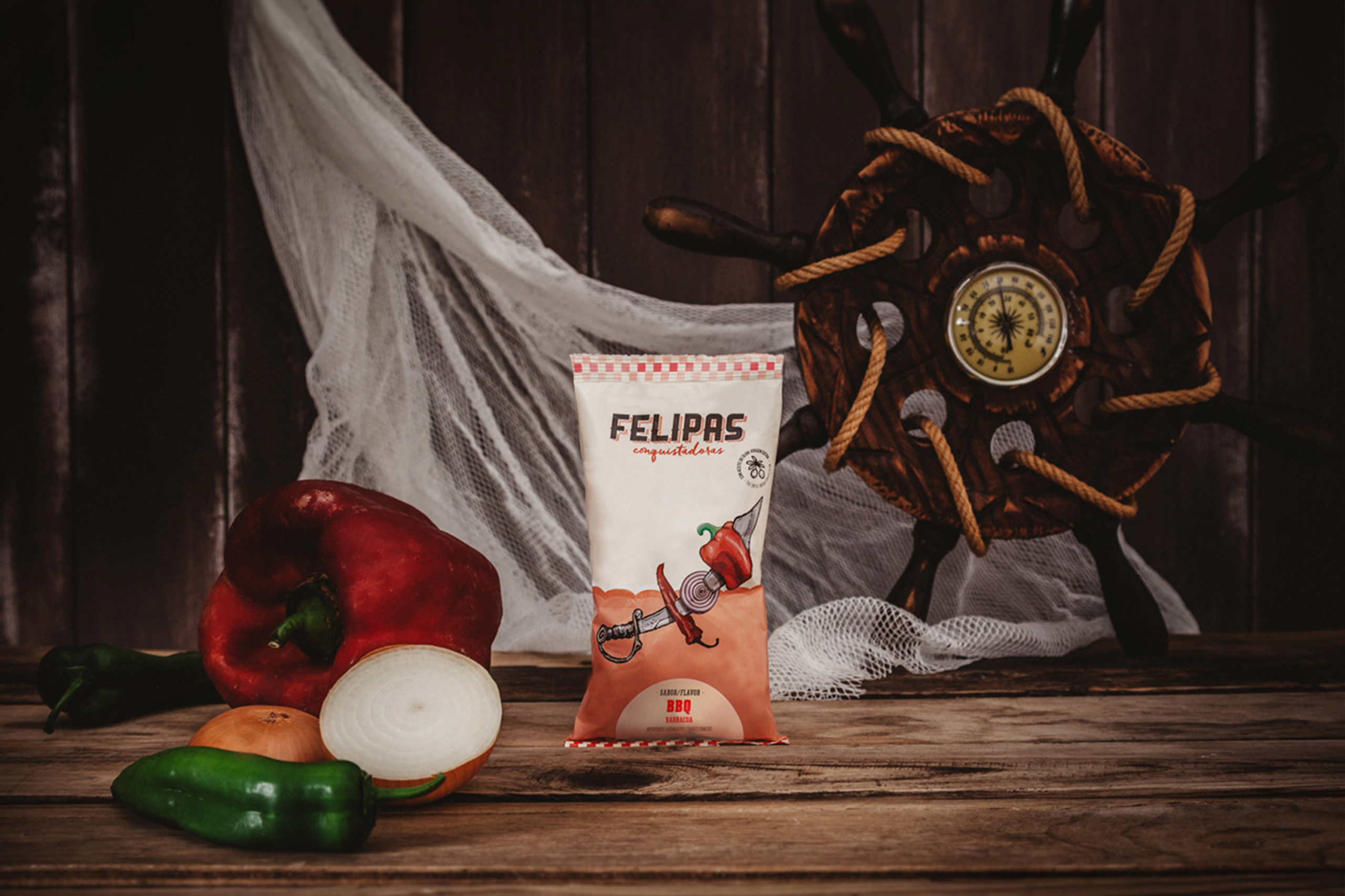
To develop the identity, we relied on the general symbol of conquests: the flag (an example of this is the arrival of the man to the moon and the mythical American flag that was placed there), took the F from the brand’s name to simulate a mast with a flag fluttering in the wind. The image of the product is based on the main ingredients (for example, cheese-flavored breadsticks, ham with tomato, etc.) and characterized by overlapped illustrations, which make the ingredients become pirates, ships or sailors.


CREDIT
- Agency/Creative: Salvartes Design
- Article Title: Felipas Conquistadoras Snack
- Organisation/Entity: Agency, Published Commercial Design
- Project Type: Packaging
- Agency/Creative Country: Spain
- Market Region: Europe
- Project Deliverables: Brand Guidelines, Brand Rejuvenation, Brand Strategy, Brand World, Branding, Graphic Design, Identity System, Packaging Design, Product Naming, Research
- Format: Sachet, Wrap
- Substrate: Metal, Plastic
FEEDBACK
Relevance: Solution/idea in relation to brand, product or service
Implementation: Attention, detailing and finishing of final solution
Presentation: Text, visualisation and quality of the presentation


