


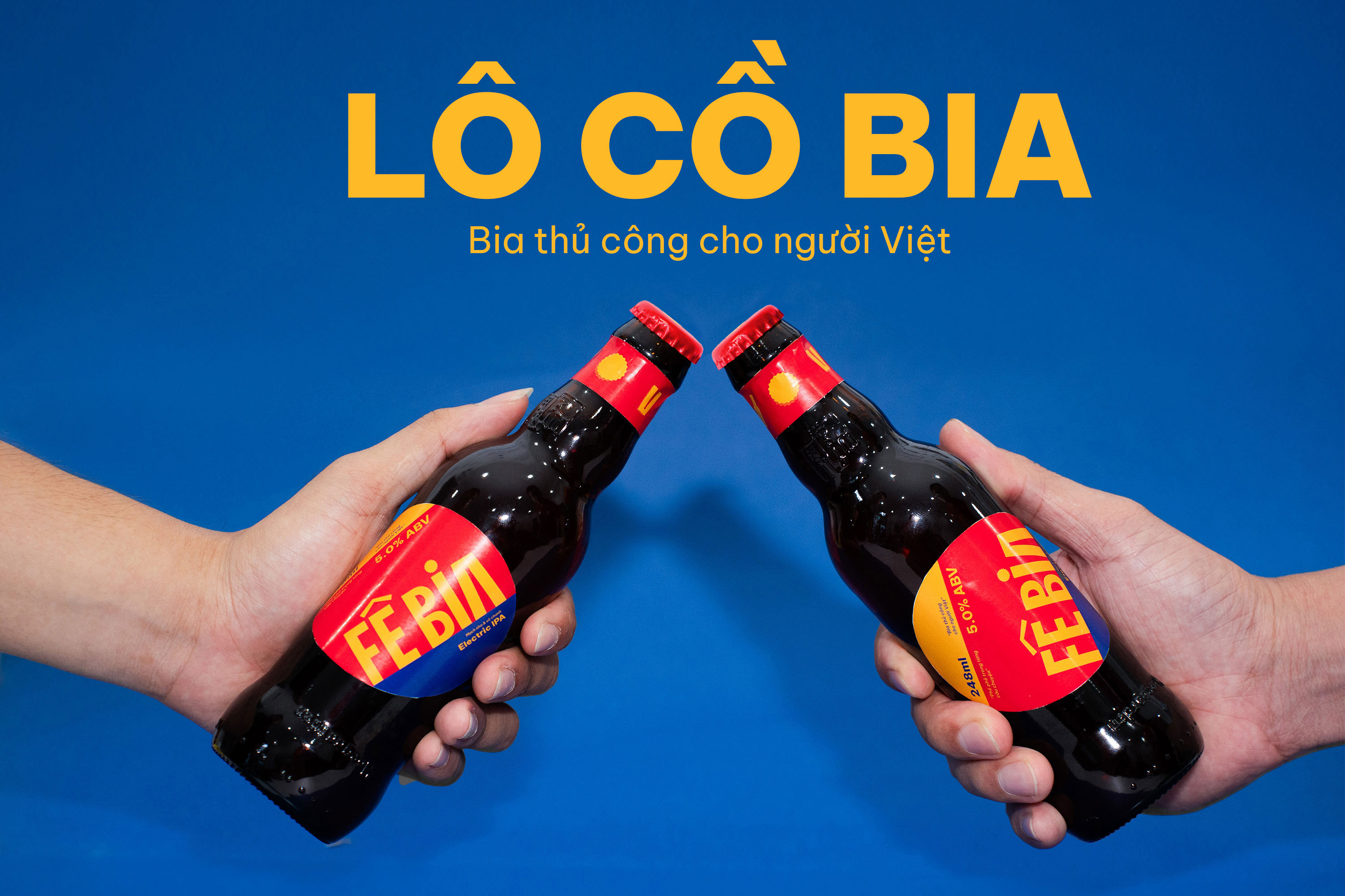
Fê Bia Visual Identity – The Local Beer
Brand Story:
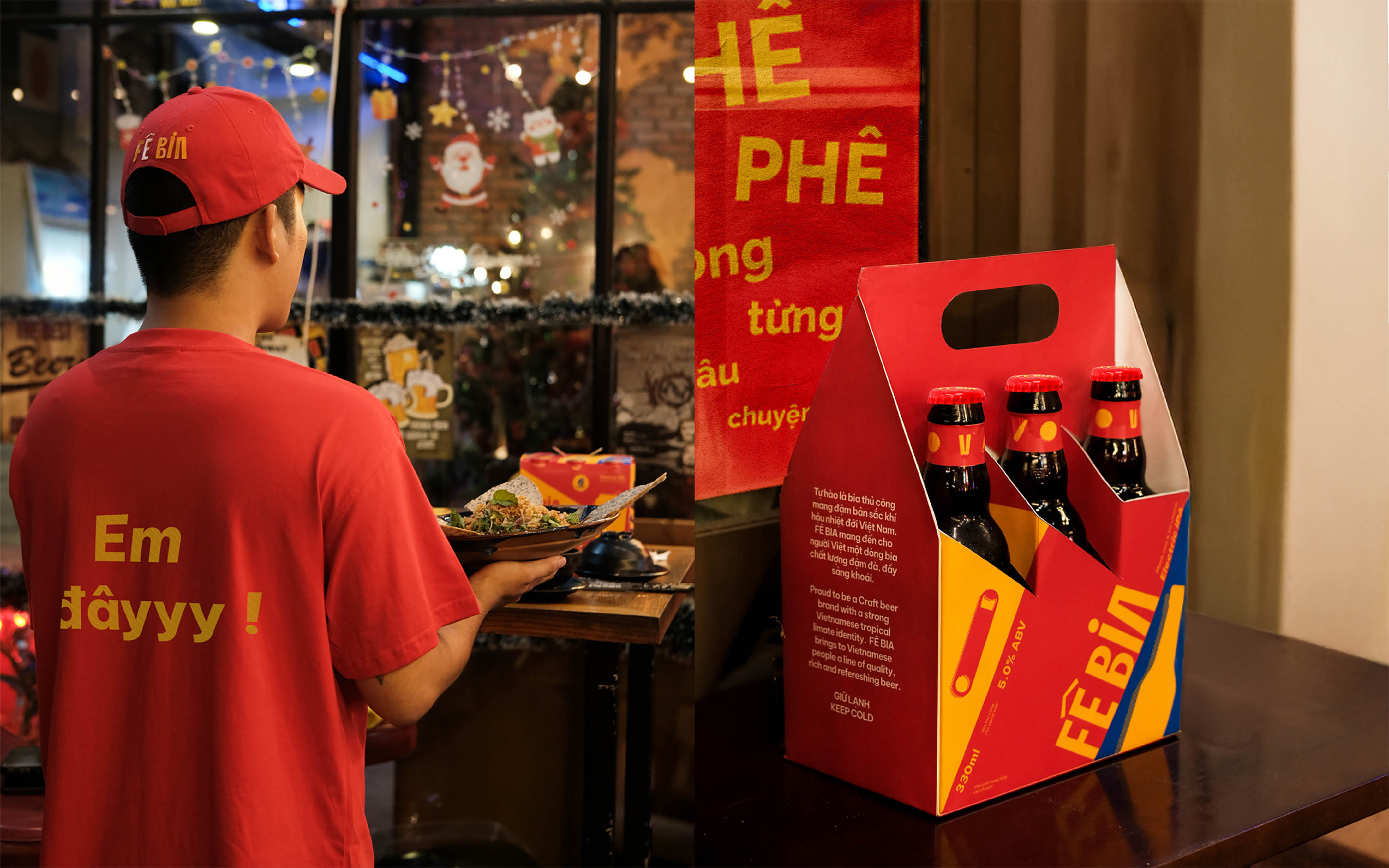
Proud to be a craft beer with a strong Vietnamese tropical climate. FÊ BIA brings to Vietnamese people a line of quality, rich and refreshing beer. FÊ BIA is a rewritten name from the phrase “Phe Bia” in Vietnamese, like a slang. It shows the youthful, uniqueness, and tingling when enjoying the brand’s cool beers.
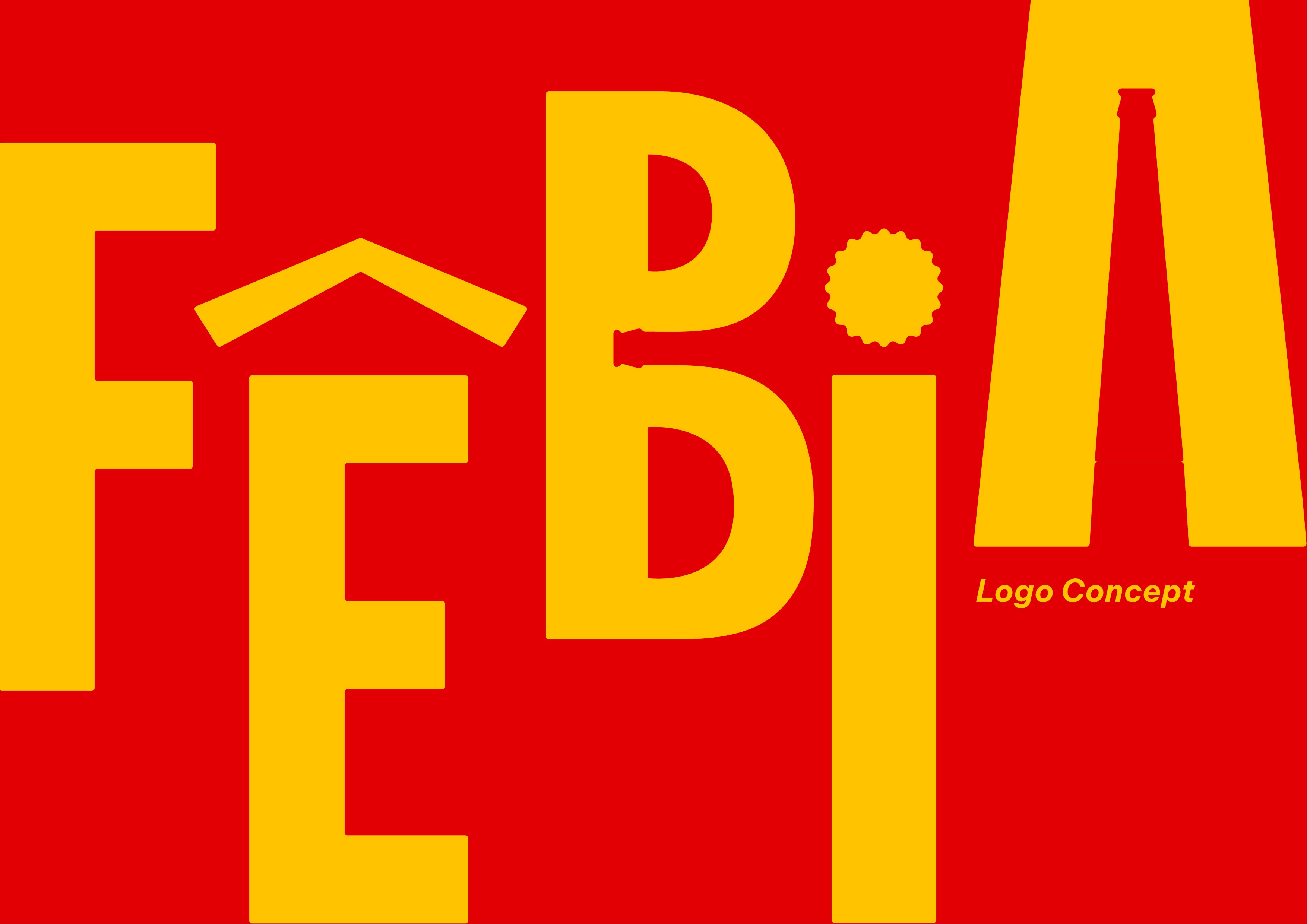
Logo Concept:
The FÊ BIA logo is a type of logotype, incorporating elements representing beer into each letter.
“Ê”: stylized with the “^” symbol of two beer bottles clinking together. This element also helps the overall logo become more Vietnamese
“B”: the image of a beer bottle is embedded in the negative space in the middle
“I”: stylized with the “.” symbol of a beer bottle cap
“A”: the image of a beer bottle is embedded in the negative space in the middle
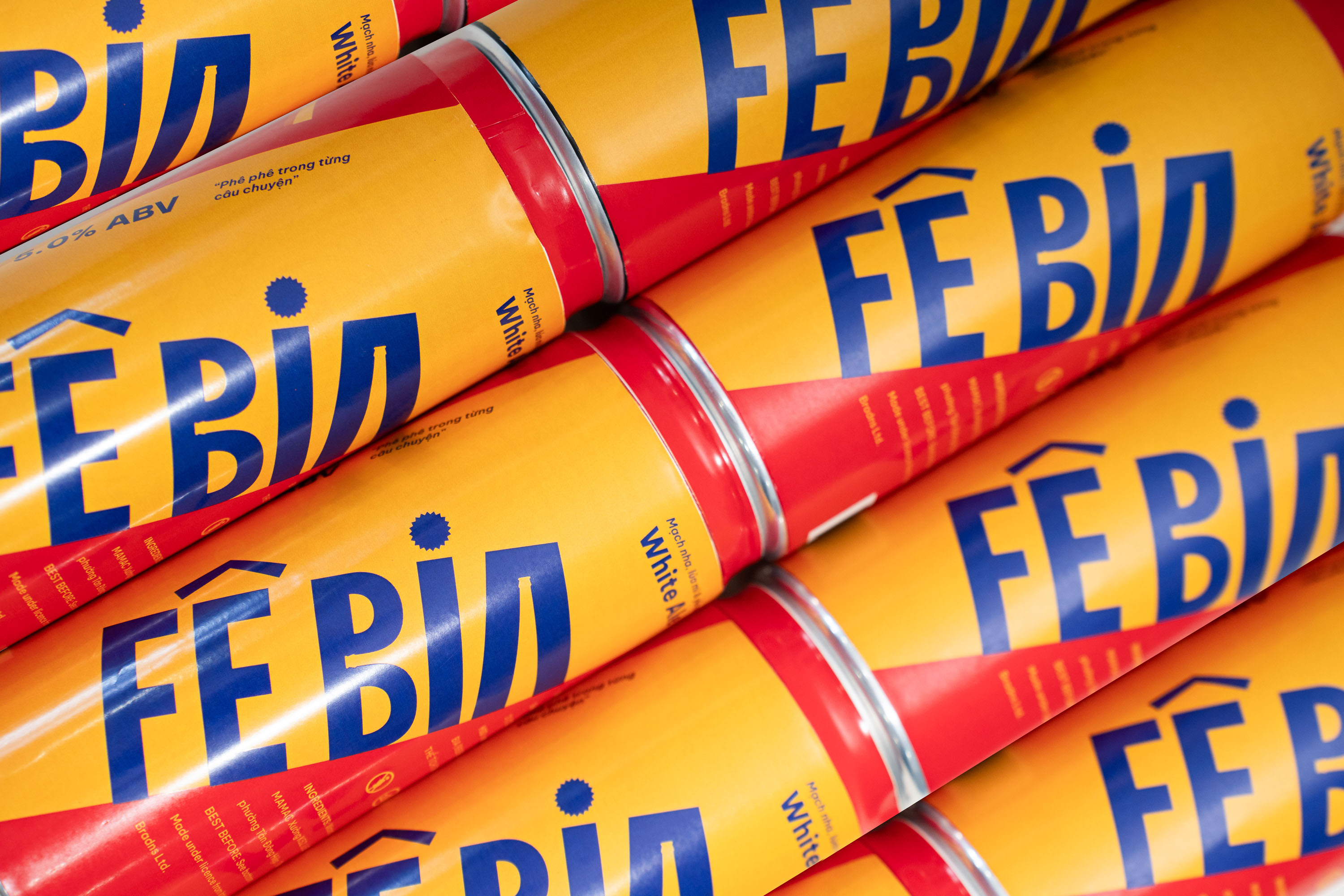
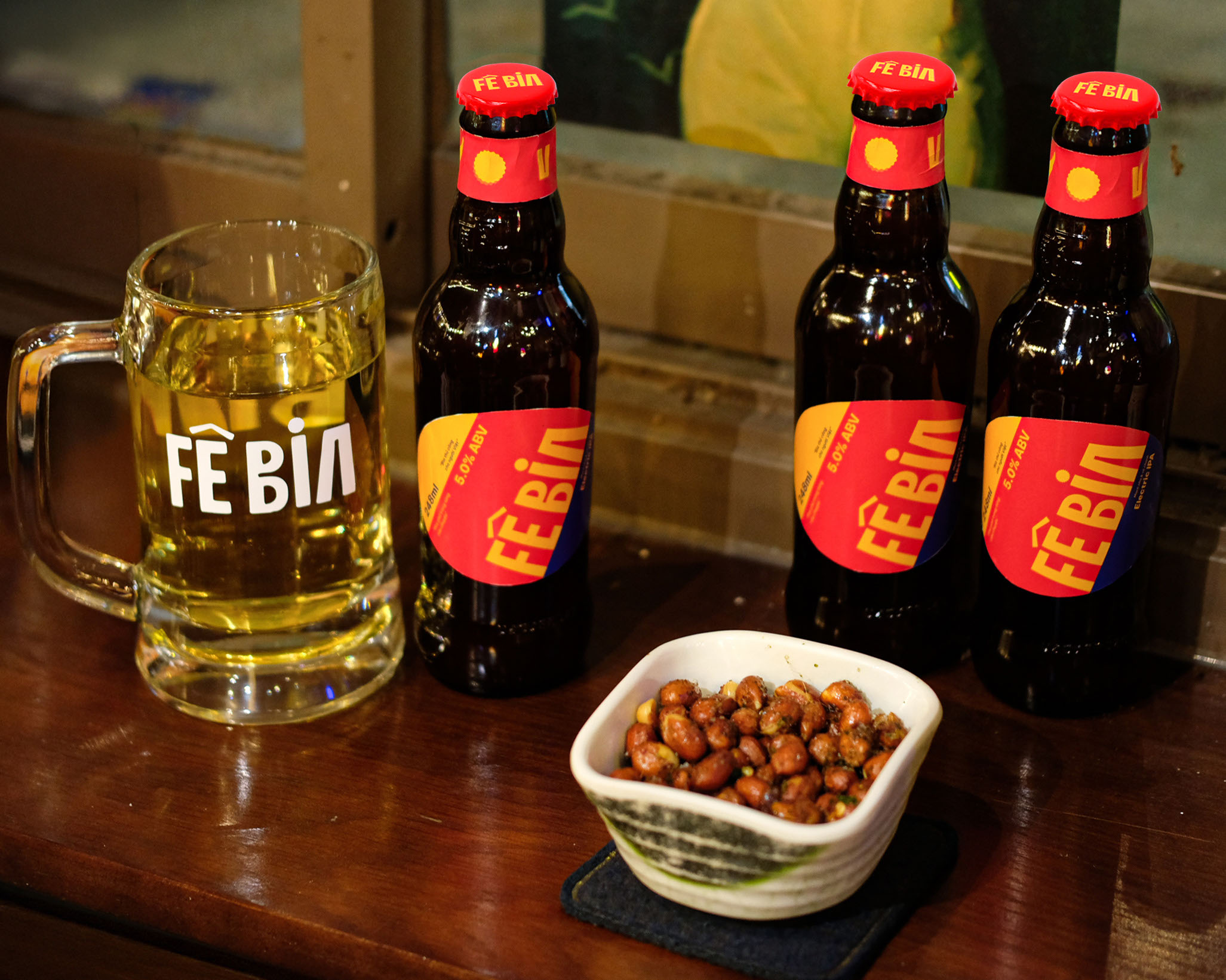
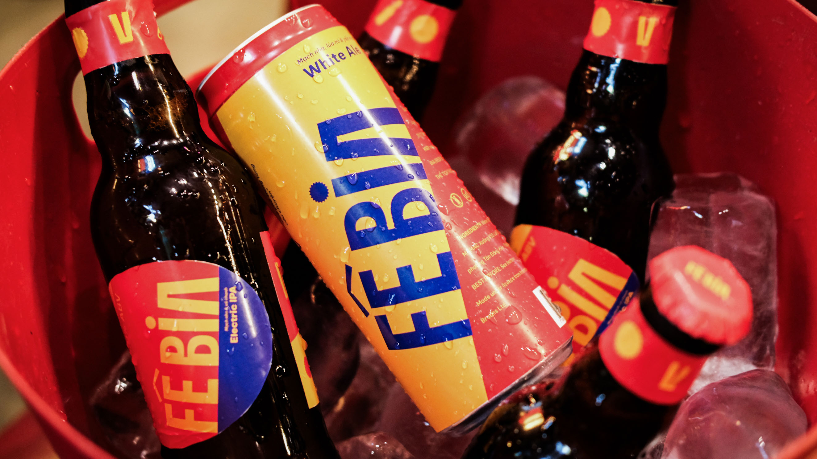
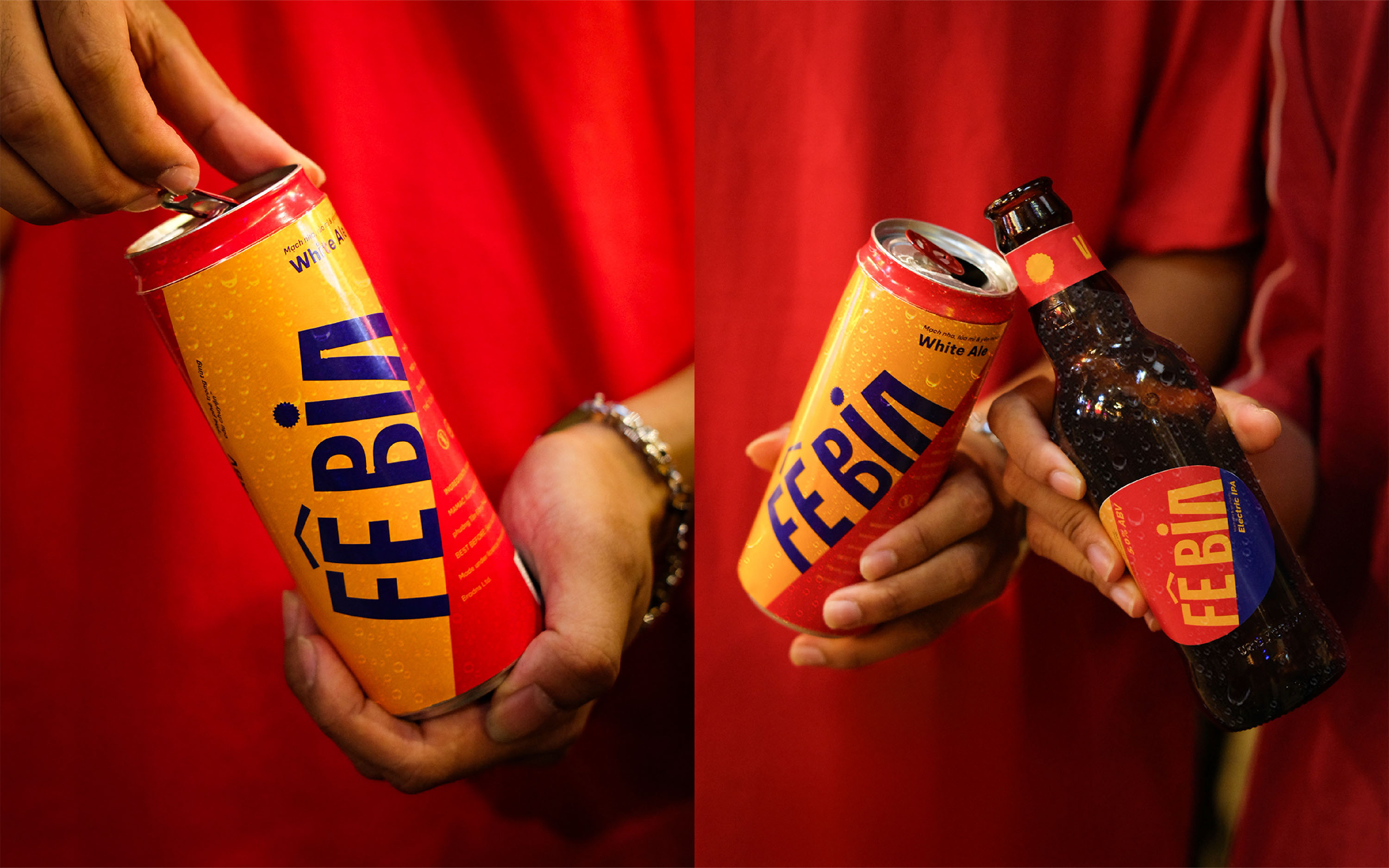
Visual Identity:
The visual of FÊ BIA is inspired and developed from the elements of beer FÊ BIA has 5 representative elements:
1. Two beer bottles clinking: taken from the “^” sign in the letter “Ê” of the FÊ BIA logo
2. Beer glass: taken from the letter “A” in the FÊ BIA logo when reversed
3. Beer cap: taken from the sign of the letter “I” of the FÊ BIA logo
4. Beer bottle
5. Beer opener
Vietnamese materials:
The shadow of Beer Element FÊ BIA is inspired by Vietnamese marble, a characteristic of Vietnamese architectural culture.
The visual of FÊ BIA is also expressed through diagonal shapes. Expressing the feeling of being drunk and happy after drinking refreshing sips of beer.


CREDIT
- Agency/Creative: Horus Academy
- Article Title: Fê Bia Visual Identity by Horus Academy
- Organisation/Entity: Student
- Project Type: Identity
- Project Status: Published
- Agency/Creative Country: Vietnam
- Agency/Creative City: Da Nang
- Market Region: Asia
- Project Deliverables: Brand Identity, Packaging Design
- Industry: Food/Beverage
- Keywords: Horus Academy, Brand Identity, Beer, Visual Identity, Packaging
-
Credits:
Made at: Horus Academy
Students: Thuc Nhi, Ngoc Quy
Photographers: Thuc Nhi, Ngoc Quy
Instructors: Phuoc Thien, To Quyen, Minh Tuan


