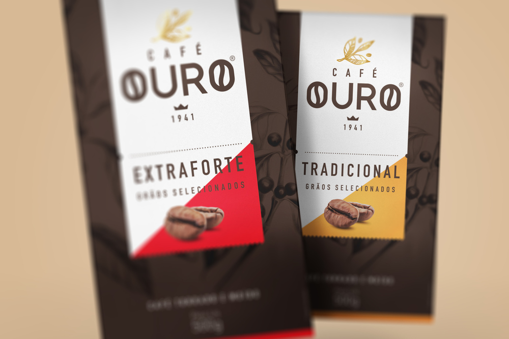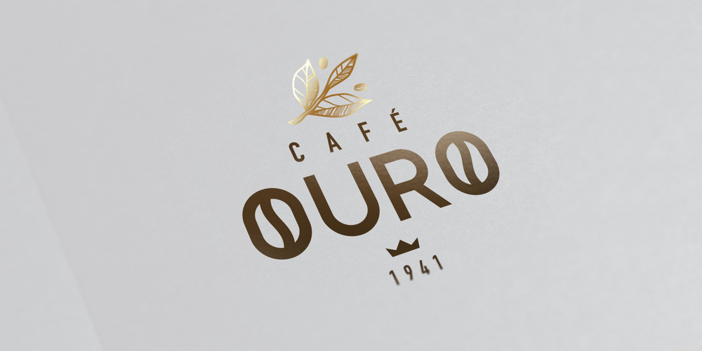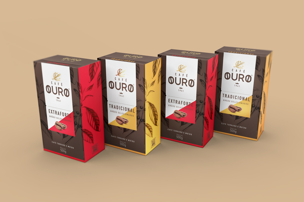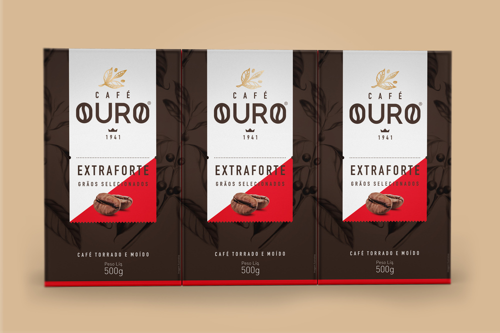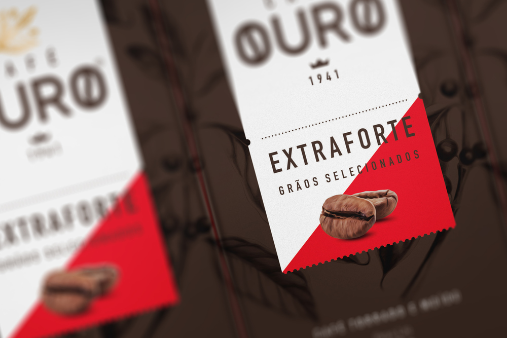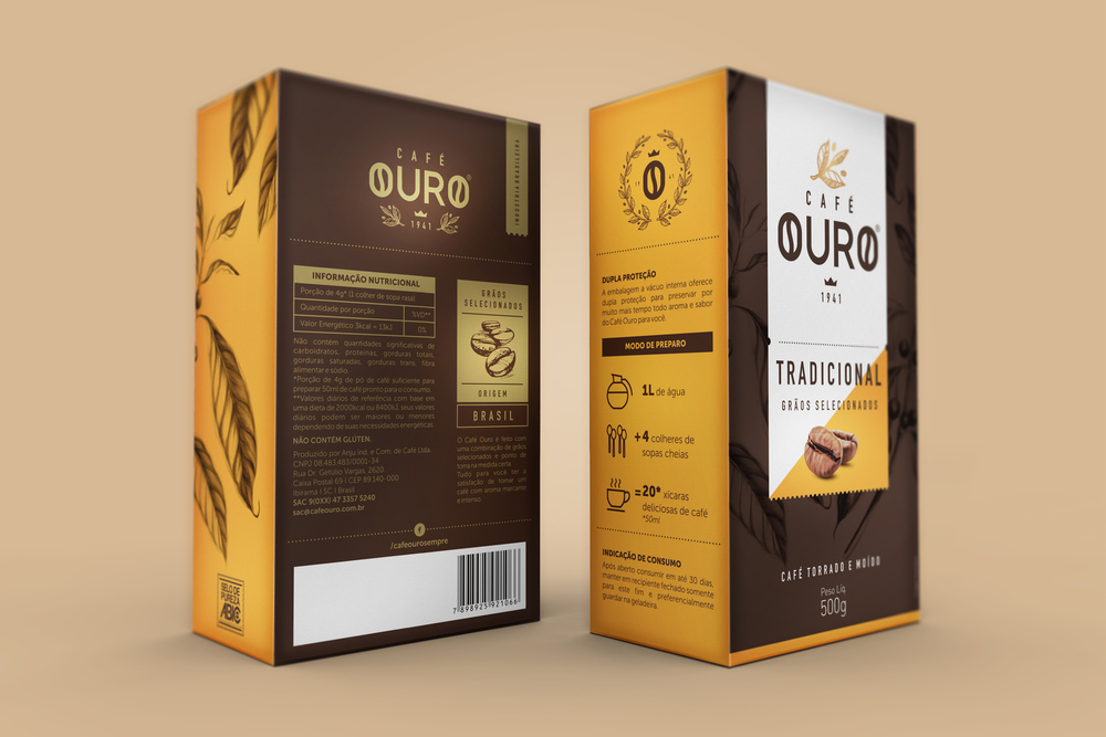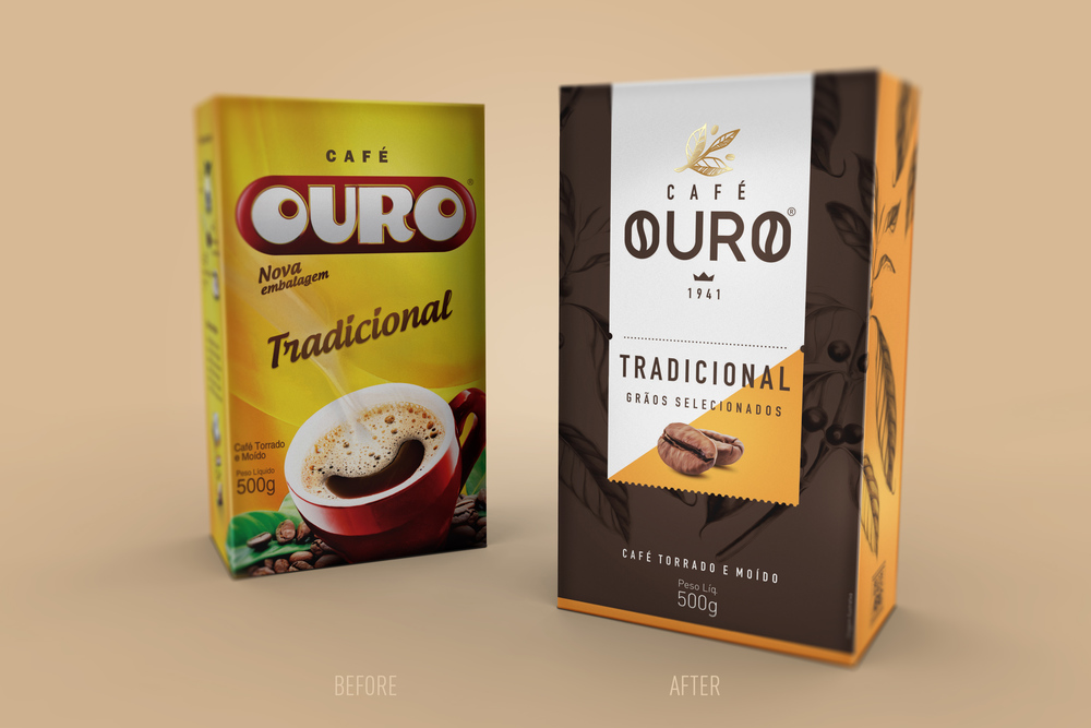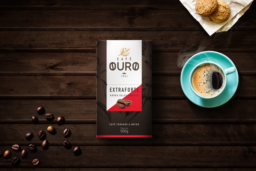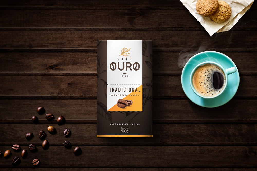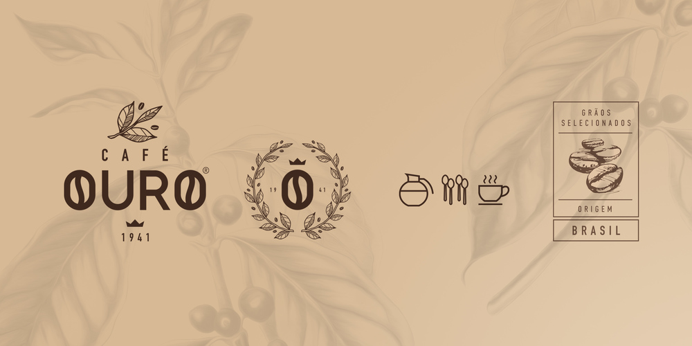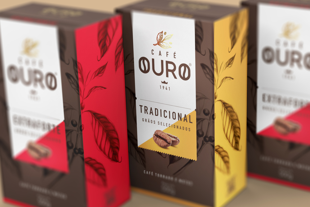
“You count with your fingers how many times you stared in front a 75 years old brand. The kind of job that involve a brand with this amount of time in the market is just as a challenge as a feeling of respect to its origins. Its conviction that the time for changing is now sounds for us such a responsabitlity and a honor.And with these premises we work on new packaging designs for Café Ouro, a brazilian coffee brand. Brand and Packaging Design for Traditional (Tradicional) and extra strong (Extraforte) coffees were the starting point of this journey. The concept for us was clear since the beginning: to treat the history of the brand as its own revitalization – again bring their heydays to the present day.The color palette was carefully chosen in order to robustly differentiate both packages, bringing you a retro concept, revisited. Shades of dark brown dominate both the front and back sides. On its front face, the brand appears with a hint of what is produced soon in its lettering: the letters ‘O’ of its name aesthetically refers to the drawings of a coffee bean.”
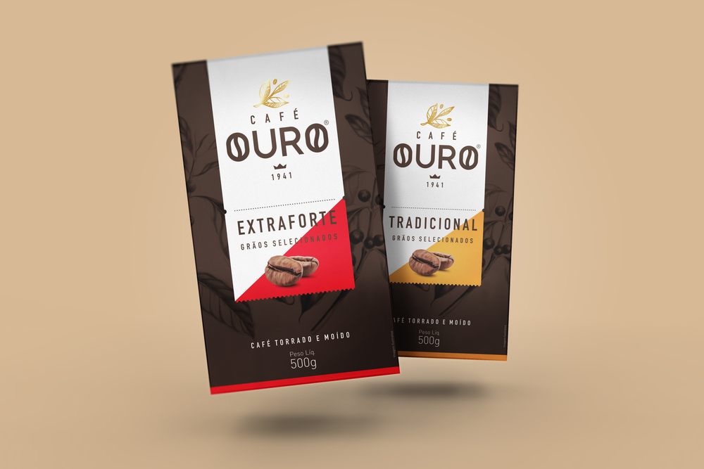
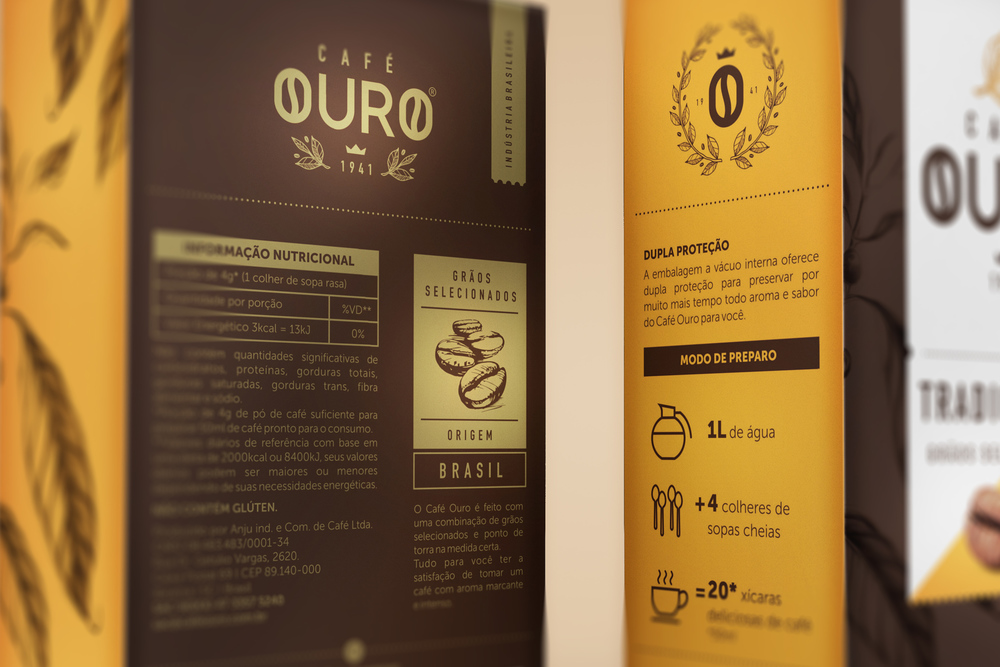
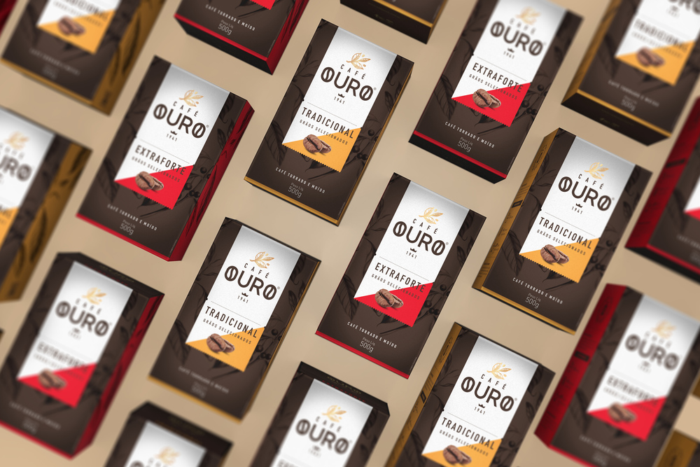
“A filigree drawing of a coffee leaf in gold at the top of the brand evokes the nobility of your product (your roasting point is visually examined by a company professional – without technology, almost handmade). All the brand today is based on a stylized stamp design, which refers to those emporiums the beginning of the 18th century, the golden era of coffee industry in Brazil. Just below the mark, respect comes: the date of opening of the plant, the beginning of everything.In its bottom and sides, the thing which distinguishes both flavors: saturated and densely distinct colors. Yellow distinct tones (Tradicional) and red (Extraforte) aim to differentiate them and also to create a distant recognition. These colors are the main package highlight, where they invite tasting and ratifies its quality.Again seeking the early 18th century, there is a pattern that begins at the front face and invades its left side, which differentiates the packaging in PoS for its elegance and sobriety. The entire front gondola communicates in unison, attracting public attention again soon ahead.And so that’s the way we developed a unique work in their richness and experience, that brings us the satisfaction of getting to combine the past with the today modernity, respecting and honoring the brand’s history. Because you count on one hand how many times have you worked with a brand with 75 years of market as new as this.”
