


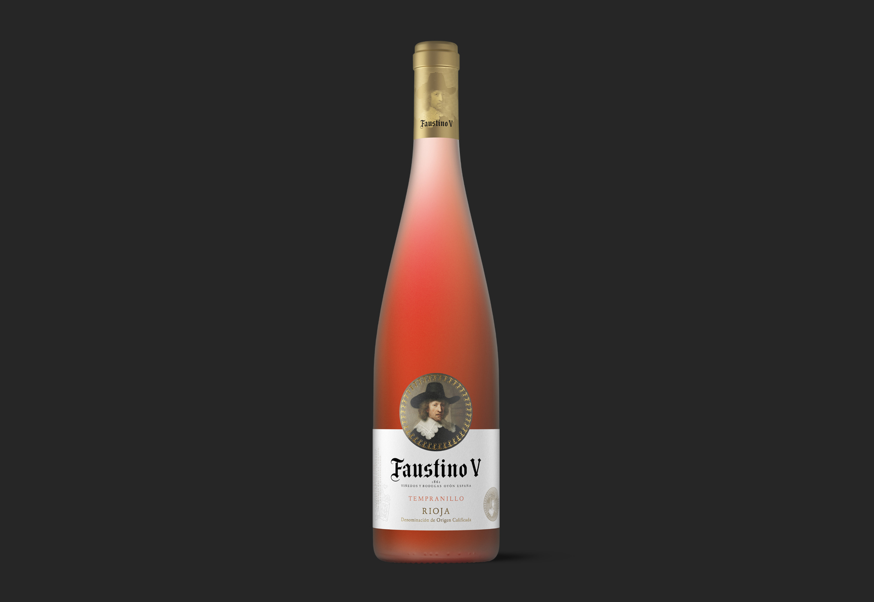
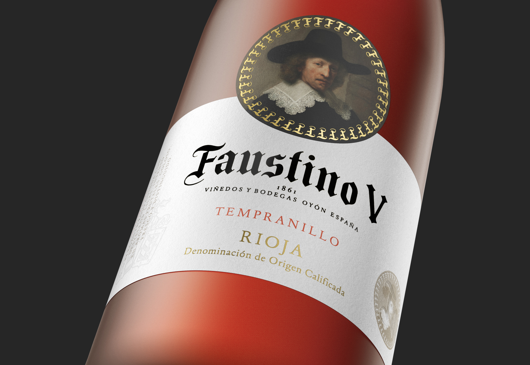
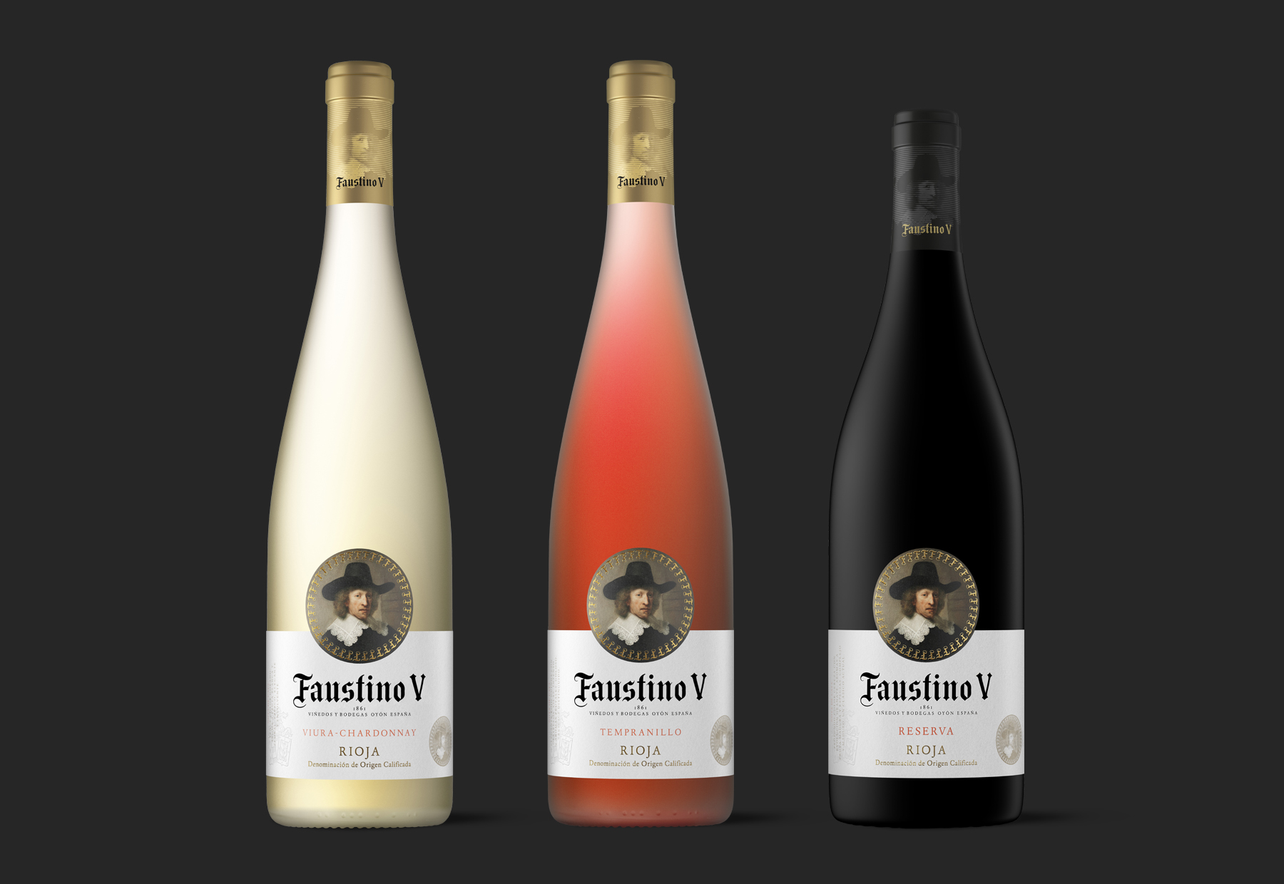
“Faustino V” is the flagship of the Faustino Winery. Given the formidable feat that this project represented, a great degree of innovation was necessary, while also preserving that which makes this emblematic wine easily identifiable.
The new image of Faustino V seeks to raise the consumer’s perception of this wine. The shape of the label returns to the origins of Faustino’s image, with the portrait at the top centered and framed, and the texts at the bottom support the composition and give it the rigor and elegance of a reserve. The embossed shield, the coin with the portrait and the texts of the tasting notes enrich the label and help to give prestige to the brand.
CREDIT
- Agency/Creative: Moruba
- Article Title: “Faustino V” Label Redesign by Moruba
- Organisation/Entity: Agency, Published Commercial Design
- Project Type: Packaging
- Agency/Creative Country: Spain
- Market Region: Multiple Regions
- Project Deliverables: Brand Architecture, Brand Identity, Brand Rejuvenation, Brand Strategy, Branding, Graphic Design, Packaging Design, Rebranding, Research
- Format: Bottle
- Substrate: Glass Bottle, Pulp Paper
FEEDBACK
Relevance: Solution/idea in relation to brand, product or service
Implementation: Attention, detailing and finishing of final solution
Presentation: Text, visualisation and quality of the presentation


