Fátima Pharmacy is more than just a pharmacy; it’s a symbol of family resilience and dedication, reflecting a Portuguese legacy of 38 years. Established with a commitment to quality care, it serves as a trusted healthcare provider, merging tradition with a modern approach to meet evolving community needs.
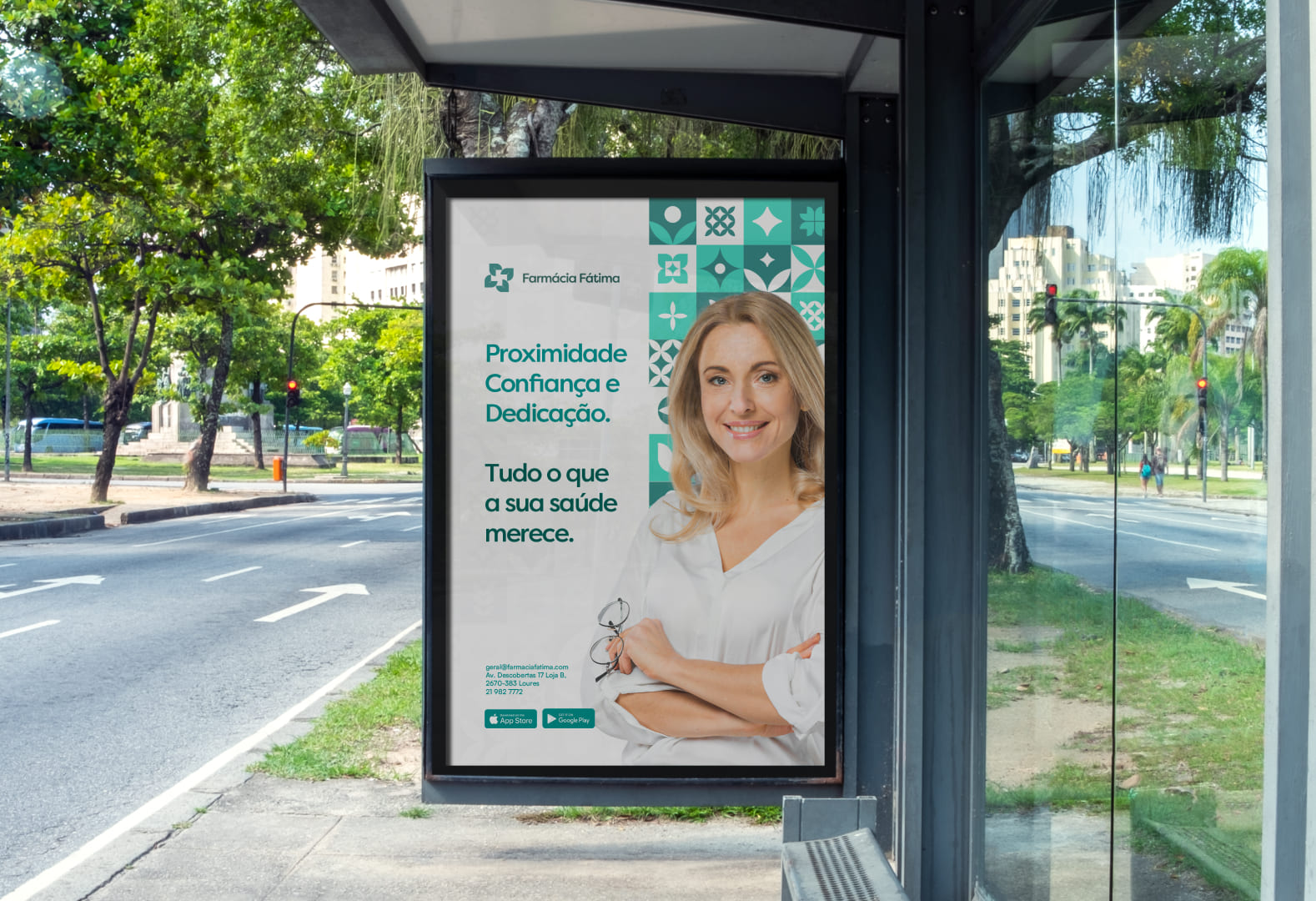
In 2024, Fátima Pharmacy embraced a rebranding initiative to create a cohesive, modern identity that respects its heritage while adopting a refined aesthetic. This new visual identity was crafted to reflect the core values of trust, community connection, and dedication to health. Our goal was to build a brand image that honors Fátima Pharmacy’s roots while showcasing its growth and continued relevance.
Logo Concept: Blending Tradition with Modernity
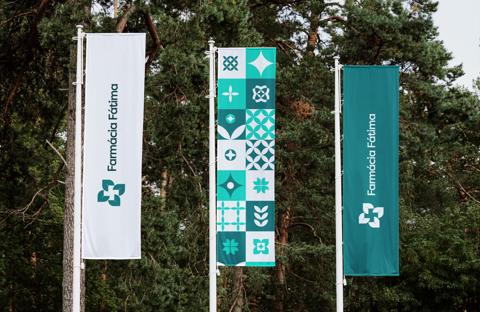
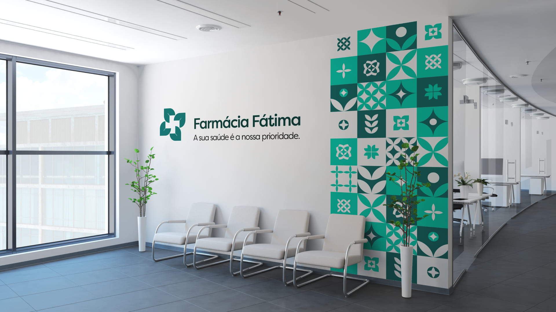
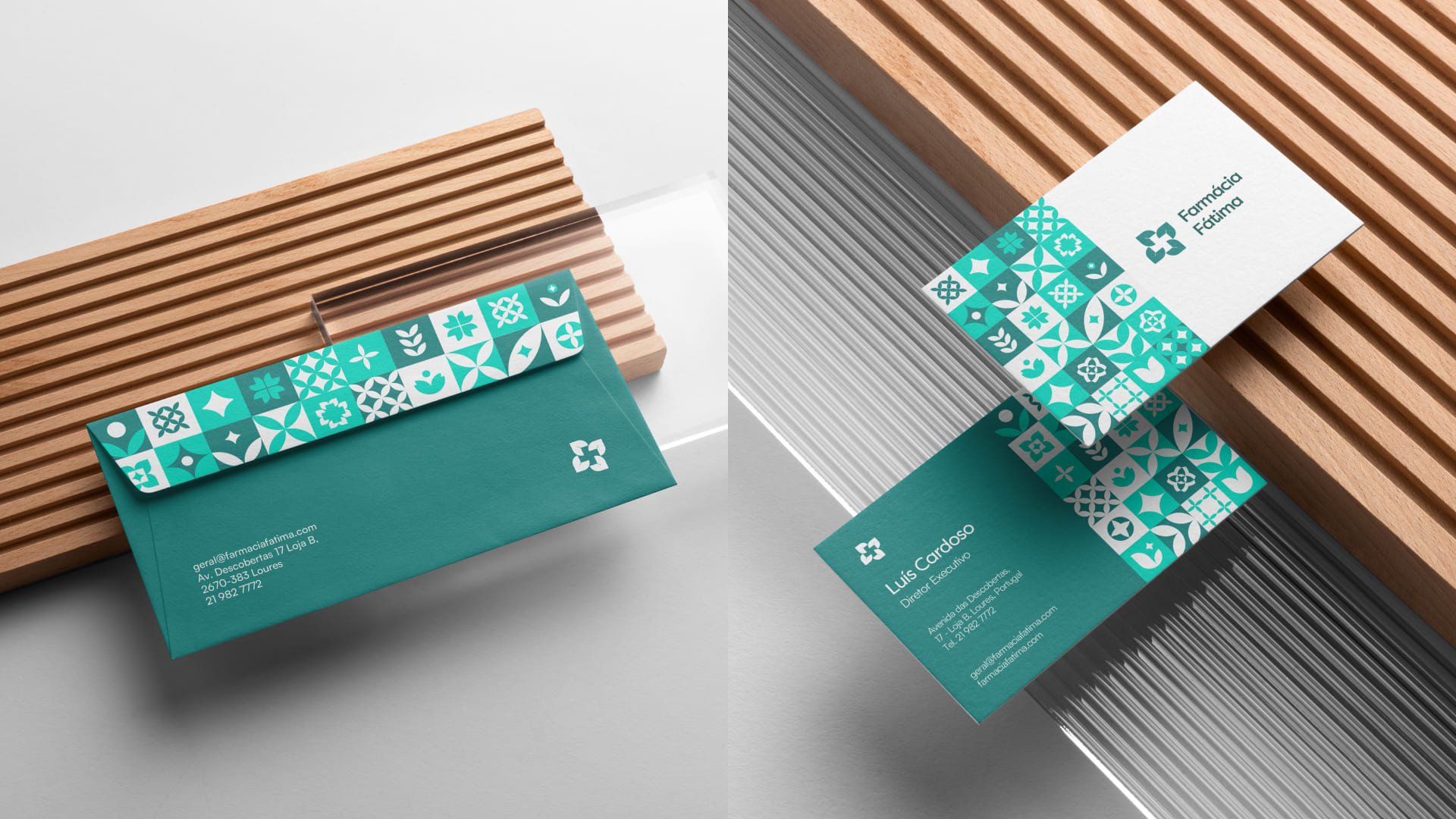
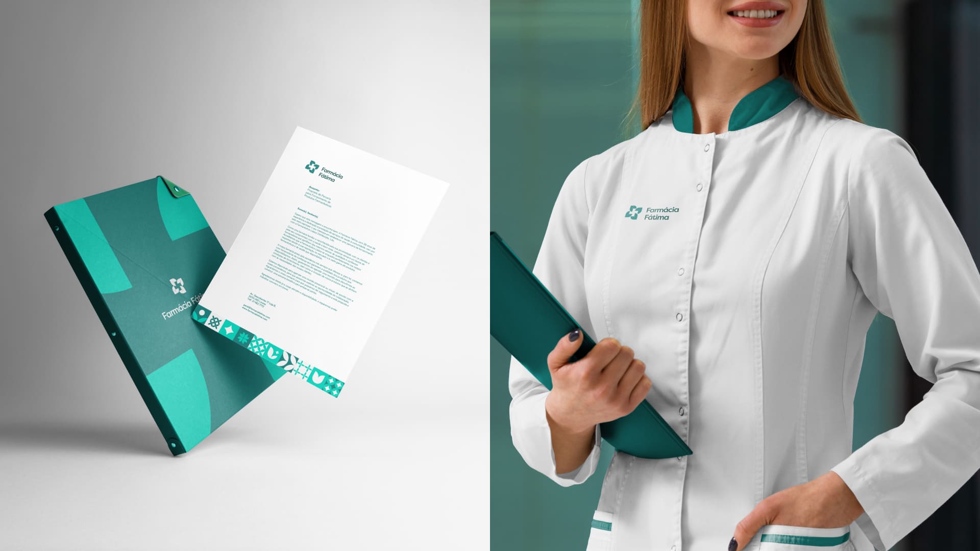
The new logo, inspired by geometric leaves, symbolizes health, growth, and care, aligning with the pharmacy’s mission. The cross formed by the leaves represents professionalism and reliability, creating an instantly recognizable connection to the pharmaceutical field. This design blends family tradition with a clean, contemporary look and integrates seamlessly with Fátima Pharmacy’s unique brand pattern.
The Brand Pattern: Honoring Heritage and Values
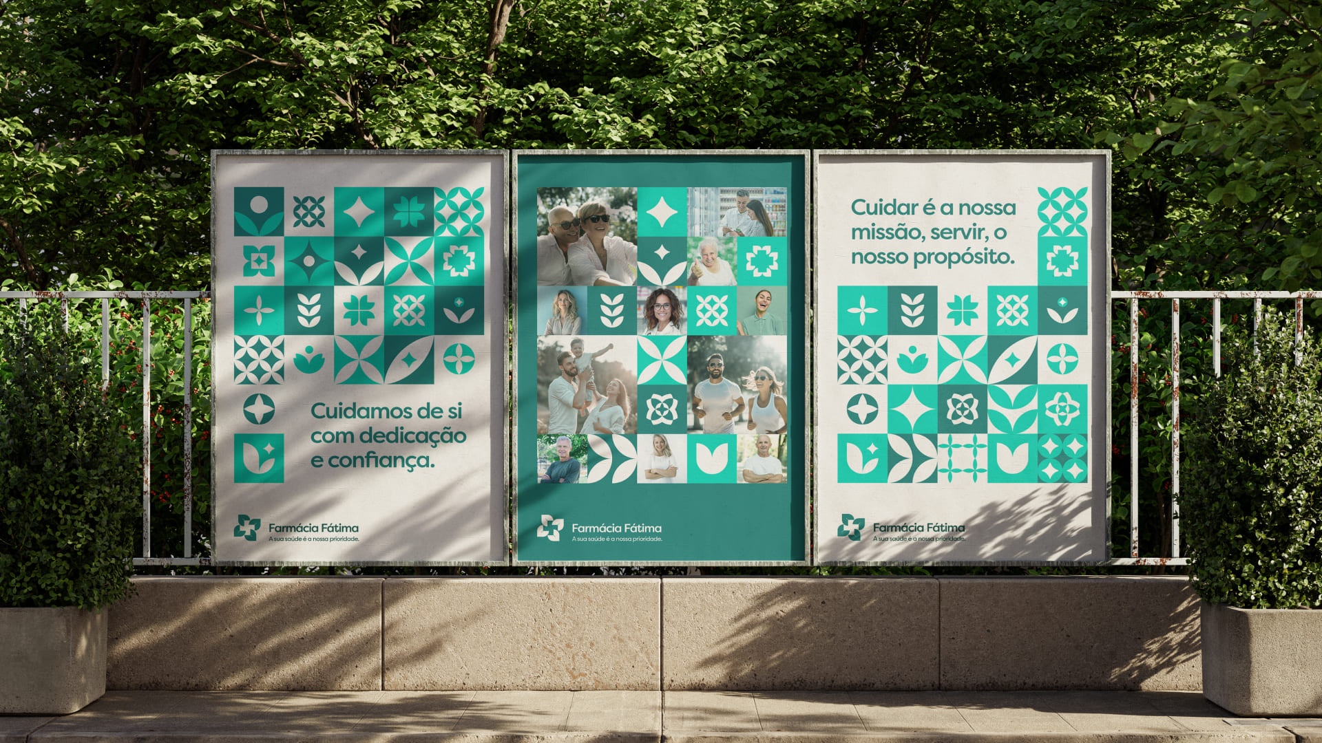
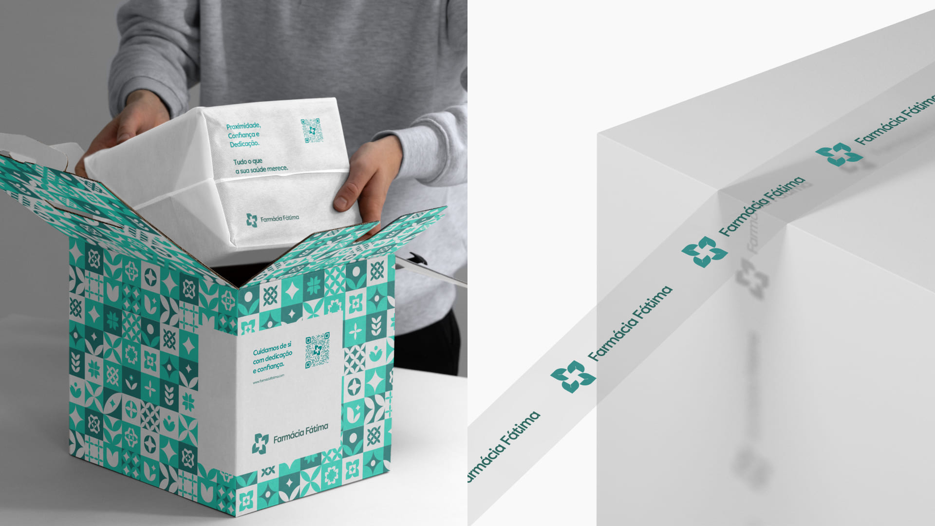
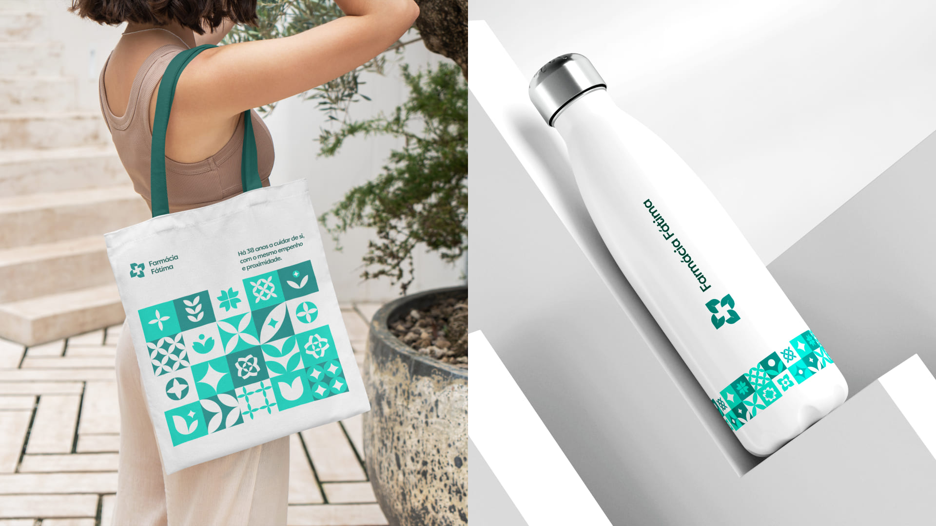
A custom brand pattern pays homage to Portuguese heritage and reflects the values of Fátima Pharmacy. Inspired by traditional tiles, the pattern incorporates natural elements like leaves and flowers, symbolizing growth and care. It also honors the pharmacy’s founder, Maria de Fátima, and her roots in Alentejo, evoking the region’s natural beauty and craftsmanship. The repeated forms suggest stability and harmony, reinforcing a sense of community and belonging.
Strategic Visual Identity
The rebranding emphasizes accessibility, trust, and quality, using green tones to represent health and nature, paired with clean typography for clarity and professionalism. This updated identity highlights Fátima Pharmacy as a modern yet familiar presence, dedicated to serving the community with integrity.
Through in-depth research, strategy, and design, Fátima Pharmacy’s refreshed identity bridges its legacy with its future, strengthening its role as a reliable and welcoming healthcare provider.

CREDIT
- Agency/Creative: Oneway Agency
- Article Title: Fátima Pharmacy’s New Branding Merges Family Legacy with Modern Care for a Fresh Take on Health & Wellness by Oneway Agency
- Organisation/Entity: Agency
- Project Type: Identity
- Project Status: Published
- Agency/Creative Country: Portugal
- Agency/Creative City: Lisbon
- Market Region: Europe
- Project Deliverables: Brand Design, Brand Guidelines, Brand Identity, Brand Redesign, Brand Strategy, Design, Graphic Design, Logo Design, Motion Graphics, Pattern Design
- Industry: Pharmaceutical
- Keywords: Pharmaceutical, Pharmacy, Logo animation, Visual Identity, Green, Poster, Pattern, Health, Wellness, Branding , WBDS Creative Design Awards 2024/25
- Keywords: WBDS Creative Design Awards 2024/25
-
Credits:
Designer: André Barbosa


