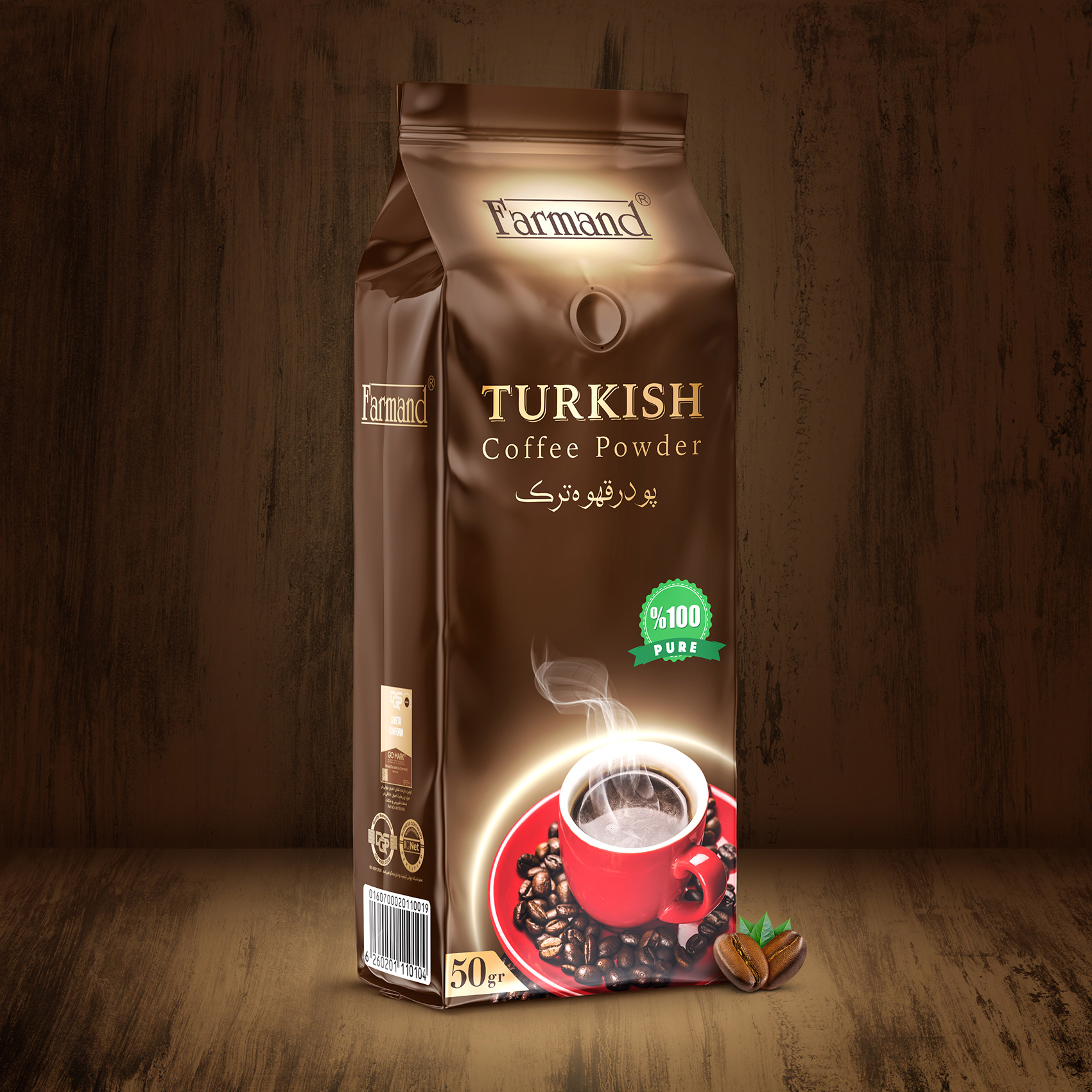
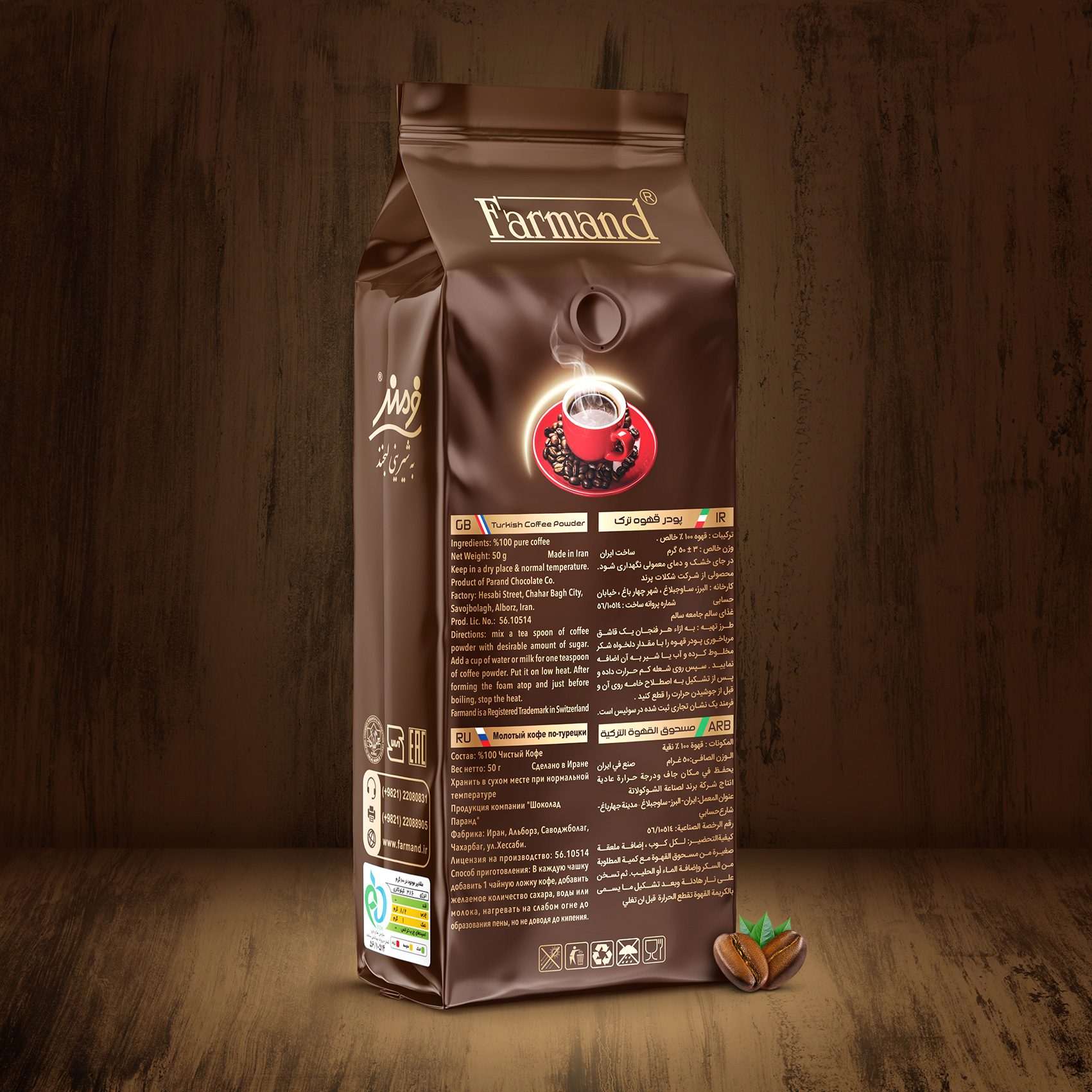
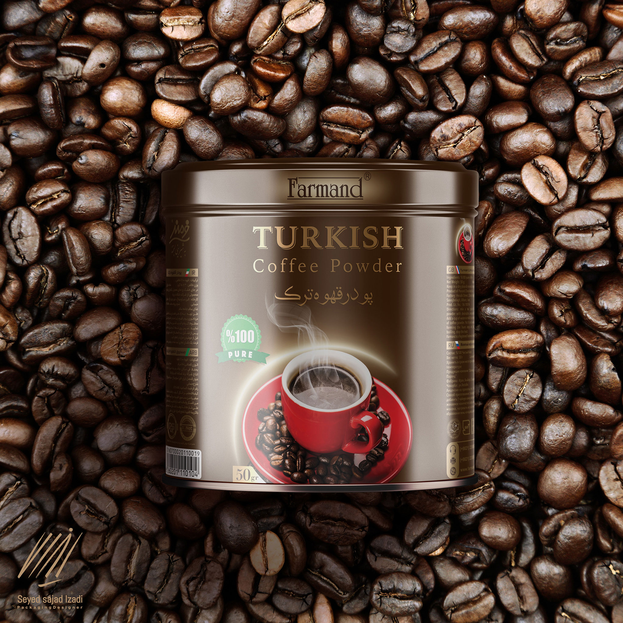
The design of the Farandim Coffee powder packaging was a project that had been sold for years in the shops and the marketing team had come to the conclusion that after all this time. The packaging was outdated and needed to be redesigned, but as you know there are many limitations in redesigning the product because it finds its market place and should not be designed to lose its target audience, so I tried to keep the red lines (including red cups, browns, coffee beans). ) The company came up with graphics that were both up-to-date and adhering to the design principles and were the result of a design effort I made. Teda on cans and finally packed into the box was empty.


CREDIT
- Agency/Creative: Seyed Sajad Izadi
- Article Title: Farmand Coffee Powder Packaging Design
- Organisation/Entity: Freelance, Published Commercial Design
- Project Type: Packaging
- Agency/Creative Country: Iran
- Market Region: Asia
- Project Deliverables: Brand Strategy, Packaging Design
- Format: Can
- Substrate: Metal
FEEDBACK
Relevance: Solution/idea in relation to brand, product or service
Implementation: Attention, detailing and finishing of final solution
Presentation: Text, visualisation and quality of the presentation


