Dessein – Dimasi Coffee
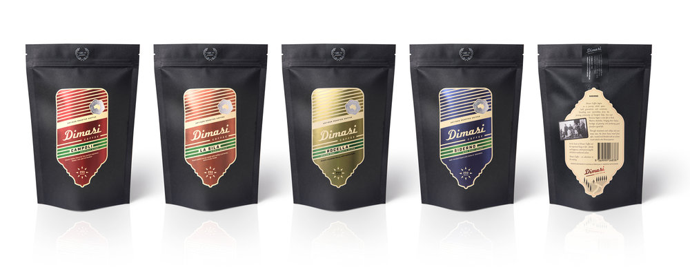
“Dimasi Coffee is an artisan coffee roaster launching in Australia. A family-owned and run business, the brand is built on a foundation of family, good food and a happy life. One of enjoying today’s modern lifestyle whilst preserving the traditional values of their Italian heritage. The brief: Create a suite of labels for the range of four blends to elevate the business from a passionate home-based interest, to a retail product range.
Italian heritage is integral to building the Dimasi brand, however it is just one from which the brand has been created.
The proprietor is a highly energized person with an infectious laugh and personality. His love of cycling, adventure and life in general are the inspiration behind the design. Cycling is prominent in Italy with the Giro d’Italia road race traveling through the regions each year. This and the proprietor’s personality provided the catalyst for the design that follows.
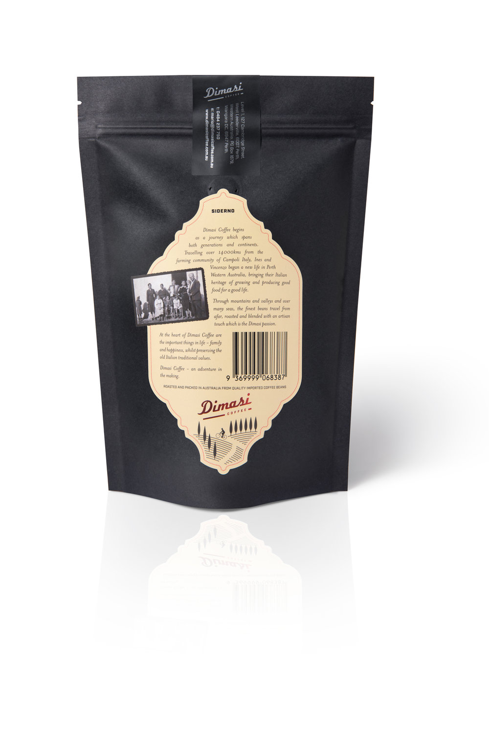
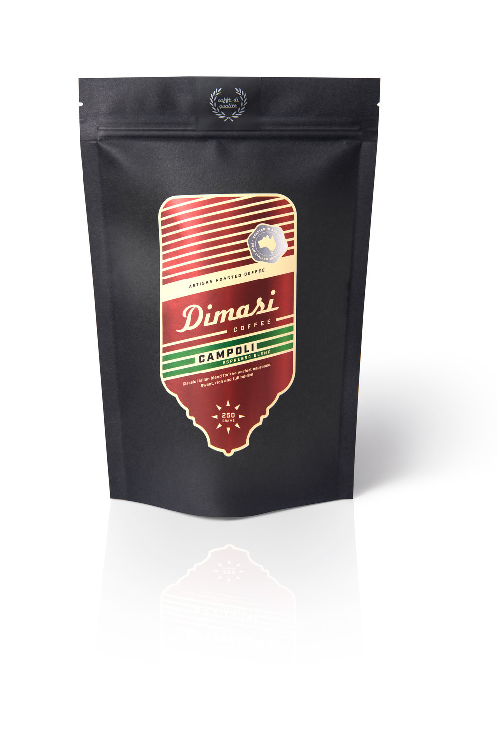
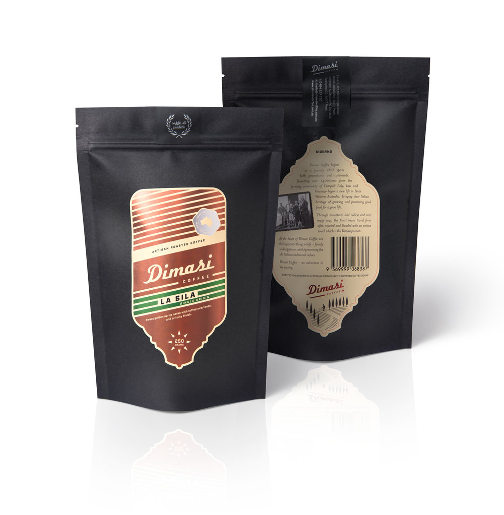
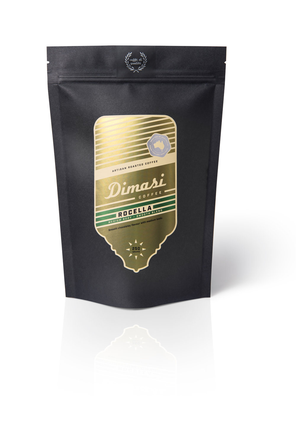
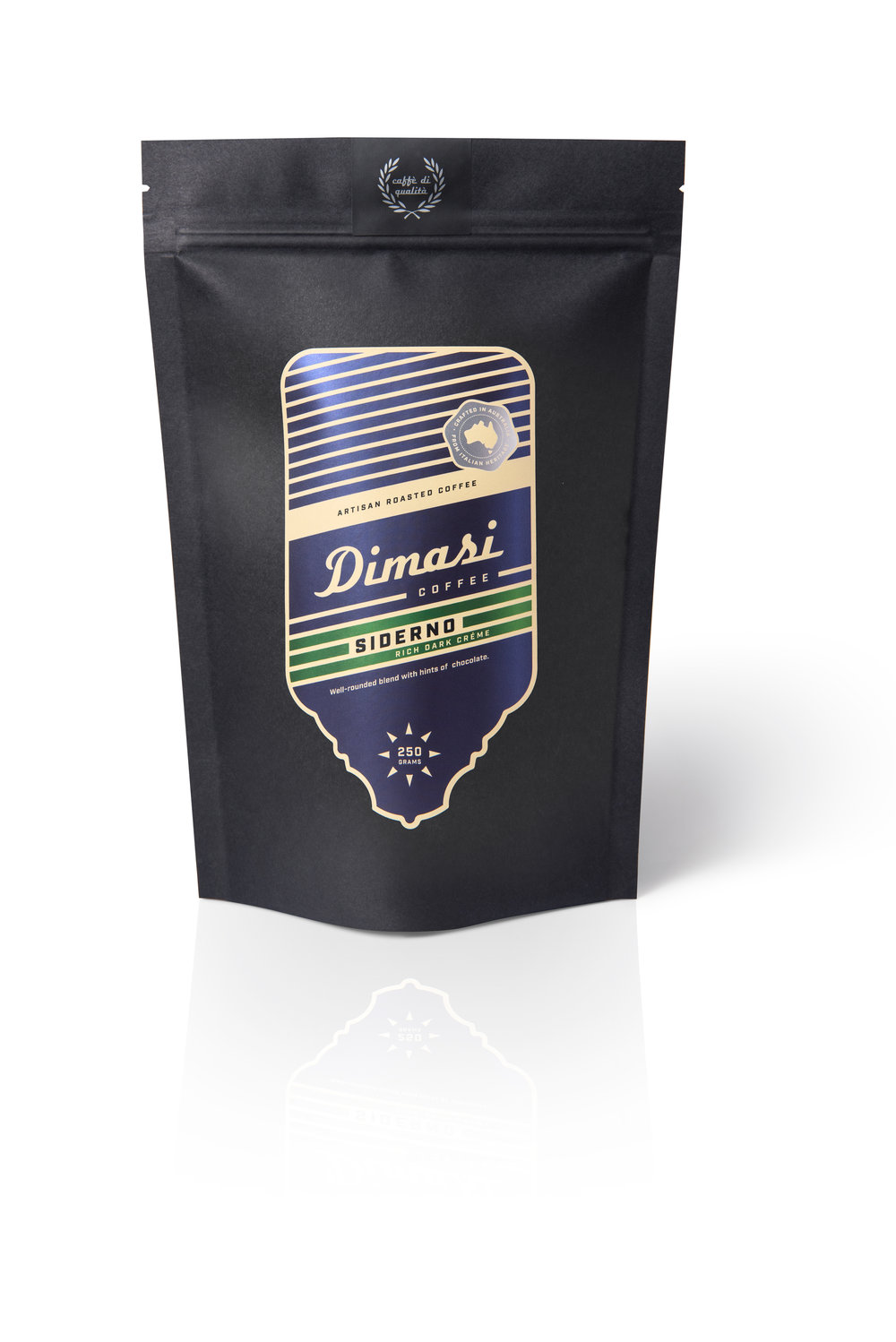
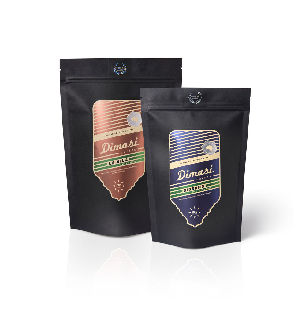
Paying homage to Dimasi’s heritage, each blend is assigned the name of an Italian region – Campoli, Siderno, Rocella and La Sila, many of which the Giro d’Italia pass through. Design of the labels echo both the vintage brass head stems of bicycles and the industrial/retro styled coffee machines. Mirroring the reflective qualities with vibrant colours on metallic surfaces, each label features the Dimasi name as a featured logotype script with green bands of colour signifying the Italian heritage.
Digitally printing the labels onto a metallic base stock, the labels appear three-dimensional and simulate the look of old cycling badges. Three labels are used on each bag: one on the front, another on the back outlining the Dimasi story and a tab label features a winner’s wreath to seal the top of the matt black pouch – making the printing of labels more cost-effective than printing directly onto bags.”
