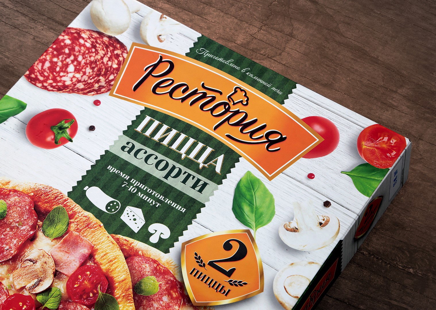
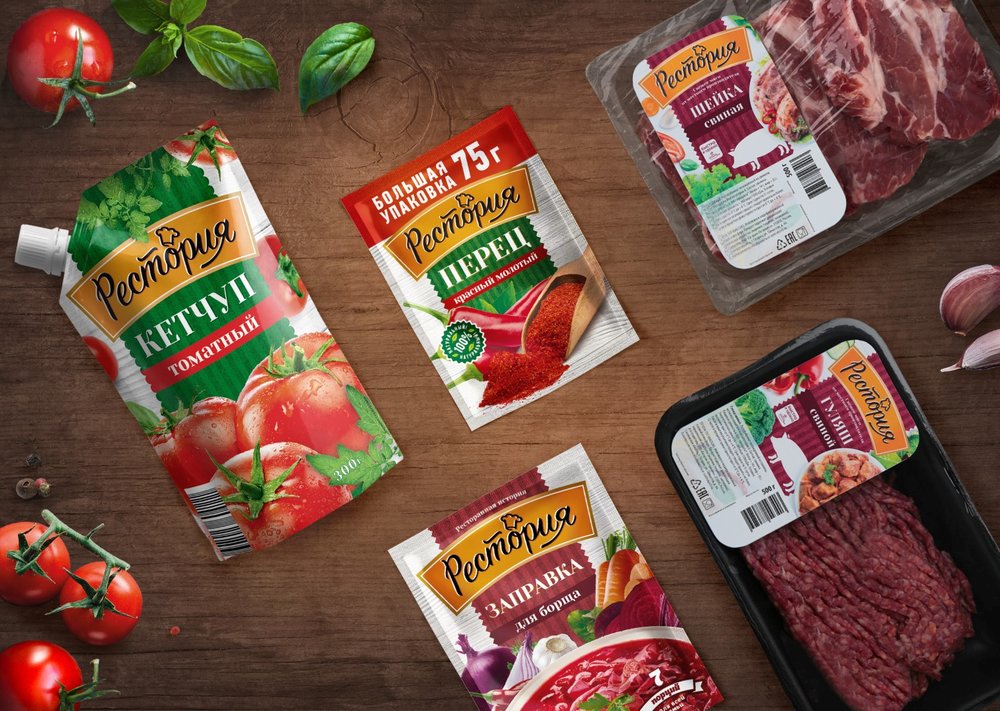
” More than 30 products: the global redesign of “Restoria” trademark by Fabula Branding
Fabula Branding has redesigned the packaging of the “Restoria” trademark – a line of frozen, semi-finished and fully cooked meals.
Why do we buy semi-finished and fully cooked meals? To save time and effort. The same pragmatic idea is expressed in the appearance of the product: a good package will not only be enticing – it will be convenient and understandable.
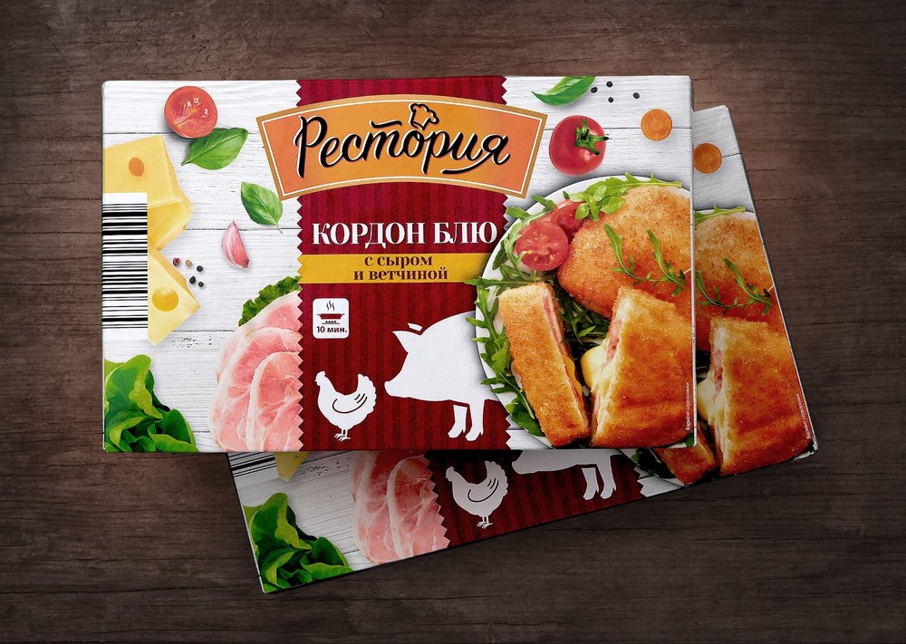
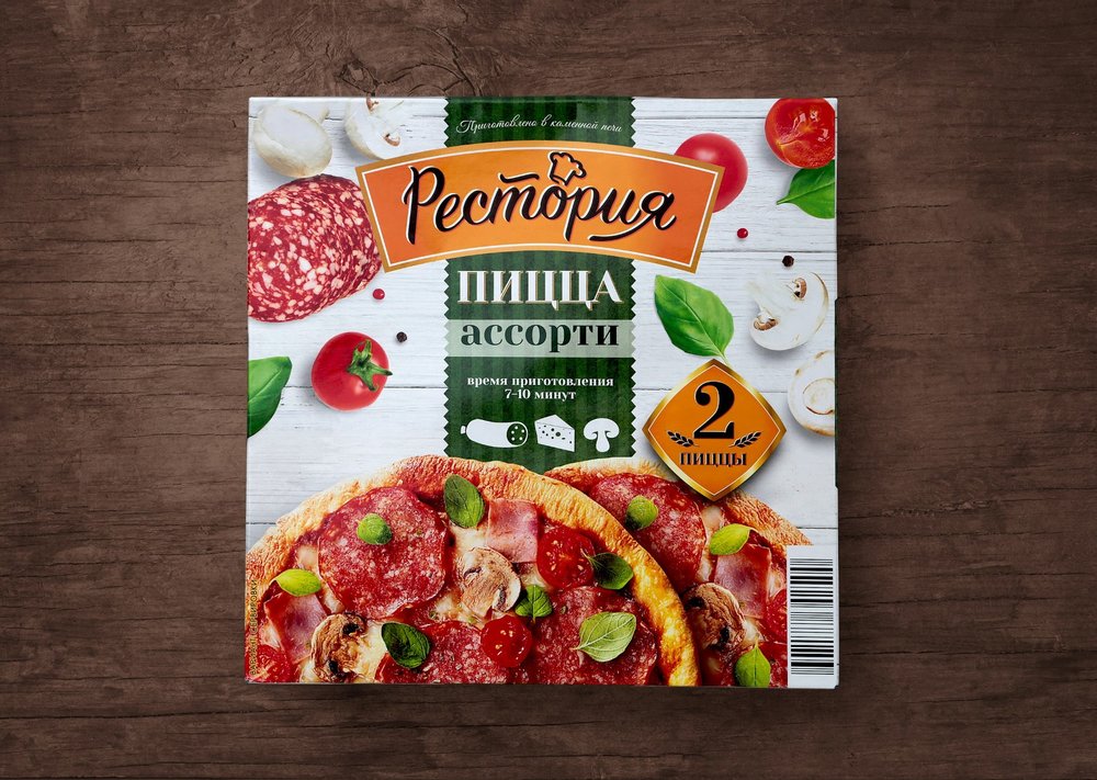
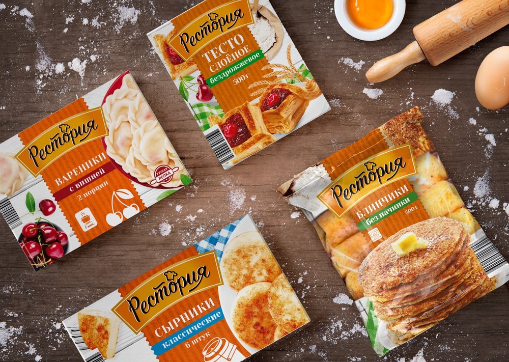
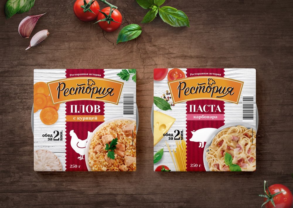
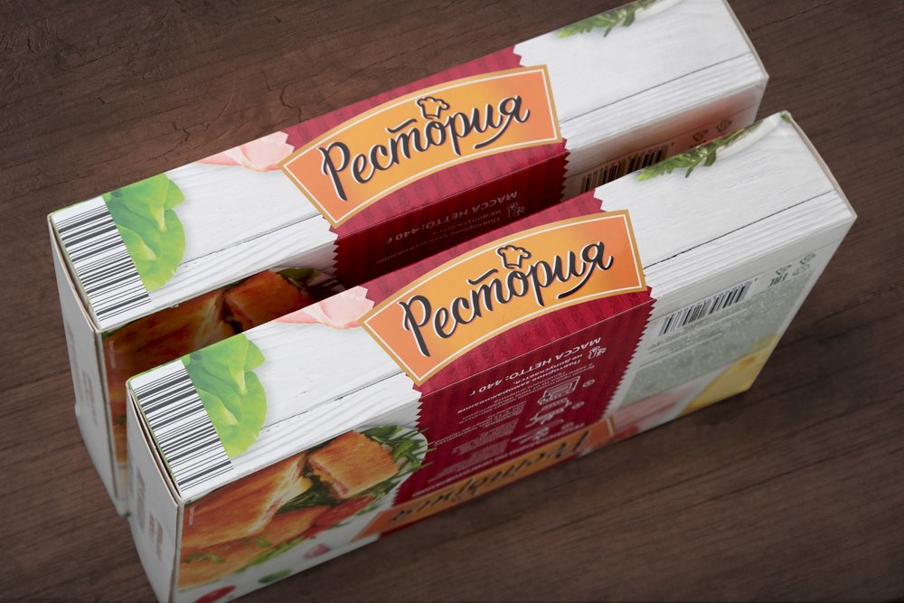
A new solution for “Restoria” trademark combines emotional and rational approaches. This is a story about a responsible approach to production with an image of a small family restaurant, where each customer is known. Light colors, wooden background textures and large photorealistic images of various products are not just a solution of a modern trend, but a detailed story about the main ingredients and cooking methods: the packaging displays both detailed images of the ingredients and the final appetizing results.
The secondary visual elements also tell us the story. The central bright elements of the package include the name encircled by an oval with the darker edges and a color pattern to complement all informational details; combined they continue to tell “complex” story of production.
As a complement to a global history of the product, the display of the name as a unifed whole is just another logical factor – the laconic infographic drawings and icons tell about the basic flavors and the cooking methods.
Changes also occurred with the logo: in particular, the Latin script was changed to Cyrillic to become clearer and closer to the consumer.”
CREDIT
- Agency/Creative: Fabula Branding
- Article Title: Fabula Branding – Restoria
- Project Type: Packaging
- Format: Box
- Substrate: Pulp Carton


