Fable&Co. embarked on a global rebrand for Dalet; a leading technology business. Dalet empowers media-rich organisations to transform their production & distribution workflows, accelerating media operations, maximising collaboration & creating far higher value from content.
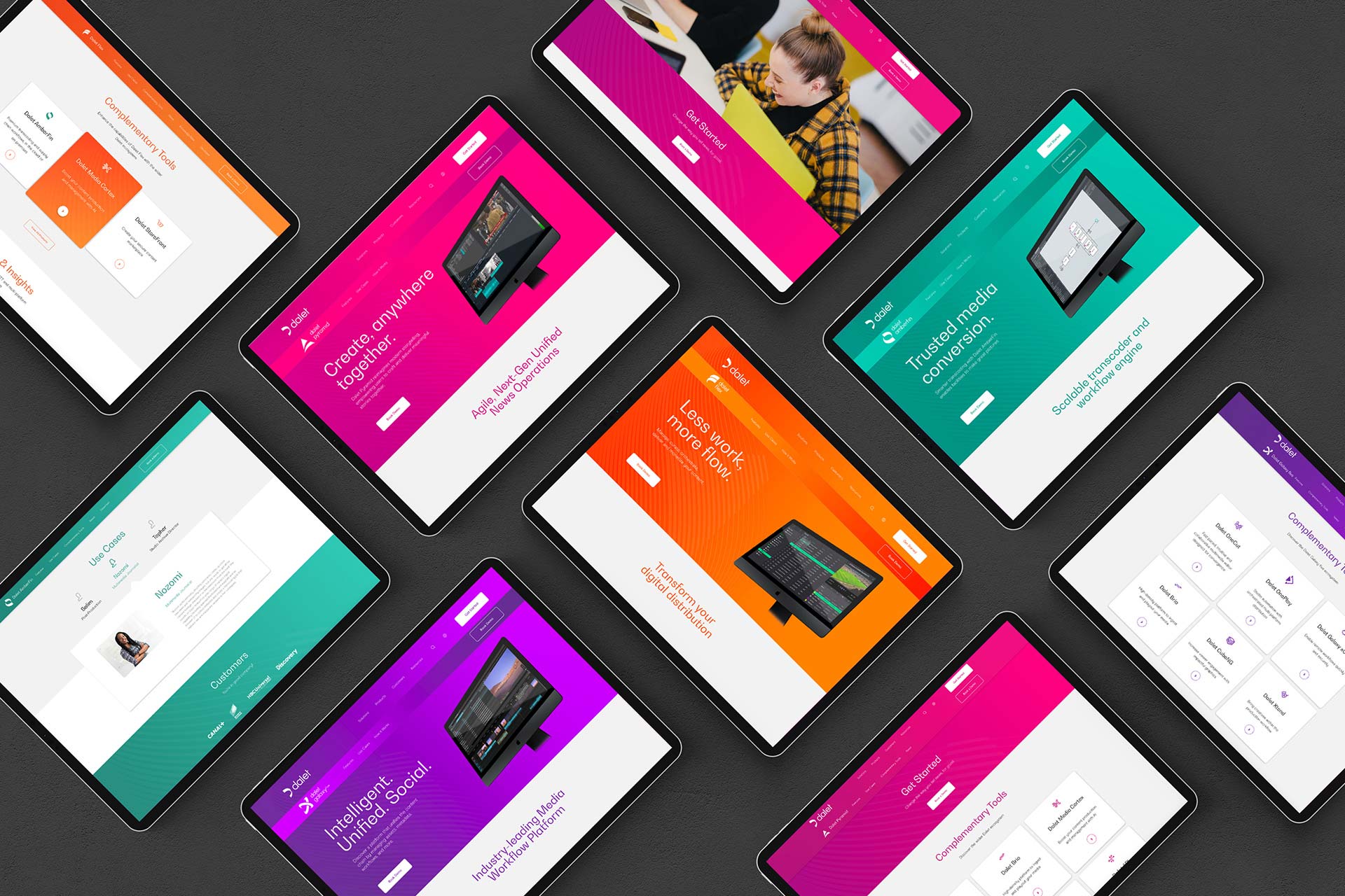
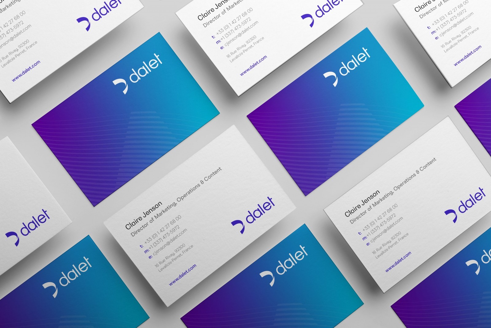
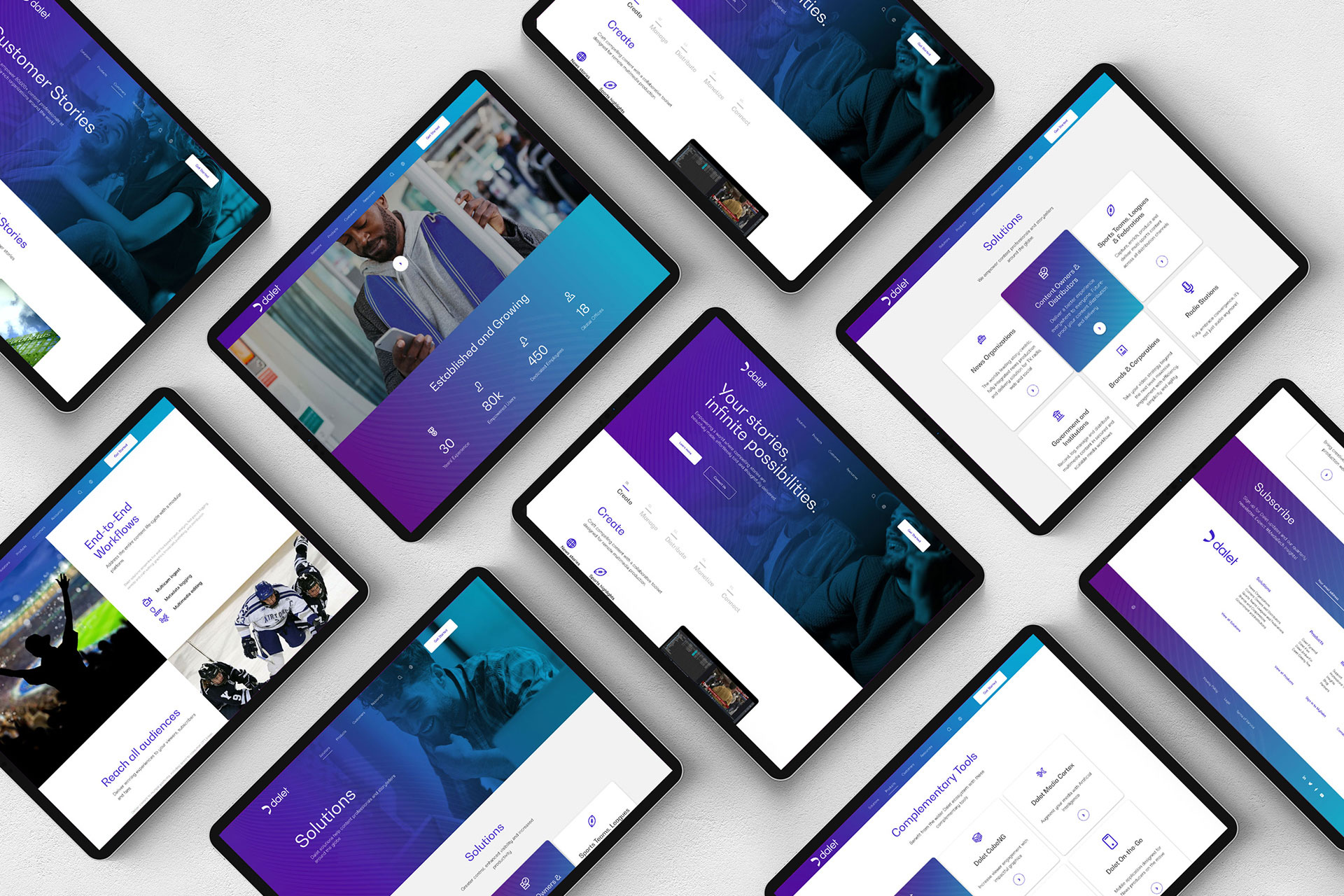
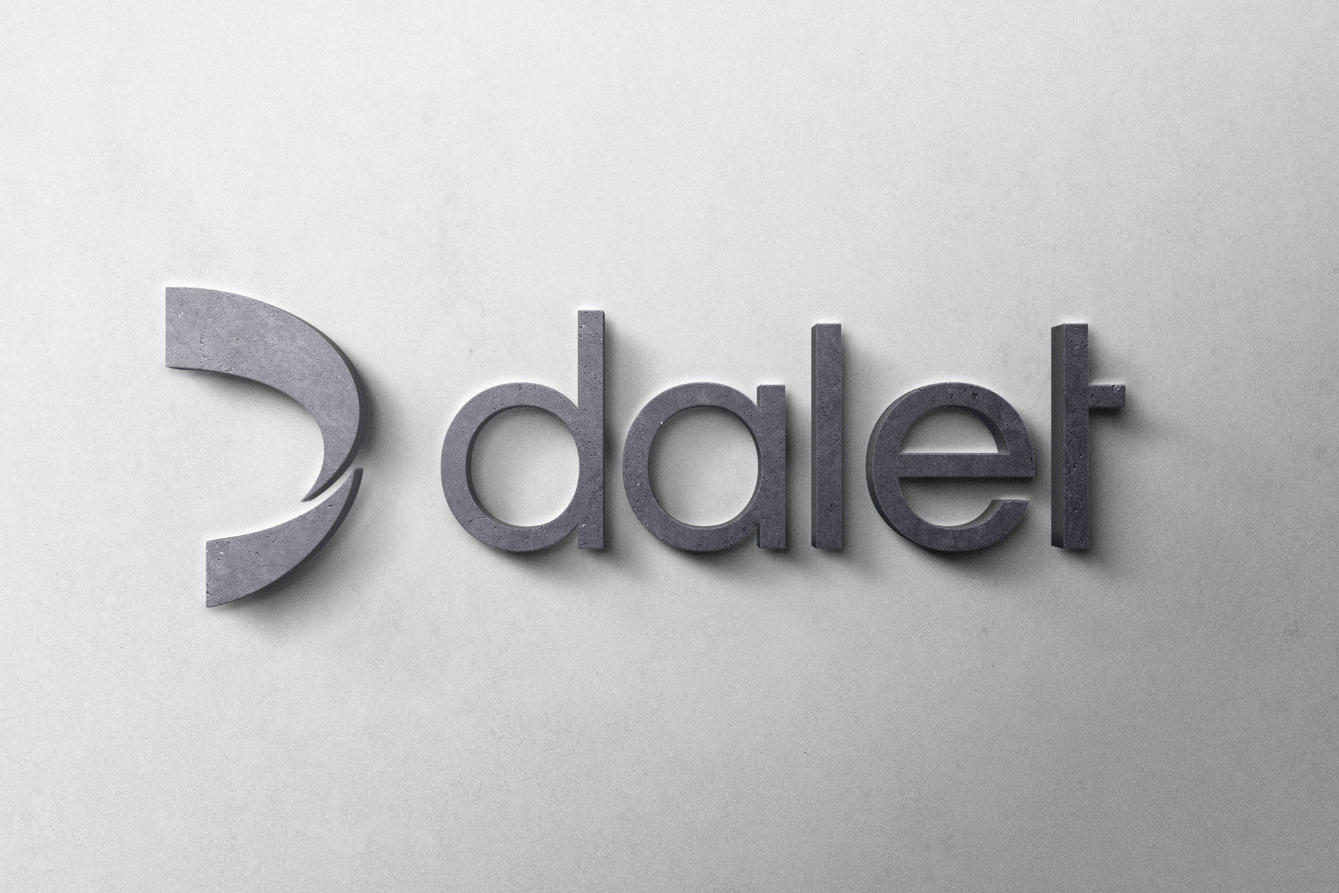
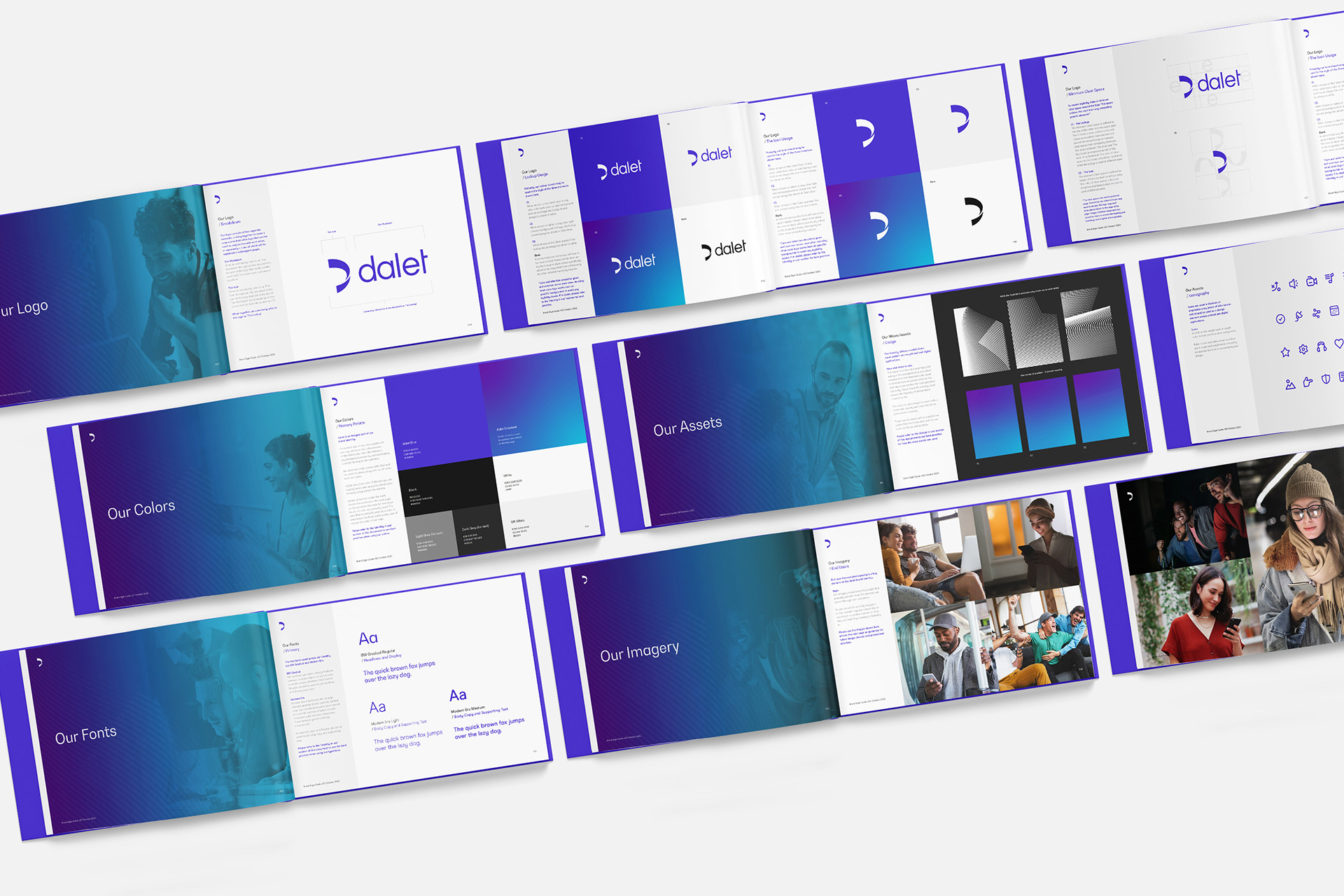
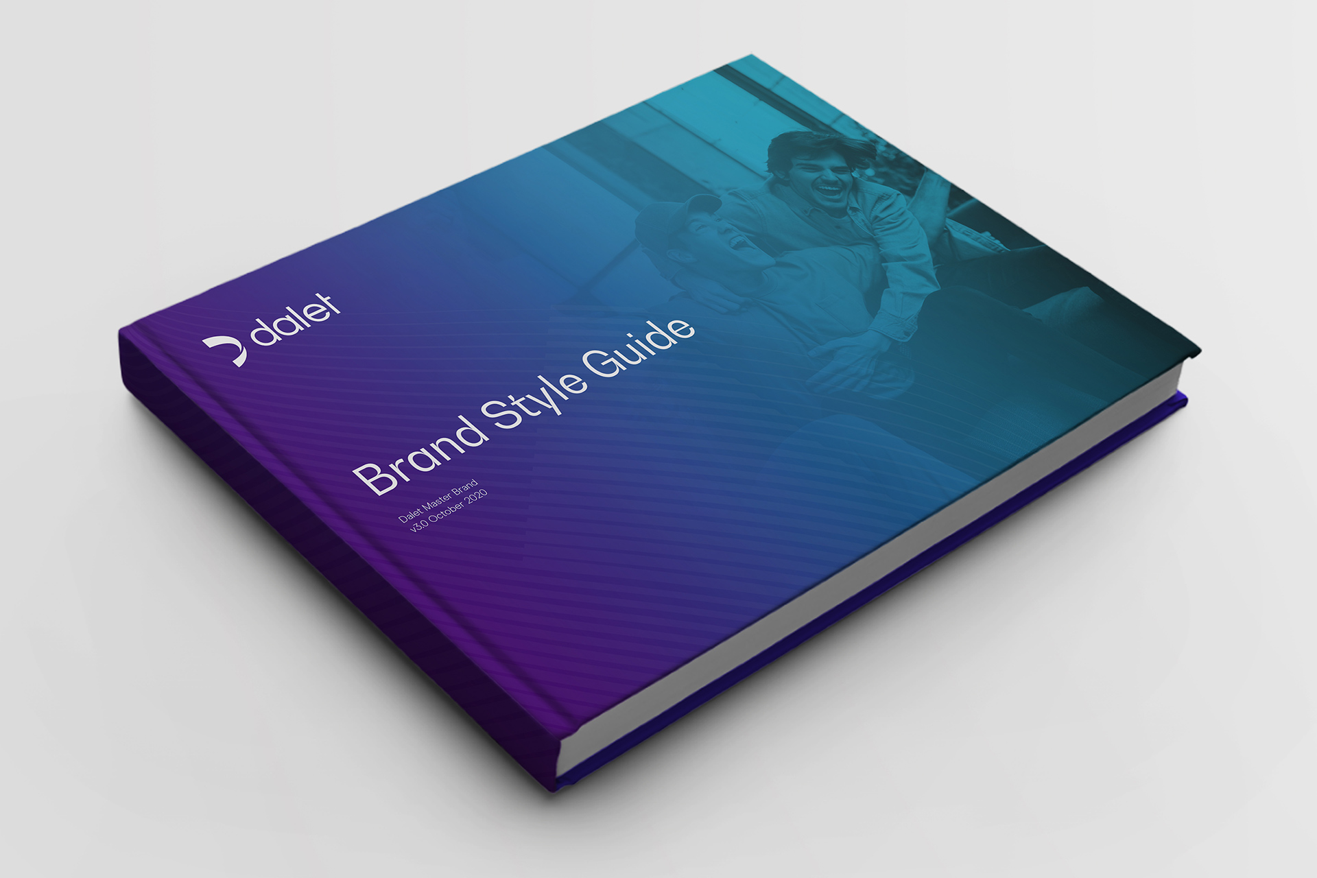
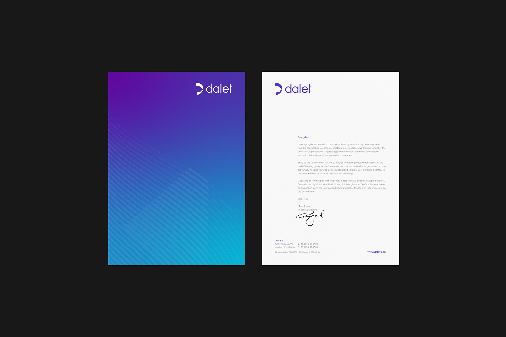
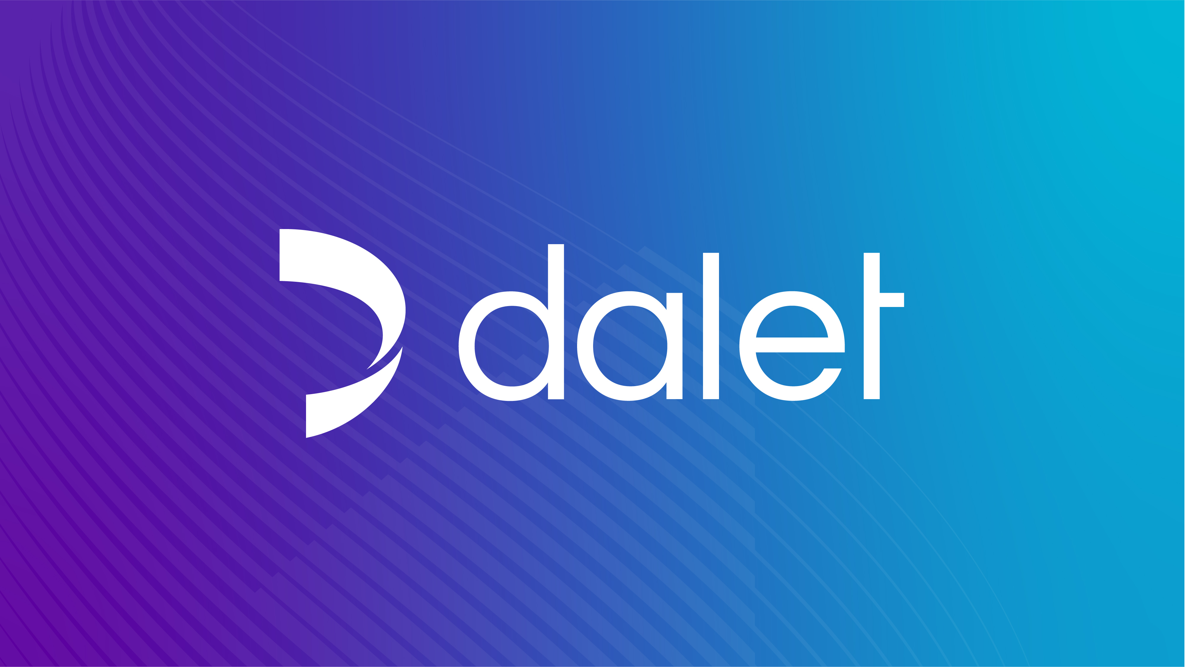
With strong strategic foundations set, Fable&Co. embarked on a comprehensive visual brand refresh with the team at Dalet. Formulating a new visual identity system with modernity, simplicity & efficiency at its core. The concept behind the new brand identity centred around motion, waves & signals, visually representing Dalet’s agility, flexibility, efficiency & speed. Rapid innovation means we depend less on satellite technology, but we continue to rely upon powerful signals to deliver content efficiently & effectively. Wave after wave of signal, traveling millions of miles in seconds to reach their unique destination.
Despite this complexity, it feels so effortless. In fact, it’s only when we experience a slight glitch in the matrix that we even know they’re there. We trust them to go about their job without fuss or disruption & simply deliver great stories.
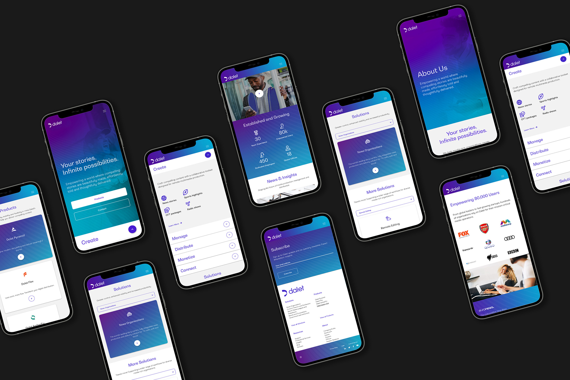
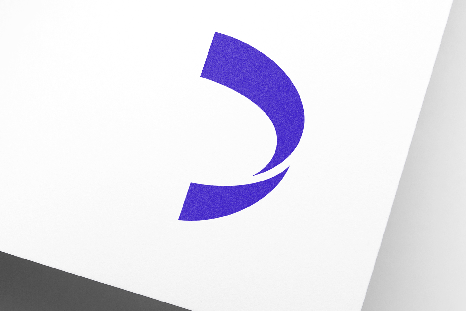
The fluidity of the new logo icon, coupled with the effortless flow of the new wave asset & soothing use of colour gradients used throughout the new brand identity created a strong sense of efficiency, effortlessness & motion.
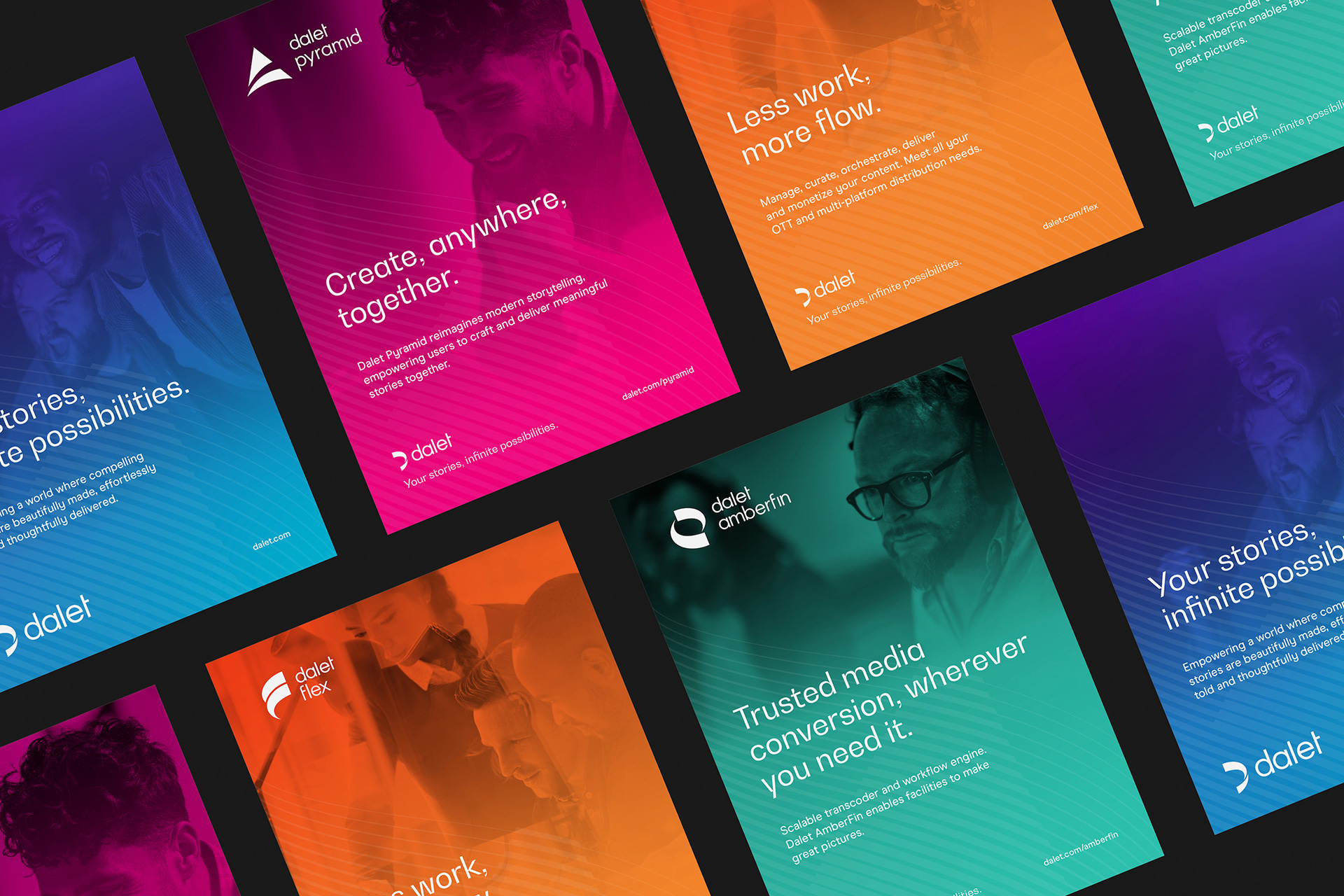
A careful balance of imagery demonstrated product features & technical expertise, with humanity & personality – creating tiers of imagery that captured end-users, customers, products & industry sectors.
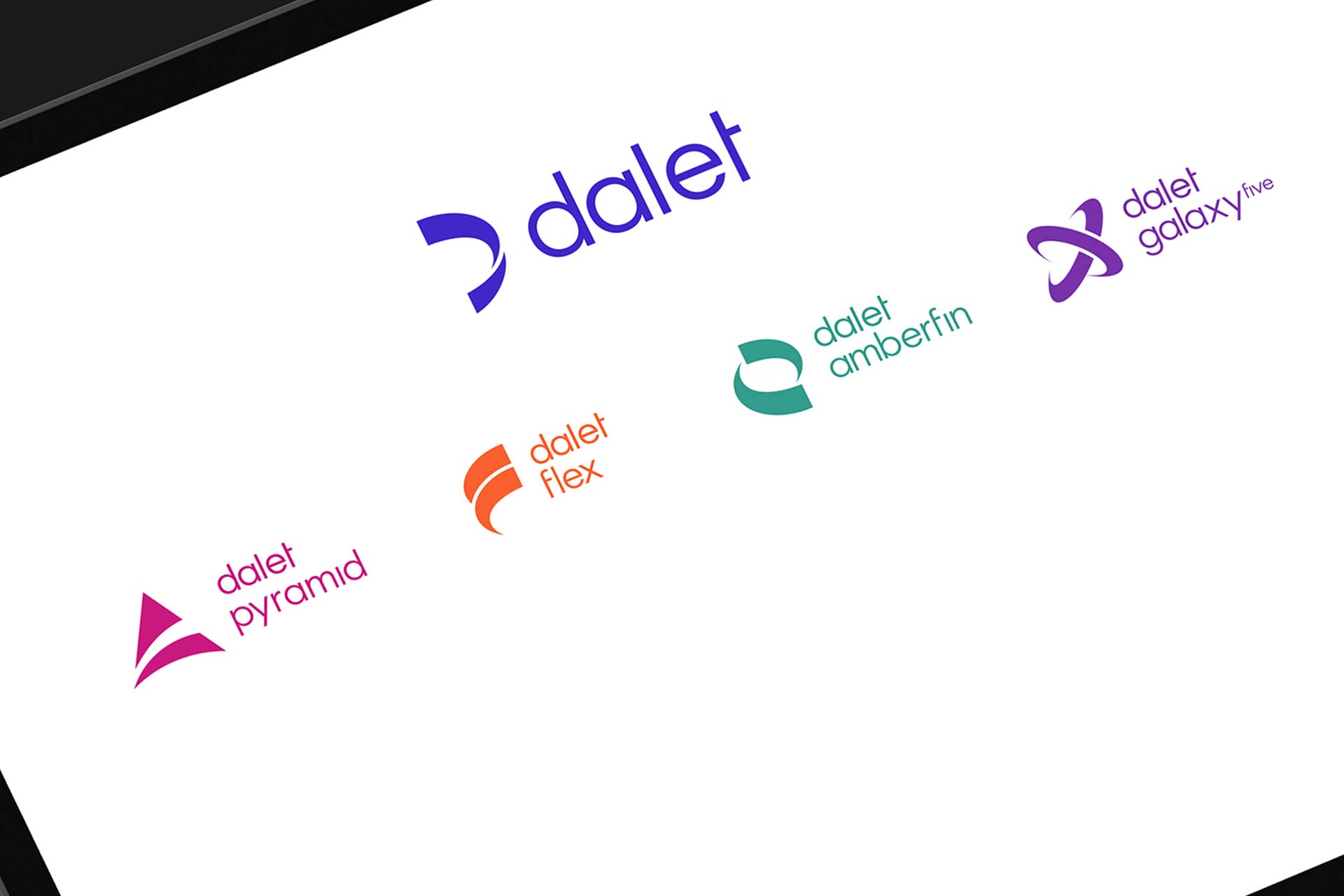
A consistent set of individual product brand identities were created to form a coherent & unified brand family. By conducting research with Product Managers & customers, we soon identified each of the products different audiences, benefits & capabilities.
We then set about simplifying & harmonising their offering, creating a brand family that ensured clear distinction between products, whilst visually part of the same coherent set.



CREDIT
- Agency/Creative: Fable&Co.
- Article Title: Fable&Co. Rebrand Global Technology Business
- Organisation/Entity: Agency, Published Commercial Design
- Project Type: Identity
- Agency/Creative Country: United Kingdom
- Market Region: Global
- Project Deliverables: Brand Advertising, Brand Architecture, Brand Creation, Brand Design, Brand Experience, Brand Guidelines, Brand Identity, Brand Redesign, Brand Refinement, Brand Rejuvenation, Brand Strategy, Brand World, Branding, Graphic Design, Identity System, Illustration, Photography, Product Architecture, Rebranding, Research, Structural Design, Tone of Voice
- Industry: Technology


