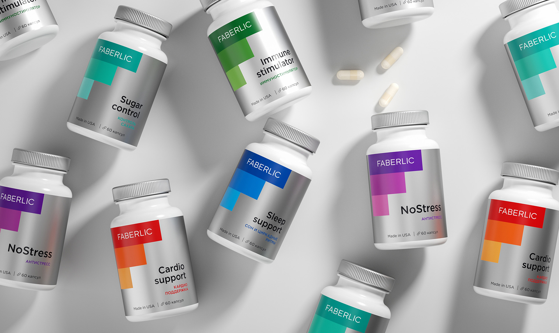
In the modern world, people are constantly exposed to the aggressive effects of external negative factors. Bad ecology, the busy rhythm of life in megalopolises or stresses lead to increased loads on the body. To normalize and improve the functional state of the body, supplements are used. These are tools that help us take care of our health.
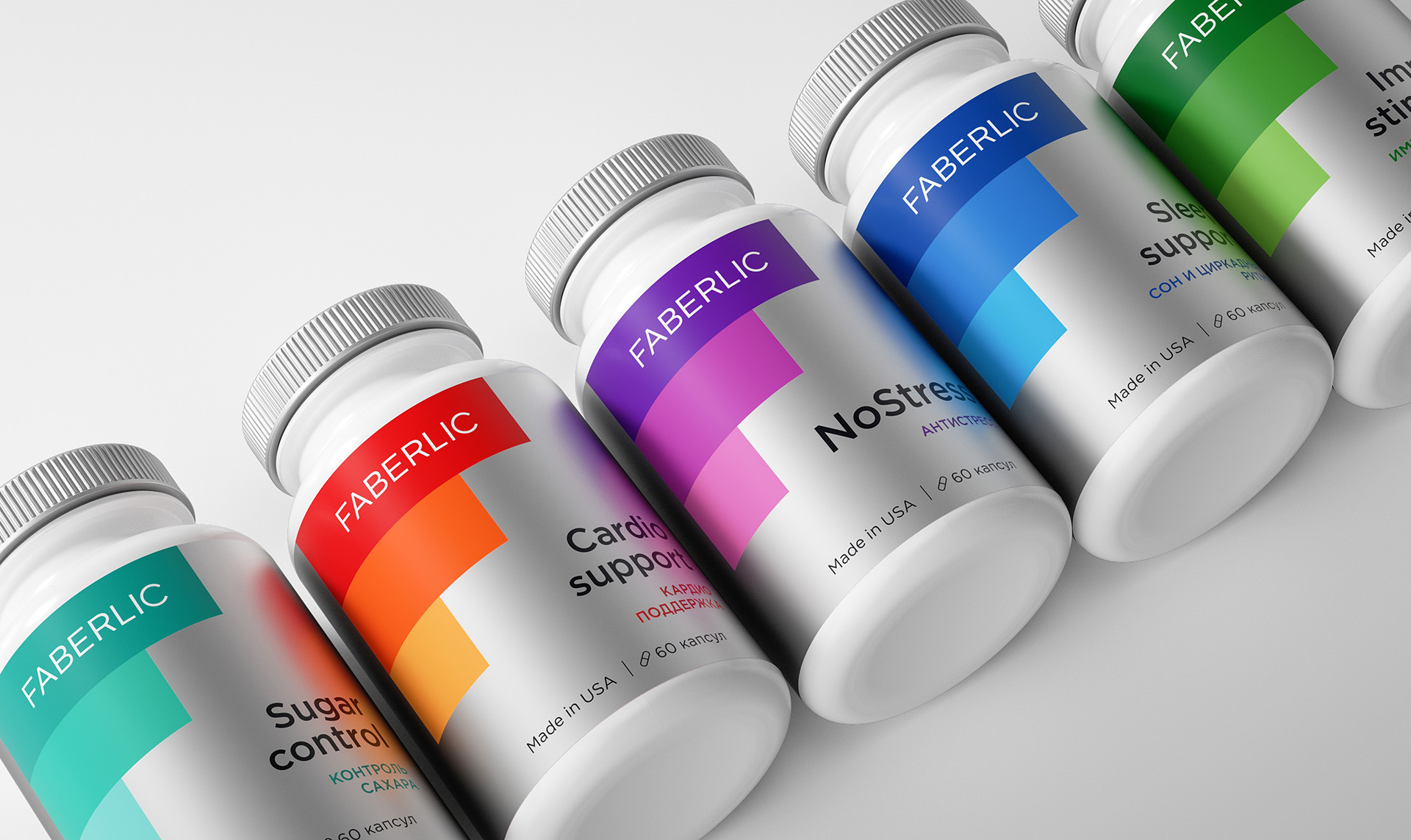
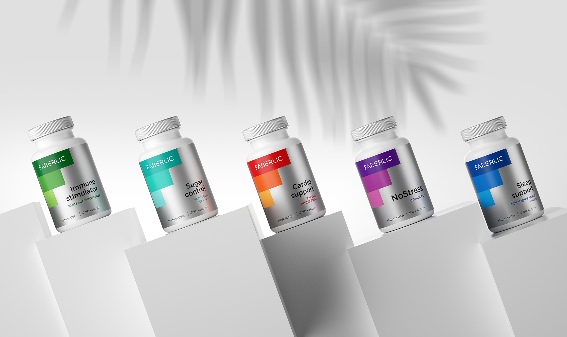
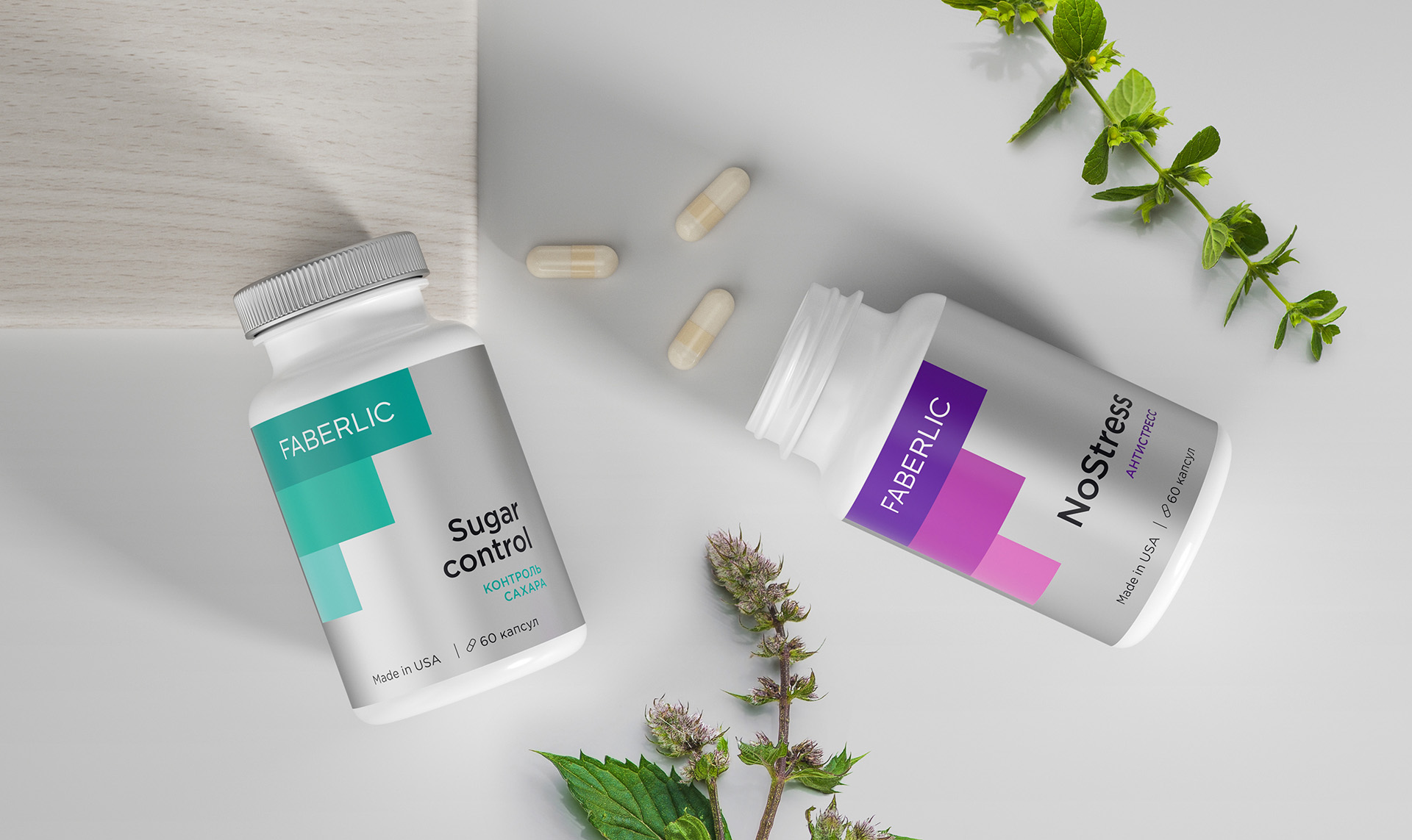
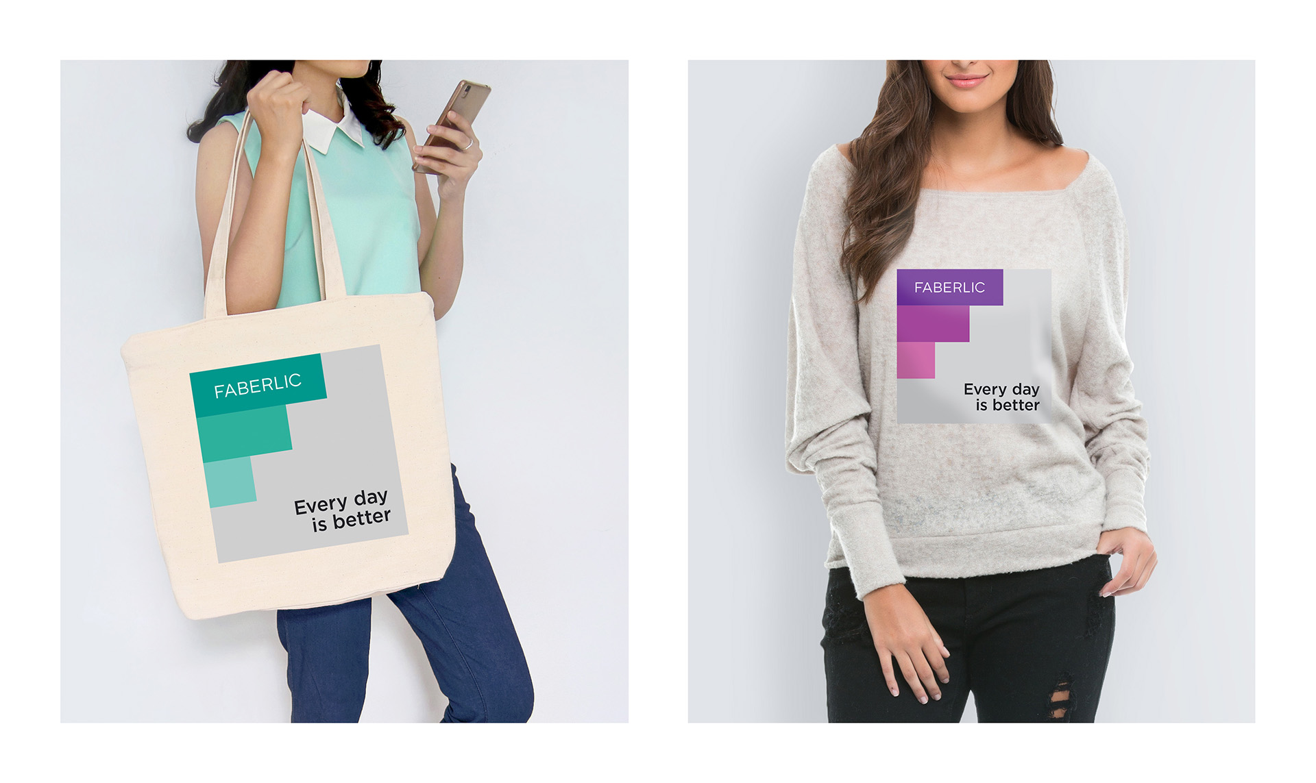
The main metaphor of this project has become the diagram of improving the well-being of a person with the use of supplements. Also, the main graphic element repeats the shape of the letter F – the first letter in the brand name.

CREDIT
- Agency/Creative: Dmitry Kultygin
- Article Title: Faberlic Supplements Packaging Concept
- Organisation/Entity: Freelance, Non Published Concept Design
- Project Type: Packaging
- Agency/Creative Country: Russia
- Market Region: Europe
- Project Deliverables: Graphic Design, Packaging Design, Research
- Format: Jar
- Substrate: Plastic
FEEDBACK
Relevance: Solution/idea in relation to brand, product or service
Implementation: Attention, detailing and finishing of final solution
Presentation: Text, visualisation and quality of the presentation


