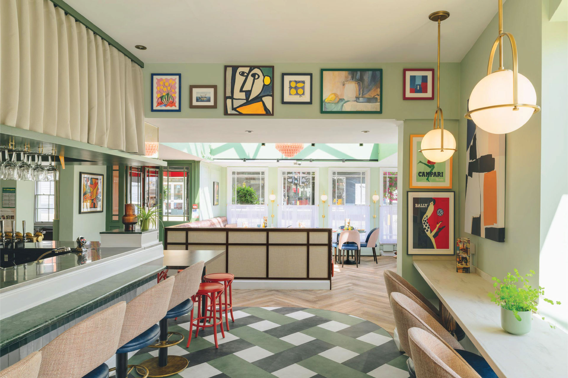
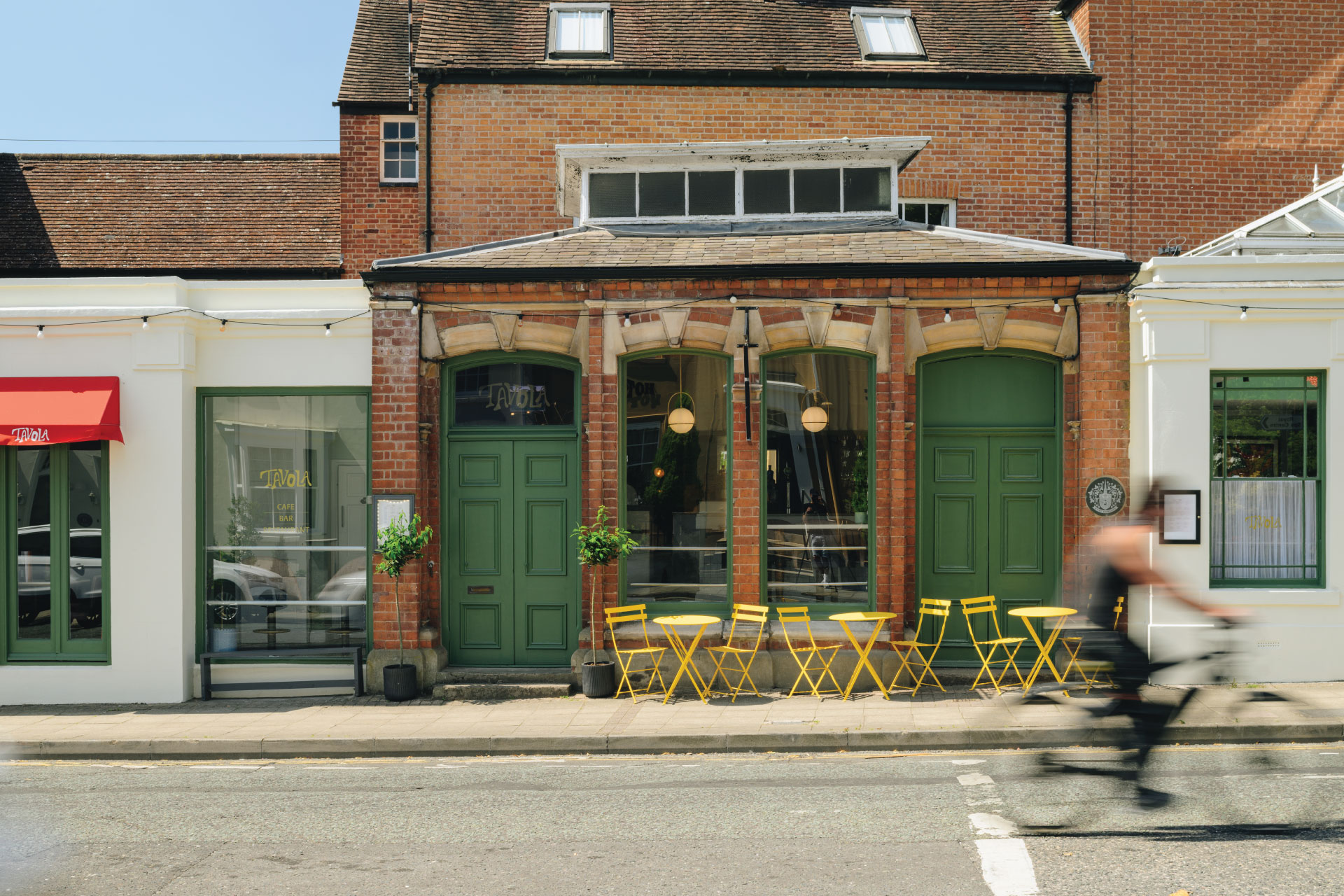
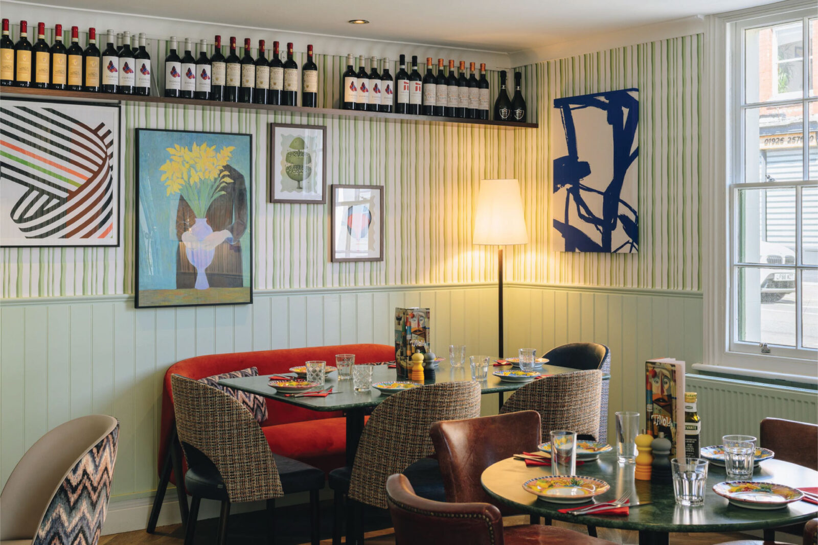
The design of Tavola is inspired by a menu that’s been described as ‘a love letter to Italian cuisine.’ Housed in a two-hundred-year-old building in Royal Leamington Spa, every detail of the eatery pays homage to the beautiful country (or ‘Bel Paese’ as it’s officially known…).
The client purchased the restaurant, which at the time had a generic name and lacked a clear point of difference, with a broad menu covering many different types of food. As a business it was failing, unable to penetrate the seemingly saturated local restaurant scene. The design brief focused on creating a clearly differentiated ‘experience’, to be built around a smaller menu of freshly prepared dishes.
The design team undertook a market analysis to establish any potential unmet needs in the local area. It became apparent that high quality Italian cuisine was lacking, with only a small number of Italian chain restaurants devoid of character, quality and authenticity.
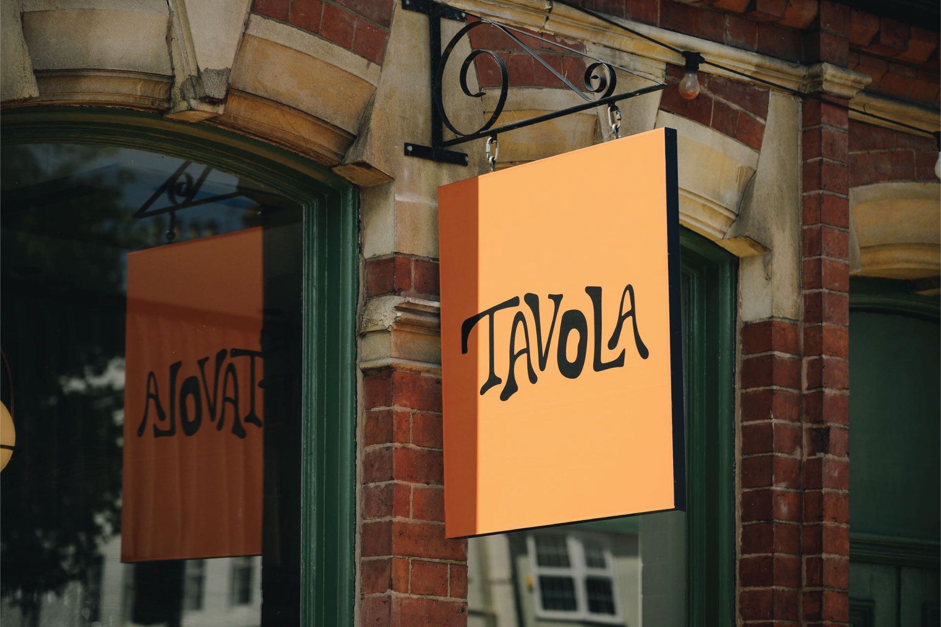
Having defined the type of restaurant this would be, attention was given to naming. The brief for the name focused on communicating individuality, the anti-thesis of the branded chain restaurant. The chosen name, Tavola, means table in Italian. It is simple and direct, referencing the important Italian tradition of gathering around the family dining table.
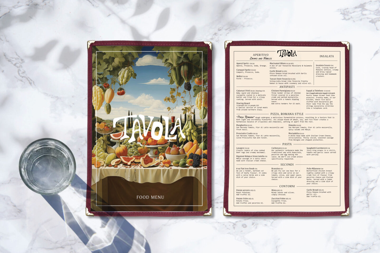
Tavola would be a celebration of creativity and imagination—no more so than in Tuscan chef Martin Serafino’s menu which takes diners from pastries at breakfast through to ‘aperitivo’ or a three-course meal for dinner. Offering a blend of tradition and innovation, the dishes are perfectly complemented by an exciting array of drinks (courtesy of mixologist Luke Hampson).
The identity for Tavola was built around the idea of individuality and creativity. Celebrating imperfection, the focus is a hand drawn brand mark conveying ‘the signature of the artist’. The designers resisted the urge to refine, relying on an instinctive response to express these values.
The expression of the brand took many forms, with the ultimate aim to create an immersive and emotionally engaging experience for diners.
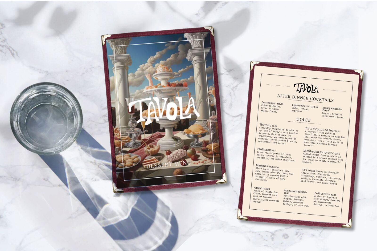
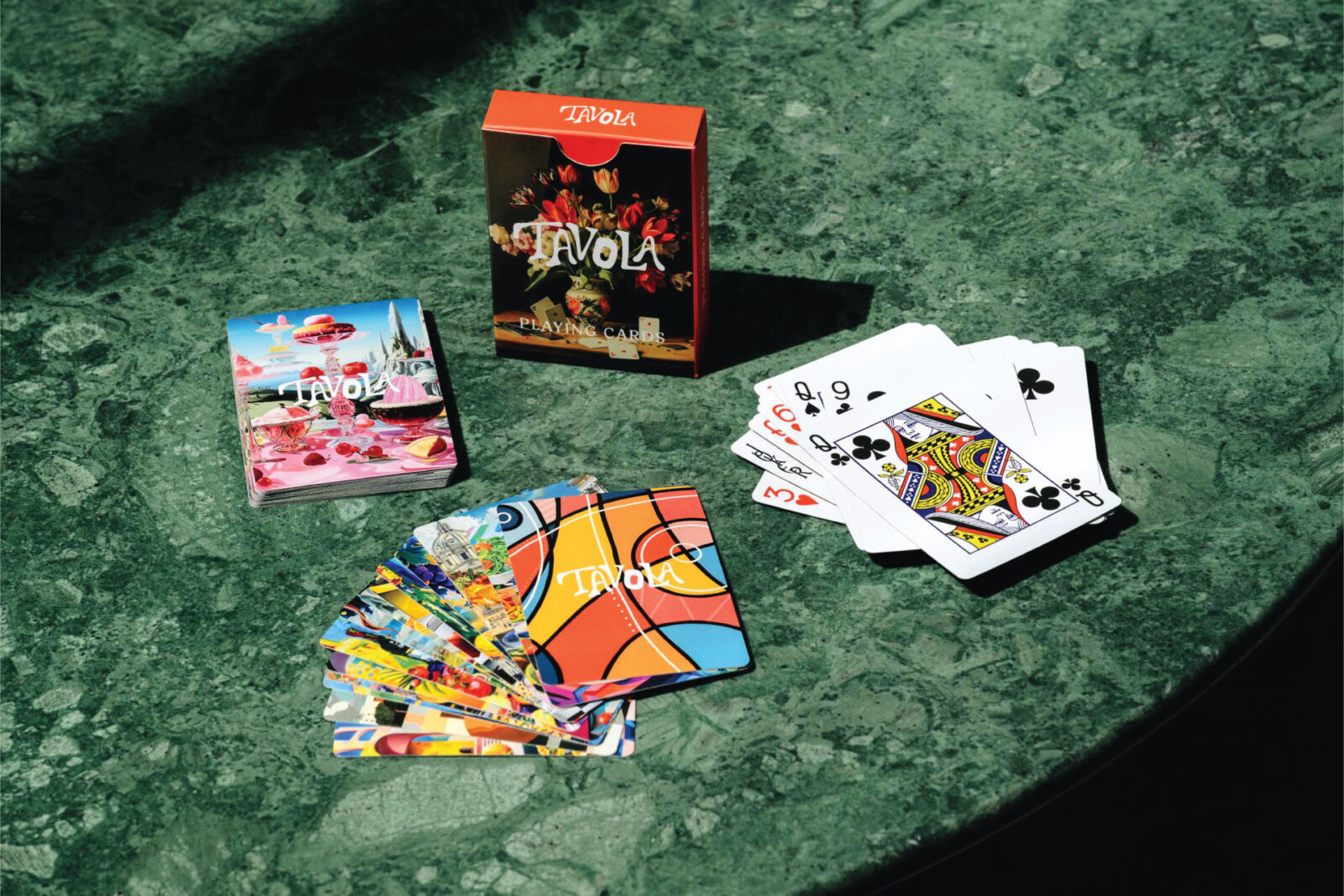
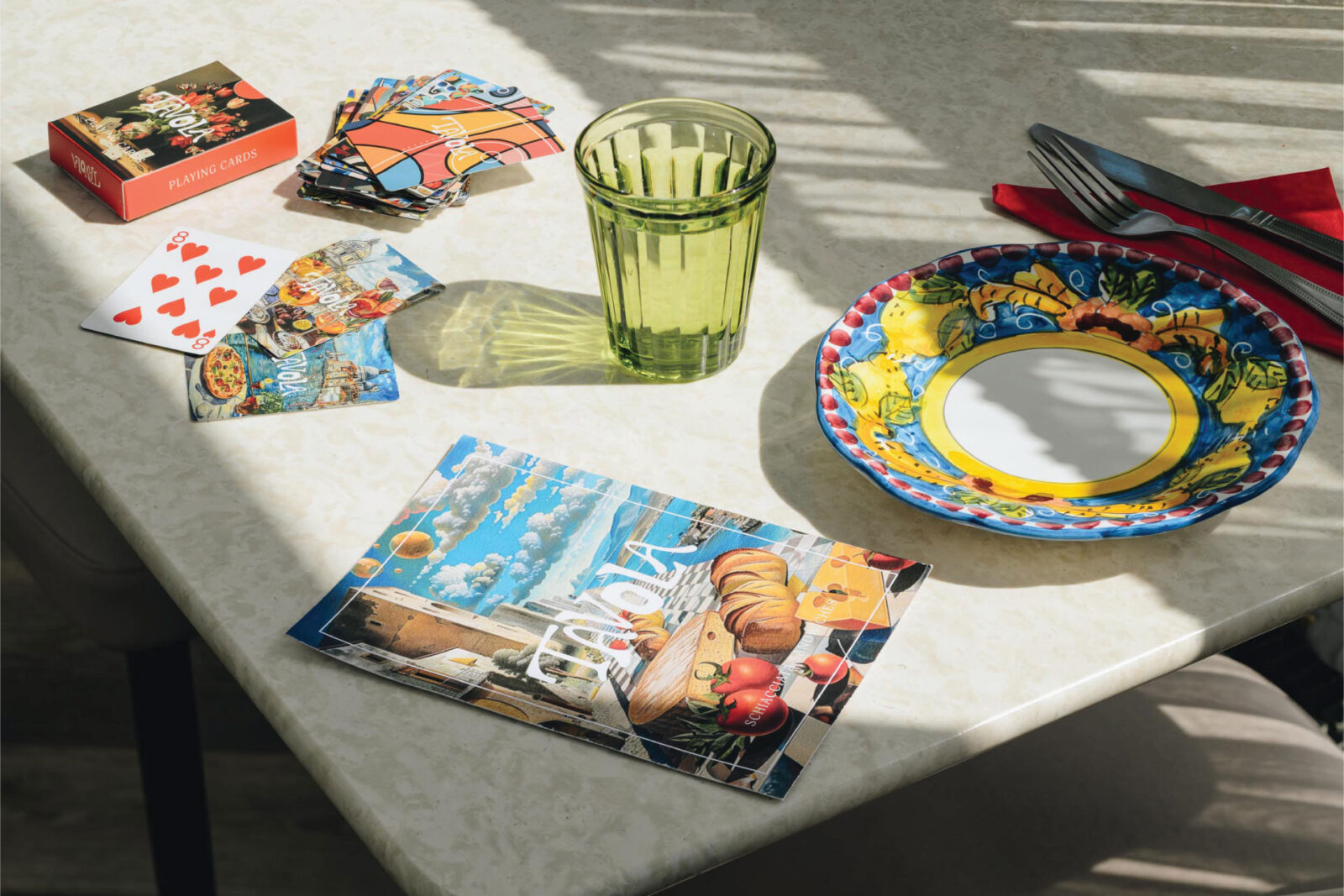
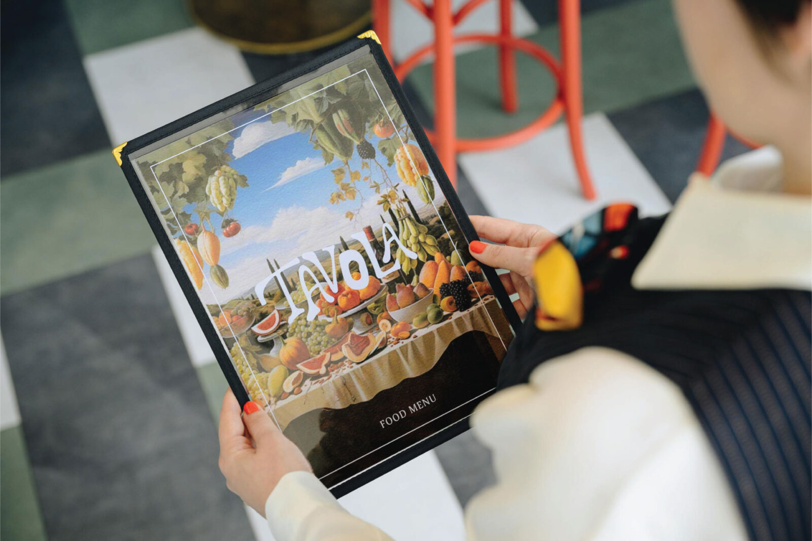
The different menus for food, desserts and drinks each feature a unique illustration, inspired by the Italian surrealists of the 1920s. Every touch point has been considered, including a pack of playing cards, given to customers free of charge to encourage them to feel at home, spend time around the table with friends and family – each card features one of 26 custom illustrations, referencing the familiar typology of playing card graphics but with a surrealist twist.
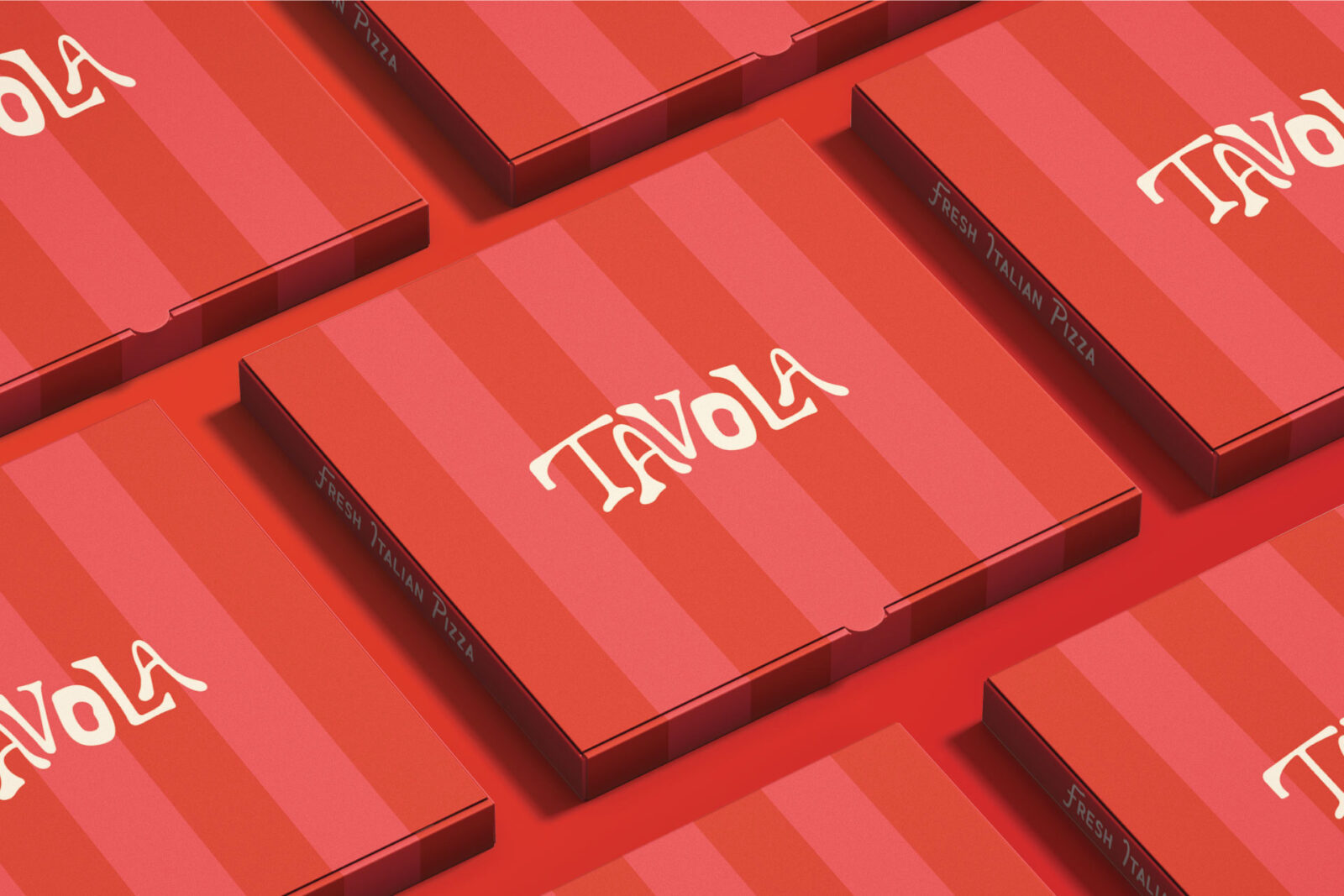
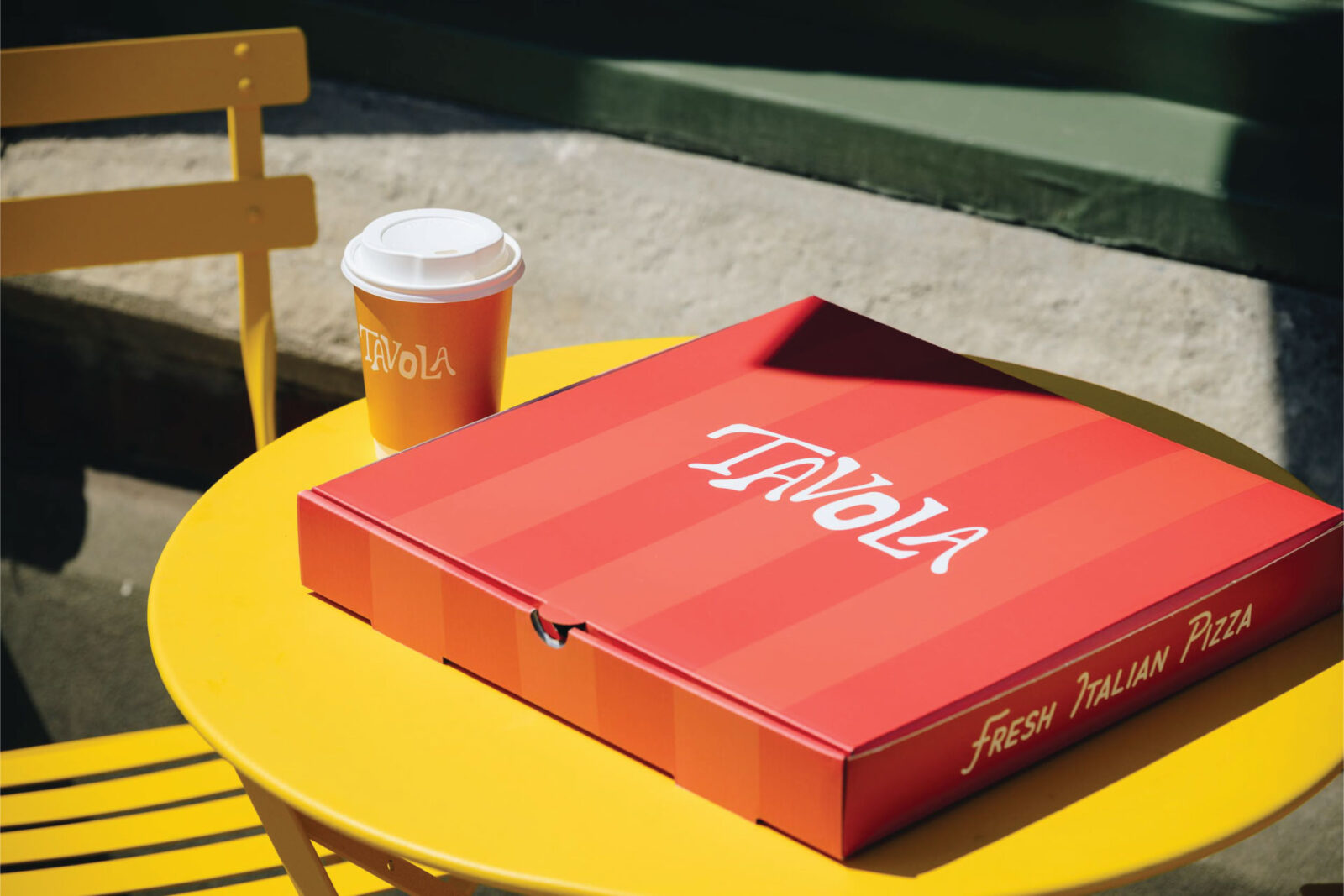
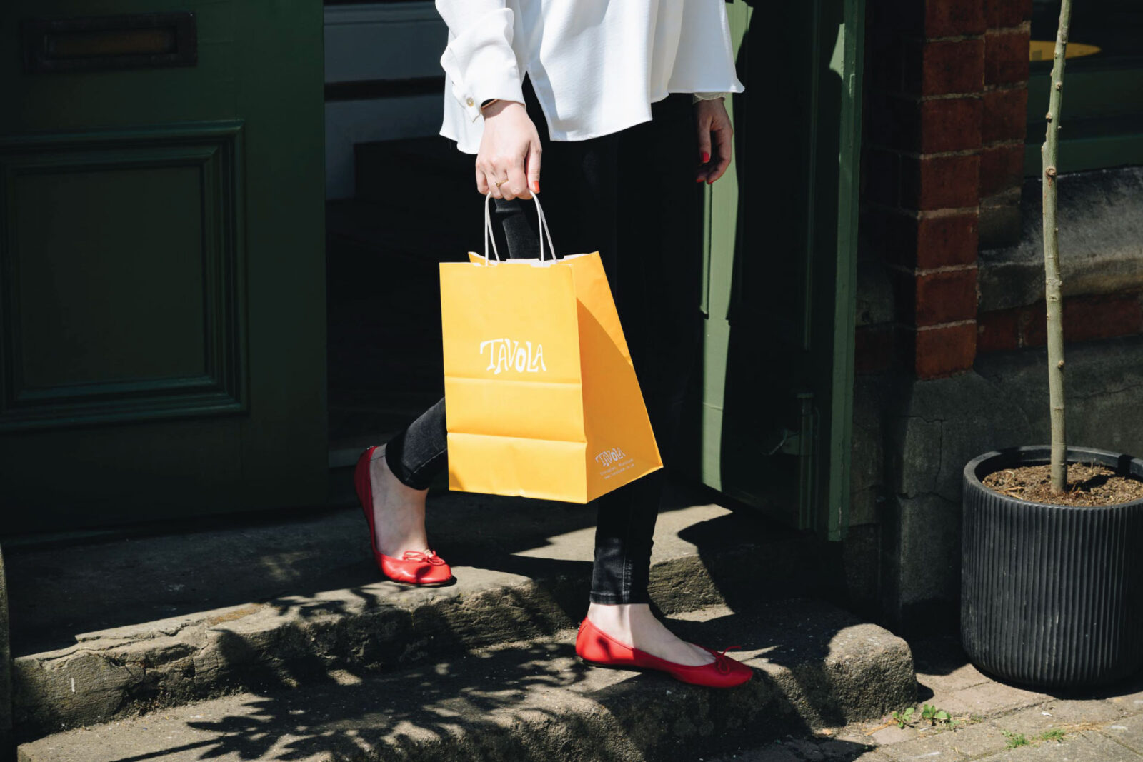
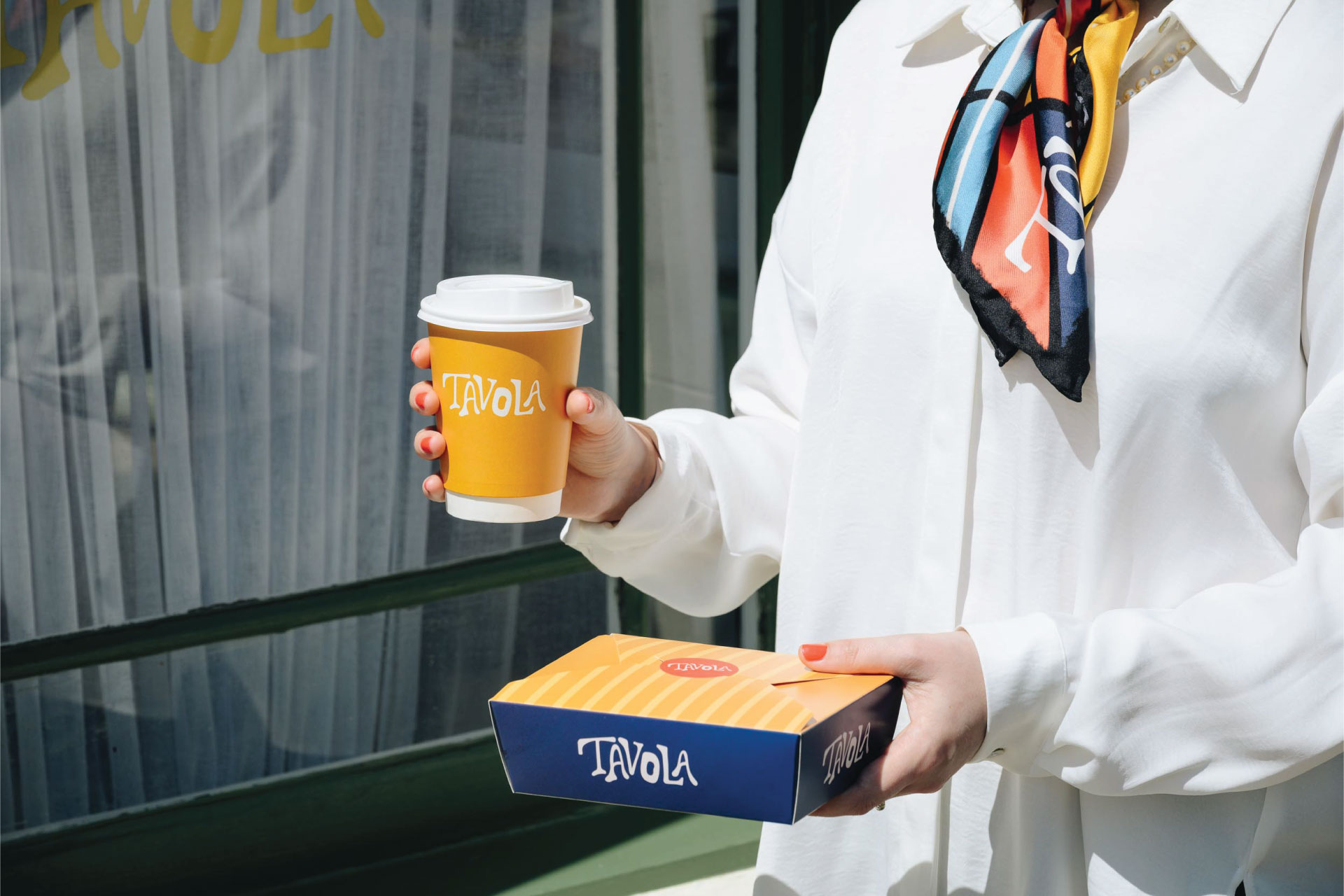
Takeaway packaging is bold and colourful, providing differentiation and visual recognition as people walk around the town. For home delivery, customers receive ‘a little piece of Tavola’ – taking the experience beyond the four walls of the restaurant.
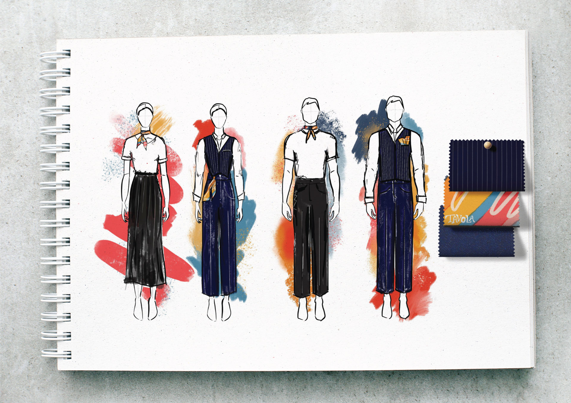
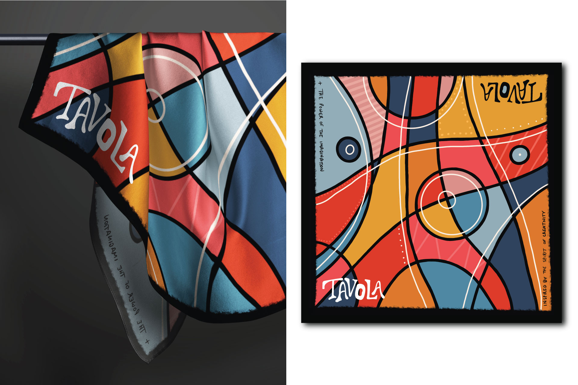
Staff uniforms were a key part of the design, to become an extension and expression of the values of the brand. Built around a custom silk scarf, allowing staff members to ‘wear it their own way’ – as a neck scarf, or perhaps tied around a belt buckle, or worn as a pocket square in the custom designed waistcoats. The scarf provides a moment of recognition and consistency, yet encourages individuality.
The outcome of all of this work is to immerse diners into a seamless experience. From the music playing, to the interior décor, alongside all elements of the brand – a distinct identity, with a clear positioning and expressed point of view. From a commercial perspective, the rebrand and redesign has transformed the finances of the business, creating a viable and prosperous independent restaurant.
CREDIT
- Agency/Creative: Faber and Company
- Article Title: Faber and Company Brings Surrealist Charm to Tavola’s Italian Brand Design
- Organisation/Entity: Agency
- Project Status: Published
- Agency/Creative Country: United Kingdom
- Agency/Creative City: London
- Industry: Hospitality
- Keywords: WBDS Agency Design Awards 2024/25 , restaurant branding, restaurant identity, restaurant graphic design, takeaway food packaging, staff uniform design
- Keywords: WBDS Agency Design Awards 2024/25 restaurant branding, restaurant identity, restaurant graphic design, takeaway food packaging, staff uniform design


