Background
It was a new mints product under the Extra brand called 雪融 (Snow Melting), which was generated from the insight that consumers were overwhelmed by the rising pressures, and sought for something sweet and chewy to relax in daily life.
To catch the good momentum of first launch, brand wanted to upgrade this product, as well as introducing lovely cartoon characters into the communication to dial up the connection with consumers.
Design considerations
Prior to jumping into the design, we worked with client to redefine the keyword of this brand – the idea of “Snow melting”.
As the insight came from the very common anxiety of modern people. The pressure generated by daily trivial matters was just like a snowball, and as time pass by, the pressure was getting bigger and bigger. Our brand wanted to be the key to melt the snowball!
Design solution
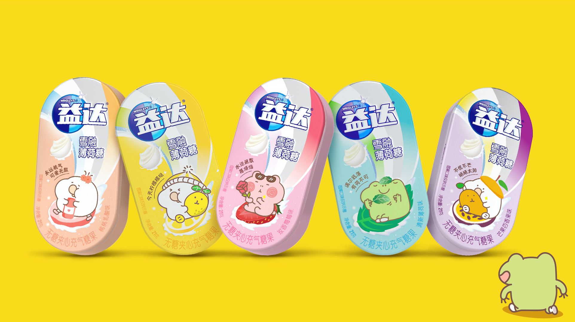
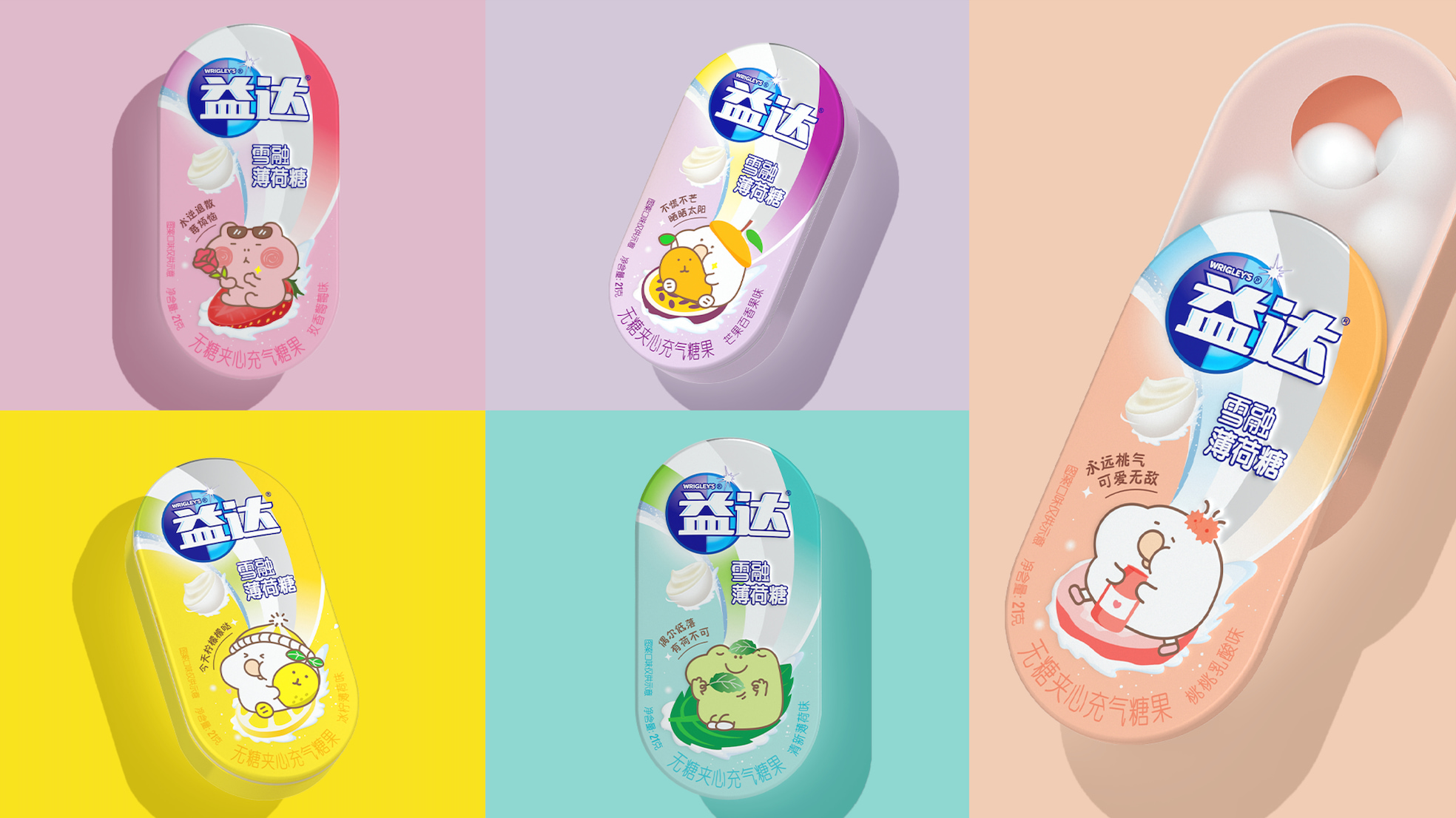
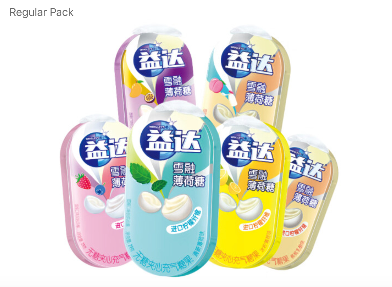
As the product has only been on the market for 2 years, we retained visual assets of the brand that were most recognized by consumers – Extra logo and the swoosh behind it.
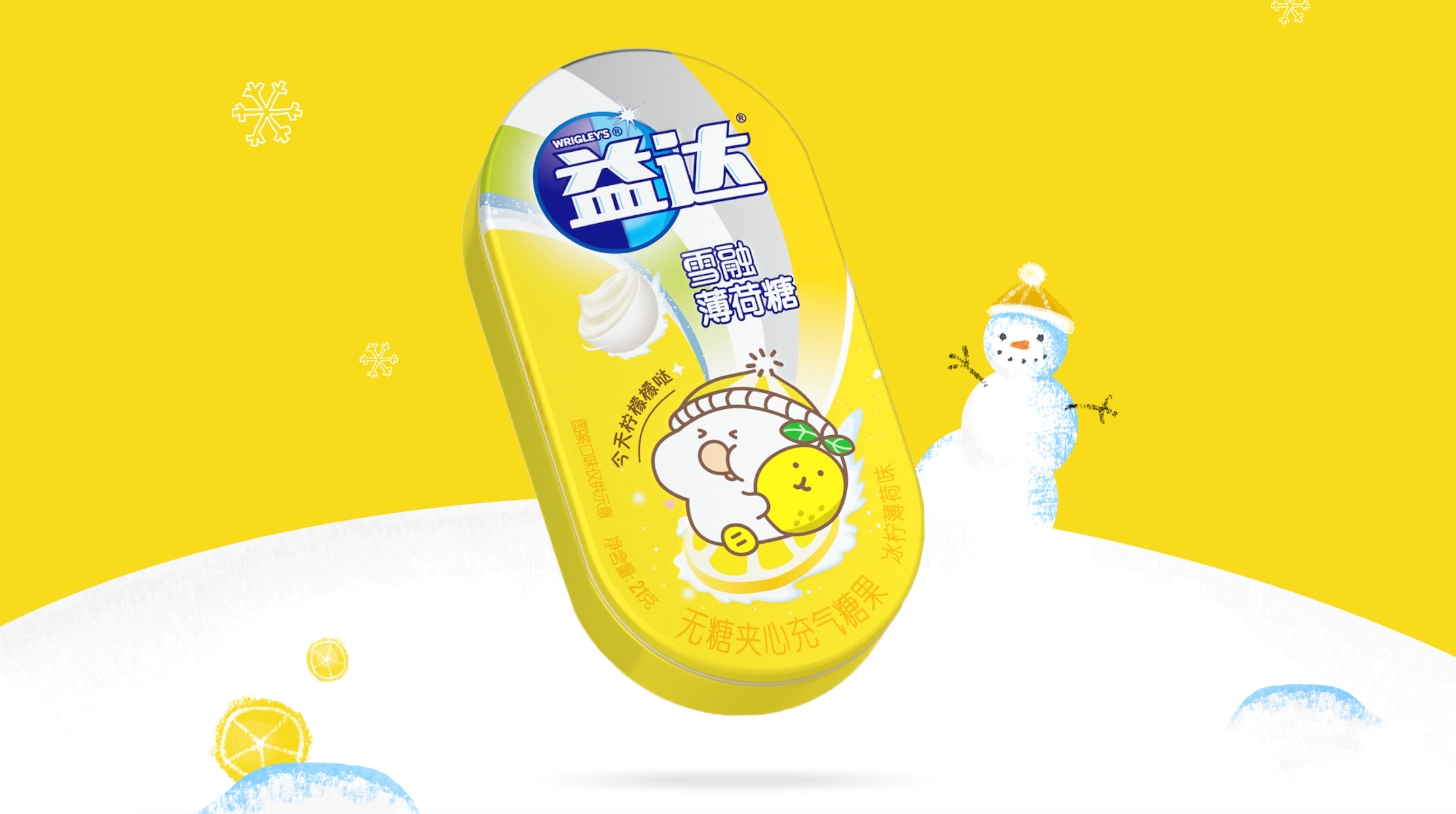
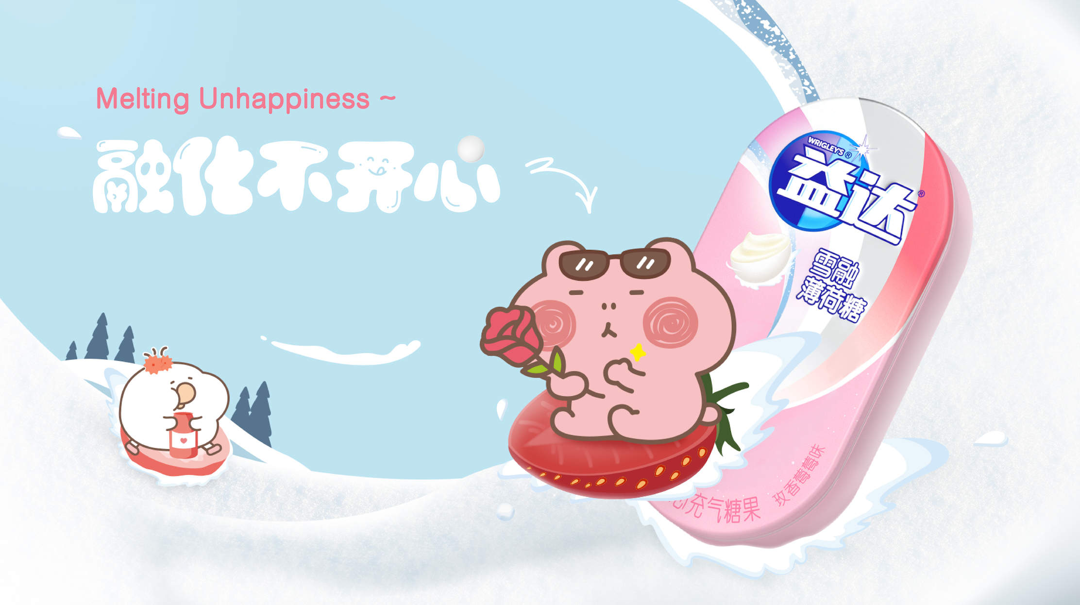
On top of it, lovely characters were introduced to build a story scene of skiing, to echo with the brand idea, which also naturally leaded the swoosh to evolve into the ski track, as a part of the skiing scene,
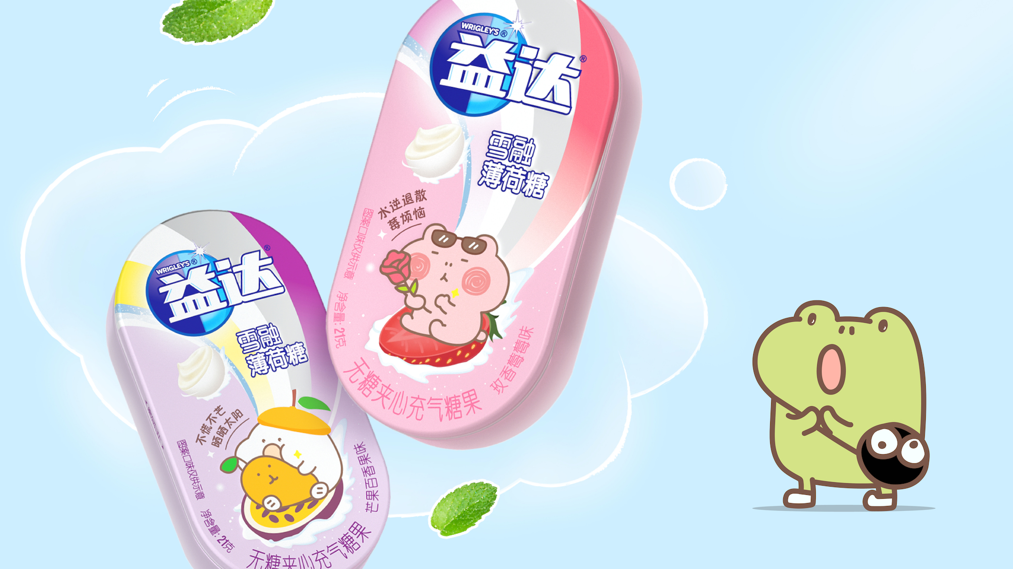
In the meantime, the flavor attraction was not diluted, lovely characters either playing with fruit or driving on it. Help them become part of the story.
We also created taglines for each flavor SKU, in a happy tone to become a cute combo!
So consumers would be amused while tasting mints, and have a joyful mood all day long.
The new packaging was revamped with more dynamic, retained and upgraded the brand’s visual assets, also enhanced the interaction between target consumers and the brand.
CREDIT
- Agency/Creative: ShinyBay Design
- Article Title: Extra Melty Mint Limited Packaging Upgrade
- Organisation/Entity: Agency
- Project Type: Packaging
- Project Status: Published
- Agency/Creative Country: China
- Agency/Creative City: Shanghai
- Market Region: Asia
- Project Deliverables: Packaging Design
- Format: Box
- Industry: Food/Beverage
- Keywords: WBDS Agency Design Awards 2023/24
- Keywords: Packaging Design, Product Redesign
-
Credits:
Design Agency: ShinyBay Design


