Sand Creative – Cinque. Five Grain Premium Lager
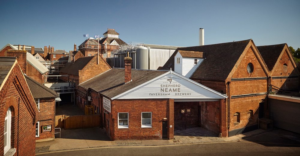
” Shepherd Neame has an established history of producing award winning lagers. They identified opportunities to extend their portfolio into the very top end of the lager market and produce an ultra premium lager.
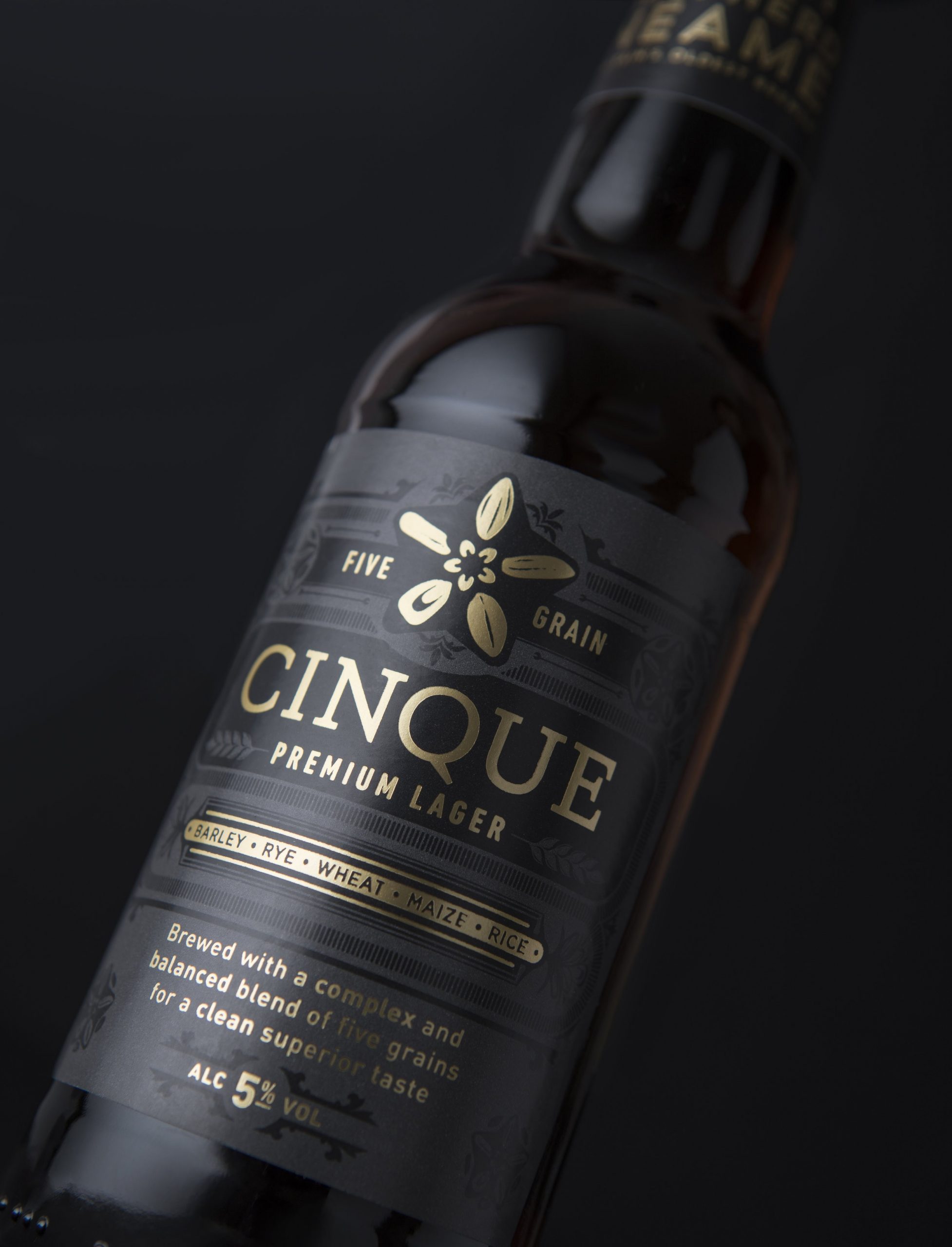
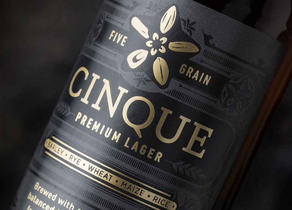
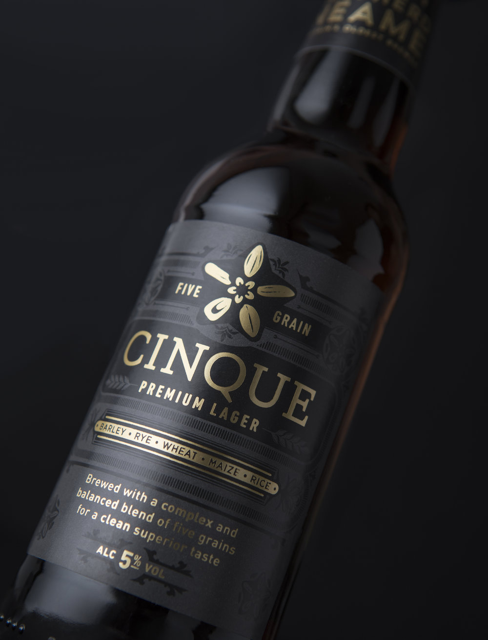
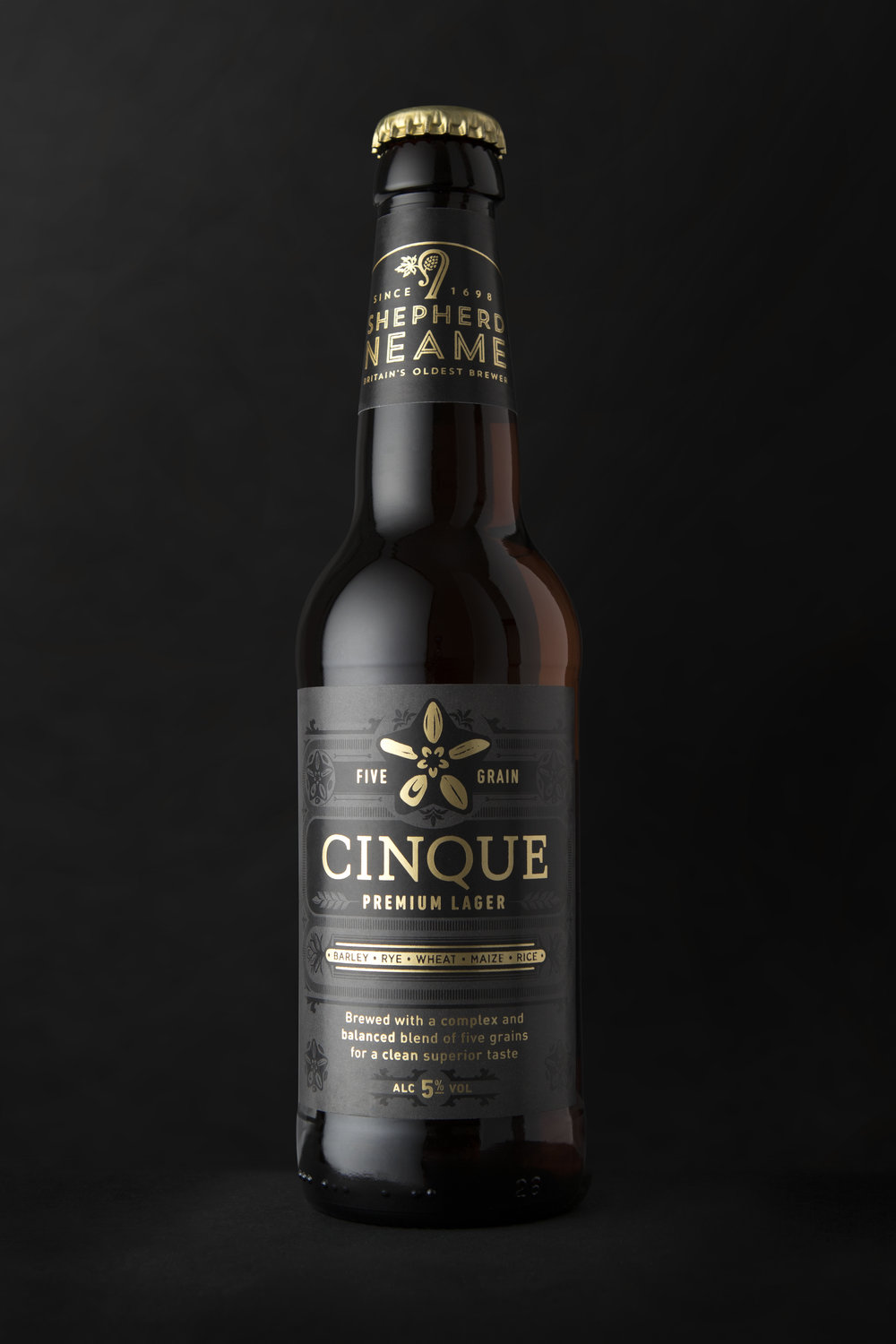
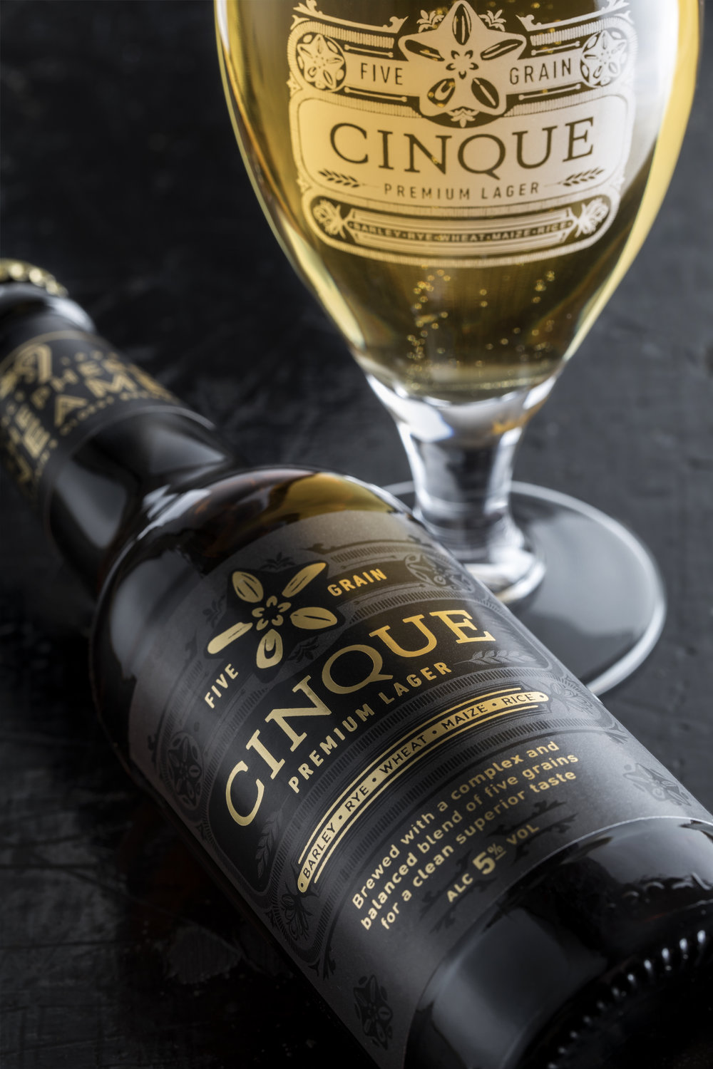
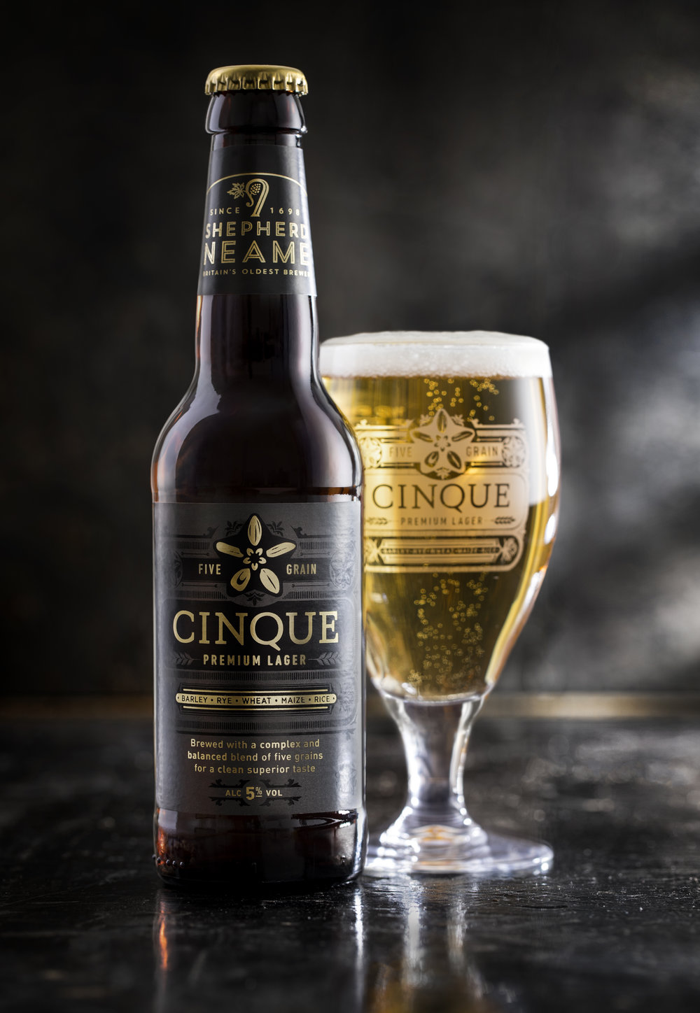
Cinque, five grain premium lager, combines Shepherd Neame’s brewers’ expertise with the finest quality ingredients, to offer this high end complex lager from Britain’s oldest brewer. Brewed with five different grains, a smoother beer has been created with a more complex flavour, making it unlike any other lager.
Cinque’s name derives from the Norman-French word meaning five and pays tribute to Shepherd Neame’s home town of Faversham, a member of the confederation of Cinque Ports. The Cinque Ports were established in the 12th century to maintain ships ready to defend the nation.
Sand Creative worked with Shepherd Neame initially with naming the lager and then creating the brand identity and packaging, including bottles, cans and secondary packs. Glassware, keg lenses and other barware followed. The design features a five grain motif of Barley, Rye, Wheat, Maize and Rice above the Cinque logo. The background shows a subtle black on black illustration representing a style found on old Cinque port documentation.”

CREDIT
- Agency/Creative: Sand Creative
- Article Title: Extend Portfolio for Ultra Premium Five Grain Lager, from Britain’s Oldest Brewer
- Organisation/Entity: Agency Commercial / Published
- Project Type: Packaging
- Agency/Creative Country: United Kingdom
- Market Region: Europe
- Format: Bottle
- Substrate: Pulp Paper


