


The Granolife Company has expanded its product portfolio with a line of muesli. The design was entrusted to the branding agency Ohmybrand that has been working with the brand almost since its launch.
Task: The company that started in 2017 with the development of granola recipes in a home kitchen has grown significantly. It has opened its own factory, established distribution, signed contracts with X5 Retail Group, Lenta, Magnit, DIXY and other retail chains, scaled the production and decided to enter related product categories. Thus a new line of muesli has been created.
The packaging for it was developed by the Ohmybrand team that had previously created the design of the main line. The project required, on the one hand, to differentiate the product, to focus customers’ attention on its novelty, to avoid confusing the new product with the main line of granola, and on the other hand, to maintain continuity and to remain within the recognisable style that is already beloved by customers.
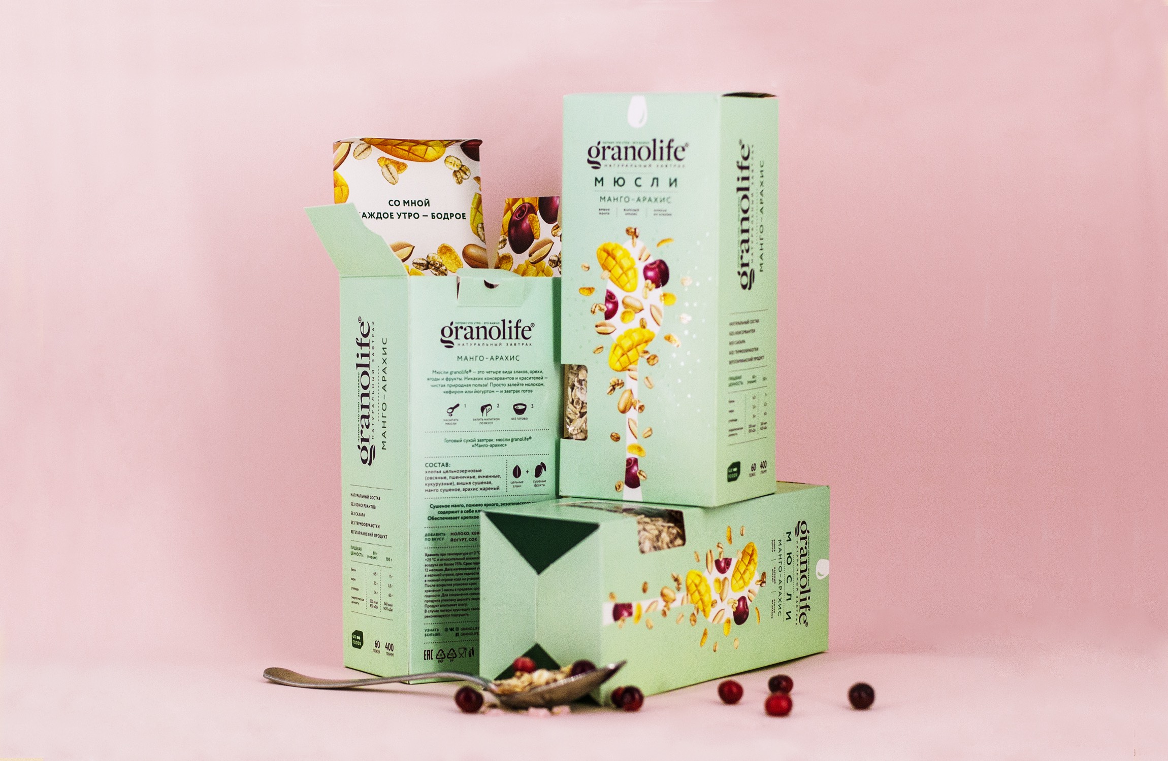
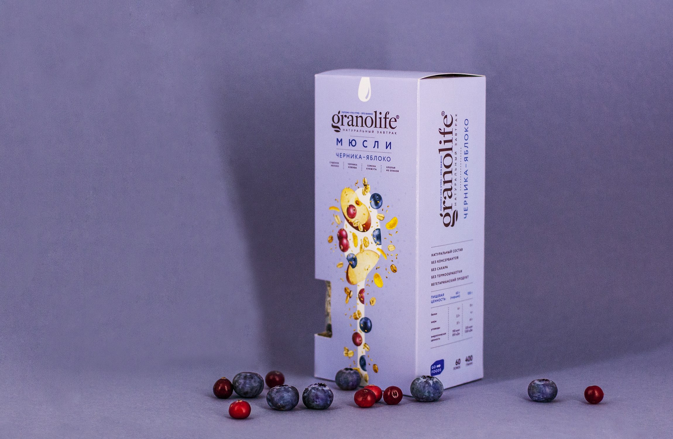
Solution: The continuity of design has been maintained by the logo, the font set used, the trademark silhouette of the spoon and a lot of “air” in contrast to the visual overload of competitor products.
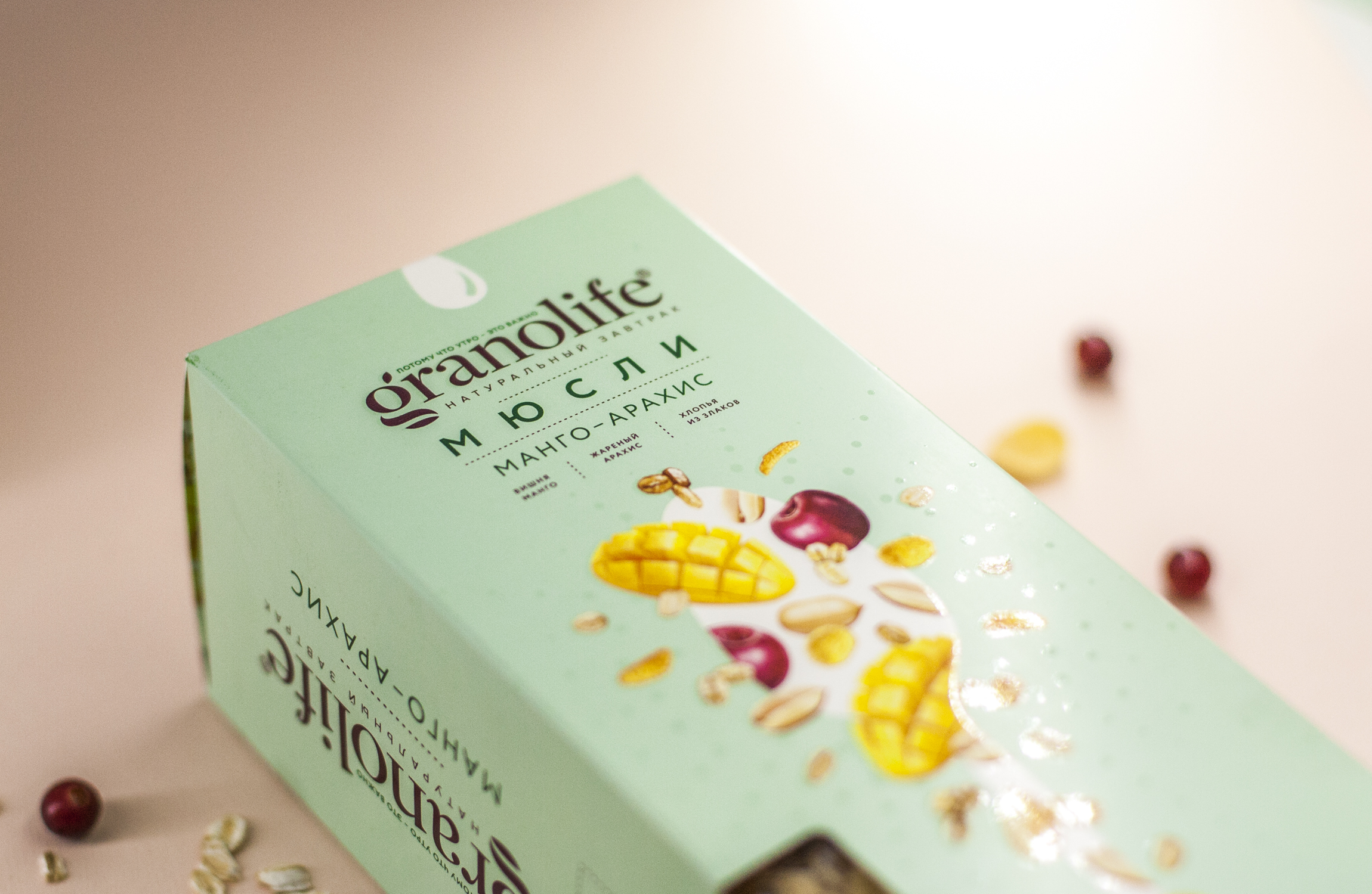
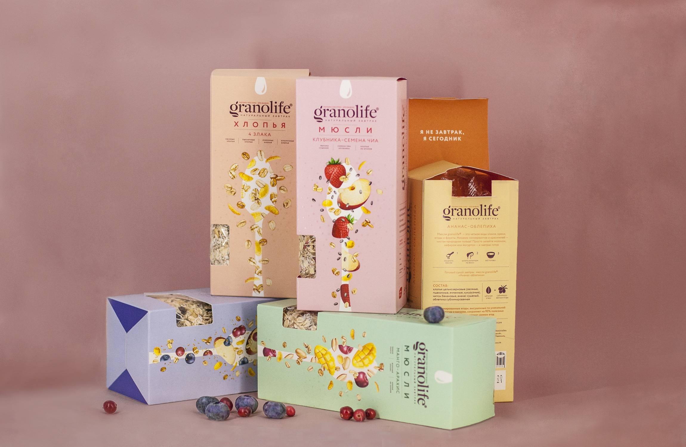
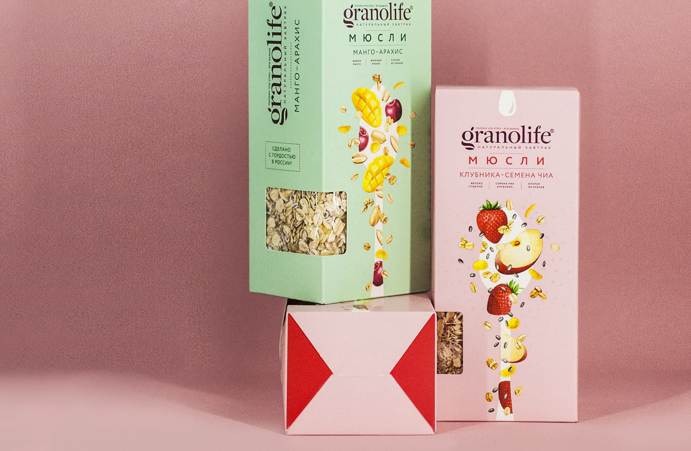
The main differentiators of the new line are colors, a large, catchy inscription “muesli” and illustrations of ingredients that “spill” from the trademark spoon in all directions – they are designed to evoke associations with an explosion of taste.
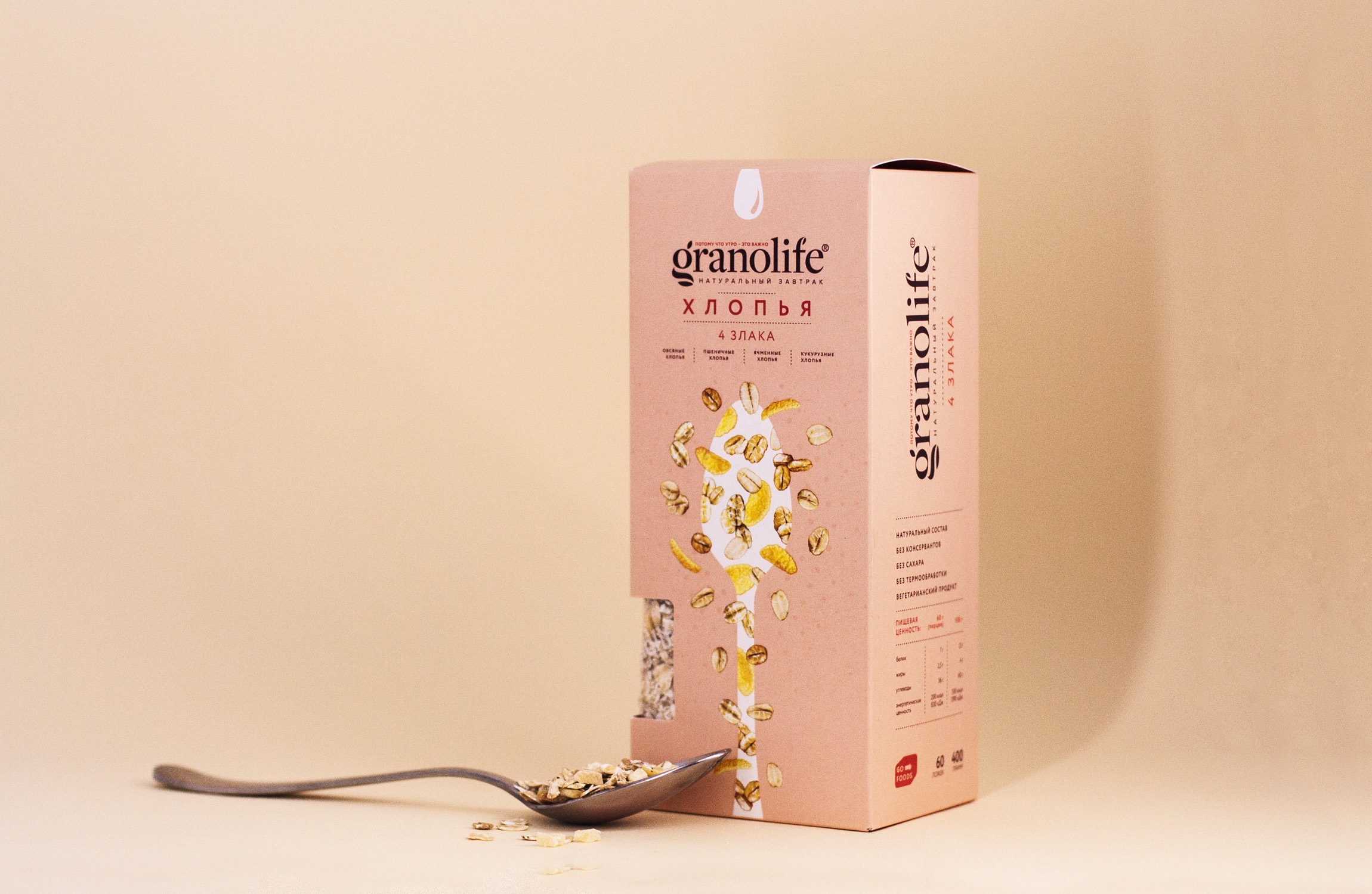
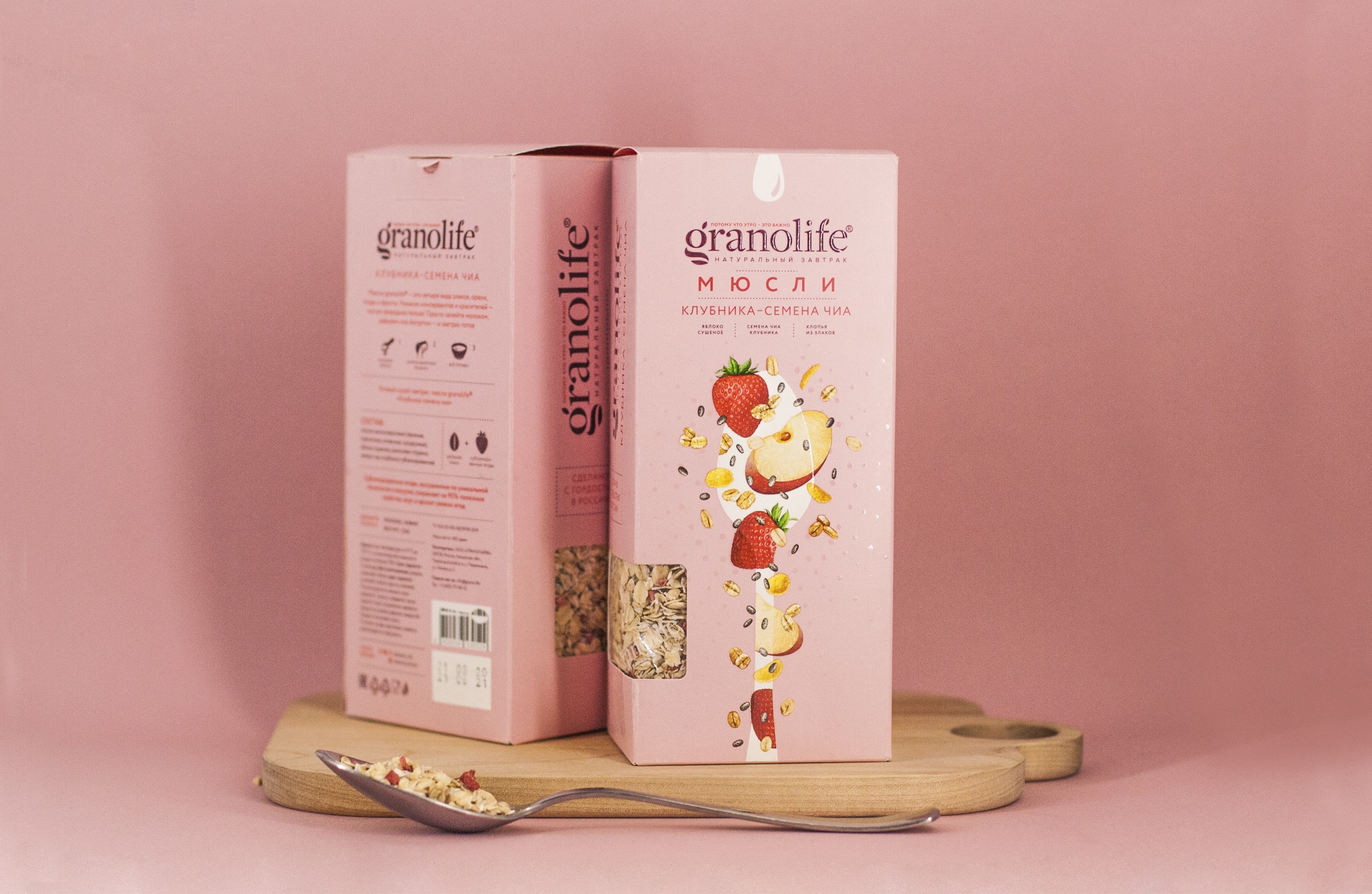
The color of the logo turns into a marker of a line (for granola it is white, for muesli it is purple), setting the rules for working with the design in case of further expansion of the range. But the background color of the pack differs from unit to unit: each SKU has its own shade. Lighter background colors are chosen for the muesli line than for granola because the product in this case has lighter processing and is not baked. Realistic images of ingredients were drawn for the project by the same artist who had worked on the illustrations for granola.
While working on the form factor, a transparent “window” on the package was created, through which you can see the muesli well without opening the package. This decision was not made by chance — retailers shared the information that customers often try to open opaque tubes with granola in stores to see the contents.
But despite the fact that the window allows customers to see the product before buying, at home, after opening the package, they will still have a surprise. On the inside of the box illustrations and cute phrases are printed that turn interaction with the packaging into a fun experience. “With me every morning is cheerful”, “Let’s have breakfast together”, “Post me on Instagram” — this is what the muesli can say when you open the box… and now you are wondering what the next pack that you buy will tell you!
CREDIT
- Agency/Creative: Ohmybrand
- Article Title: Explosion of Taste in Every Spoonful – A New Line of Granolife Muesli
- Organisation/Entity: Agency, Published Commercial Design
- Project Type: Packaging
- Agency/Creative Country: Russia
- Market Region: Europe
- Project Deliverables: Brand Identity, Brand Strategy, Branding, Graphic Design, Illustration, Packaging Design, Structural Design, Tone of Voice
- Format: Box
- Substrate: Pulp Carton


