Kazuha Otake – Speaking Volumes ~ Japanese Spice Branding
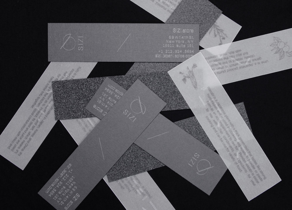
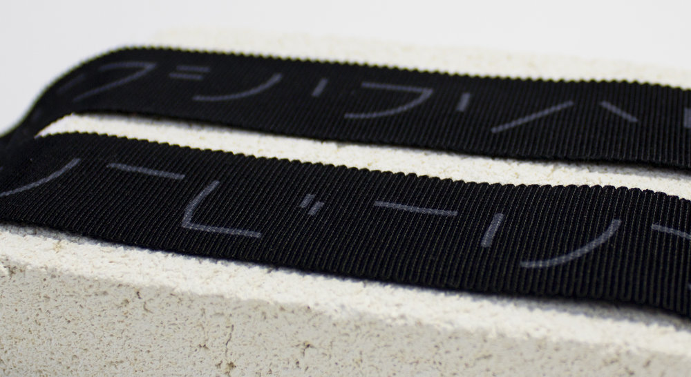
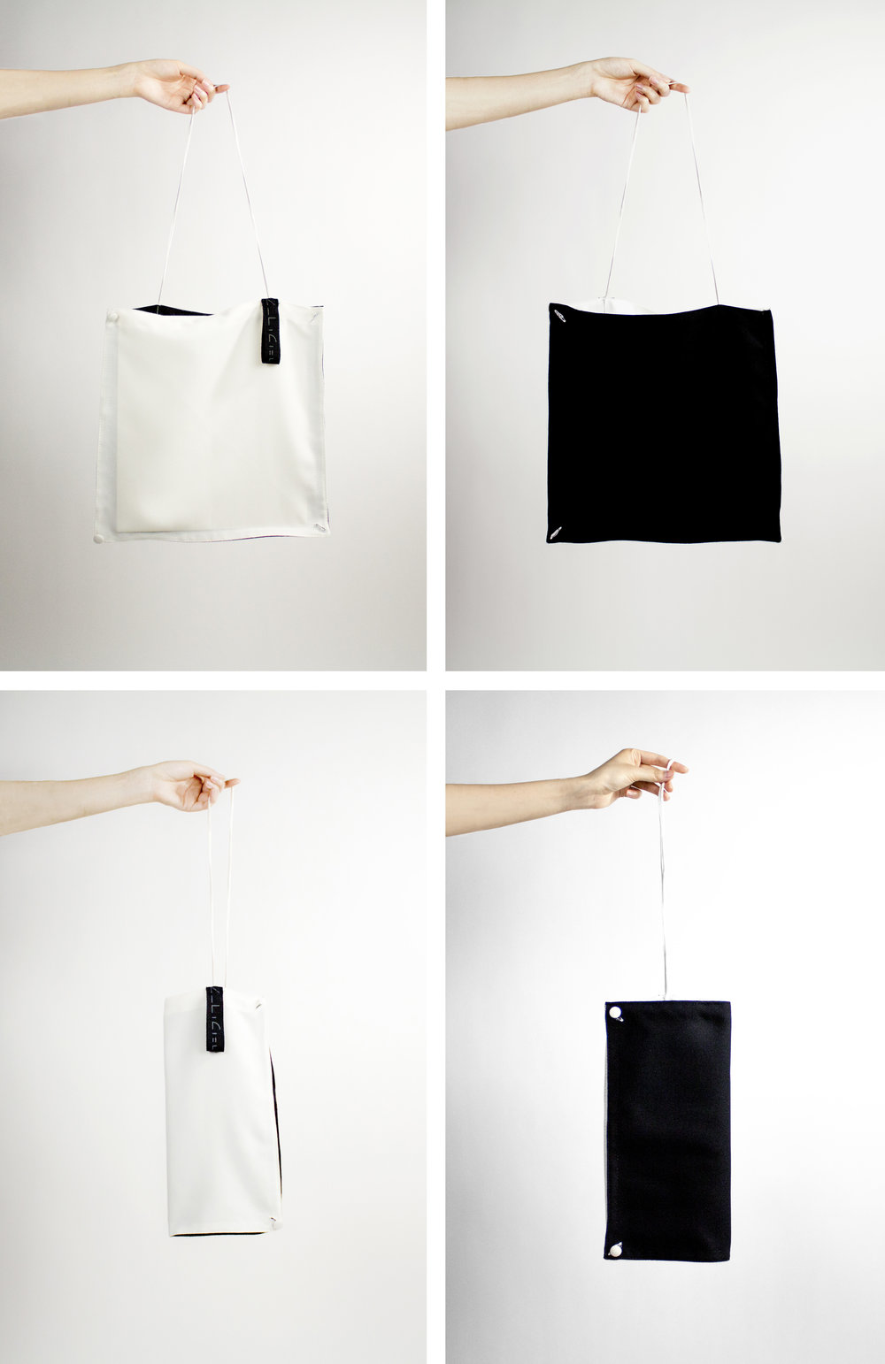
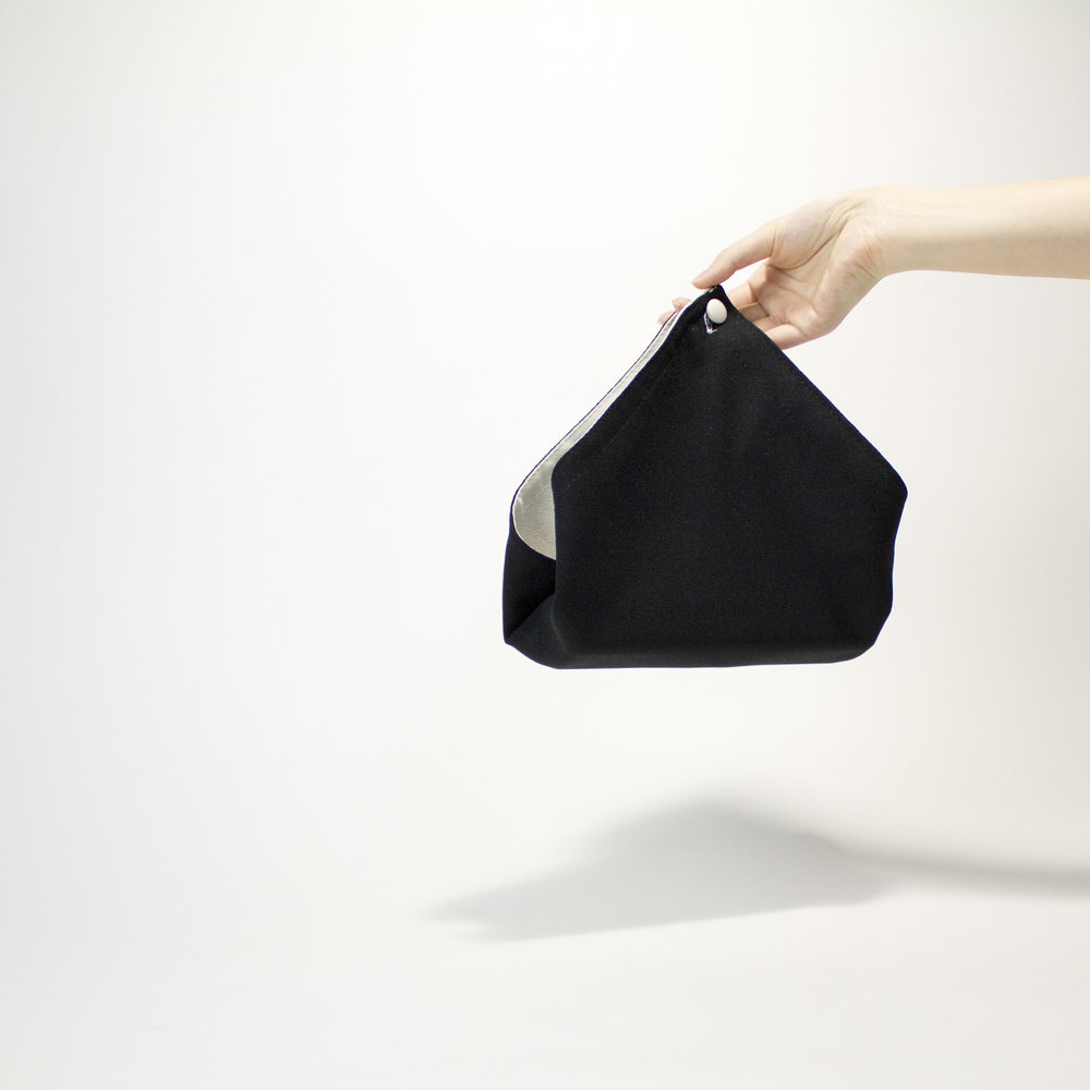
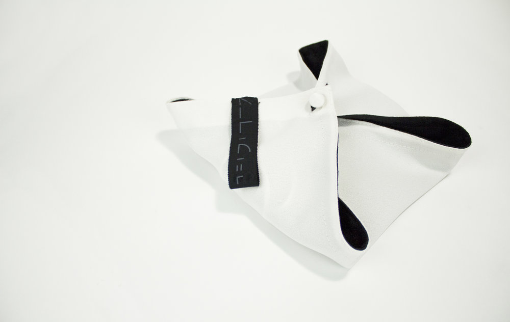
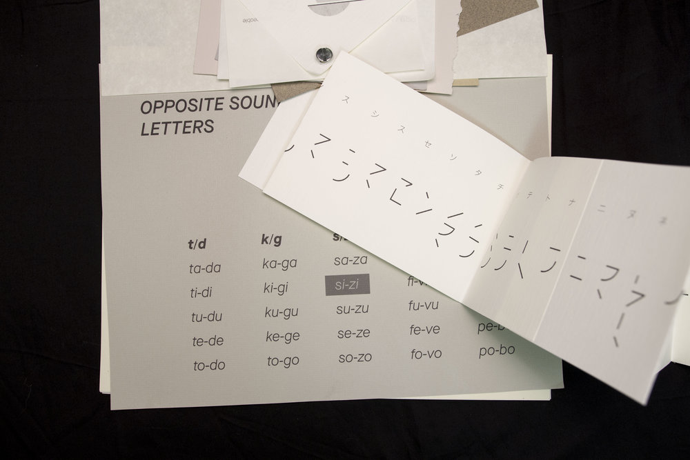
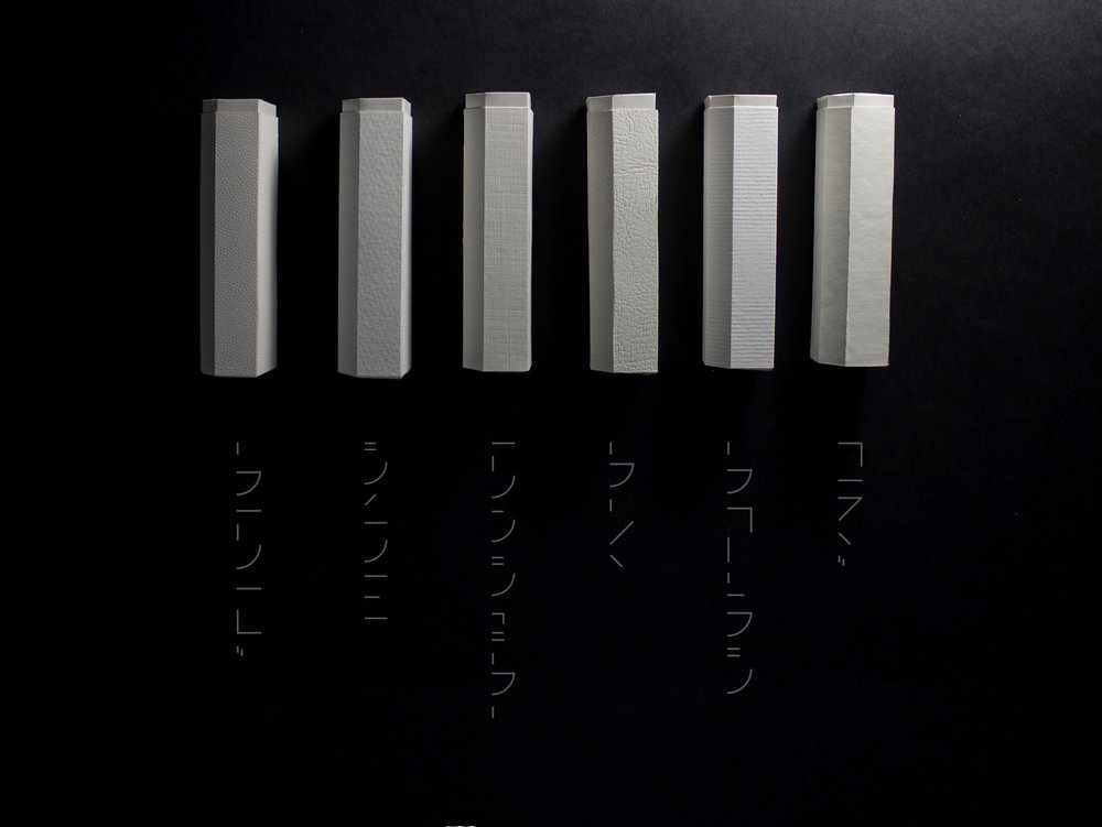
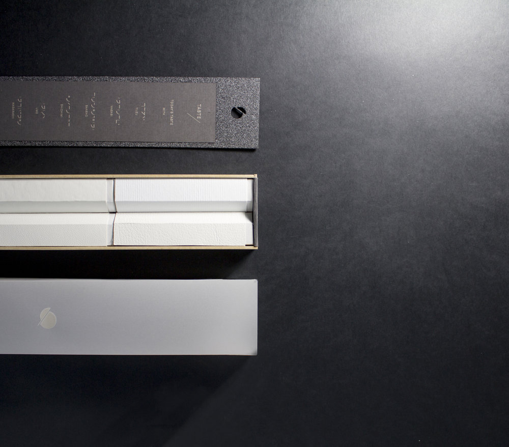
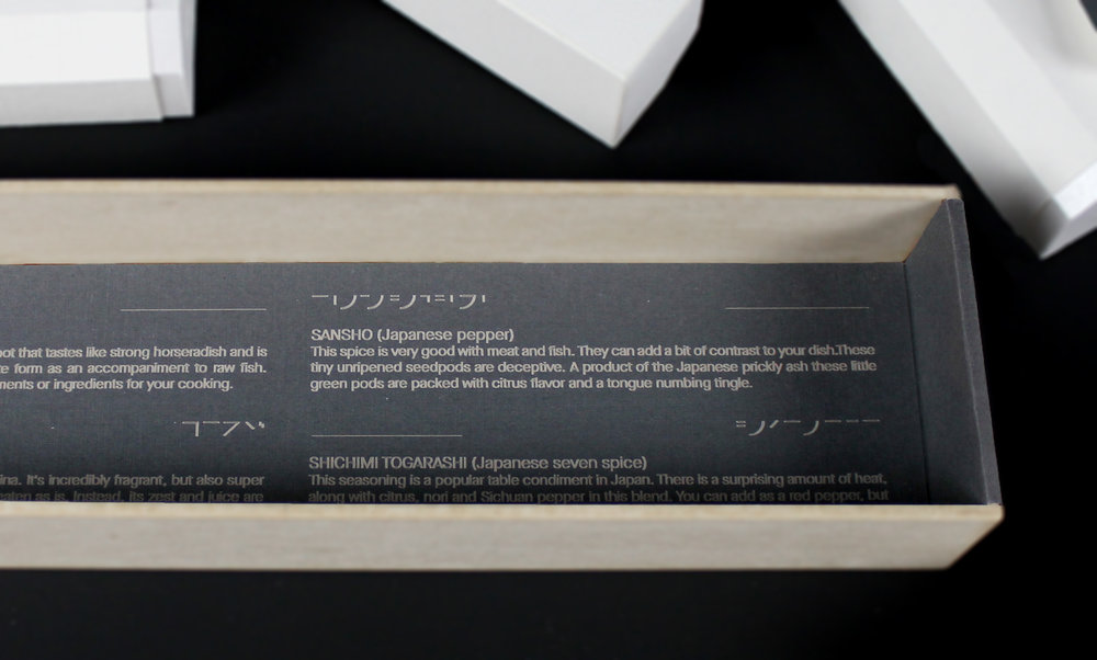
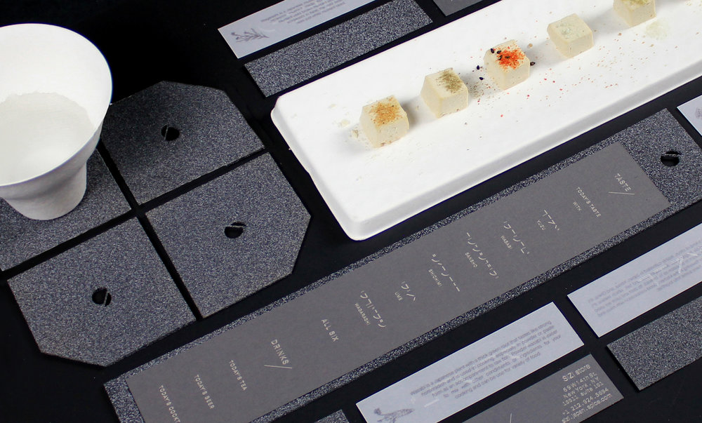
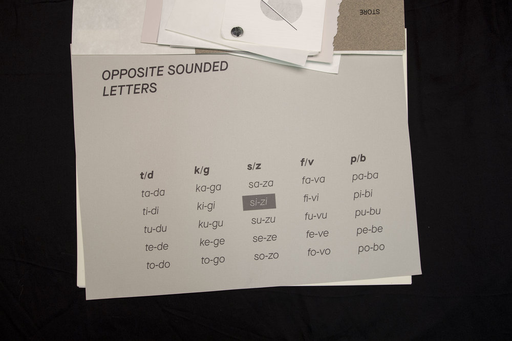
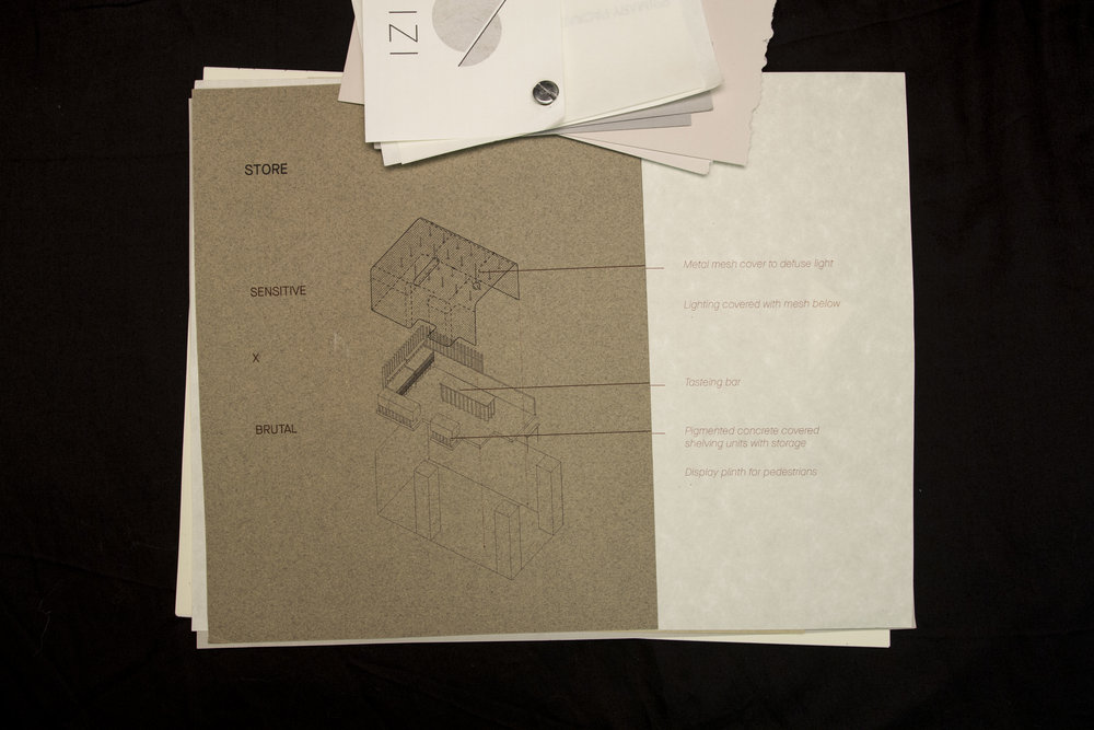
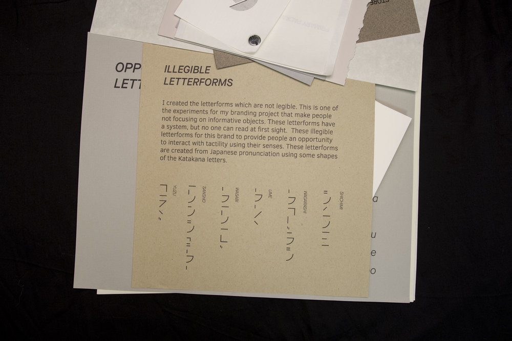
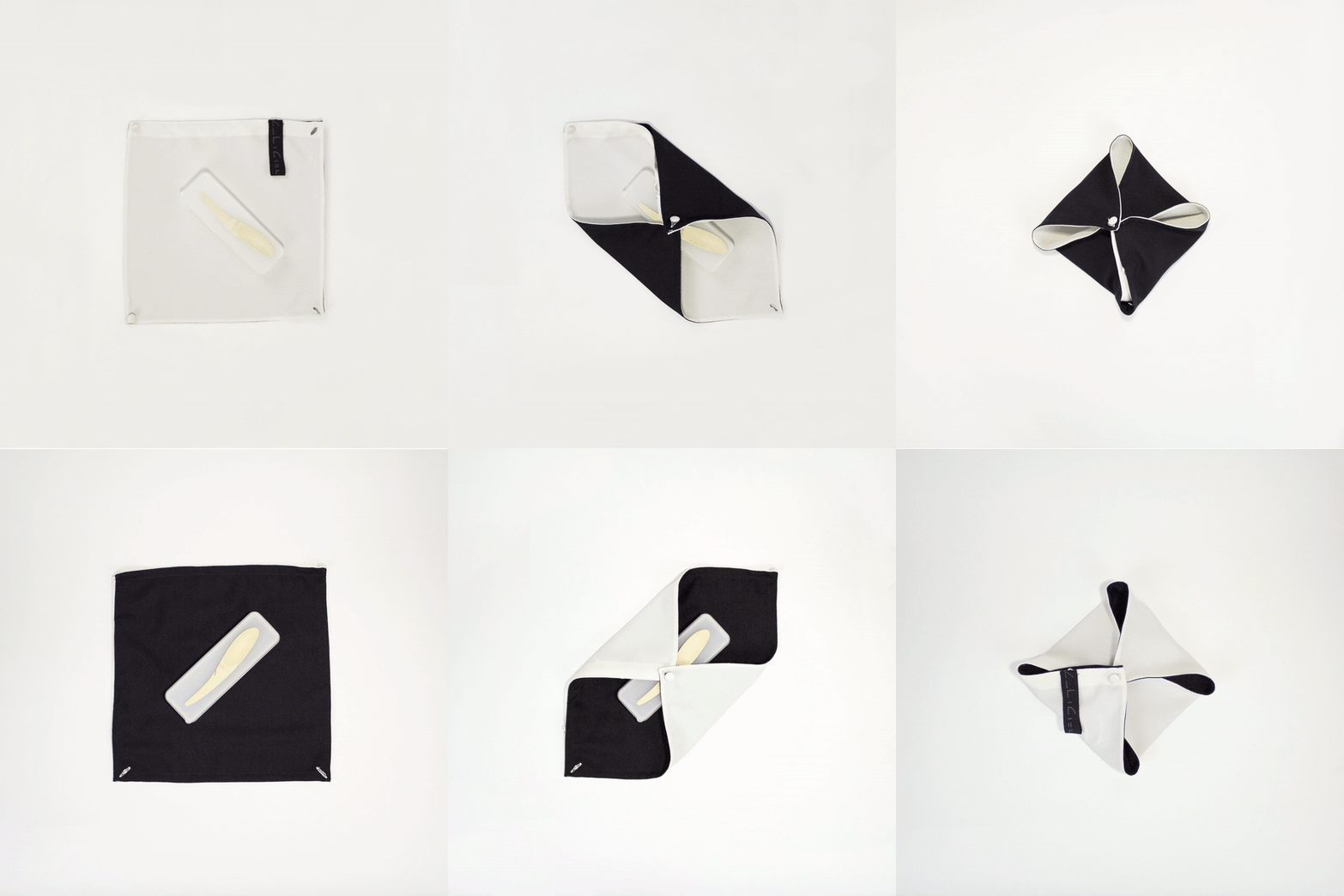
“Design often depends on graphic elements and texts to provide information. This project explores how to create a visual and haptic language that communicates without relying on specific languages, letterforms or graphic symbols and I approach the experience of a package through the senses, capitalizing on texture, form, tone, and materials. I designed a new line of Japanese spices “SIZI”.The concept of the product line, the name, the packaging solution, and overall branding is based on haptic design which reflects the unique sensitivity and refined taste of the Japanese culture.Unlike any other spices Japanese spices add a refined dainty and ever so slight accent to a dish. This one of a kind feature is represented in the entire branding design and concept solution.>The identifier. (The hairline cutting through the perfect circle, that does not change the perfect shape of the circle)>The packaging structural solution, the use of the variety of sensitive tactile substrates, the letterforms which are based on the Japanese Katakana letters, the subliminal graphic solution>Instead of having a standard shopping bag, I designed a multiple use fabric bag. I wanted to create the moment that people use their senses through the product I made, I used fabric which has unique tactility also matches to the branding concept and other designs.”












CREDIT
- Agency/Creative: Kazuha Otake
- Article Title: Exploring Visual and Haptic Language for Japanese Spices Without Replying on Traditional Communications Cues
- Organisation/Entity: Student Concept / Non Published
- Project Type: Packaging
- Agency/Creative Country: United States America
- Market Region: Multiple Regions
- Format: Bag, Box
- Substrate: Pulp Paper, Wood


