Double Dagger is a military and security-focused publisher, dedicated to publishing material that, while rooted in conflict, transcends the idea of ‘war’ as merely a genre. The publication seeks to explore and challenge the conventional understanding of military topics, aiming to move beyond the mere clash of weapons and delve into the deeper, often unseen, dimensions of conflict. Their works provide readers with fresh perspectives on the cultural, ethical, and psychological impacts of war, highlighting narratives that resonate beyond the battlefield.
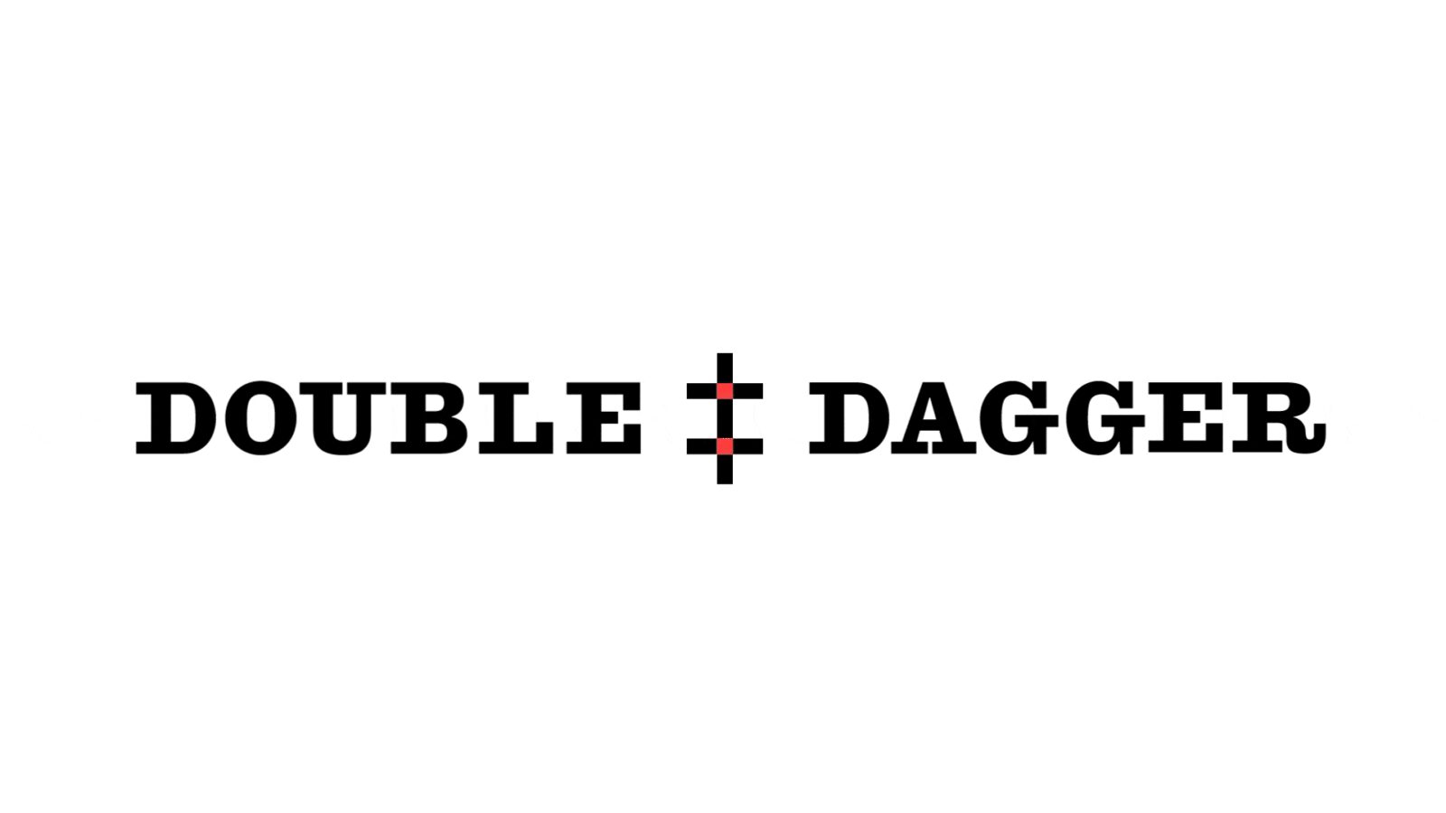
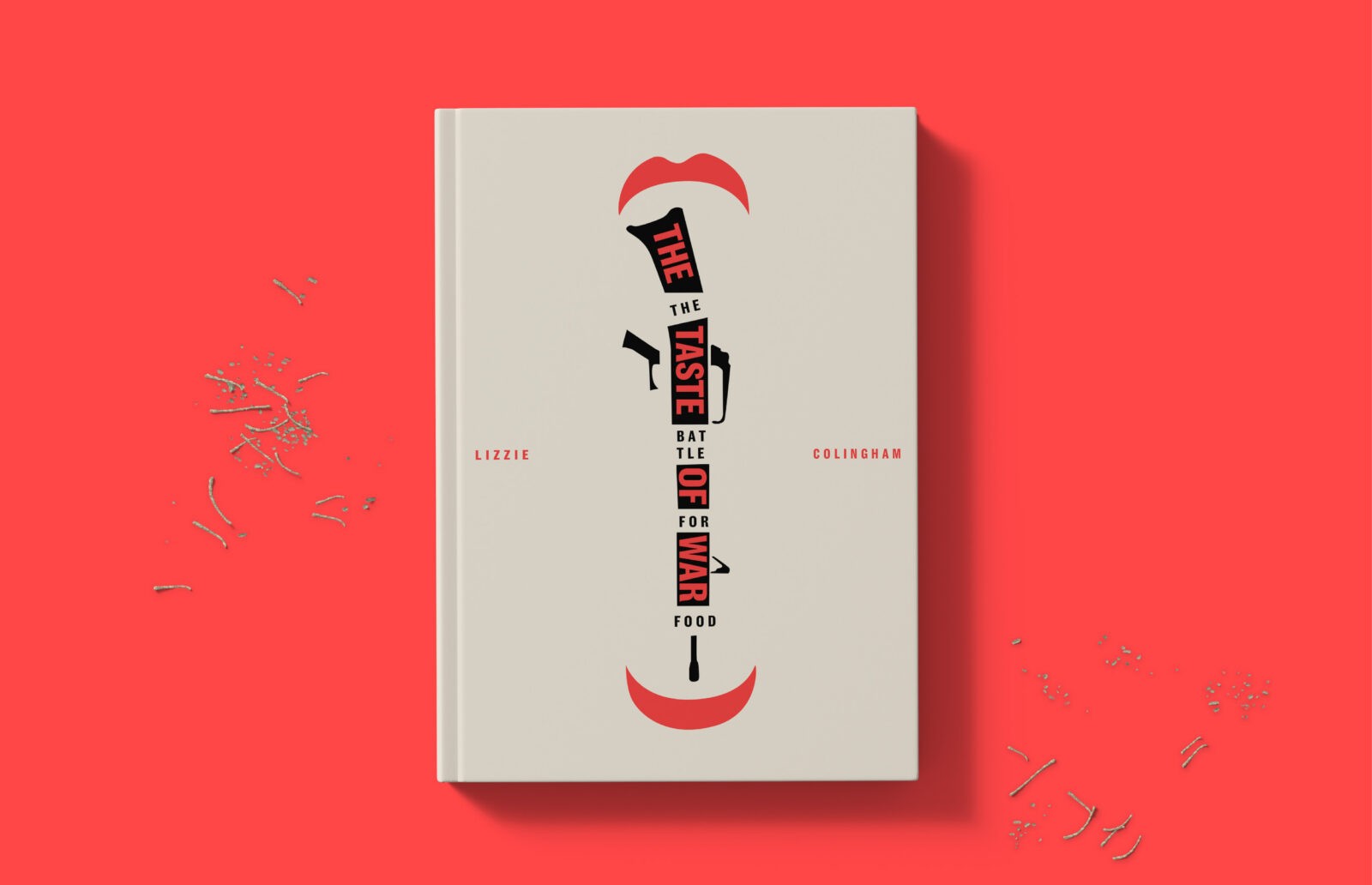
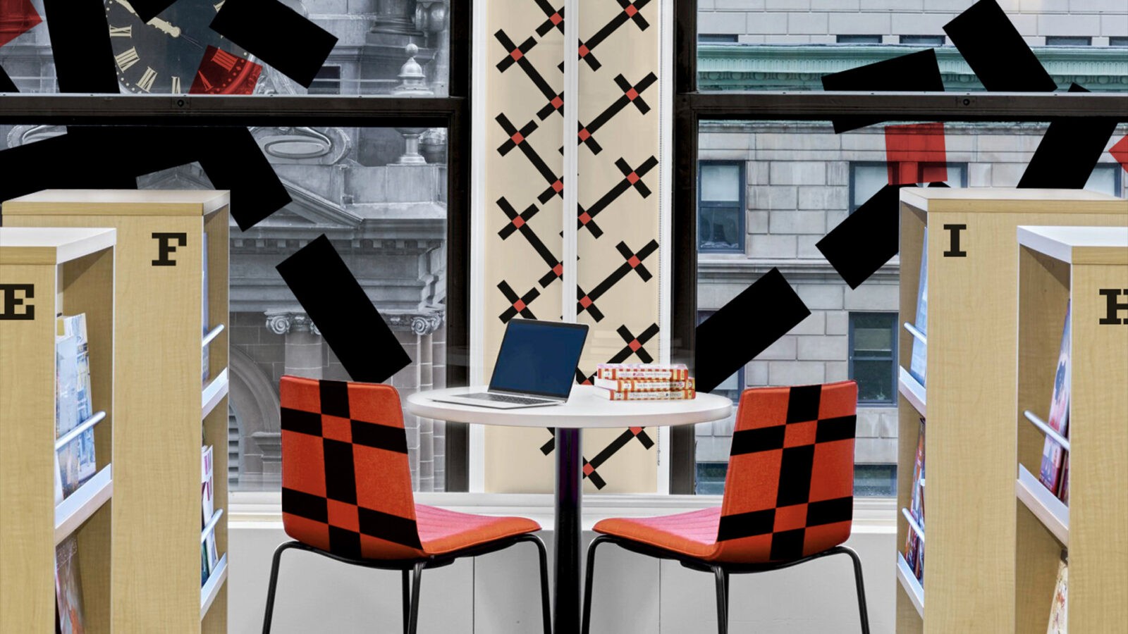
Using their existing logo of a double-edged sword, I redesigned it to symbolize post-war collapse by breaking the logo into smaller rectangles, forming a unique and dynamic pattern. This visual concept reflects themes of fragmentation, decay, and the aftermath of conflict, reinforcing Double Dagger’s focus on exploring the consequences of war. I also grouped their previous publications into three distinct series and designed cohesive layouts for the books, creating a unified visual identity aligned with the publisher’s overarching mission.
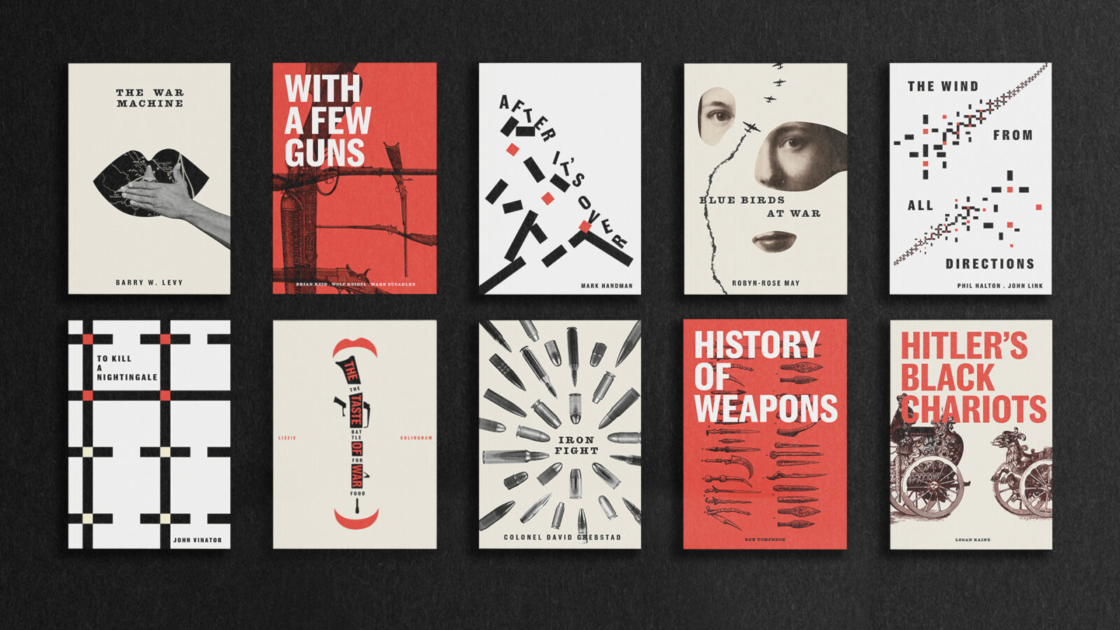
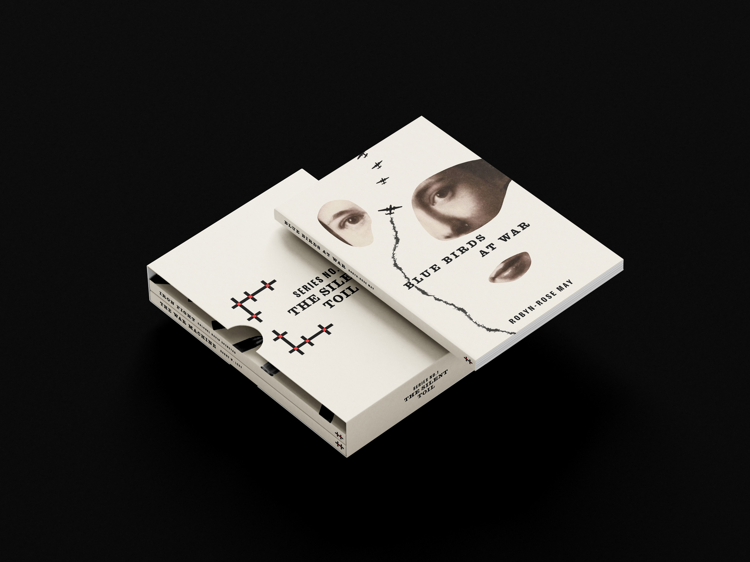
The first series features three compelling book covers, designed using collage techniques to visually communicate the themes of each title. For instance, *The War Machine*, a novel that reveals long-classified secrets, features a cover image depicting a forcibly silenced mouth, symbolizing suppression and the exposure of hidden truths. These distinctive designs give each series a bold and memorable presence while maintaining consistency within the brand.
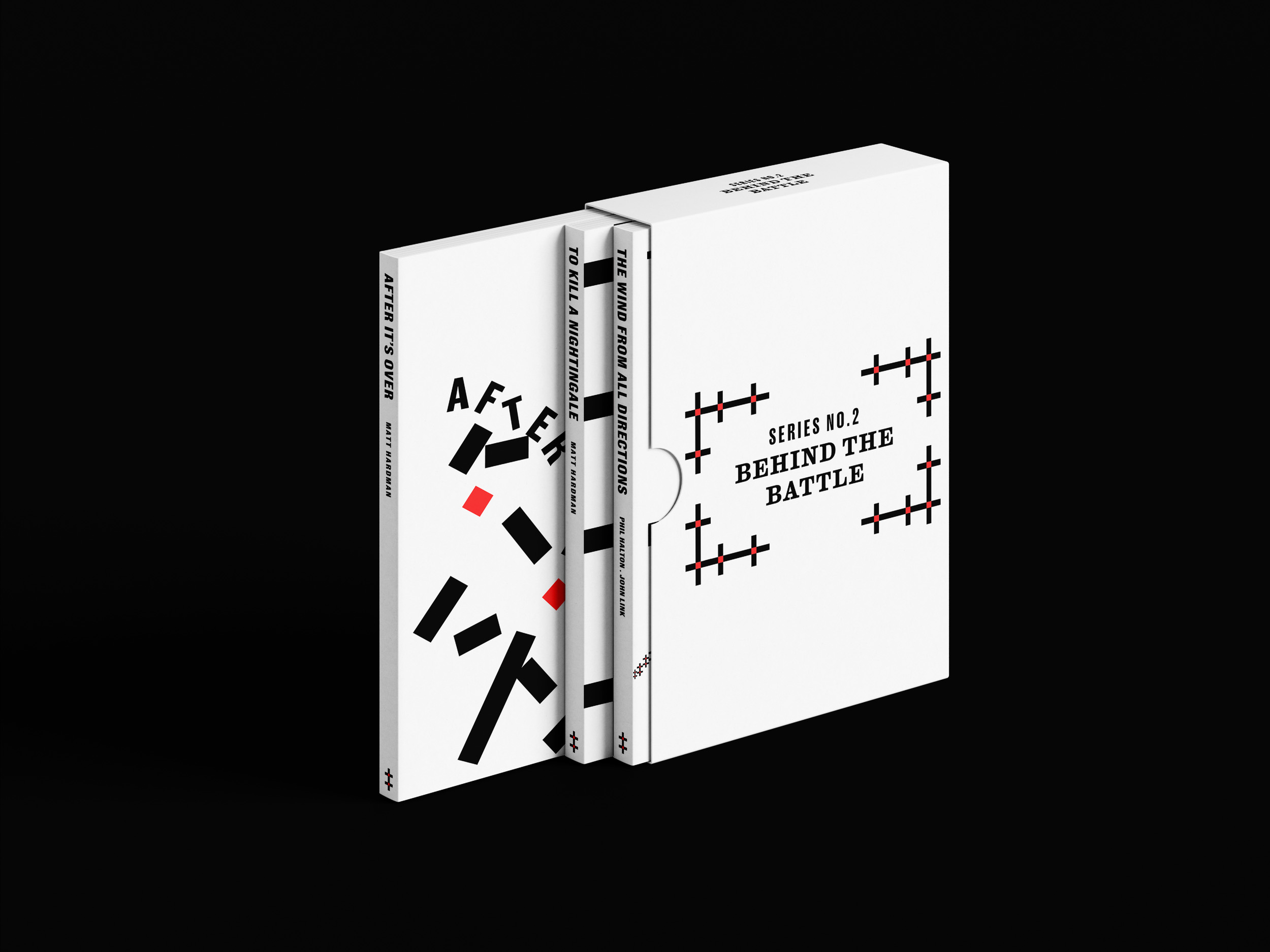
These logos and patterns were further developed into designs for boxed sets, each containing three novels. The patterns were crafted to be versatile and unrestricted, allowing them to evolve and be applied creatively across various formats and mediums, from book covers to promotional materials. This adaptability ensures the brand remains fresh and impactful, providing a dynamic platform for Double Dagger’s thought-provoking content. Through this approach, the identity celebrates the depth and complexity of their mission.






CREDIT
- Agency/Creative: Yubin Won
- Article Title: Exploring Conflict Beyond War: Double Dagger’s Bold Visual Rebranding by Student Yubin Won
- Organisation/Entity: Student
- Project Status: Non Published
- Agency/Creative Country: United States of America
- Agency/Creative City: New York
- Project Deliverables: Graphic Design
- Industry: Information
- Keywords: WBDS Student Design Awards 2024/25 Book Design
- Keywords: WBDS Student Design Awards 2024/25 Book Design
-
Credits:
Educational Institution: School of Visual Arts
Educator's Name: Courtney Gooch


