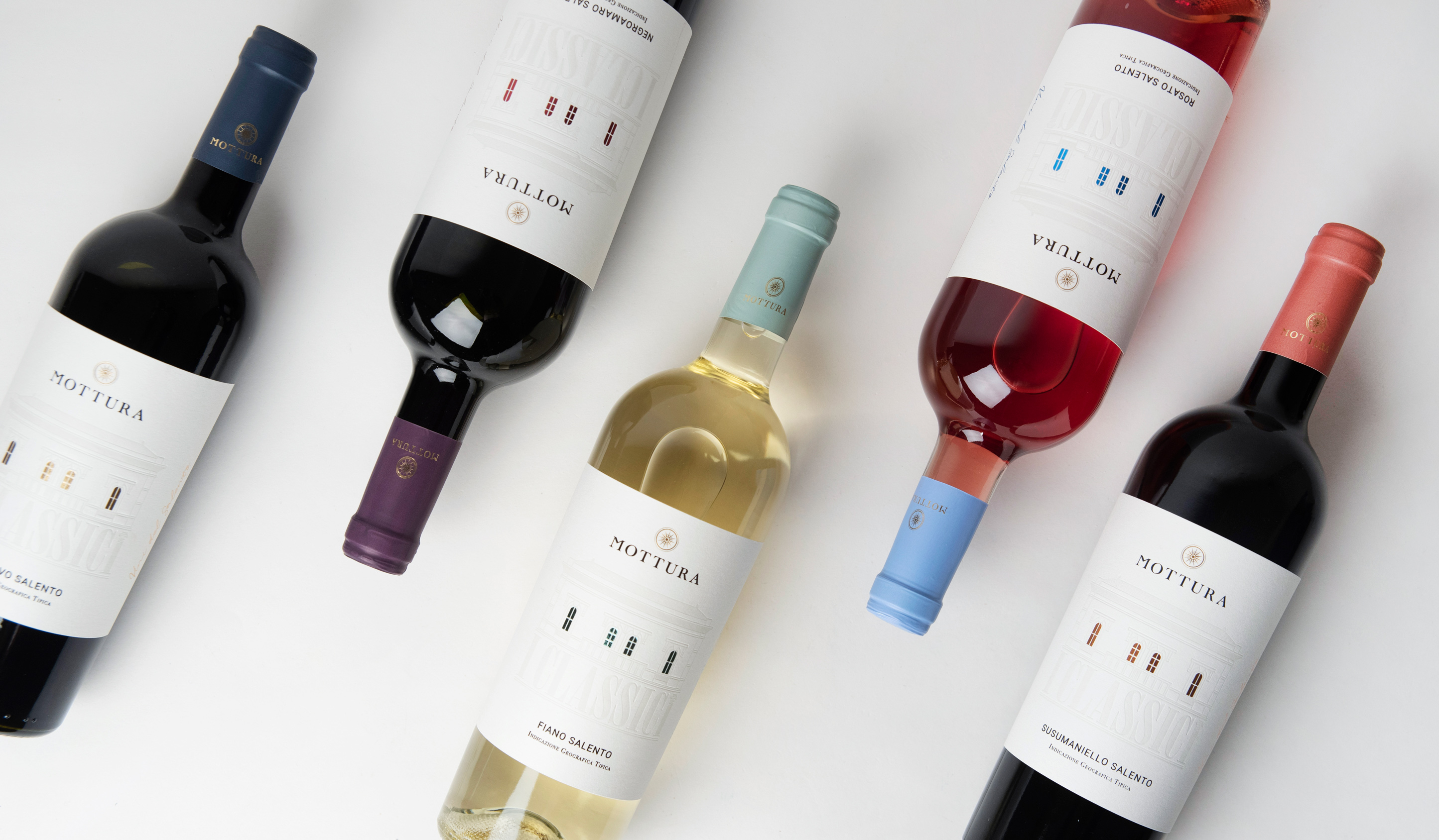
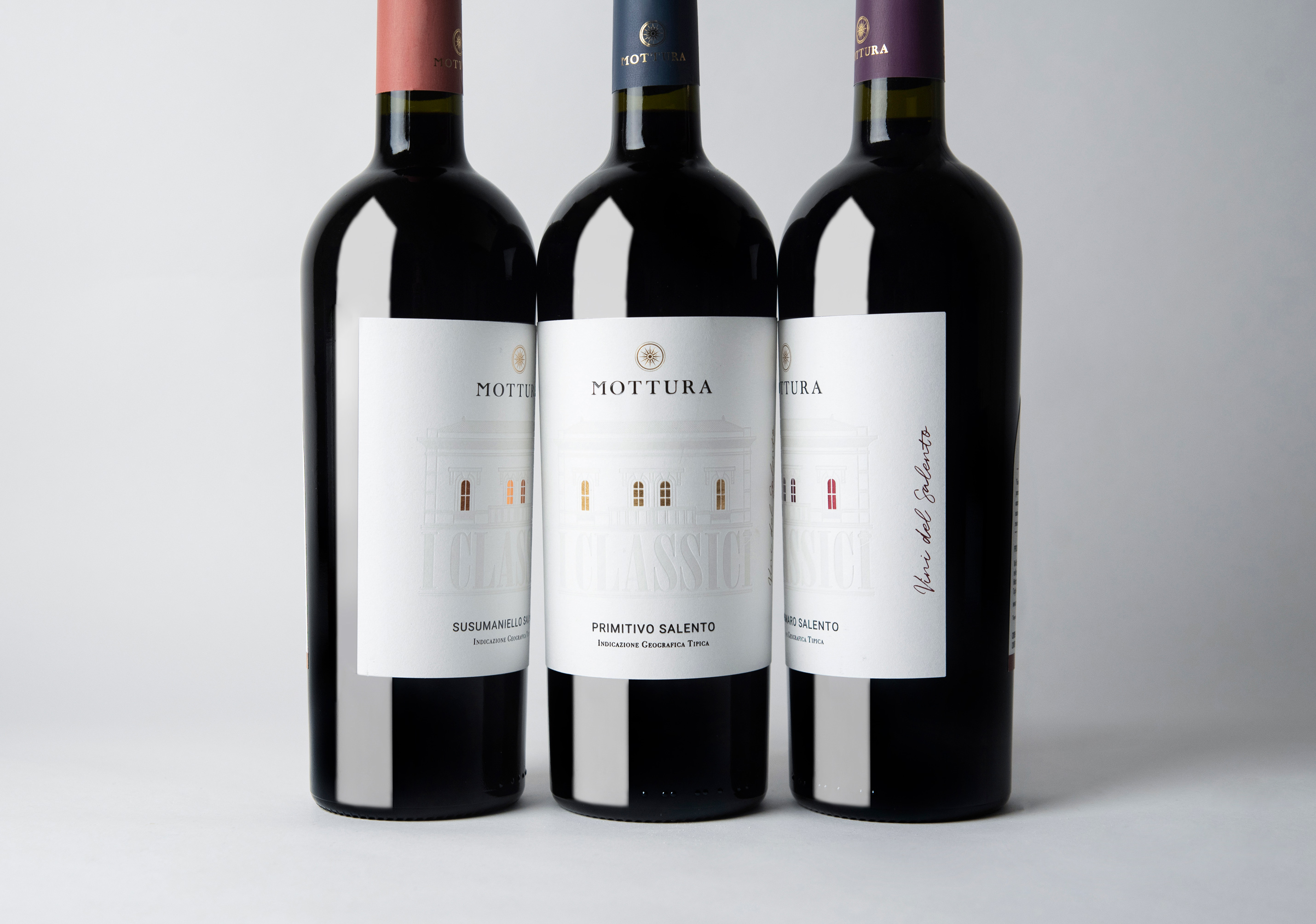
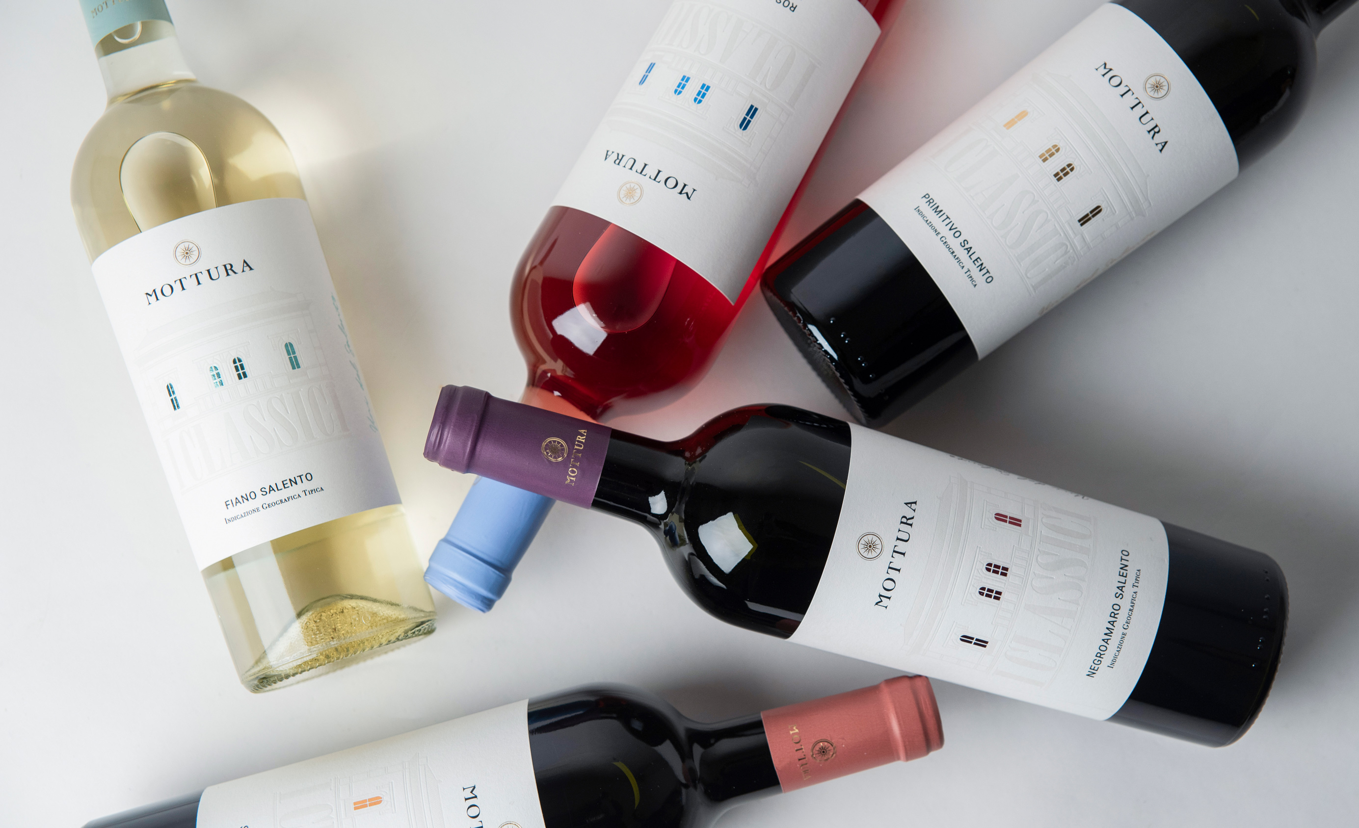
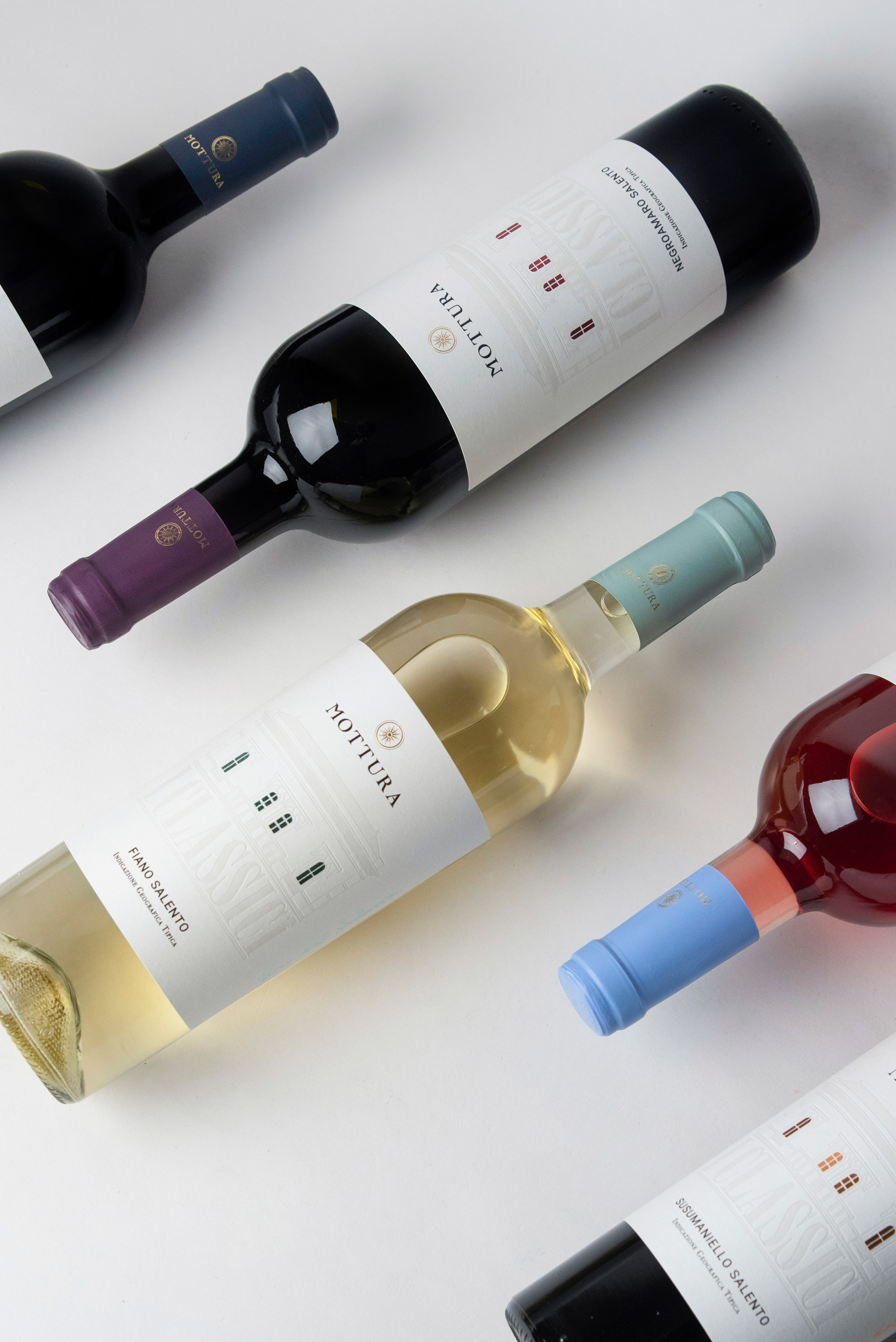
The elegance and iconic character of the Mottura winery building are reinterpreted with a rational approach, enhancing the elements with targeted finishing. The villa has always characterized all Mottura labels in various graphic and stylistic interpretations, making the architectural element a strong symbol of recognition for the company.
The aim was to renew and refresh the line of the Classics, a line destined for the horeca sector, to give it a more important image and thus increase the positioning of the product. Along with the illustration, the typefaces used refer to classic stylistic styles, giving the wine an aura of striking historicity. Our first approach was to keep the presence of the elements on the label unchanged, preserving their significance for the company and the recognition of its products.
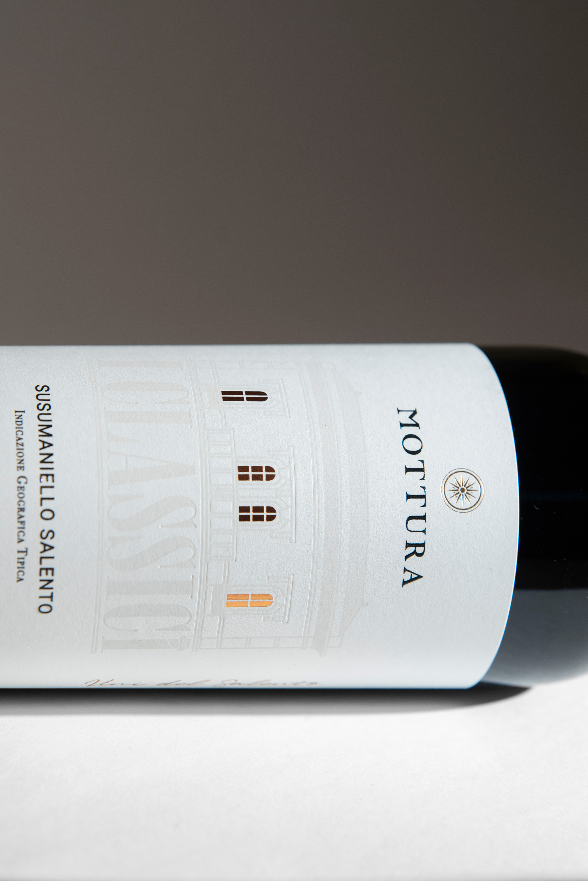
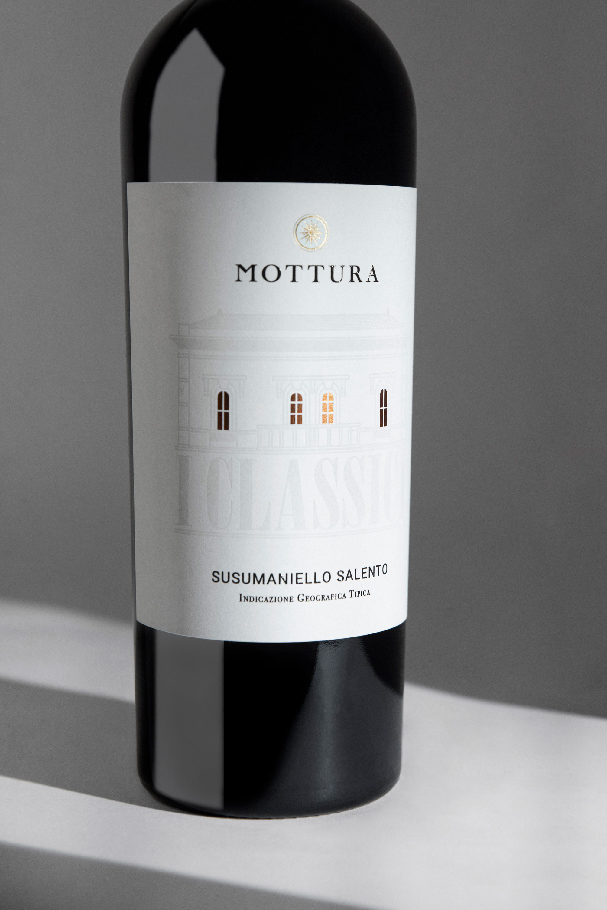
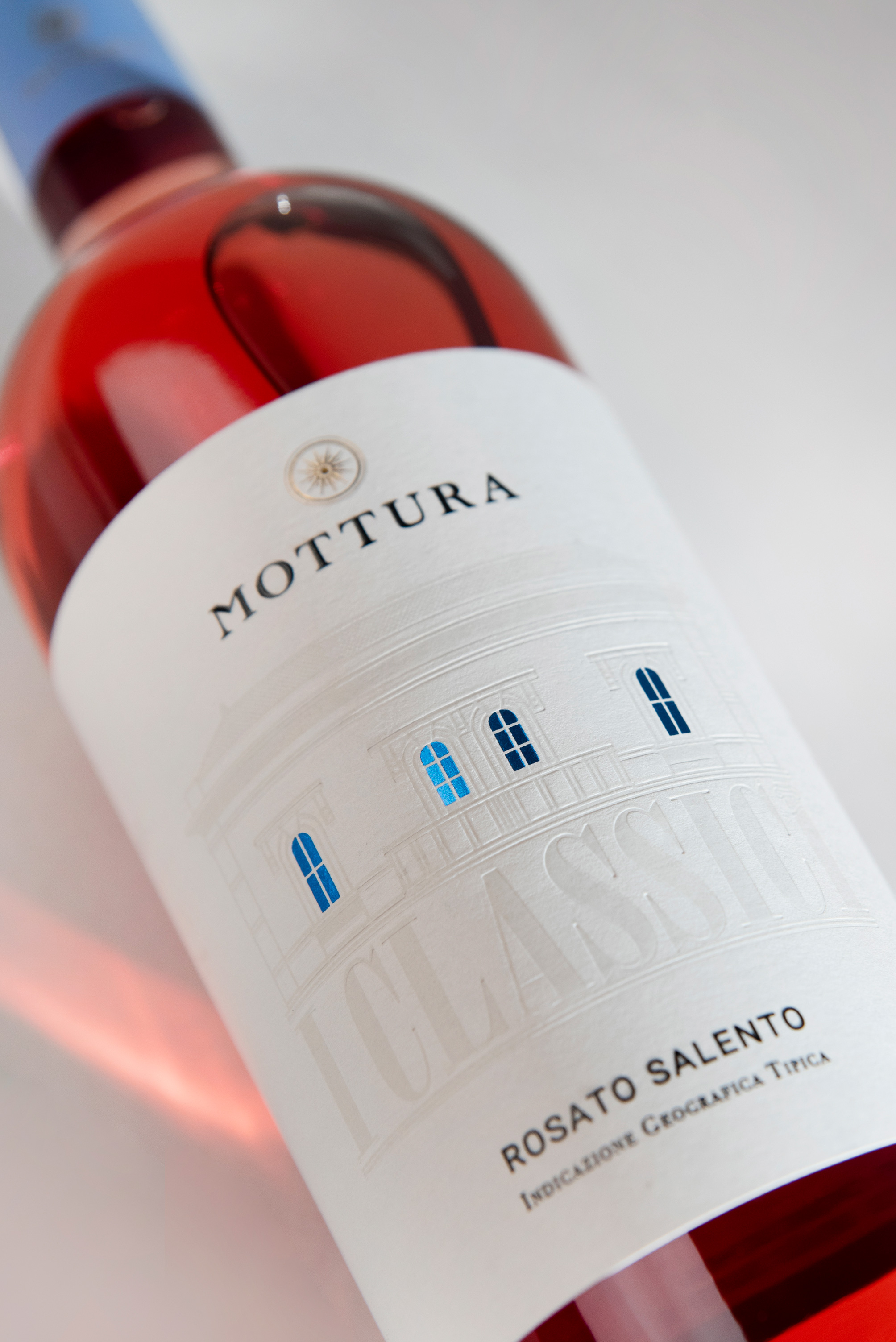
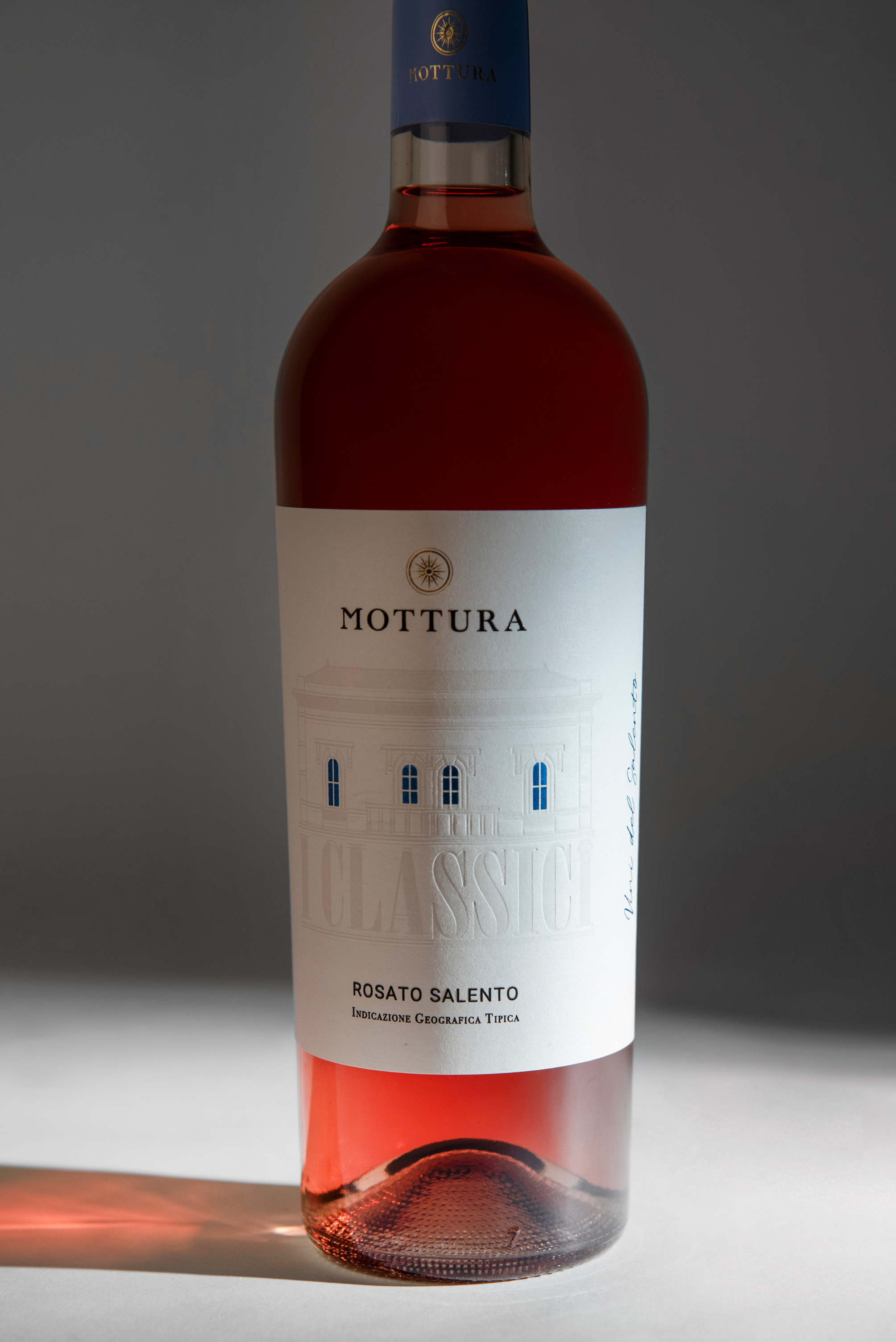
We have reconstructed the facade with geometric, modern, and decisive lines, abandoning the previous illustrative style, and making its dimensions more significant. It was decided to integrate the facade of the villa and the name I CLASSICI as a single building element, all rendered with essential lines and material effects.
Despite the size, this central body does not stifle the viewer’s perspective. Everything is treated with a debossing effect to evoke a refined bas-relief. At the top are windows that now shine and draw the viewer’s attention to the central part of the label. The light emanates from the villa, pushing outwards, and its qualities overflow, presented with sober elegance.
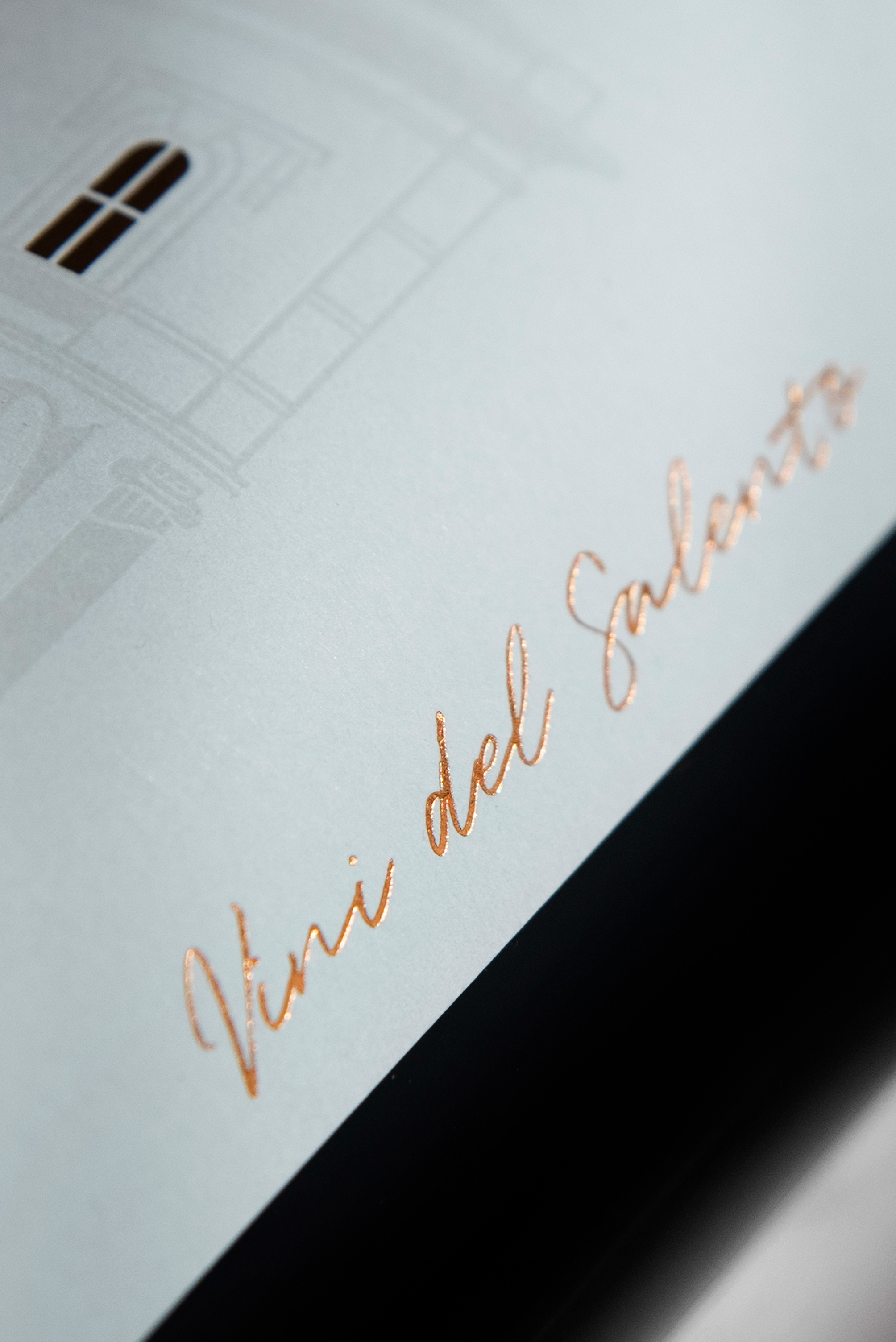
The white of the facade allows the Mottura logo and the varietal to stand out, placed at the upper and lower parts of the label, while the company payoff “The wines of Salento” is inserted laterally in golden foil.
In continuity with the front, the back label also holds significant importance in dressing the bottle. We decided to design it with the same shape as the windows, reminding the viewer of the experience of first taking the bottle. This effective redundancy enhances the memorability of the product.
CREDIT
- Agency/Creative: Usopposto
- Article Title: Experience Usopposto’s Stunning Redesign of Mottura’s Classic Wine Labels
- Organisation/Entity: Agency
- Project Type: Packaging
- Project Status: Published
- Agency/Creative Country: Italy
- Agency/Creative City: Grottaglie
- Market Region: Europe
- Project Deliverables: Graphic Design, Label Design, Typography
- Format: Bottle
- Industry: Food/Beverage
- Keywords: wine, bottle, classics, apulia
-
Credits:
Art Director: Alessandro Santoro


