The exhibition of spinning machines “Threads” is an exposition on the history of modernization of the jacquard machine and its derivatives.
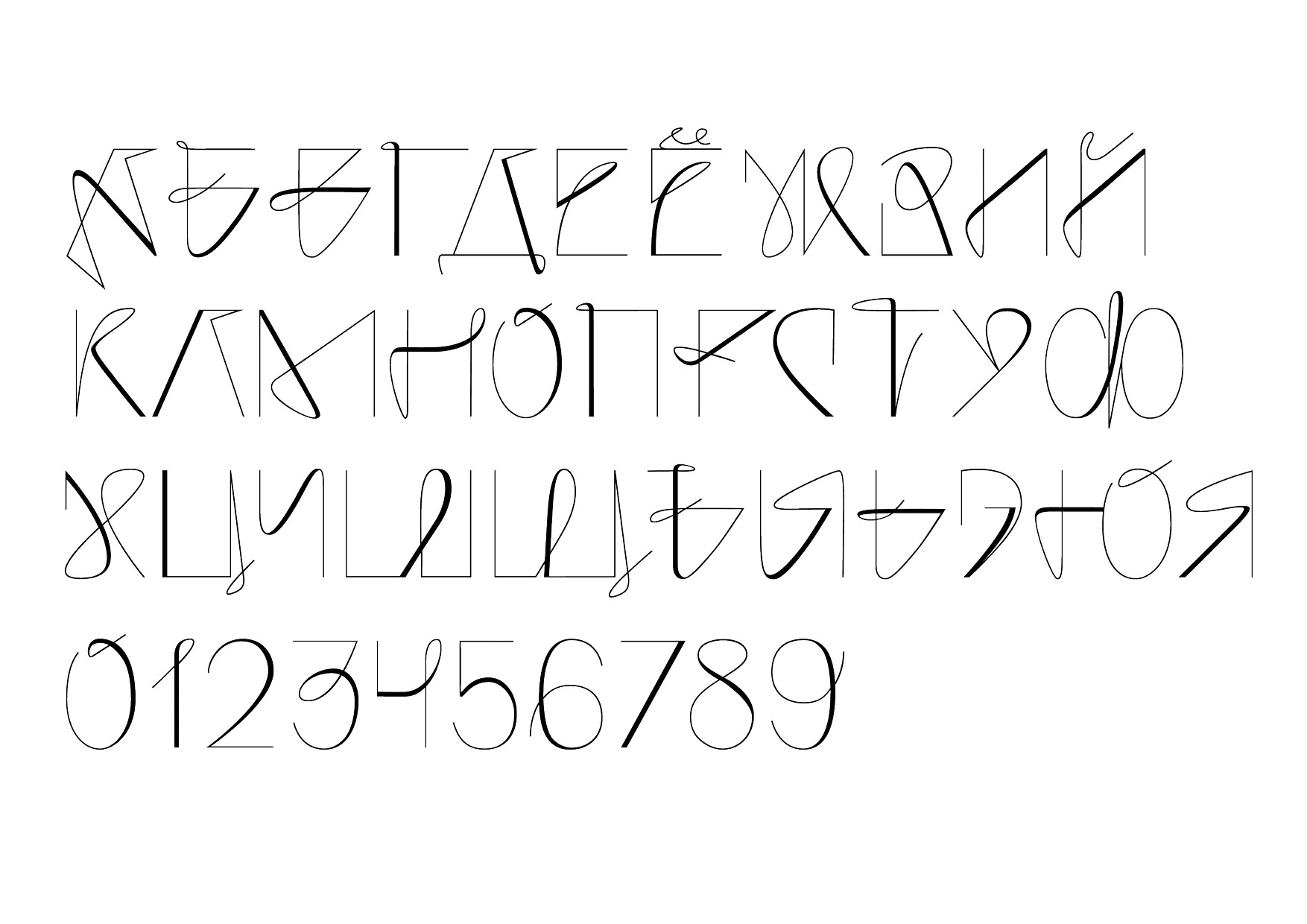
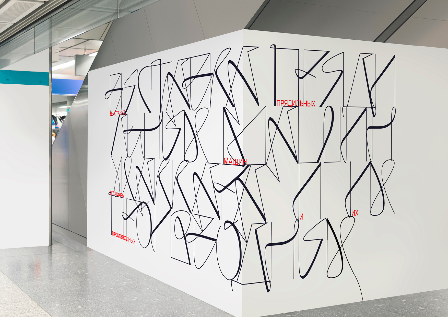
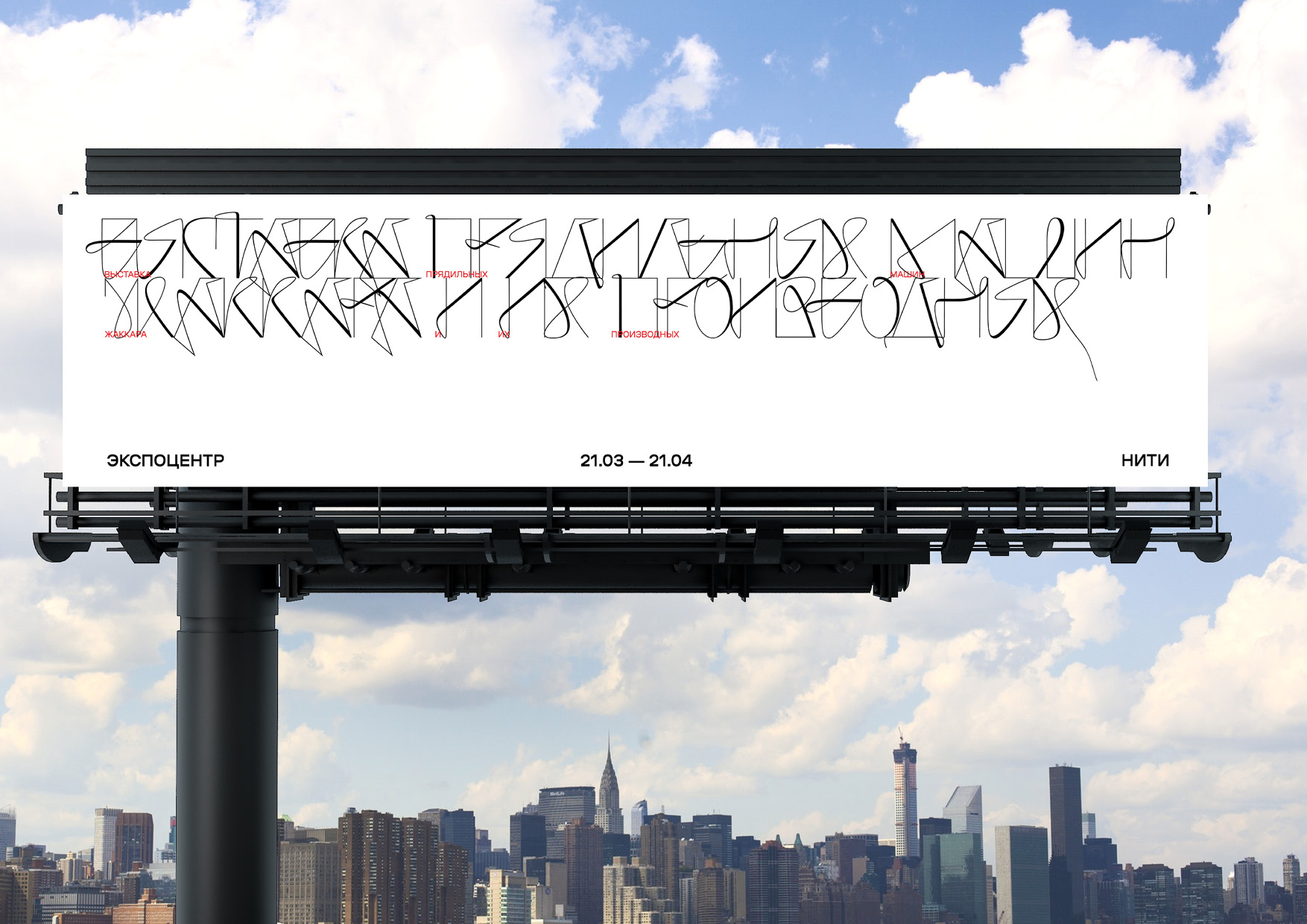
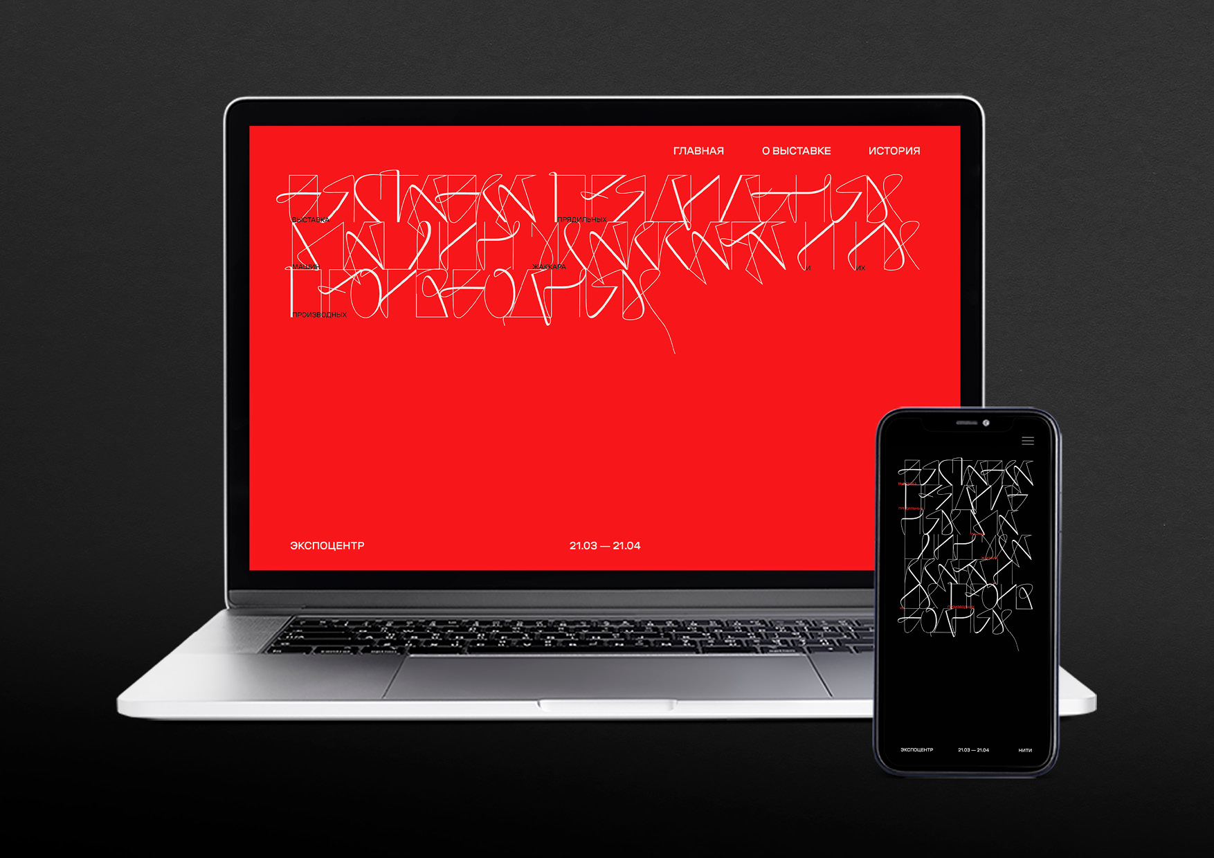
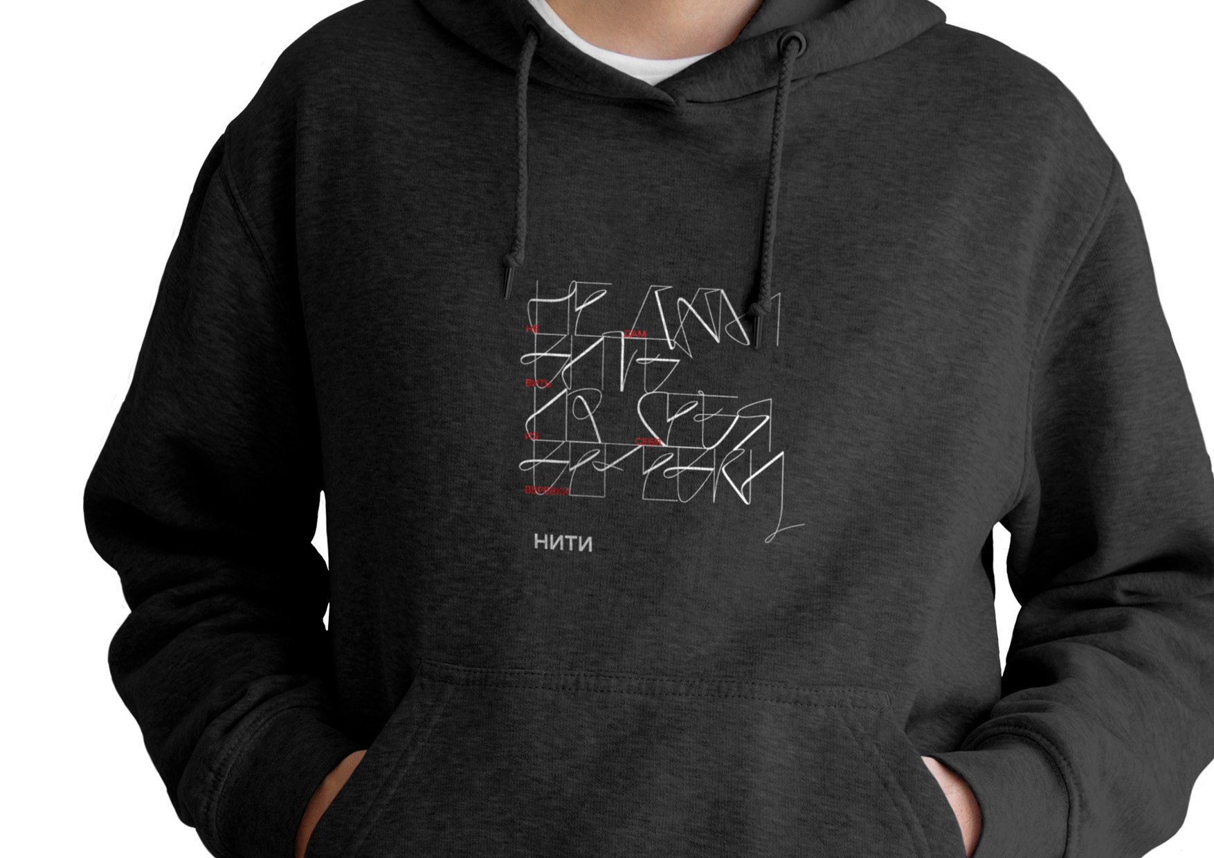
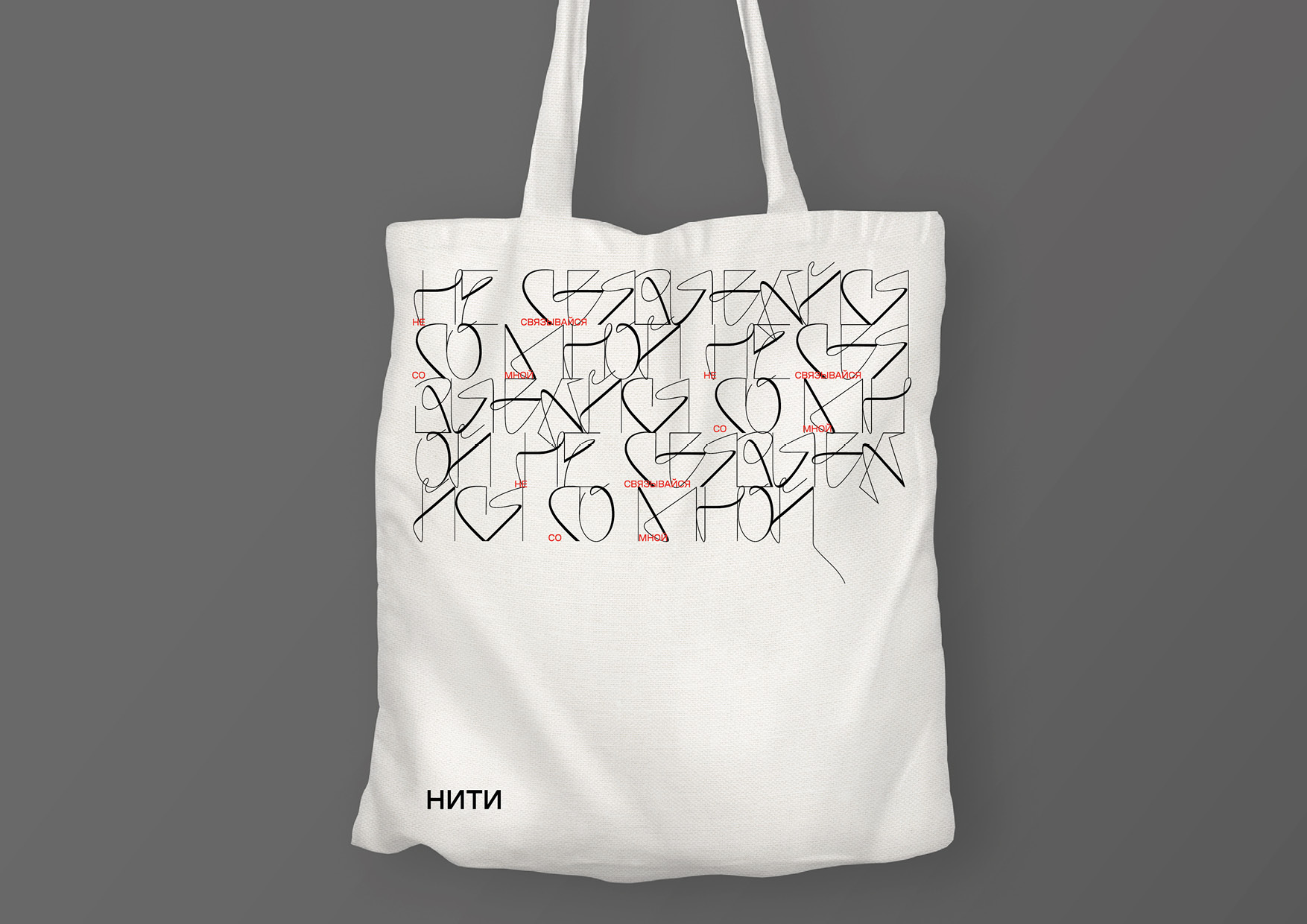
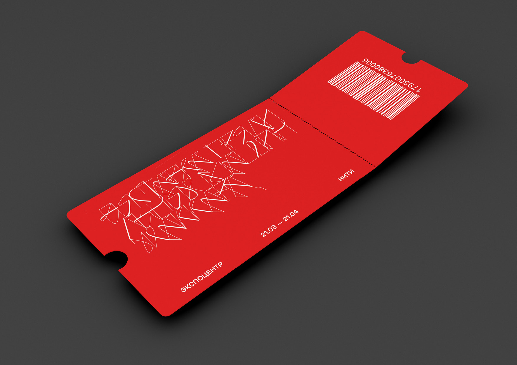
The imagery of the font is based on confused threads. The font includes calligraphy to convey the movement of the threads. The font reflects not only the normal weave, but also the tangled threads, which is normal for jacquard weave. Kerning and interlining of words work directly on the concept, it is immediately clear that the project is about fabrics. The text is typed in an accidental font always evenly and tightly as a canvas. Due to the poor readability of the accident, there are red subtitles in addition to it. Red subtitles represent the interweaving of red into the “black and white” fabric and form a peculiar pattern.
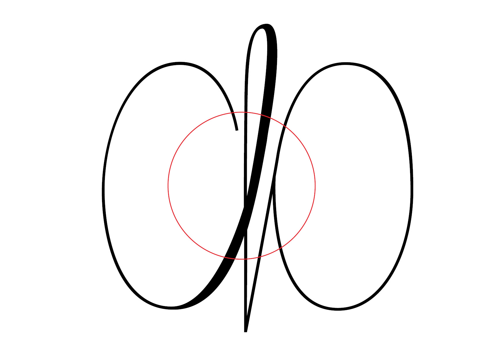
The concept was based on a woven weave. When typing, the font forms a canvas, at the end of which a thread sticks out. It is assumed that an alternative sign has been created for each letter of the alphabet with the help of an additional tail, so that there are no problems when typing. The thickening on the letters is designed to form a chaotic pattern when typing, avoiding monotony. Information typography exists separately from the main set of accidental font, so as not to interfere with its perception.
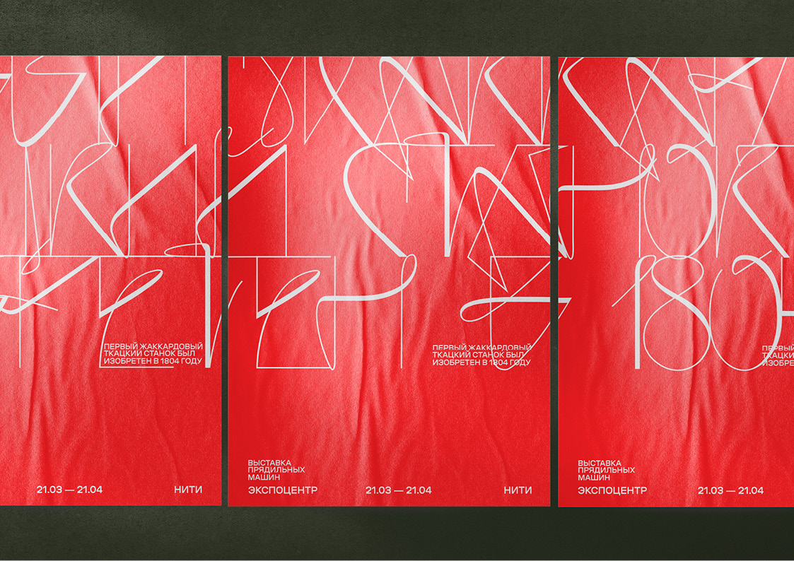
Red, white and black colors were chosen as color coding. Black and white are the most contrasting in relation to each other, they help to show a thin font, and red is taken from a stable form of speech such as a red thread.

CREDIT
- Agency/Creative: Arina Khramova
- Article Title: Exhibition of Jacquard Spinning Machines
- Organisation/Entity: Student
- Project Type: Identity
- Project Status: Non Published
- Agency/Creative Country: Russia
- Agency/Creative City: Moscow
- Market Region: Europe
- Project Deliverables: Exhibition Design, Type Design, Typography
- Industry: Entertainment
- Keywords: Exhibition, Font, HSE Art & Design
-
Credits:
Art Director: Leonid Slavin
Educational Institution: HSE Art & Design
Teacher: Kirill Sirotin


