The Challenge
Evotix, an ESG business, formerly known as SHE Software (an abbreviation of Safety, Health and Environmental Software) is fast-growing SaaS company. In its initial years of development, it had experienced rapid growth and expansion in the UK market. However, cut-through in the US was not happening at the rate or volume desired. This was primarily driven by a lack of brand awareness and consideration.
Through our initial research, it was identified and recognized that a brand evolution was required. Particularly, as the business lacked a resonating and compelling brand positioning, the brand name was holding the business back and the visual identity had become dated in comparison to competitors and other SaaS brands.
The Strategy
It was discovered that over 5,000 people are killed in workplace accidents in the US and EU – a number that’s risen in the US over the last ten years – and blue-collar workers in the US are five times as likely to have accidents as their white-collar counterpart. Yet for many organizations, changing the way they handle health and safety can be daunting, even if established practices are based on out-of-date processes and technologies.
For a business that already helps protect the safety of over 3,000,000 employees worldwide through simple, intuitive and engaging solutions, this insight was instrumental in positioning the brand around the idea of giving clients ‘the confident to transform’. Evotix would be the changer makers transforming workplace health and safety.
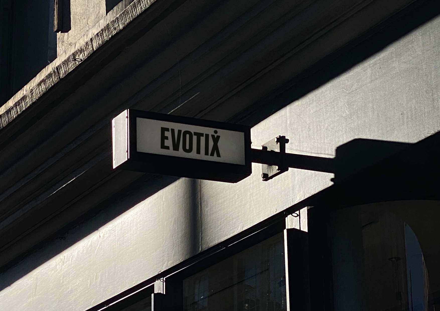
This new purposeful, client focused idea shaped both verbal and visual expressions of the brand. Including the brand name – The Evotix name is a conflation of the key qualities that makes the business unique – evolutionary technology, innovation and experience.”
The Creative
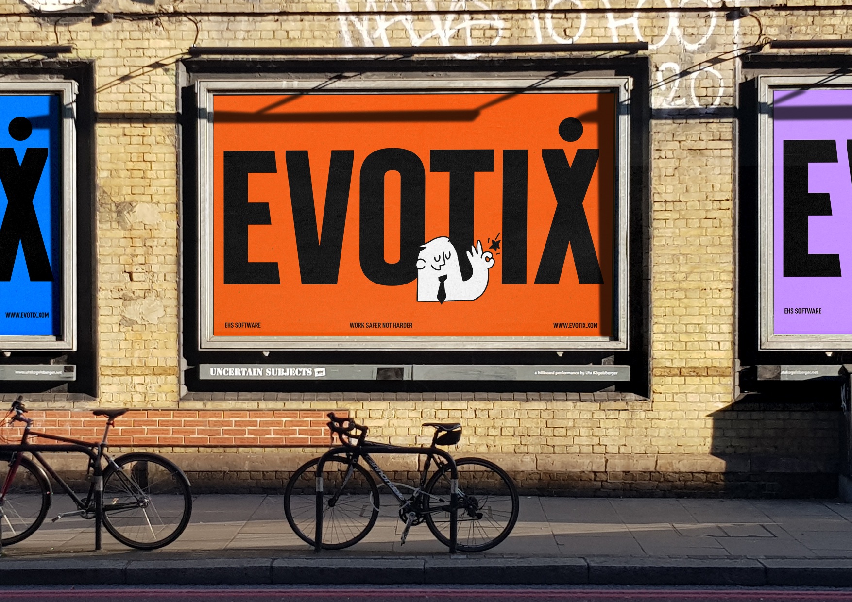
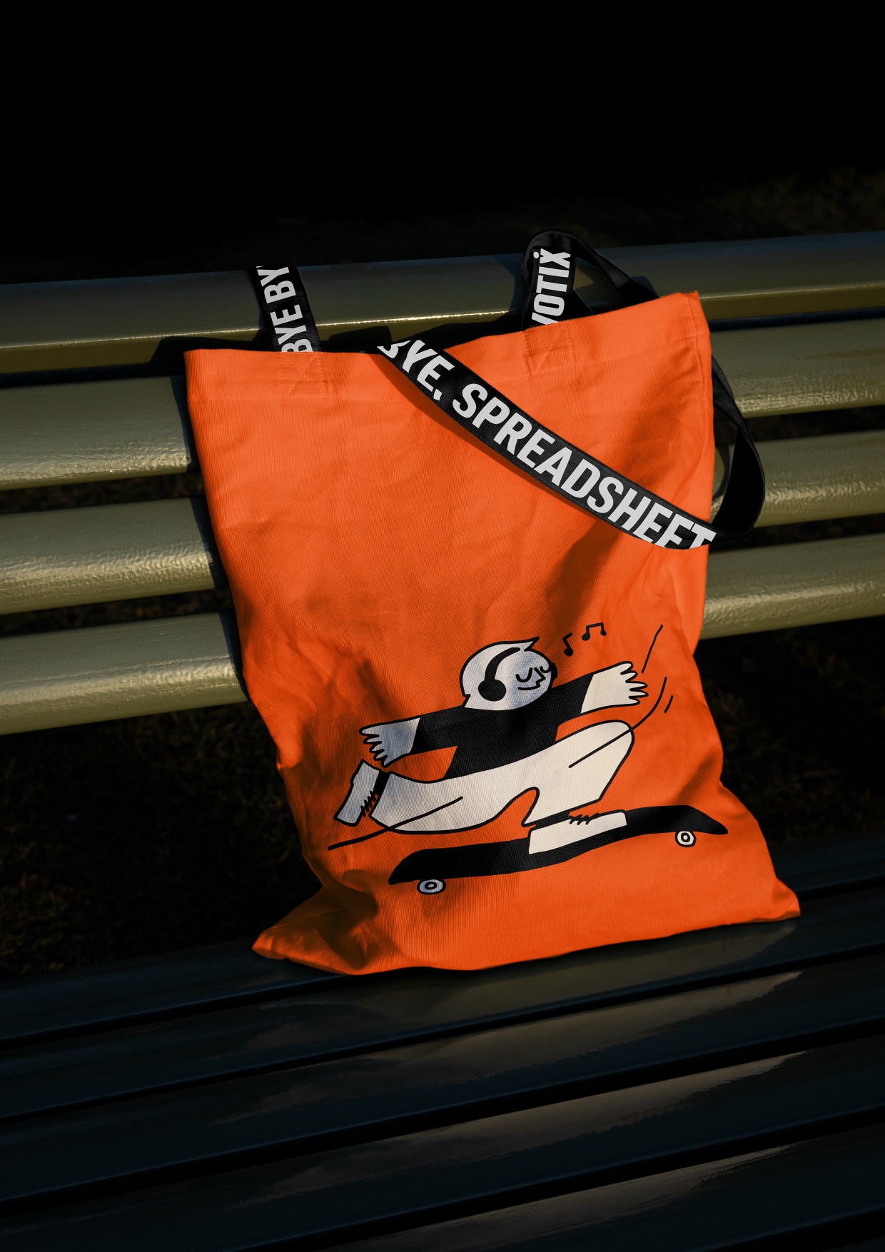
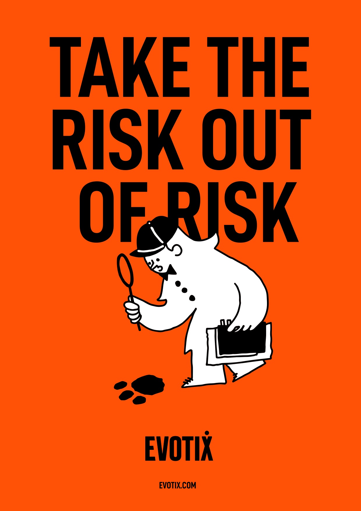
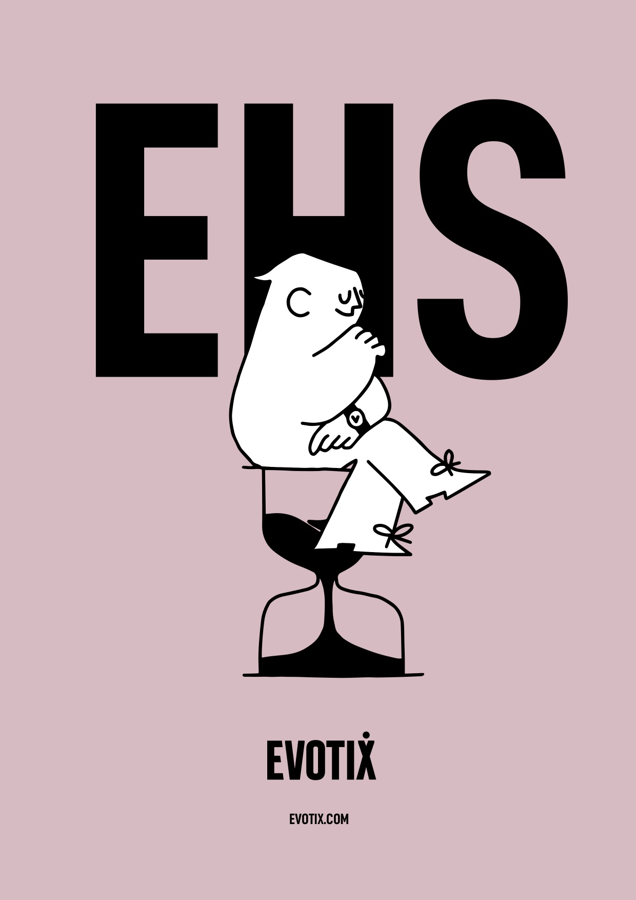
The visual expression set out from the start to create a confident yet charming new brand that balanced the serious nature of the product with a human and witty style that would connect with the target audiences. Allowing the company to be to the point, simple and bold without loosing it’s sole.
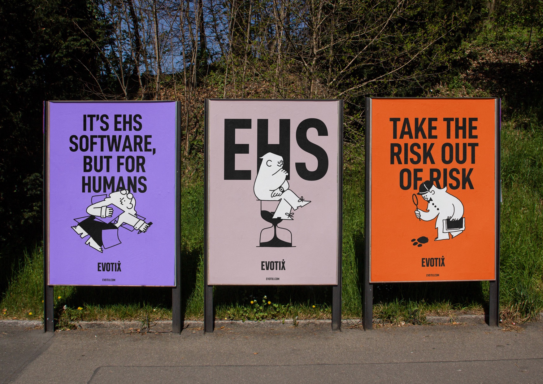
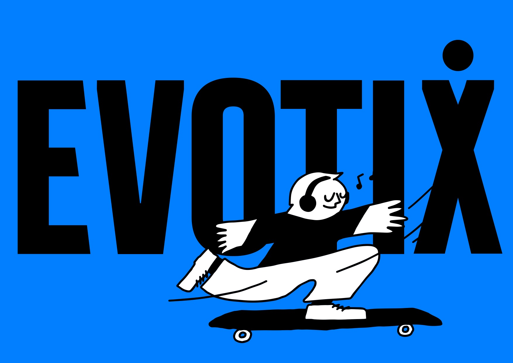
Messaging formed the foundation of the expression with a bold almost industrial typographical style being adopted to deliver short punchy headlines. This impactful layout principal was counter balanced by a humorous and informal tone of voice, and supported by a punchy attention grabbing primary colour palette of colours.
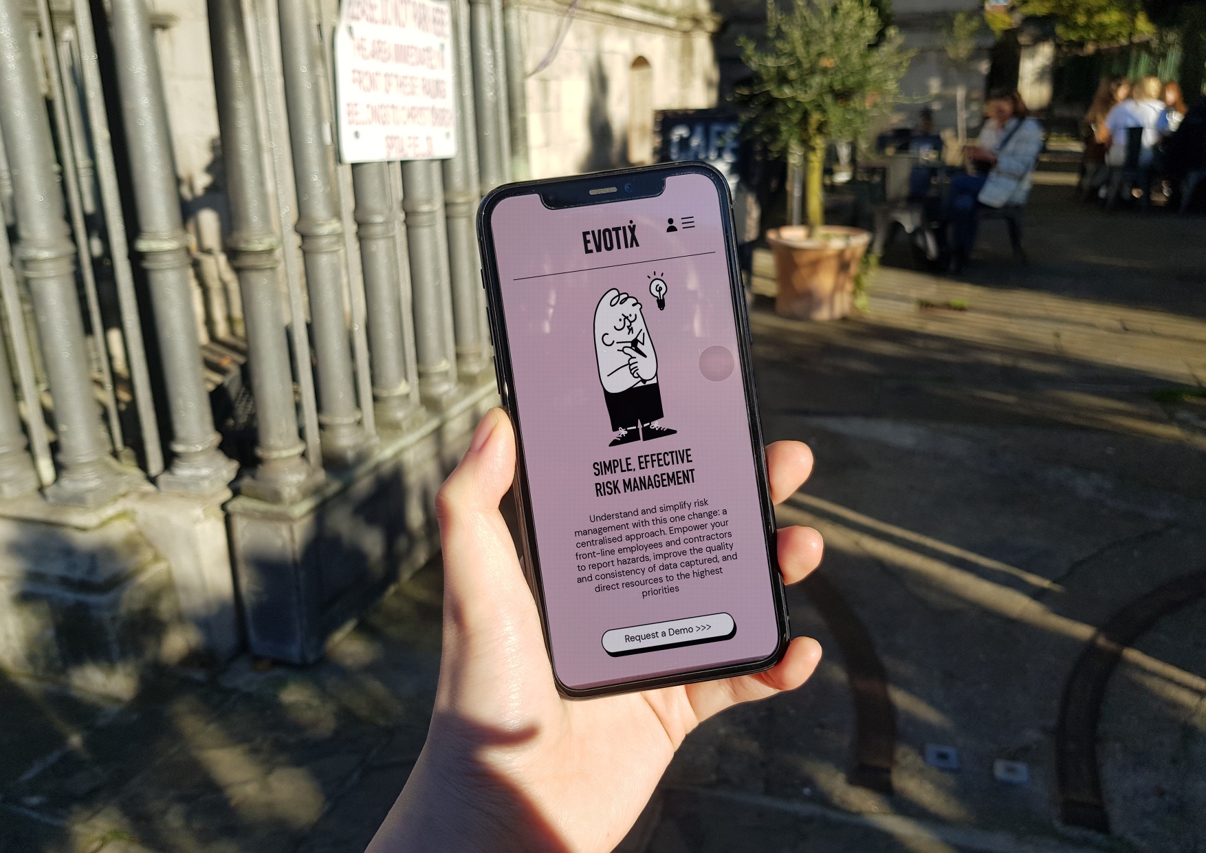
To humanise this bold visual styling, a charming contemporary/retro suite of illustrations was developed to add spots of light relief. Like wise a conscious decision was taken to develop a low-fi UI system that would bring the technical complexity of the product, back down to earth.
The Results
The new brand launched in mid November 2021 to an amazing internal response. Currently it is too early to collect meaningful sales data demonstrating impact, but already social posts on linkedin have seen a 1000% increase in click through rates compared to pre rebrand communications.

CREDIT
- Agency/Creative: BRU:D x BRANDS2LIFE
- Article Title: Evotix Brand Design Creation by BRU:D x BRANDS2LIFE
- Organisation/Entity: Agency
- Project Type: Identity
- Project Status: Published
- Agency/Creative Country: United Kingdom
- Agency/Creative City: London
- Market Region: Global
- Project Deliverables: Brand Identity
- Industry: Technology
- Keywords: WBDS Agency Design Awards 2021/22
-
Credits:
Creative Director: David Mineyama-Smithson
Creative Director: Si Liu
Designer: Yunzhu Chen
Illustrator: Yubzhu Chen
Marketing Director: Matt Brown
Associate Marketing Director: Aidan Danaher
Junior Account Executive: Estel Madrigal Belouet
Senior Strategist: Adnan Habis


