In collaboration with CBA Design, NESCAFÉ has revealed a bold new look. The iconic brand has unveiled a fresh visual identity, showcasing its legendary logo with even more presence. This new design not only gives a makeover but also celebrates the unmistakable taste of NESCAFÉ.
NESCAFÉ, one of the world’s favorite coffee brands, has always been able to adapt to consumers’ tastes and aspirations.
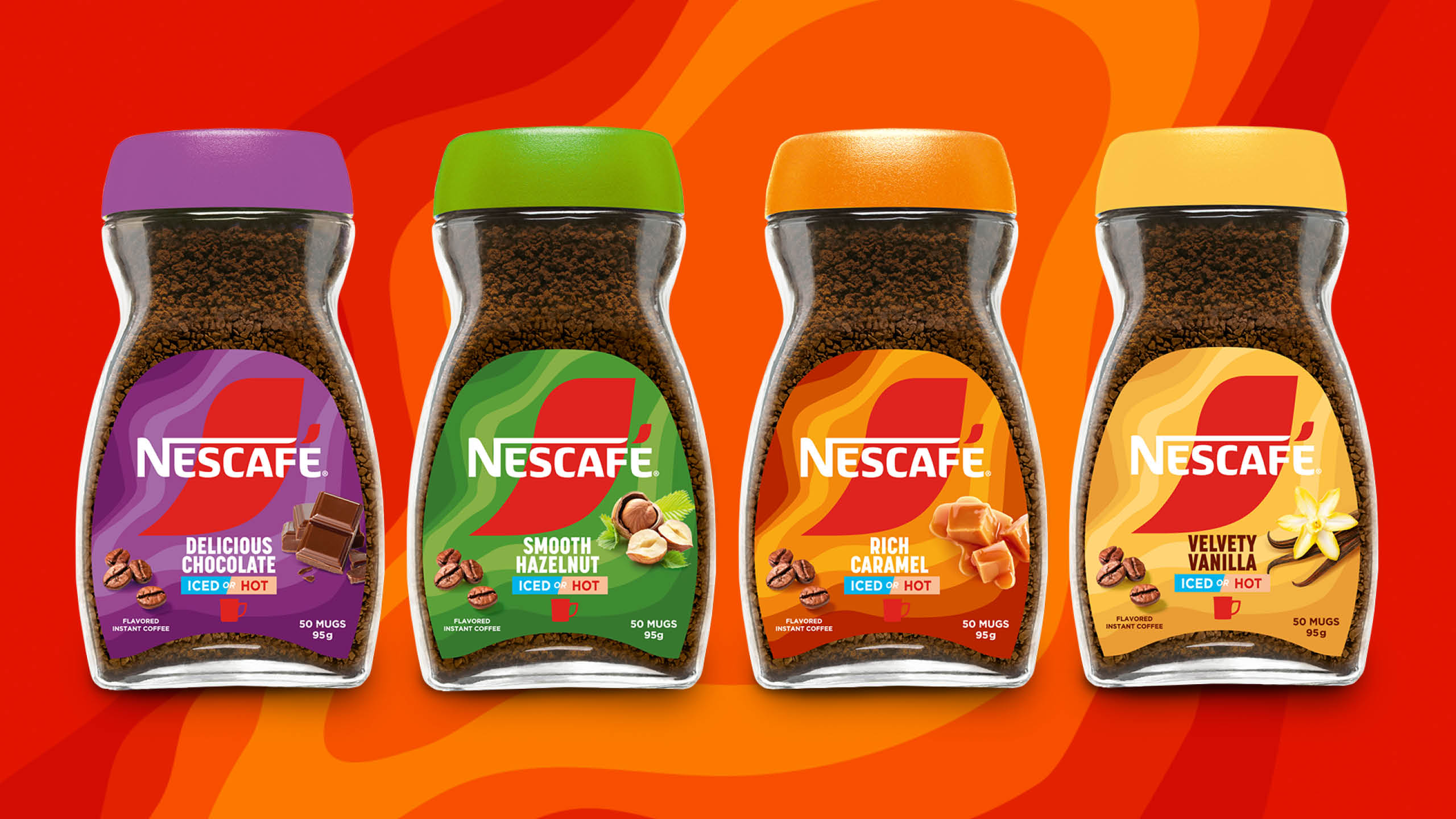
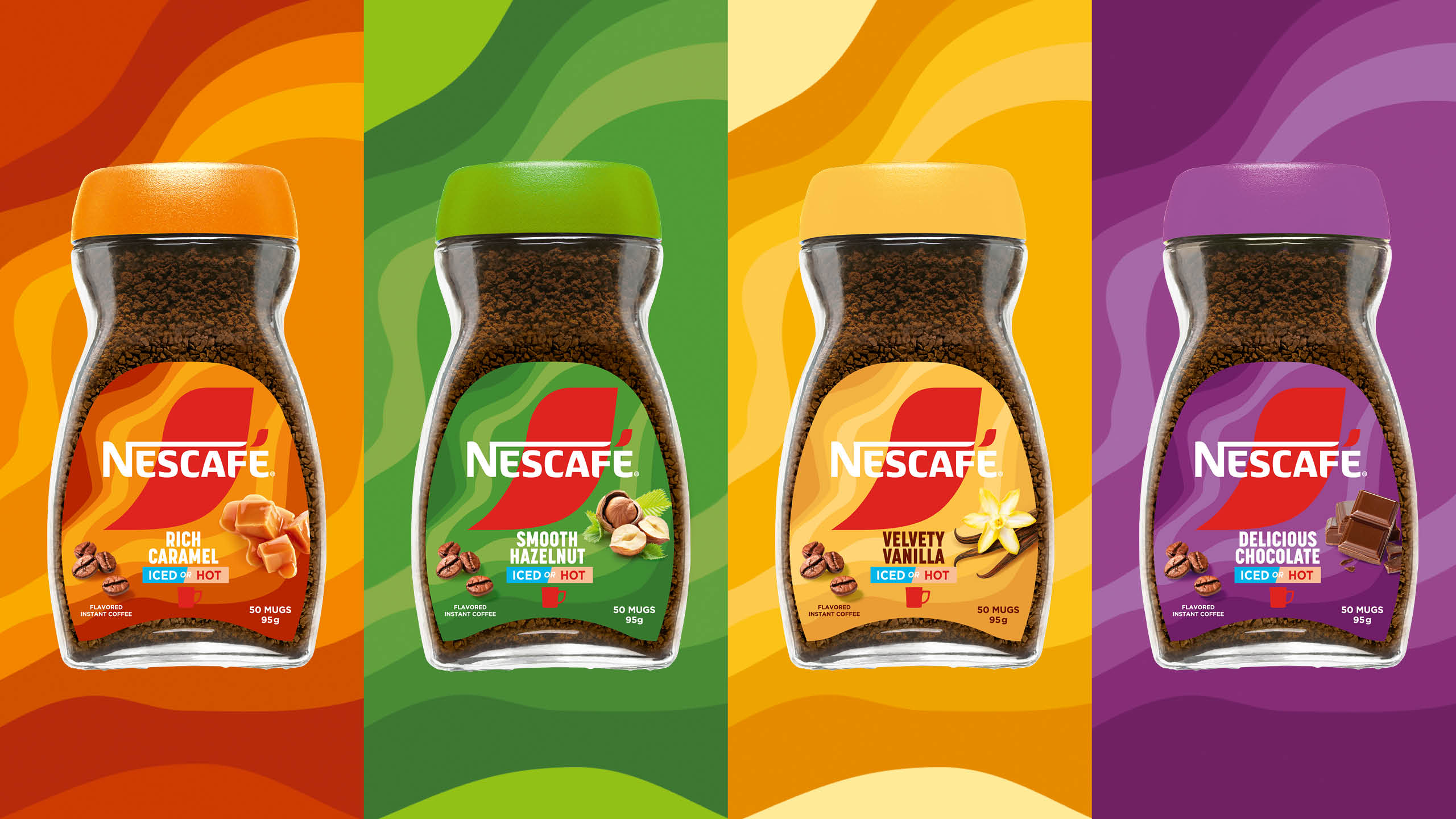
The iconic brand embarks on a new chapter by unveiling a modernised and engaging visual identity, reflecting its vision. A vision now articulated in the structure of its extensive product portfolio and its packaging, also developed in partnership with CBA.
NESCAFÉ aims to inspire coffee lovers worldwide to make a difference – for themselves, and their communities. This vision, embodied in the “Make Your World” strategic platform launched earlier this year, is translated into actions at every step of the value chain, from bean to cup.
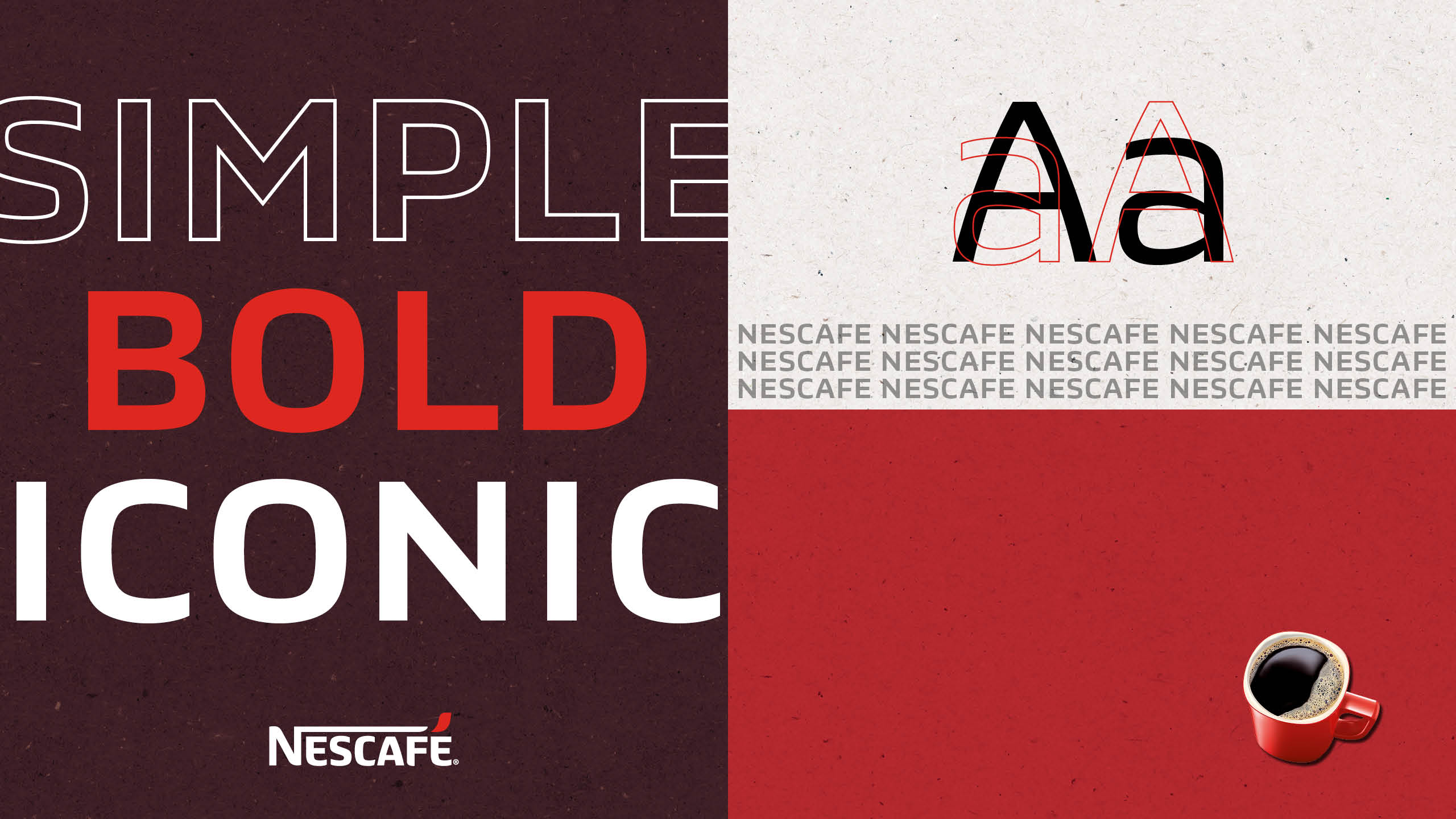
To embody this vision, NESCAFÉ collaborated with CBA Paris to rethink its visual identity. Simplicity and authenticity are the two pillars on which the coffee brand’s identity is based.
The result? A clean and impactful design that highlights the very essence of the brand.
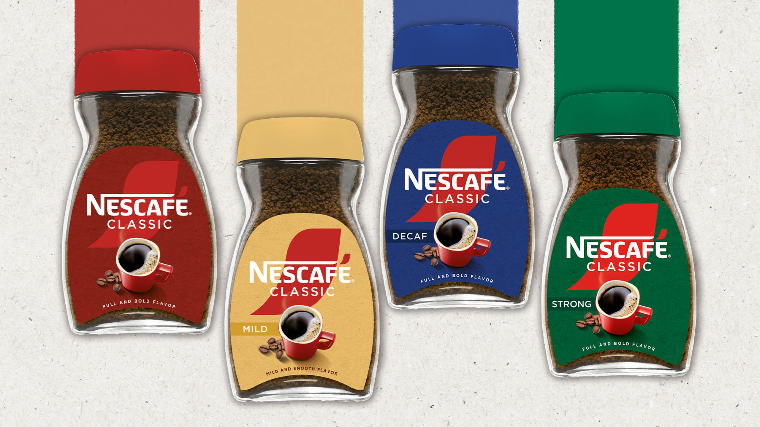
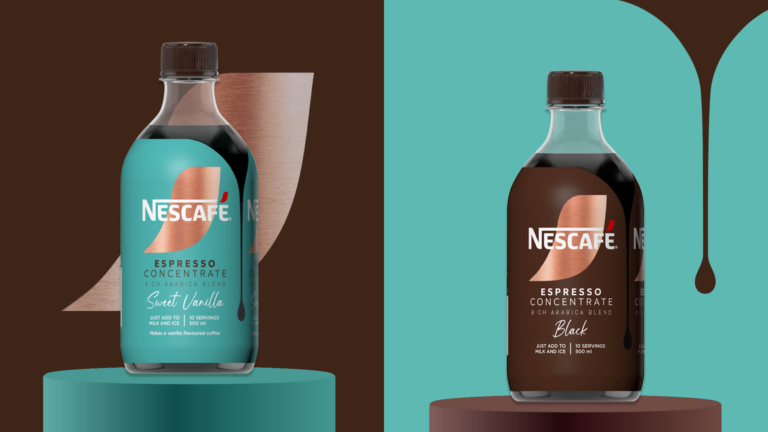
The NESCAFÉ logo, with its emblematic accent, is now displayed with pride and boldness across all product lines. Enlarged and prominently featured, it reaffirms the brand’s prominent position among coffee lovers. This new visual identity, both consistent and striking, ensures increased visibility on shelves.
The clean design, natural colour palette and tactile texture give a sense of authenticity NESCAFÉ aims to convey.
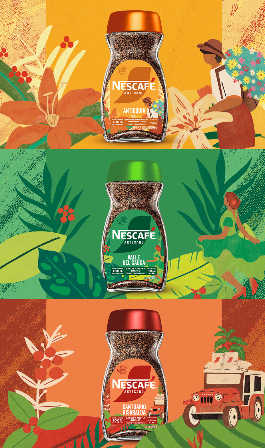
NESCAFÉ‘s new branding has been designed to adapt to the 180 markets in which the brand operates. CBA Paris collaborated with its local agencies, including CBA B+G for Latin America, CBA Spain, CBA Asia and CBA USA, to ensure global consistency while respecting the cultural specificities of each market. This collaborative approach has created a strong and recognizable visual identity worldwide, while offering flexibility to adapt to local needs.




CREDIT
- Agency/Creative: CBA Design
- Article Title: Everything Starts with Nescafé: CBA Design Refreshes Nescafé’s Visual Identity, Blending Tradition with Modern Experiences
- Organisation/Entity: Agency
- Project Type: Identity
- Project Status: Published
- Agency/Creative Country: France
- Agency/Creative City: N/A
- Market Region: Global
- Project Deliverables: Brand Experience, Brand Guidelines, Brand Identity, Brand Redesign, Packaging Design
- Industry: Food/Beverage
- Keywords: brand redesign, consumer brand identity, packaging, love brand design
-
Credits:
Design: CBA Design


