


Creating a new era of personal care for every body, every day.
From brand identity, vessel design and benefit-focused copy to art direction and a go-to-market campaign, we worked hand in hand with frank body to imagine a new era of personal care. This wasn’t just about launching another skincare range; it was about rethinking the way we interact with personal care products daily. Every detail was crafted to feel intuitive, fresh, and seamlessly integrated into people’s routines, making self-care as effortless as it is effective.
The brief: create a brand that could leverage the equity built over time in frank body, and also stand alone, including within a whole new retail environment; Priceline. The challenge was to take everything that people already loved about frank body—the honesty, the fun, the effectiveness—and evolve it into something distinct. A brand that felt like an extension of frank body but could also thrive independently, appealing to a broader audience in a high-traffic retail setting. This meant developing a brand identity that was both familiar and fresh, something that long-time fans could connect with while inviting new customers to explore and engage.
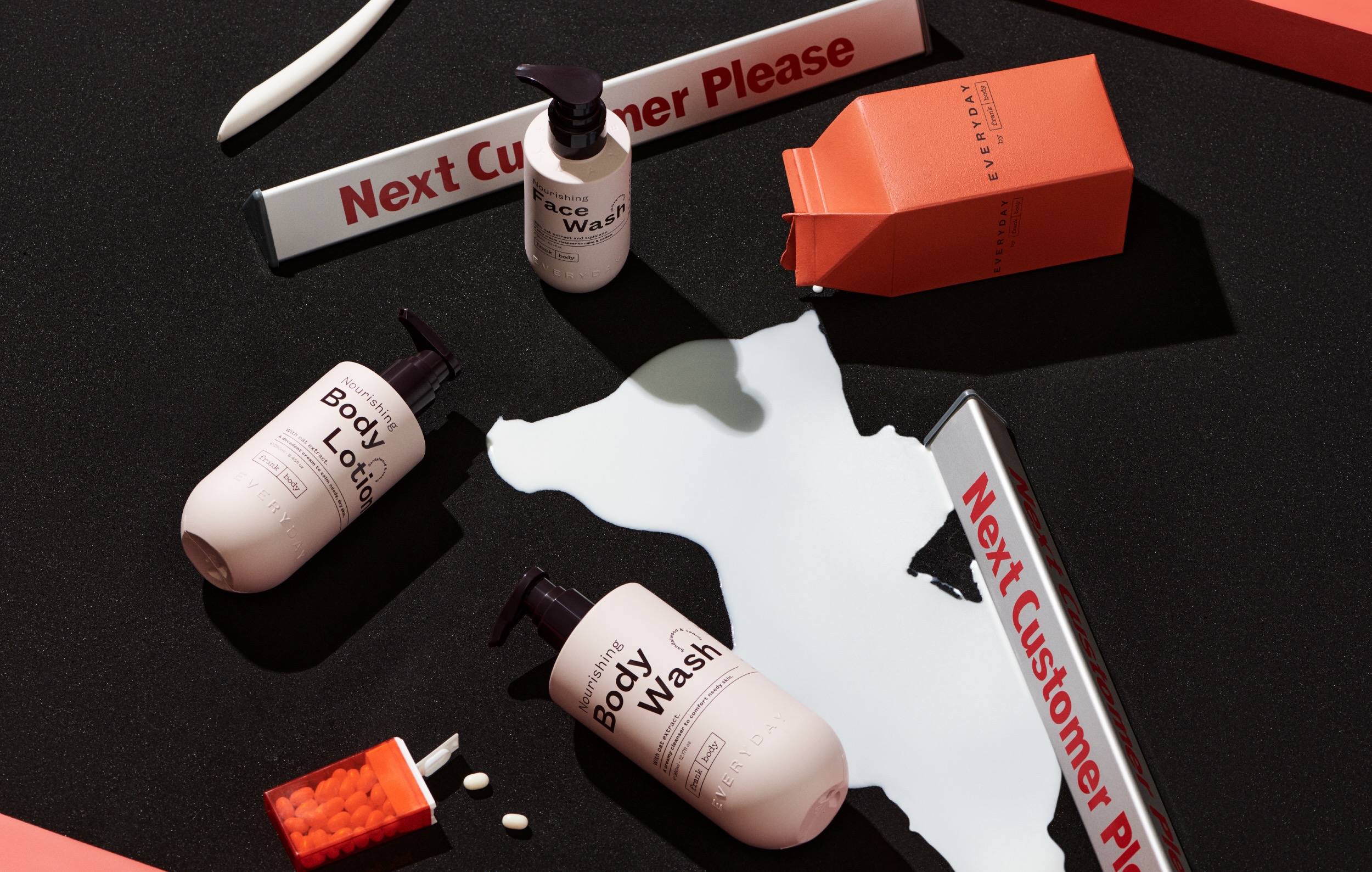
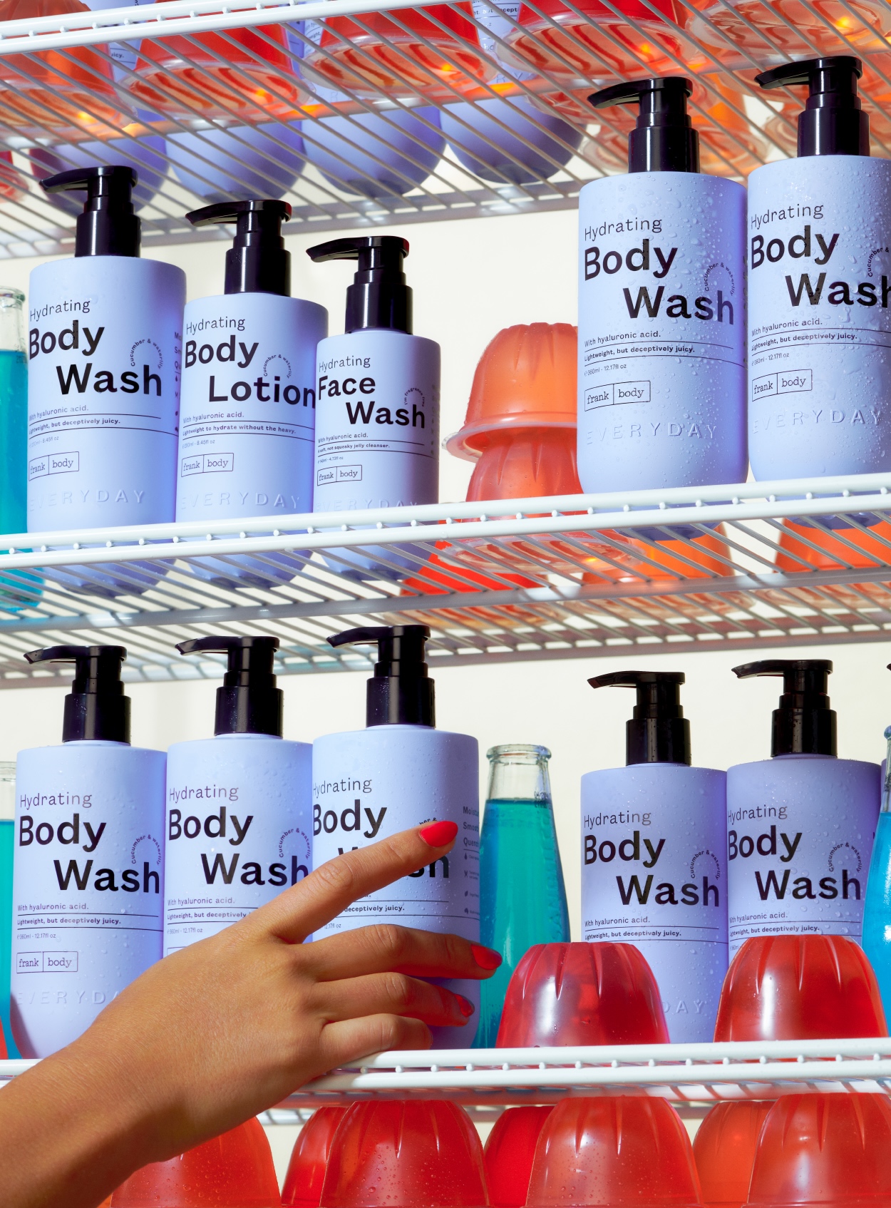
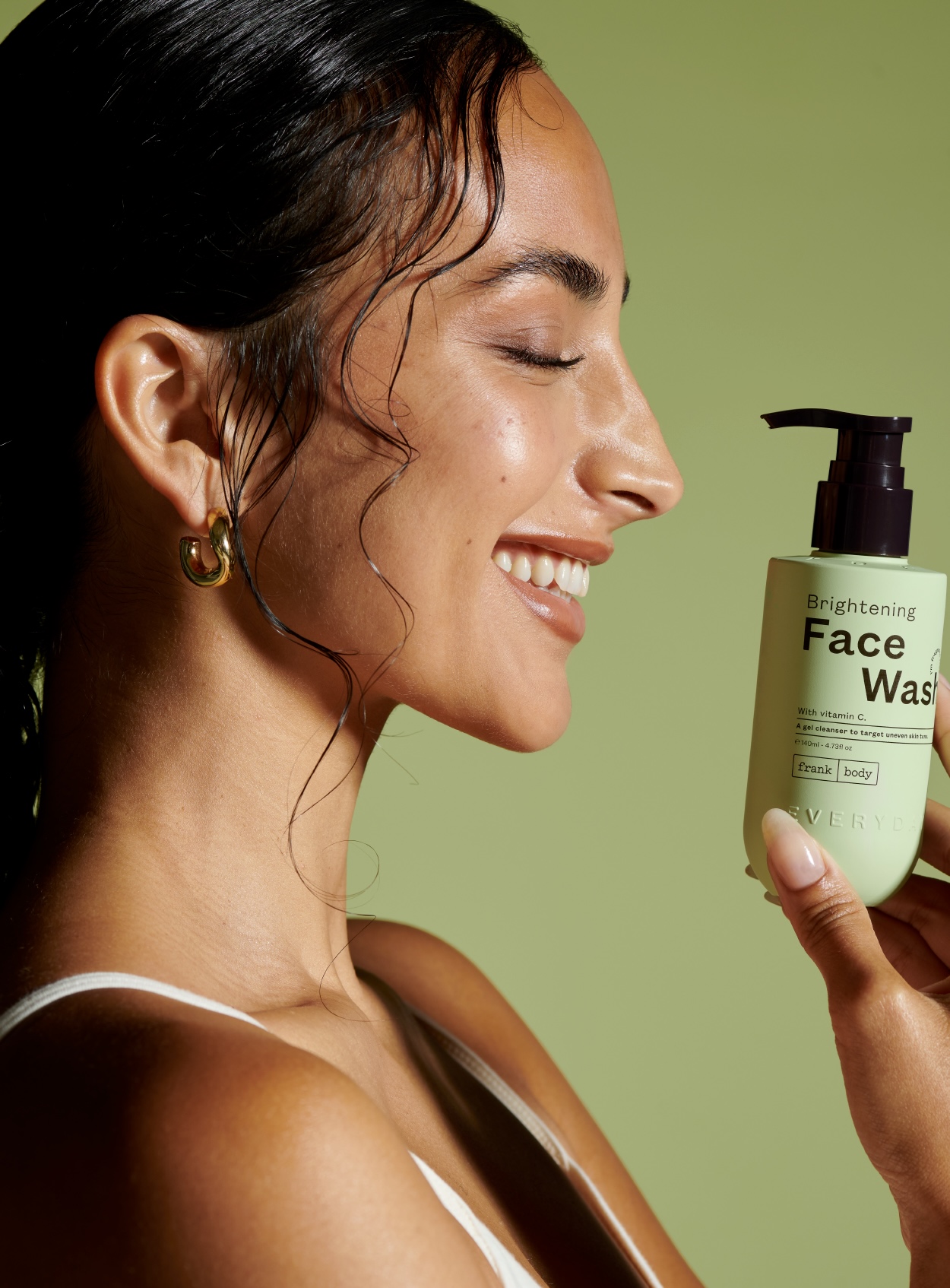
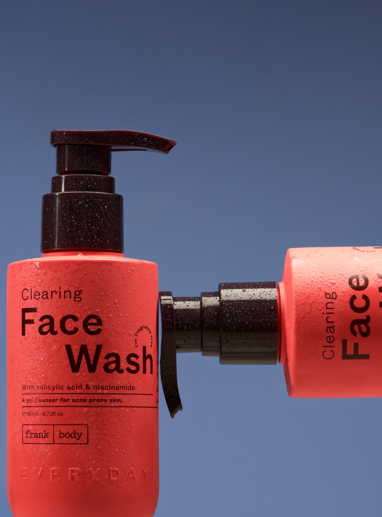
We designed a range featuring four unique franchises; each identifiable via ingredient, benefit and colourway. Every element was intentional. The ingredient-led approach made it easy for consumers to identify the product that suited their needs, while the bold, recognisable colourways ensured strong visual impact on shelves and in bathrooms alike. The range was designed to be shoppable—inviting, accessible, and clear in its benefits. These were products that worked effectively but also looked good on anyone’s shelf. Because when something looks good, it becomes part of your space, part of your routine, part of your day-to-day. Everyday isn’t just about skincare; it’s about making self-care effortless and accessible.
To launch Everyday to market, we considered how to position a new range of personal care as a daily essential. The answer: place the product in scenarios already familiar to us—baskets, conveyor belts, weigh scales and fridges—inviting people to add great skin to their shopping list. Because good skin shouldn’t feel like a luxury or a step you need to carve out time for—it should be as simple as picking up your essentials at the store. The campaign Everyday, everyday reinforced this idea: that skincare should be effortless, an easy yes, a no-brainer. By placing the range in universally understood, everyday settings, we reinforced its accessibility and convenience. This approach not only helped position Everyday as a daily staple but also built an immediate visual language that resonated across digital and physical touchpoints.
For social, we were tasked with elevating the Everyday Instagram aesthetic. Yes, lo-fi Reels work well for the algorithm—but what was working well for the brand? We designed a suite of assets, iconography and brand tools to transform the Everyday social aesthetic into something that not only looks great but elevates the Everyday brand. For always. The goal was to strike a balance between engaging content that felt organic and a strong, cohesive visual identity that would establish Everyday as a brand people recognised instantly in their feeds. We developed a set of brand-led templates, playful yet refined iconography, and a tone of voice that felt effortless yet intentional. Because looking good online isn’t just about keeping up—it’s about standing out in a way that feels uniquely you.
Beyond digital, we considered how the brand would live and breathe in a retail space like Priceline. In a busy, high-turnover environment, the challenge was to ensure Everyday stood out while feeling like it belonged. Our approach to packaging and in-store presence was rooted in clarity: clear benefits, clear differentiation, clear reasons to buy. Whether someone was picking up a product for the first time or returning for a restock, the design made their decision-making process seamless.
At every touchpoint, the goal was the same: to make great skincare feel as easy as picking up a loaf of bread. Everyday, everyday.
CREDIT
- Agency/Creative: Willow & Blake
- Article Title: Everyday by Frank Body: Creating a New Era of Personal Care for Every Body, Every Day
- Organisation/Entity: Agency
- Project Type: Packaging
- Project Status: Published
- Agency/Creative Country: Australia
- Agency/Creative City: Melbourne
- Market Region: Oceania
- Project Deliverables: Design
- Format: Bottle
- Industry: Beauty/Cosmetics
- Keywords: Frank Body
-
Credits:
Creative Director: Bianca Georgiou
Head of Brand Voice: Bri Nixon
Account Director: Madeleine Hargreaves
Graphic Designer: Mia Langfelder
Senior Graphic Designer: Anna Maunsell


