Despite working with artwork and colour management for nearly 30 years, to this day, my relationship with colour is still an uncomfortable one. Sometimes we fall out.
I’ve stood in many a supermarket aisle staring at packaging and I’m stunned and disappointed by the colour difference of two packs sat side by side on shelf, thinking…How can this happen?
Print colour management is easy, right?
Surely the printer and the artwork agency take care of this for a brand (?) … but is that really enough? Can a brand be so hands-off in its approach to colour management and still get great results?
Not in my experience.
To achieve excellence, you need great collaboration between all the key stakeholders.
In this article, which expresses my own views, I thought that I would share an open and honest insight into a that we’ve been on over the last 5 years to gain a greater control of the colour accuracy and consistency of our Kellogg’s branded packaging in Europe, where I have the privilege of working with some of the best-known brands in the world.
I’m not claiming to be a colour expert – I don’t know all the answers. My hope though, is that reading this inspires you that colour management isn’t a myth. We’ve learned some lessons along the way that you may be able to benefit from.
When I joined Kellogg’s Europe back in 2014, initially in the role of Packaging Artwork Manager, print colour management accountability landed somewhere between a number of internal teams. I suspect this is a similar situation that many brand owners have(?).
Each of these teams were accountable in some part for print colour management, but nobody truly had accountability, the expertise or adequate resources available to give the level of attention that colour management needed.
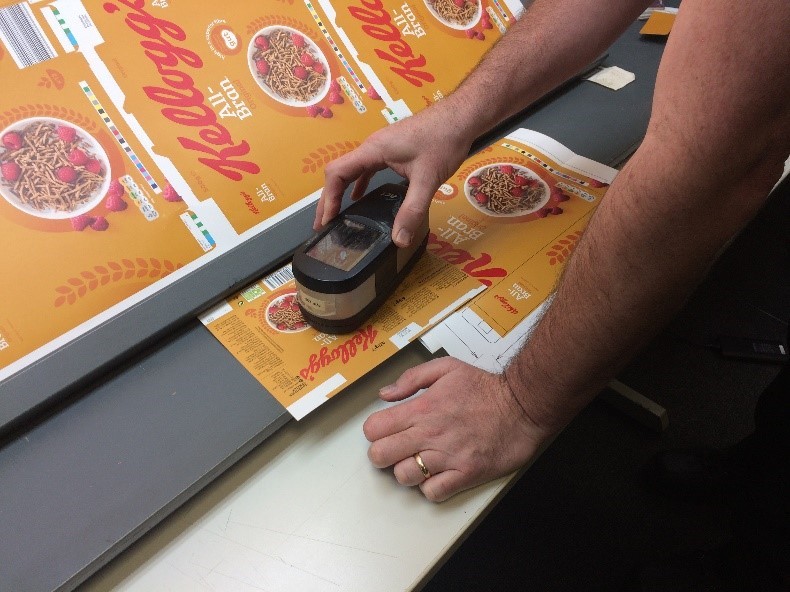
In retrospect, we didn’t really have a print colour management process. We ran pretty much on a trust basis, and despite the provision of a profiled and calibrated Epson target proof at every print run, we often found that the trust model simply let us down, and on several high-profile occasions.
Our brand’s appearance was being damaged by consistent print colour variation. We needed a new approach.
I love a challenge. Print colour management made eye contact with me and I couldn’t resist! This was an opportunity to make things better.
“If you can measure it, you can control it”
When you’re talking about printing ink on a substrate, never forget that you’re talking about a science, and if you want to reproduce a target colour match every time, then you really need to repeat the same conditions time after time.
Now, let’s be honest with each other here, in commercial print, that’s never going to happen, the odds are stacked heavily against you.
The number of variables in an analogue printing process is vast. We estimated that there are around 150 potential variables that could scupper your chances of getting a good match to your colour target on any given day, so good luck with that one!
It’s true, we can measure print against a standard and incorporate a tolerance factor. There are many good systems and software’s out there for doing this, and no doubt I’ll be inundated with offers of such products after this article is published, but what good is just measuring the end result?
It’s a bit like going on a journey and arriving at your destination and recording that “you’ve made it”. Big deal! It doesn’t exactly reveal the true story of the effort or time delays it took to get there, or give advice about the next time you make that journey – such as what you should watch out for, or try changing this to get there more efficiently next time.
Put another way… what good alone is a press side colour report? It doesn’t tell you if the printing plates are over exposed, if the dot gain curves don’t match press behaviour, if the press is poorly maintained, the viewing conditions are sub-standard, the press operators are frustrated, demotivated or poorly trained.
So, this is why you have to measure the end to end process, and for us that meant that whatever we introduced, it had to be able to address the root cause of why print colour may not match the target in the first place, not just measure and control the end result.
As the brand owner with natural budget constraints, the reality was that to get this up and running it really needed to be low or cost neutral and not eat up vast amounts of valuable time or resource.
To summarise our requirements:
1) Improve print colour accuracy and consistency
2) Do this in partnership with our suppliers
3) Must be a resource and cost-neutral model
After considering various software and processes on the market, there was one solution that stood out to us, and that was presented by Mellow Colour.
I wouldn’t be surprised if you haven’t heard of Mellow Colour. By their own admission they are not big, and they don’t shout their name from the rooftops (as much as they should!), but Mellow Colour are colour and quality process experts. Through and through.
Mellow Colour’s certification program addressed not only the end result, but how you get there.
Don’t start at the inky end if you want to have good print colour management.
You should consider developing a quality process that has a level of control on every touch point of the process of creating colour. It’s not just about the press. It’s about pre-press, plate production, calibration, engagement, training, maintenance. These things, and more, will create an environment for success.
Put the effort in up front and it makes achieving the desired result easier. This really struck a chord with me as we had instilled this same philosophy into our Design to Print process.
Engagement of the people in any process is critical. For print colour management, buy-in from senior leadership in the print business is important, but what’s more important is that they in turn empower and support the people that do the day-to-day work to build the colour management process. Everyone aligned to the same goal.
The politics
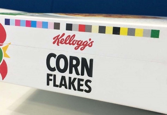
As the brand owner, setting out on this journey with Mellow Colour was straight forward. We set a standard, aligned closely to ISO 12647-2, created a program to manage the implementation of this standard, and worked with our artwork agencies to apply a Mellow Colour strip to the base panel of our packaging artworks.
We then made Mellow Colour PrintSpec reports from some existing printed packaging and used the results to have open and transparent discussions with some of our procured printers, where we set out the framework of the goal that we were trying to achieve.
Some of those discussions were challenging. Some are still ongoing. Change will always meet resistance. There is often good reason behind the resistance. The opportunity here is to create a situation that is mutually beneficial to all parties.
The potential benefits that Mellow Colour offers varies depending on the printer’s current quality level, but to most printers, for a relatively small investment,there is a quick return on the investment when you consider the opportunity to reduce waste in set-up time and make ready materials, paralleled with an uplift in general print quality, customer satisfaction, and an added immeasurable benefit of raising engagement of employees who truly own and take pride in their work.
Many printers offer colour management reports to their customers, and to some brand owners receiving reports of varying formats from their different printers might be acceptable, but if you want to compare apples with apples, you really need all the data in a consistent format and stored in one place.
Mellow Colour has a cloud based solution to upload reports into. The brand owner then has some great analytics tools to produce reports of performance across their print partners.
We worked with one of our most trusted print partners for the first implementation of Mellow Colour. After some initial conversations, they embarked on Mellow Colour certification level 1 (Proficient Print) and then on to level 2 (Impression Proof), and we attend the training as well.
The training didn’t disappoint. Almost immediately, we could see tangible results, and competition developing amongst the press operators to deliver the first ‘100’, perfect score.
Rather than being reliant upon perceptions of performance, with Mellow the brand owner can base performance conversations around factual information. This isn’t just good news for the procurement team, it’s a great tool for the printers to use to unlock new doors.
At printers who have invested in Mellow Colour, we’ve seen rapid improvements in the quality and consistency of their work.
Our journey is far from over
Colour management isn’t a quick win, and it isn’t just about inky things. You’ve got to collaborate with all internal and external stakeholders and maintain positivity and resilience through drawn out discussions, red tape, training and implementation.
Over the last 5 years, we have:
1) Created our own colour management program, with a set of standards
2) Integrated Mellow Colour quality procedures and standards into our day-to-day thinking.
3) Packaging now carrying a Mellow Colour strip
4) Printers uploading Mellow PrintSpec reports into the Mellow Cloud
5) An opportunity to approve print remotely at any time of day (or night!) in real time, using the Mellow Colour software, without the need or expense of a press side approval (so there’s even a sustainability angle!)
6) Analysis of performance
We now have great looking packaging, with better accuracy to colour targets and better consistency from pack to pack.
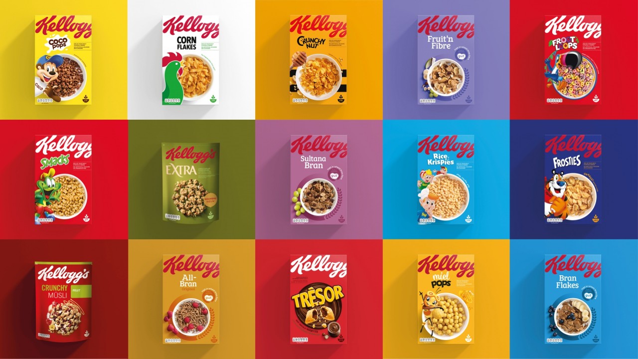
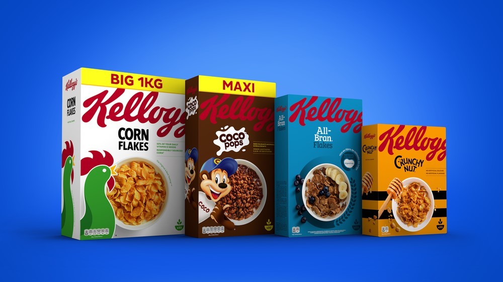
We’ve recently gone through a cereal Masterbrand re-design and the benefits of the hard yards put in over the last 5 years are now there to see on shelf in the cereal aisle.
Final thoughts…
For those high-profile new innovation projects, as much as we can put our faith in the science, process and software, never underestimate the value of a print trial, a press pass and physically seeing the print results yourself. Your eyes are (usually) the best tool in the business. If you can’t do both, do the print trial. It’s a less pressured environment and probably not as time critical, plus you’ll have the opportunity to know what works and what doesn’t and can adjust artwork files in time for the first print run.
If you don’t have the confidence to go on a print trial or press pass and ‘talk the talk’ with the experts, I implore you to be courageous and inquisitive and just do it. Print isn’t that scary, and showing vulnerability isn’t a bad thing. Never be afraid to ask questions and learn.
If you work with good artwork agencies, they may have print technical managers that can support you with print trials and press passes. They will have so much experience and can offer some fantastic technical advice. Also, don’t forget to involve the print technical manager throughout your design to print process, as this can add so much value by removing potential issues before they arise.
My final message to anyone struggling with print colour management would be:
1) Be clear on your objectives
2) Find the right partners to work with. Maybe just work with one at the start to prove the process is right
3) Avoid press side measurement only solutions. You need an end to end process control.
4) Watch a few online courses on ‘building your resilience’!
Hopefully this article has provided a useful insight and some tips for you in your valiant quest to achieve print colour excellence.
References:
www.kelloggs.com/
www.mellowcolour.com/
CREDIT
- Article Title: Ever Wondered How a Brand Does Print Colour Management by Steve Wardle


