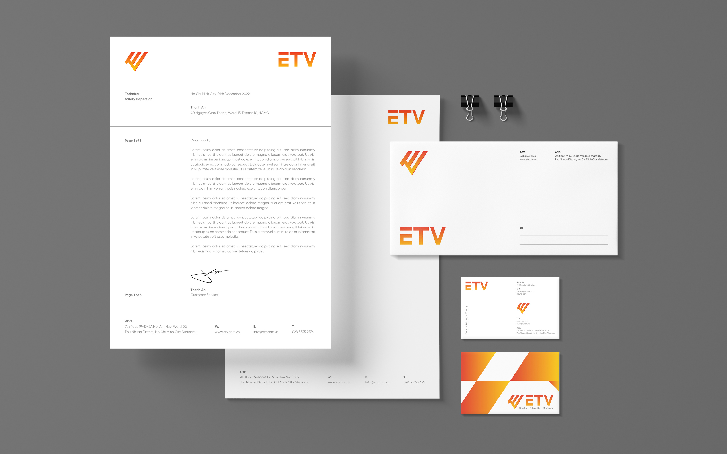
ETV – Brand Identity – A new brand image for the safe solution company in the Vietnam safety testing sector.
Established on November 9, 2018, ETV is a brand specializing in consulting and providing services: Inspection of machines, equipment and materials with strict requirements on occupational safety. Testing and calibration of measuring instruments, training on occupational safety and health, consulting on building a safety – health – environment management system for enterprises (HSE), monitoring the working environment in Vietnam.
Challenge
Vivian partnered with ETV to redesign the brand identity in Vietnam to build corporate identity, re-establish a smart platform strategy, identity emphasizing personalization and cohesive image, connect with customers.
ETV is a successful enterprise myself, an accredited brand with enough prestige in the domestic market. Vivian has approached and analyzed to understand the internals of ETV: Objectives, strengths, differences, corporate strategy and competitive advantage. These startup steps will shape the direction of the business. Then, we define and understand the audience, who the customer is, what their expectations are about the product, the message and the identity of ETV. This will create a deep connection between the brand and the customer.
Approach
ETV expectation is to become the leading brand in providing KTAT testing services, OSH training, HSE according to Vietnam and international standards.
ETV design builds on key foundations that Vivian identified to translate into brand identity. In particular, the purpose and meaning of the brand is the most important foundation besides other platforms such as brand core, brand personality, brand value, and brand image.
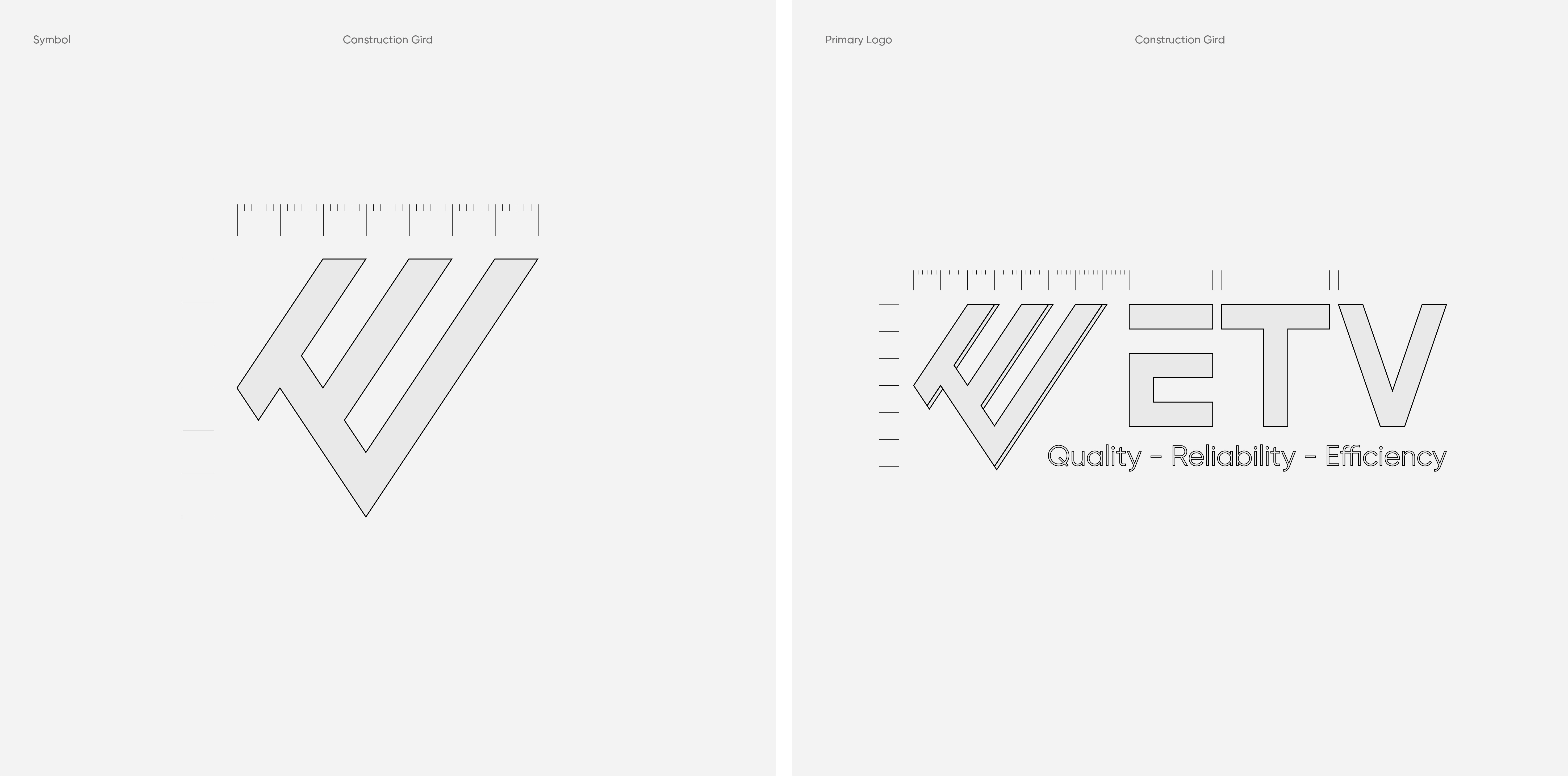
ETV logotype is created with basic and user-friendly geometry, solid, expressed through bold bold, simple and clean. A slight emphasis on the letter E is handled when removing the crossbar. With this highlight, the ETV word cluster can always stand alone on other applications and still be highly identifiable.
Brand Logo
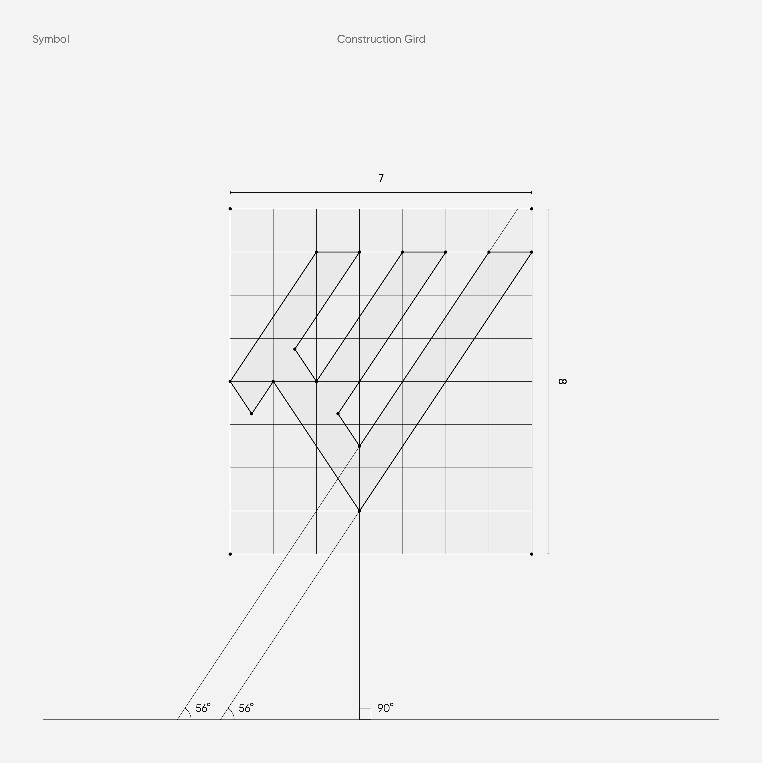
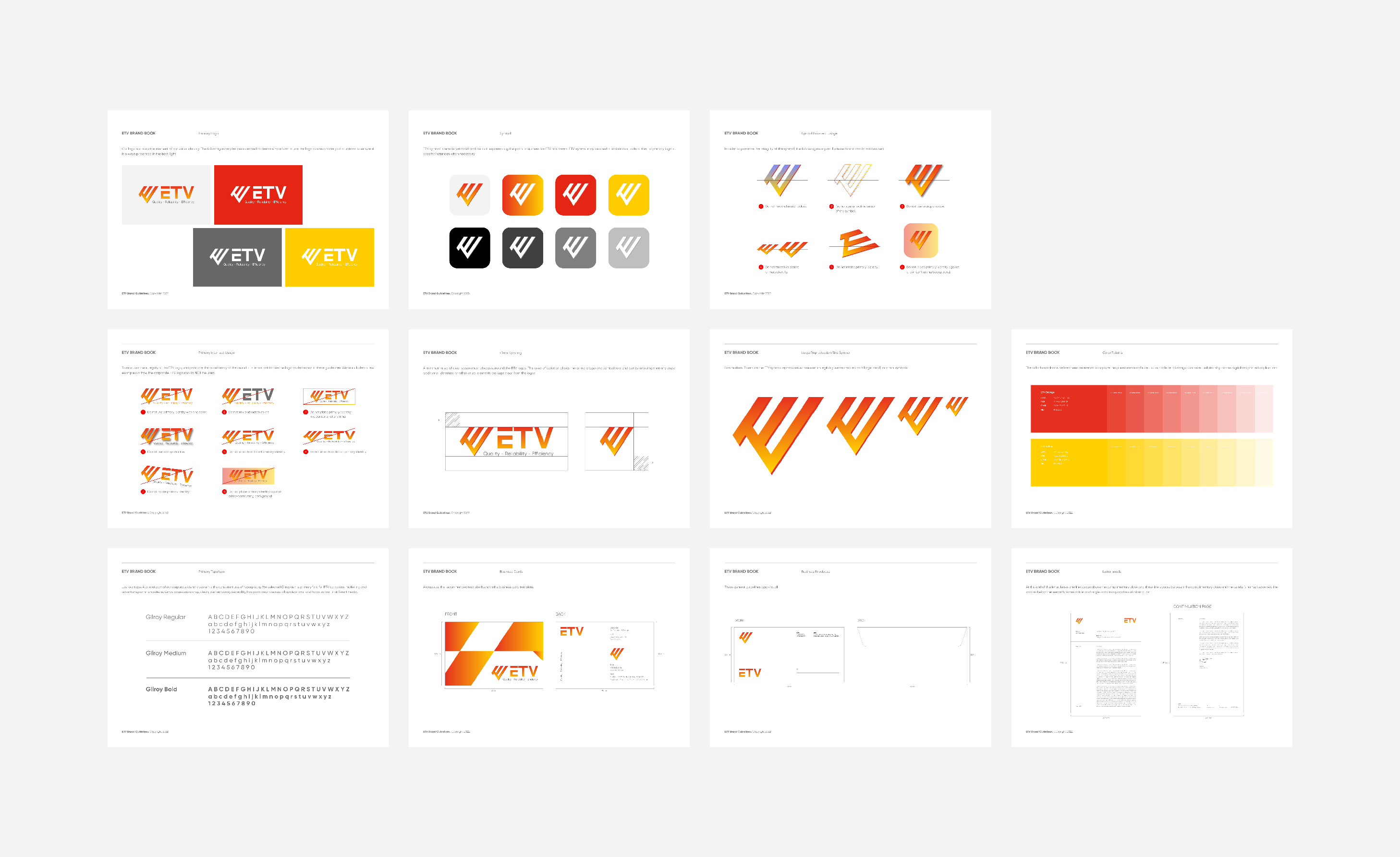
Vivian was required with an easy to remember, powerful, flexible and embeddable ETV brand name. After discussion, we chose the Monogram Logo design option to be used as a narrator of the story of ETV’s journey of striving and development. What’s interesting about a monogram logo design is the sentimental value it carries – the use of letters forms memorable acronyms and a deeper connection to the company name. The letter E is boldly treated with 3D shape geometry. The balance by the simple structure of 2 TV characters nested on the first and last E creates stability and solidity, directionality and many other activities.
Components in the layout are built based on visual elements with the language of geometry, color, layout, space and story to convey a modern, streamlined identity, helping to focus more clearly on the message that the ETV wants to convey.
Brand Color
The color palette builds on the heritage orange, yellow that distinguished ETV from its competitors, evolving it to a more vibrant, dynamic and ownable gradient. The extended palette uses a combination of brights and darks that allow flexibility within the site and social media.
Typography
Just our type. A crucial part of our corporate identity system is the consistent use of typography. We selected Gilroy as the primary font for ETV corporate marketing and advertising communications. Gilroy possesses a crisp, clean, contemporary sensibility, has good depth across all applications, and holds up well in different media.
Visual Identity
ETV delivers a message of constant communication to customers through every product, which is applied to the geometry motif of ETV symbol to customers.
Brand Application
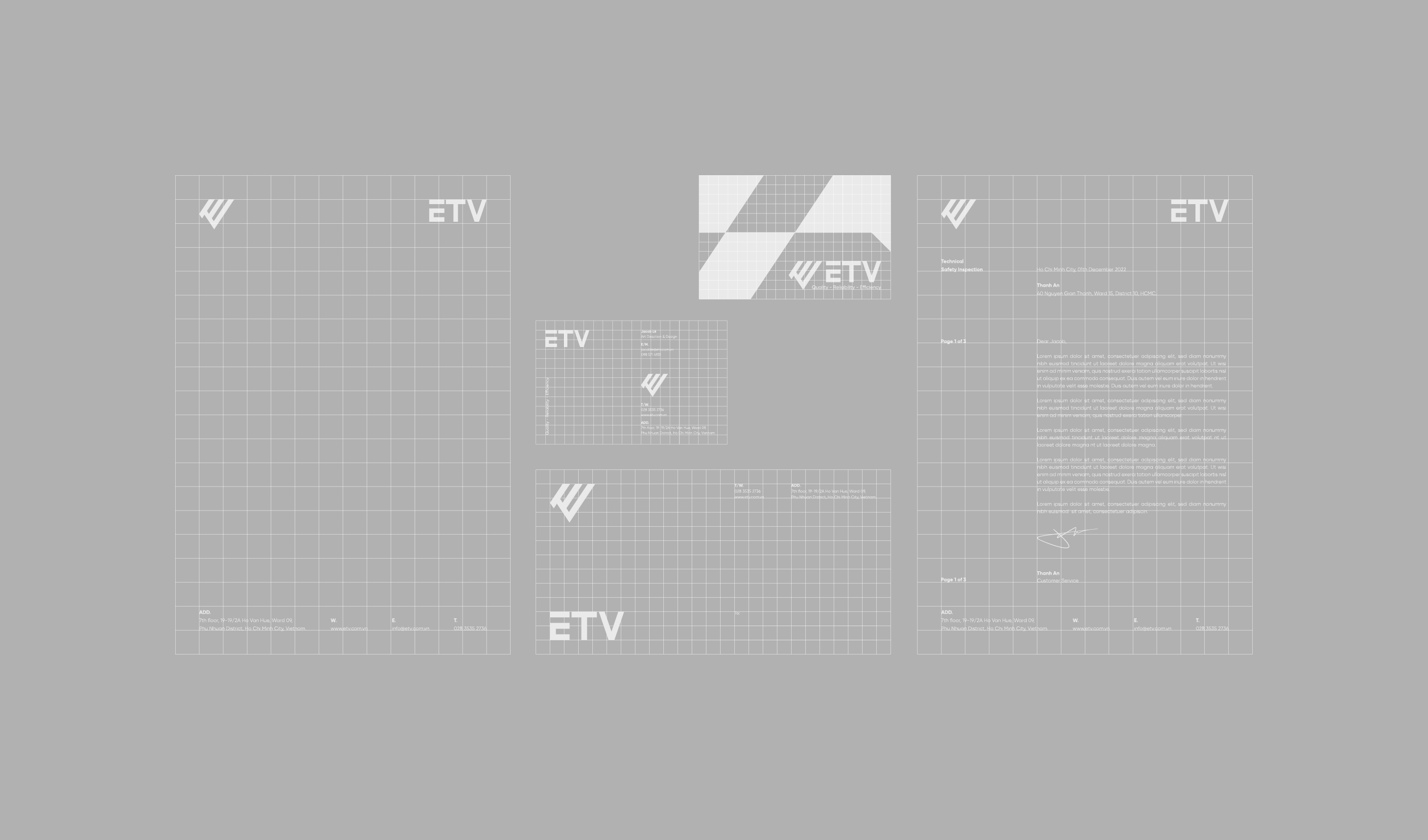
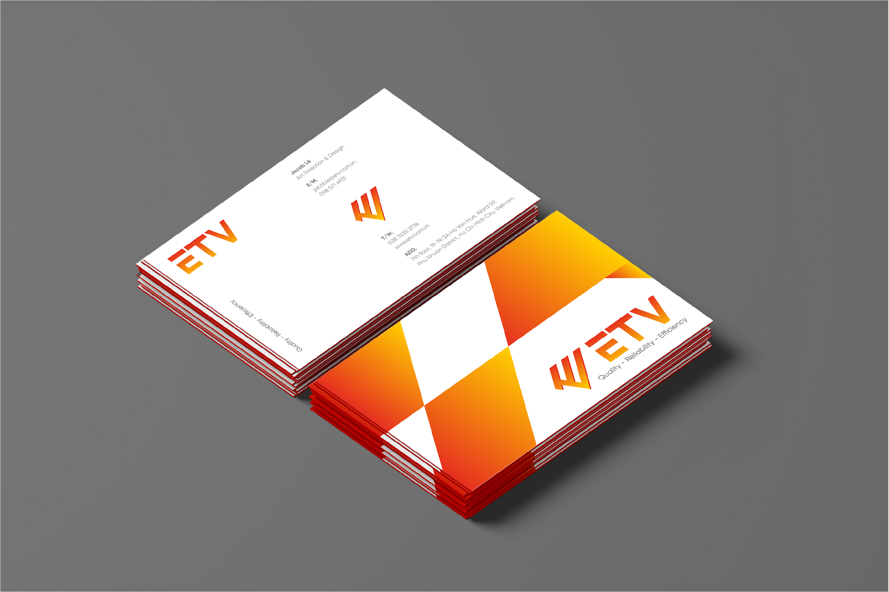
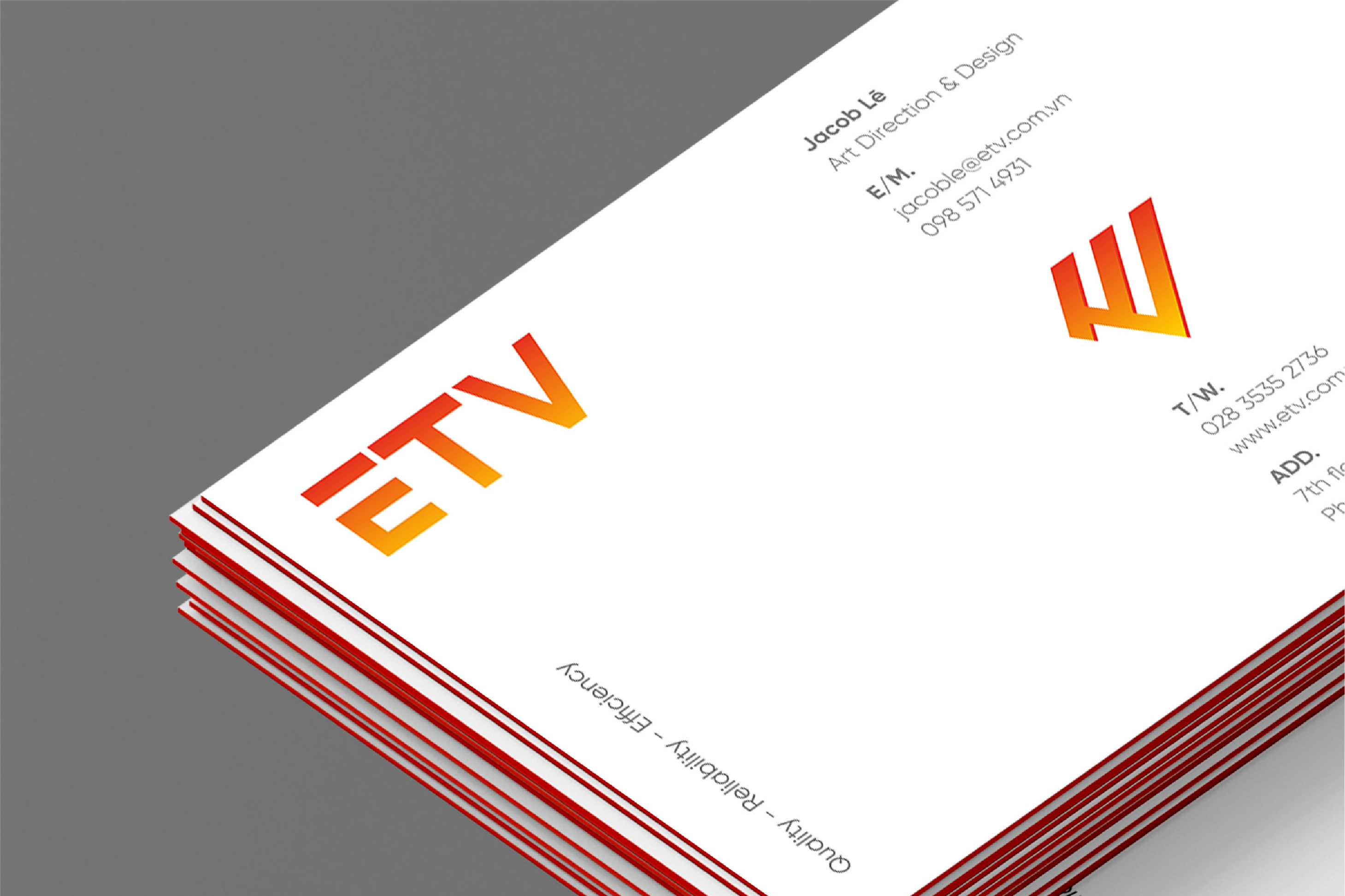
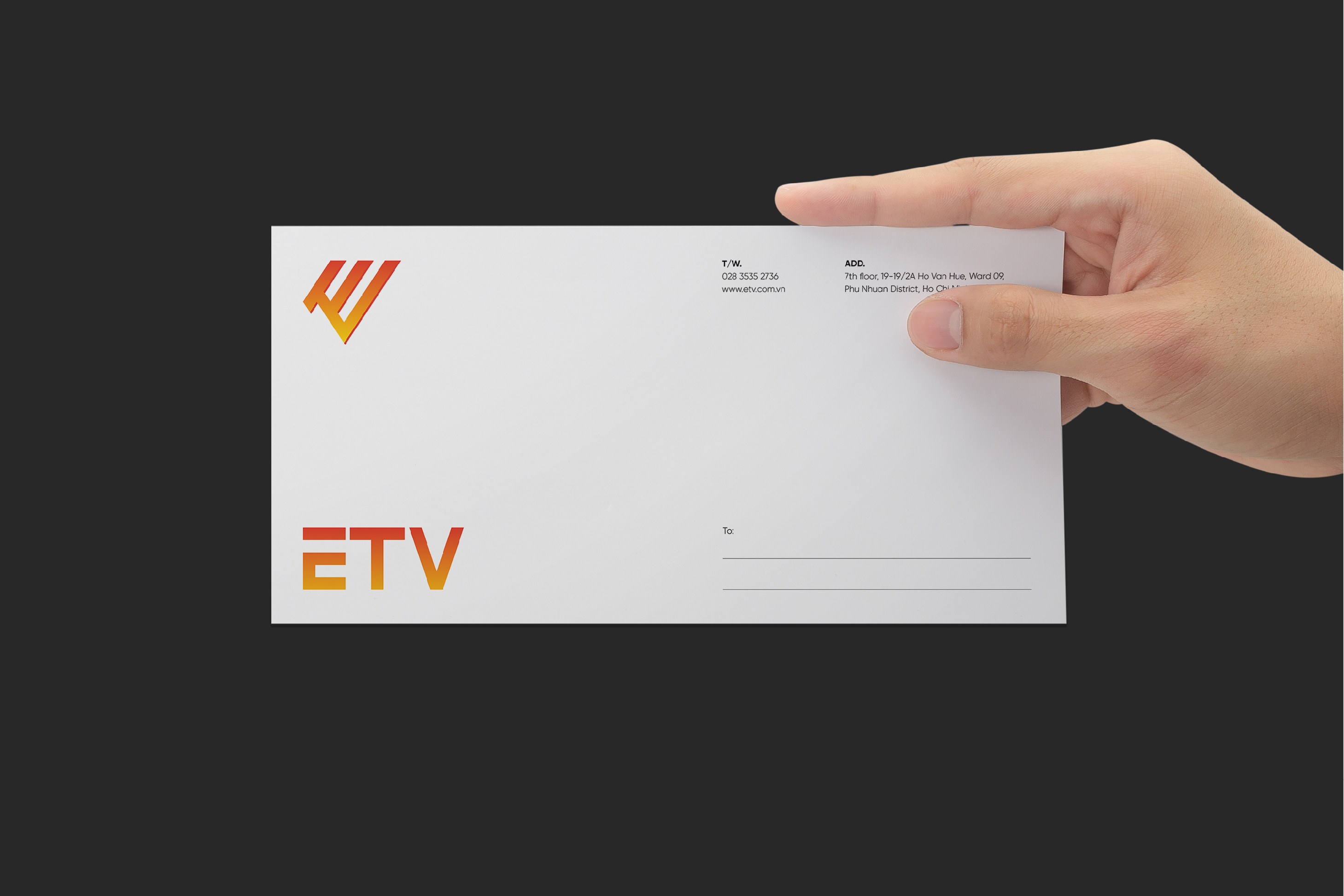
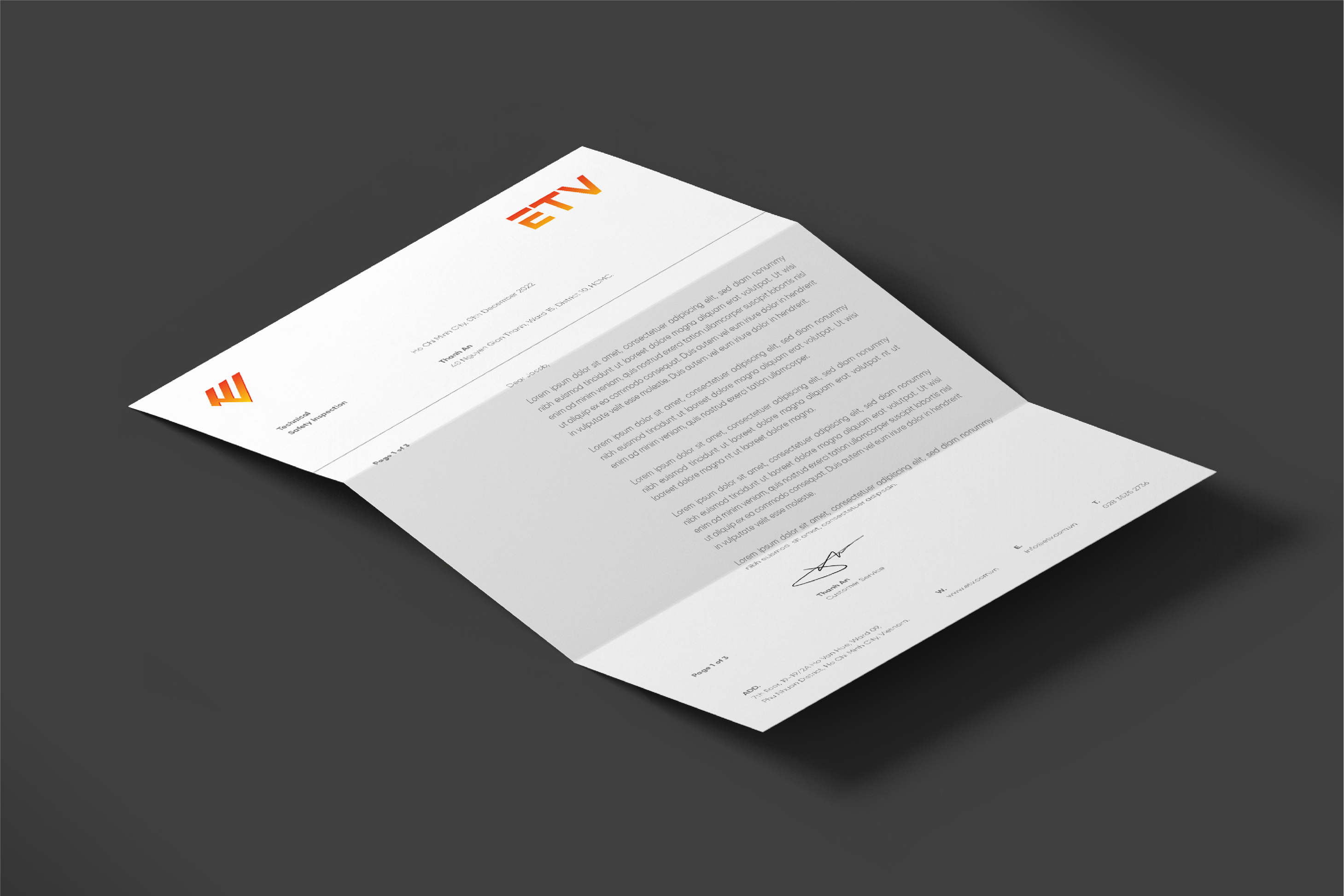
This is the rollout of the brand’s new identity on all the brand assets, ranging from corporate materials like letterhead, business cards etc, to the banners, posters and all other marketing materials and other client’s touchpoints, a significant step towards allowing their clients to get to know the brand as an organization is making the brand communicate with its customers through a consistent brand voice and cohesive appearance.
The system remains recognisable in all contexts and lends itself to products ETV, which functions both as recognition function and as bold, visual cues.
Results
The identity system was implemented and since mid-2018 has been showing its strength: ETV perception has raised to the desired level of objectivity and seriousness in the telecom segment. The transition to 100% B2B segment is ongoing, as financial results are established and positioning is aligned with the company’s strategic objectives.

CREDIT
- Agency/Creative: Vivian
- Article Title: ETV Brand Design by Vivian
- Organisation/Entity: Agency
- Project Type: Service
- Project Status: Published
- Agency/Creative Country: Vietnam
- Agency/Creative City: Ho Chi Minh City
- Market Region: Asia
- Project Deliverables: 2D Design
- Industry: Energy
- Keywords: Safe Solution
-
Credits:
Art Direction & Design: Jacob Lē


