


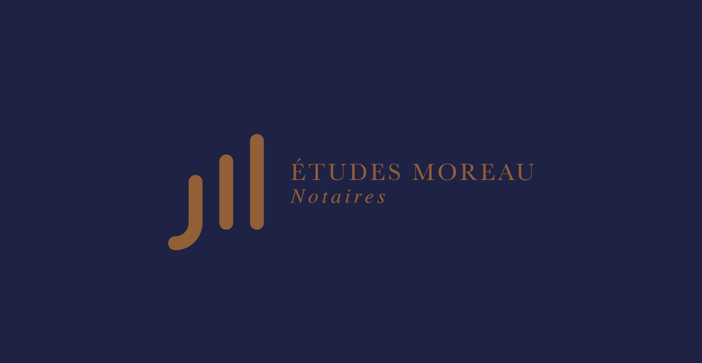
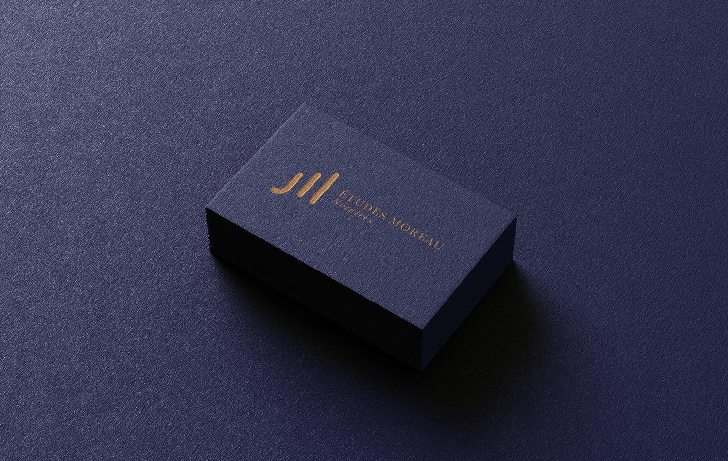
This project is a full branding for a french group, Etudes Moreau.
Etudes Moreau Notaires is a notary group, a public officer that authenticates legal documents.
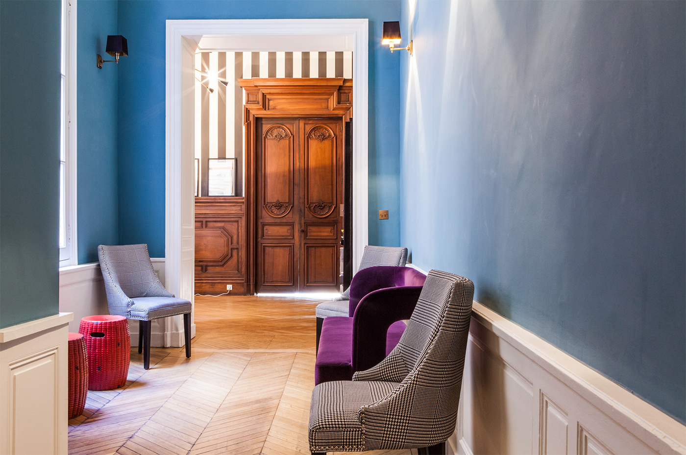
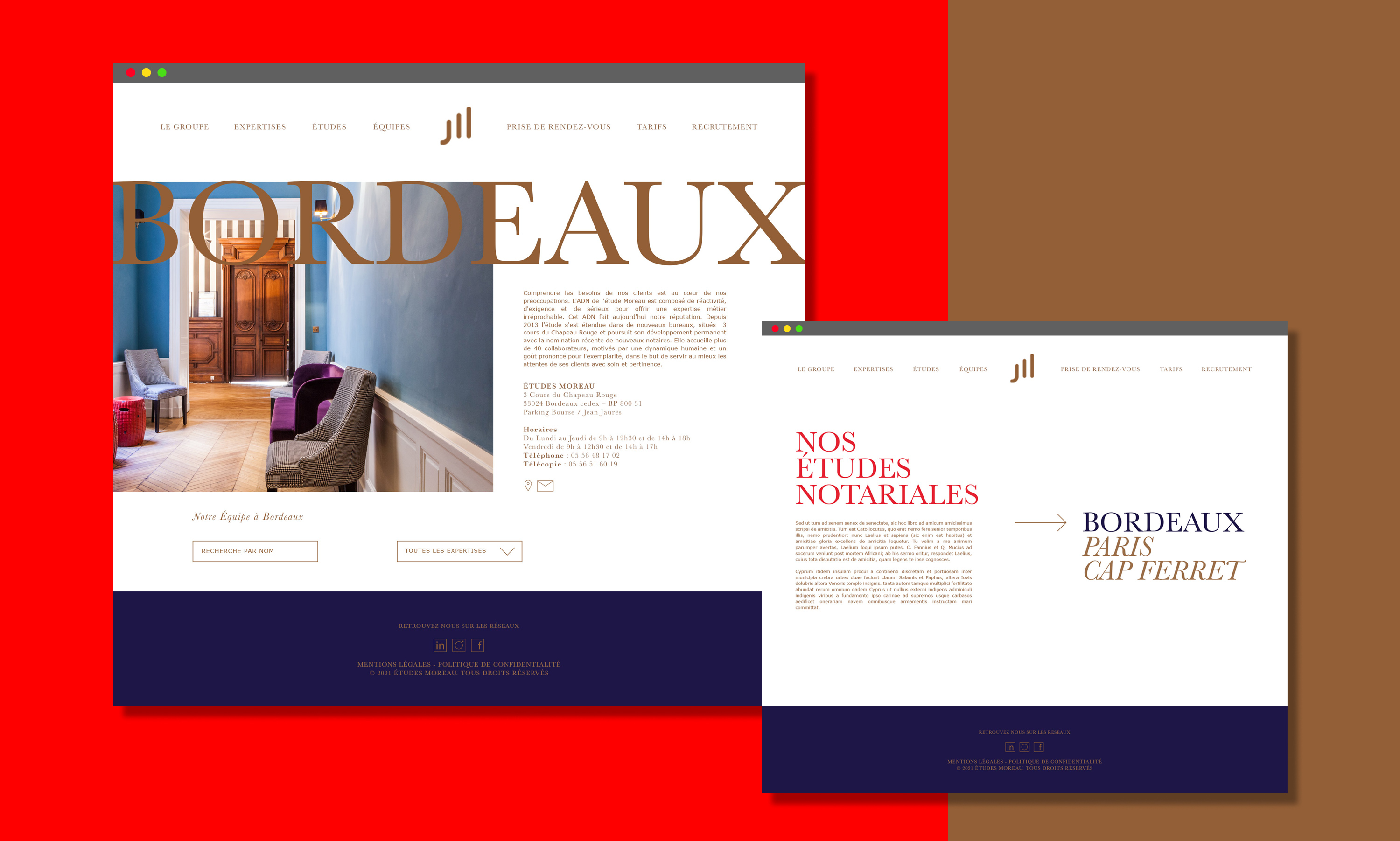
If the project started 5 years ago around a timeless and elegant logotype, as the group grows so did the art direction leading to a real and unique brand.
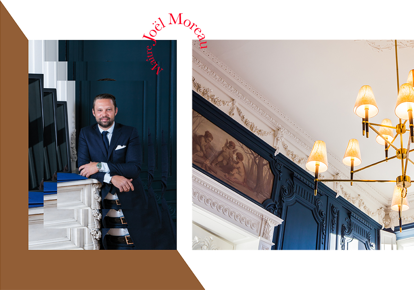
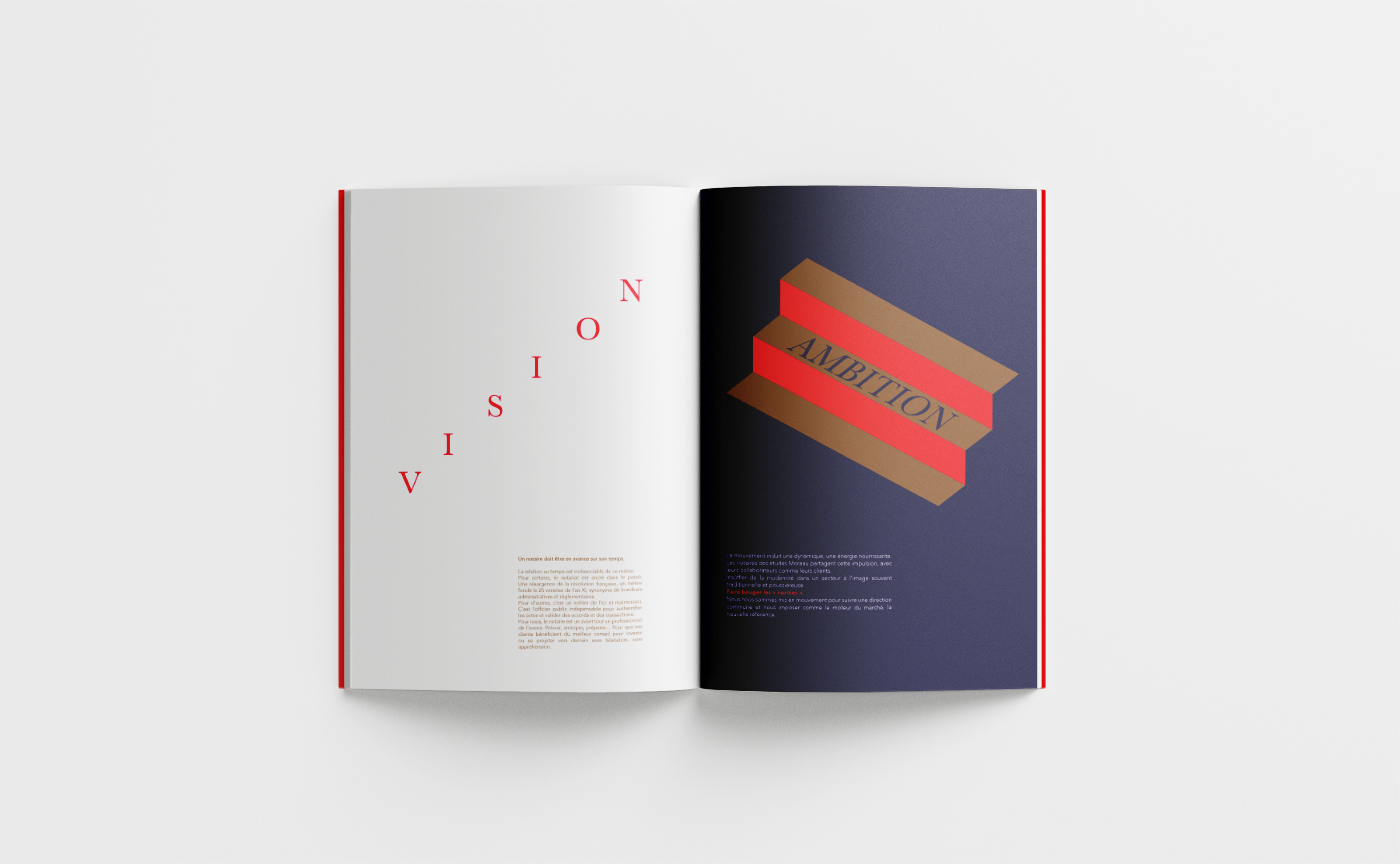
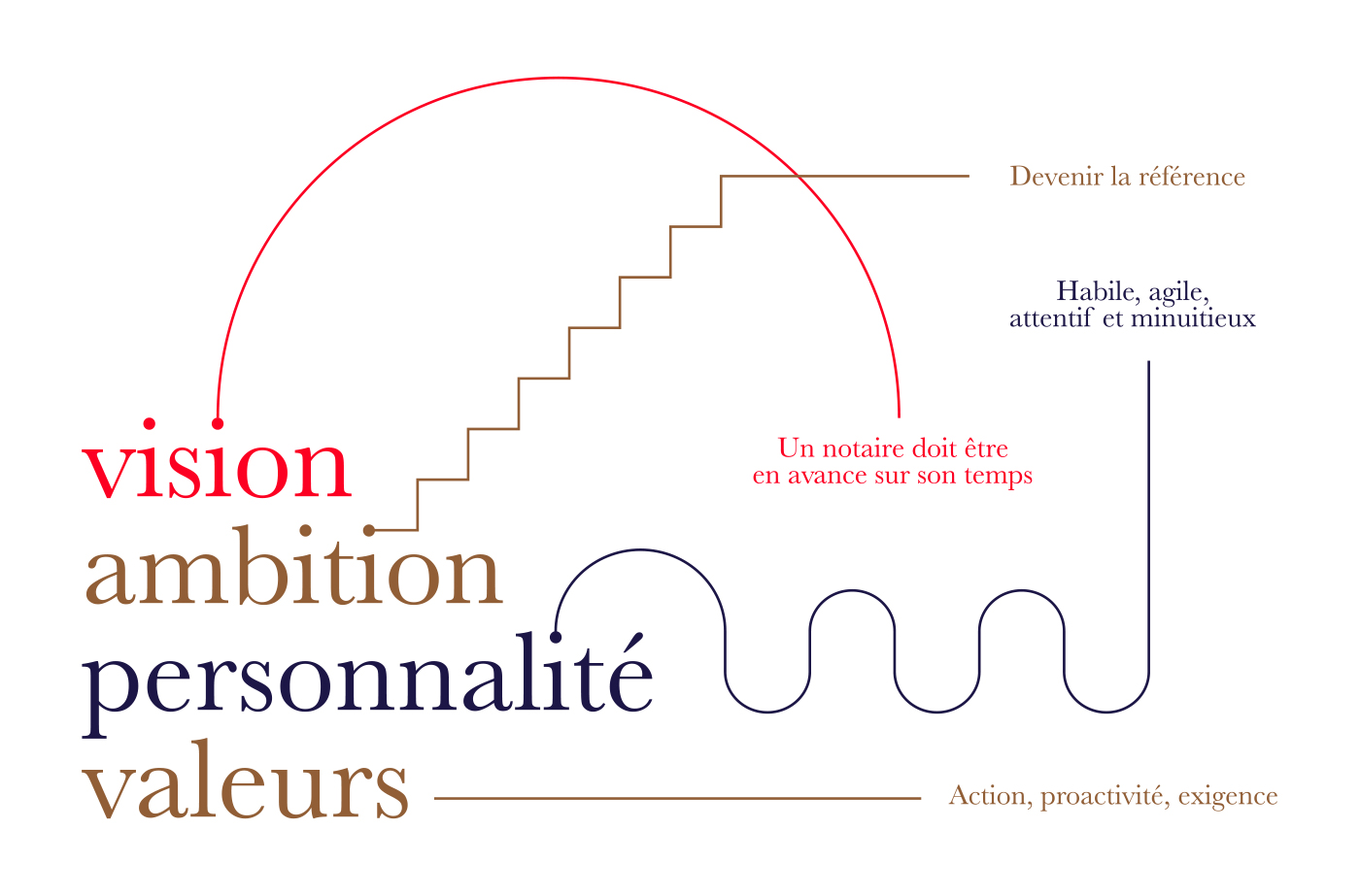
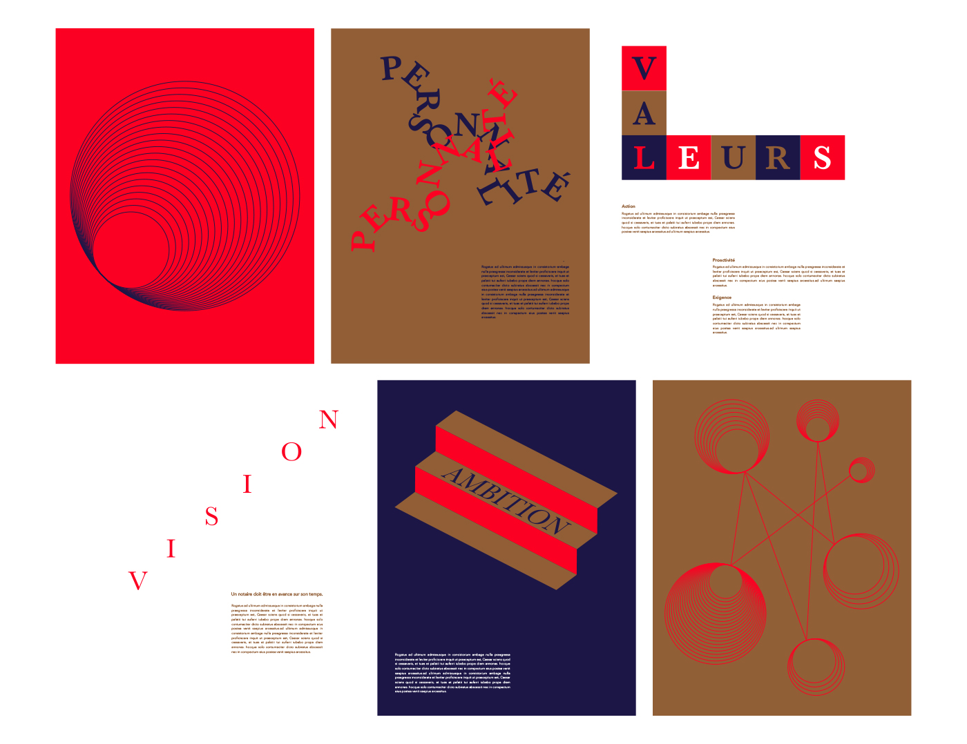
The core of this branding is the logotype which have been thought around the founder personality. The result is the combination between a monogram work and the leading vision interpretation. This logo concept is design to be a mix between notary tradition and a modern perception.
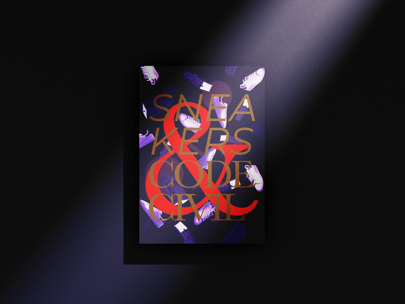
At the beginning gold and navy were the only colors but a third was meant to wake up. This orangy red came as a natural choice.
There are more and more companies with a traditional image that are looking for a more modern and unique identity. If they want to break their codes, let’s play the game and design it
CREDIT
- Agency/Creative: Edouard Allegret
- Article Title: Etudes Moreau Notaires Branding
- Organisation/Entity: Freelance
- Project Type: Identity
- Project Status: Published
- Agency/Creative Country: France
- Agency/Creative City: Bordeaux
- Market Region: Europe
- Project Deliverables: Brand Design
- Industry: Public Utility
- Keywords: brand design notary art direction graphic design logo
-
Credits:
Photography: Benjamin Guénault


