


Aspronautas: ‘Explorers of the Wine Universe’, a social inclusion project
Aspronautas is an inclusive wine for which four people with intellectual disabilities have been leading its whole process: from learning how to revitalise the vineyard and cultivate it, through the vinification stage, and ultimately contributing to the bottles labelling.
The project name brightly blends ‘Asprona Wine’ (the NGO’s name and idea) with the word ‘Astronautas’ (space travelers), to deliver a daring concept: ‘Explorers of the Wine Universe’.
To add to the visual value of the packaging, many companies have worked alongside us in the project on a pro-bono basis. Working together in a participatory approach to be part of this charitable labelling, which highlights the social work of the main non-profit organisation involved.
This NGO was created more than 50 years ago to respond to the rights and needs of those with intellectual or developmental disabilities, in order to improve their social inclusion. As a locally-led effort, and with the support of the winery ‘13 Viñas’, they have salvaged several plots of old vines to be tended, with the full intention of also making this idea grow. As the funds obtained from the wine’s sales will be used to finance new inclusive projects.
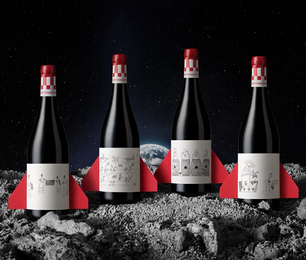
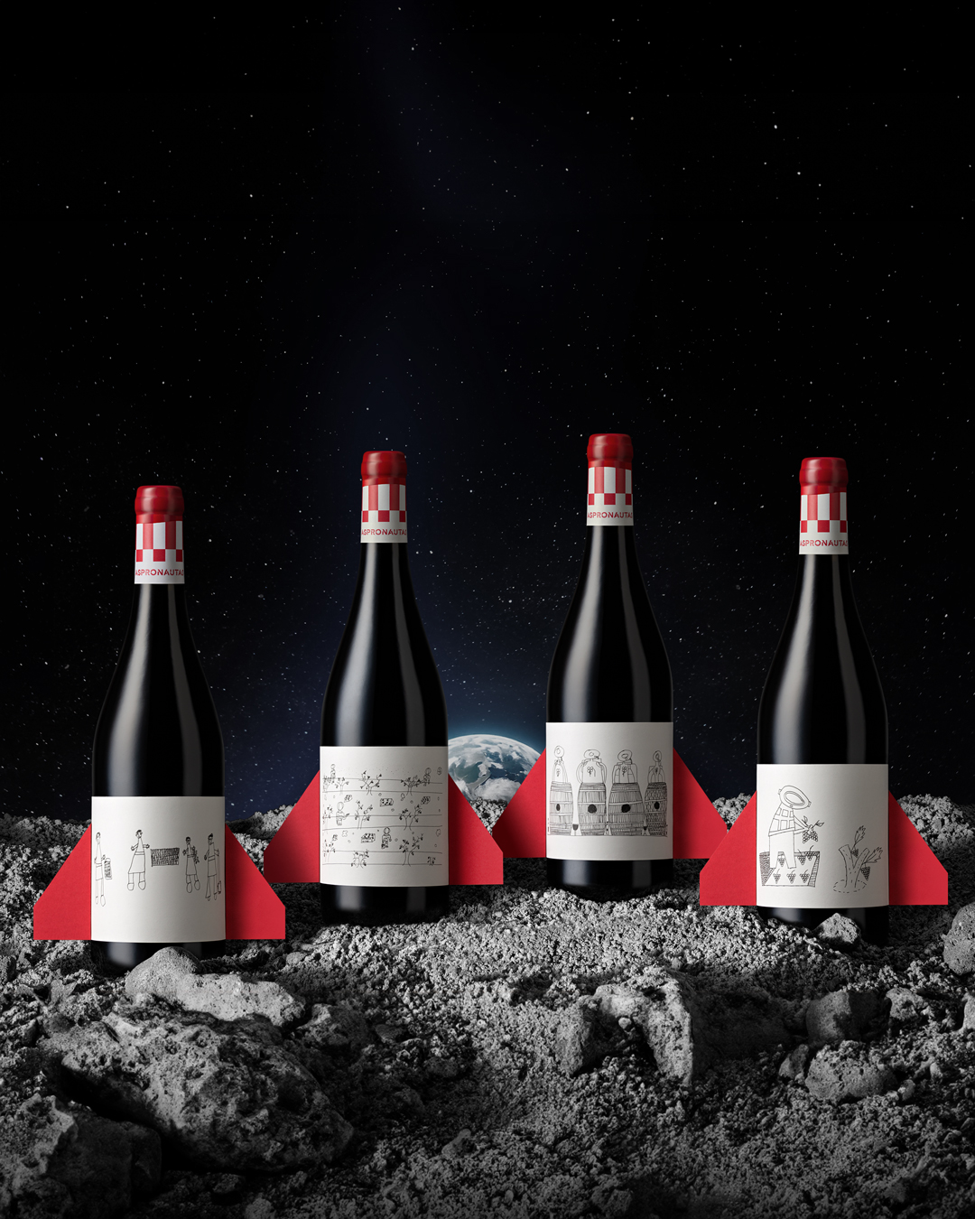
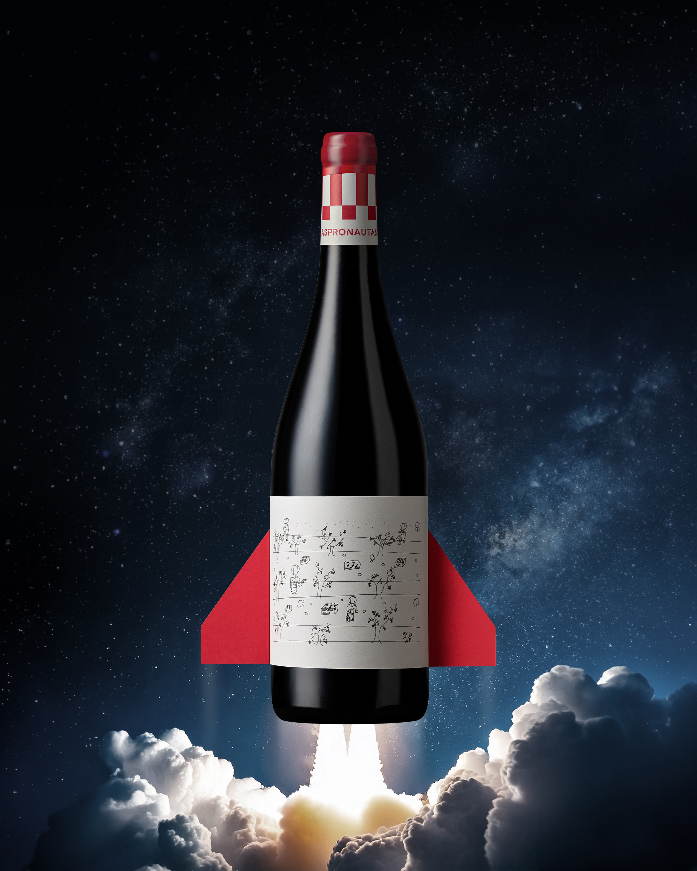
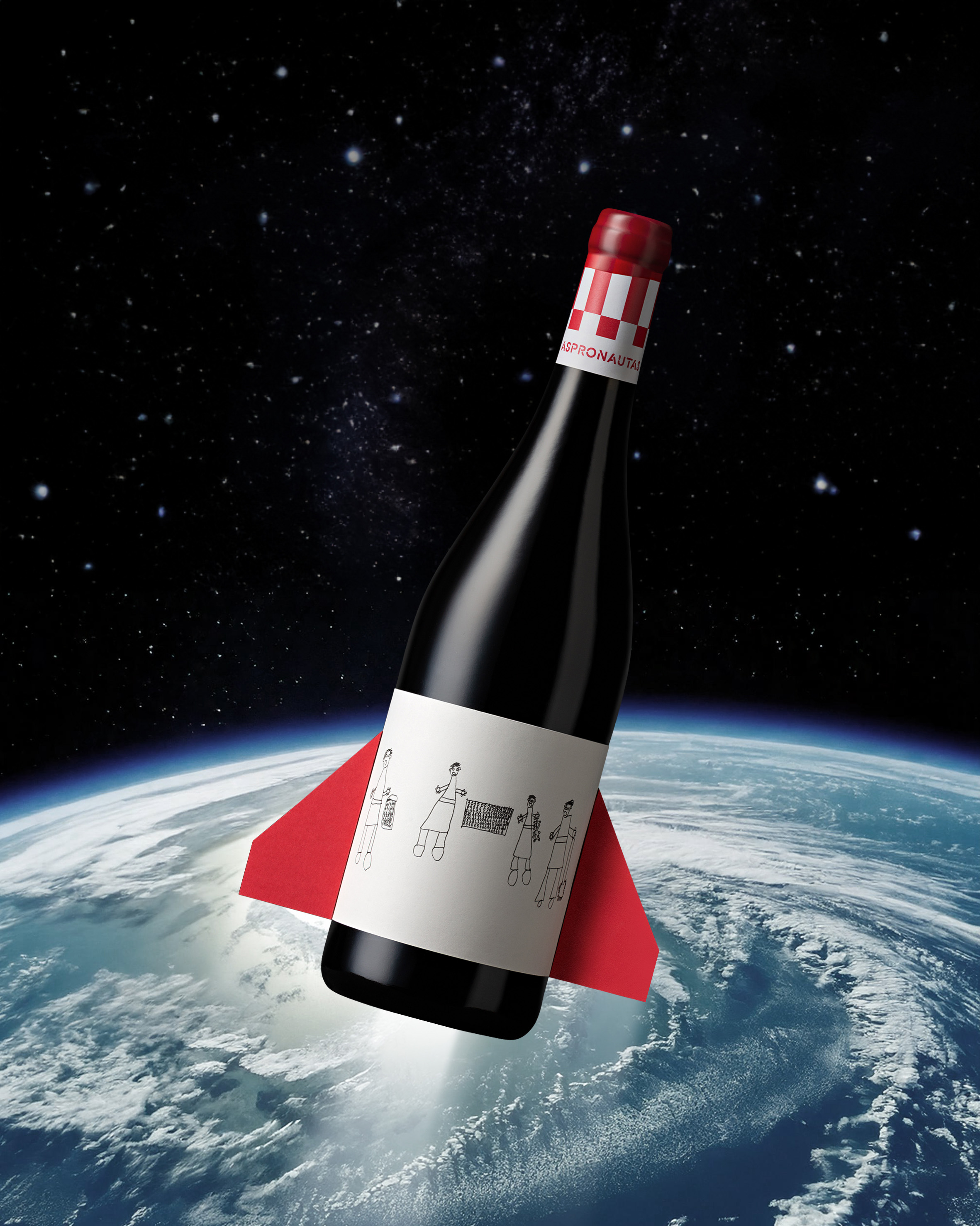
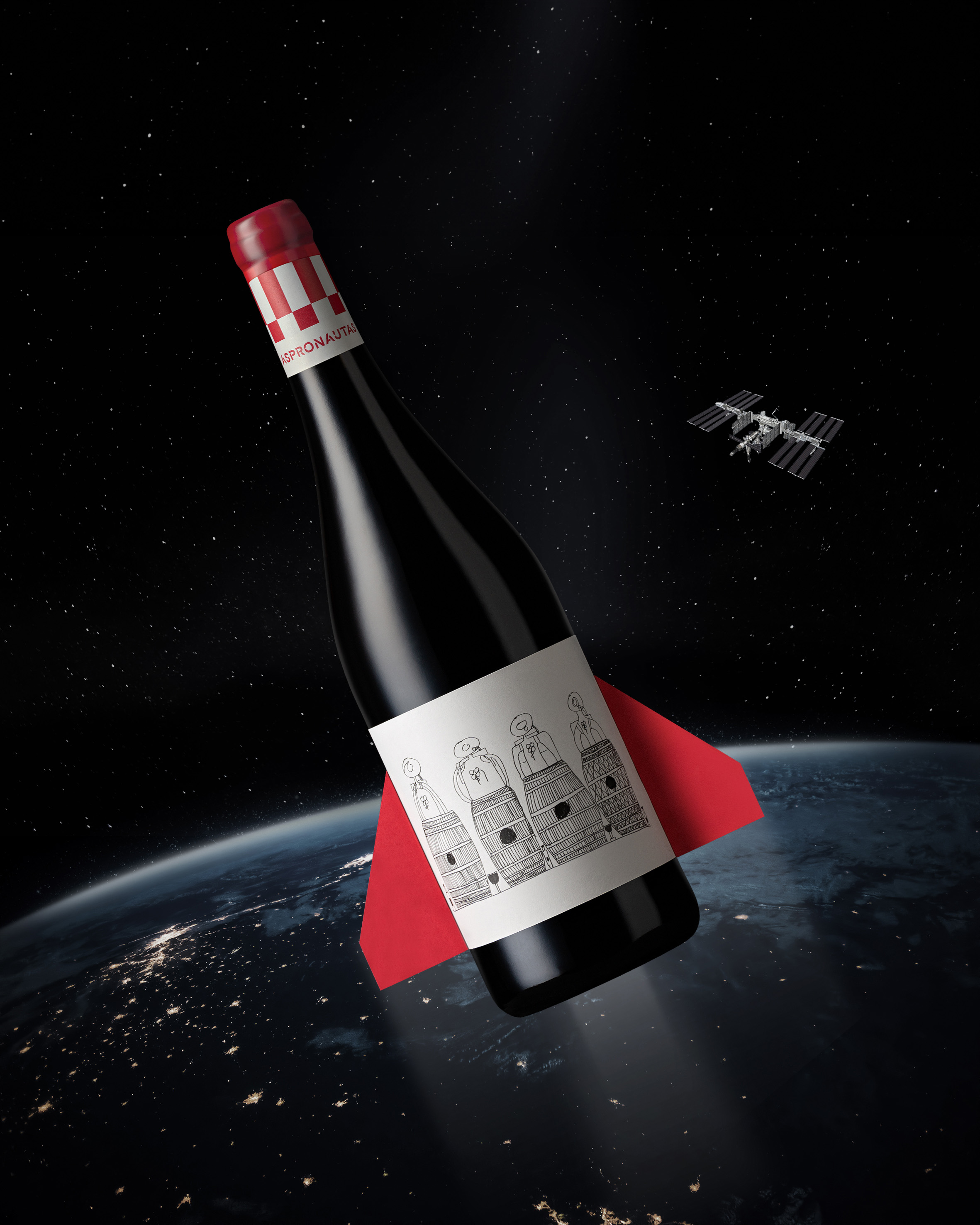
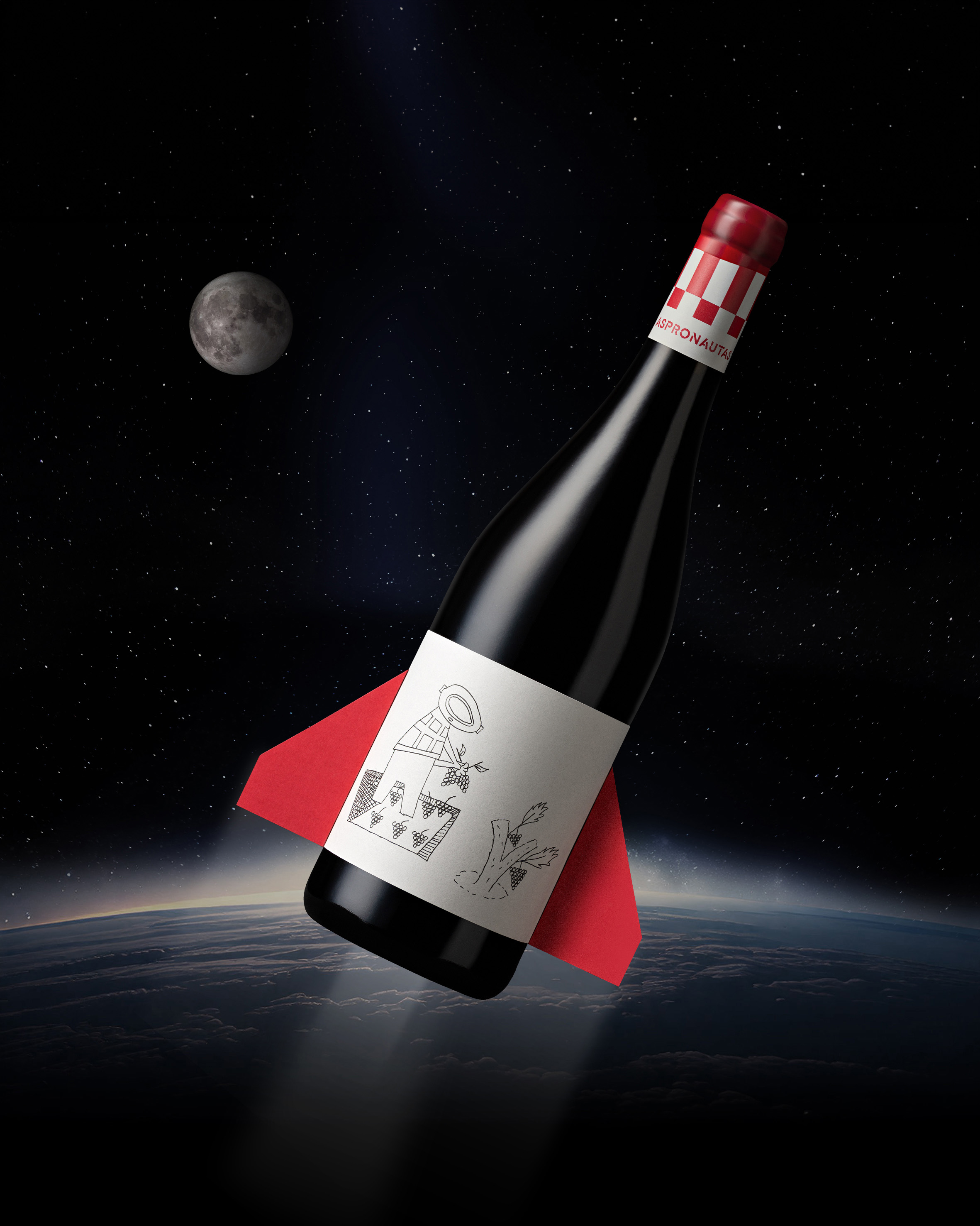
All Ready for Launch
With this forceful idea in mind, we envisioned the bottles as rockets on which their illusions take off. The label depicts the four ‘Aspronautas’: Teresa, Baldomero, Miguel and Guillermo. As an additional co-creation element, each label also features a unique hand-drawing made by each one of them: further enriching their personal vision of this journey throughout the ‘wine universe’.
Our design studio, the type foundry and the printing company… all of us contributed time, materials, and work (at no cost) to make this possible. On top of that, other members of the association have participated in auxiliary tasks such as putting the ‘flaps’ on the bottles, and so on.
The resulting design is a packaging that integrates all the elements on the bottle (sealing wax, neck, label and cardboard flaps) to create an imaginative, personal and optimistic way of conveying this uplifting initiative.
With our enthusiasm ‘skyrocketing’, we have all been thrilled to support such an empowerment cause for people like them, that aspire to overcome obstacles and become more independent through their efforts.
We feel privileged to have contributed to the inspiring launch of this charity wine, one that is helping them find new opportunities in employment and social inclusion.
CREDIT
- Agency/Creative: Estudio Pablo Guerrero
- Article Title: Estudio Pablo Guerrero’s Aspronautas Wine Branding Blends Social Inclusion with Stellar Design
- Organisation/Entity: Agency
- Project Type: Packaging
- Project Status: Published
- Agency/Creative Country: Spain
- Agency/Creative City: León
- Market Region: Europe
- Project Deliverables: Brand Identity, Graphic Design, Photography
- Format: Bottle, Box
- Industry: Food/Beverage
- Keywords: inclusion, co-creation, intellectual disabilities, wine packaging, non-governmental organization
-
Credits:
Creative Director: Pablo Guerrero Gómez
Printing: Coreti (Asteria Group)
NGO: Asprona Bierzo
Foundry: Tightype
Sealing wax: Carlos Bacigalupe
The four Astronauts and authors of the label drawings: Teresa Lorenzo, Miguel Ángel Amoedo, Baldomero García and Guillermo Álvarez


