


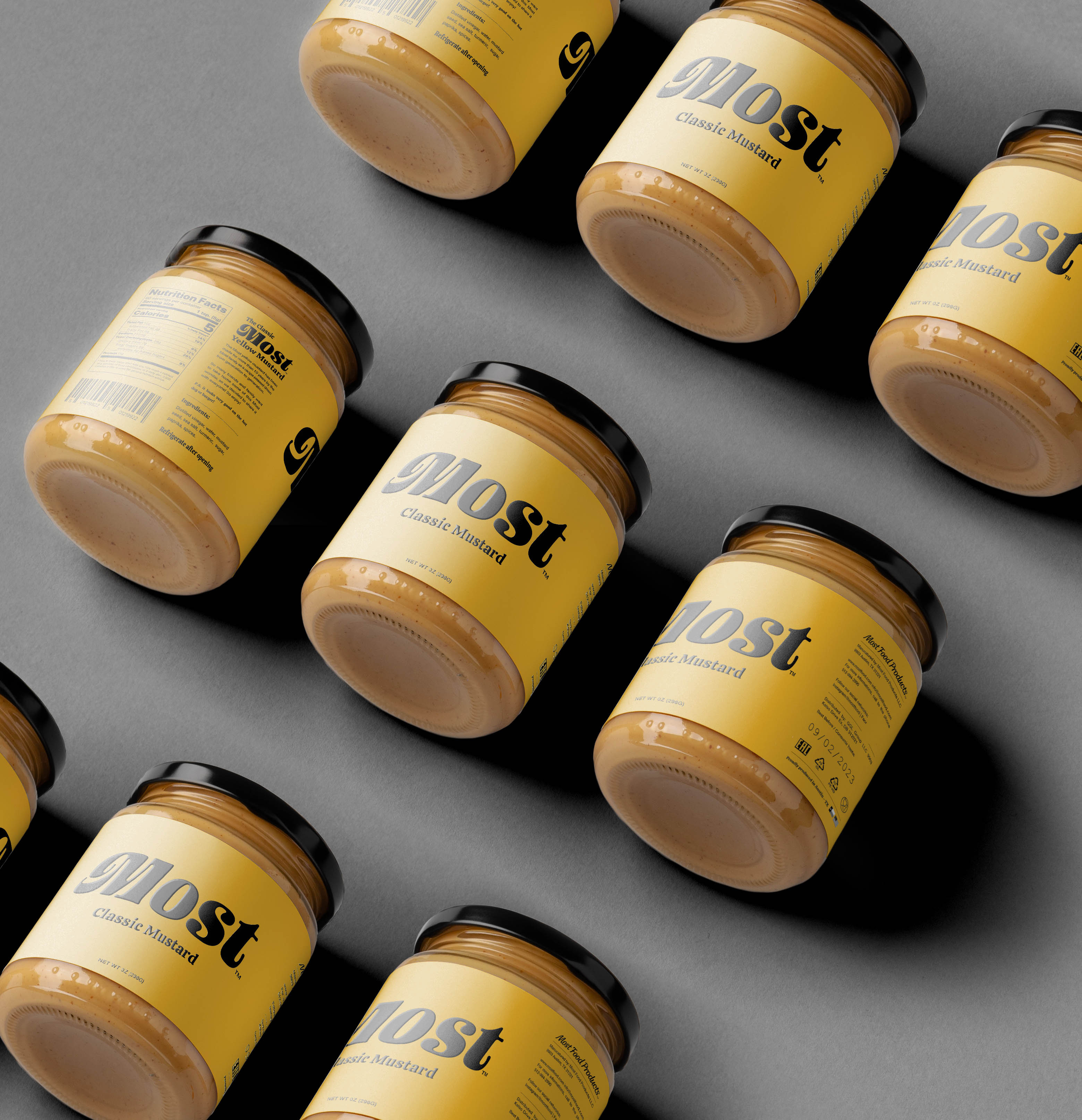
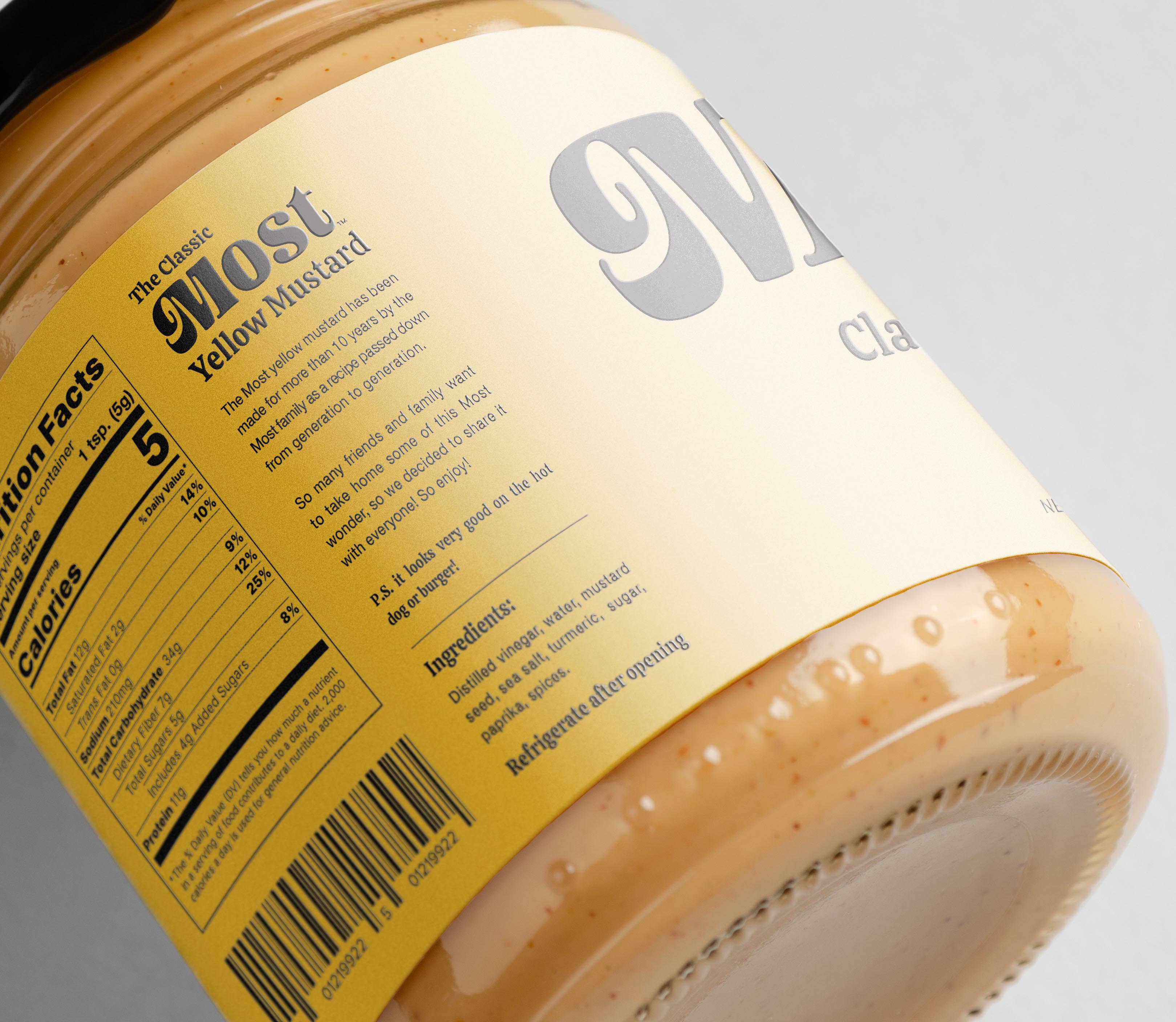
The Most ™ yellow mustard has been produced for more than 10 years by the Most family as a recipe passed down from generation to generation. Most are a traditional Austin – Texas family that likes to gather friends for barbecues and hot dogs. Always in their meetings is the famous classic yellow mustard of the Most family that is loved by everyone.
As so many friends and family always wanted to take some pots home, they decided to turn them into a commercial product. So our challenge was to create a visual identity and label for Most Classic Mustard, which had a low production cost but without losing style and prominence in the family name.
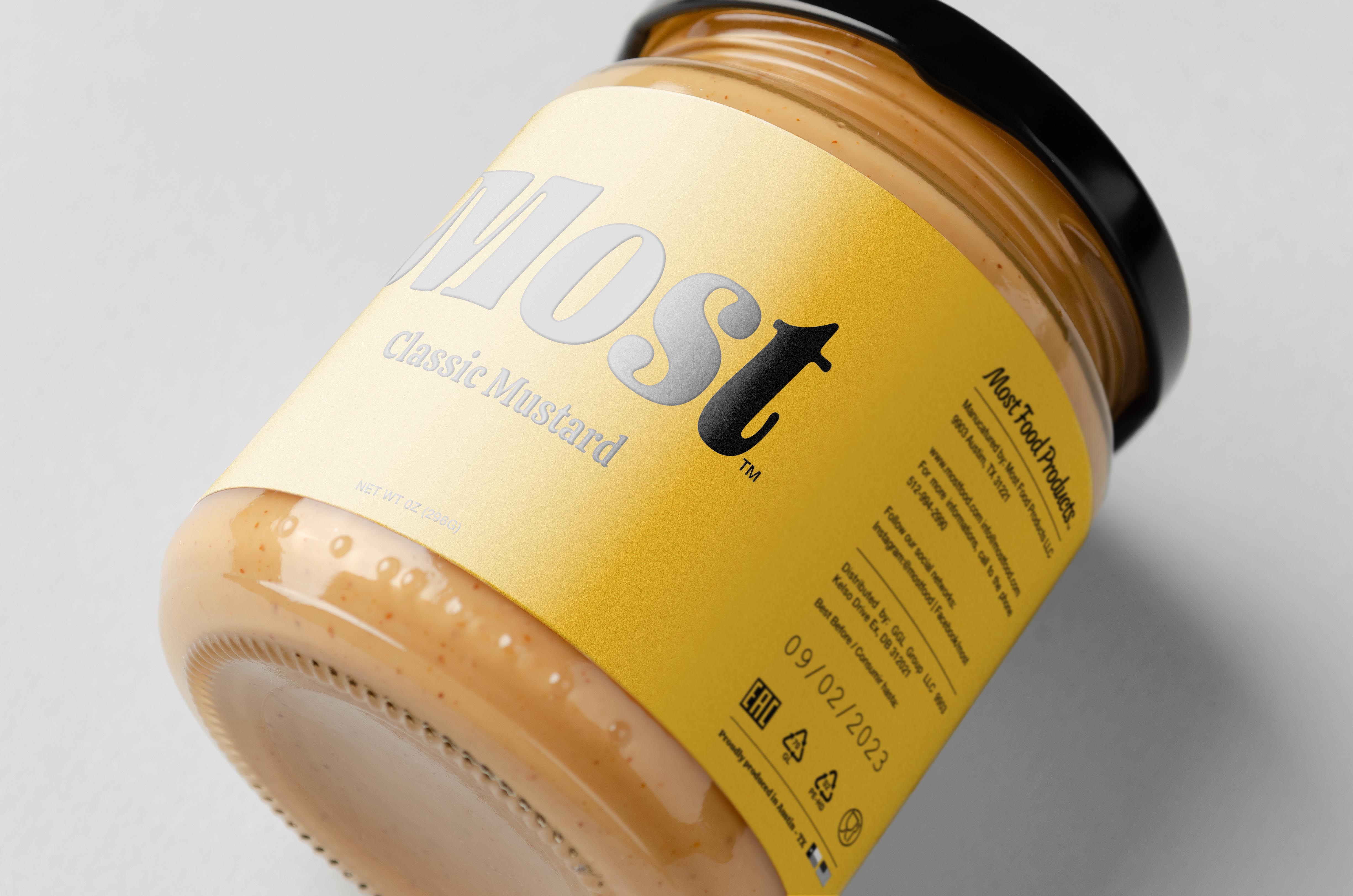
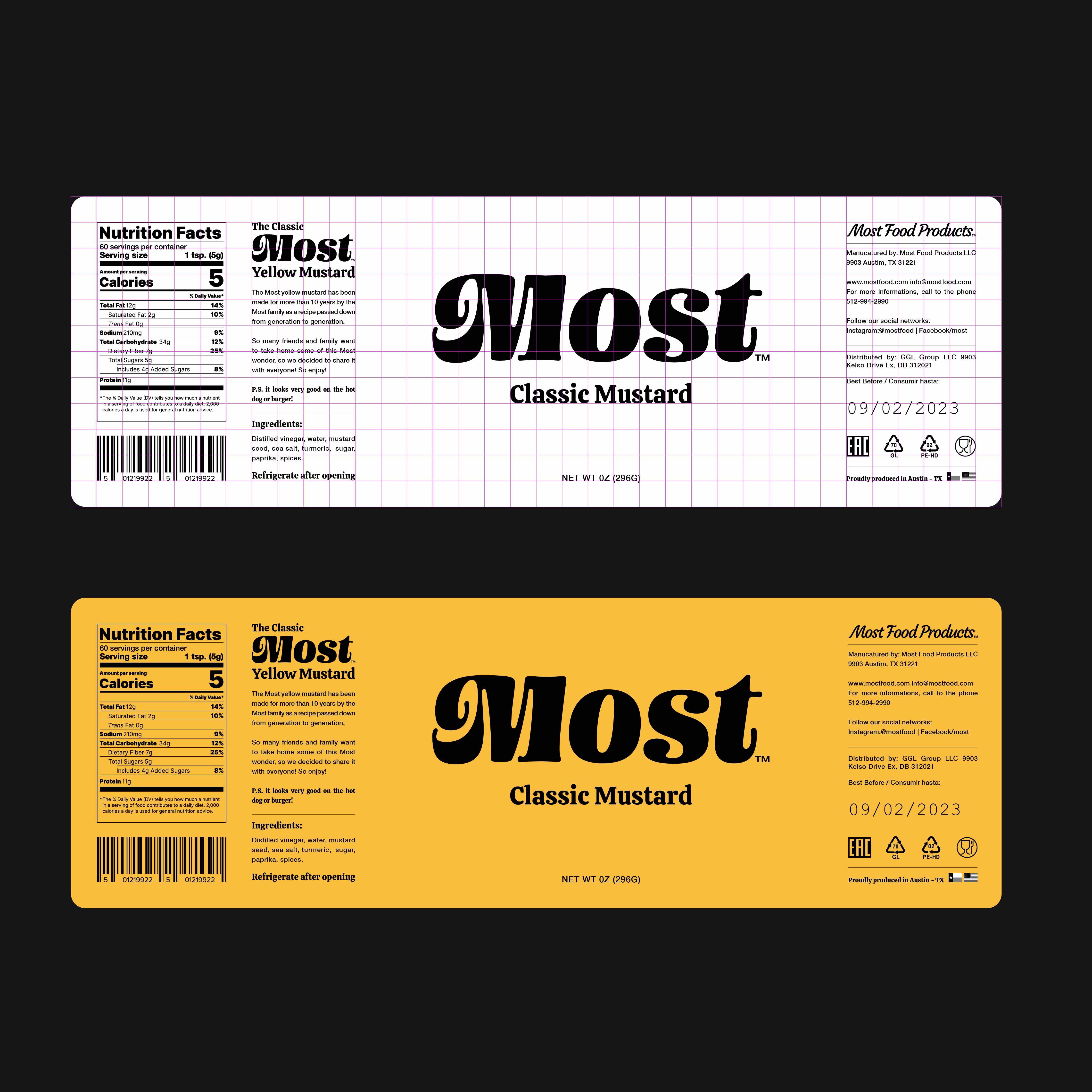
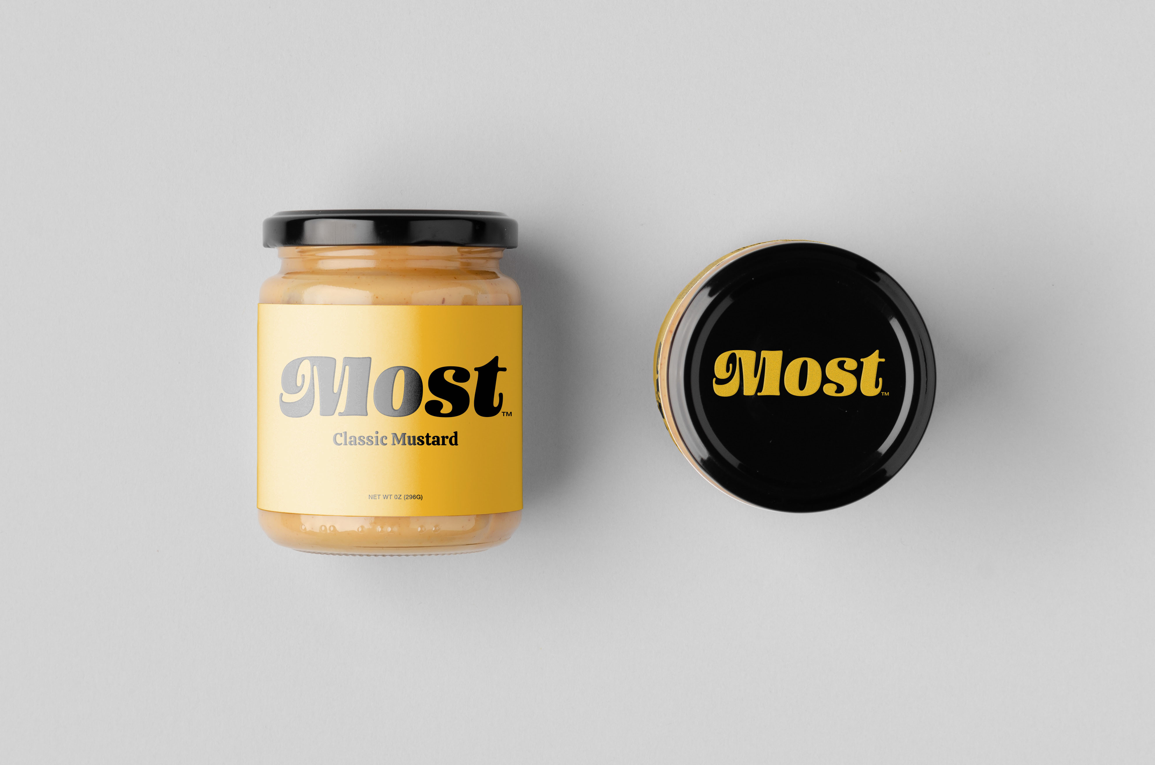
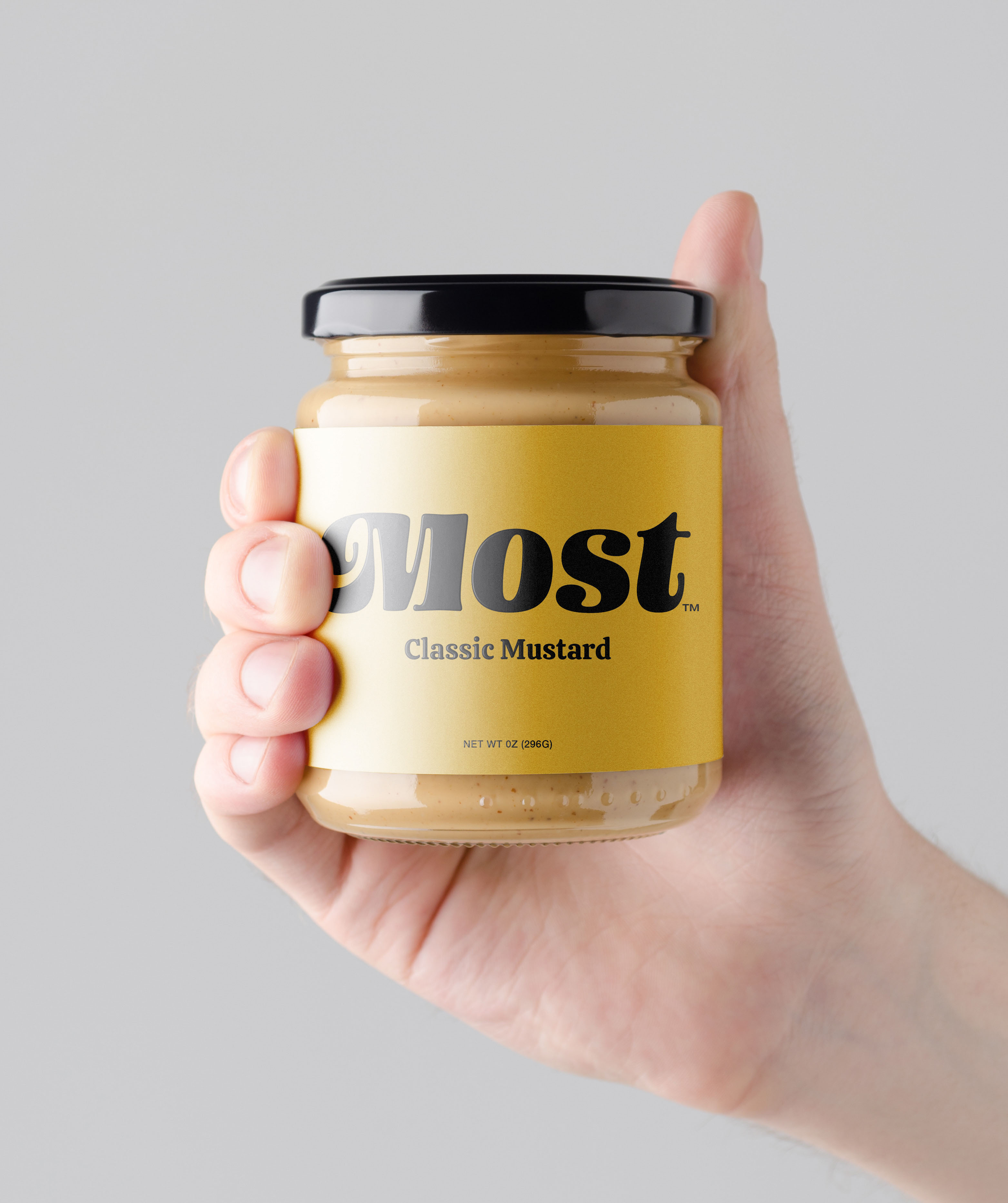
Taking this story into account, we created a logo that emphasized the name Most so that people could really associate the product with the classic family recipe. We use a fluid and contrasting typography, like a good mustard sauce.
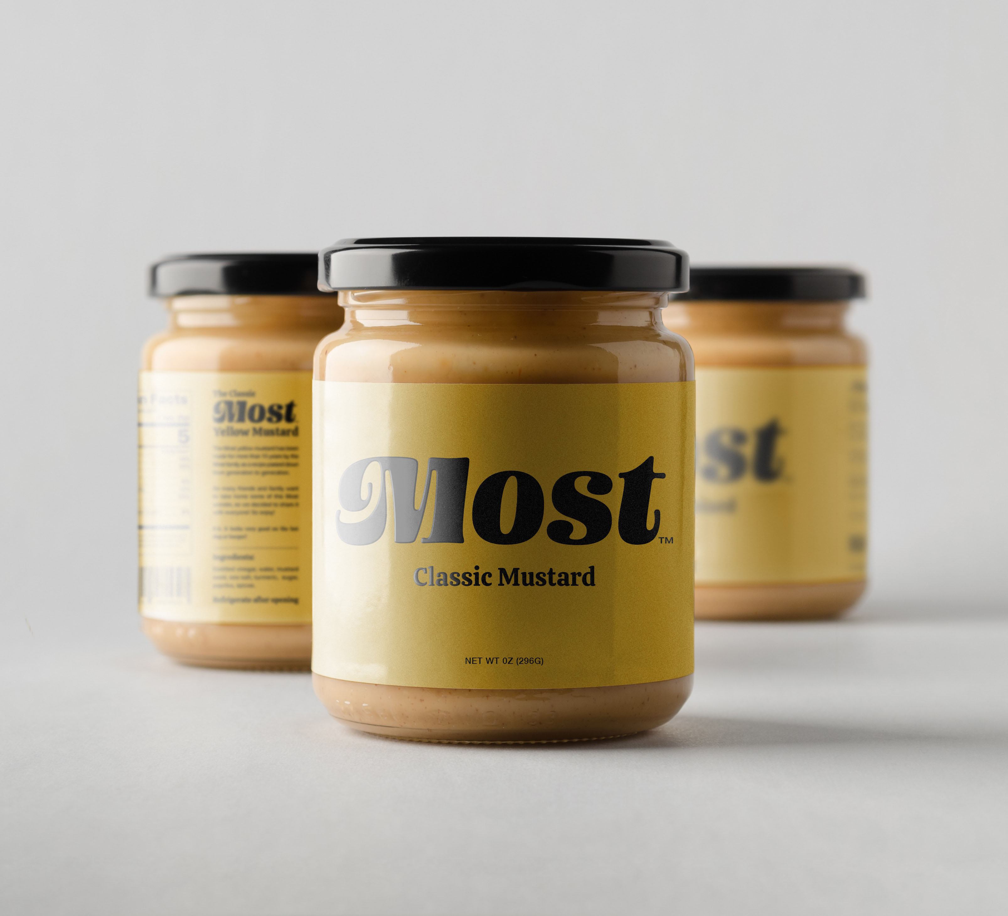
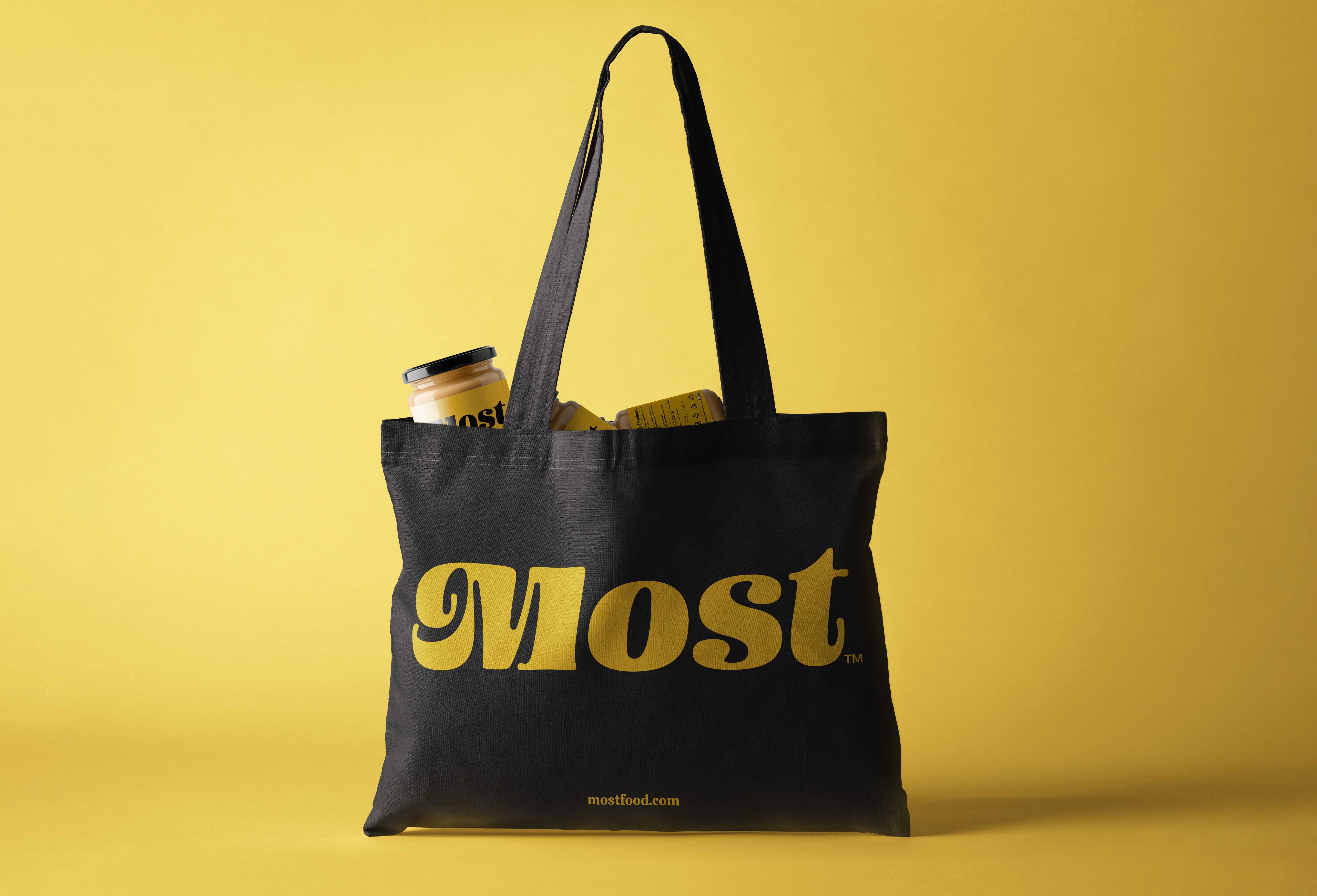
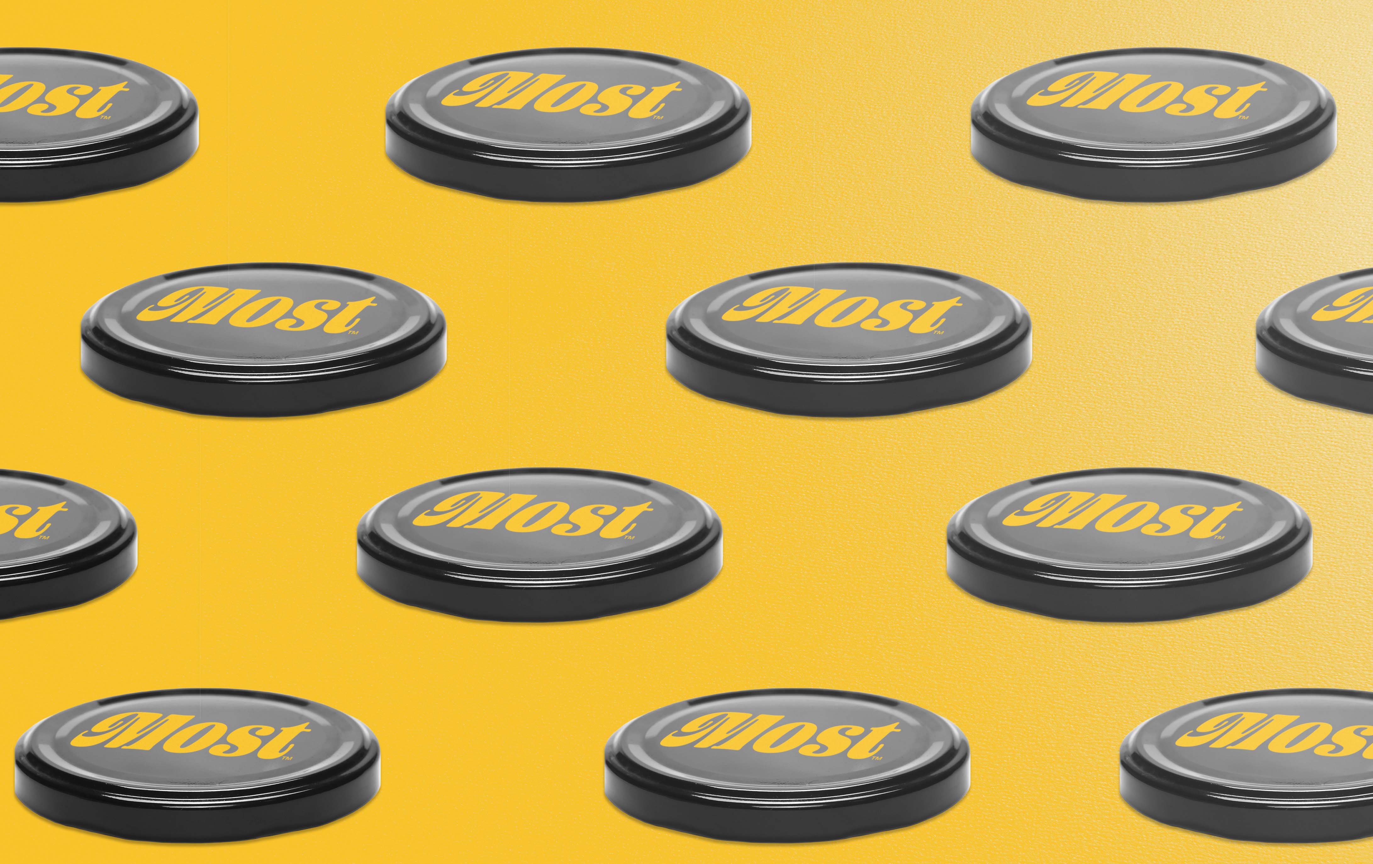
The jar was kept as a vestige of the original recipe of the house, as friends and family took their portions of mustard to their homes in pots, but we put an adhesive label to bring the visual identity of the project. We use only two colors to keep the production cost low: Pantone 136 CP (mustard yellow) and black. With this we achieved a high visual contrast for a reduced cost since it only takes two colors in its production.
The adhesive material of the label is printed vinyl paper, as it is resistant to changes in temperature and humidity, as our product must be kept in the refrigerator. Vinyl is also a low-cost material, but it has a refined texture and touch that we needed to create a product that had a more familiar and simple face, but without losing the visual appeal that the product required.
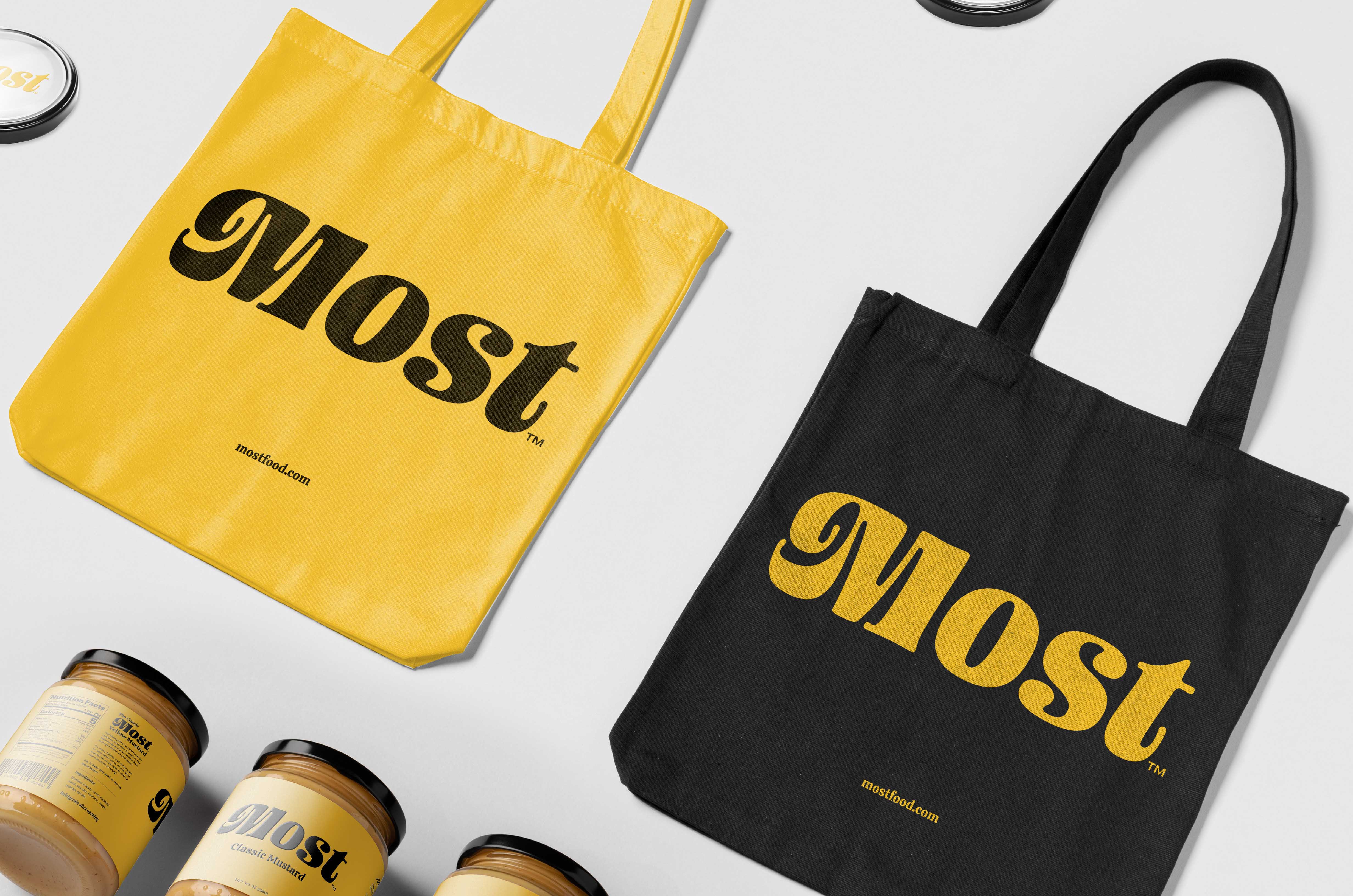
Along with packaging, we have also developed ecobags that can be sold, used for gifts or merchandising material. They are also developed with low cost in mind, keeping the same two colors of the label, but printed on silk screen.
The visual set of the project allowed Most to commercialise their revenue and scale sales of their product

CREDIT
- Agency/Creative: Estudio Leo Tavares
- Article Title: Estudio Leo Tavares Develops Label for Most Mustard
- Organisation/Entity: Freelance, Non Published Concept Design
- Project Type: Packaging
- Agency/Creative Country: Brazil
- Market Region: North America
- Project Deliverables: Brand Architecture, Brand Creation, Brand Identity, Graphic Design, Packaging Design
- Format: Jar
- Substrate: Glass


