


Labuta Studio was entrusted with the mission of crafting a brand identity that could truly translate the unique essence of tourism in Cabo de Santo Agostinho. This municipality is a cornerstone of Brazilian history, revered as the birthplace of the nation’s colonization. Its significance is underscored by evidence of a Spanish presence dating back to 1499, predating the arrival of the Portuguese. For centuries, the Cabo region played a pivotal role in Pernambuco’s economy, driven by the prosperous sugar cane trade, and today it stands as a vibrant cultural and tourist pole.
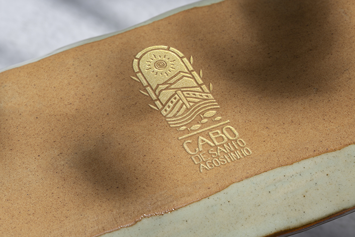
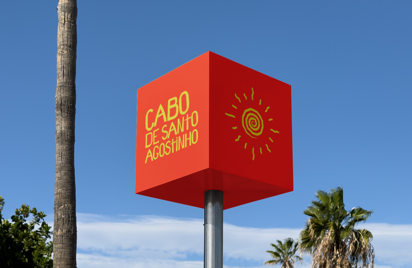
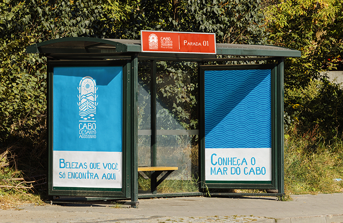
Through a comprehensive immersion process, we conceived a brand that elegantly dialogues with the city’s profound historical architecture while embracing its abundant tourist attractions. The central symbol of the mark is an arch, a shape that perfectly encapsulates the city’s identity. This arch functions as a symbolic portal, representing the historical gateway through which Cabo de Santo Agostinho was introduced to the world. Within this sophisticated design, one can identify carefully integrated references to its rich heritage: the sugar cane that built its economy, the caravels that docked in its historic port, the traditional fishing activity, its characteristically steep terrain, and the area’s vibrant, sun-drenched colors. This project gained significant recognition by being a highlight of the prestigious Pernambuco Tourism Award, where it secured second place. This award is highly valued across the state and stands as a meaningful endorsement of our studio’s dedicated work and creative vision.


CREDIT
- Agency/Creative: Estúdio Labuta
- Article Title: Estúdio Labuta Shapes Cabo de Santo Agostinho Tourism Identity With Cultural Depth and Strategic Clarity
- Organisation/Entity: Agency
- Project Type: Identity
- Project Status: Published
- Agency/Creative Country: Brazil
- Agency/Creative City: Petrolândia
- Market Region: South America
- Project Deliverables: Brand Identity, Brand Mark, Identity System, Logo Design
- Industry: Public Utility
- Keywords: brand, Identity, Visual Identity, Corporate identity, Identity system
-
Credits:
Creative Director: Felipe Couto
Brand Strategist: Léo Lins


