


The new visual identity of Estena Group is the result of the vision and strategy of a training group that wants to respond to the challenges of the XXI century and the philosophy of the company; professionalism, experience, know-how, dynamism and success taking into account the person above all.
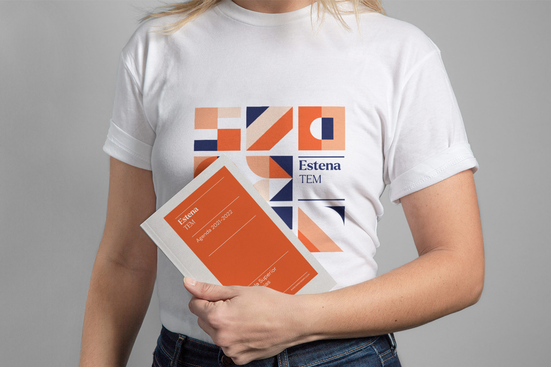
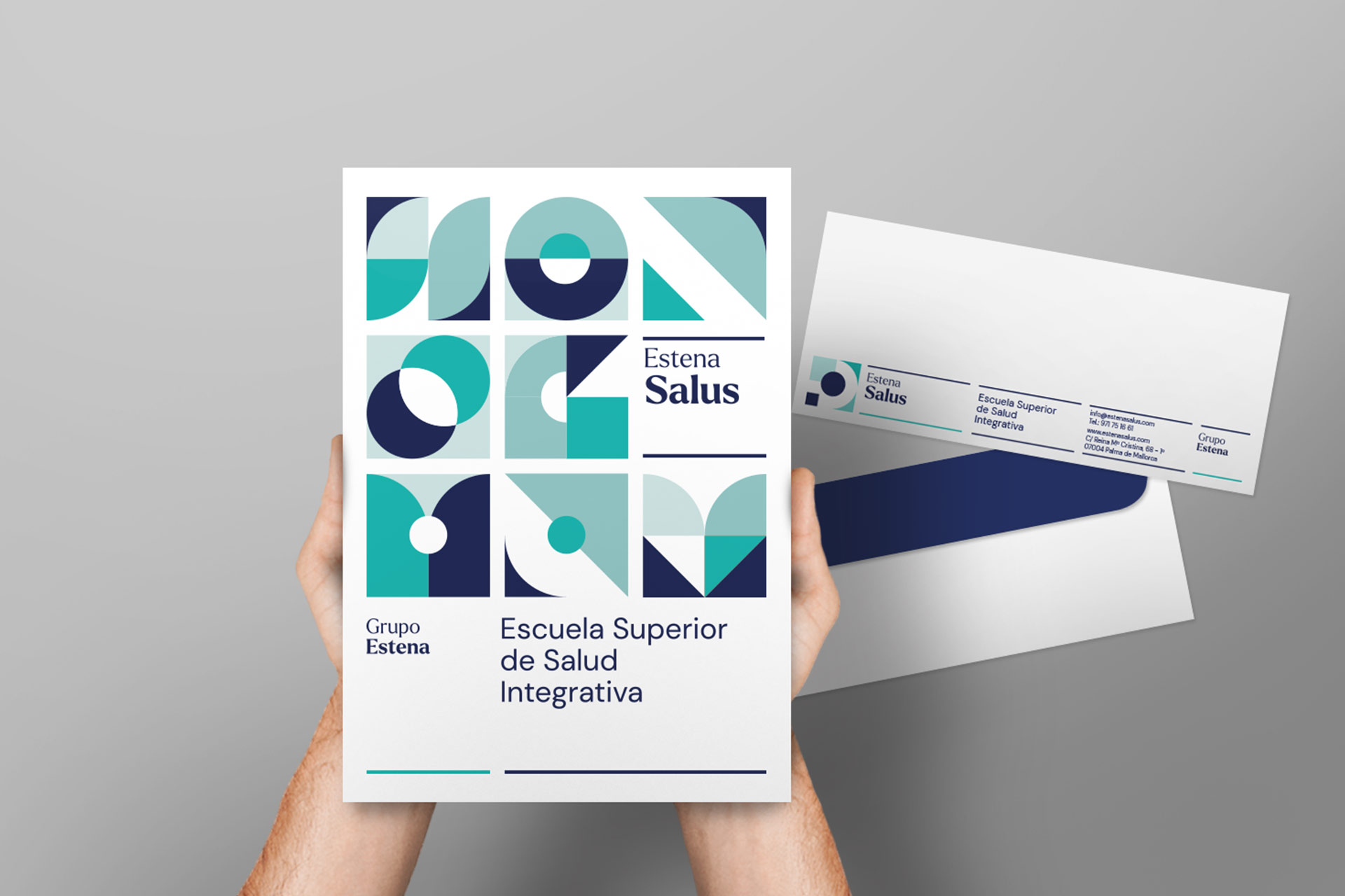
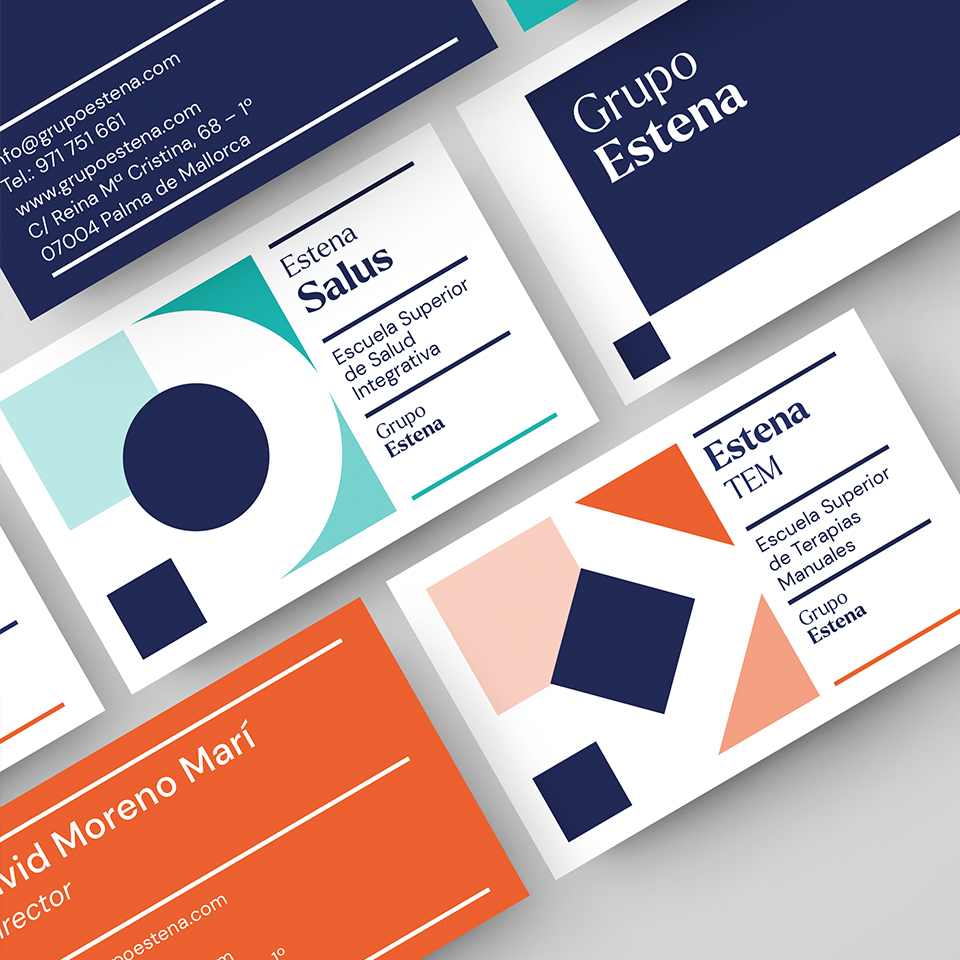
The final design follows a square base as a basic geometry to express training / school. From this element a concept is developed with the initial (E)stena, the centre as the focus of the person, the balance as a complement and integration and finally the knowledge as the basis for dialogue and reflection. A complex concept, but one that perfectly justifies each element integrated in this group identity.
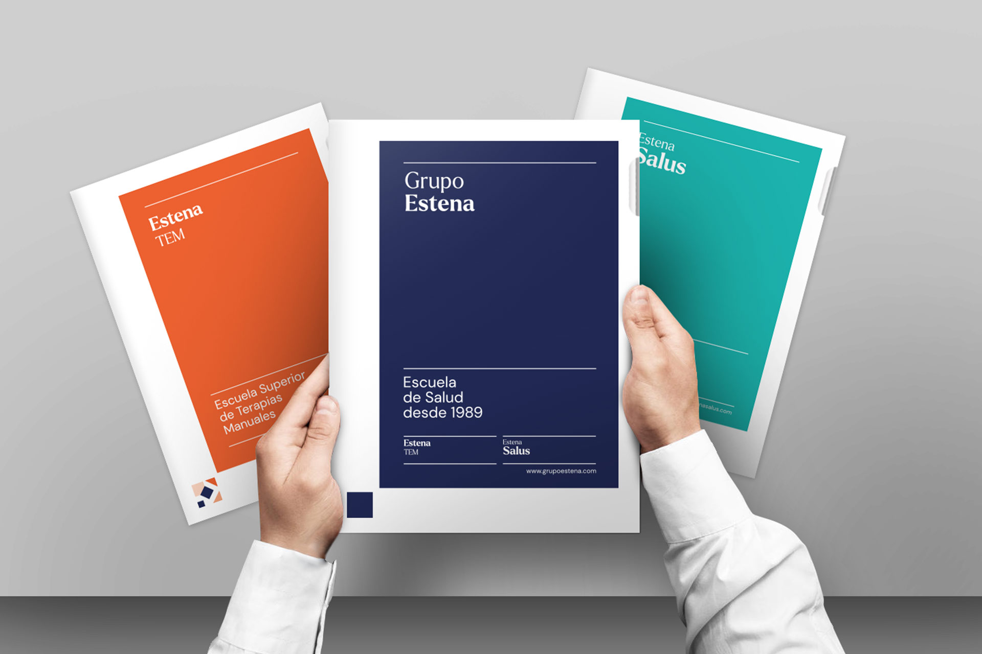
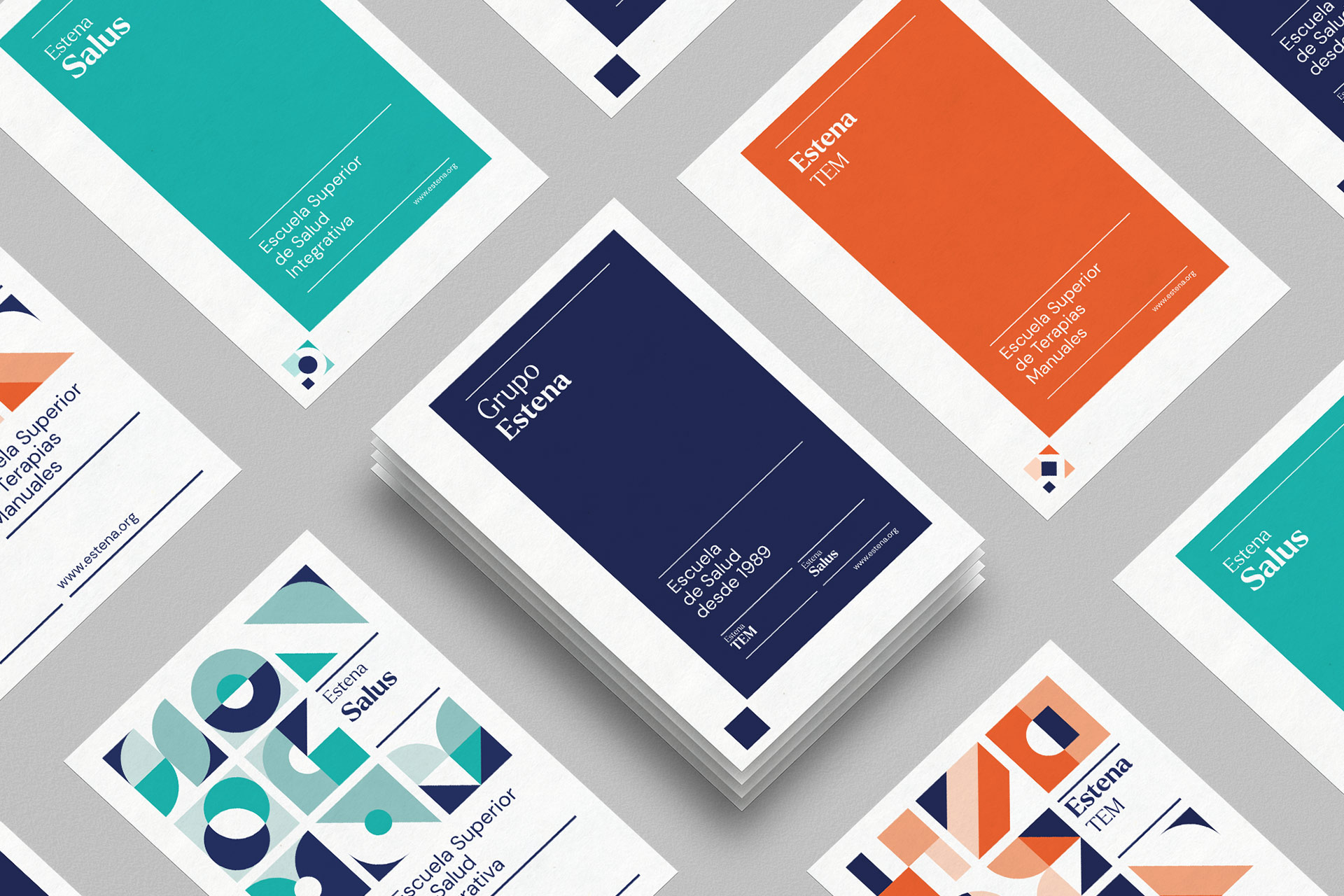
The changing composition of the different blocks generates a versatility and an ideal game to represent each school and at the same time provide a flexible communication.
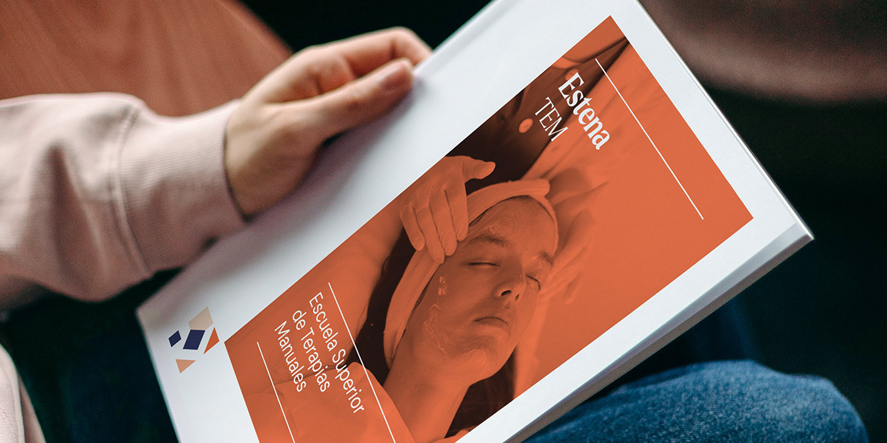
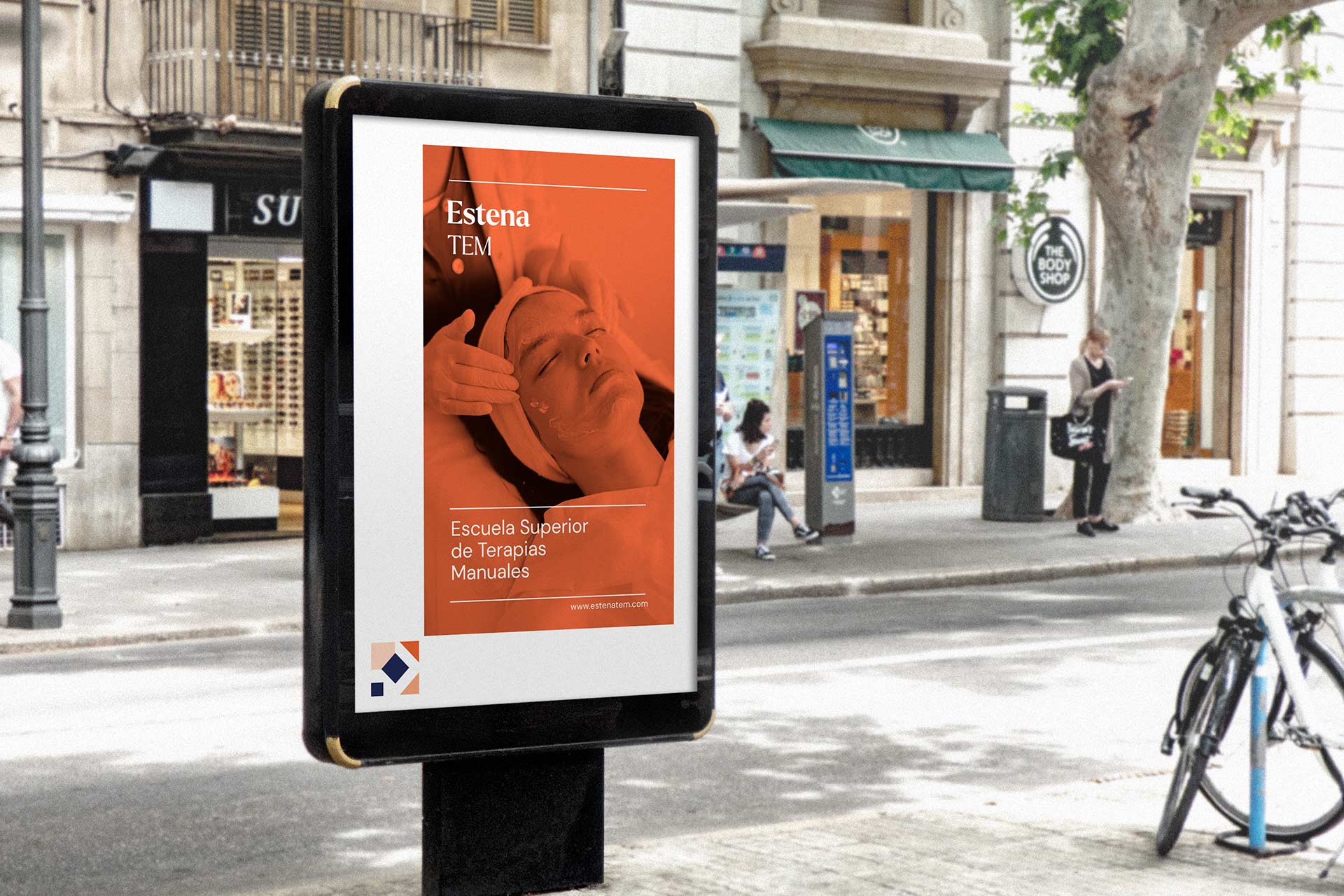
The main objective of the brand was to move away from natural and alternative therapies towards the concept of integrative health and manual therapies. The person is the centre, balance the formula and dialogue the knowledge: Health as a point of view; It deals with the duality between the organic and the psychic, Process of reflection and research
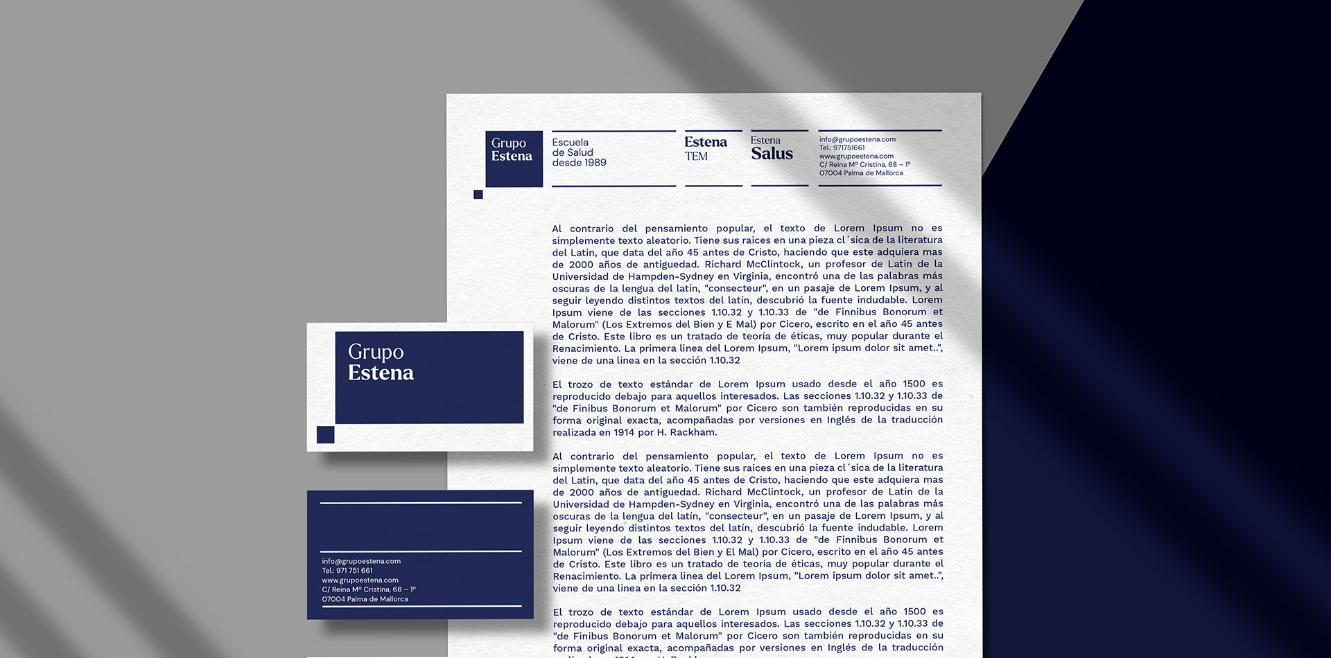
Typography used is Larken, a combination of contrast between a main font with Serif typeface character (Estena Group with its brand varieties) and a secondary typeface Sans Serif, DM Sans. About the colours: Chromatic linkage with the target audience, habits and lifestyle. Main blue for training and more corporate character. Turquoise green with connotation to purity, nature and medicine. Orange tone for reference to the body, warmth and strength. Corporate blue.
The changing composition of the different blocks generates a versatility and an ideal playfulness to represent each school and at the same time provide an edible communication. The Estena group’s communication is based on a gridded composition that follows the basic that follows the basic geometry of inspiration. It can be exuded and adapted to different supports being a very versatile figure to formalize the communication of the brand.
CREDIT
- Agency/Creative: Barceló Estudio
- Article Title: Estena Group Branding Designed by Barceló Estudio
- Organisation/Entity: Agency
- Project Type: Identity
- Project Status: Published
- Agency/Creative Country: Spain
- Agency/Creative City: Palma de Mallorca
- Market Region: Europe
- Project Deliverables: Brand Guidelines, Brand Identity, Brand Redesign
- Industry: Education
- Keywords: school, university, college
-
Credits:
Creative Director: Xisco Barceló
Art Director: Estel Alcarza


