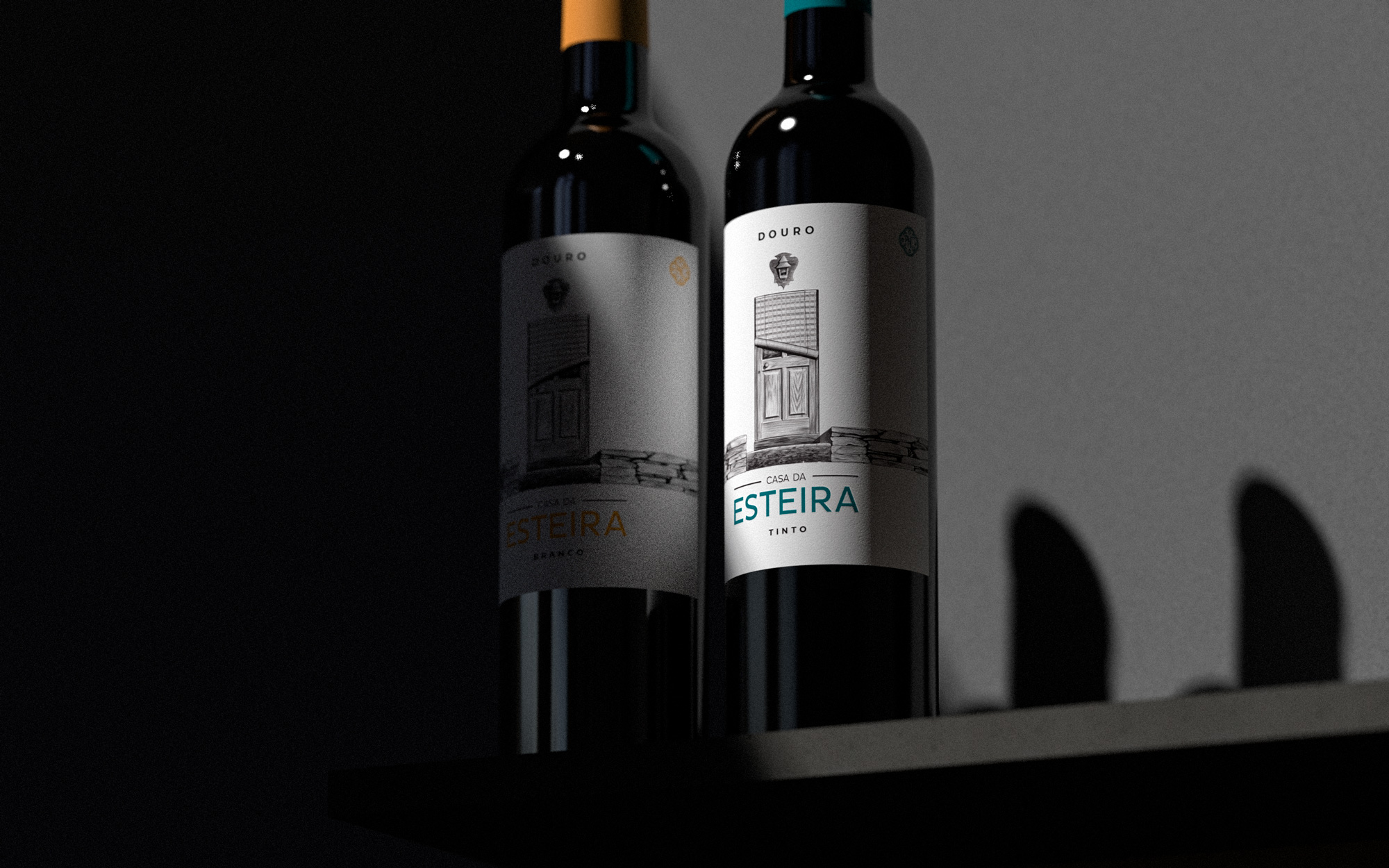
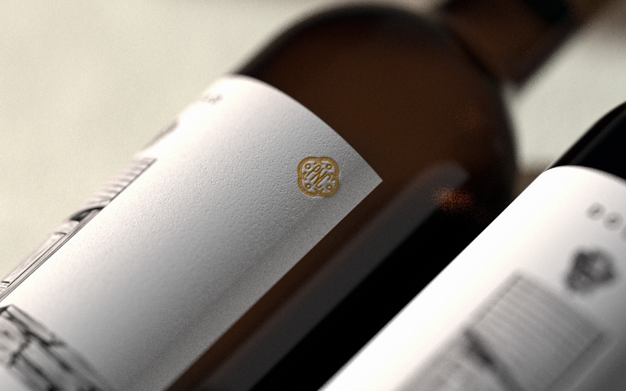
“Esteira” is produced by the PNC duo (Parceiros na Criação). The white, fresh and with citrus aromas, ages in stainless steel vats, sur lies, and with bâtonnage fortnightly for 3 months. The red, dominated in the nose by black fruits, spices and cocoa, ages for 12 months in used French oak barrels of 225 liters.
Two different wines, sons of the same house: Casa da Esteira, located in Barcos, Tabuaço, in the Douro Valley, Portugal. Barcos belongs to the Wine Villages group: very special places in Douro, where it seems time didn’t exist, but where we find new and experienced producers, who are making sure these villages are alive and still very relevant.
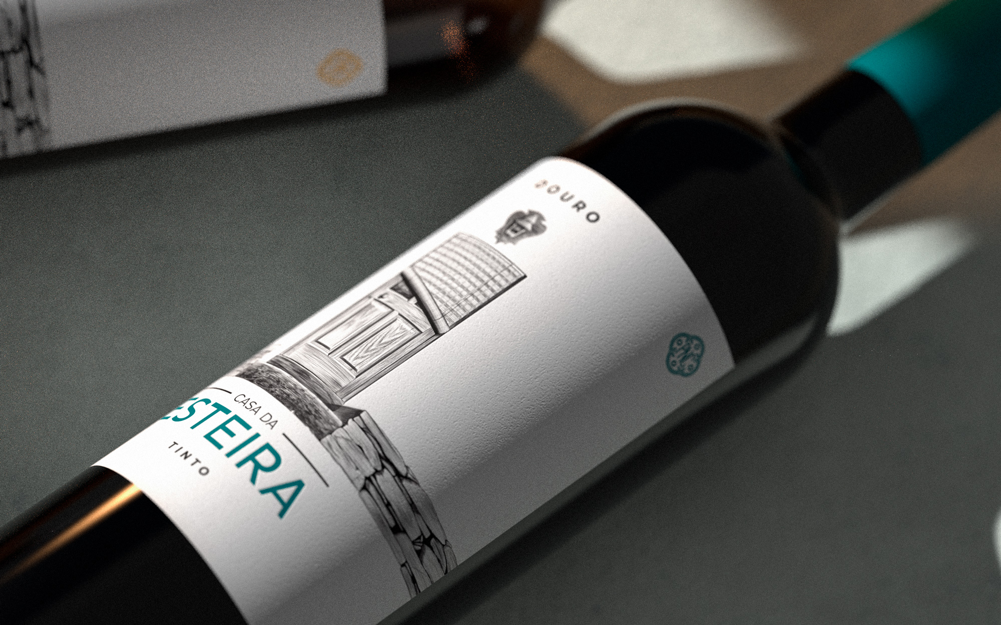
For these labels, both white and red, we got inspired by the origin of it all — the house — and the texture perceived when we think of “esteira” as a material. It doesn’t have a translation to English — it is a weaved sheet, made of strong straw, that is used both as a mat and as a window blind. It’s a material full of contradictions: resistant but light, it shines under the sun but protects from the rain. It’s a very present material at Casa da Esteira and it is an indispensable element of its identity.
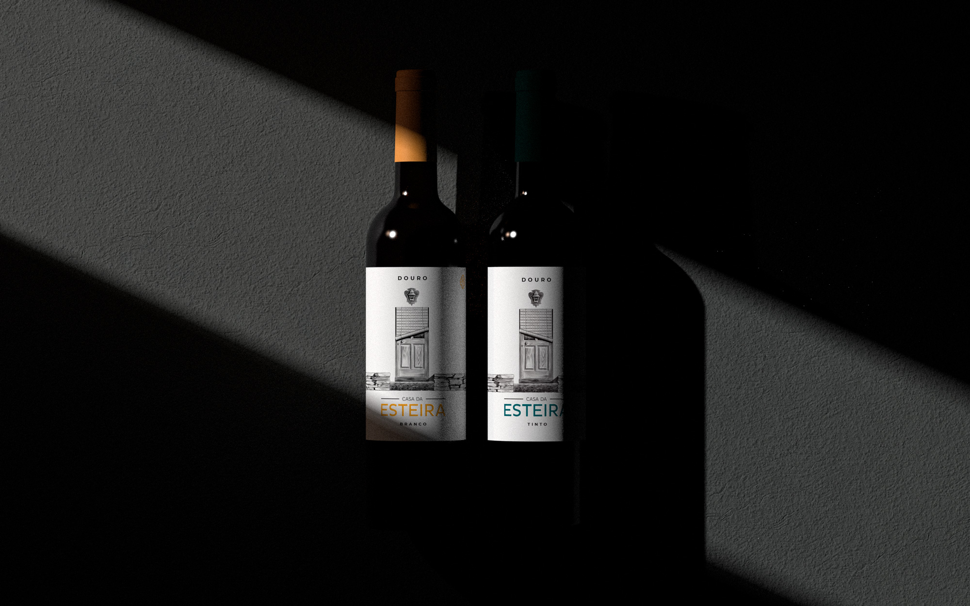
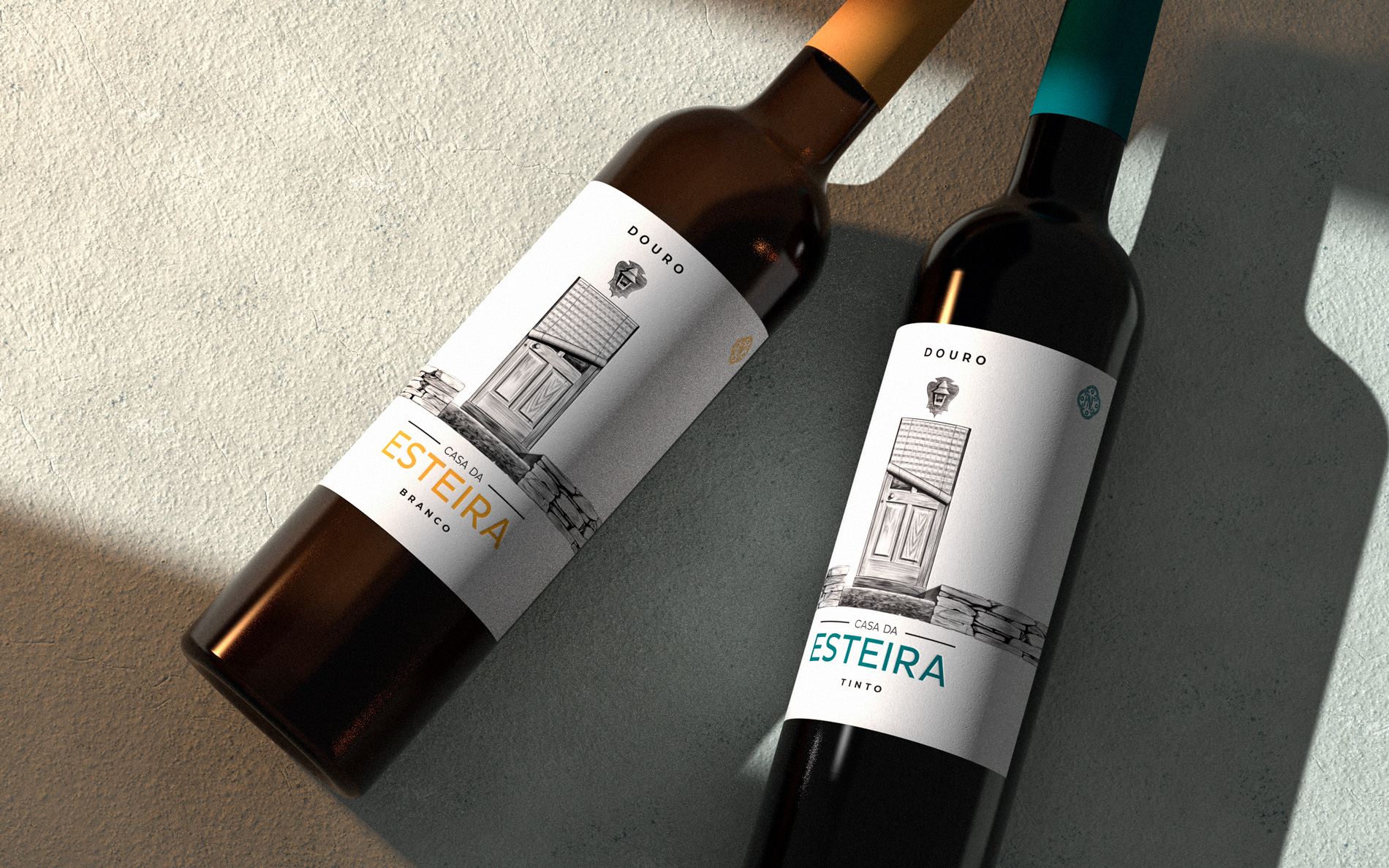
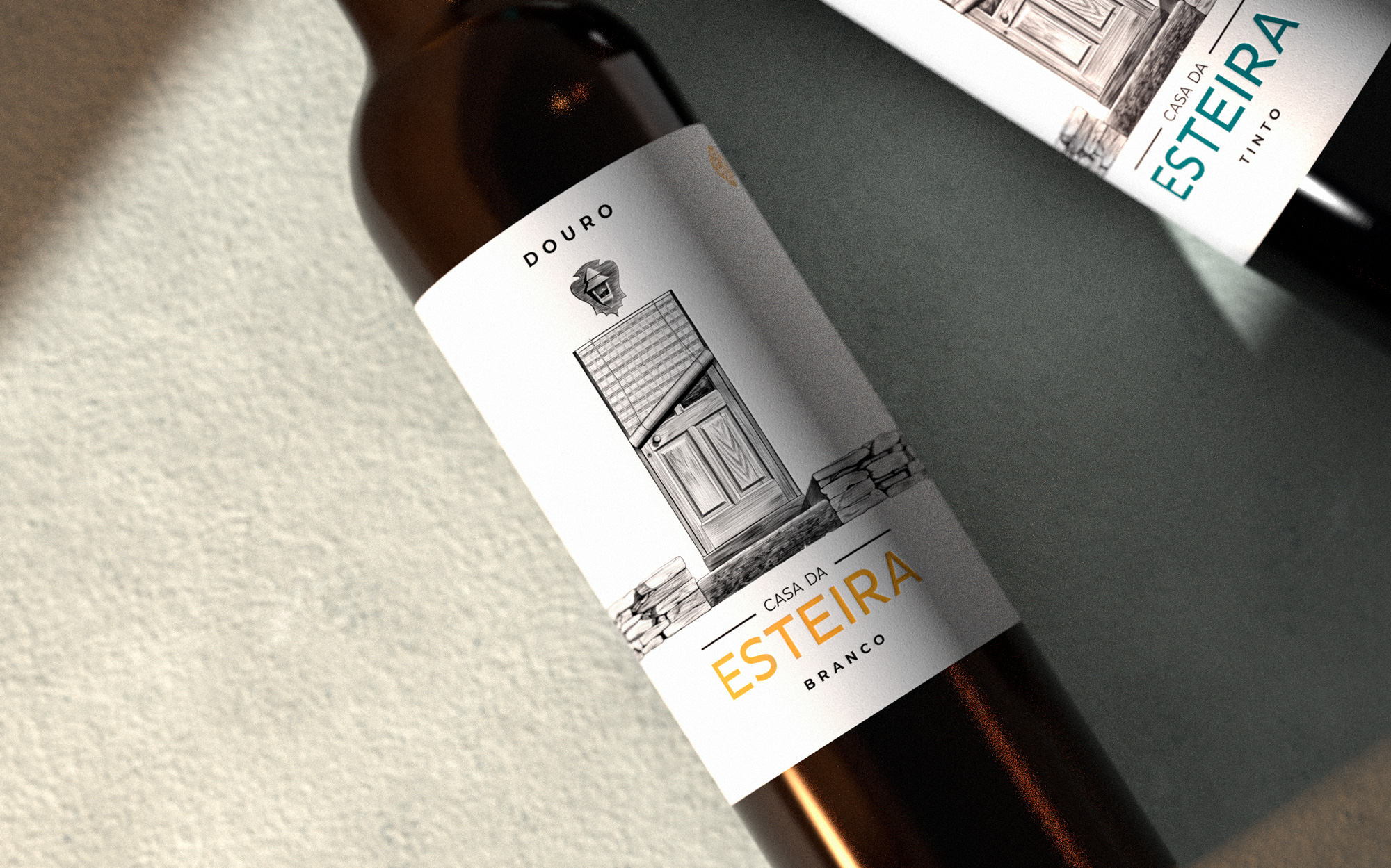
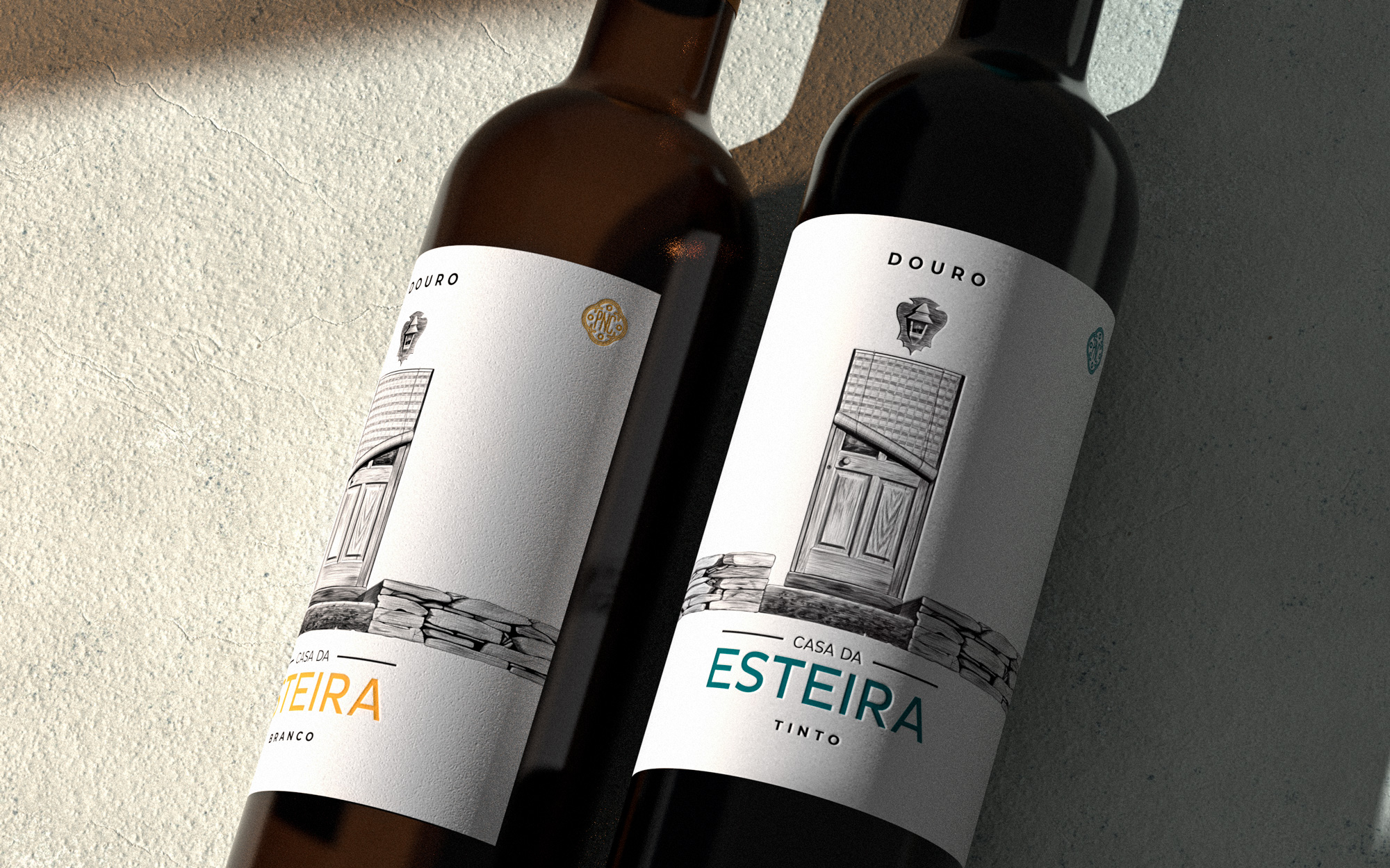
We knew that this “esteira” had to be present, and that was exactly what we brought to this label — a drawing of the door, covered by a “esteira”. This drawing was made with pencils, like a drawing of any age, and the simplicity of choices is very clear, there is no hiding. It is because it’s so simple that this drawing leaves us space to fill with everything that should be around: we imagine the rest of the house, we remember other houses we knew and went. It’s a drawing that evokes the nostalgia of country houses, the seasons in Douro and slower days. It is a simple drawing, but full of meaning — not only because of the connection to the place where the wine is made, but also because of the memories of who makes it and our own memories of similar places, similar houses, from our grandparents’ time.
Besides the door and its “esteira”, the small schist wall was also an element we wanted to include. It appears, in the drawing, as a footnote that frames the door, but it ads so much to this story: the schist pinpoints Casa da Esteira in the Douro Valley and completes our imaginary for these wines, whose grapes grew and matured on vines growing on shale soil.
The sans-serif typography allows the drawing to breath and removes the weight of tradition, which could easily be associated with classical drawings like this. We didn’t want it to look and old-fashioned label, quite the opposite: the Douro Valley will always have that ancient legacy, but these are wines of today.
These are two wines that grew up in Douro and look like two brothers: similar, but different. They could be facing each other, like neighbors with the same house door, covered by a “esteira”.
CREDIT
- Agency/Creative: Bisarro Studio
- Article Title: Esteira Wine Label Design by Bisarro Studio
- Organisation/Entity: Agency, Published Commercial Design
- Project Type: Packaging
- Agency/Creative Country: Portugal
- Market Region: Europe
- Project Deliverables: Brand Identity, Brand Naming, Brand Redesign, Graphic Design, Packaging Design, Product Architecture
- Format: Bottle
- Substrate: Glass Bottle


