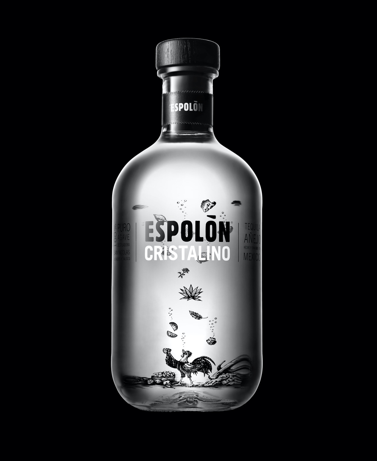
Espolòn Cristalino is a new extension to the Espolòn range of tequilas with the aim of elevating the new variant to the luxury Cristalino category. Our challenge was to bring the Cristalino story to life, using the codes of Espolòn, and disrupt a quickly expanding category by standing out from the competition.
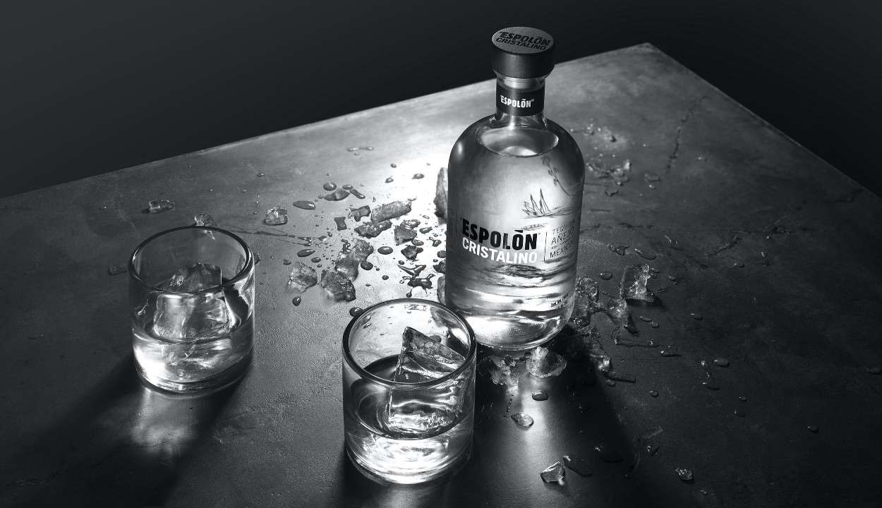
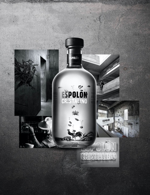
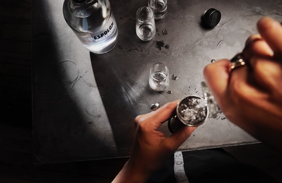
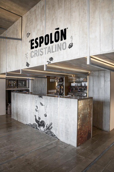
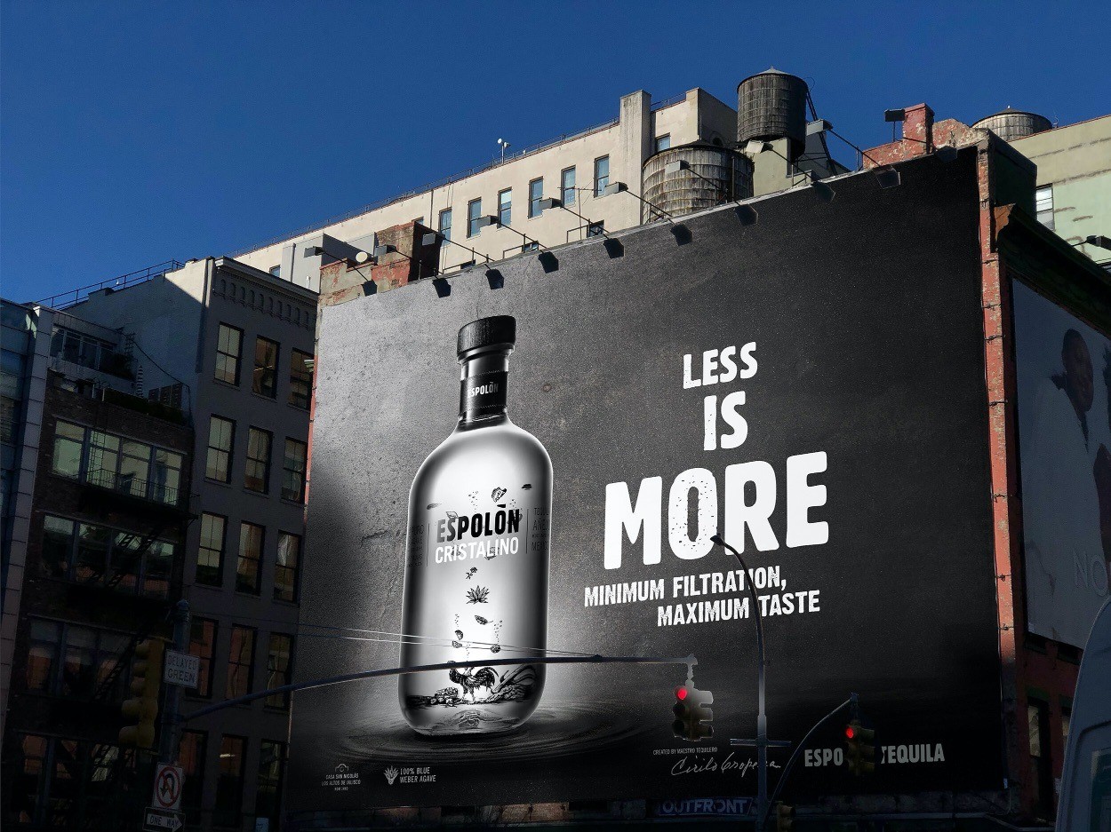
Our design team developed the Espolòn Cristalino visual identity, the concept, the bottle graphics, the illustration, the gift box graphics, and bottle photography, as well as the brand visibility tools for the launch campaign. We also created key visuals and shot the launch campaign. “The Agency has been an important agency partner of ours since 2019 and is responsible for bringing to life some of our important foundational brand assets, including the Espolòn brand visual identity. The team brings a unique approach to each project, led by its strong design knowledge, underpinned with sound strategic rationale.” Franck Dudley, Global Senior Brand Manager – Mexican Spirits Portfolio at Campari Group.
Inspired by the existing Posada-style illustrations on the core range, which depict rich tales based on Mexico’s storied history, we crafted a new story for Espolòn Cristalino. We created a story around the Mexican Cenotes – pools of crystal clear water revered by the ancient Mayans and used for offering precious objects to the gods. Our illustration depicts various gifts floating down the clear bottle to Espolòn’s expectant rooster icon, Ramón.
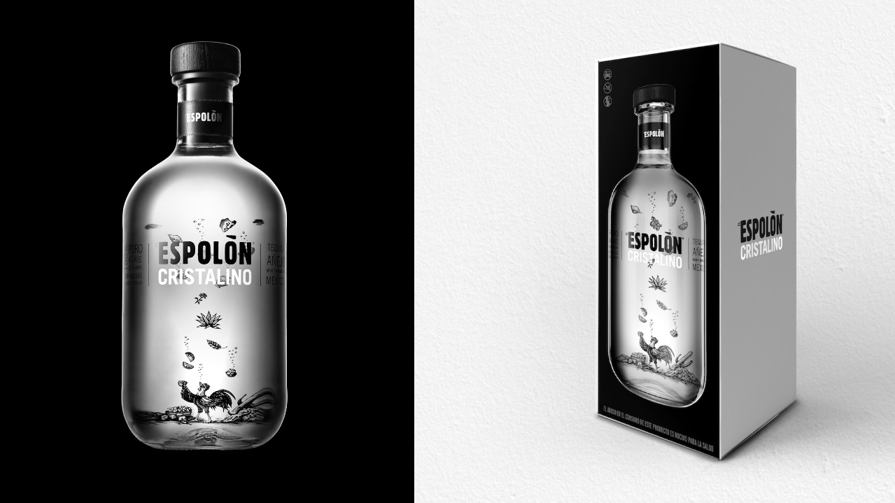
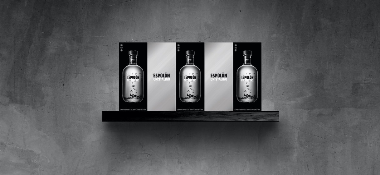
Along with the unique bottle, which features a no-label look to highlight the incredible liquid and story, we also designed the gift box – a simple, but striking packaging that, with contrasting black and silver panels, provides a very strong standout. The pack features beautiful photography of the bottle that brings strong brand recognition.
With a no-label look and the illustration printed on the back of the bottle, the design brings a fresh perspective on the “Cristalino” category. The illustration slightly de-form and re-form as you move the bottle, bringing depth to the storyline.
Espolòn Cristalino is an innovation first launched in June 2021 in Mexico. Espolòn Cristalino will be soon launched in The USA and in Europe. We don’t have data at this point about the launch, but we know that this launch will reinforce the very strong position of Espolòn in a striving North American market.
CREDIT
- Agency/Creative: forceMAJEURE Design
- Article Title: Espolòn Cristalino Packaging Design by forceMAJEURE Design
- Organisation/Entity: Agency
- Project Type: Packaging
- Project Status: Published
- Agency/Creative Country: United States
- Agency/Creative City: Brooklyn
- Market Region: Global
- Project Deliverables: Packaging Design
- Format: Bottle
- Substrate: Glass Bottle
- Industry: Food/Beverage
- Keywords: WBDS Agency Design Awards 2021/22
-
Credits:
Design Agency: forceMAJEURE Design


