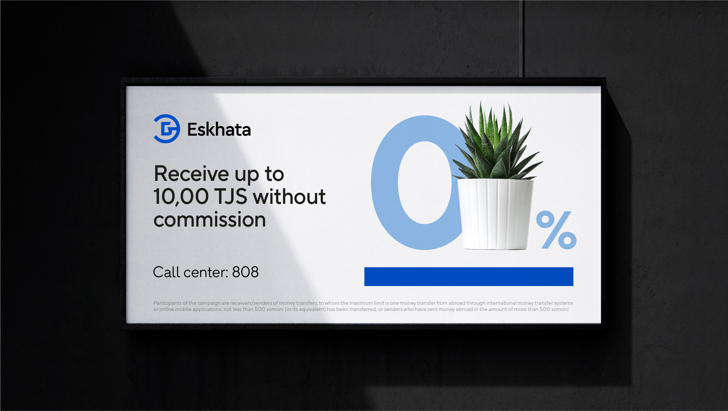
Rebranding of a bank included in the top 3 in Tajikistan.
“Bank Eskhata” is a private independent financial institution with foreign capital, providing all basic banking products to individuals and legal entities. After 30 years of existence and active development in the market, there was a need to reconsider the positioning and design system.
LINII developed the “Bank for Close Ones” positioning, a design system with clear rules for different types of media, as well as a communication strategy.
The name “Eskhata” itself reflects the entire complex of brand values: the concept of family, close circle of people, transparency, attention to everyone and constant inclusion.
The Sage and Parent archetypes accurately convey the character of the brand: “Bank Eskhata” is attentive to customer requests, and provides simple and understandable information about financial products.
The LINII design system reflected the company’s professionalism and empathetic approach to people. The blue line is one of the main graphic elements of the brand, which symbolizes the constant support and daily presence of Bank Eskhata in people’s lives.
The brand name is a monogram with a unique combination of the letters “E” and “B”.
The updated identity retains the recognizable blue color, but modernizes its shade. Additional colors also appeared in the palette: sky blue and “friendly” sand.
We described the developed photo style, brand book and communication strategy on the website. Follow the link.


CREDIT
- Agency/Creative: LINII
- Article Title: Eskhata Bank Rebranding by LINII
- Organisation/Entity: Agency
- Project Type: Identity
- Project Status: Published
- Agency/Creative Country: Russia
- Agency/Creative City: Moscow
- Market Region: Europe
- Project Deliverables: Brand Design, Brand Identity, Brand Strategy
- Industry: Financial
- Keywords: bank, Tajikistan, identity, blue
-
Credits:
Director of Strategy: Polina Vasilyeva
Strategist: Inessa Genkina
Strategist: Angelina Sorokina
Creative Director: Julia Plotnik
Designer: Ilya Savonkin
Designer: Kirill Zharkoy
Designer: Sofia Vychuzhanina
Development Director: Dmitry Burenko
Project manager: Valeria Lyakutkina
Project manager: Anna Bolshedvorskaya


