Client:
Erbert stands as the pioneer of the Italian food chain committed to promoting healthy eating. Nestled in the heart of Milan, with 5 thriving outlets, the brand is on a rapid ascent. What sets Erbert apart is its innovative culinary laboratory, where a dedicated team crafts over 100 ready-to-eat meals daily. Each dish emerges from a harmonious collaboration between skilled chefs and seasoned nutritionists, resulting in a culinary system that delivers wholesome, delectable, and diverse food, ready to enrich the daily lives of everyone.
Assignment:
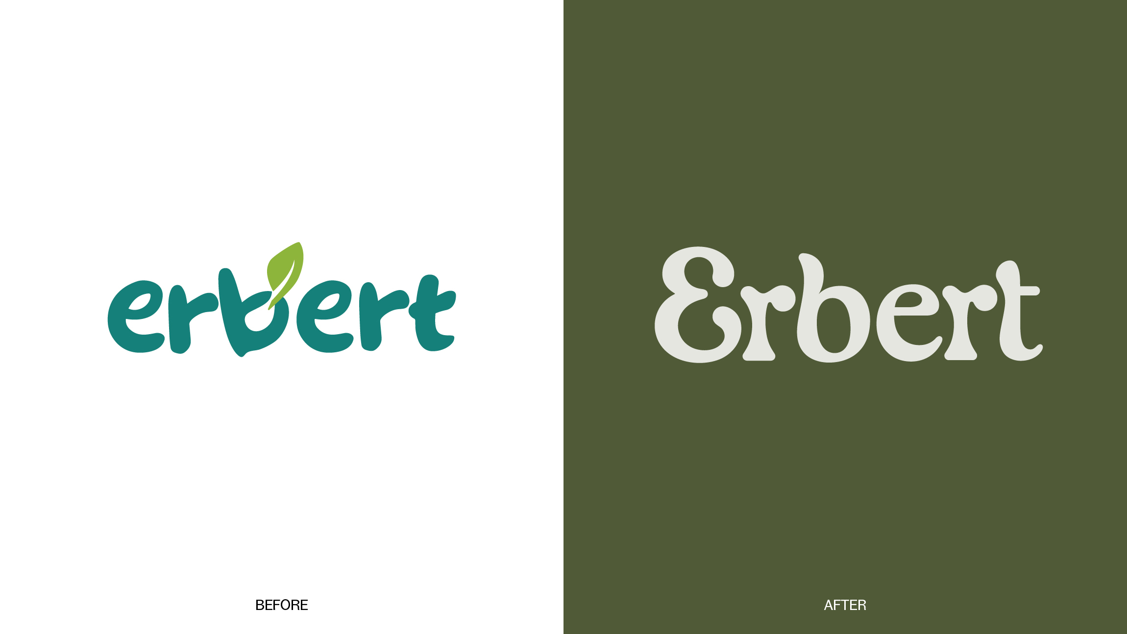
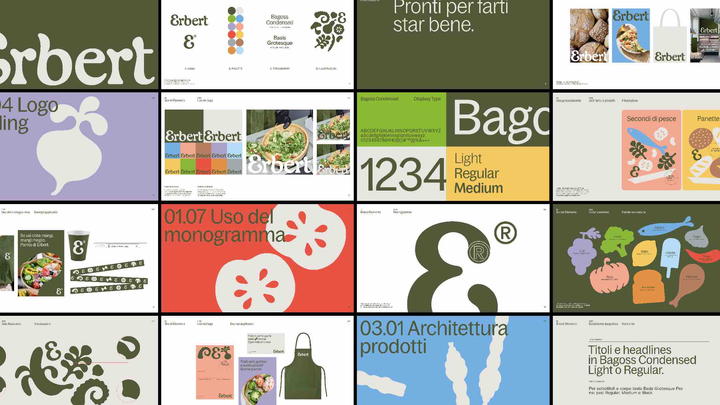
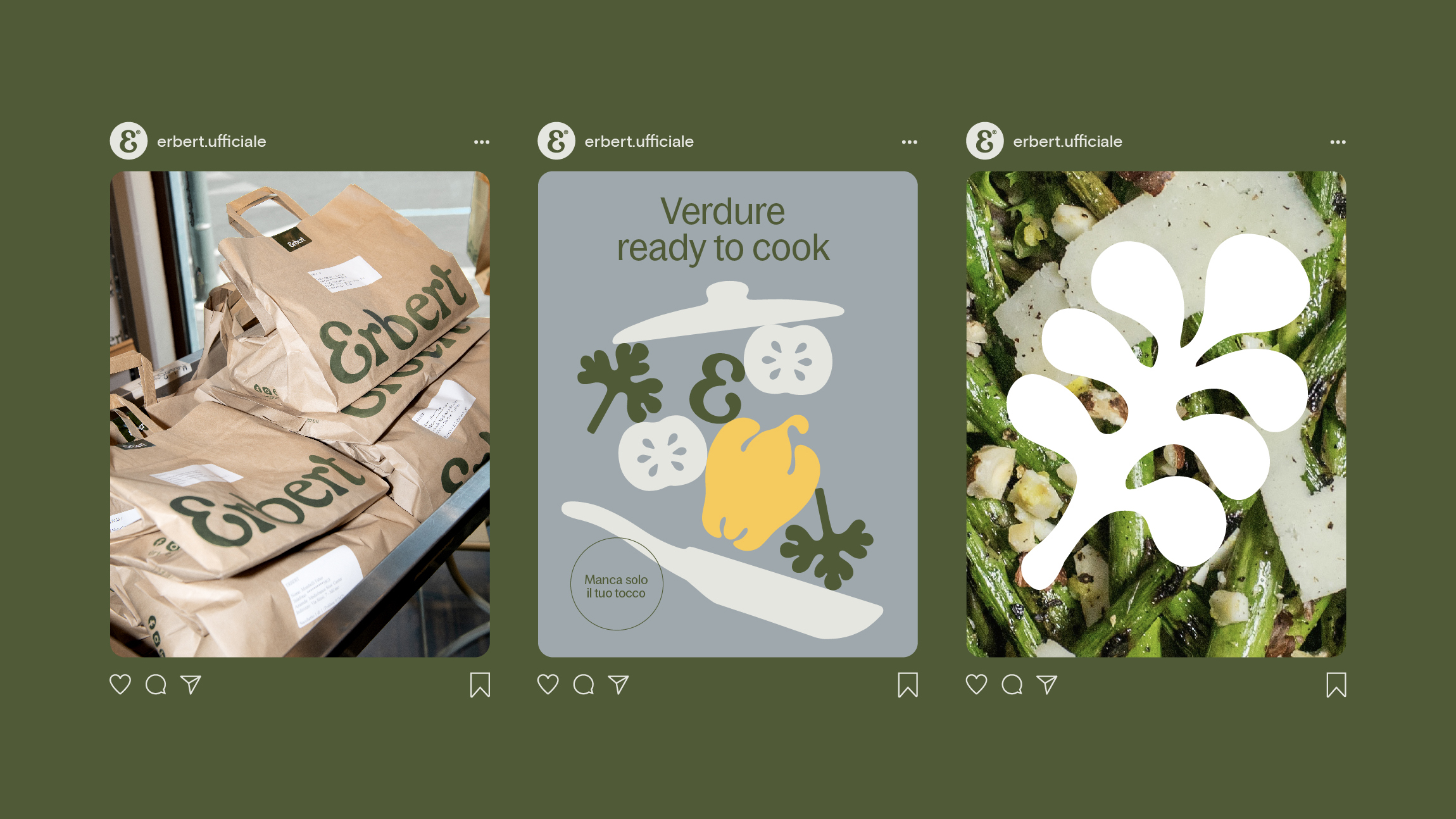
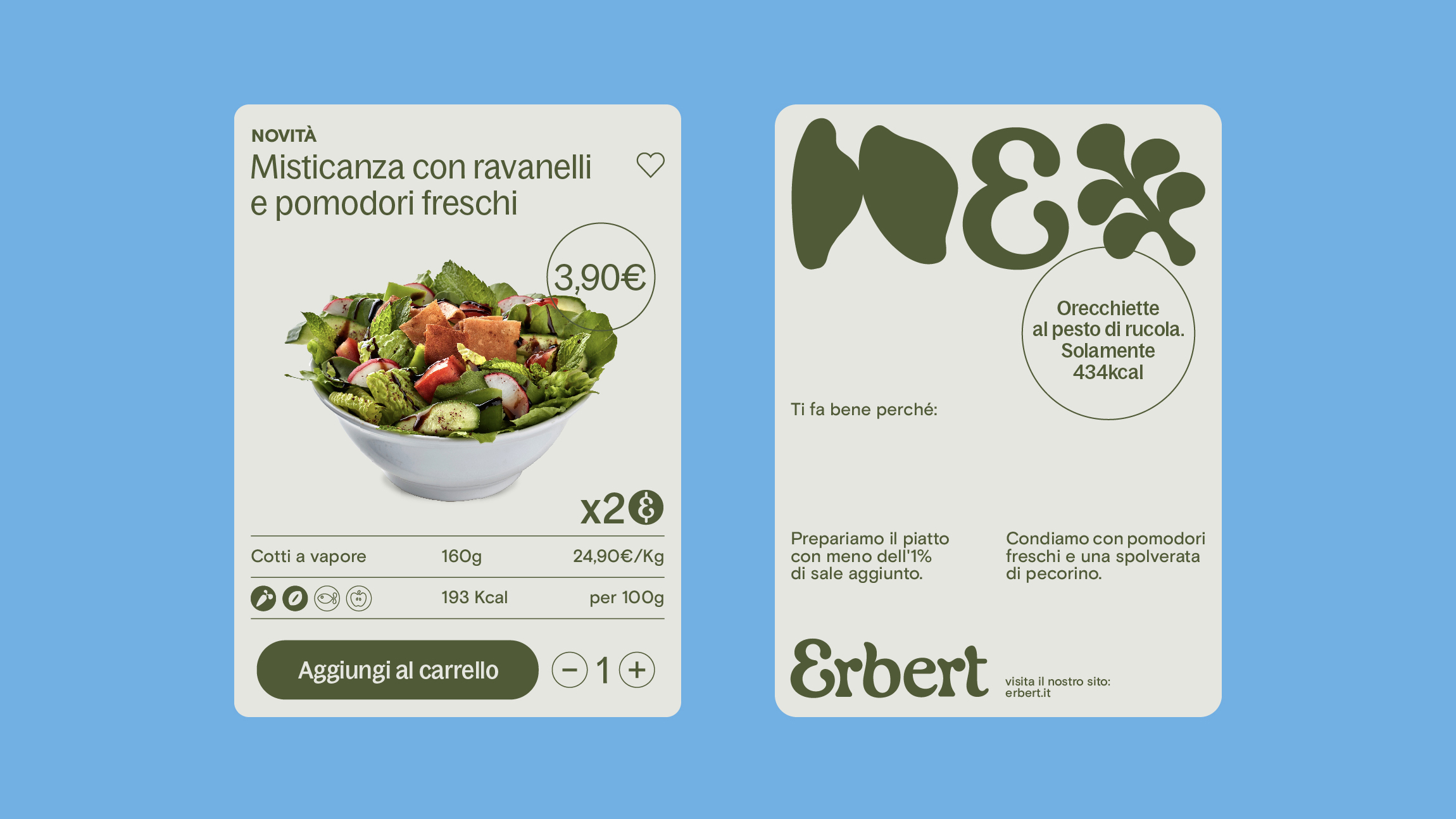
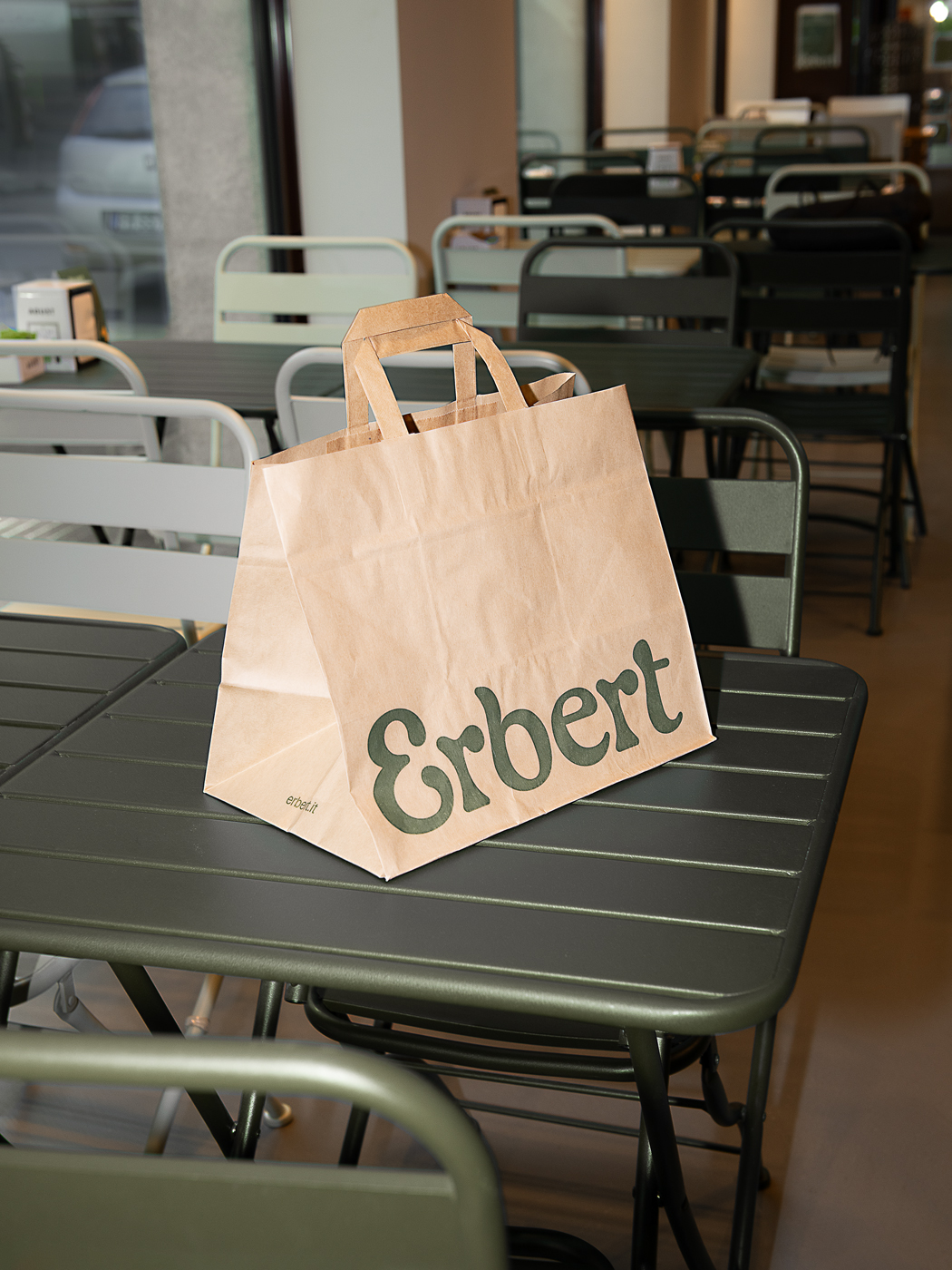
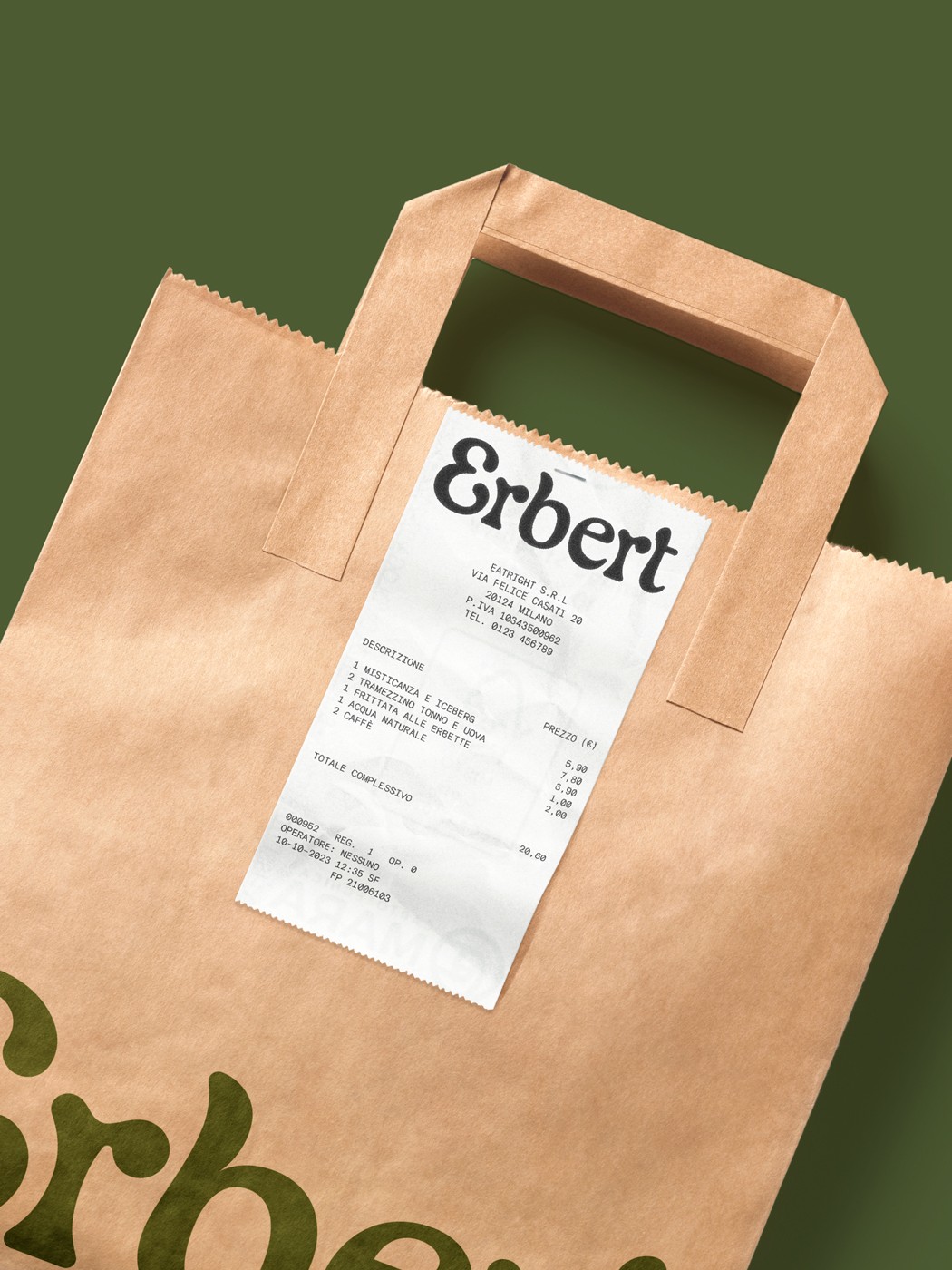
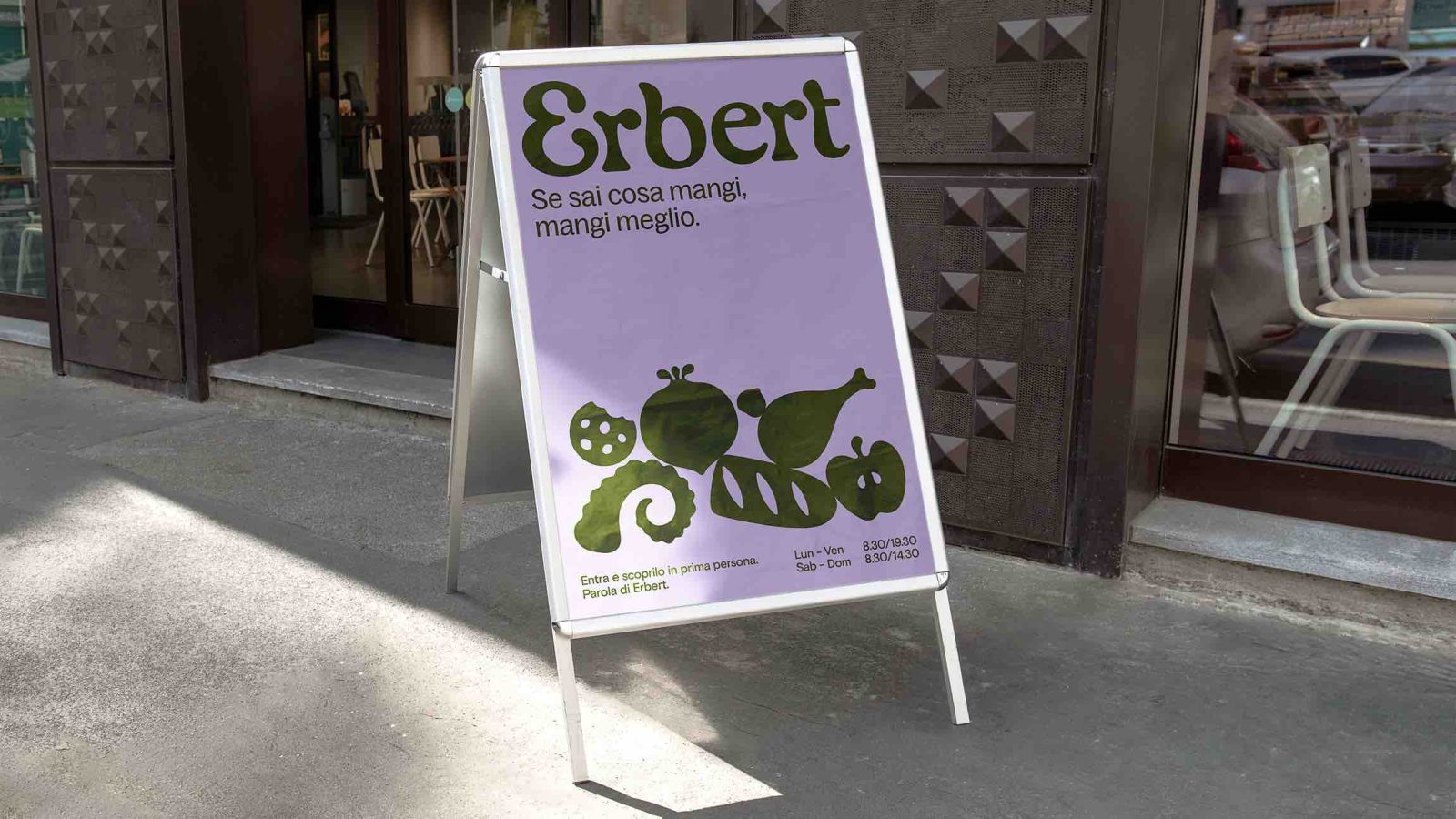
Our mission extended beyond a mere rebranding; we were tasked with repositioning Erbert. We aimed to transform it from a supermarket merely offering fresh and health-conscious products into an entirely new concept—an innovative fast food restaurant dedicated to serving convenient, healthy, and affordable ready-to-eat meals. This transformation was more than a change in the brand’s identity; it was a shift towards educating and empowering people to embrace a varied and balanced eating style. Our comprehensive scope of work encompassed crafting a renewed brand identity, extending across various touchpoints, including a fresh logo, a typographic ecosystem, product labels, shopping bags, and packaging for online orders.
Solution & Process:
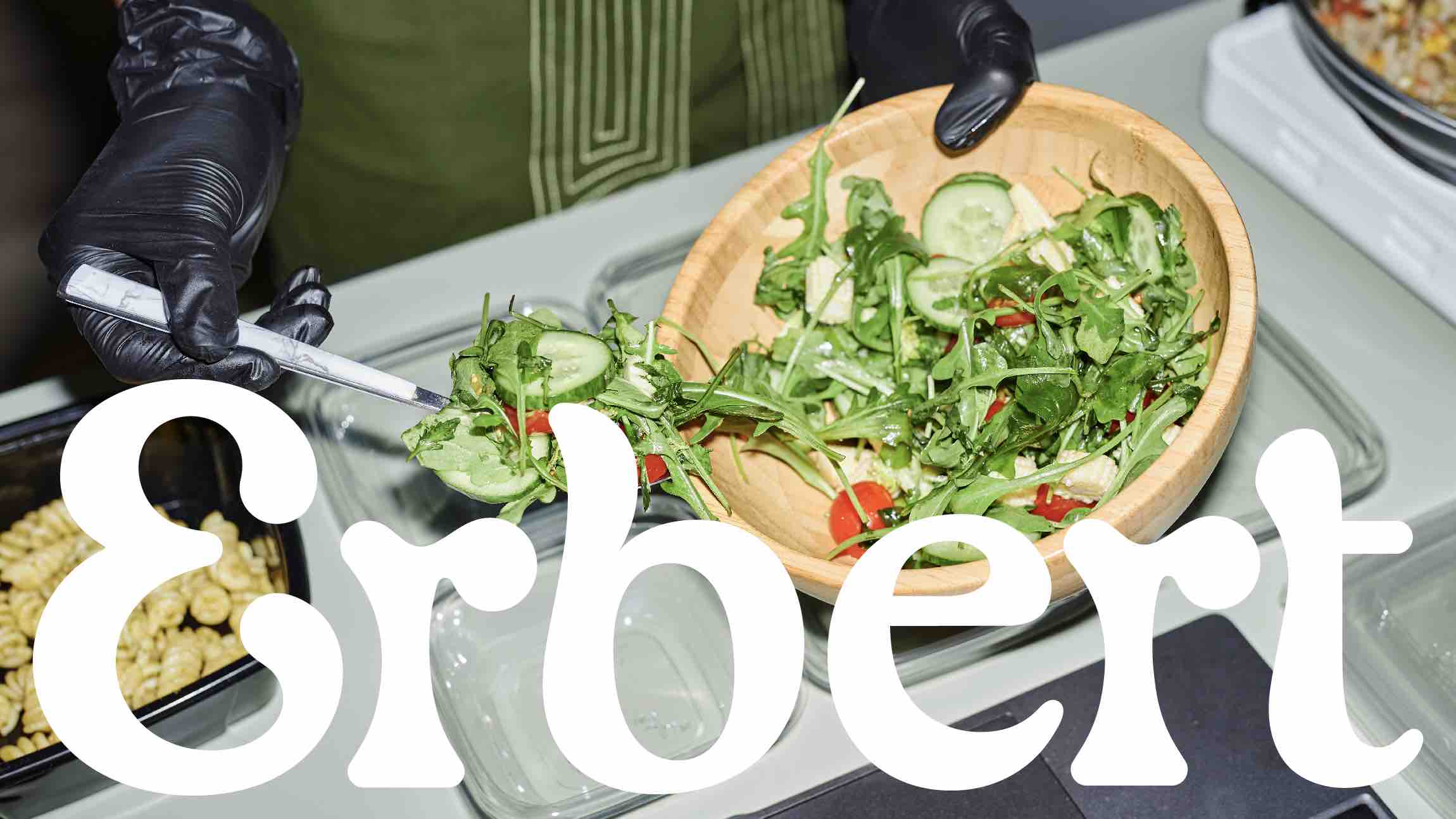
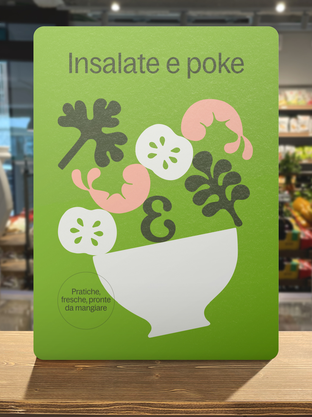
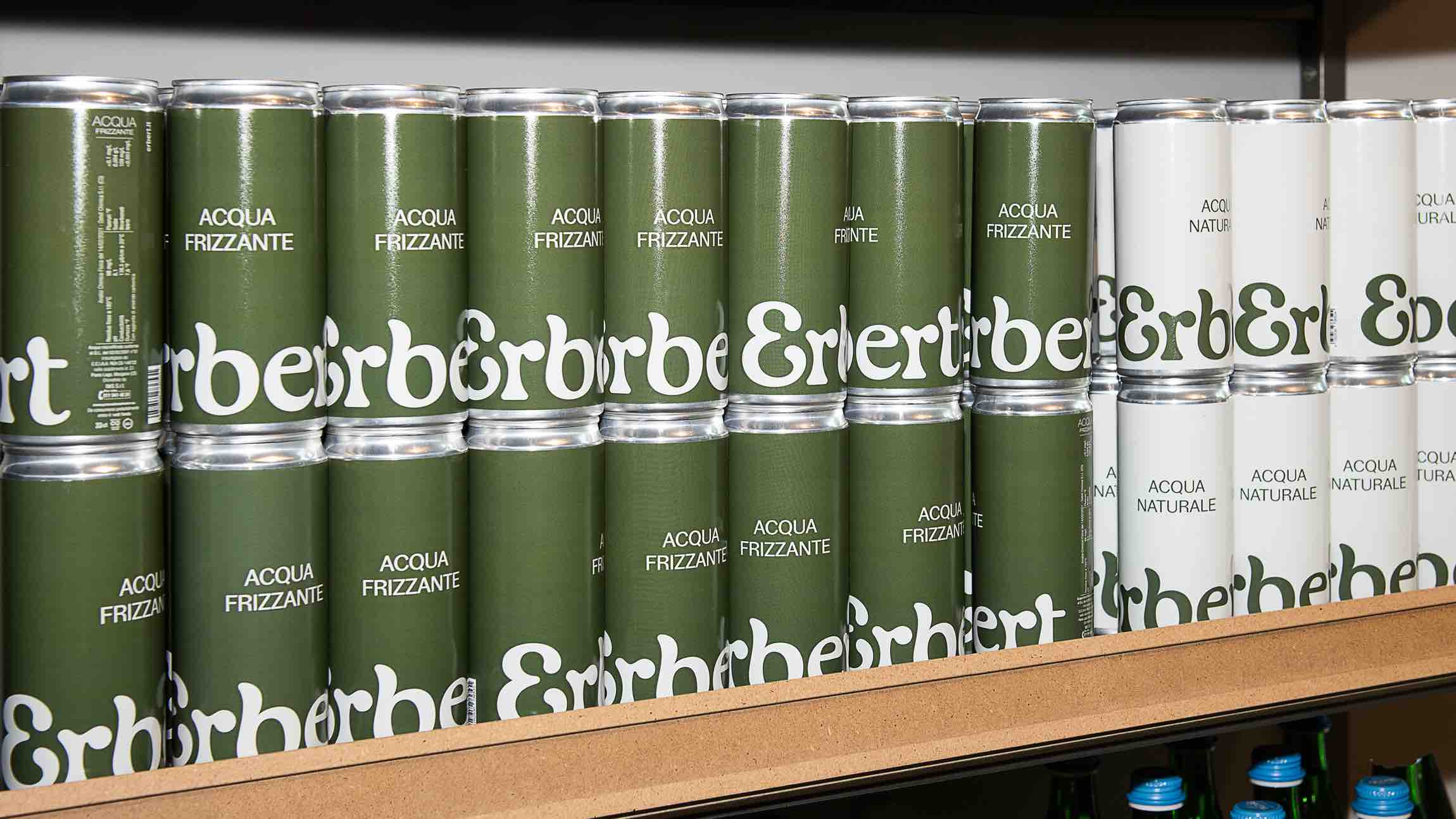
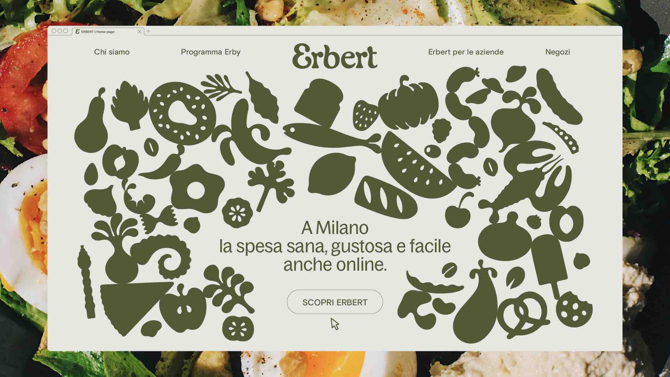
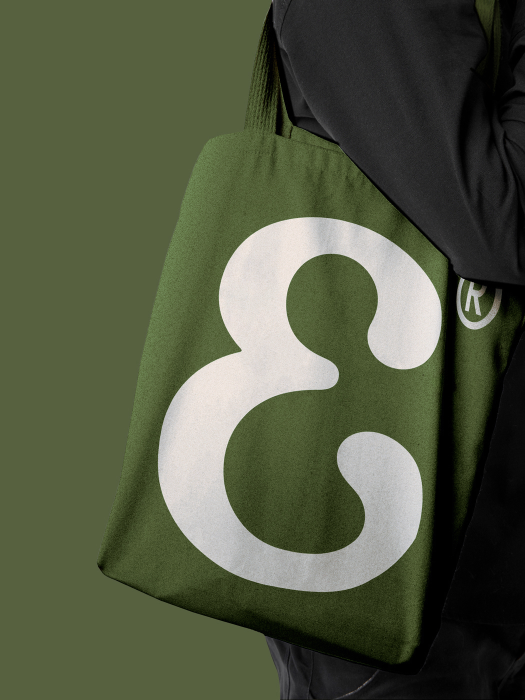
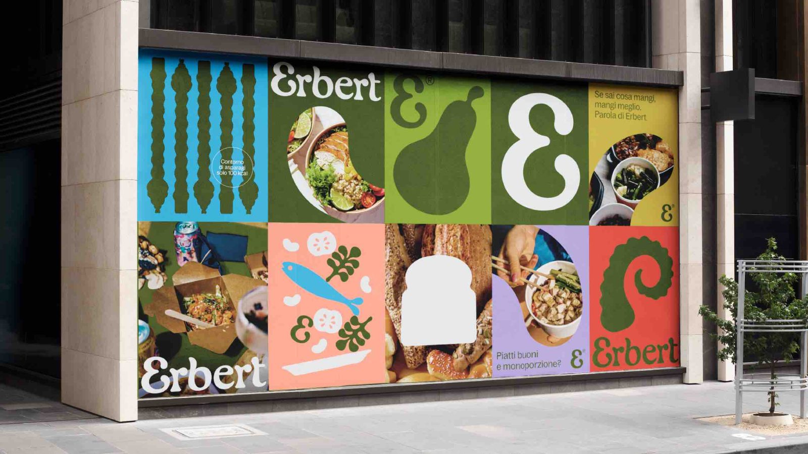
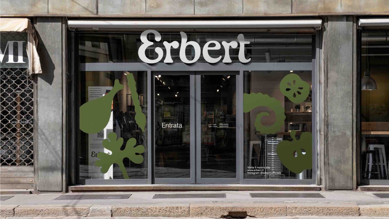
At the heart of our design is a custom logotype meticulously tailored to capture the essence of freshness and healthiness intrinsic to Erbert’s culinary offerings. The typography is defined by graceful curves and rounded serif terminations, symbolizing the brand’s commitment to delivering a wholesome and gratifying dining experience. The entire visual identity has embraced a vibrant color palette, with green taking center stage. This fresh and invigorating hue not only adorns printed materials but also infuses the retail experience, embodying the brand’s dedication to health and vitality.
The result is more than a mere visual transformation; it’s a holistic journey that aligns Erbert’s brand identity with its core mission—to make healthy eating accessible, enjoyable, and educational for everyone. With our design, Erbert is not just a place to dine; it’s a place where knowledge, taste, and well-being converge.
CREDIT
- Agency/Creative: Auge Design
- Article Title: Erbert Vibrant Visual Identity for an Innovative Fast Food Experience
- Organisation/Entity: Agency
- Project Type: Identity
- Project Status: Published
- Agency/Creative Country: Italy
- Agency/Creative City: Firenze
- Market Region: Europe
- Project Deliverables: Brand Identity
- Industry: Food/Beverage
- Keywords: WBDS Agency Design Awards 2023/24
- Keywords: Identity, Brand Redesign
-
Credits:
Executive Creative Director: Davide Mosconi
Design Director: Giovanni Stillittano
Designer: Carlo Quaranta
Creative Director: Andrea Mastroluca


