


Designing Scent That Lives Beyond the Senses
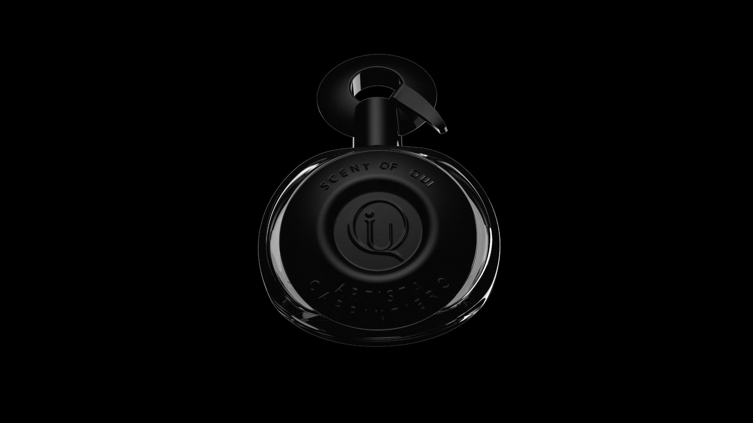
The perfume bottle of Scent of Qui isn’t just packaging—it’s a sculptural embodiment of the brand’s soul. It bridges the intangible and the tactile, translating narrative and emotion into form. In a saturated luxury market, our challenge wasn’t to impress—it was to design a vessel that feels like memory, carries intimacy, and whispers intention with every detail.
From Narrative to Form
Scent of Qui was born from the idea that fragrance is storytelling. Each scent is a character. Each layer is a line in a poem. The bottle had to carry this storytelling spirit—visually, emotionally, and physically. Instead of chasing trends in glass design, we focused on quiet presence. We asked: what would a scent feel like if it lived in your hand? How would memory look in matte?
This question became our north star. The result is a bottle that feels less like an object and more like an invitation. An experience. A gesture.
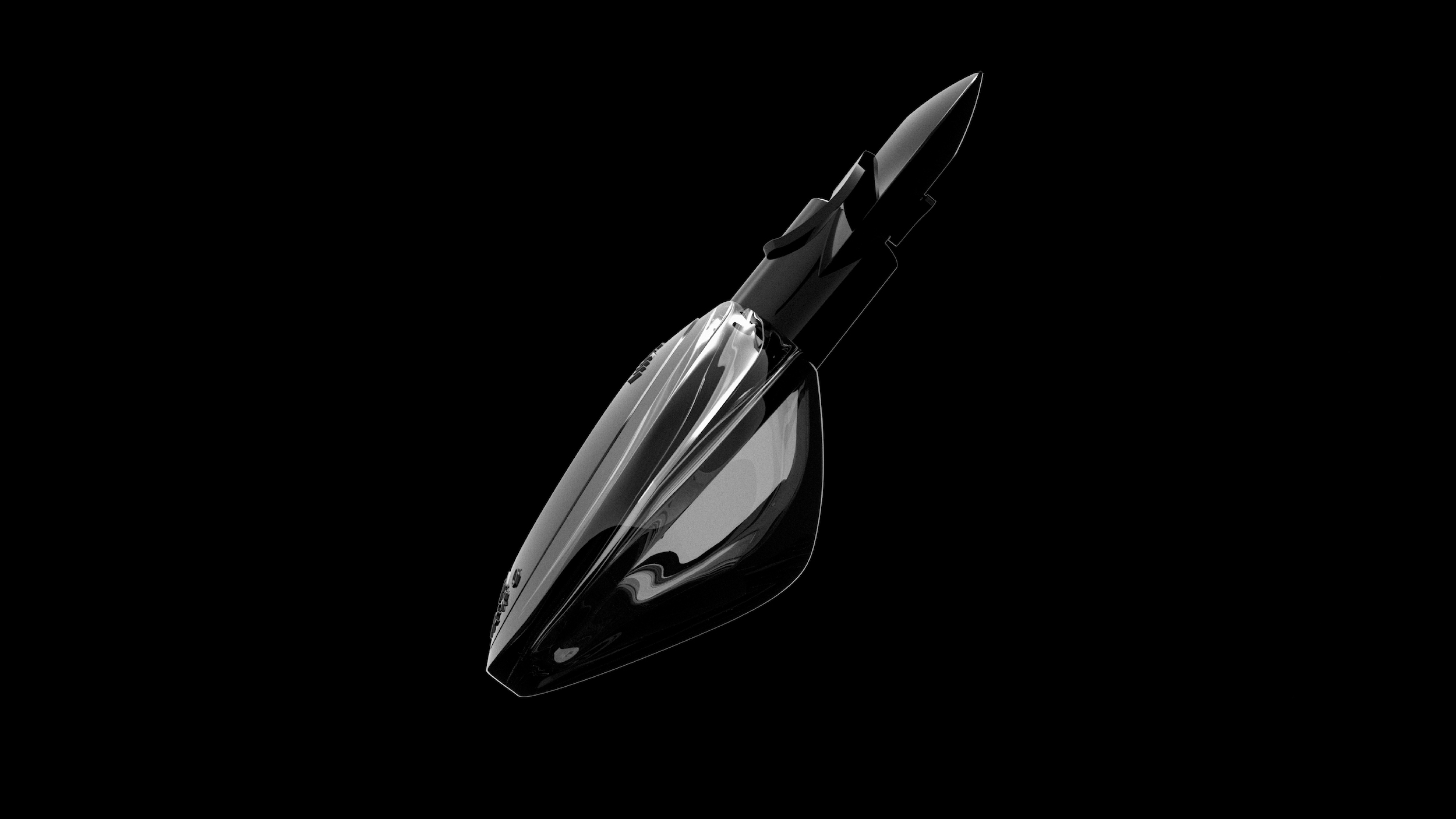
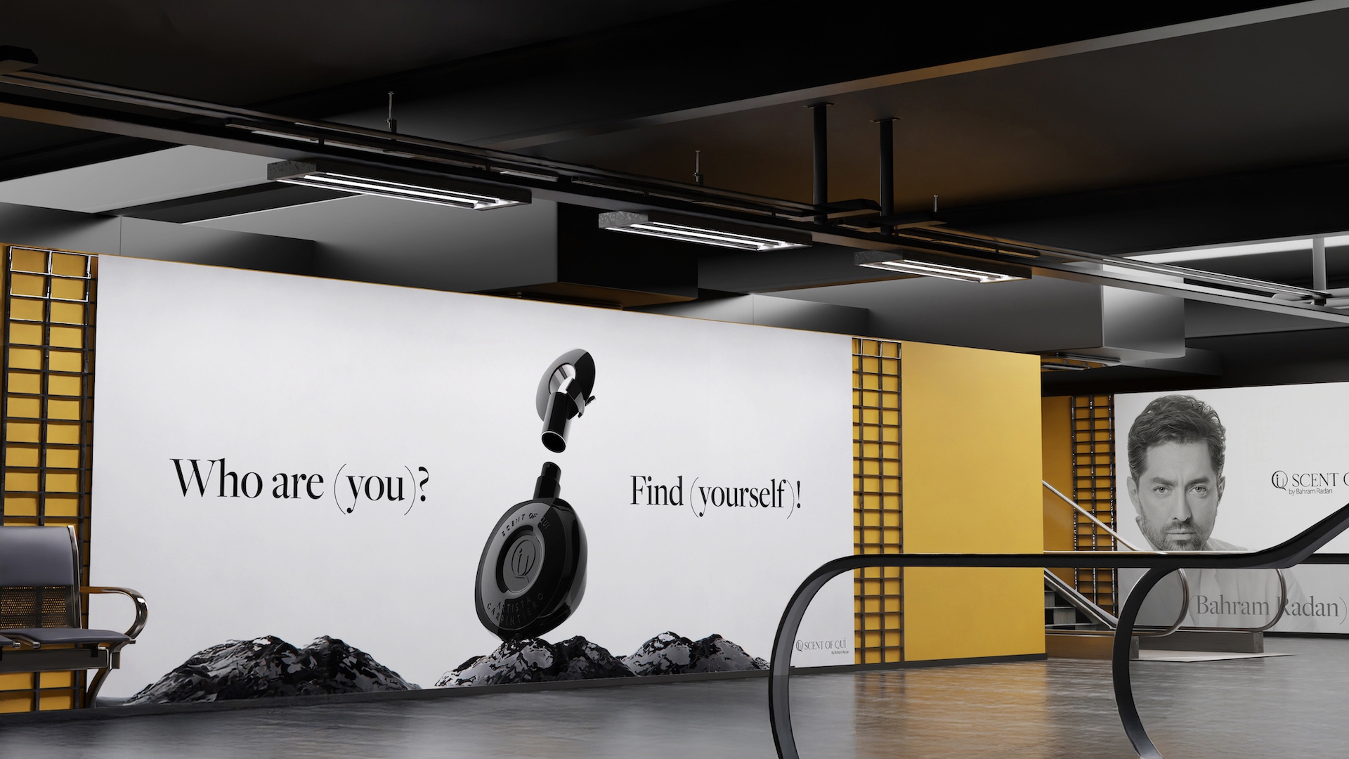
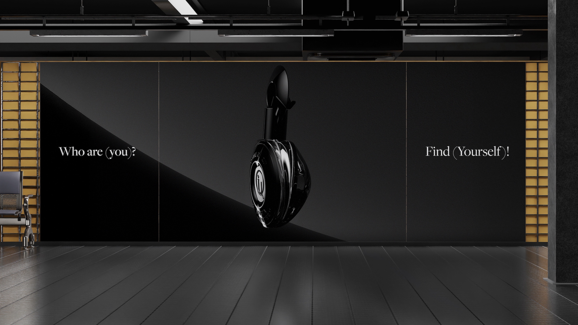
Form Factor: Curves Over Corners
The silhouette of the bottle is curved—free of hard edges or sharp corners. This softness isn’t decorative. It’s intentional. It echoes the gentle unfolding of scent. Just like a fragrance doesn’t start abruptly, the form of the bottle emerges with quiet confidence.
The body is subtly contoured to fit comfortably in the hand, almost like a worn pebble or an heirloom object. Its weight is carefully balanced—light enough to feel effortless, heavy enough to feel significant.
This balance of ergonomics and emotion gives the bottle a universal touchpoint. It’s neither feminine nor masculine. It’s timeless, human.
Surface Treatment: The Power of Matte
We selected a deep, ultra-matte black surface for the bottle. In a market full of reflective glass and metallic overstatement, this finish does the opposite. It absorbs light rather than reflecting it. It draws the viewer in, rather than bouncing attention away.
Matte textures trigger different responses. They feel warmer. More grounded. More private. When paired with scent—which is already intimate—this creates a deeper relationship between user and object.
Fingerprints don’t shout on matte. Light doesn’t glare. The bottle becomes a quiet extension of the scent’s personality.
Material Decisions: Weight, Texture, Presence
The bottle is made from frosted, soft-touch coated glass with a velvety hand feel. This wasn’t just about looks—it was about ritual. From the first contact, the bottle invites pause. It’s the kind of object that makes you want to turn it in your hands, to take your time with.
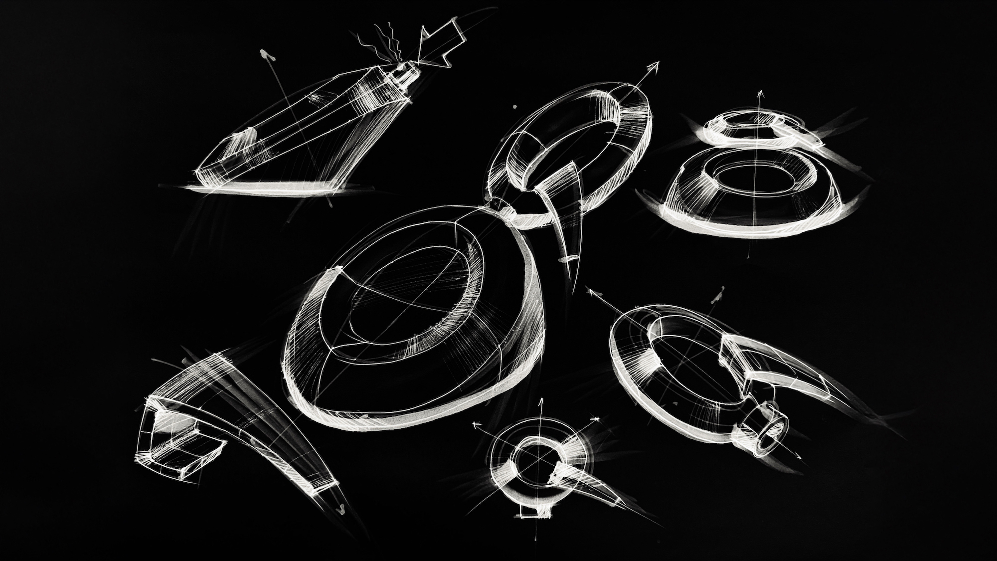
We explored several prototypes with varying weights and wall thicknesses before choosing the final version. The goal wasn’t just to “feel premium.” It was to feel deliberate. Honest. Substantial without being bulky.
Even the tactile contrast between the smooth surface and the crisp mechanical lines at the neck of the bottle offers tension—like story arcs in a well-written sentence.
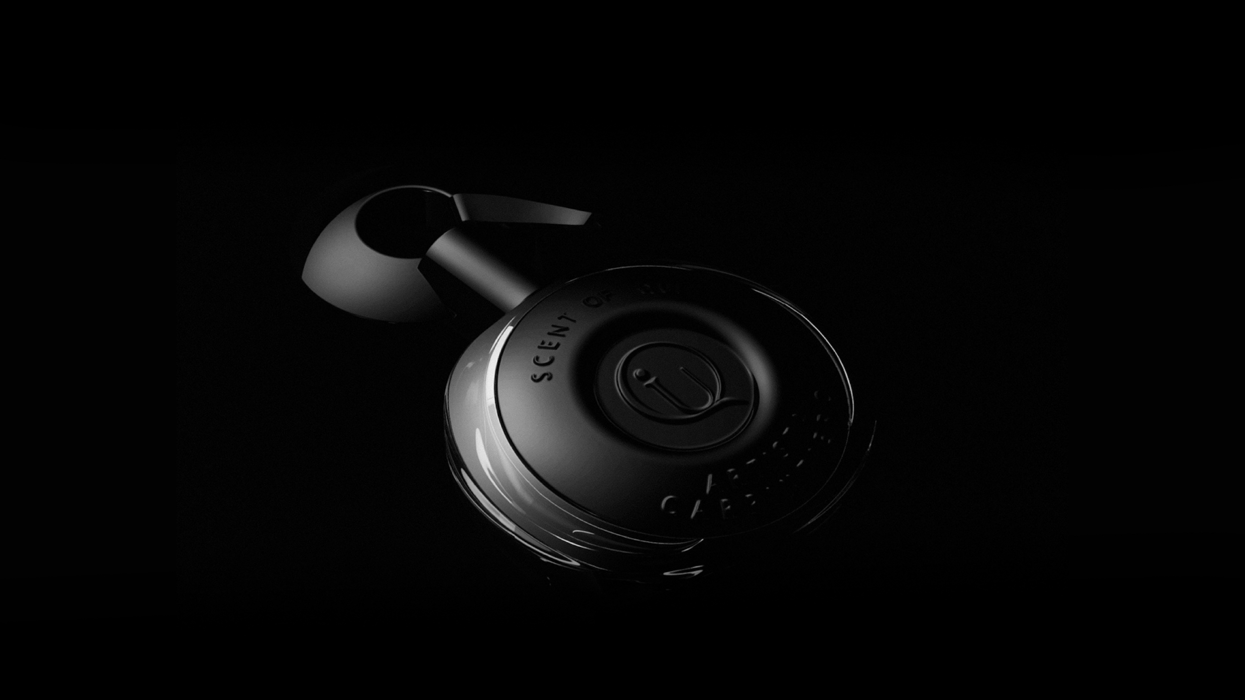
Cap Design: Silence as Luxury
The cap was designed to match the language of the bottle—subtle, strong, with presence. It sits flush with the bottle’s shape, completing the silhouette without overpowering it.
We used a hidden magnetic closure system, ensuring a satisfying, silent “snap” when sealed. No plastic clicks. No visual distraction. Just a quiet lock, reinforcing the brand’s belief that true luxury is restraint.
The material is a soft-touch composite—black, uniform, slightly powdery. It doesn’t reflect light. It doesn’t compete with the scent. It completes it.
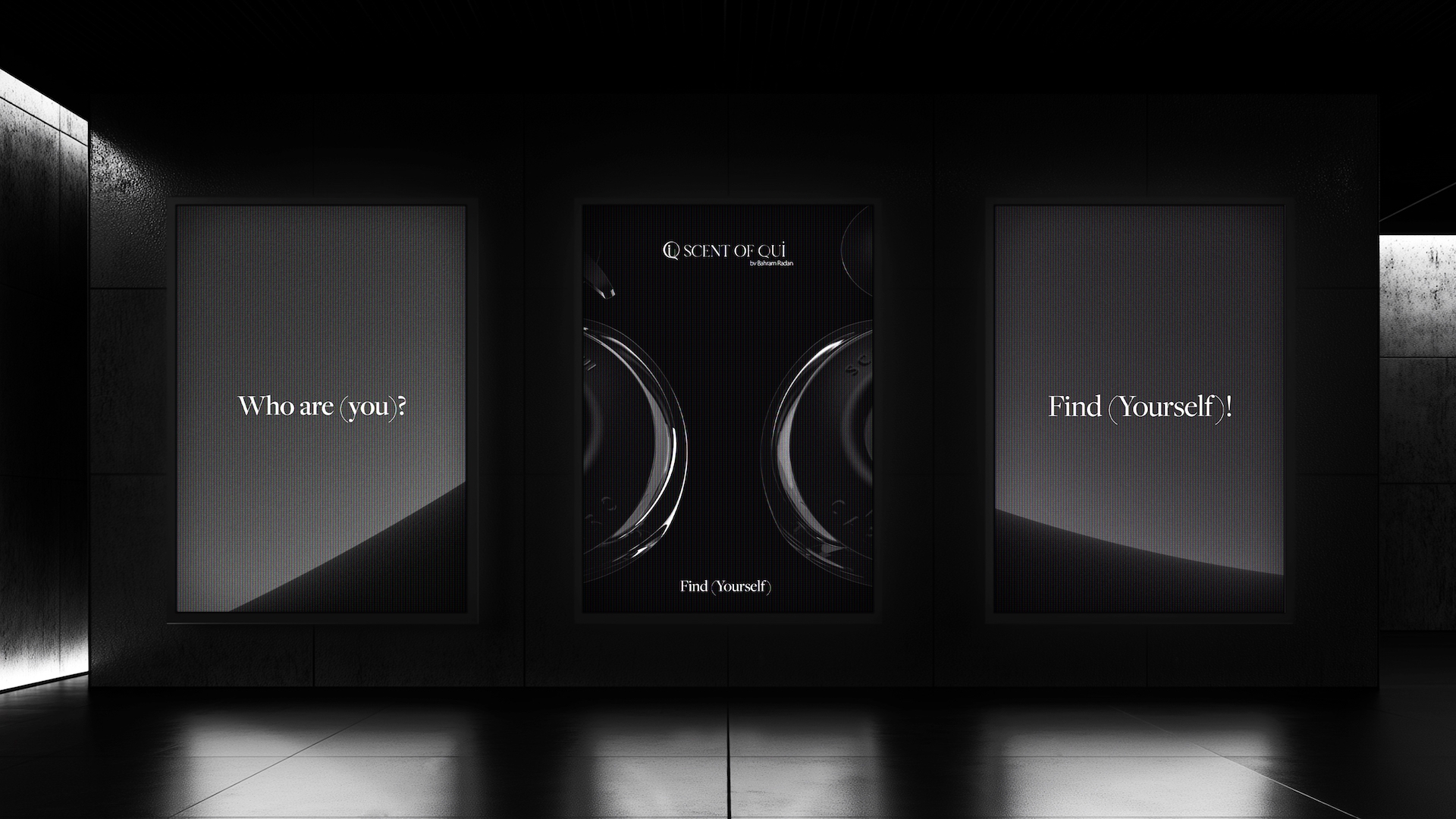
Typography and Label Application
There are no large graphics on the bottle. No loud fonts. No gilded frames. The brand name—Scent of Qui—is placed with precision, using micro-engraved ink and a barely-there debossing technique.
This choice was about presence, not promotion. You don’t need to shout when you’re remembered.
CREDIT
- Agency/Creative: Erahaus
- Article Title: Erahaus Designs a Sculptural Identity for Scent of Qui That Transforms Fragrance Into Memory
- Organisation/Entity: Agency
- Project Type: Packaging
- Project Status: Published
- Agency/Creative Country: United Arab Emirates
- Agency/Creative City: Dubai
- Market Region: Middle East
- Project Deliverables: 3D Design, Advertising, Industrial Design, Packaging Design
- Format: Bottle
- Industry: Beauty/Cosmetics
- Keywords: Luxury Brand Identity Fragrance Branding Perfume Packaging Design Minimalist Logo Design Matte Black Packaging Aurora Inspired Design Emotional Brand Identity Story-Driven Branding Esxence 2025 Exhibition Sculptural Bottle Design High-End Visual Identity Sensory Packaging Brand Design for Perfume Monochrome Identity System Editorial Typography Artistic Brand Experience
-
Credits:
Product Designer and Art Director: Emad Rahimi
Industrial Designer: Reza Kaboudmehri
Aria Shahidi: Brand Developer
Artist & Storyteller: Bahram Radan
Artist & Storyteller: Alireza Khazaal
Graphic Designer: Fatimah Rahmani


