


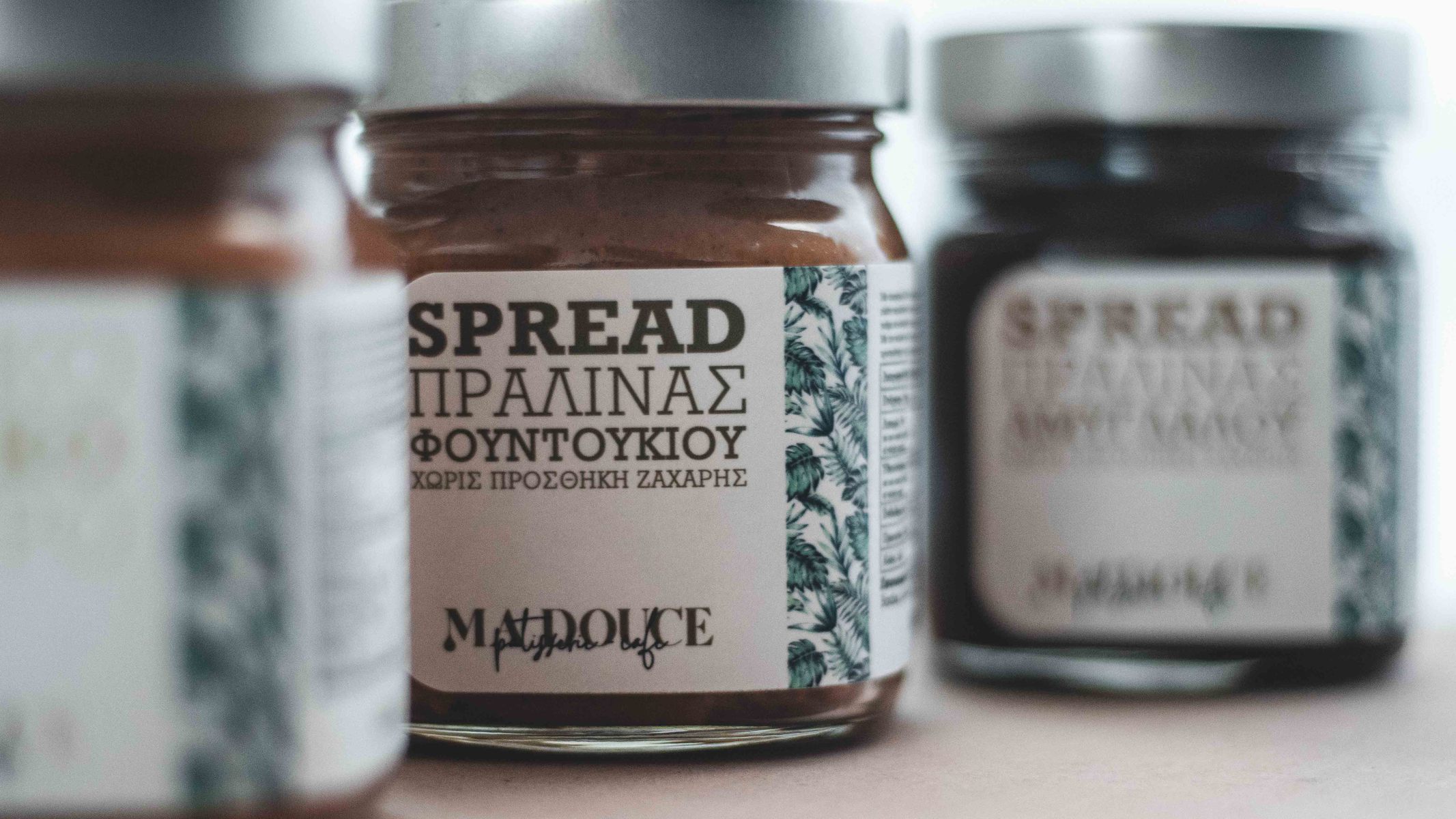
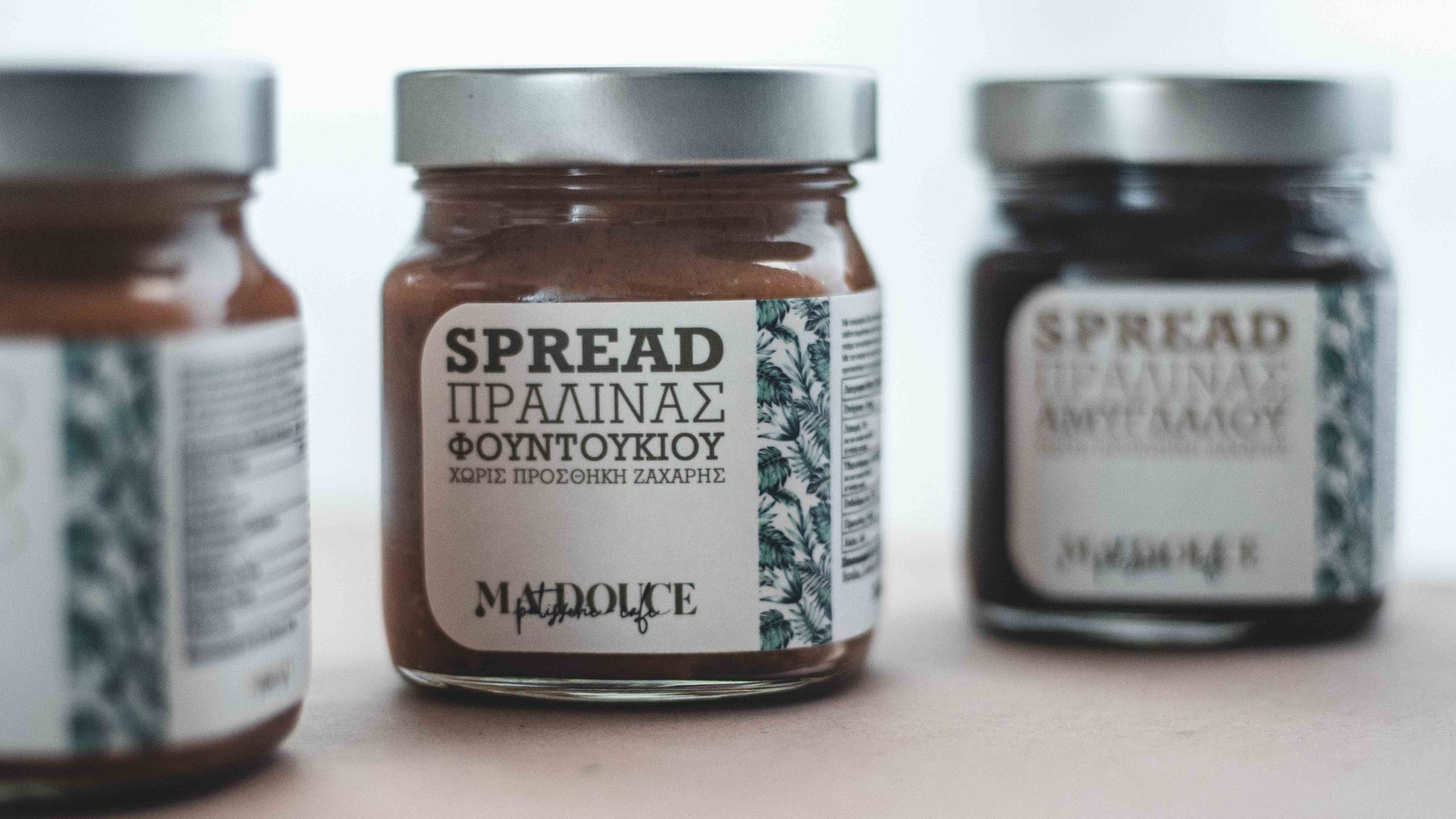
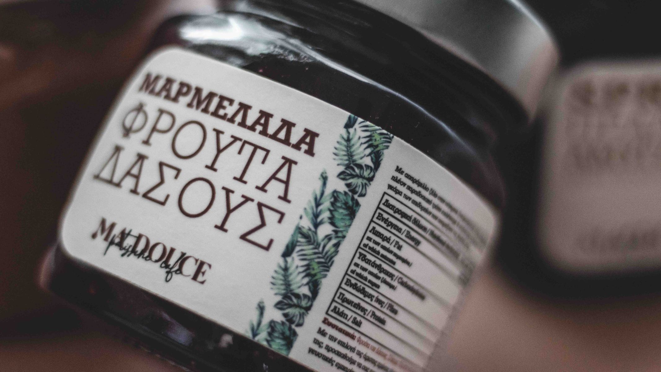
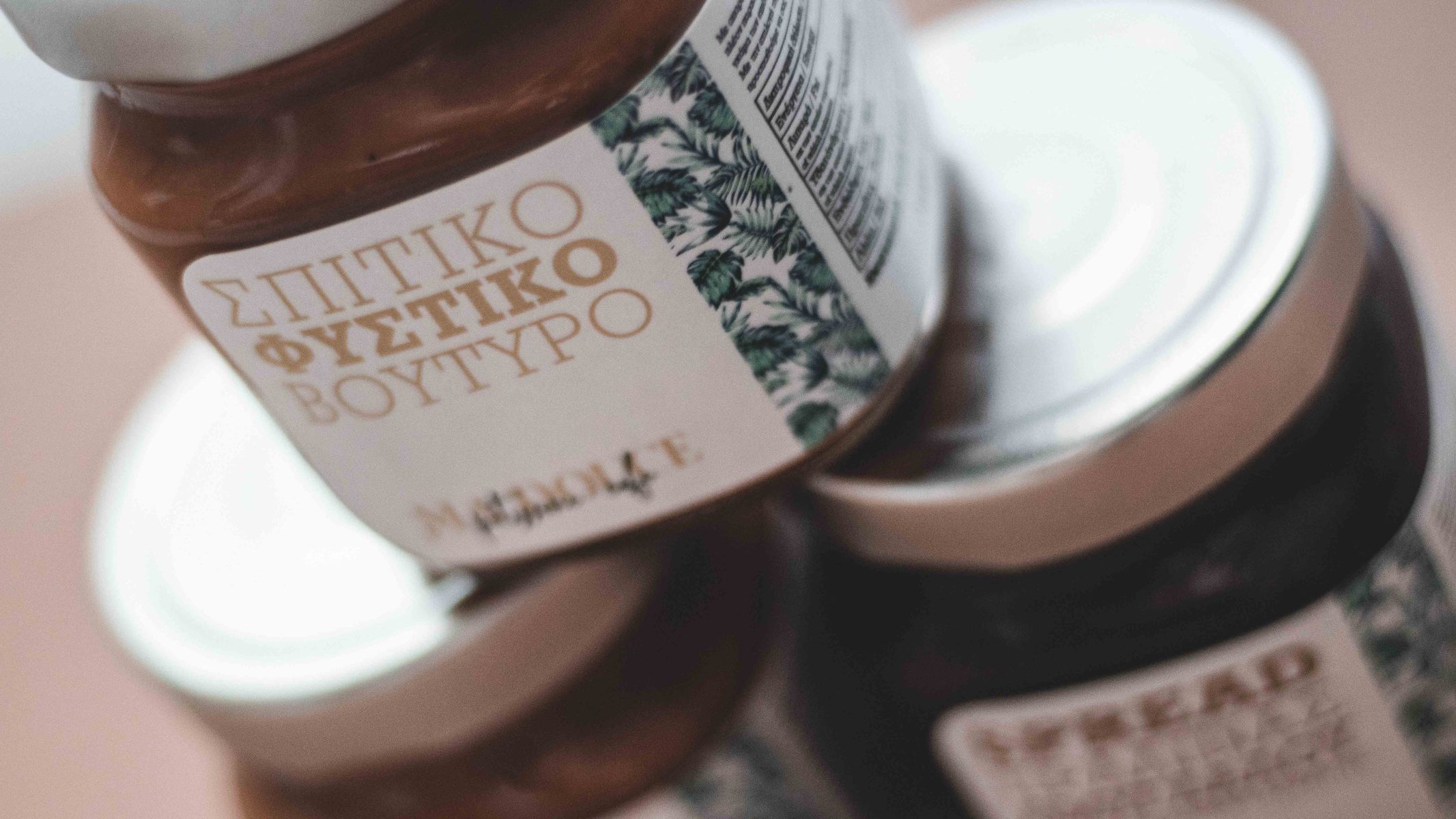
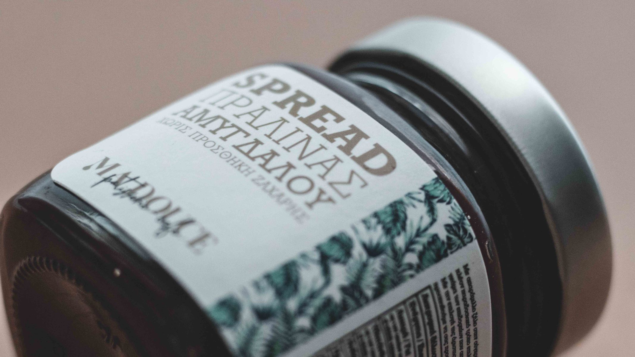
Ma Douce means “My Sweet” in French and is a new business based in Rethymno, Greece with the vision of creating unique sweets in the most traditional way.
For the logotype serif typography was selected with clean, simple lines and capital letters with the characteristic “M”, which refers to melting caramel and also functions as the logomark.
For the subtitle, one-piece handwritten typography was used, reminiscent of liquid chocolate. All this combined, results in prestige and professionalism without missing the handmade and traditional element.
The packaging labels aim to visually and verbally, suggest the excellent quality of the company’s candy and sweets.
CREDIT
- Agency/Creative: Epigrafeio
- Article Title: Epigrafeio Creative Factory Creates New Labels for MaDouce Patisserie Products
- Organisation/Entity: Agency, Published Commercial Design
- Project Type: Packaging
- Agency/Creative Country: Greece
- Market Region: Europe
- Project Deliverables: Brand Advertising, Brand Guidelines, Brand Identity, Brand Rejuvenation, Brand Strategy, Branding, Graphic Design, Illustration, Packaging Design, Photography, Product Naming, Research
- Format: Jar, Sachet
- Substrate: Glass Jar, Pulp Paper
FEEDBACK
Relevance: Solution/idea in relation to brand, product or service
Implementation: Attention, detailing and finishing of final solution
Presentation: Text, visualisation and quality of the presentation


