


About the Project
“Ratimir” is the most renowned brand of meat products in the Far East of Russia. With nearly 30 years of existence, its range has significantly expanded over time – the “Ratimir” brand now offers a vast array of various sausages, semi-finished products, and gourmet meats in both high and mid-price segments. Despite its longstanding presence, the brand’s logo has remained unchanged since its inception, with only sporadic updates to the packaging design.
In 2022, the company approached Ohmybrand with the task of refreshing the brand while maintaining continuity with the previous design.
Tasks
At Ohmybrand, our objectives were to:
Refresh the packaging design and logo.
Revitalize the brand’s communication style.
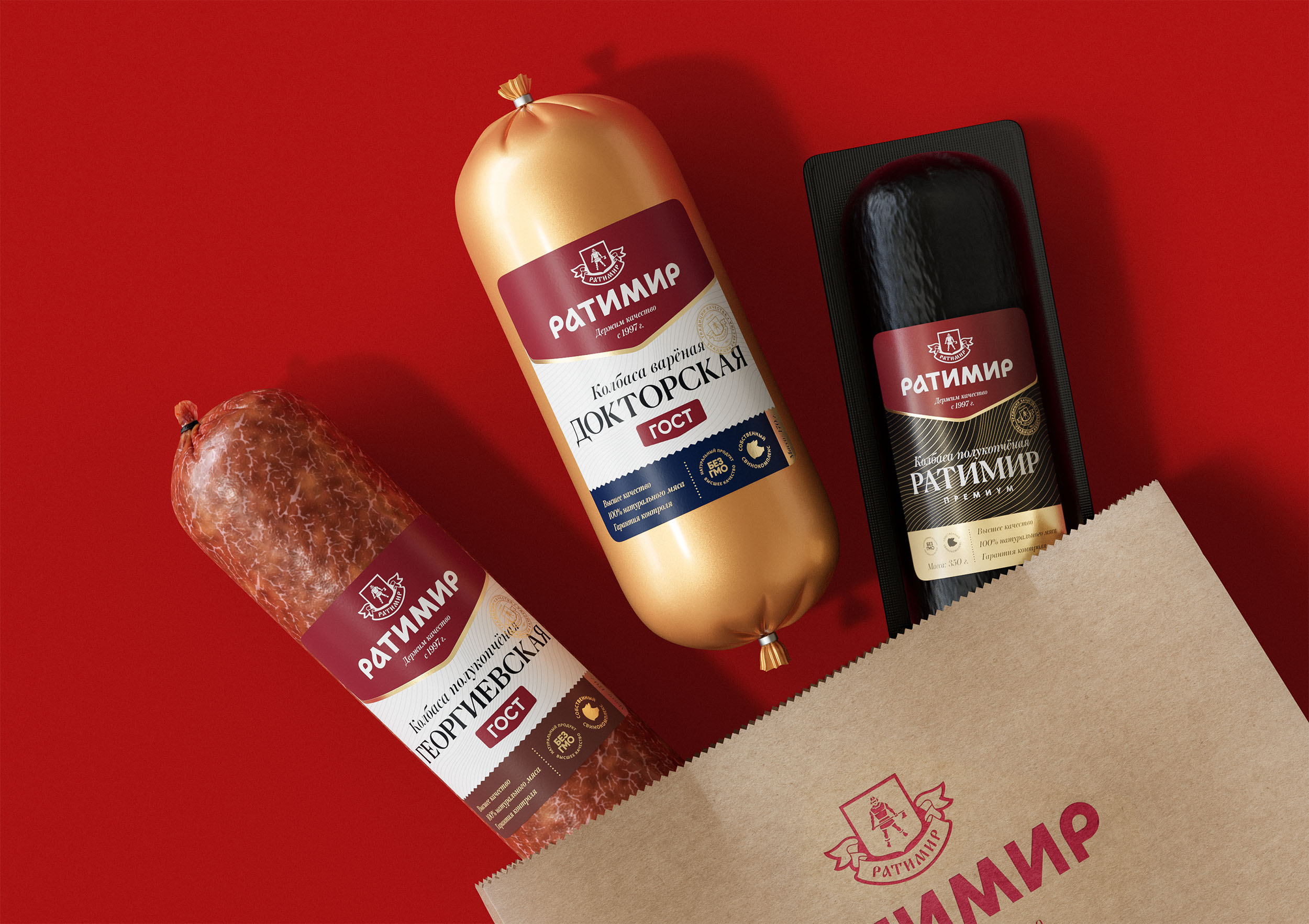
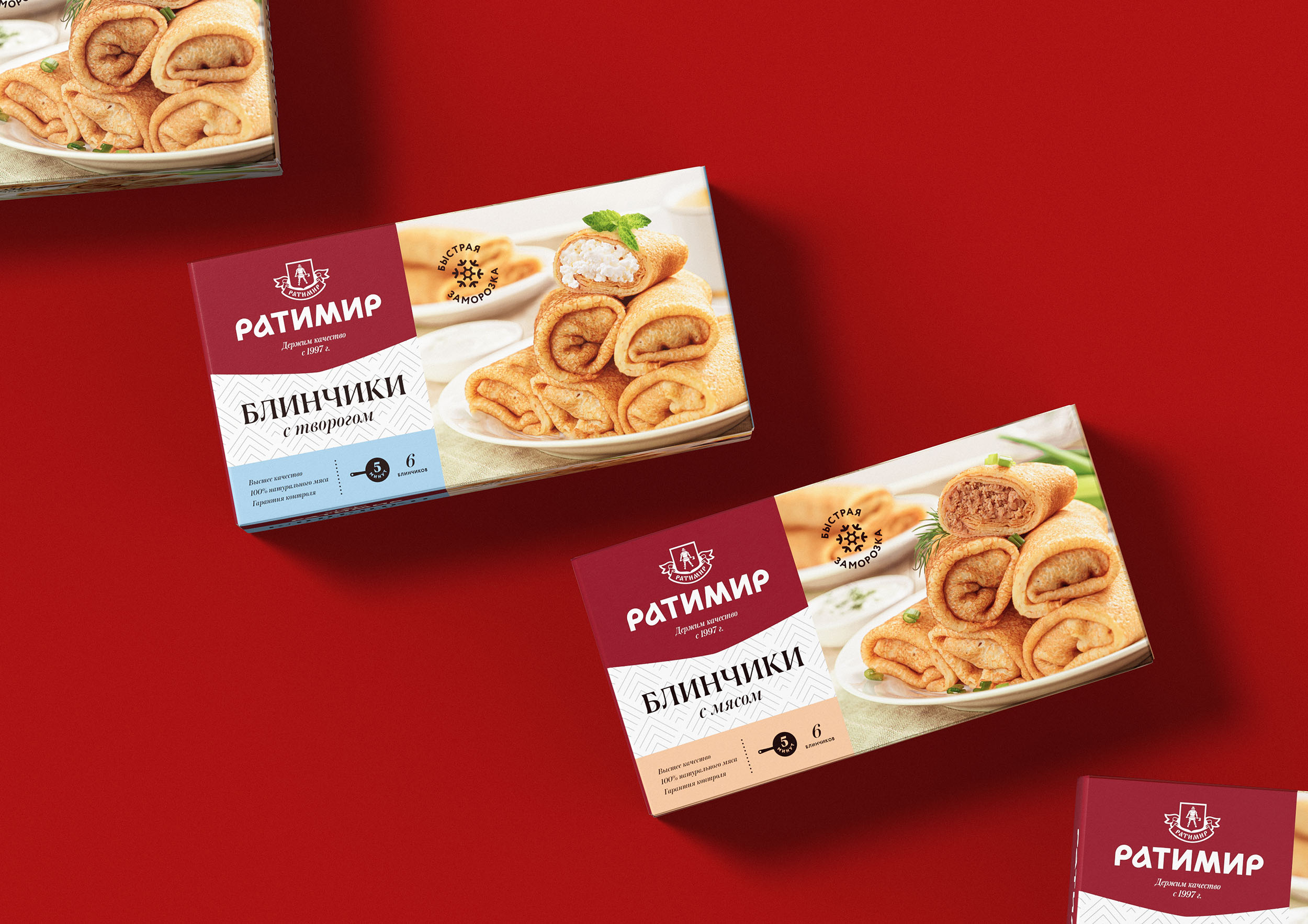
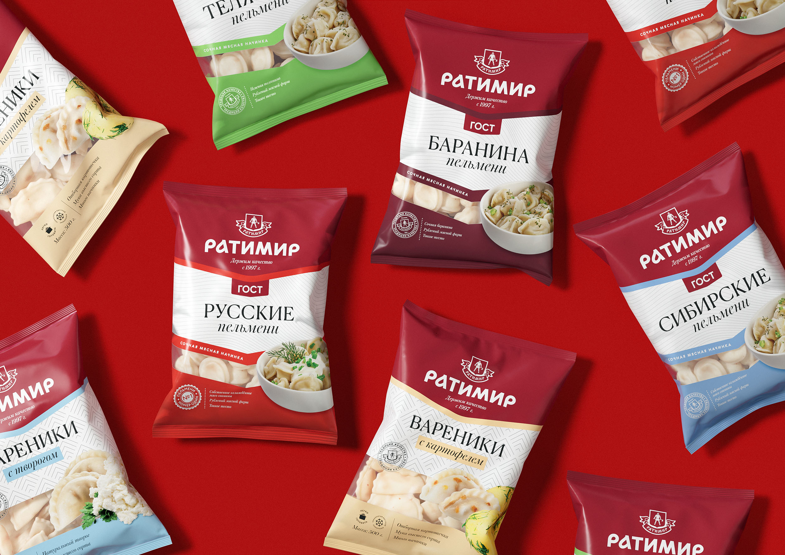
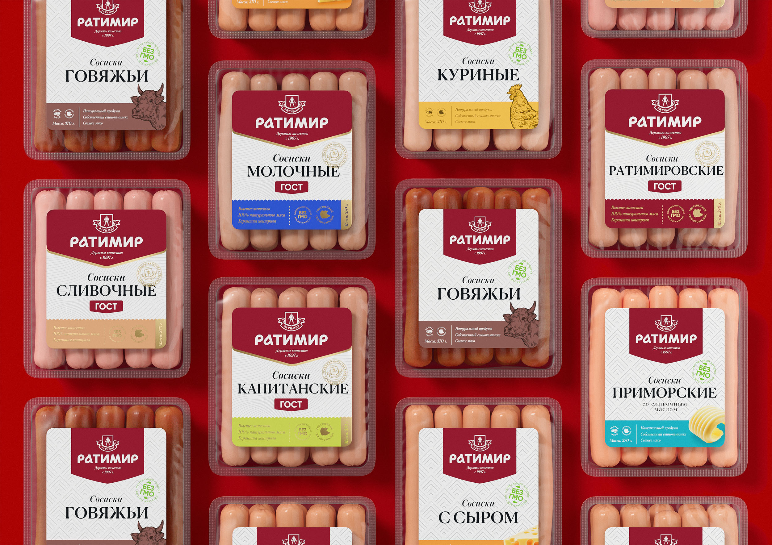
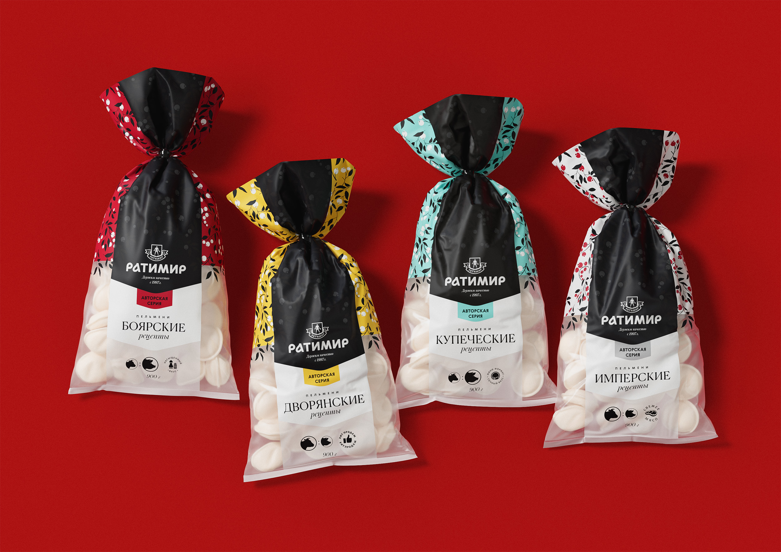
Adapt the branding to various product categories, highlighting sub-lines within the brand, and distinguishing between the mid-range and premium segments.
Maintain the recognizability of the beloved brand.
What did Ohmybrand do:
We kept the corporate colour to ensure that consumers could easily recognize the brand on the shelf.
We refreshed the logo, modernizing it while preserving its Russian roots in typography. The logo underwent a two-stage transition: initially introduced alongside the updated brand communications, and later, a new version of the sign was introduced, featuring an enlarged silhouette of the hero Ratimir, eventually evolving into his portrait.
We devised the slogan “Maintaining Quality Since 1997” to reaffirm and solidify consumer trust.
We established principles of differentiation among three product lines – the mid-range, GOST, and premium segments.
We introduced flavor differentiation and developed a universal packaging architecture for different SKUs: the front side uniformly features the brand zone, product name, additional information, and stamps, with food zones added in some cases.
We outlined guidelines for food zone photography and provided recommendations for other graphic and informational elements such as stamps, patterns, and typography.
We created a corporate style for printed, advertising, and souvenir products of the brand – including presentations, letterheads, business cards, and outdoor advertising.
Result
The redesign was implemented in 2023, and according to company surveys, consumers responded positively to the changes.
CREDIT
- Agency/Creative: Ohmybrand
- Article Title: Epic Redesign: Ohmybrand Agency Unveils Brand Identity and Corporate Style for “Ratimir” Meat Products Brand
- Organisation/Entity: Agency
- Project Type: Packaging
- Project Status: Published
- Agency/Creative Country: Russia
- Agency/Creative City: Moscow
- Market Region: Europe
- Project Deliverables: Brand Design, Brand Identity, Brand Redesign, Branding, Identity System, Logo Design
- Format: Case
- Industry: Food/Beverage
- Keywords: Ratimir, Brand Identity, Corporate Style, Food
-
Credits:
Creative Director: Nadezhda Parshina
Art Director: Alexandra Pershina
Designer: Alya Zaripova
Designer: Anastasia Panarina
Designer: Ivan Zhinzhin


