This project envisions a world where Enron not only survived its past challenges but emerged stronger and more resilient. The rebranding of Enron is a strategic effort to revive the company, rebuilding trust and positioning it as a leader in energy, finance, and transport sectors. My primary goal in this endeavor was to restore confidence in the Enron brand while highlighting its potential for growth and innovation.
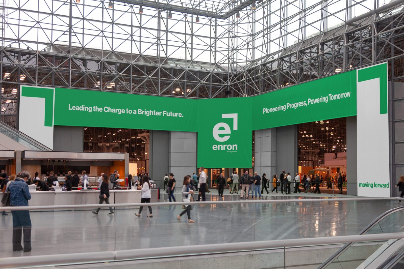
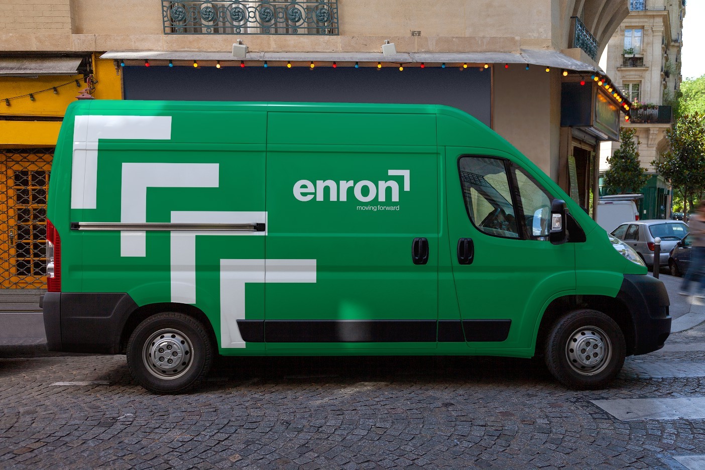
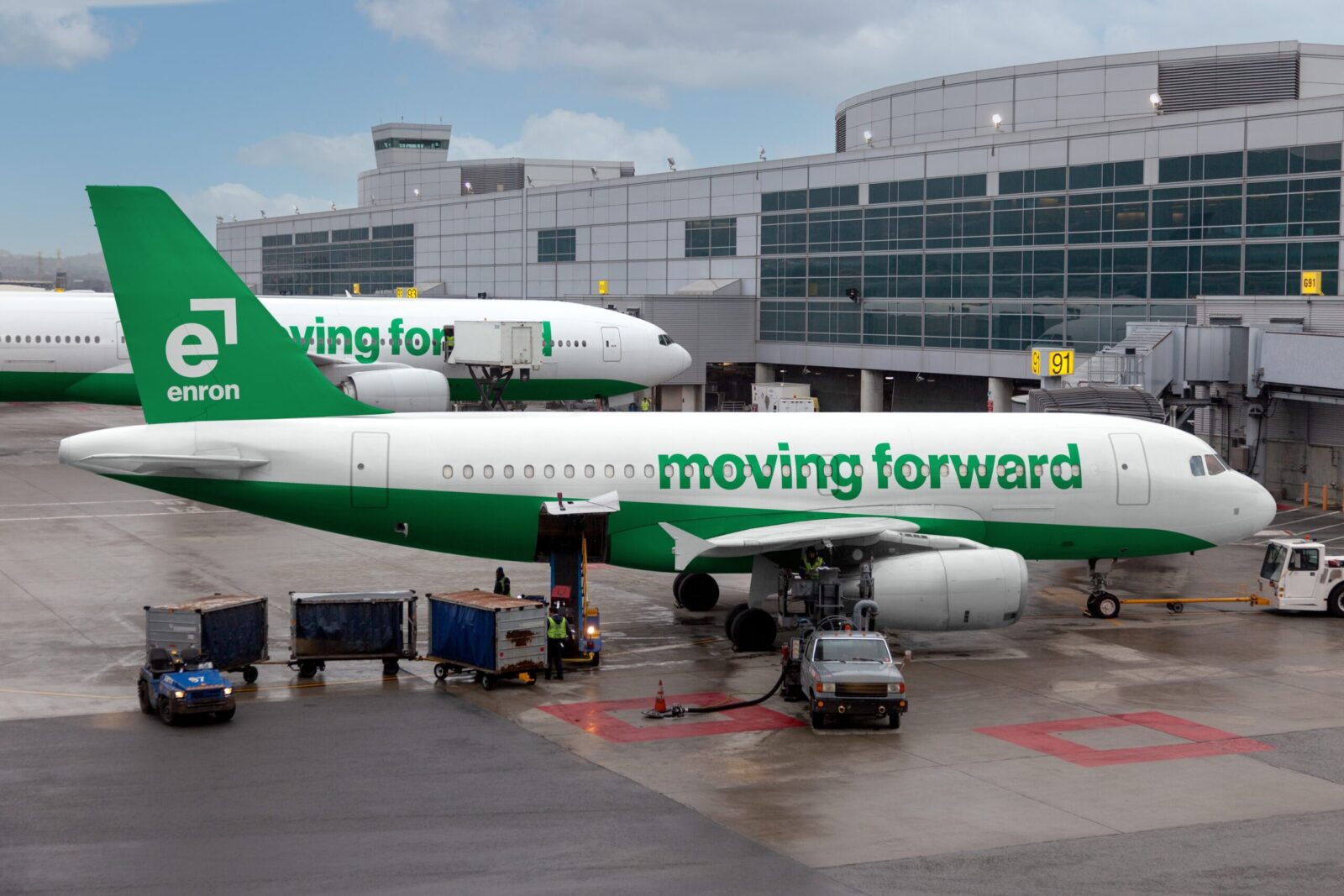
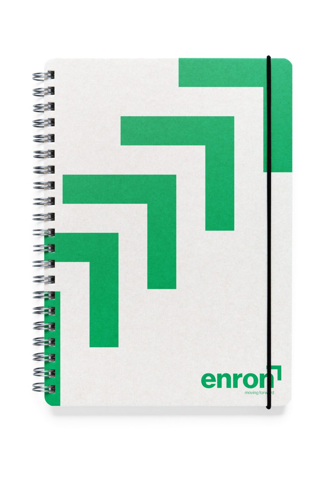
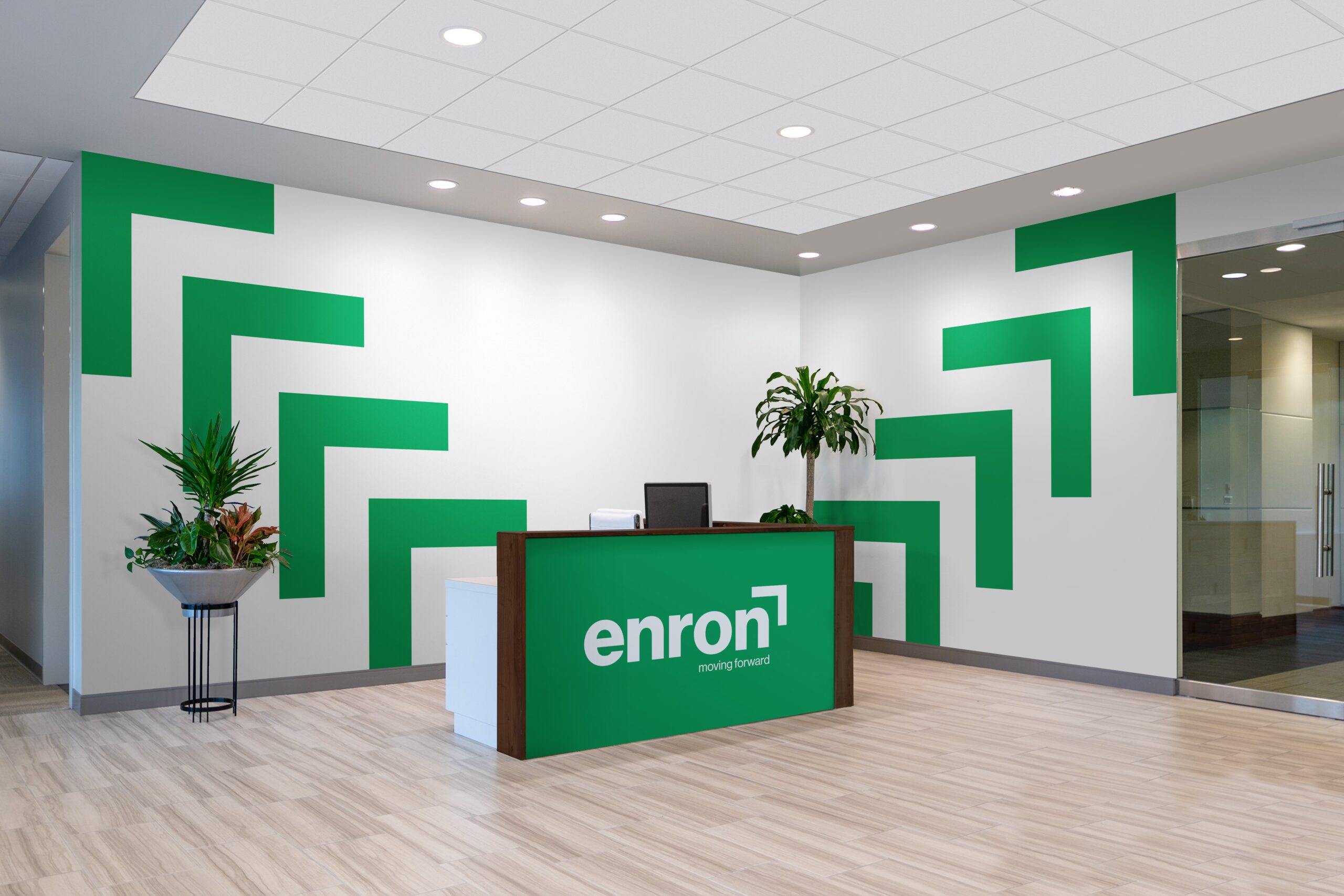
The new brand identity is centered around a distinctive green, a color carefully chosen to represent trust, stability, and renewal. This green serves as a visual metaphor for Enron’s commitment to sustainability and ethical practices, key elements in its journey towards regaining public trust. The redesigned logo plays a crucial role in this transformation. Featuring an upward-pointing arrow at a 45-degree angle, the logo symbolizes Enron’s focus on growth, progress, and learning from its past. The arrow is more than just a design element; it is a powerful emblem of the company’s vision to reach unprecedented heights and lead in its industry.
In addition to the corporate logo, I developed a suite of subsidiary logos for Enron Connect, Enron Finance, Enron Transport, and Enron Energy. Each subsidiary was given a unique identity while maintaining a cohesive connection to the parent brand, ensuring a unified visual language across all sectors. This comprehensive rebranding effort included the creation of business collateral such as letterheads, business cards, and envelopes, all meticulously designed to reflect the new brand ethos.
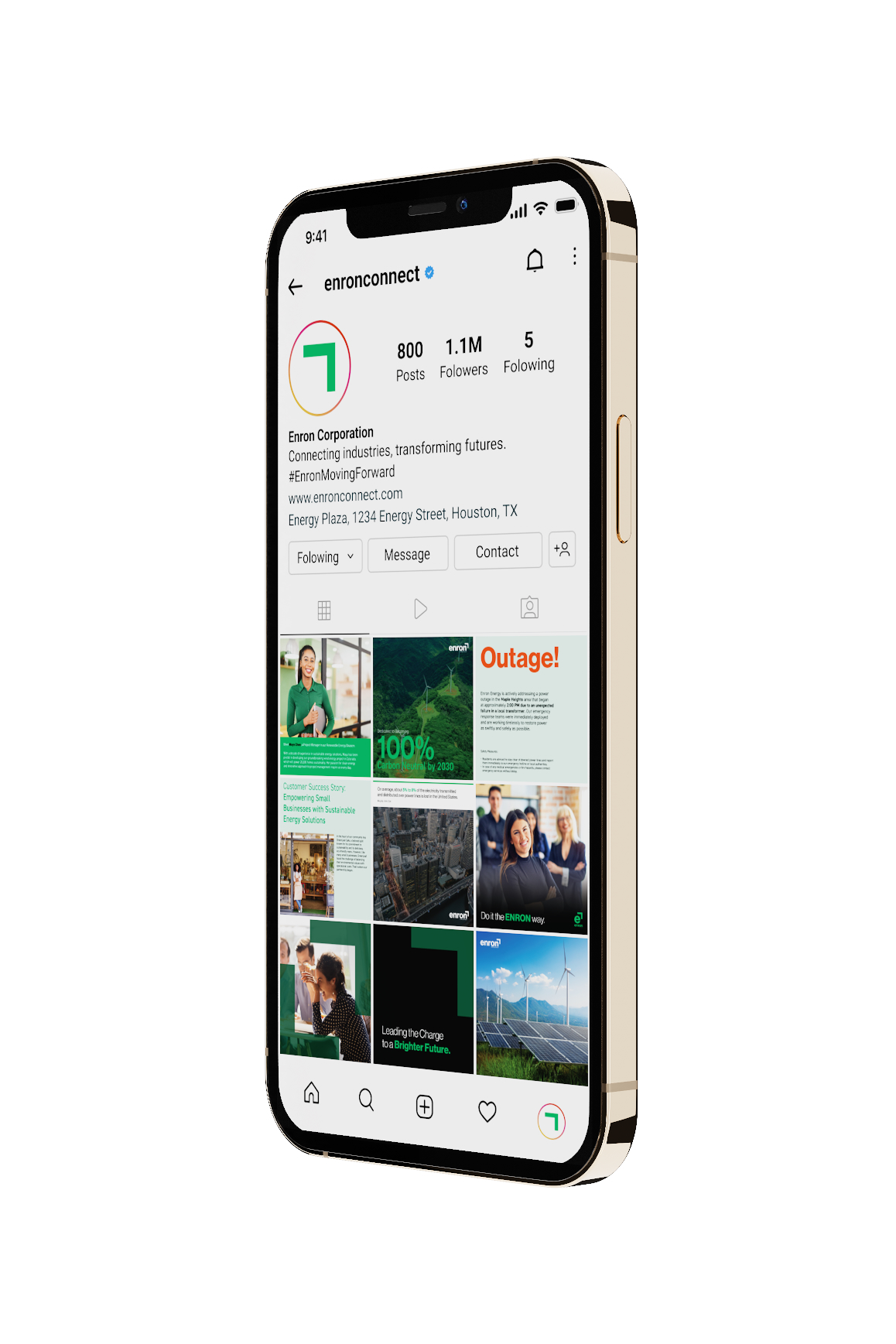
The project also extended to digital and physical presences, including the redesign of the Enron website and social media platforms. I crafted engaging social media content that conveys Enron’s forward-thinking and trustworthy nature, including Instagram stories and posts that highlight the company’s services, achievements, and future goals. The content was tailored to resonate with a B2B audience, focusing on Enron’s commitment to innovation, sustainability, and excellence.
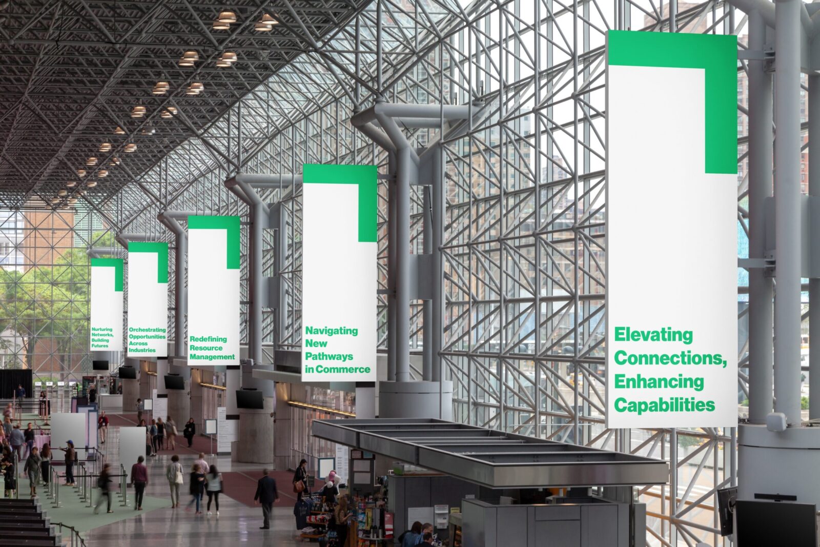
Additionally, I developed a set of visual patterns and motion designs to enhance Enron’s brand experience across various touchpoints. This included logo animations and promotional materials that align with the company’s mission of leading the charge to a brighter future.
Through this project, I demonstrated my ability to strategically rebrand a company, incorporating its values and vision into a cohesive and modern identity. The reimagined Enron is not just a revival of a brand, but a testament to the power of transformation, resilience, and forward momentum.


CREDIT
- Agency/Creative: Eshaan Sojatia
- Article Title: Enron Rebranding for Stability, Growth, and Innovation by Eshaan Sojatia
- Organisation/Entity: Student
- Project Status: Non Published
- Agency/Creative Country: United States of America
- Agency/Creative City: Rochester
- Project Deliverables: Brand Redesign
- Keywords: WBDS Student Design Awards 2024/25
- Keywords: WBDS Student Design Awards 2024/25
-
Credits:
Educational Institution: Rochester Institute of Technology - Visual Communication Design
Educator's Name: Mike Minerva


