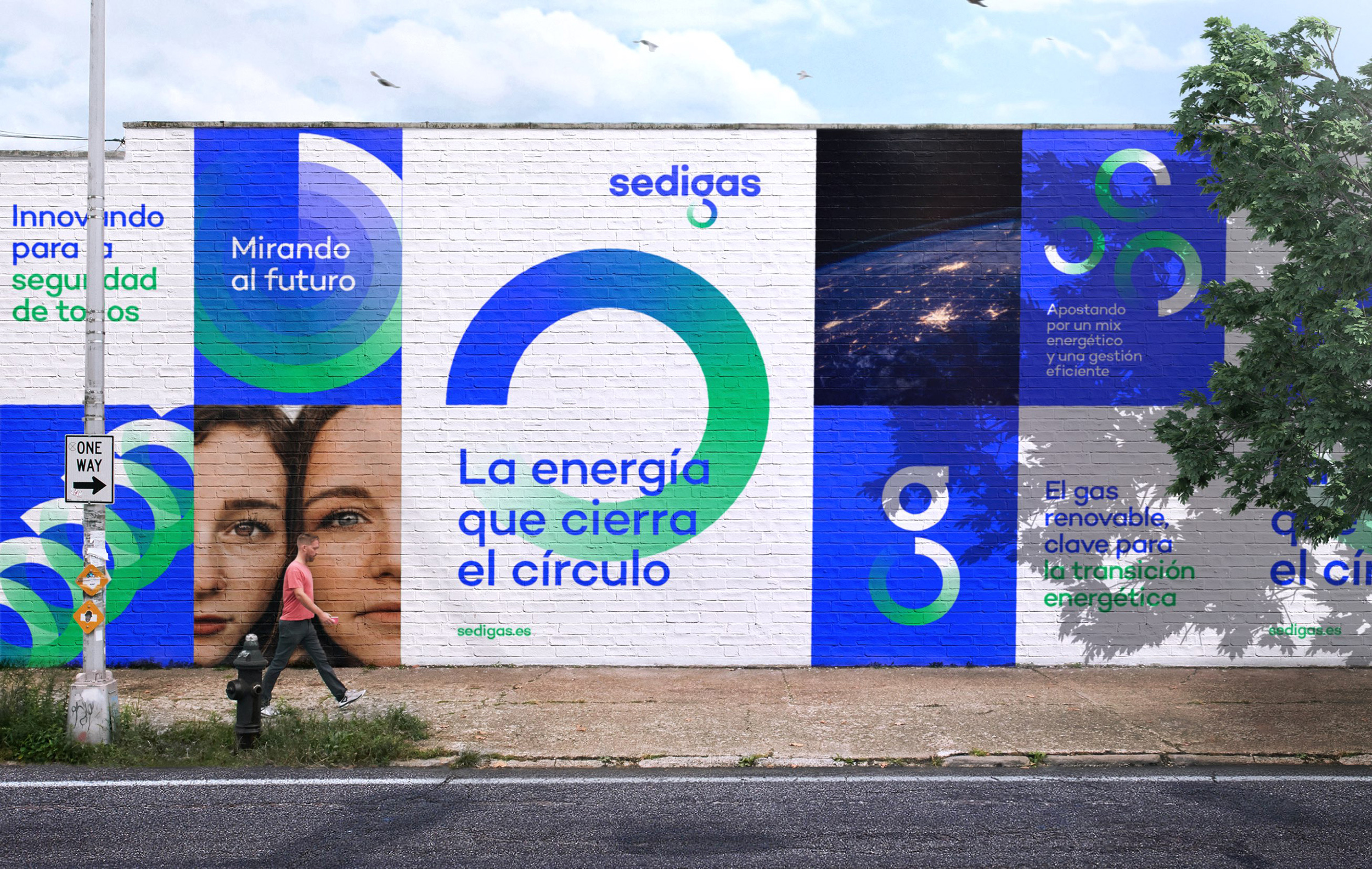
Sedigas was born to group companies in the gas sector in Spain together. After years of shared success and knowledge generation, they decided to take an active role in the fight against climate change and instigate the energy transition based on their holistic knowledge of energy, leading viable innovations such as renewable gas.
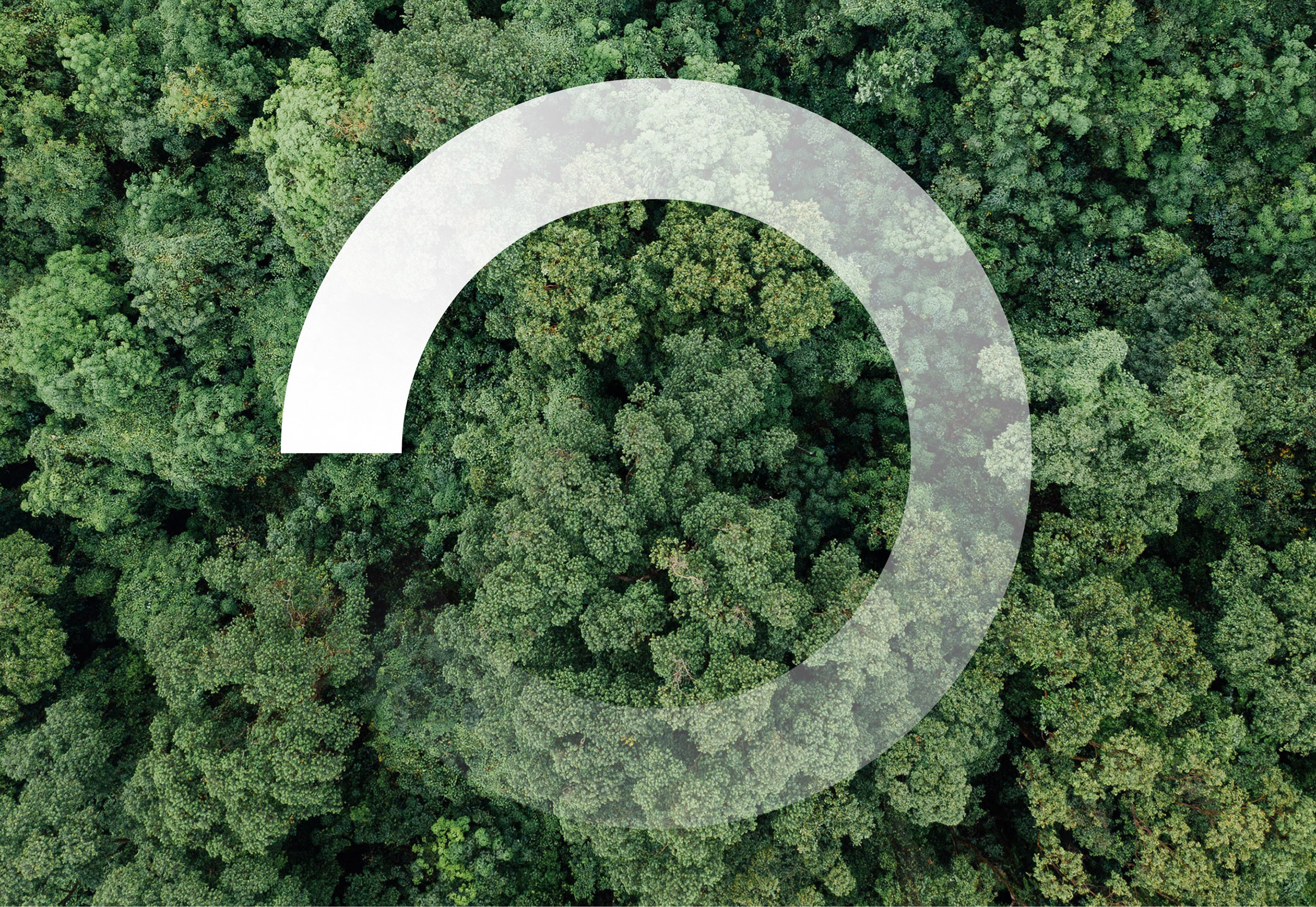
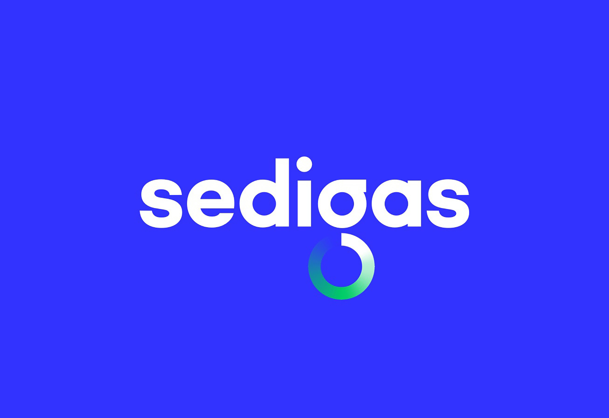
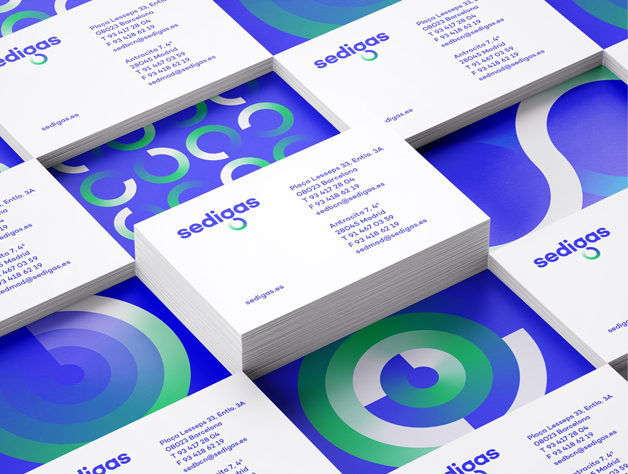
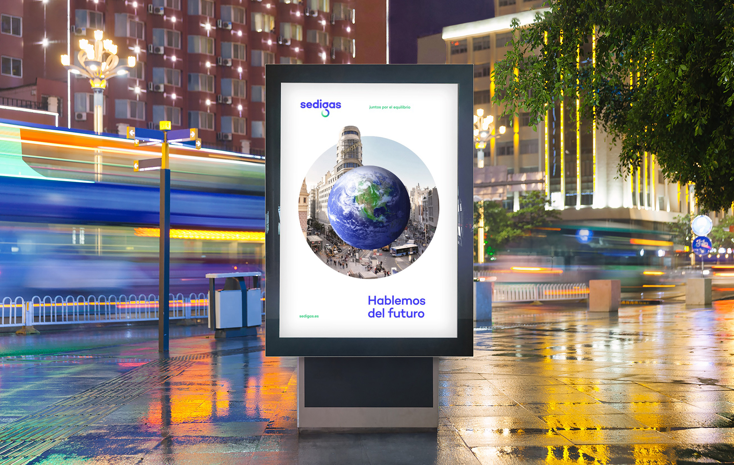
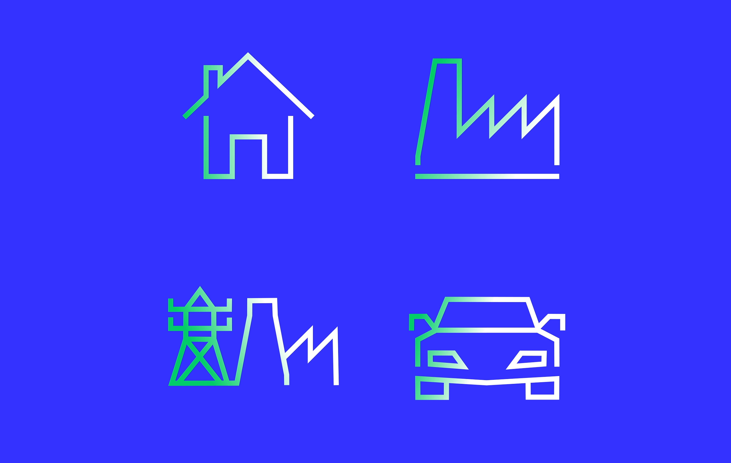
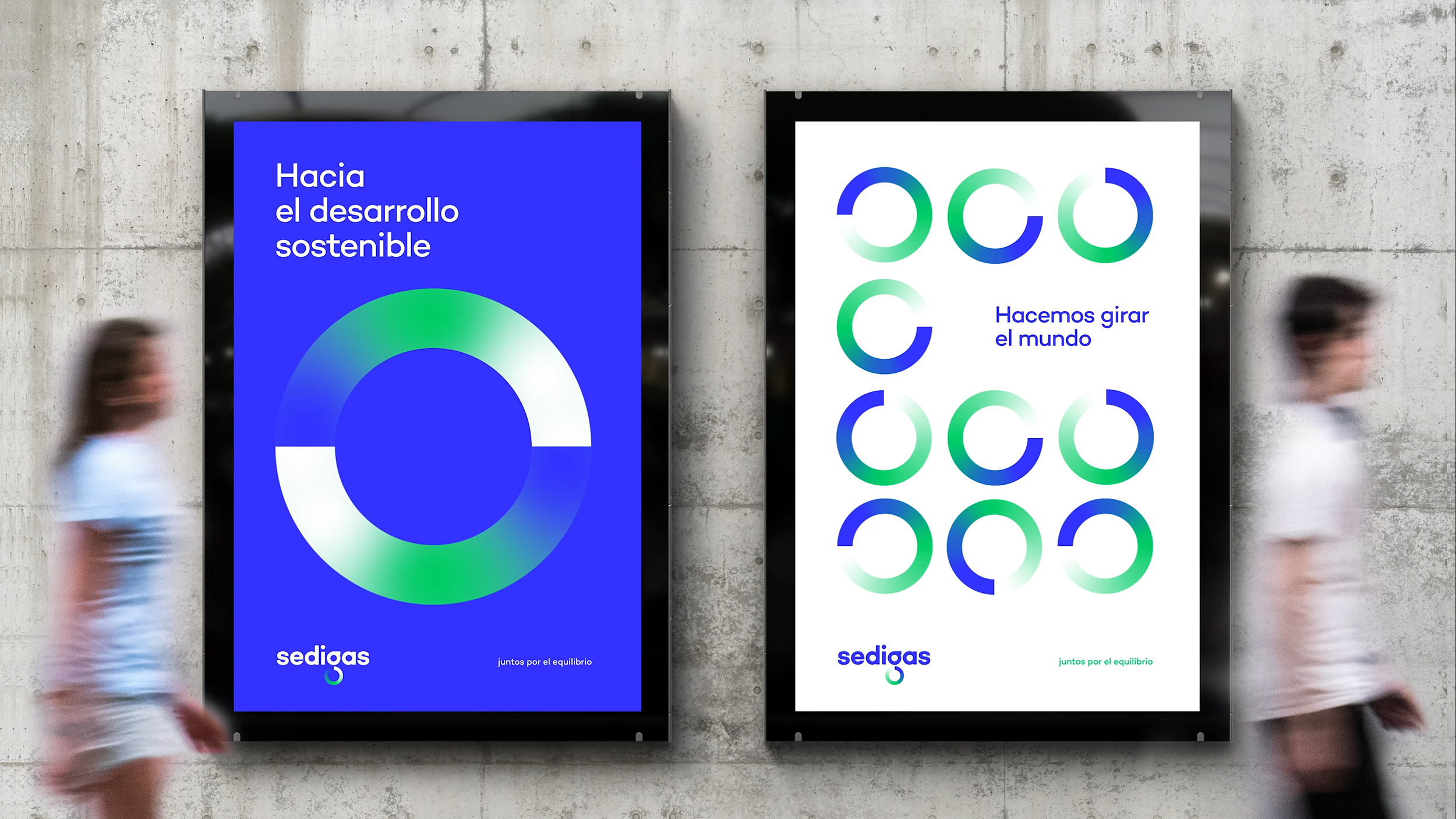
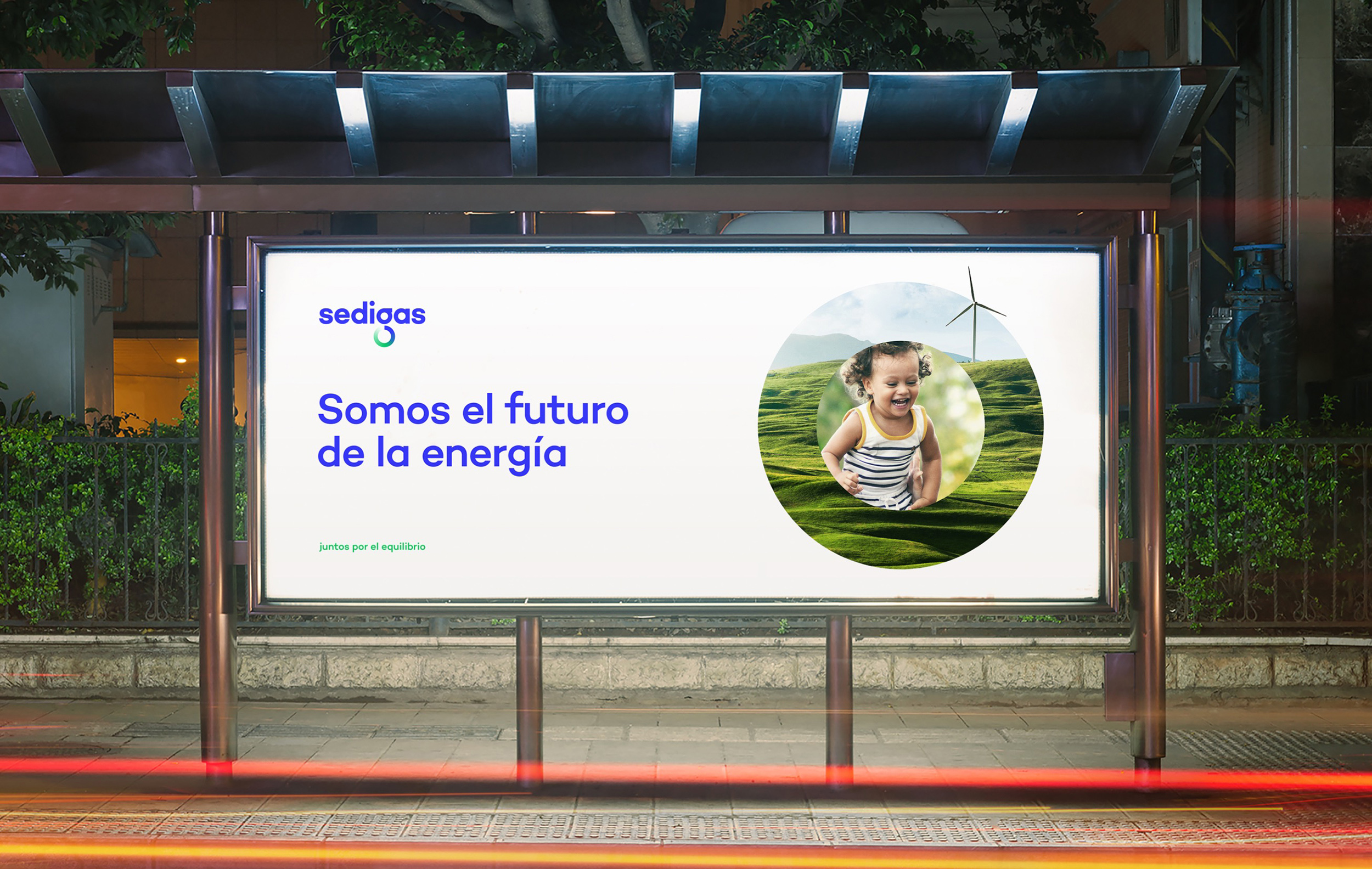
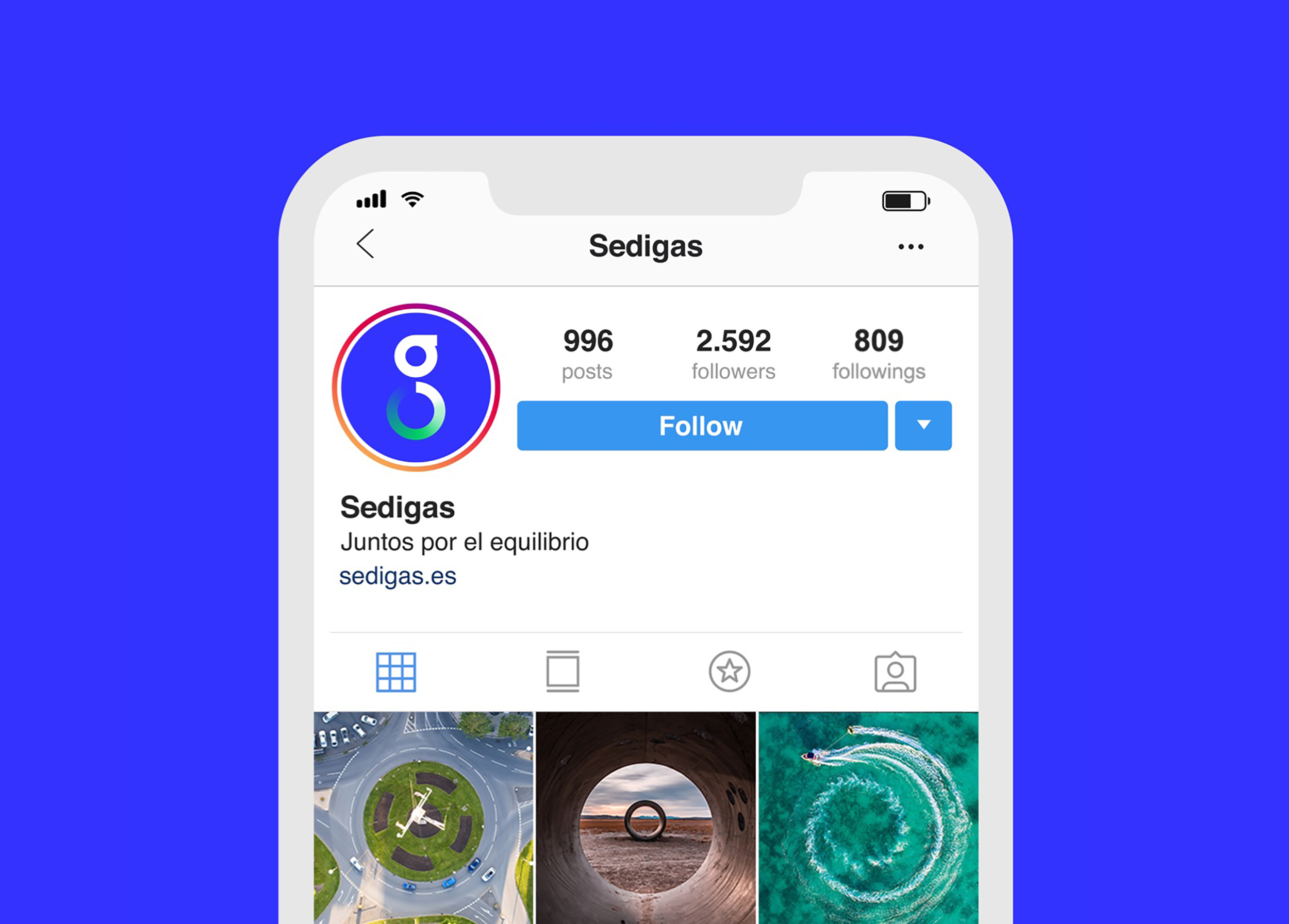
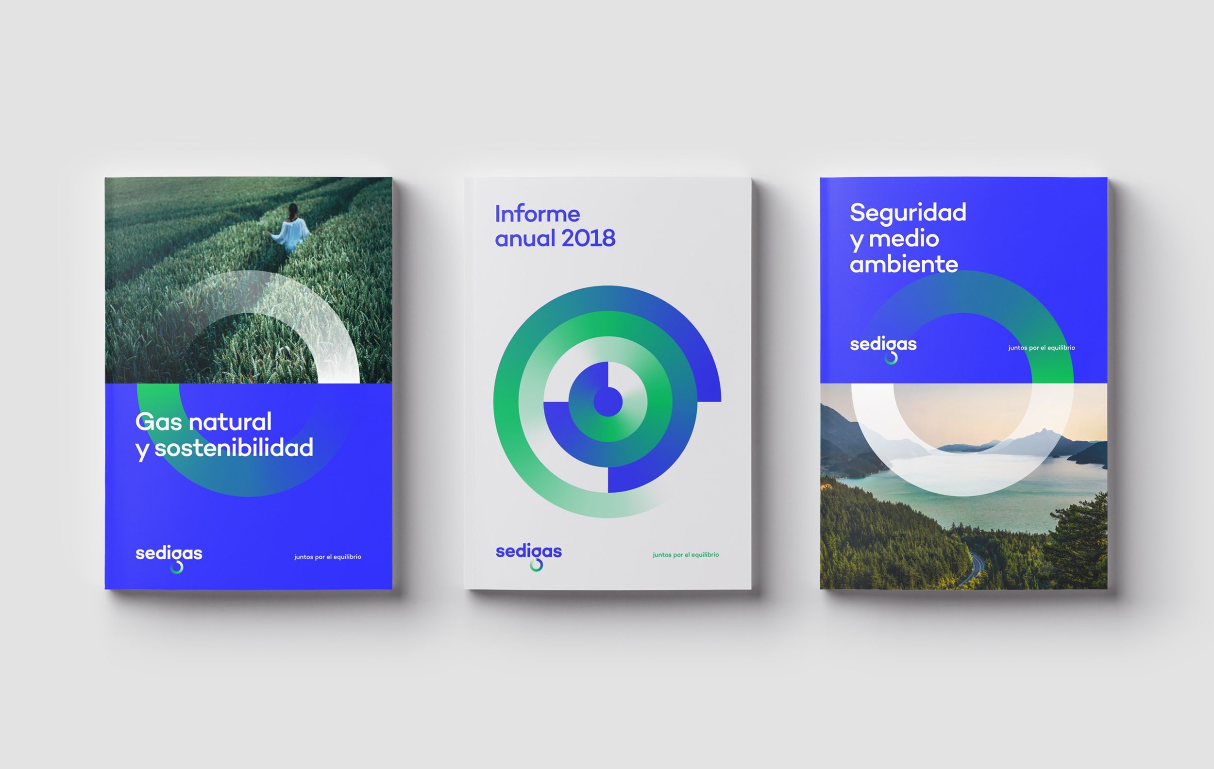
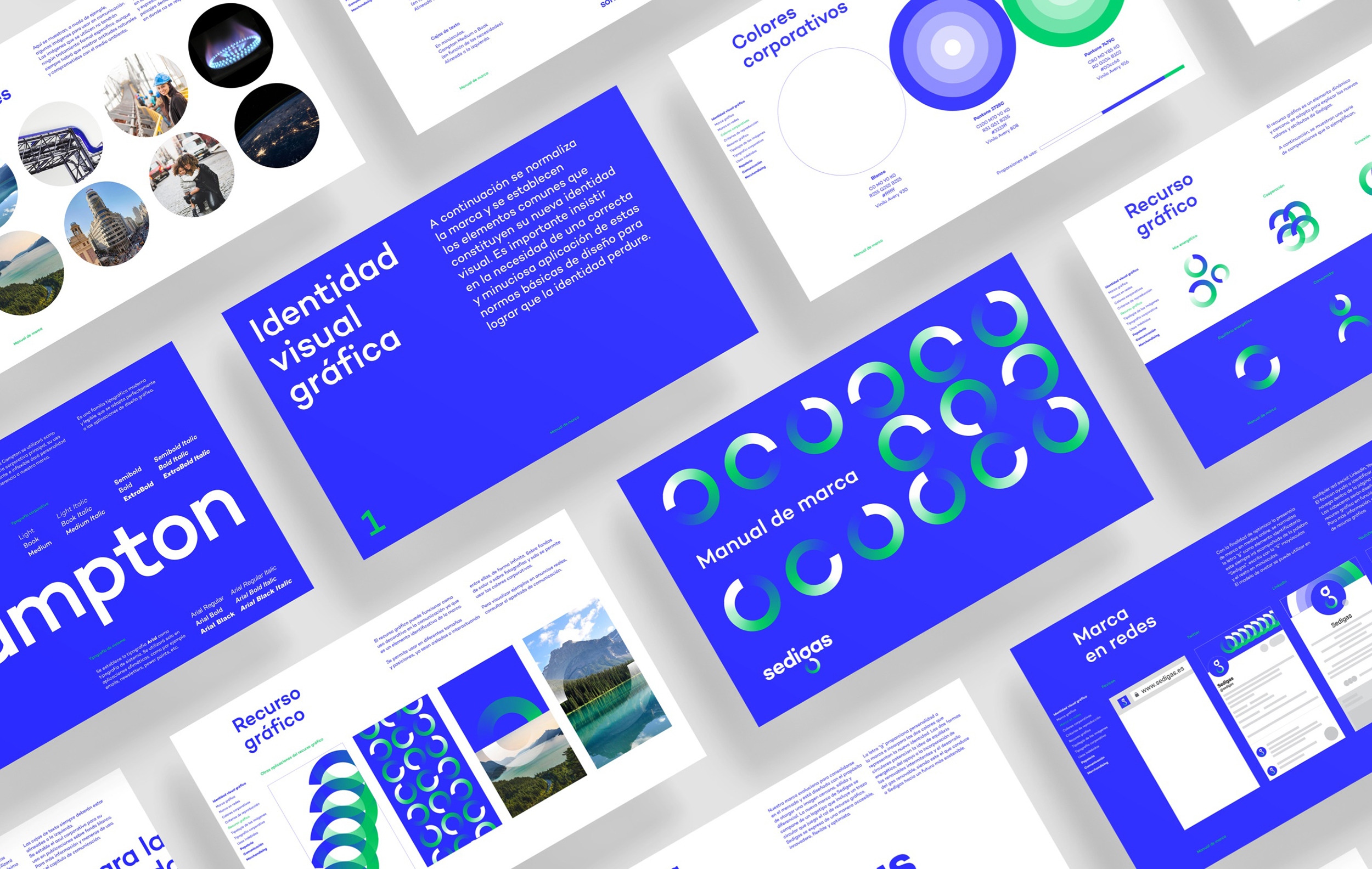
A graphic premise was born from the idea of energy equilibrium – the combination of different energy sources in the most sustainable way possible-: to restore what is consumed, return what is generated, to regenerate energy in a constant cycle. It is represented in a typographical gesture inside the logo. The gradient of colors explains the transition in which the sector is located: from blue of gas to green of sustainability. From the circle and its repetition, a dynamic metaphorical graphic language fuses with a high symbolic power, through which the versatility of gas is represented as key energy in the development of a multitude of sectors, which invites us to look to the future with optimism.
CREDIT
- Agency/Creative: Morillas Branding Agency
- Article Title: Energy That Comes Full Circle
- Organisation/Entity: Agency, Published Commercial Design
- Project Type: Identity
- Agency/Creative Country: Spain
- Market Region: Europe
- Project Deliverables: Brand Advertising, Brand Design, Brand Experience, Brand Guidelines, Brand Identity, Brand Redesign, Brand Strategy, Graphic Design, Identity System, Rebranding, Research, Tone of Voice
- Industry: Energy
- Keywords: gas, circle, energy, balance, climate change, future, sustainability, innovation


