


How do you stand out when expertise alone isn’t enough? Regen’s network sits at the heart of the UK’s energy transformation, engaging a growing community of supporters that represent the whole of society’s interests. But their previous visual identity didn’t reflect their position as whole-system experts and bold thought leaders. Together with creatives from Signifly, Regen set out to tackle a common challenge in the consultancy world.
“Most research groups and consultancies in this space look remarkably similar – safe, corporate, and frankly, forgettable. Regen needed an identity that matched their ambition and influence. They’re not just analysing the energy transition; they’re actively powering it.”
Christopher Ashton, digital designer at Signifly
Beyond Academic: From Aesthetics to Actions
The new design direction for Regen is built on three principles: Radiating knowledge, Community power, and Partnership. This framework translates into a visual identity that feels approachable yet authoritative, humanised yet professional – embodying descriptors like “challenger,” “grassroots,” and “advocate.”
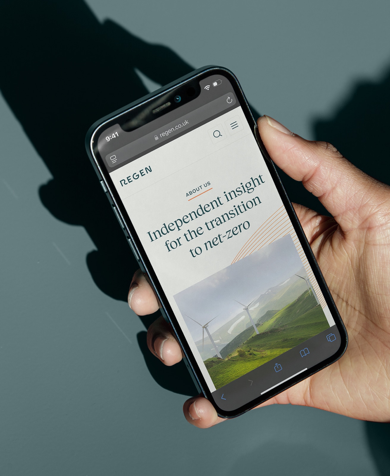
“The visual language needed to reflect Regen’s dual nature,” says Ashton. “They’re grounded in serious expertise and tradition, yet completely forward-thinking and adaptable. The serif font conveys trust and professionalism, while the sans serif adds that modern edge that aligns with their innovative approach.”
Rather than simply refreshing superficial elements, Signifly took a systematic approach that mirrors Regen’s own methodology. Covering every element of the visual identity and how they can bring them to life across touchpoints.
Authority. Authentic. Approachable.
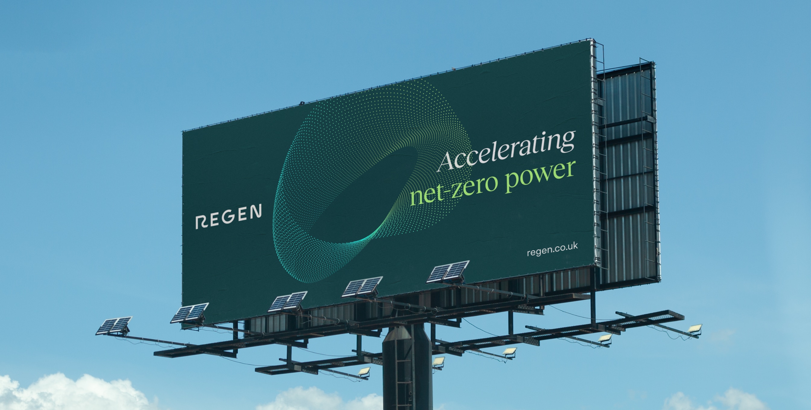
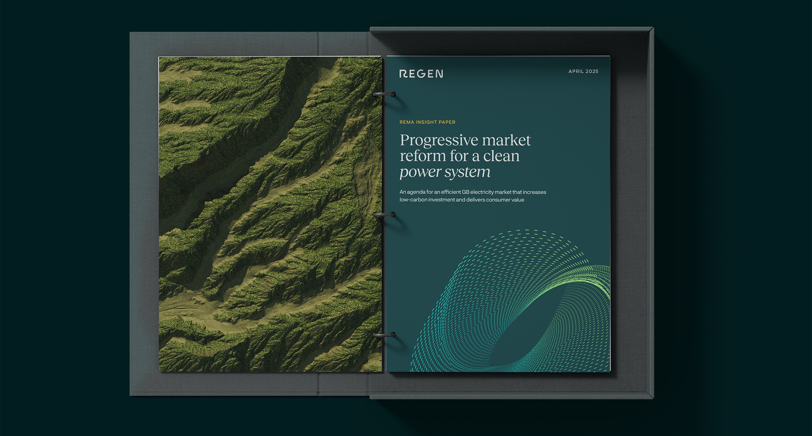
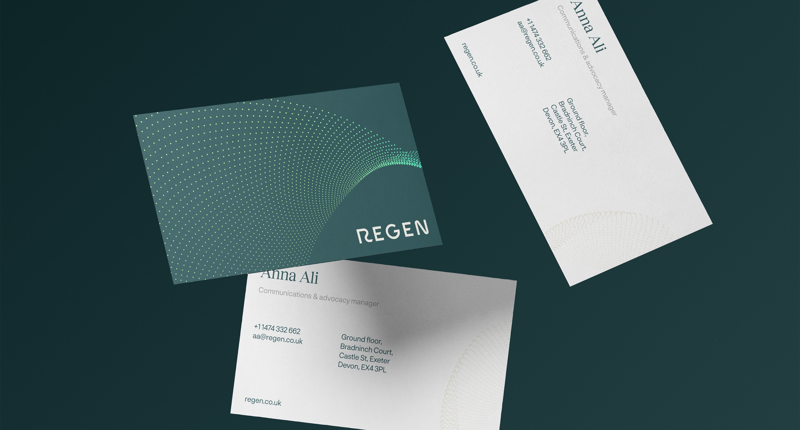
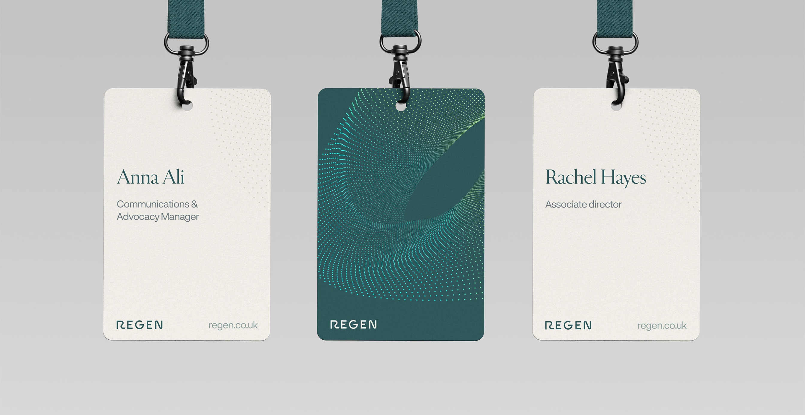
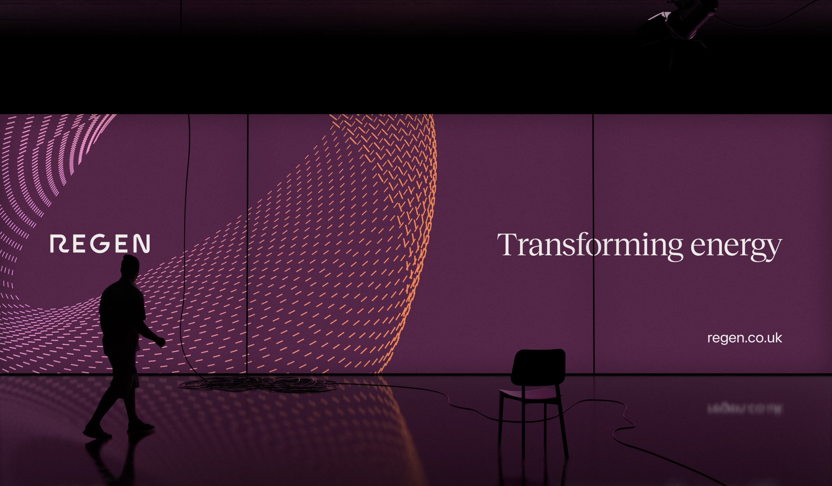
Regen’s new, confident wordmark stands alone without needing an icon. It reflects Regen’s reputation and belief in moving forward. Sharp angles suggest progress and a future-focused mindset, while the typography balances heritage with innovation through a combination of serif and sans serif typefaces.
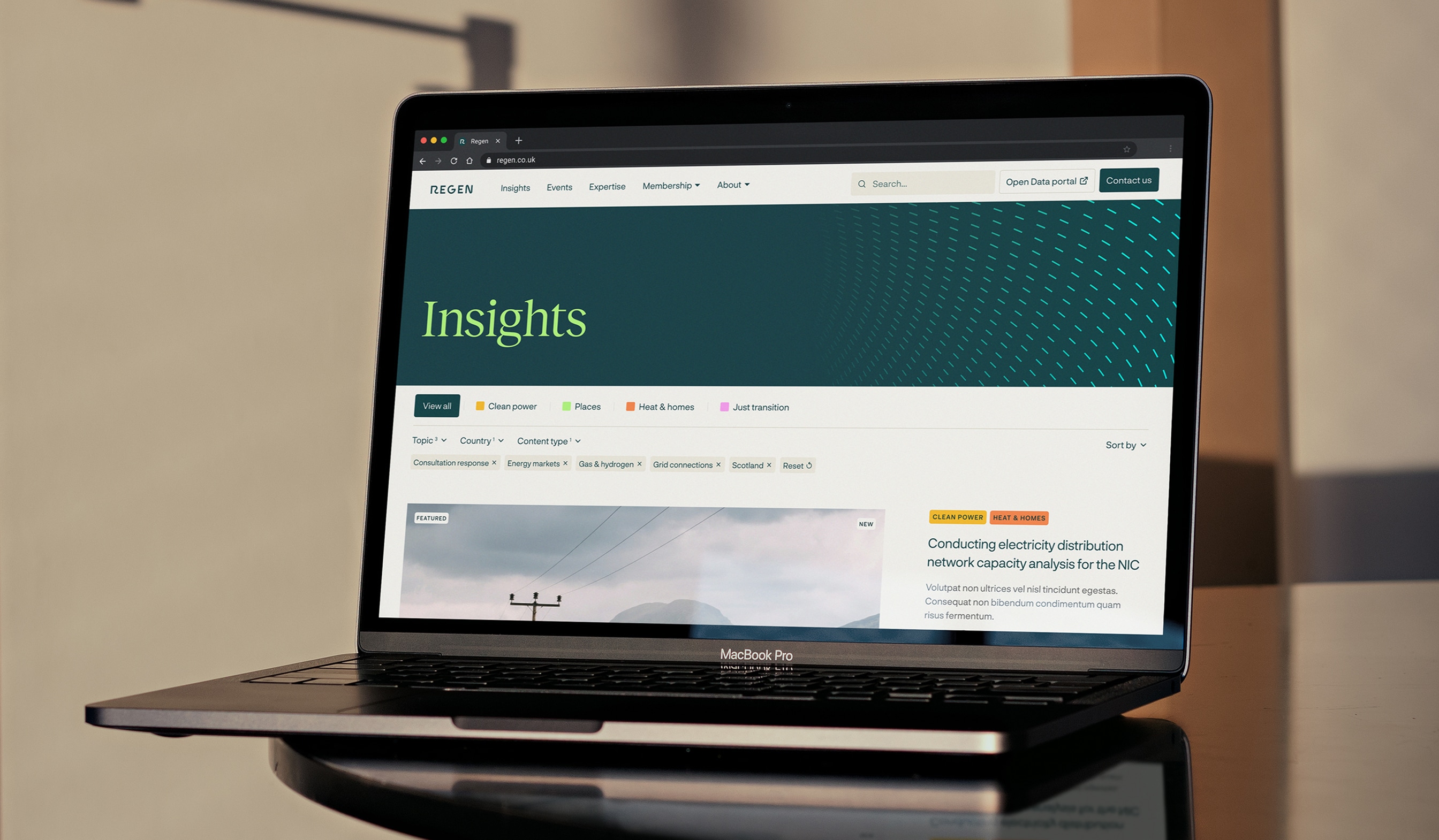
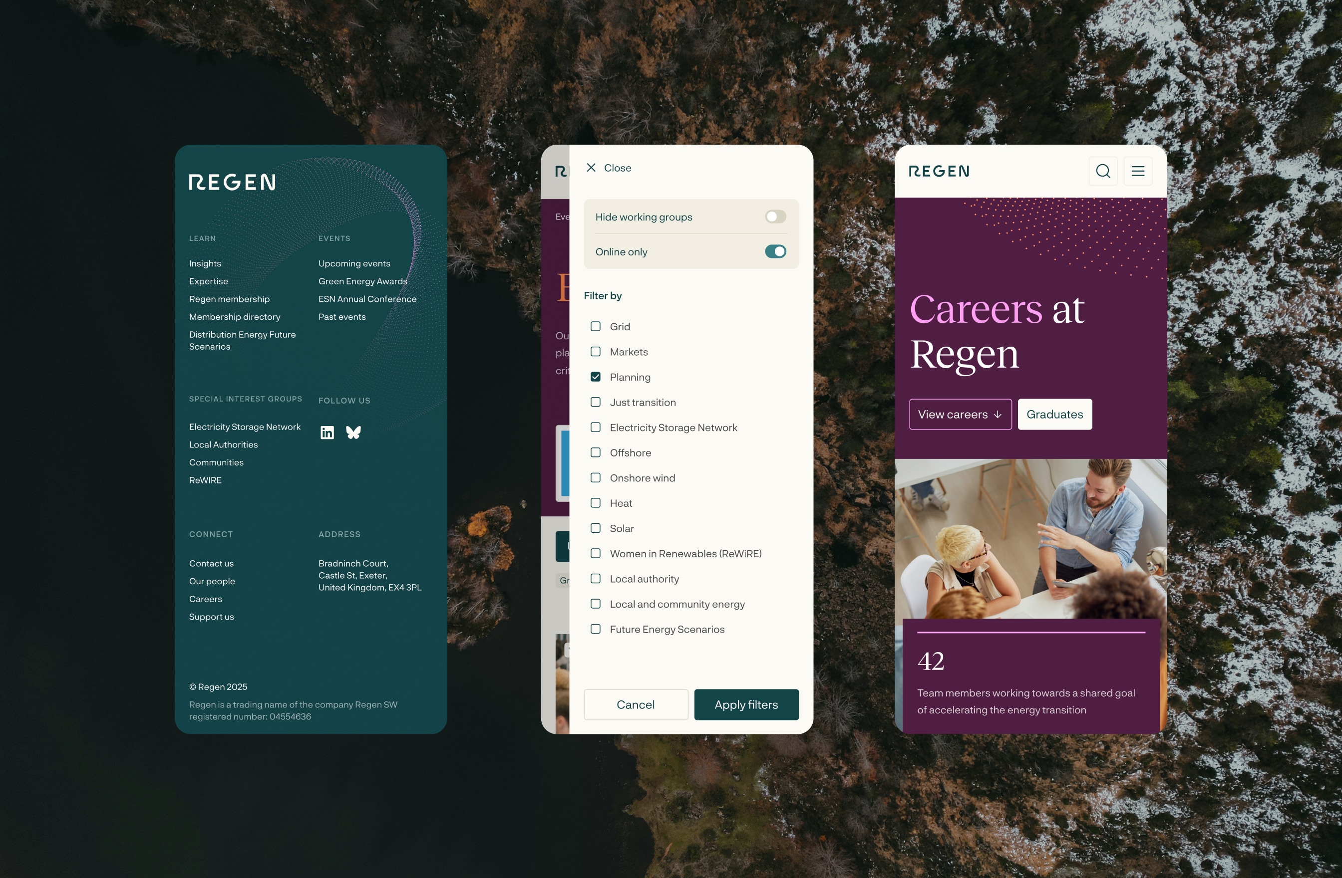
The brand’s color palette is deliberately grounded and mature, with strategic pops of vibrant color that add a fresh, cutting-edge feel without compromising credibility.
The graphic element reimagines Regen’s original Möbius strip icon in three distinct forms, illustrating the concept of interconnected systems and networks – central to both Regen’s work and their collaborative approach with communities across the UK.
“This wasn’t about making Regen look prettier,” reflects Ashton. “It was about giving them the visual authority to match their intellectual leadership. When you’re advocating for society-wide transformation across power, heat, and transportation, your brand needs to command attention and respect.”
The result positions Regen as the confident voice of energy transformation they’ve always been, now with an identity that ensures they’re heard above the noise of an increasingly crowded sustainability sector.
CREDIT
- Agency/Creative: Signifly
- Article Title: Energy Leaders Regen Rise Above the Green Noise, Powered by Signifly
- Organisation/Entity: Agency
- Project Type: Identity
- Project Status: Published
- Agency/Creative Country: United Kingdom
- Agency/Creative City: London
- Market Region: Europe
- Project Deliverables: Branding, Design, Graphic Design
- Industry: Professional Services
- Keywords: redesign, rebrand, energy sector, consultancy, professional services, Signifly
-
Credits:
Lead Consultant: Dženita Džindo
Client Lead: Jamie Vaughan
Designer: Christopher Ashton
Strategist: Joe Portman
Developer: Kenan Yigitoglu


