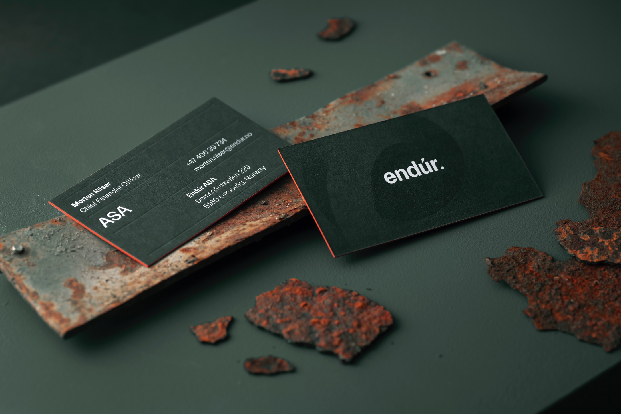
Rebranding an industrial giant
Endúr ASA was formed in 2019 following the merger of Bergen Group ASA with Endúr Fabricom. The merger created a major industrial group, based in western Norway, with three key business areas that will provide a platform for future growth – Aquaculture, Maritime Services, and Energy Solutions. KIND has developed a new brand and communication strategy for the industrial giant.
Endúr is an Old Norse word derived from the word ‘endurnýja’ – which means to renew, refresh, to change. But endúr also has several other meanings – not least ‘enduring’ or ‘persisting’ – and can be read as a short form of the English word endurance, which means tireless perseverance; to withstand with courage.
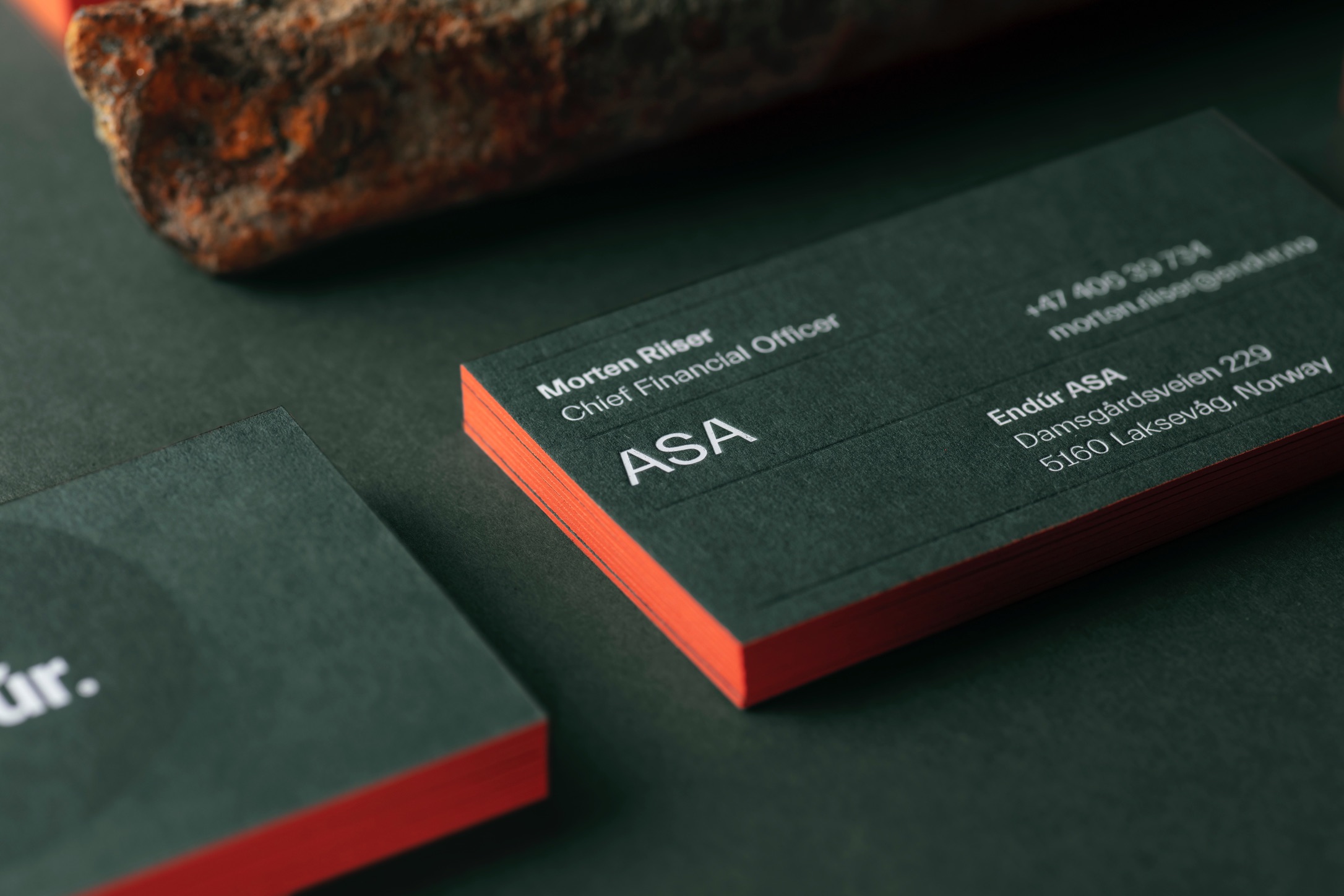
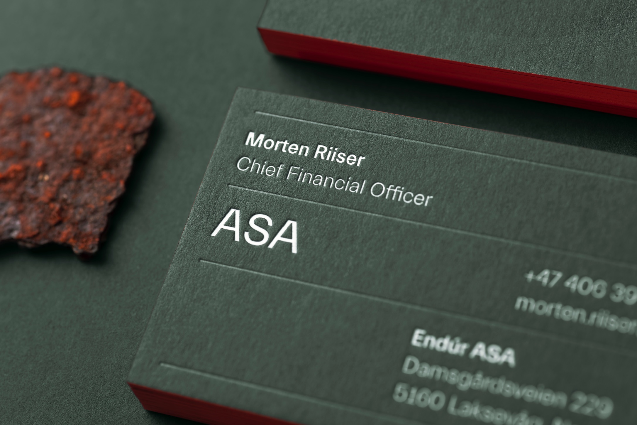
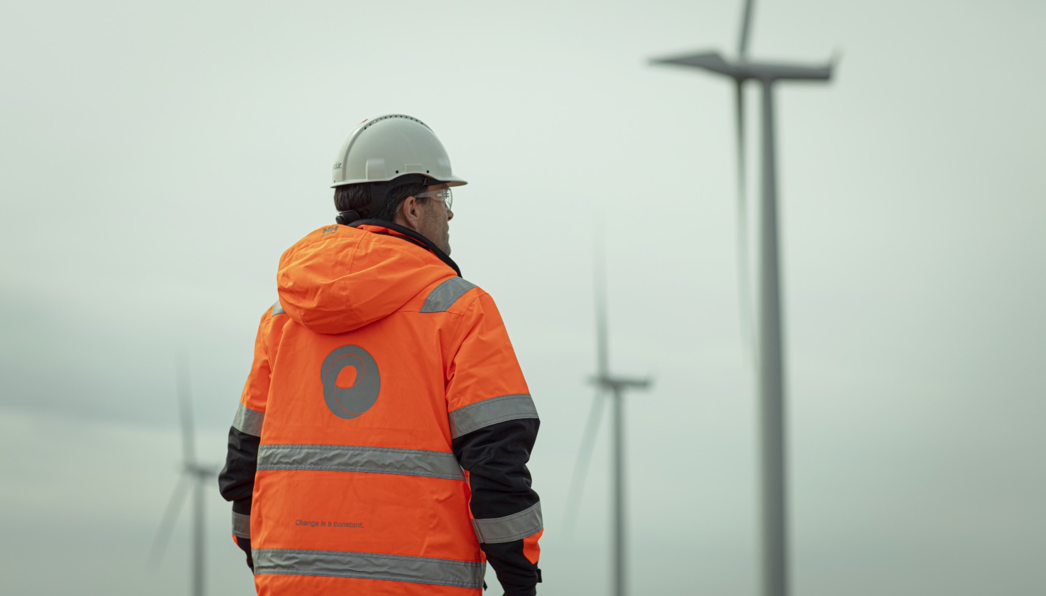
KIND has built a strong brand and an innovative identity that reflects both the company’s and the industry’s constant change and their ability to adapt to the market in a flexible way. Renewal and change are highlighted by the communication concept ‘Change is a constant’. The world is constantly changing, so must we. To be able to endure and develop, we must adapt and innovate. Renewal has defined the Endùr culture and should continue to do so. Endùr is constantly searching for new ideas, new solutions, new people, and new opportunities.
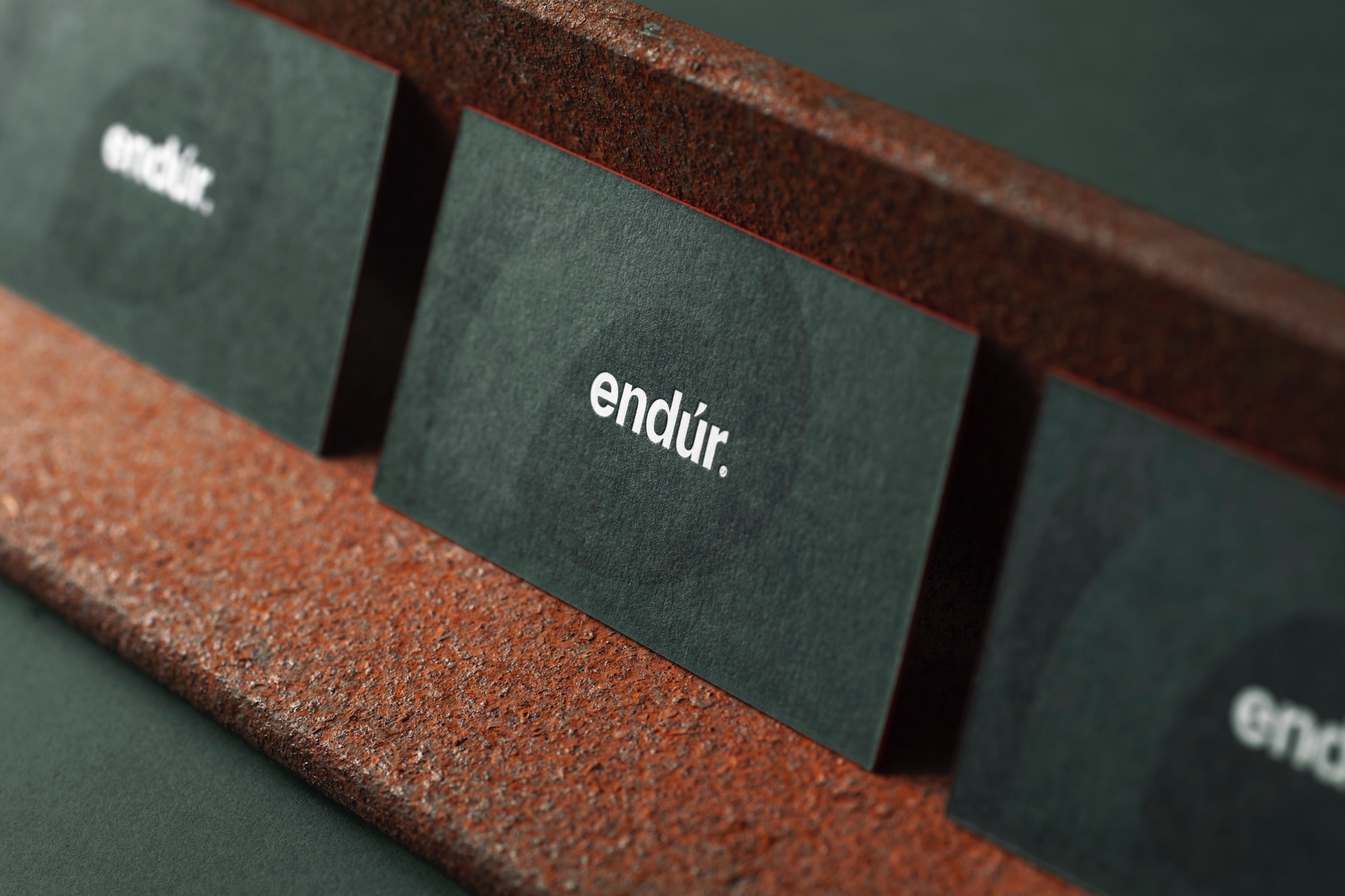
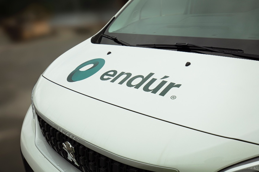
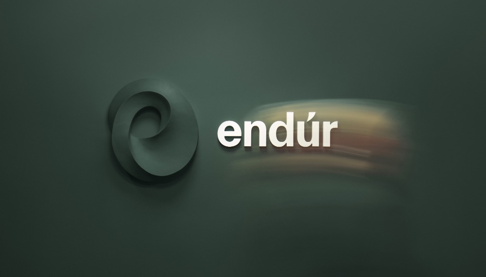
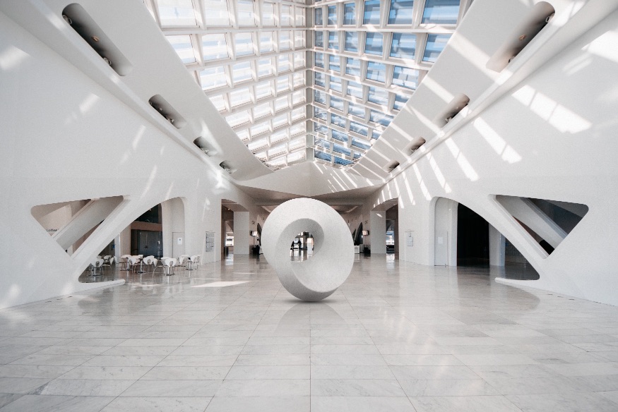
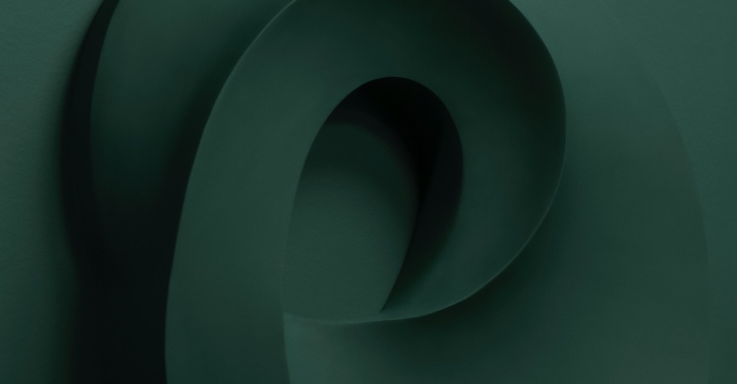
Endúr has got a stable and serious logotype with a dynamic and energetic symbol. The symbol is inspired by the “Moebius strip” which is an object that consists of only one surface and only one outer edge. This symbolizes unity and reflects Endúr´s desire to stand together. It is also a form that represents a loop. In our visual interpretation, it forms the “e” letter for endúr and is an “infinite” kinetic sculpture that constantly rotates. The symbol is also built as a shape which in theory should be able to rotate with wind power and works like a turbine with blades that act as a windbreak.
The strong and powerful symbol works well both statically and as a moving object. Together with all the other visual elements it positions the company large and dynamic and gives Endúr a clear unifying identity for
the future.
CREDIT
- Agency/Creative: KIND
- Article Title: Endúr Brand Redesign by Kind
- Organisation/Entity: Agency
- Project Type: Identity
- Project Status: Published
- Agency/Creative Country: Norway
- Agency/Creative City: Bergen
- Market Region: Global
- Project Deliverables: Brand Identity
- Industry: Energy
- Keywords: WBDS Awards, Agency
-
Credits:
Creative Director: Tom Emil Olsen
Design Director & Senior Designer: Knut Harald Longva
Photographer: Christoffer Meyer
Senior Designer: Carl Bugge
Designer: Kristine Flatland Larsen
Senior Designer: Agnieszka Gawlik
Strategic Brand Consultant: Thomas Danielsen
Project Manager: Ann Kristin Michelsen


