


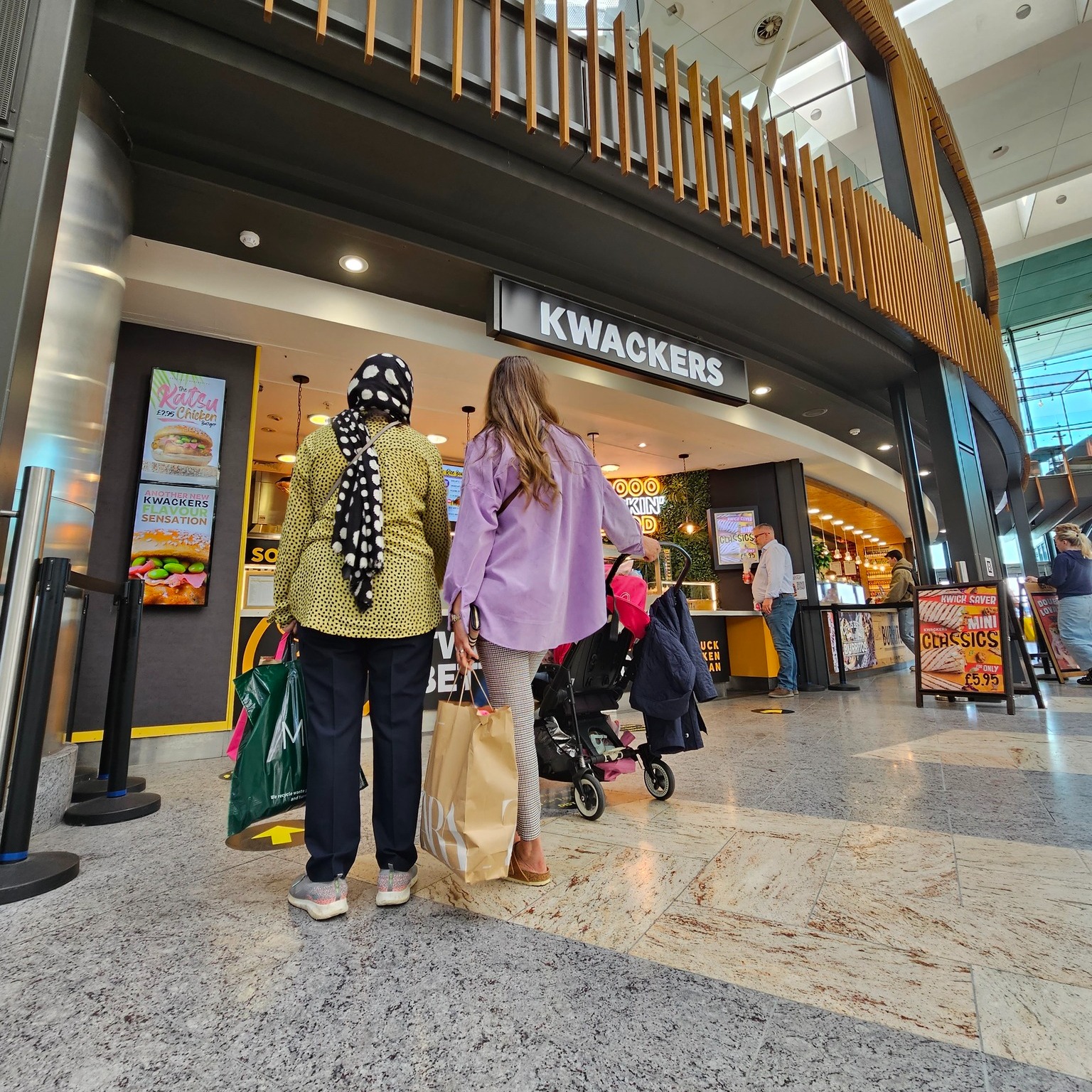
To create a compelling branding case study for Kwackers Original, we embarked on a journey to establish a strong and distinctive brand presence for this UK-based street food outlet. Our mission was to help Kwackers thrive in the highly competitive marketplace of festivals and outdoor events, and ultimately enable them to make a successful foray into Southampton, one of the south coast’s prominent retail locations.
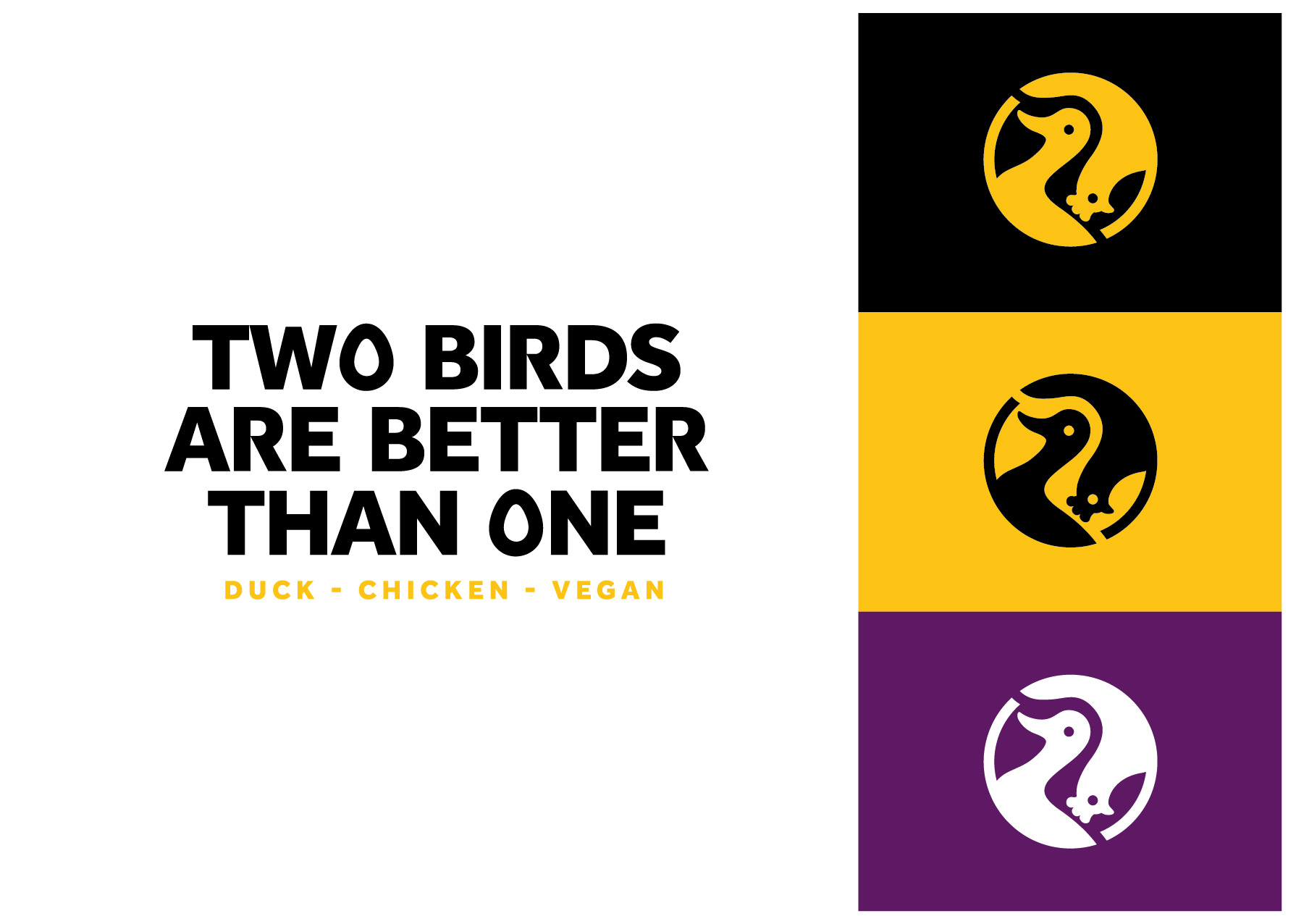
Drawing inspiration from Kwackers’ unique twist of flavors and their diverse menu options, which included both duck and chicken dishes, we developed a visual identity that celebrated this rich variety. Embracing the age-old saying “Two heads are better than one,” we leveraged the concept of diversity to not only create a strong marketing message but also design a striking and memorable icon that would soar above the competition.
Our comprehensive branding solution encompassed various elements, each carefully crafted to align with Kwackers’ vision and values. Here’s an overview of what we delivered:
Brand Strategy:
We conducted in-depth research and analysis to formulate a robust brand strategy for Kwackers. This involved understanding their target audience, competitive landscape, and unique selling propositions. With this knowledge, we devised a roadmap that would guide Kwackers in positioning themselves effectively and resonating with their customers.
Brand Identity:
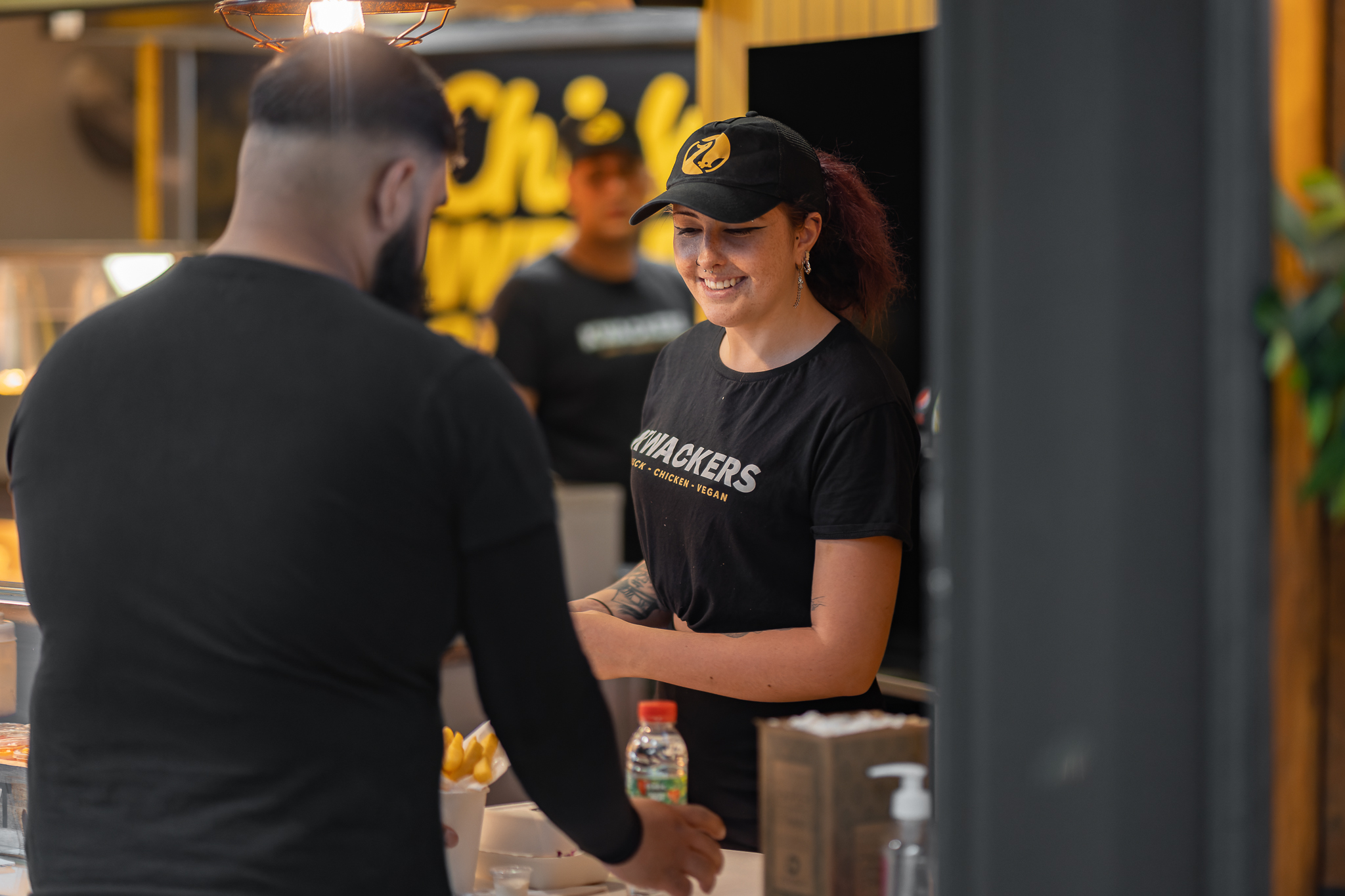
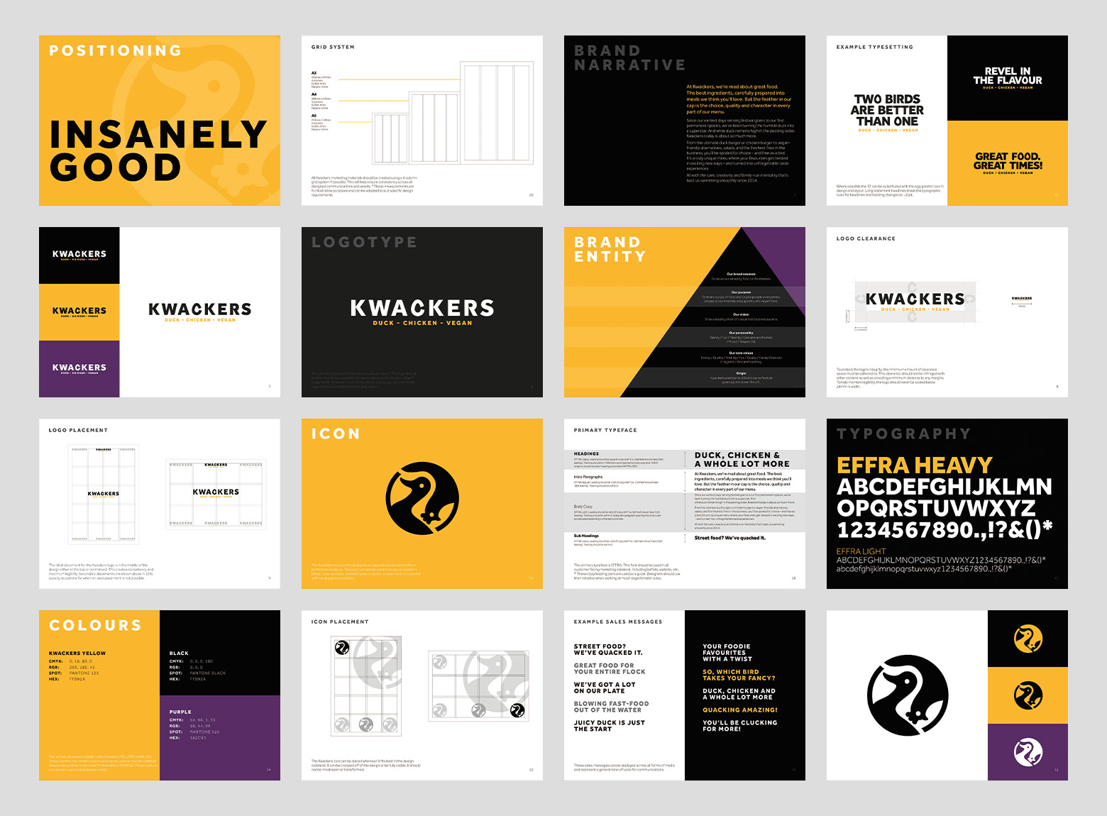
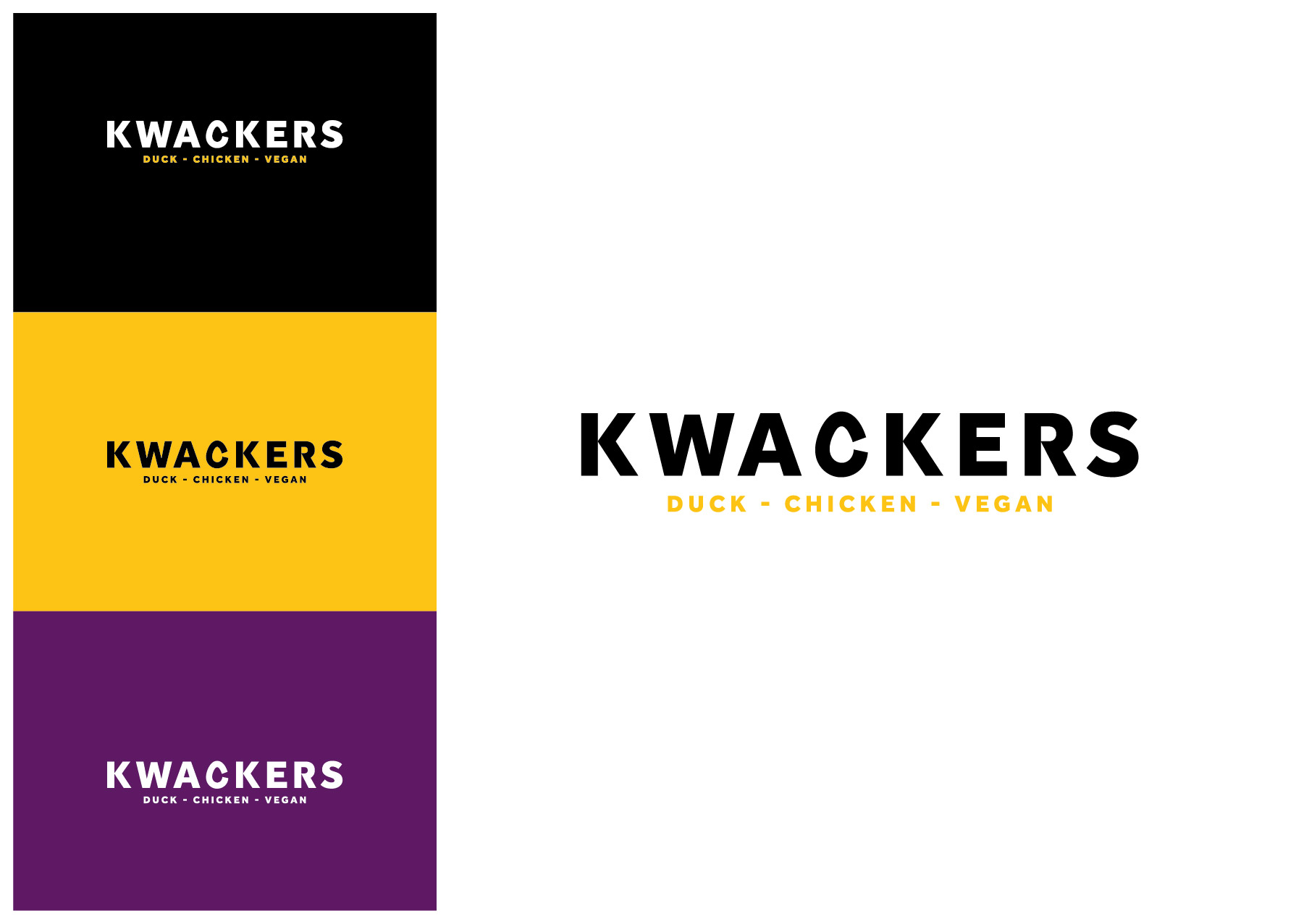
Building upon the insights gained during our strategic exploration, we crafted a compelling brand identity for Kwackers. This included designing a visually captivating logo that showcased the fusion of duck and chicken elements, reflecting their diverse menu. We carefully selected a color palette and typography that conveyed the brand’s personality and values, ensuring consistency across all touchpoints.
Tone of Voice:
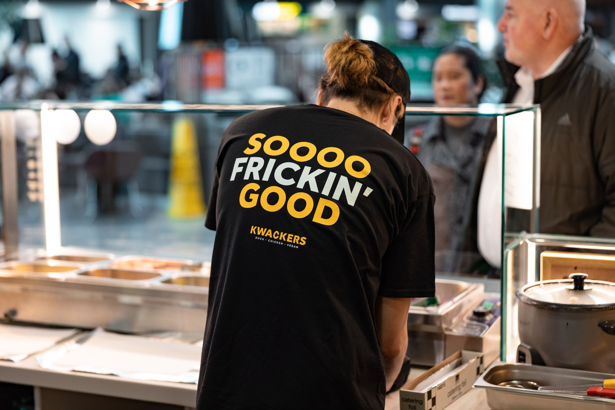
To establish a consistent brand experience, we developed a distinctive tone of voice for Kwackers. This encompassed the language, messaging, and overall communication style that would be employed across various platforms, from marketing materials to social media interactions. Our aim was to create a voice that resonated with the target audience, evoking excitement, curiosity, and a sense of adventure.
Brand Guidelines:
To maintain brand consistency and provide a clear framework for future communications, we created comprehensive brand guidelines. These guidelines outlined the proper usage of the logo, colors, typography, and other visual elements. They also provided instructions on maintaining the brand’s tone of voice and ensuring a cohesive brand experience across all channels.
Packaging:
Recognising the importance of packaging as a touchpoint for customer engagement, we designed eye-catching and practical and sustainable packaging solutions for Kwackers. Our packaging design not only reflected the brand’s visual identity but also enhanced the overall dining experience, making it convenient and memorable for customers.
Social Assets:
Social media plays a vital role for promoting Kwackers. We developed a range of engaging social assets for Kwackers, including visually appealing graphics, animated content, and video snippets. These assets were tailored to various platforms, helping Kwackers establish a strong online presence and effectively connect with their target audience.
Through our collaboration with Kwackers Original, we were able to create a compelling brand strategy and visual identity that truly set them apart in the local marketplace. Our comprehensive deliverables, including the brand strategy, identity, tone of voice, brand guidelines, packaging, and social assets, positioned Kwackers for success as they expanded into Southampton and beyond. With their unique brand story and visually striking presence, Kwackers was ready to leave their customers flapping for more.

CREDIT
- Agency/Creative: Frost Creative Limited
- Article Title: Enabling a Street-food Outlet to Spread Its Wings and Take Off
- Organisation/Entity: Agency
- Project Type: Identity
- Project Status: Published
- Agency/Creative Country: United Kingdom
- Agency/Creative City: Eastleigh
- Market Region: Europe
- Project Deliverables: Brand Creation, Brand Design, Brand Guidelines, Brand Identity, Packaging Design
- Industry: Food/Beverage
- Keywords: food, retail, design, fun, bold,
-
Credits:
Creative Team: Gary Frost, Bryan Rodrigues, Abbey Purkiss


