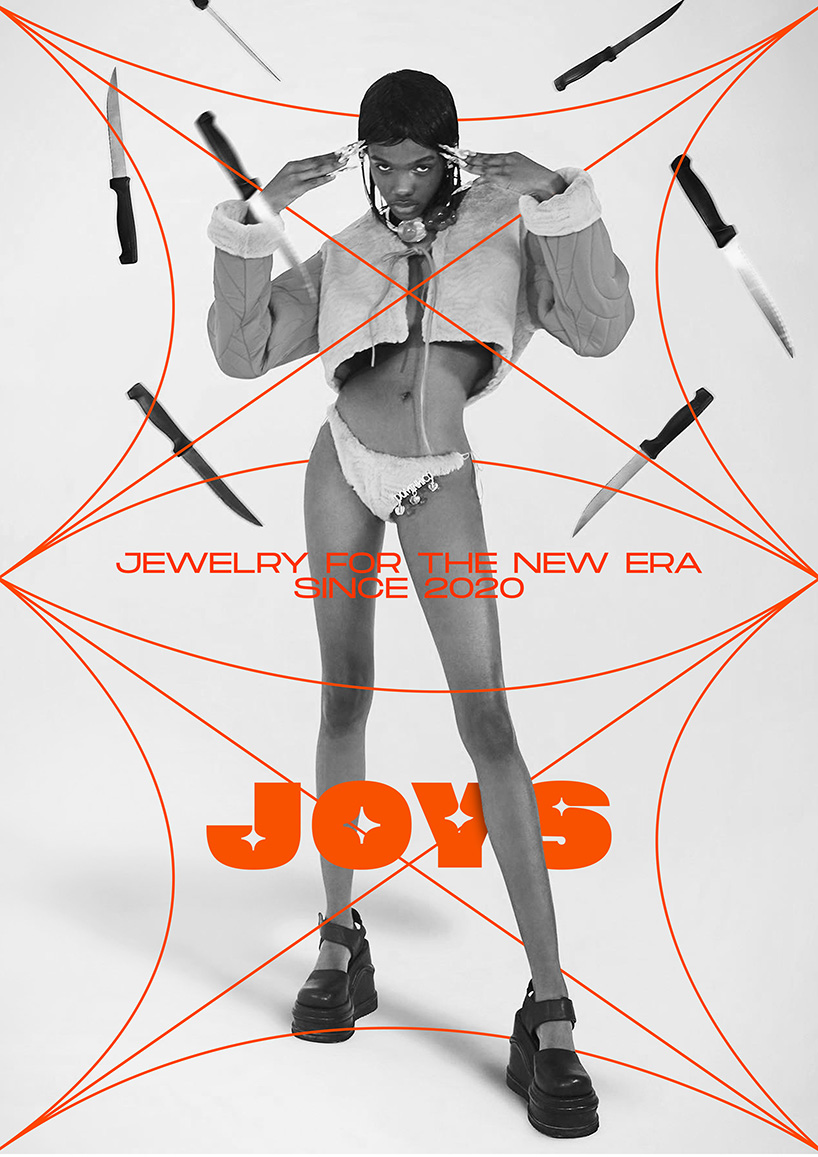
Neither elegant, nor inherited, nor valuable. Jewelry can no longer be what it used to be. That’s why Joys, the new costume jewellery brand that burst into Madrid and in social media by the hands of Wanna studio, turns it into a tool for self-affirmation and individual expression.
In a globalized, ephemeral and contradictory world, the tastes and needs of the younger generations mutate at the speed of a live Twitch stream. Although the jewelry sector, static, elitist and conservative by definition, is oblivious to these changes. Then comes Joys and bangs on the table. With its new discourse and its unprecedented vision, it aspires to become the jewelry brand for the new era.
Wanna has been the architect of this comprehensive branding and interior design project. And it has positioned Joys as the brand that empowers young people through the power of jewellery. To do this, the studio has focused on the graphic and verbal language of the new generation. A generation for whom luxury is not elegant. But rather ostentatious, daring, from the hood. Like a grillz.
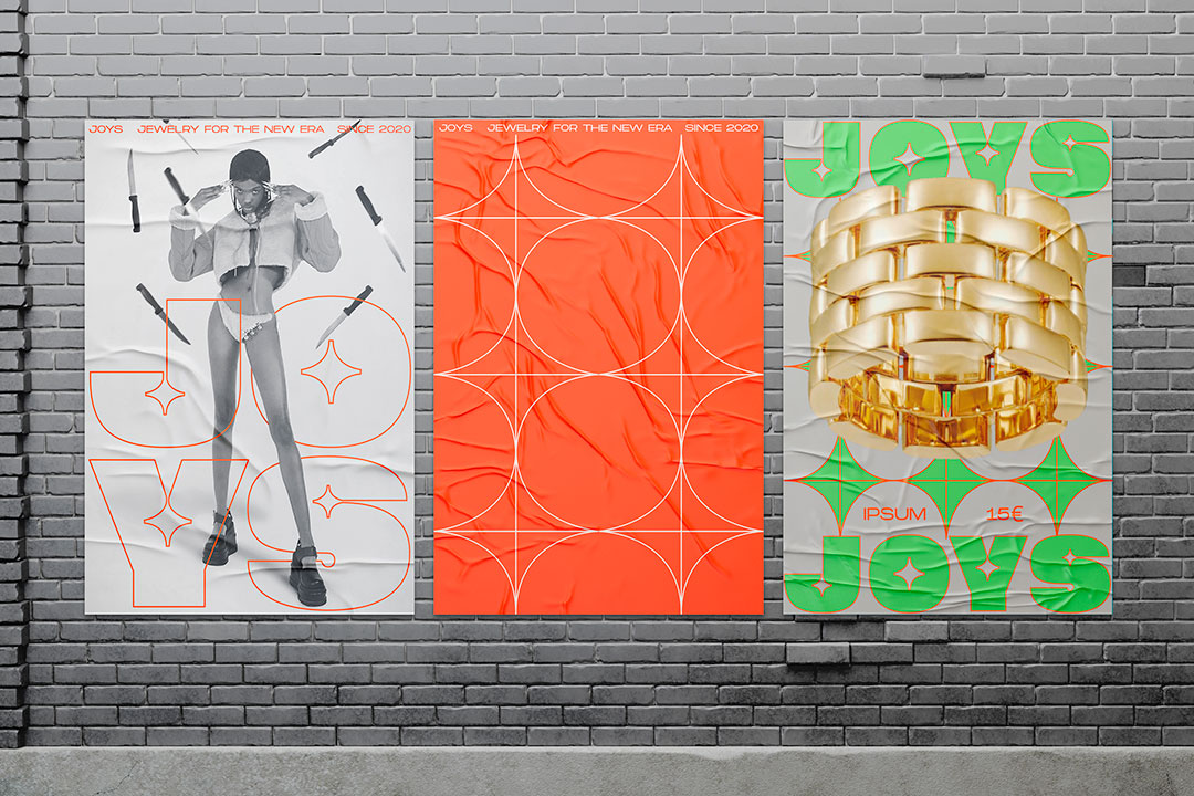
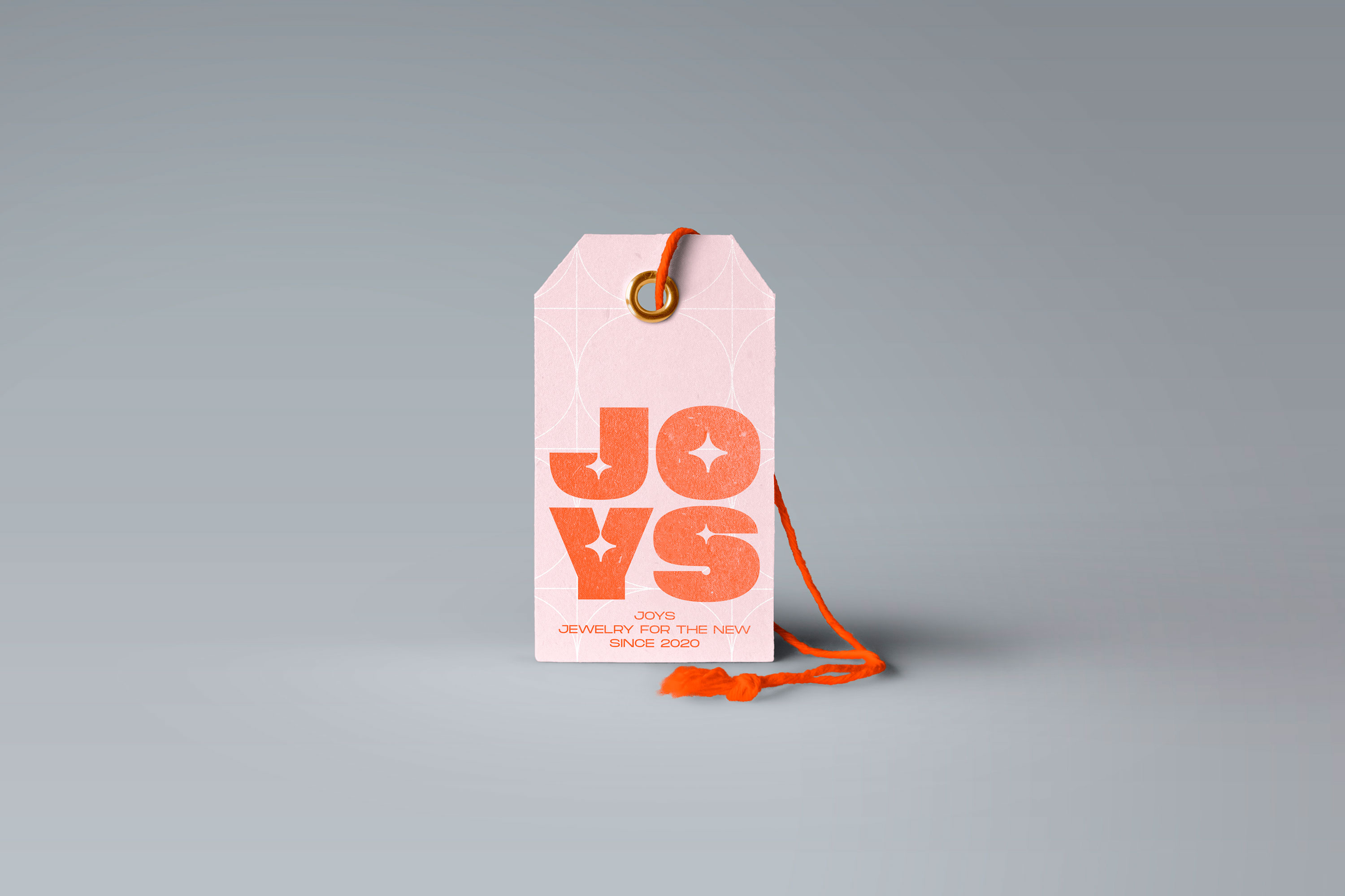
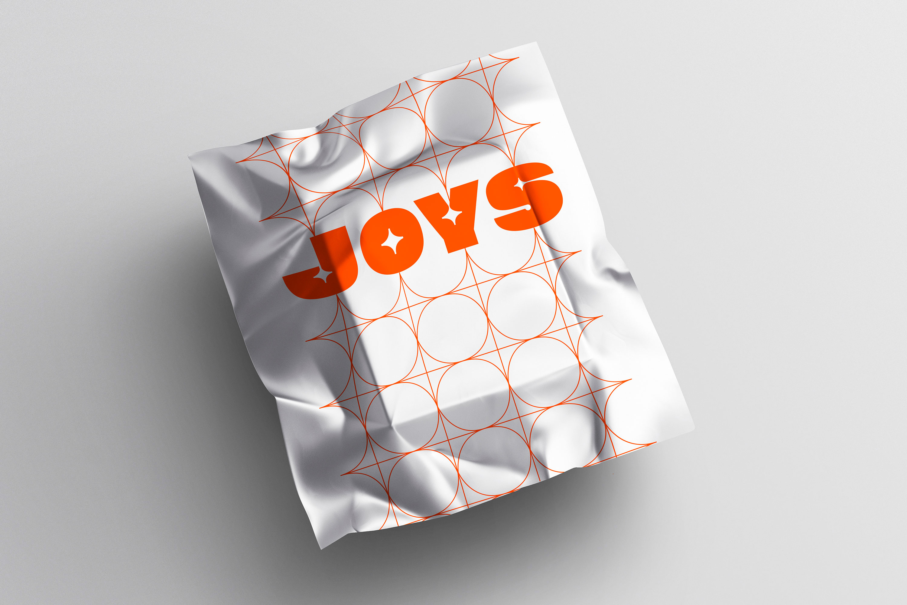
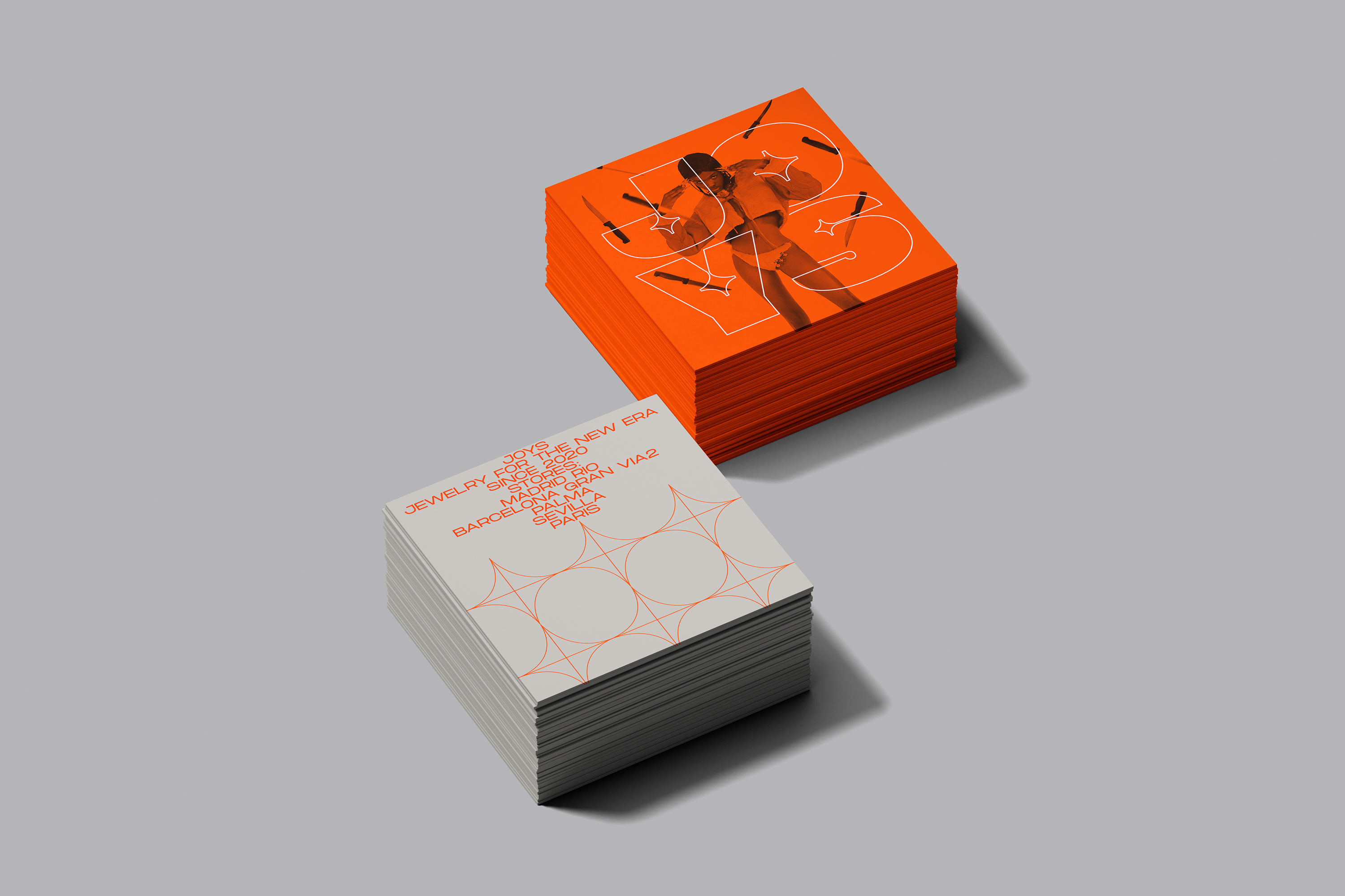
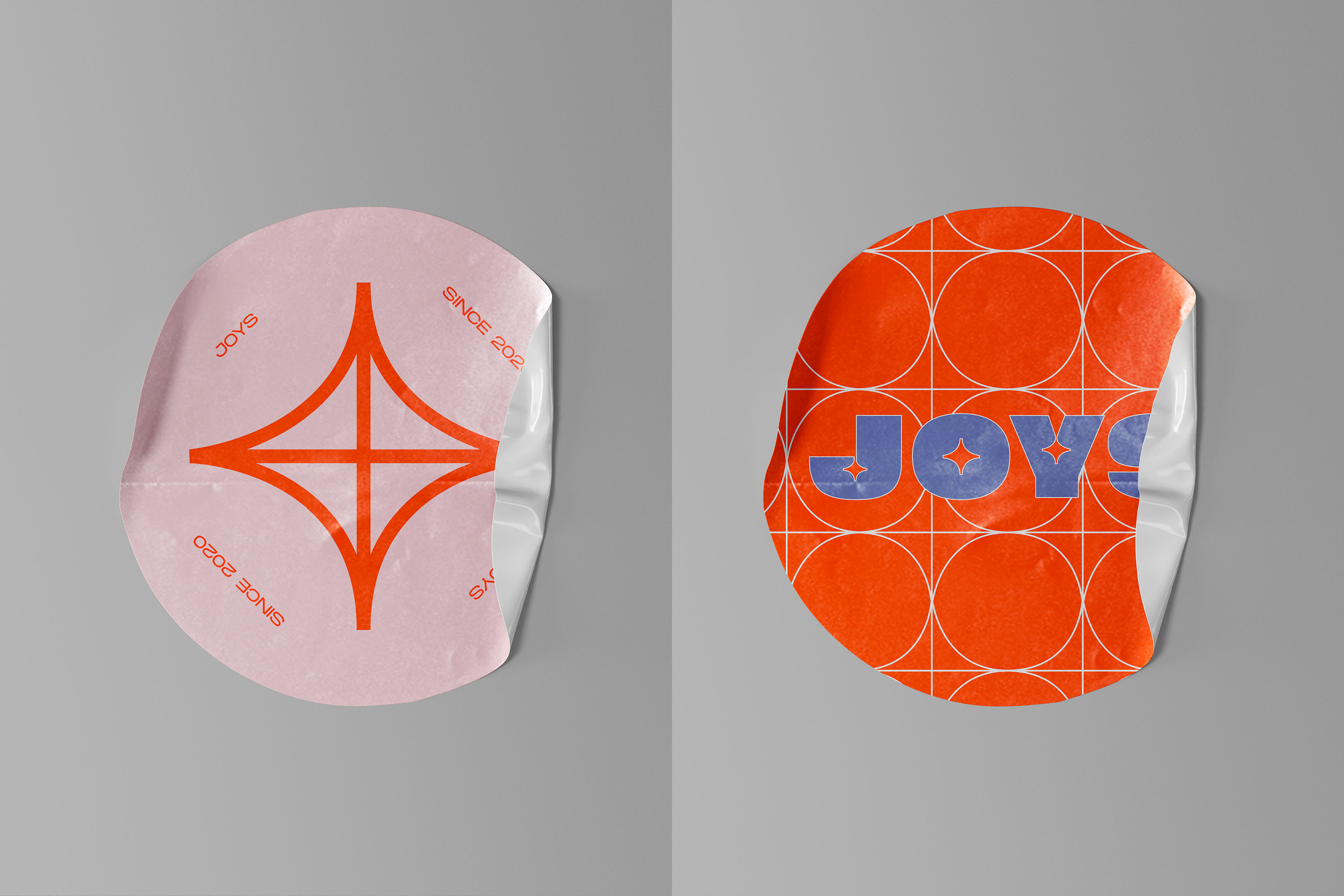
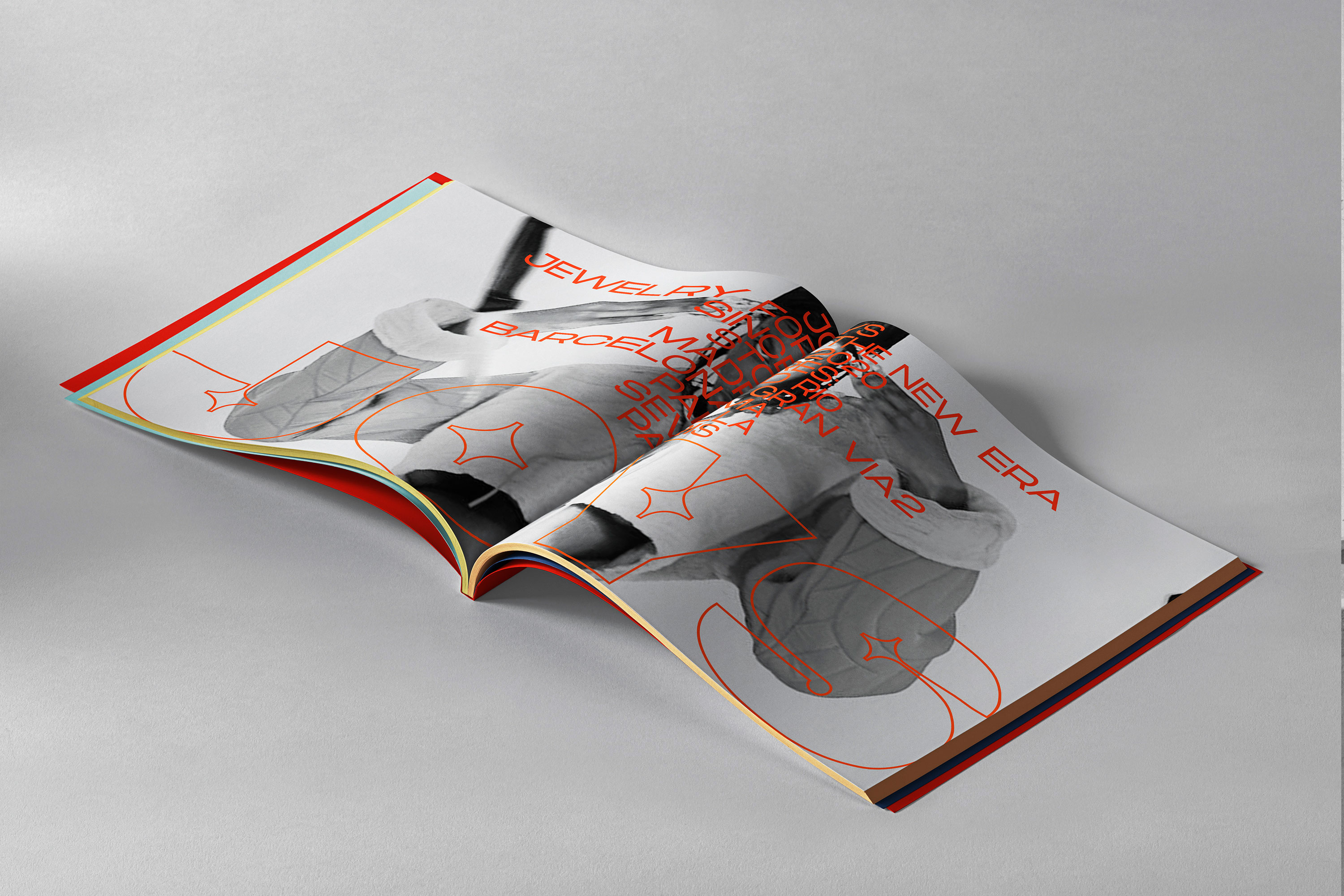
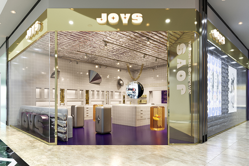
That’s why Wanna built the verbal and visual identity of the brand inspired by trap and ratchet aesthetics. From the Monument Extended family, the studio generates a compact and quilted typeface, with a central sparkle, reminiscent of the bling-bling of trap icons. The Hatton family was chosen as a secondary typeface to reinforce the world of excess evoked by the logo.
From a chromatic point of view, Joys is a bold, powerful and mutant brand. Just like the tastes of its target. Where now there is green, red and blue, in the course of time there may be other colors.
The graphic universe is completed with fine lines reminiscent of the security gates of “Gold Dealers”. And with black-and-white photographs of street aesthetics, on which the colored jewelry stands out. The models that appear have an androgynous look. Because in this new generation of young people the boundaries of gender and class are blurred. And Joys, as an inclusive and diverse brand, embraces all that.
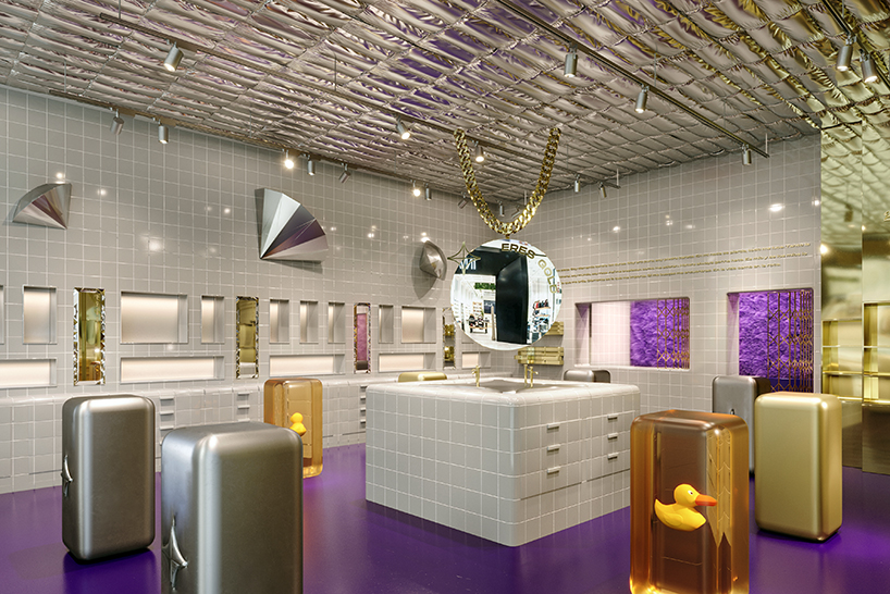
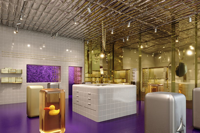
After creating the brand, Wanna has also taken it upon themselves to reflect their identity in the interior design of the first Joys store. True to its urban spirit, the store is located in Madrid’s Chinatown: the Usera neighborhood. And it is a space of a conceptual costumbrismo that seeks a conscious disorientation, which combines trends seen in the streets, fashion, art, design and gastronomy, with “everyday” decorative codes, typical of the music videos of trap artists. The result is closer to a bathroom than to a jewelry store. Something absolutely disruptive in the sector.
CREDIT
- Agency/Creative: Wanna
- Article Title: Empowering Joy Jewellery, Branding by Wanna
- Organisation/Entity: Agency
- Project Type: Identity
- Project Status: Published
- Agency/Creative Country: Spain
- Agency/Creative City: Madrid
- Market Region: Europe
- Project Deliverables: Brand Creation, Brand Design, Brand Redesign, Brand Strategy, Brand Tone of Voice, Branding, Copywriting, Creative Direction, Design, Interior Design, Logo Design, Research, Retail Design, Tone of Voice
- Industry: Fashion
- Keywords: Jewelry, Brand, Madrid, Trap, Jewelry Store, Retail, Trends, Fashion
-
Credits:
:


