Calla is the perfect example of a brand with purpose. Calla designs and crafts shoes for ‘problem feet,’ without compromising on style or comfort, believing this should never be a binary choice. Jen, Calla’s founder, and a bunion sufferer herself, felt the ignominy and disheartening experience of the search for a dream wedding shoe that didn’t exist. So she made it happen, with Calla.
There was a clear gap in the market, with the majority of other shoe manufacturers in this industry feeling unambitious, sterile and overly medical in approach. Whilst Calla’s shoes themselves stood out as elegant and brilliantly designed, their visual brand identity and messaging fell short. We looked to help reposition them as a truly aspirational high-end, fashion-led shoe brand.
The brand core strategy we developed for Calla focussed on empowerment. Restoring feelings of confidence and self-worth that can be harmed through the struggles of finding and wearing beautiful shoes that don’t cause discomfort.
The core concept and messaging revolved on the mantra of ‘Raise Up’. By tapping into this concept throughout every single touch point, we believe that Calla can achieve their mission to deliver joy and wonder through the entire customer experience.
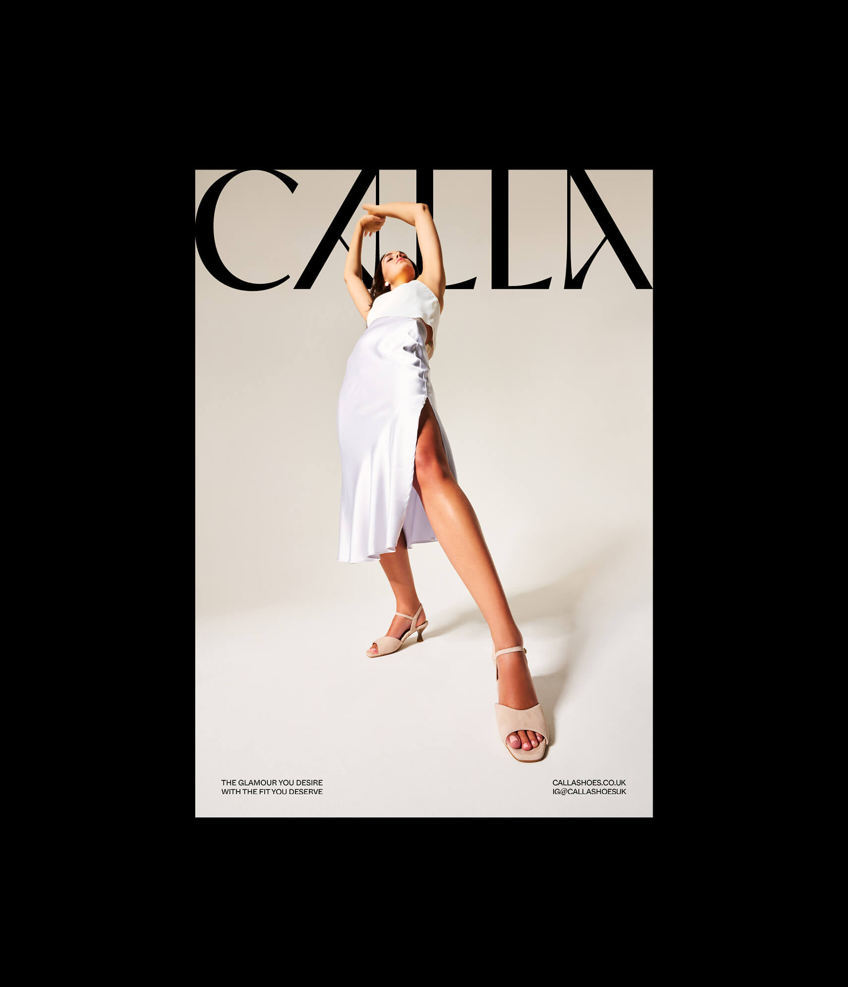
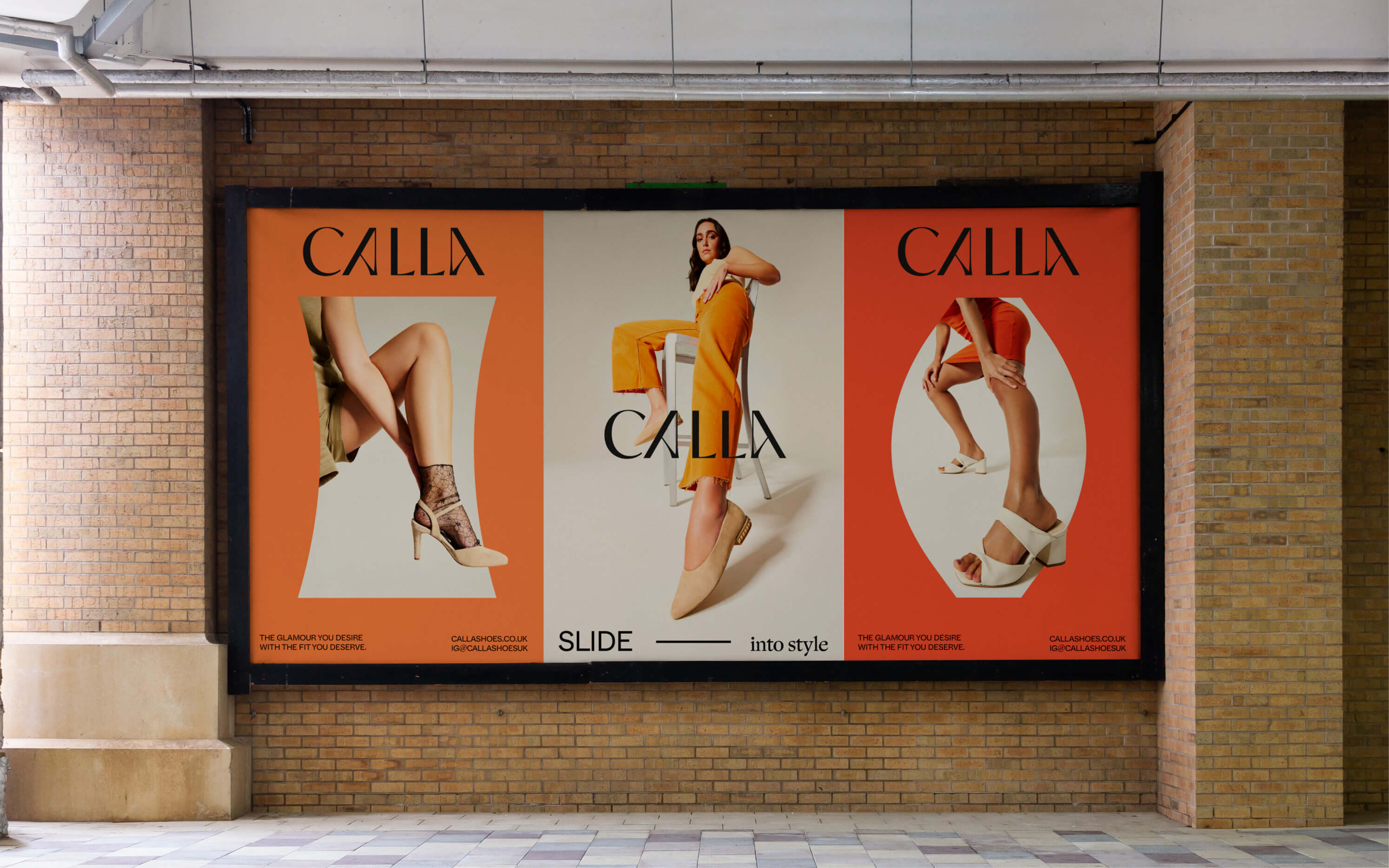
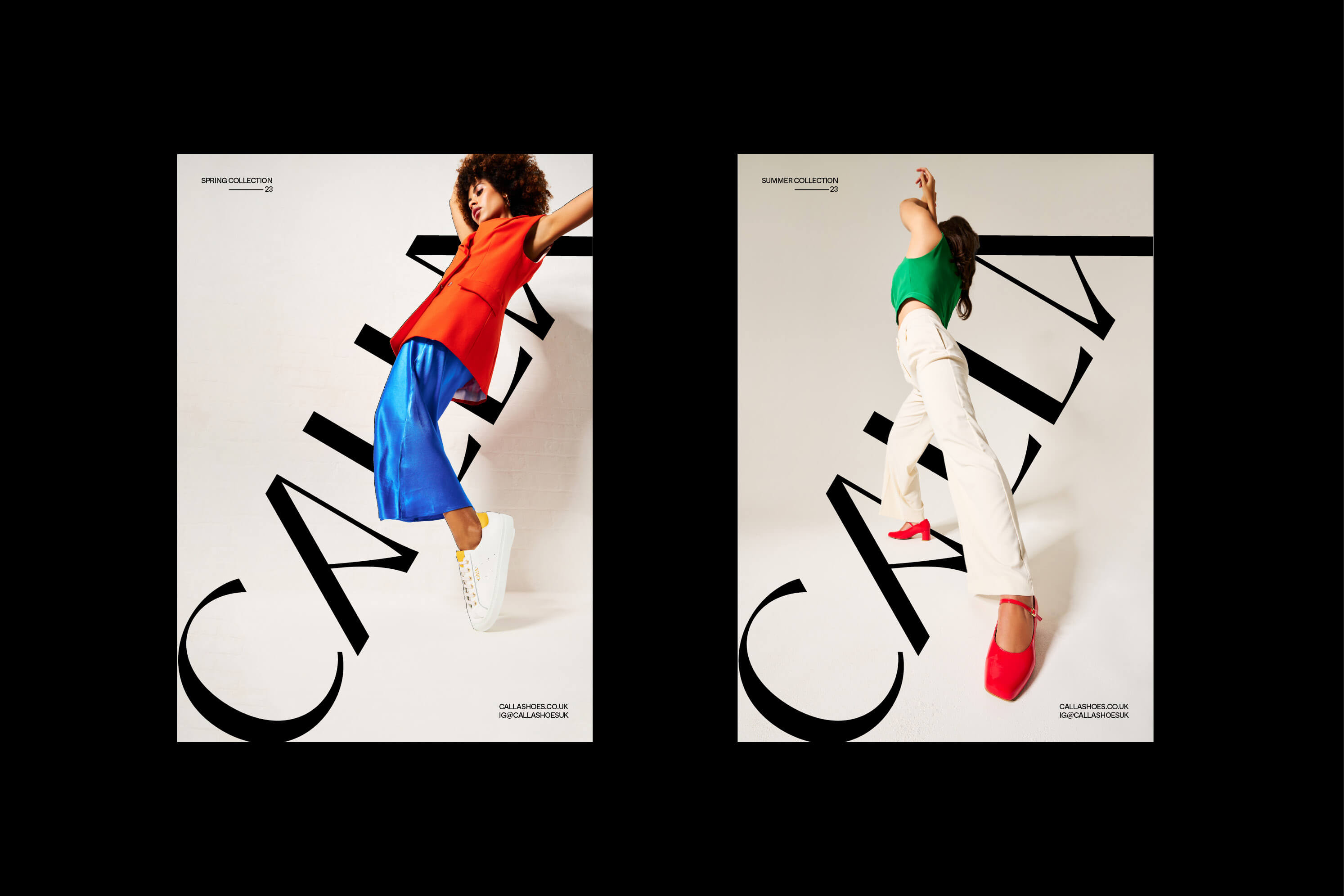
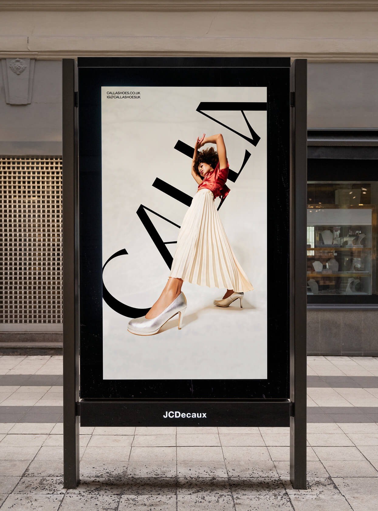
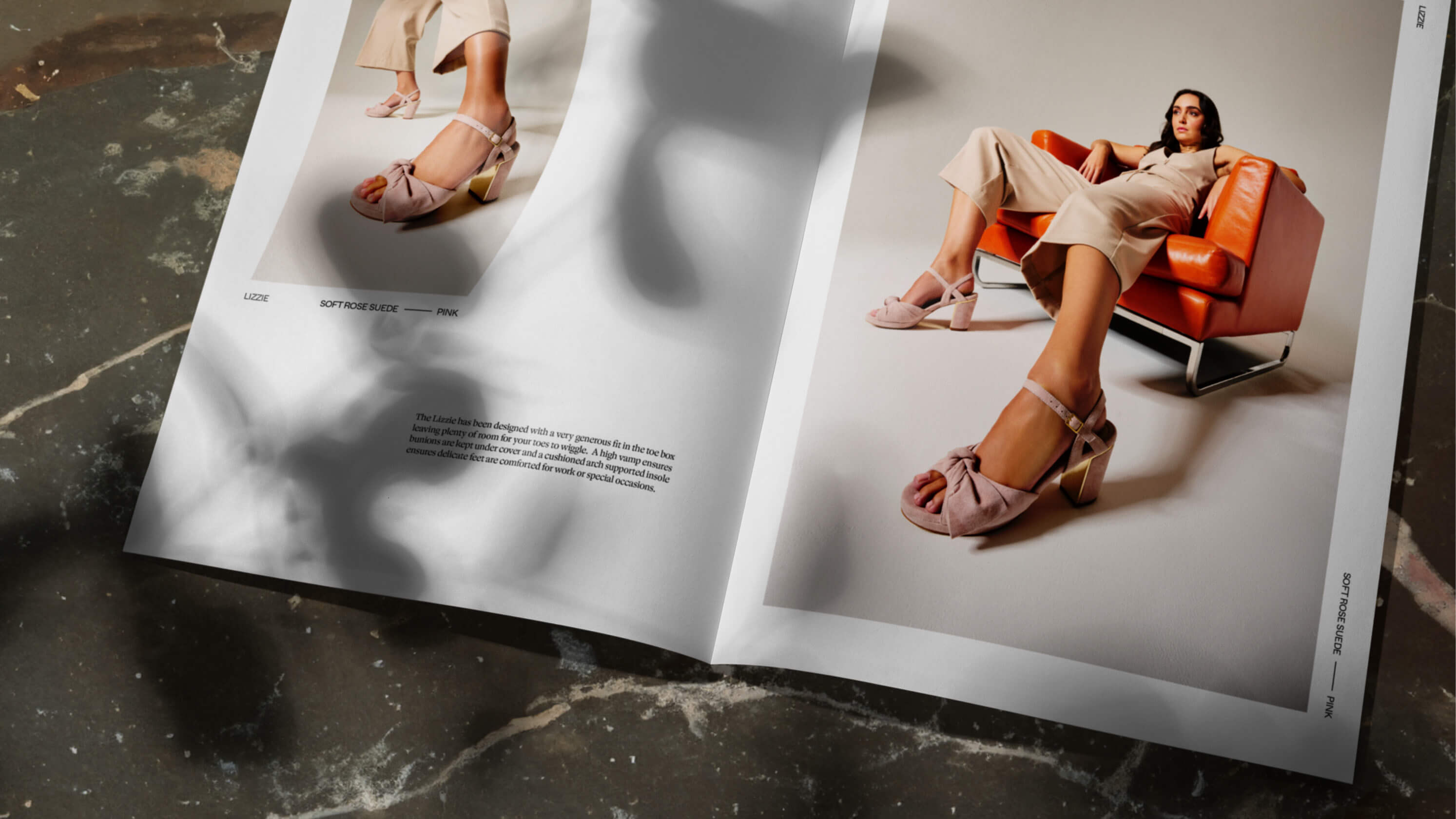
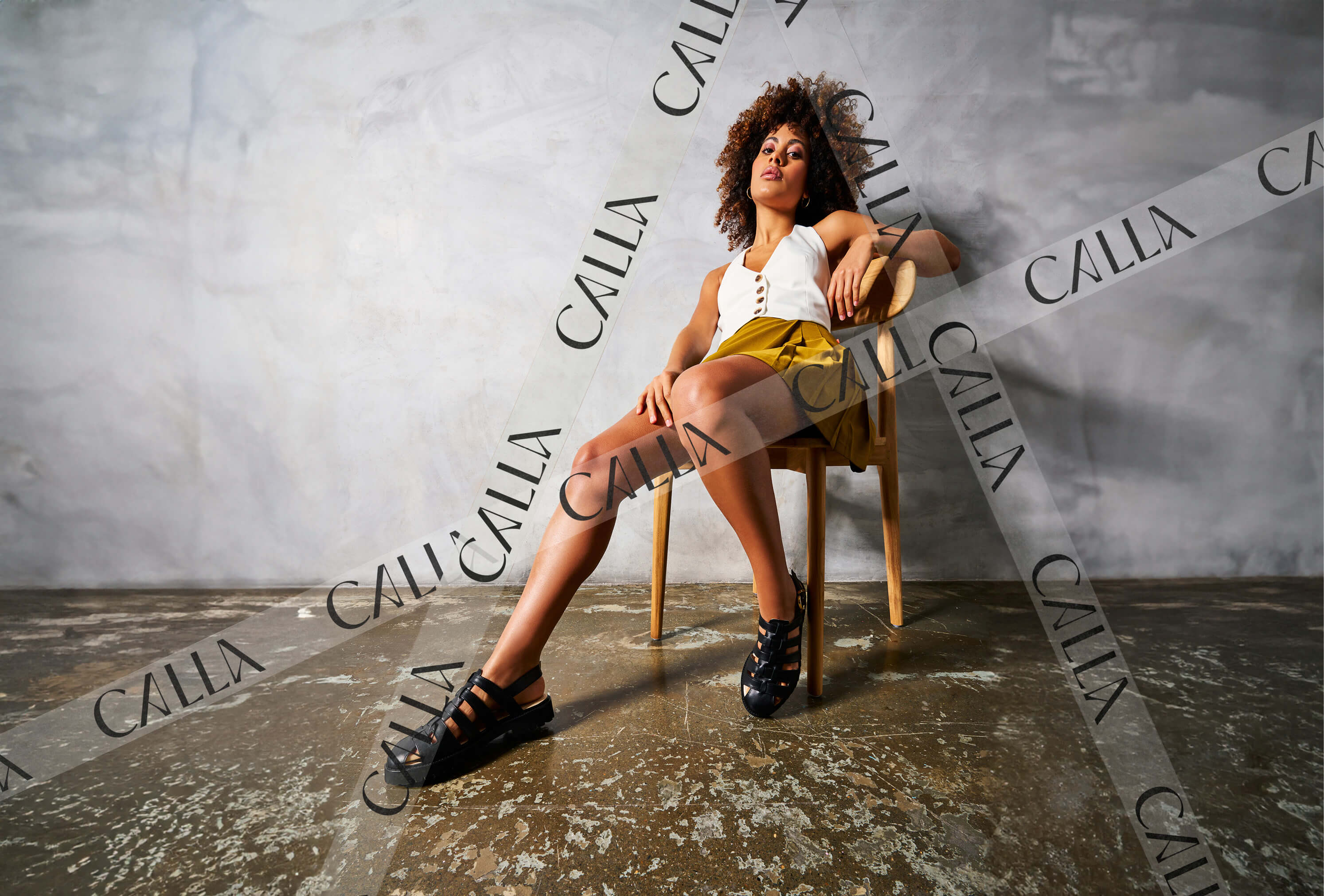
With this message in mind, we knew art direction would be a powerful asset. We explored the idea of celebrating the female gaze – to empathise rather than objectify, to show emotion and intimacy whist also respecting and platforming. Delving into feminist editorial photography, we took inspiration from respected photographers such as Fanny Beckman, using lower-angle shots to make the models look domineering and more powerful. These shots also allowed us to fill the space within the image, and provide a focus on the lower body including the feet and vitally the end product.
This concept of the female gaze, and the lens it is viewed through, led to the creation of a series of ‘windows,’ based around lens shapes. These can be used to house photography, information, or create crops in layout systems. We also allowed the photography to break out the frame, bringing more emphasis to the shoes themselves.
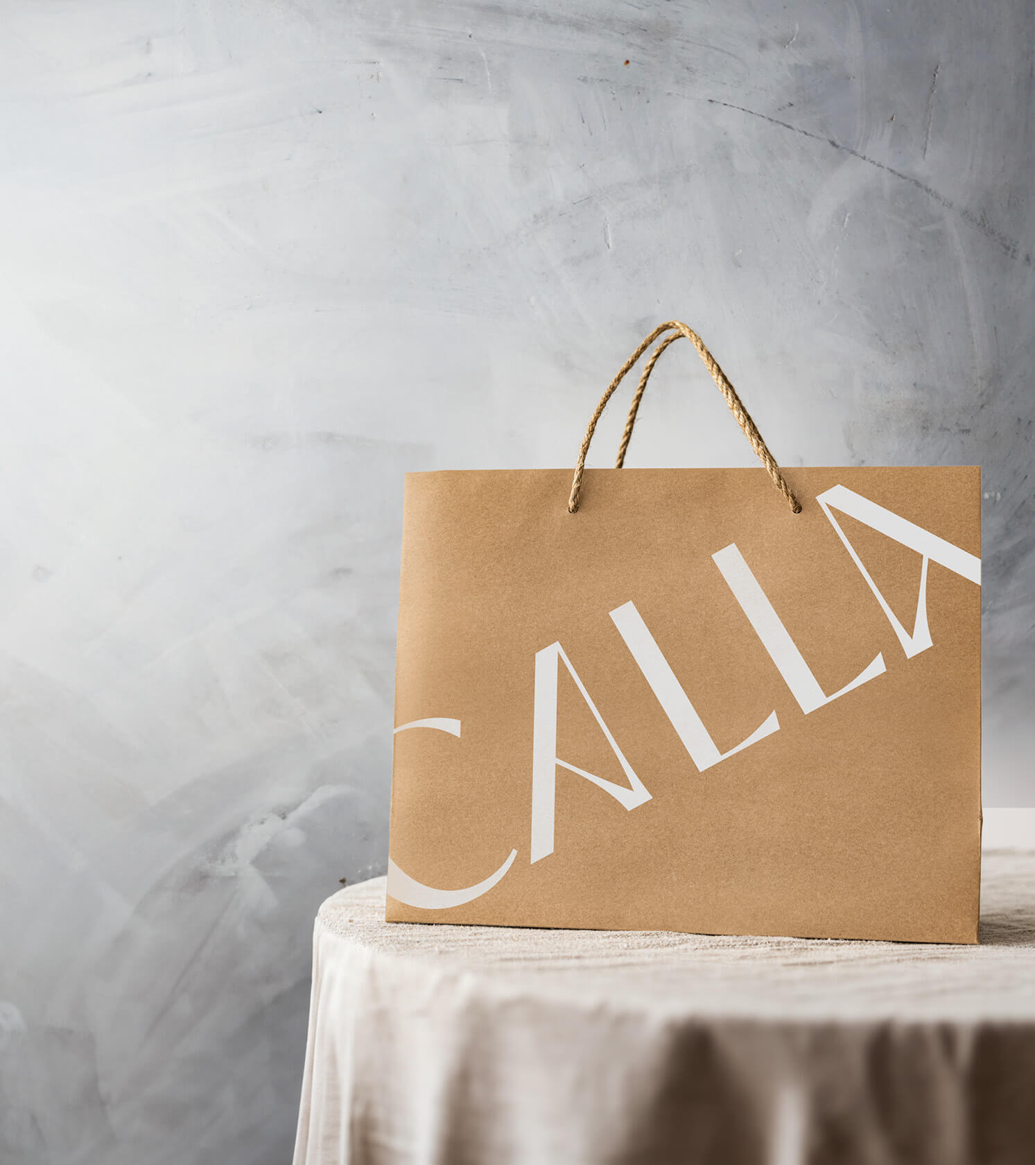
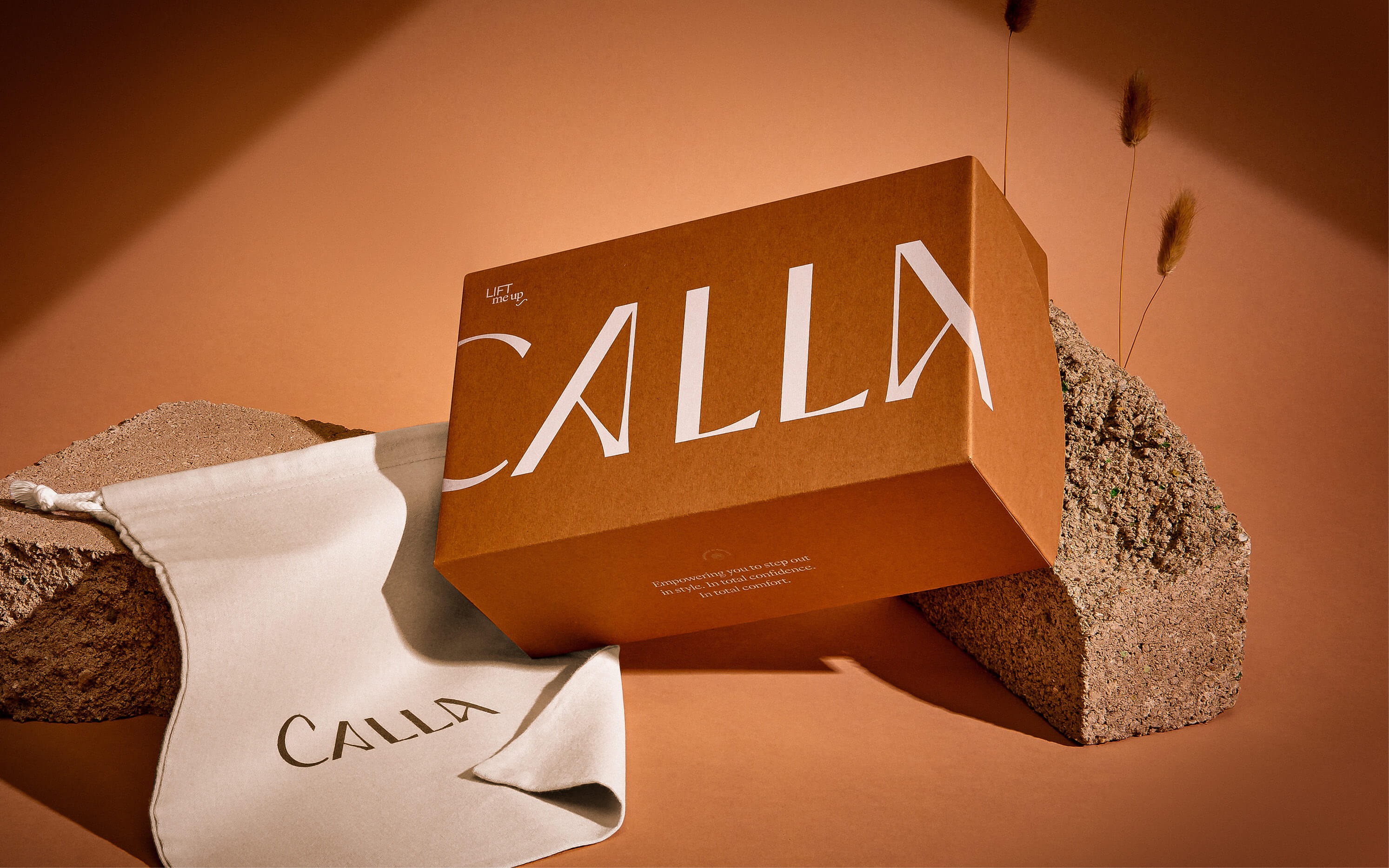
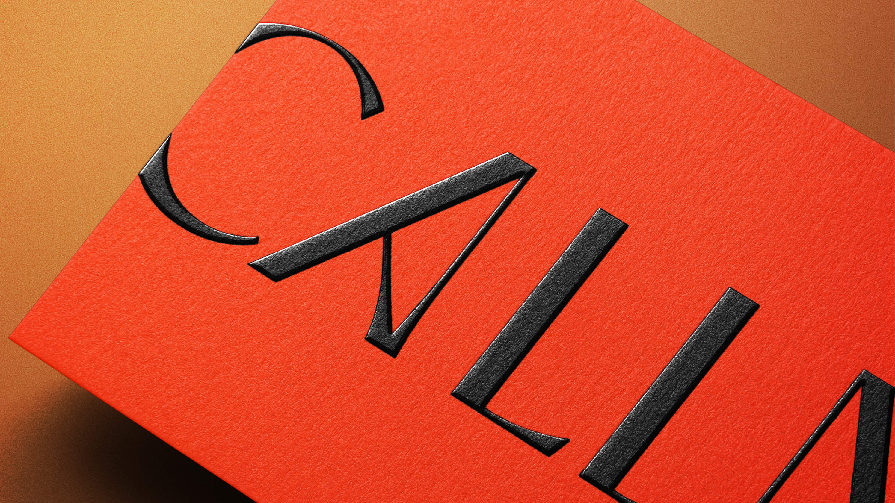
The logo was designed to align with their premium brand positioning, with generous letter spacing and an elegant serif typeface. We deliberately explored type that felt elongated and that tapped into our concept of raise up and standing tall, whilst referencing a subtle nod to heels using crafted crossbars within the letter forms of the A’s.
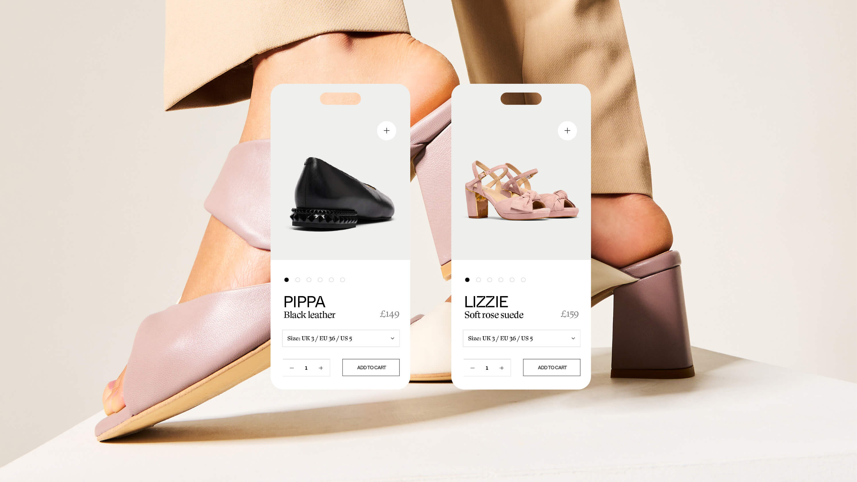
The new branding is now used across packaging, their website, and on the shoes themselves. Founder Jennifer Bailey added: “The feedback we’ve had has been incredible – the new look and feel together with the launch of our new improved range has dramatically increased revenue this year.”.
CREDIT
- Agency/Creative: Dawn
- Article Title: Empowering Brand Redesign: Calla’s High-End Shoe Design with Purpose
- Organisation/Entity: Agency
- Project Type: Identity
- Project Status: Published
- Agency/Creative Country: United Kingdom
- Agency/Creative City: Cheadle Hulme
- Market Region: Global
- Project Deliverables: Art Direction, Brand Guidelines, Brand Identity, Brand Redesign, Brand Refinement, Branding
- Industry: Fashion
- Keywords: rebrand, calla, branding,
-
Credits:
Creative Agency: Dawn Creative


