Brand overview
Established by Associate Professor Dr. Nguyen Quang, known as a pioneer in Urology and Andrology in Vietnam, Q+Medic was established to make up for the deficiencies in both professional and empathetic healthcare regarding gender matters. Focusing on male patients and urological issues in the beginning,
Dr. Nguyen Quang realized there was a big lack of consideration and compassion for postpartum women and the LGBTQ+ community in medical consultations and treatment practices.
To meet these needs, Q+Medic expanded its services to include a network that specialized in gender health and urology. It is dedicated to providing quality, compassionate care for individuals of all ages and genders while cultivating a well-informed community on issues related to gender in order to enhance the public health of its population.
Direction
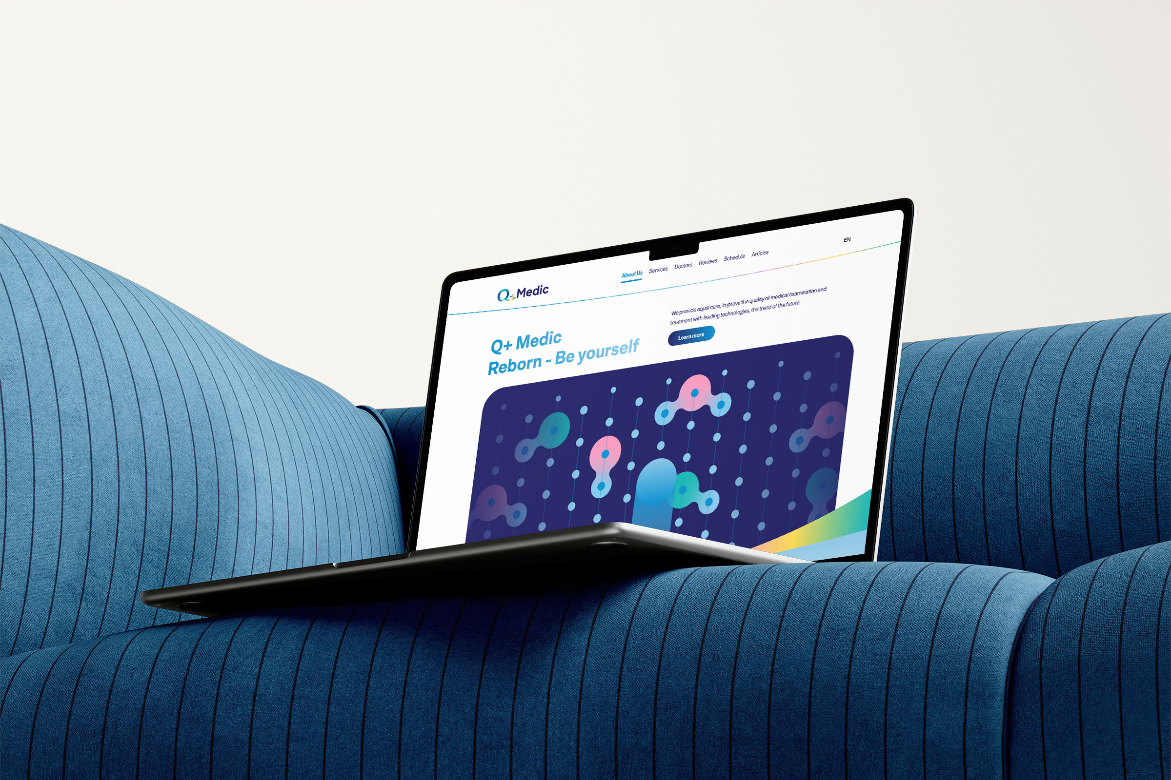
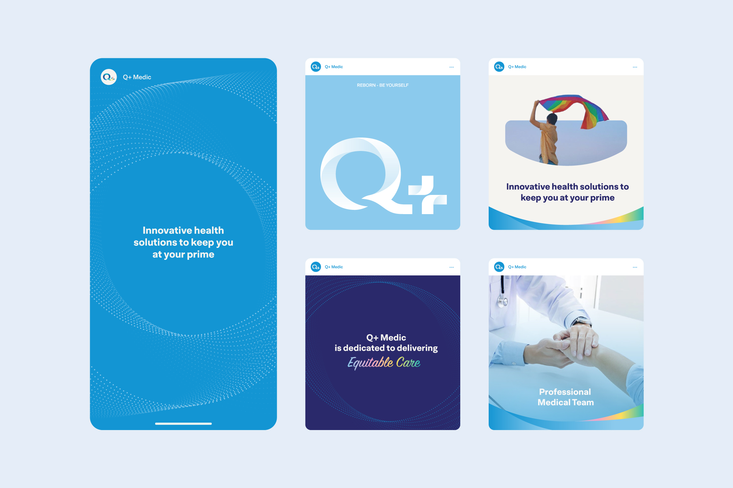
The design methodology adopted embodies basic principles of privacy, comfort, and inclusiveness in the healthcare sector, especially on sensitive issues related to gender and reproductive health. The aim was to create a visual identity that conveys professionalism, inclusivity, and accessibility for people of all ages.
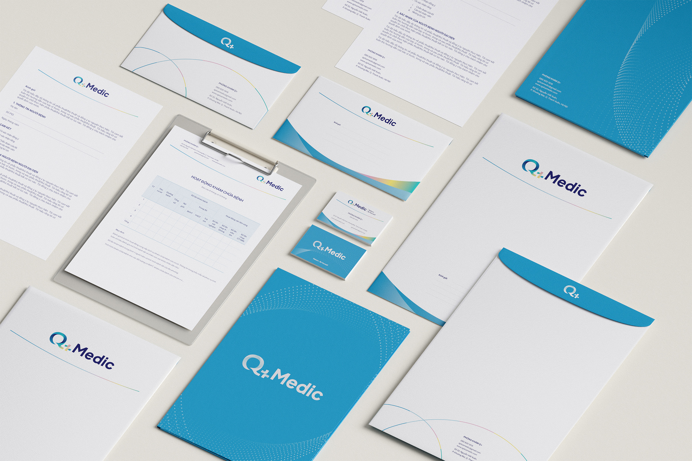
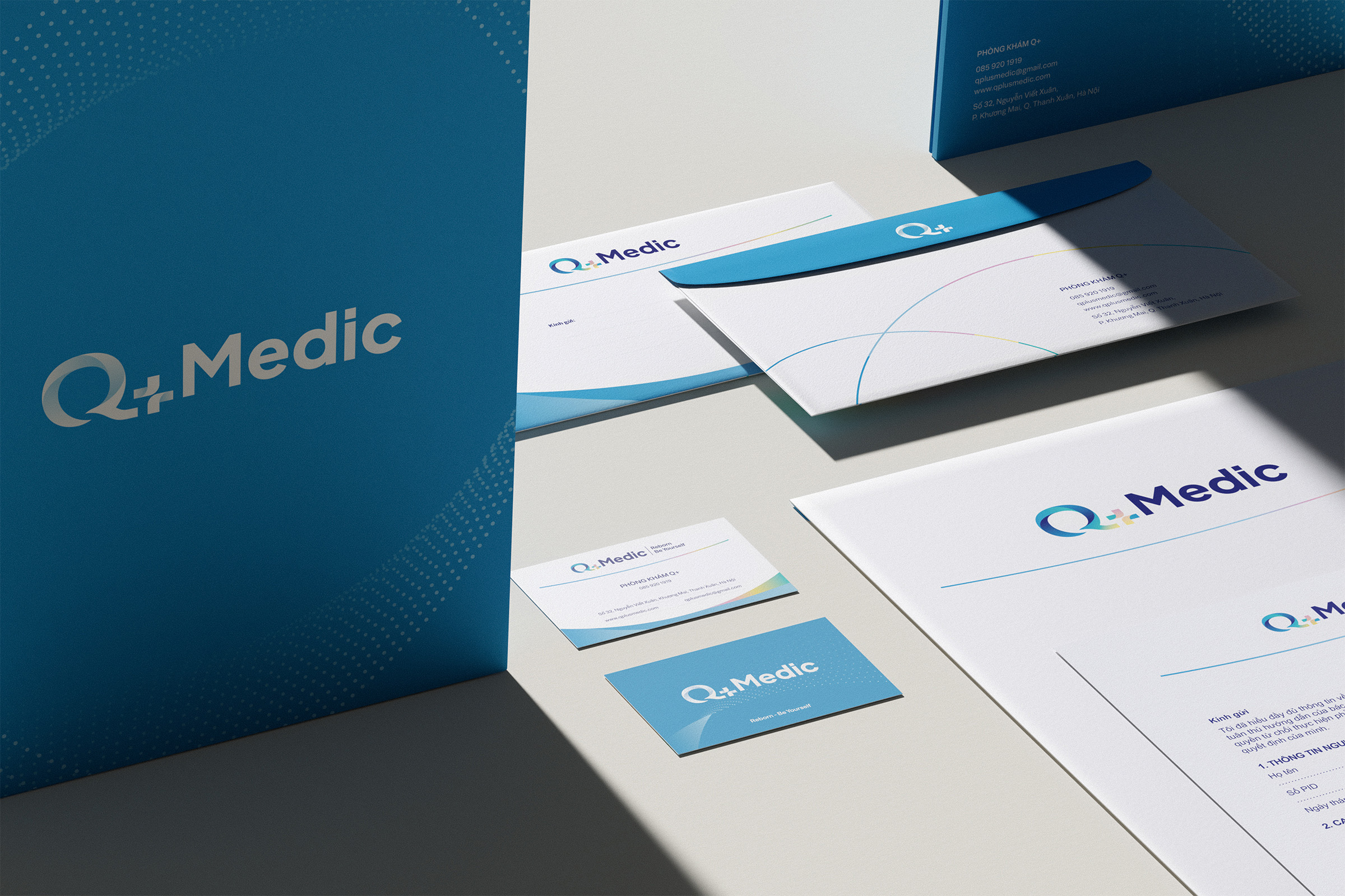
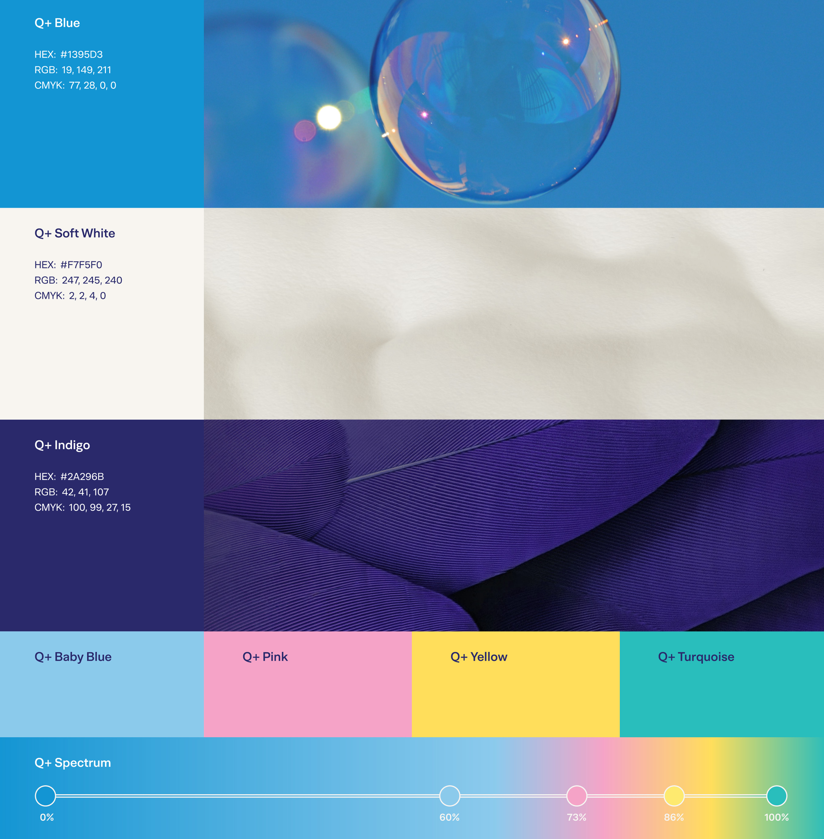
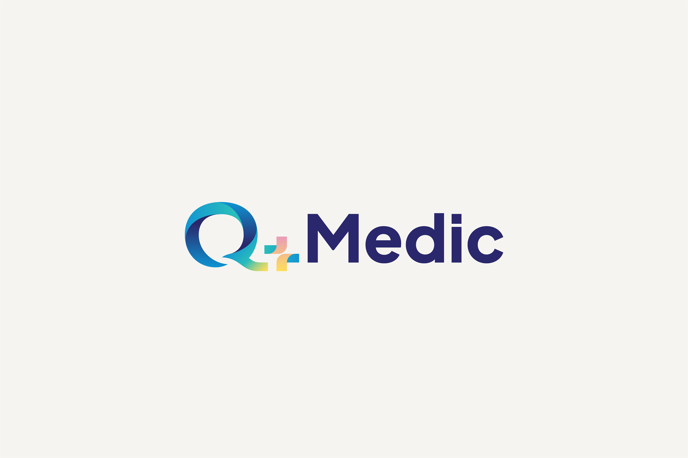
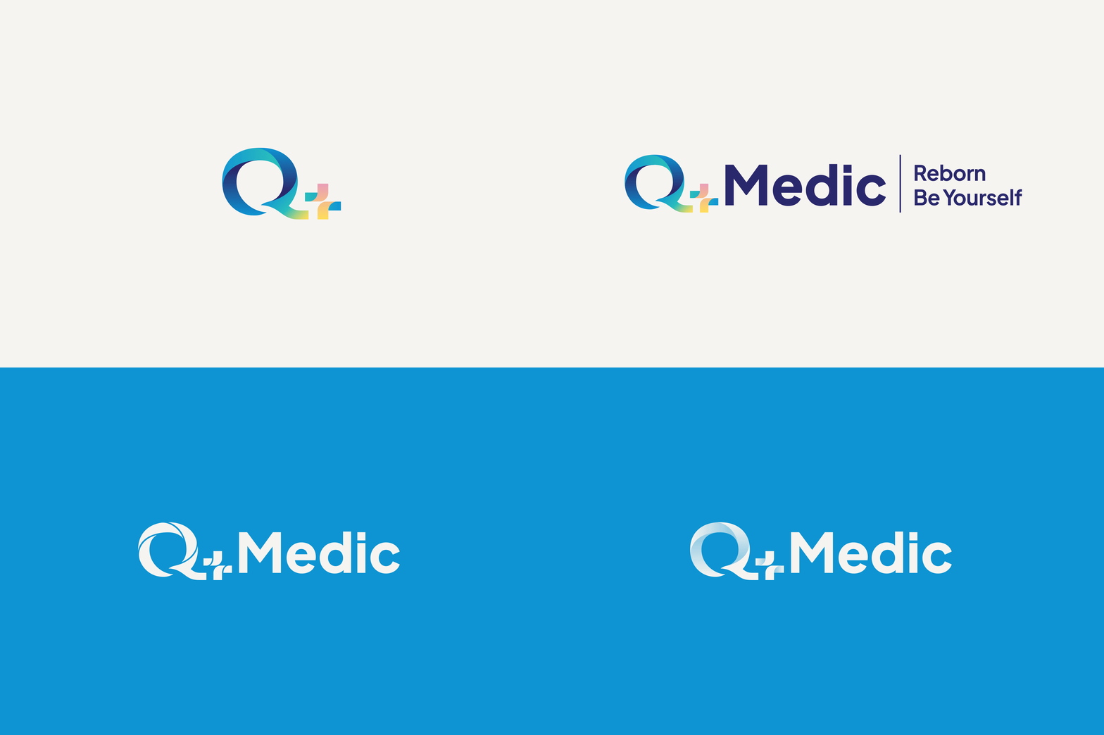
The “Q+” symbol is the central part of the logo, forming a warm and recognizable icon that resonates across diverse demographics. The color palette encompasses a spectrum of genders, remaining modern and approachable. This design conveys empathy and care, while being highly inclusive, especially toward the LGBTQ+ community.
1. Logo Design Description
– The “Q+” Symbol
– The “Q” is crafted with smooth curves, creating a welcoming and harmonious shape. The gradient shades of blue symbolize trust, calmness, and medical professionalism.
– The “+” symbol, integrated seamlessly into the “Q,” uses a combination of pastel shades (pink, yellow, blue, and green) that represent inclusivity and diversity. These colors reflect a spectrum of genders and identities, with an emphasis on the LGBTQ+ community and people of all ages.
– Together, the “Q+” forms a modern and recognizable icon that conveys warmth and openness, making the logo memorable and approachable.
2. Typography
– The word “Medic” uses a clean, bold, sans-serif font, symbolizing reliability, clarity, and a professional medical standard.
– The choice of a deep blue for the text reflects trust, authority, and confidence—core values for any healthcare provider.
3. Tagline
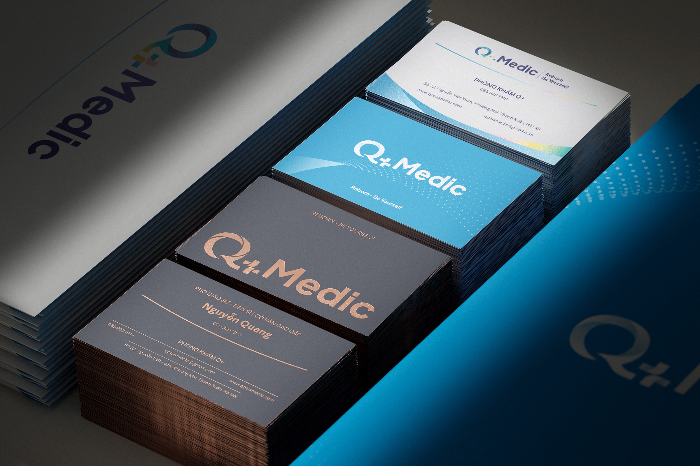
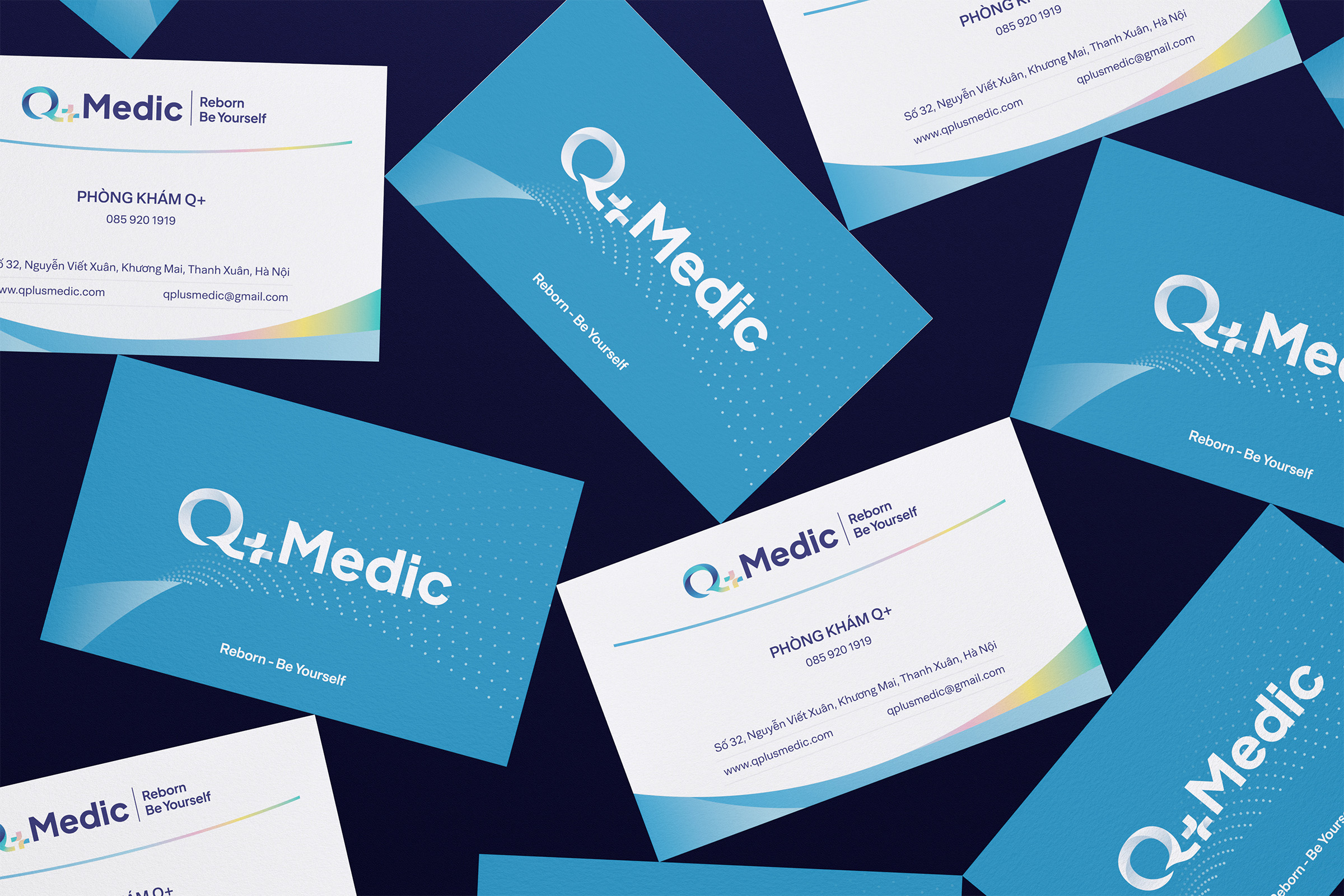
– “Reborn Be Yourself”—this empowering statement complements the logo’s visual identity by promoting individuality, self-acceptance, and compassionate care. The alignment with the bold typography enhances readability while resonating emotionally with the audience.
Artistic Methodology
Inclusivity Through Color: The pastel colors in the “+” symbol were chosen to reflect diversity and gender inclusivity. The thoughtful use of soft shades avoids harsh contrasts, fostering a sense of comfort and empathy. Privacy and Comfort in Shapes: The rounded, smooth curves of the “Q” and “+” symbolize care, safety, and trust, aligning with the brand’s focus on gender-sensitive and empathetic healthcare. Modern Simplicity: The minimalist and clean design ensures the logo remains timeless, professional, and highly versatile across different mediums (digital platforms, print, or signage). Accessibility: The clear, bold typeface ensures legibility for all demographics, reinforcing the brand’s mission to be accessible to individuals from diverse backgrounds.

CREDIT
- Agency/Creative: Brio Studio
- Article Title: Empowering All Genders: The Inclusive Vision Behind Q+Medic’s Visual Identity by Brio Studio
- Organisation/Entity: Agency
- Project Type: Identity
- Project Status: Published
- Agency/Creative Country: Vietnam
- Agency/Creative City: Hanoi
- Market Region: Asia
- Project Deliverables: 2D Design
- Industry: Health Care
- Keywords: brand identity, healcare, logo design, gender matter, LGBTQ+
-
Credits:
Art Director: Hai Ninh
Project Manager: Hai Ninh
Designer: Hai Ninh, Hoang Viet


