Empower (previously empowerHER) is an international organization that connects, supports, and empowers children and young adults who have experienced parent loss. The organization offers events and a one-of-a-kind mentorship that pairs children with strong, inspiring mentors who know what losing a parent feels like. Today, the organization unveils a full rebrand by Brooklyn-based strategy and design studio, Team.
The rebrand signals an expansion of the organization’s initial mission, which focused on supporting young women who had experienced mother loss, broadening the organization’s reach to all children and young adults of parent loss.
Empower Founder, Cara Belvin explains “This rebrand is so critical to our organization. We have been serving girls and young women who have experienced the profound loss of their mothers since our inception, and today we proudly serve all children and young adults who’ve lost their mother or father. An expansion like this is no small feat and is an enormous undertaking — however, we are more confident than ever in our mission. Our goal will remain the same, to help teach children and young adults that this loss is survivable.”
Amy Globus, Co-Founder and Creative Director at Team says “This refreshed brand will allow Empower to show up as the national, leading organization that they are. The brand supports Empower’s mission and allows them to do what they do best: inspire personal growth and empowerment for more children than ever before.”
Mentors with a mission
In 2013, Cara Belvin founded empowerHER to help support young girls who were navigating the loss of a mother, a challenge that mirrored her own lived experience of grieving her mother at a young age. As the organization has grown, Belvin and her team have expanded their mission: today they’re out to help any and all young people, regardless of gender, cope with parent loss by connecting them with mentors who have been through similar experiences of grief and hosting events to build a supportive community.
Belvin shares more insight into the expansion: “This is an enormous endeavor for our young organization and we are excited to welcome male mentors and serve boys and nonbinary youth. For years, families have asked why we did not serve all children of any parent loss and the answer was a lack of resources. However, with a recent transformational one-million-dollar gift from The Hale Family, our vision to become more gender-inclusive has become a reality.”
Belvin tasked the Brooklyn-based agency Team (whose wide-ranging client list includes Pfizer, Red Bull Arts, and The Bronx Museum) to reimagine the empowerHER brand to reflect the organization’s expanded scope.
The nonprofit organization needed a new name, logo, messaging, and visual identity that was scalable. It needed to be inclusive of all children, not just young girls, and feel truer to their mission: to empower children who have experienced parent loss, building a unique, uplifting community defined by shared experience and connection.
Empowering all
“From start to finish, this was a strategy-driven project,” says Sam Lee, Head of Strategy at Team. “The main challenge was figuring out how to expand the brand from one specific demographic — girls who’ve experienced mother loss, to a wider demographic, all children of all types of parent loss. We needed to create something that felt approachable to children without feeling childish, while simultaneously appealing to potential adult mentors and donors,” says Lee. “We also needed to communicate that Empower isn’t a replacement for a lost parent, but a friendly face to help carry the weight or celebrate moments of joy. The strategy became about not just telling a story of surviving parent loss, but how you can thrive.”
A new name leads the charge in signaling the expansion of Empower’s mission and doubles down on its commitment to uplifting young people. The shift from empowerHER to Empower is simultaneously subtle and loud — it maintains the equity of the organization’s long-standing name, while extending a hand to children who previously might have felt excluded by the organization’s initial focus on girls.
The new inclusive name is supported by a wider brand system that preserves Empower’s history and underpins its evolution. It speaks clearly to the unique support Empower can offer through clarified messaging that tells an empathetic and uplifting story about navigating grief.
Taking up space
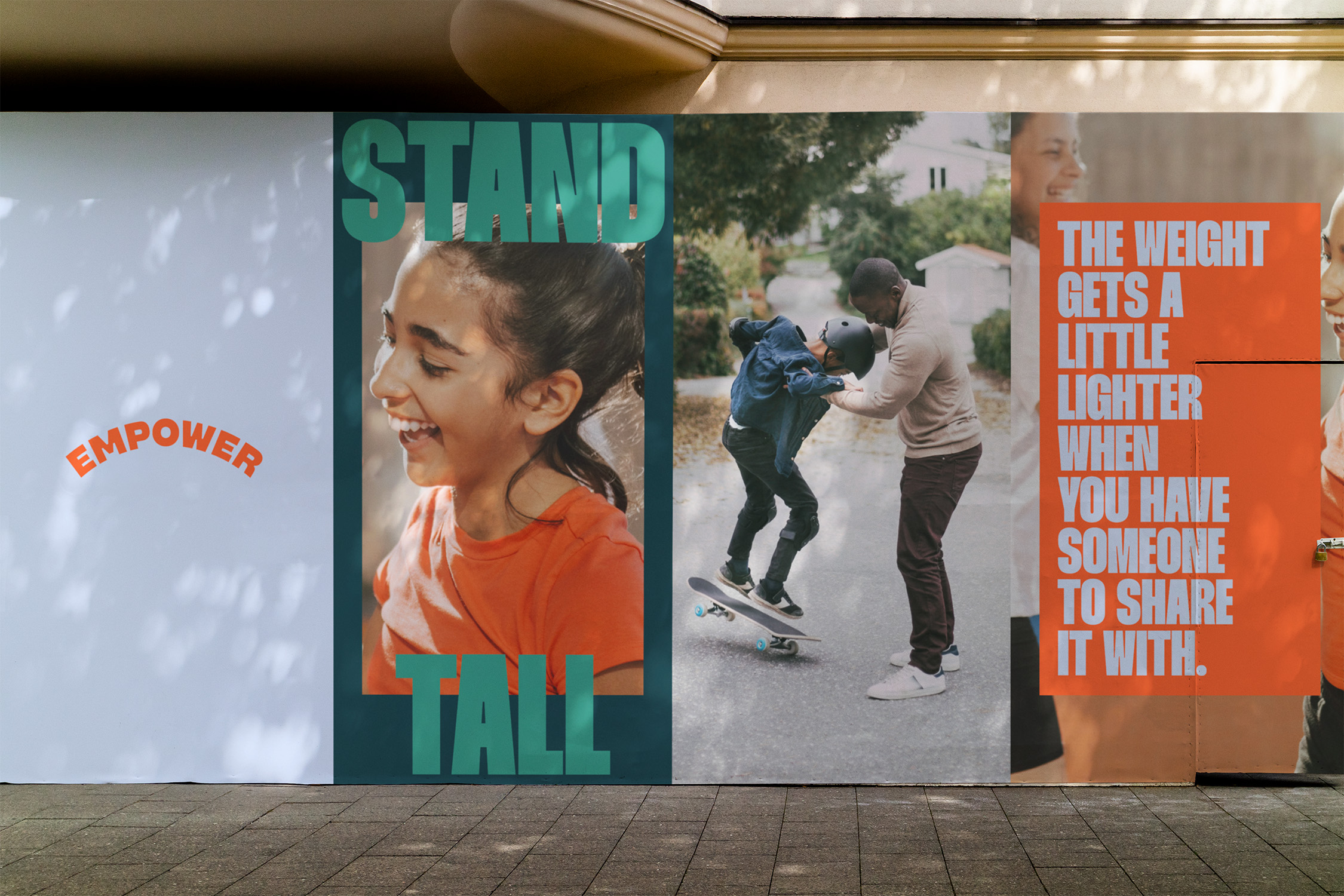
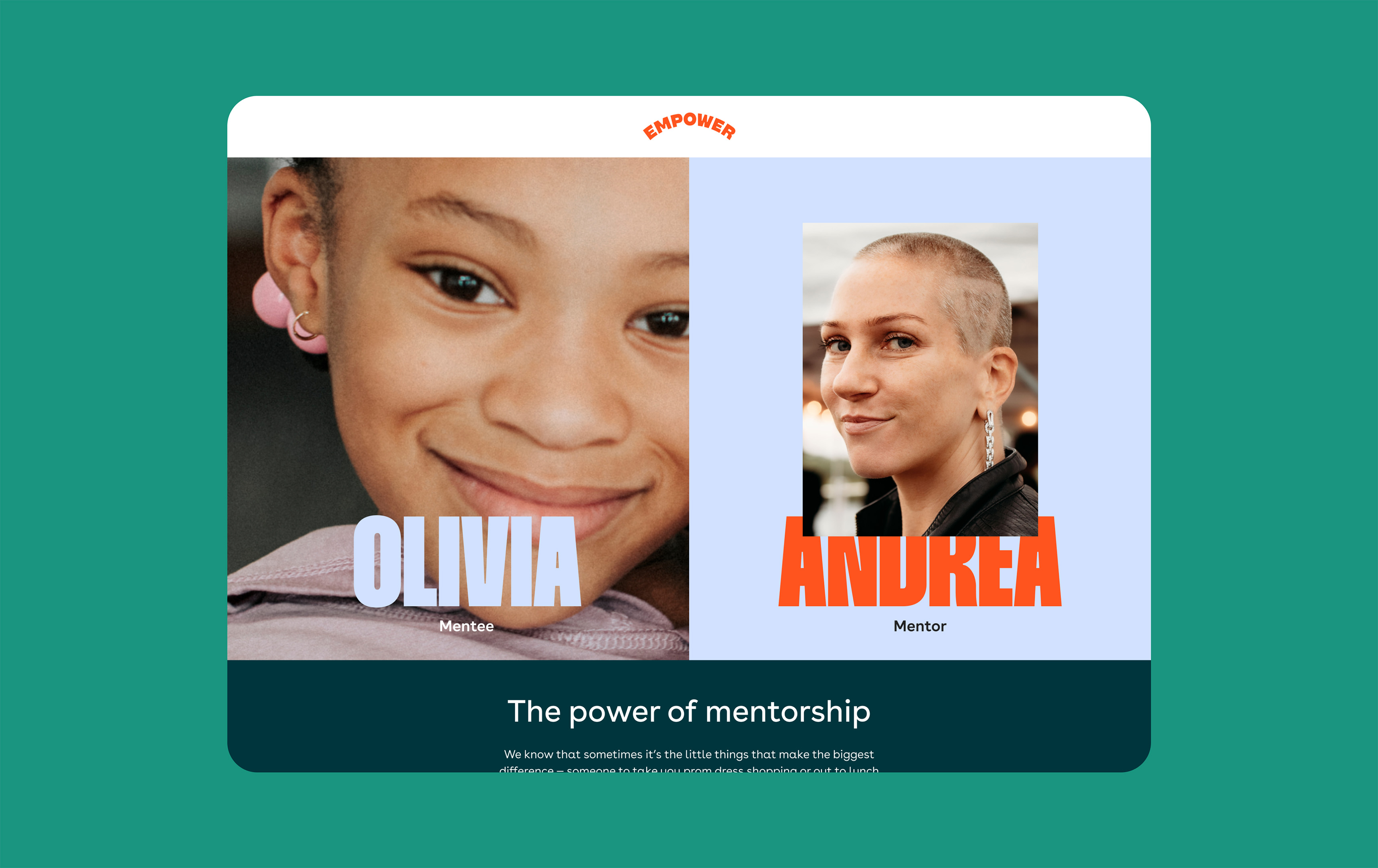
Empower’s visual identity breaks the mold of muted, somber color cues typically associated with grief and support organizations, as well as working to support the expanded mission to serve all children coping with loss, not just girls.
Team helped Empower identify core values that they wanted to express visually, landing on one crucial word: uplift. Stephanie Zabala, Associate Design Director at Team says: “When we focused on that word, ‘uplift,’ it led to a visual brand that is confident, encouraging, and isn’t afraid of taking up space.”
Team’s design embraces this with a visual identity that rejects the common messaging of pity or sorrow. Instead, Empower’s new visual identity summons confidence and encourages the young people Empower supports to find their strength.
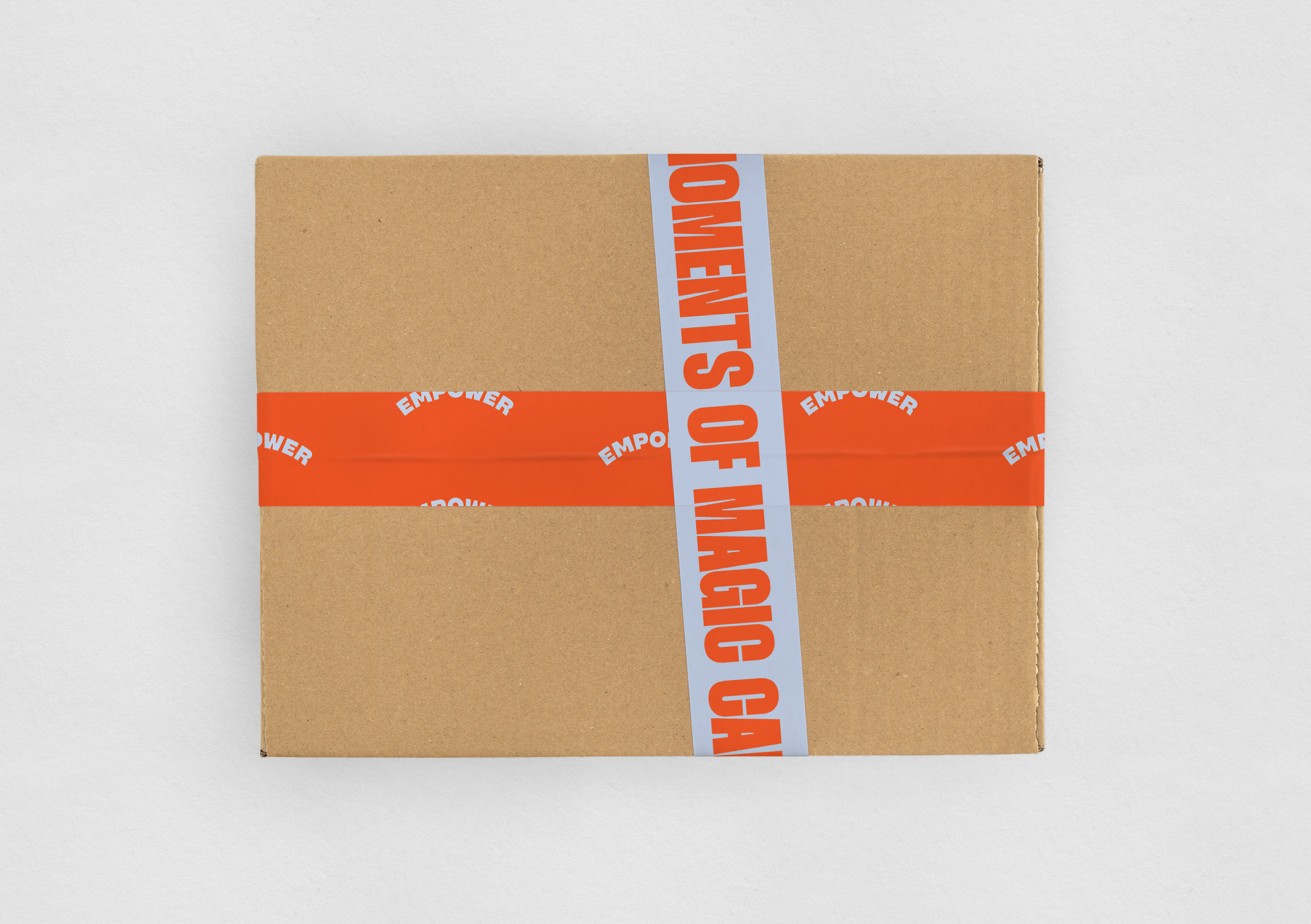
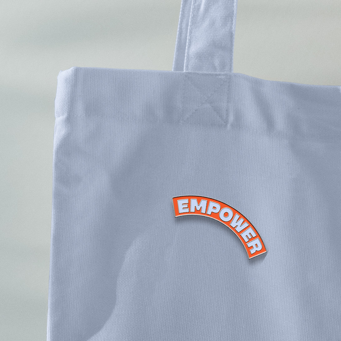
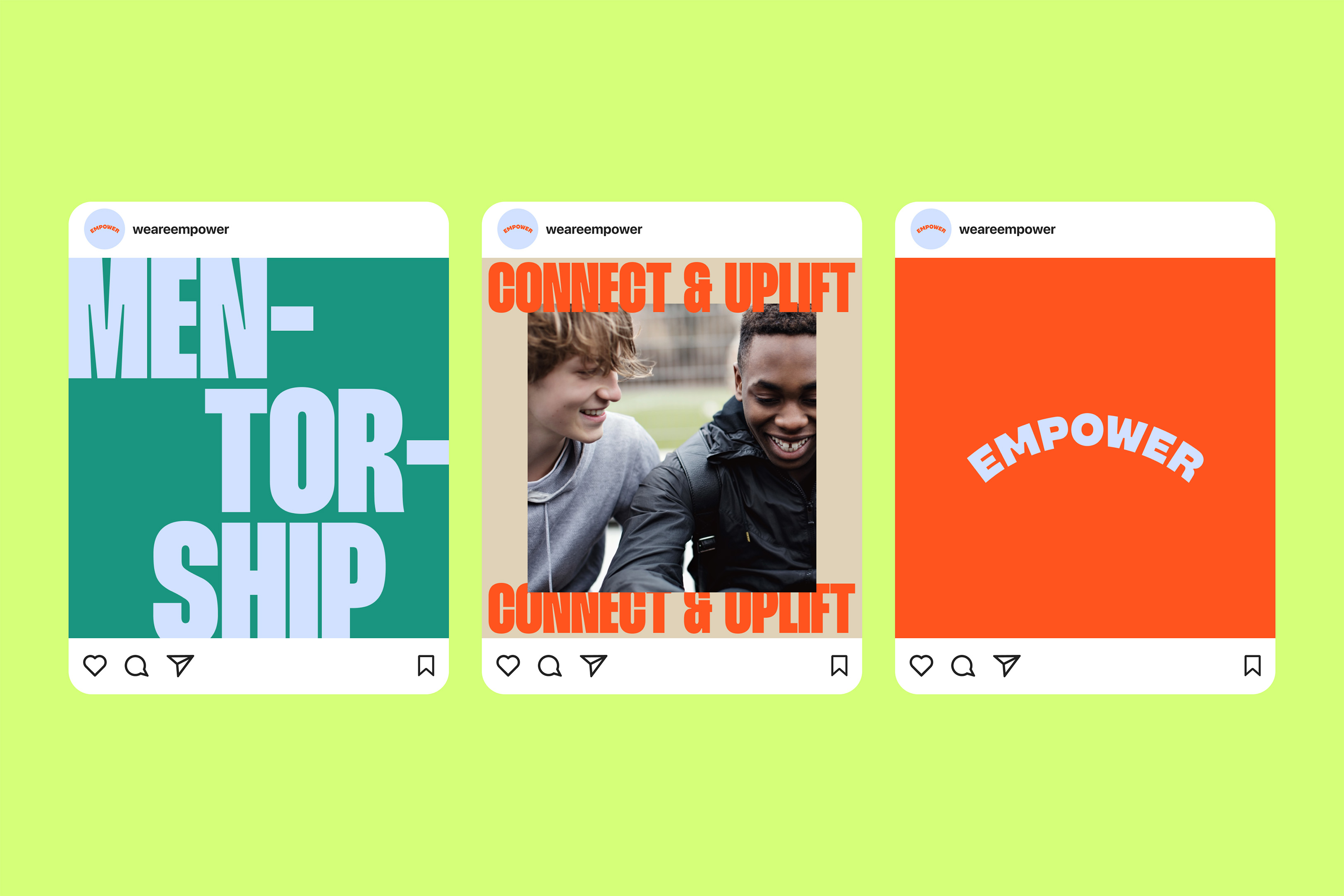
Empower’s new logo, a subtle arch, is a visual representation of puffing up your chest.
Full bleed imagery is designed to take up space in the system, while a tall, bold typeface breaks through the grid to convey the uplifting mission behind Empower.
Bright, bold colors emphasize the dynamic, human-led support that Empower offers.
Meanwhile, a new website, also designed by Team, showcases a streamlined user experience and an expanded Stories section featuring powerful, inspiring stories from the Empower community. It will serve as a valuable marketing and recruitment tool as the Empower organization grows and expands.
Inspiring impact
This new brand gives Empower the right tools to communicate effectively at every level with clear and compelling storytelling.
Team’s Sam Lee sums up the impact: “Empower’s mission is, and always has been, inspiring. The new brand doesn’t try to change the core of Empower — it embraces it and acts as a megaphone to amplify its message. As they grow at scale, the new brand is designed to grow with them and make it easier for them to share their story.”

CREDIT
- Agency/Creative: Team
- Article Title: EmpowerHER Becomes Empower in New Gender Inclusive Rebrand by Team
- Organisation/Entity: Agency
- Project Type: Identity
- Project Status: Published
- Agency/Creative Country: United States
- Agency/Creative City: New York
- Market Region: North America
- Project Deliverables: Brand Design, Brand Naming, Brand Strategy, Logo Design, Web Design
- Industry: Non-Profit
- Keywords: Youth, Mentoring, Nonprofit, Identity Design, Naming, Gender Inclusive
-
Credits:
Creative Director: Amy Globus
Creative Director: John Clark
Stephanie Zabala: Associate Design Director
Sam Lee: Head of Strategy


