


EmoSense is a medical center for children with alexithymia. Alexithymia is a neuropsychological phenomenon characterized by significant difficulties in recognizing, expressing and describing one’s own emotions. The main goal of the children’s center is to teach children with aleximatosis to control and recognize their emotions, as well as to help them socialize and find new friends. The emotion center works and looks the same as an ordinary school, there is nothing hinting at medical topics here, so that the child feels as comfortable as possible in a new environment for him.
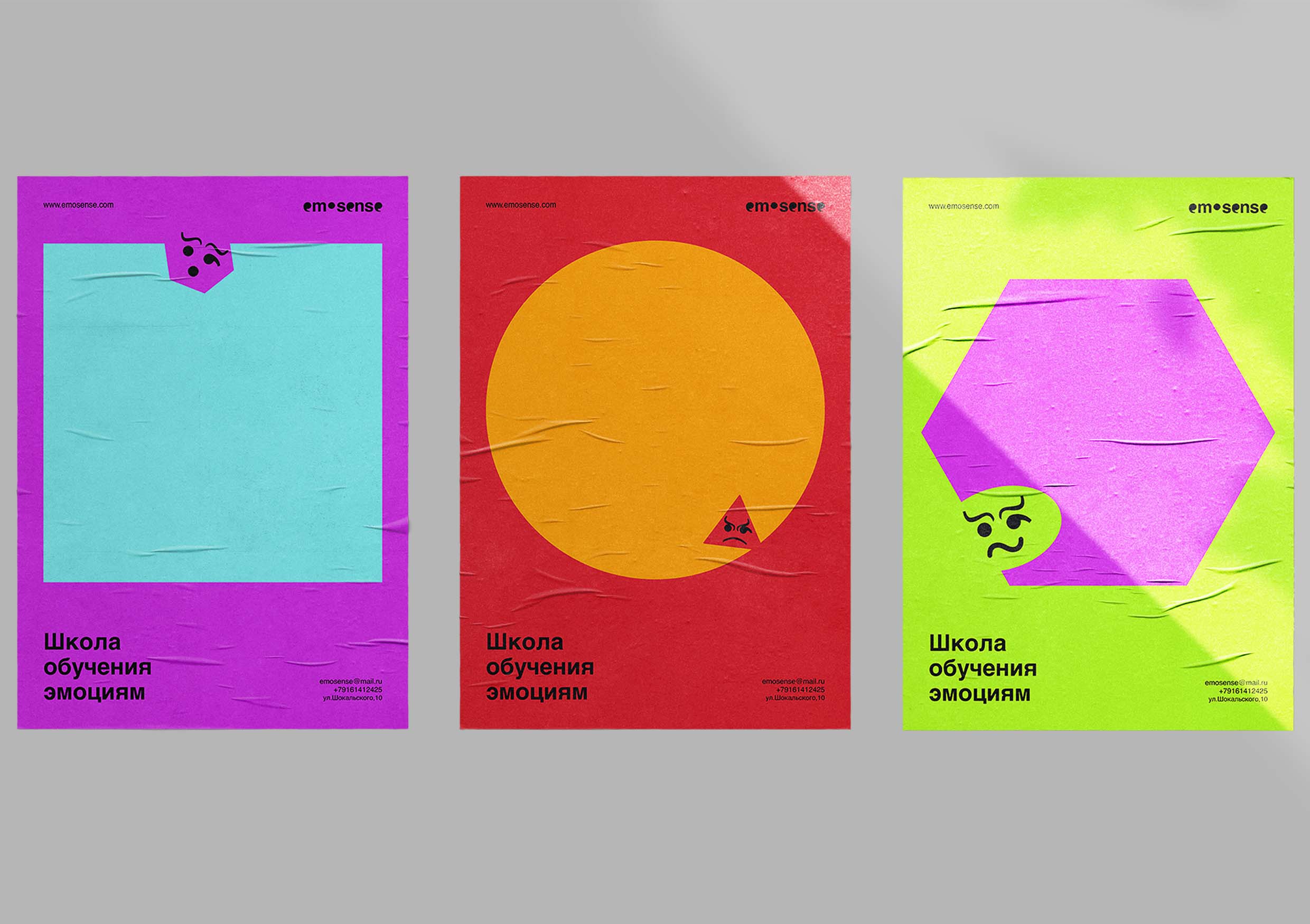
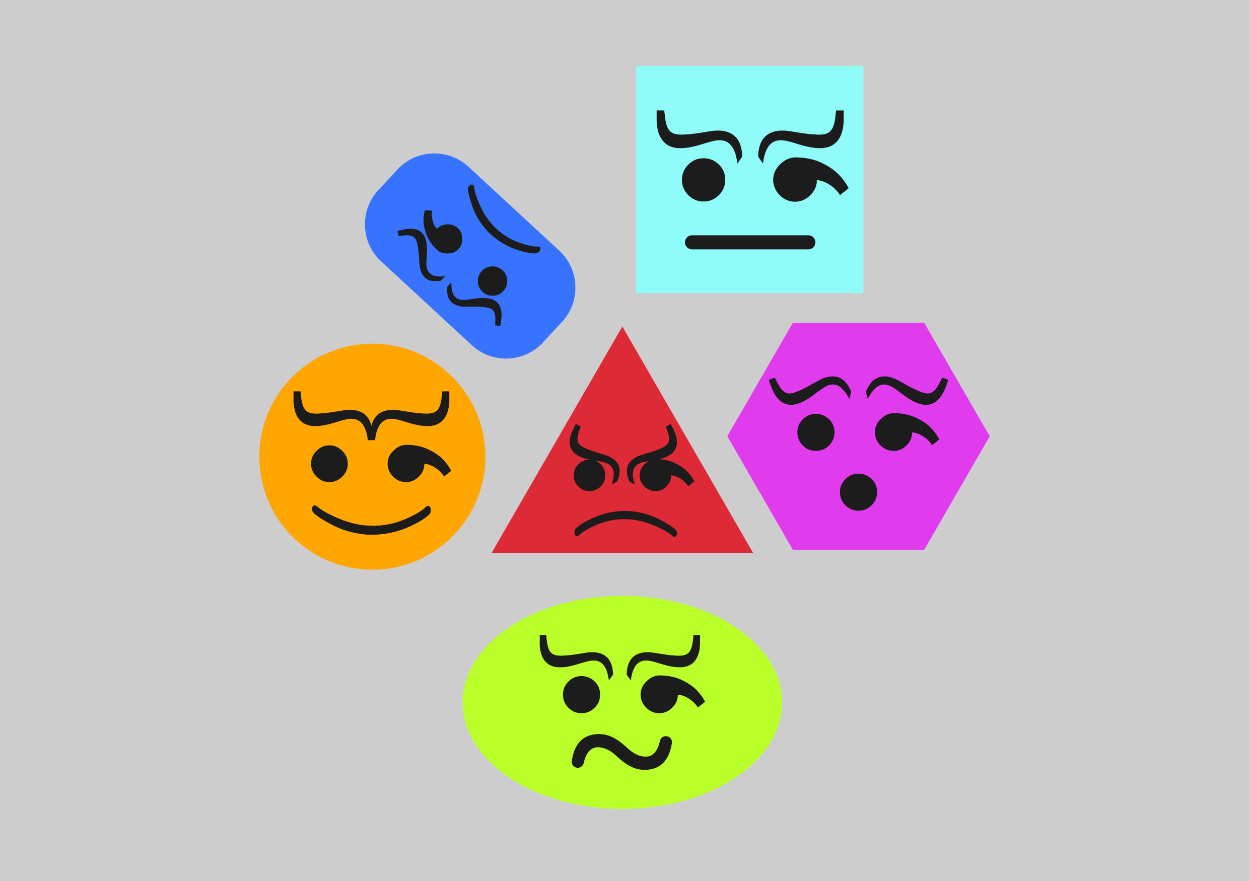
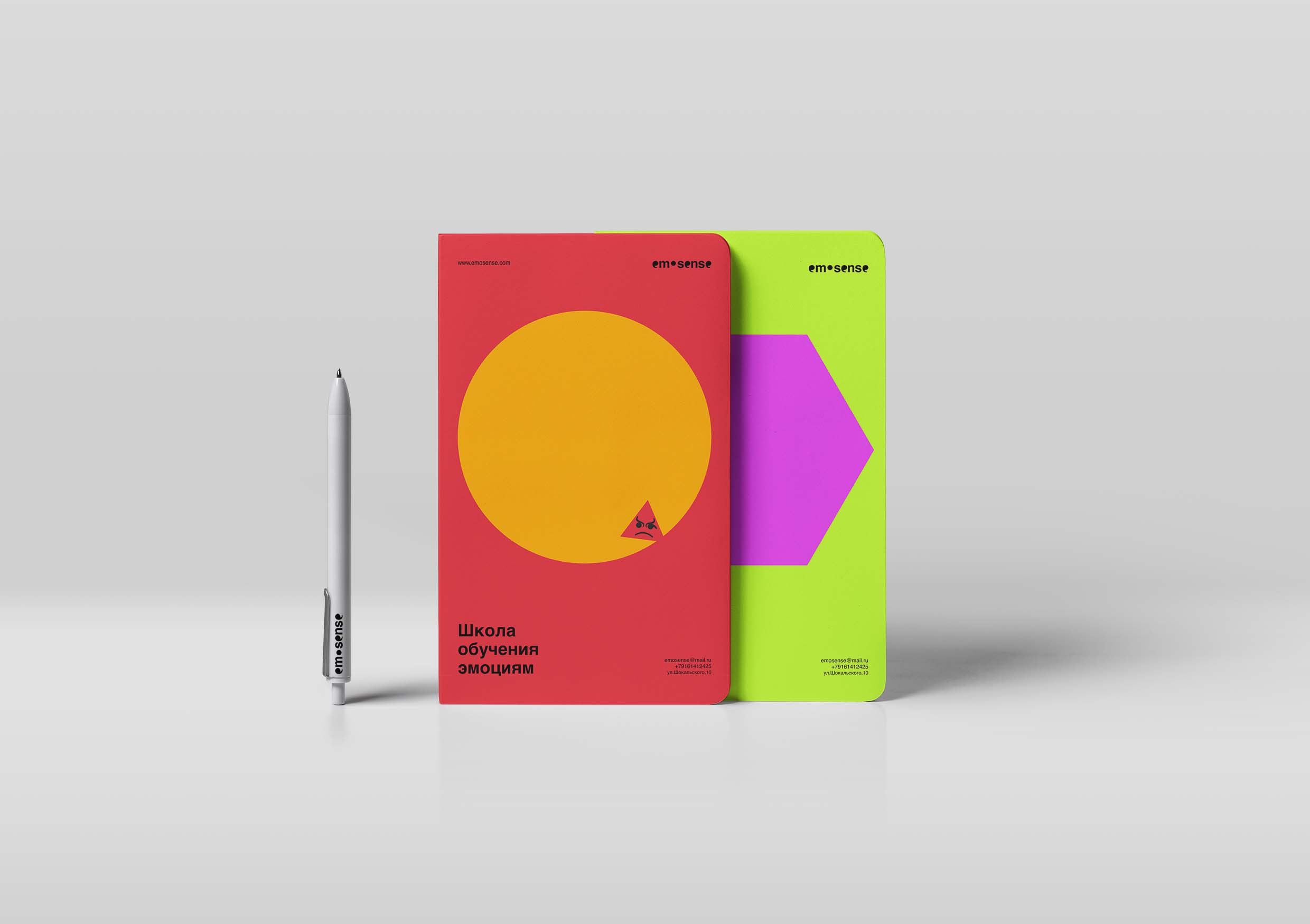
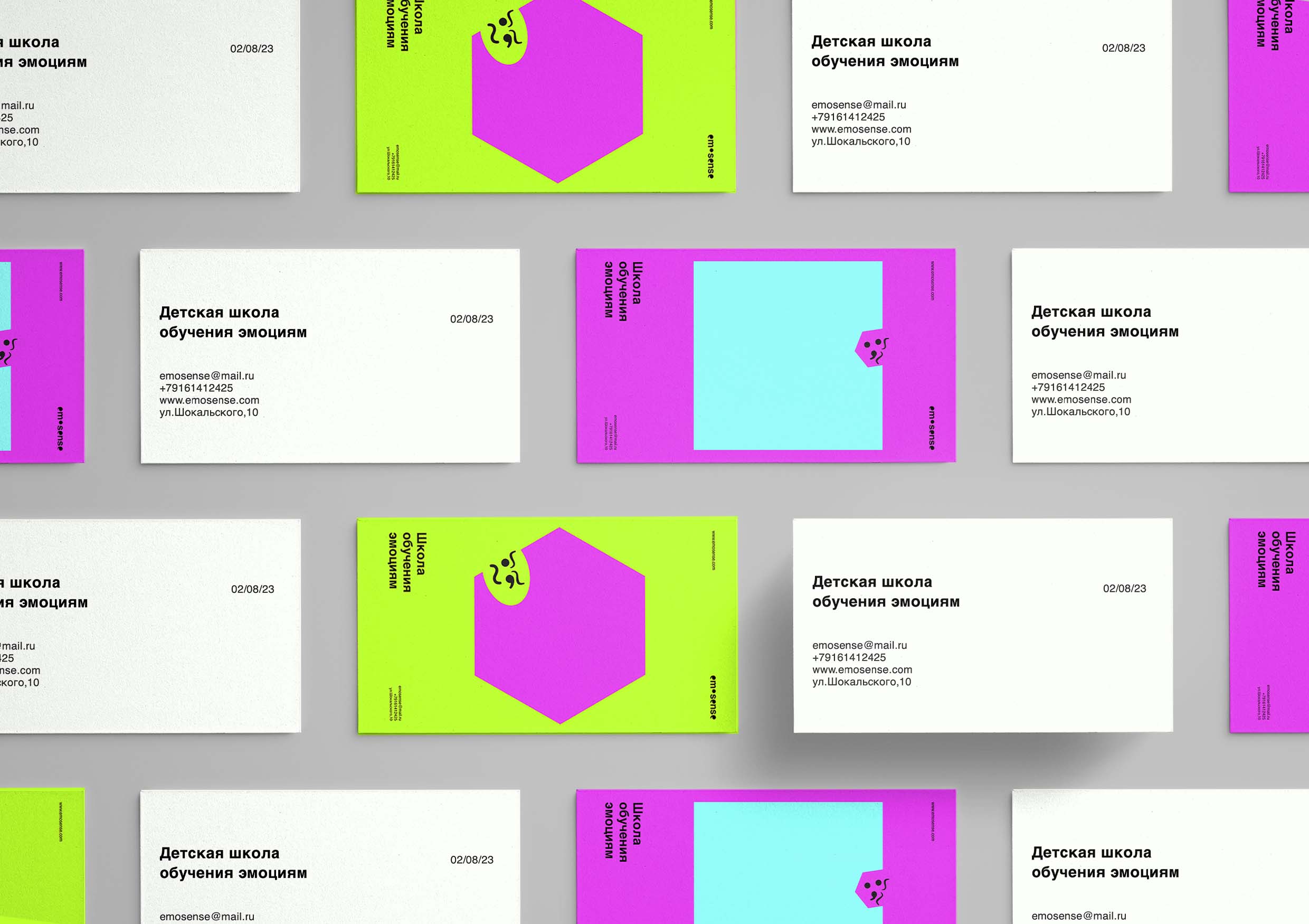
The metaphor for creating the EmoSense identity was human emotions, which are formed by punctuation marks. Why punctuation marks? Punctuation marks in the text are responsible for the transmission of emotions, they can express delight or joy, sadness or surprise. People are used to reading texts with punctuation marks and take them for granted, subconsciously reading the color of the text, but what if we imagine that there are people who cannot read punctuation marks? This is almost a direct analogy with how children feel who are unable to read emotions in the world around them. In the corporate style, markers of such emotional punctuations are placed in separate hints-faces that literally illustrate an emotion that a child can easily count. Each emotion has its own individual shape and color contrasting with other figures, which also helps to recognize it more clearly. Simple laconic shapes and lively faces form a bright and concise corporate identity. Punctuation marks also exist in the logotype, in the word “EmoSense” they replace the words “e” and “o”.

CREDIT
- Agency/Creative: Tsoy Daniil
- Article Title: EmoSense Identity Concept by Student Tsoy Daniil
- Organisation/Entity: Student
- Project Type: Identity
- Project Status: Non Published
- Agency/Creative Country: Russia
- Agency/Creative City: Tsoy Daniil
- Market Region: Global
- Project Deliverables: Brand Identity
- Industry: Health Care
- Keywords: Tsoy Daniil, brand identity
-
Credits:
Tutor: Tanya Dunaeva


