(English)
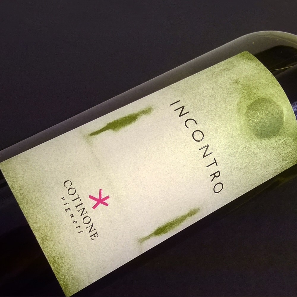
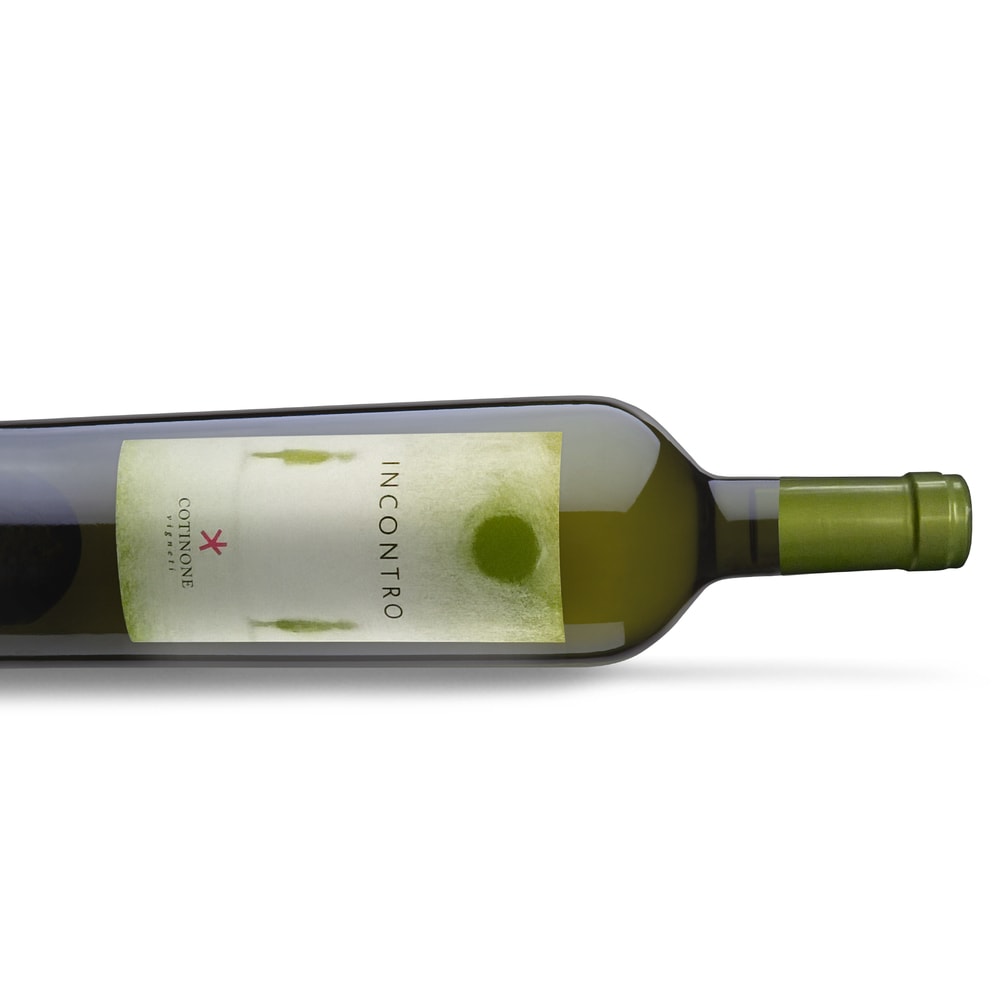
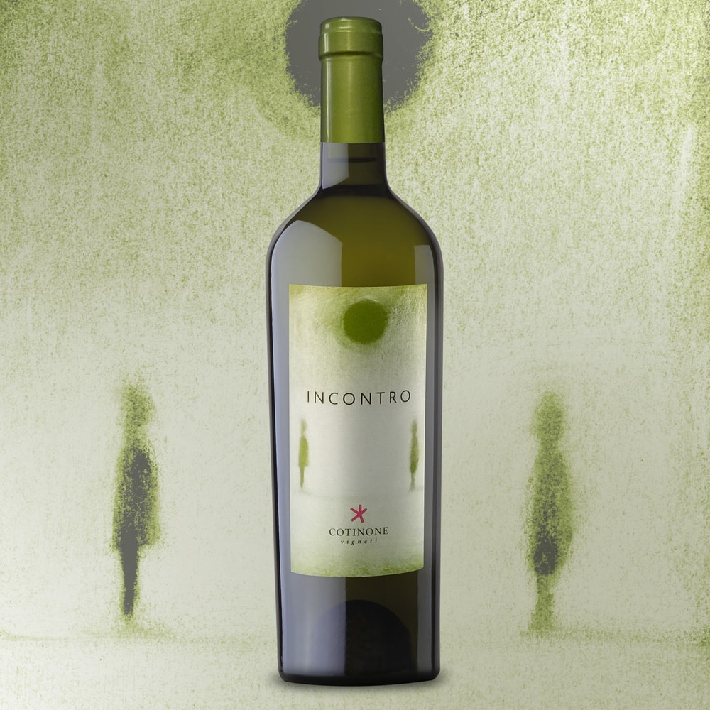
“Delicate appeal and ethereal charm for label design project of Incontro white wine.
The label’s focal point is the charcoal drawing, inspired by name of this wine and by its nature; in fact “Incontro” means blend between an Apulian native grape variety, such as Bombino Bianco, and an international variety, such as Chardonnay.
To express freshness and lightness we have drawn with delicate strokes and we have used fair colors. The raised print highlights wine’s name and brand and it enhances the design project.”
(Italian)
“Incontro, il nuovo bianco di Cotinone Vigneti
Appeal delicato e fascino etereo per il progetto di label design per il vino bianco Incontro dell’azienda Cotinone. Focus dell’etichetta è il disegno a carboncino, ispirato dal nome stesso di questo bianco e dalla sua natura di blend, un “incontro” straordinario tra un vitigno autoctono pugliese, il Bombino Bianco, e un vitigno internazionale, lo Chardonnay. I tratti del disegno sono lievi, quasi accennati, così come il colore, chiaro ed utilizzato in degradé, per esprimere freschezza e leggerezza. Il dettaglio tipografico della serigrafia lucida a rilievo permette di evidenziare in maniera discreta e raffinata il nome del vino e il marchio aziendale, impreziosendo il progetto.”