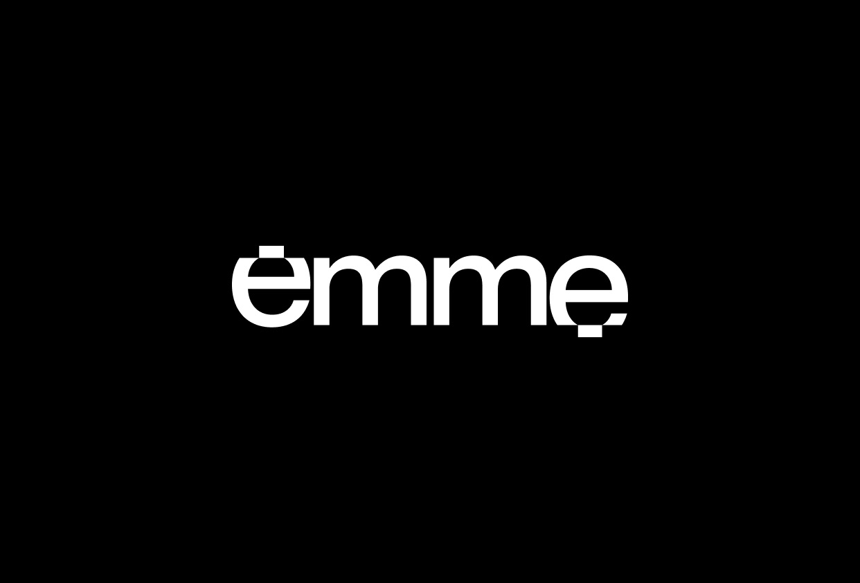
Emme is a new Italian studio, based in Bologna, focused on depicting reality with a brand new style. With three founders, Emme Studio offers services of Architectural visualization, Motion Graphics, Art Direction, Animation and Virtual Reality.
The goal was to create a visual identity that would highlight the values and the work created by the three young founders, attentive to new technologies and to what the current international panorama offers.
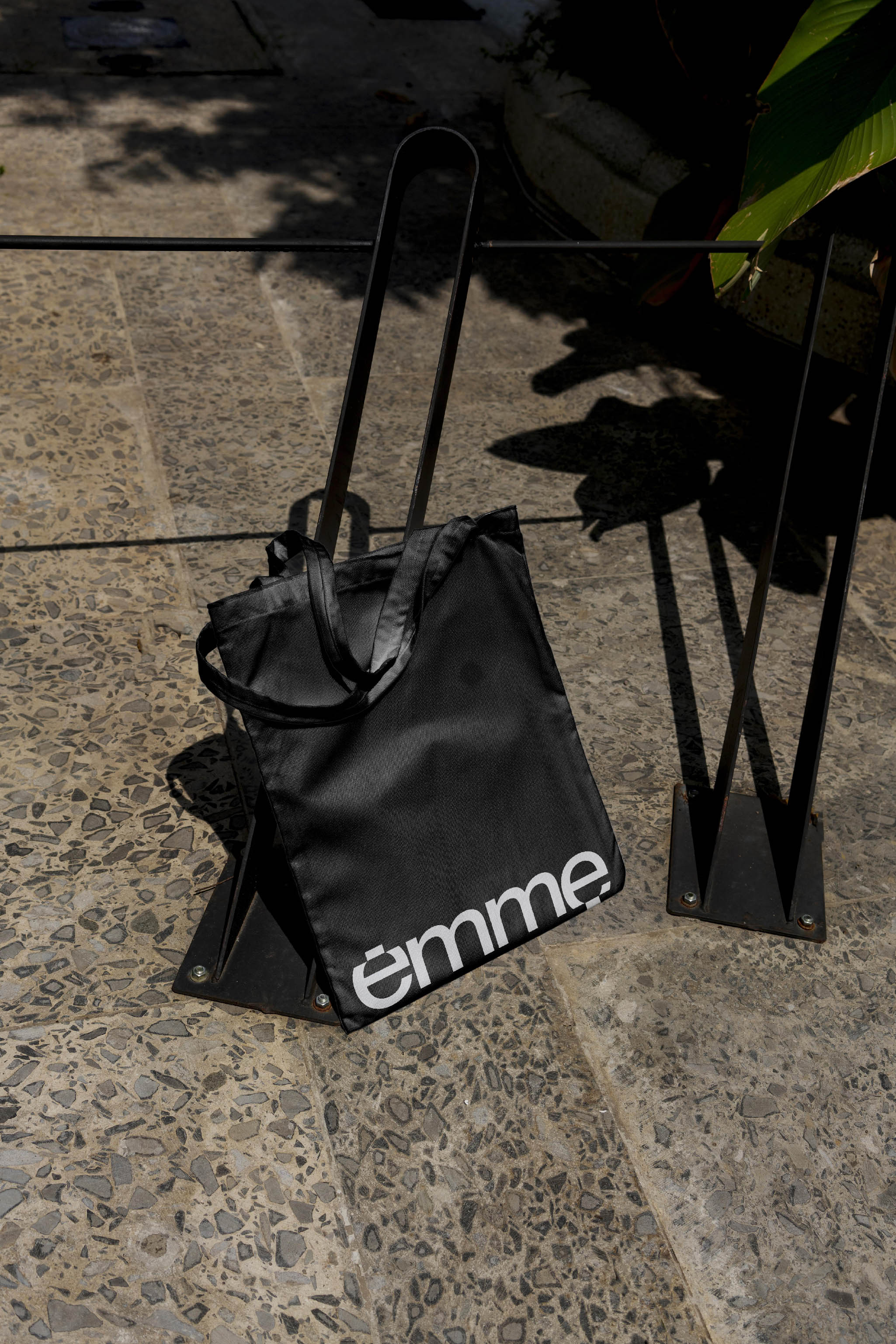
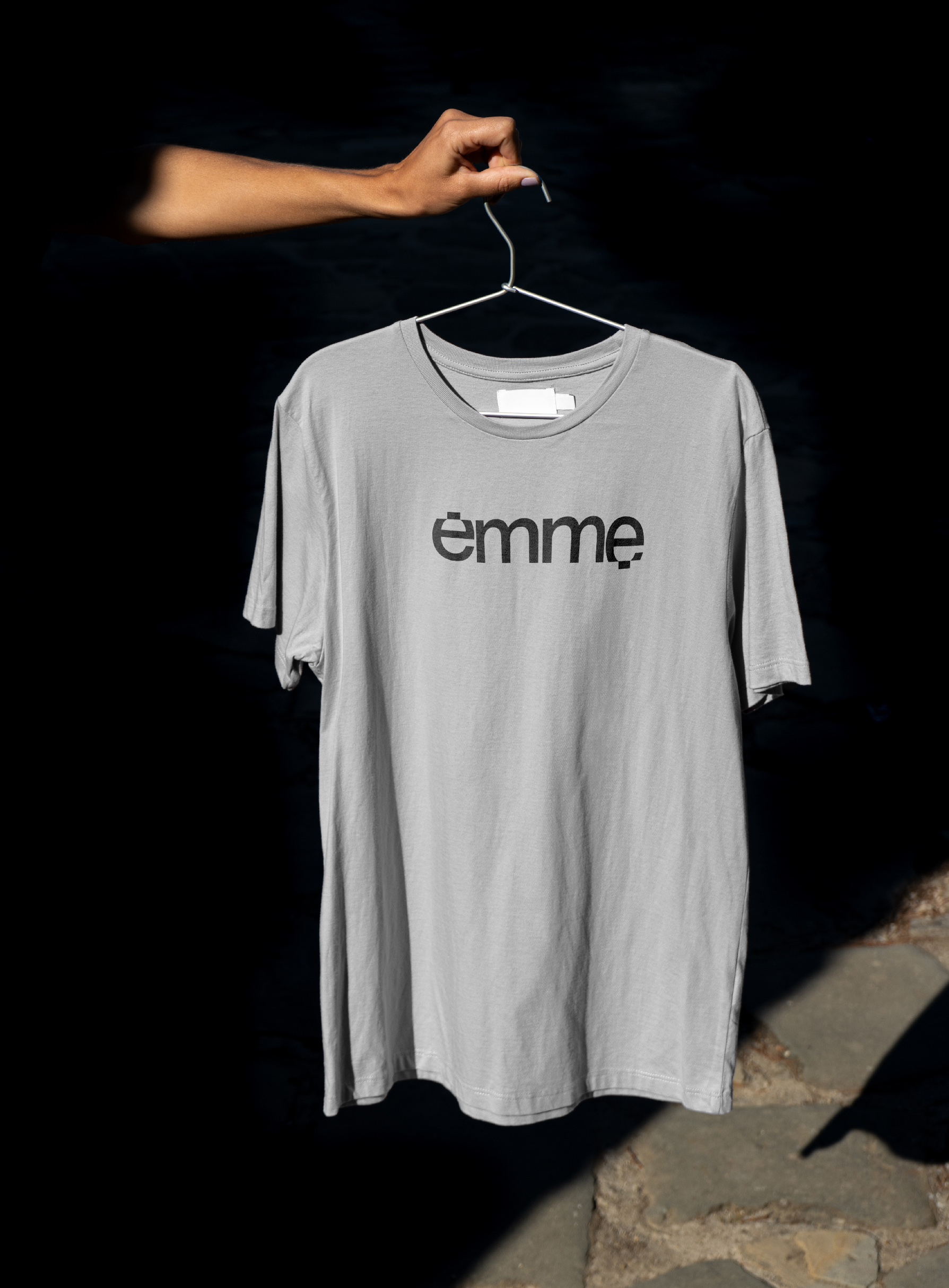
It was chosen to work on a customized logotype based on the Neue Montreal typeface, by Pangram Pangram Foundry.
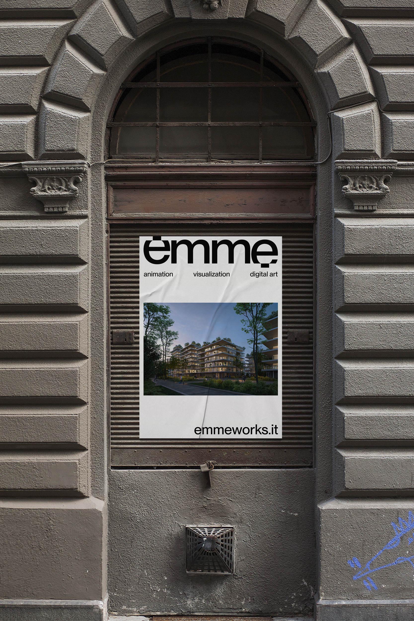
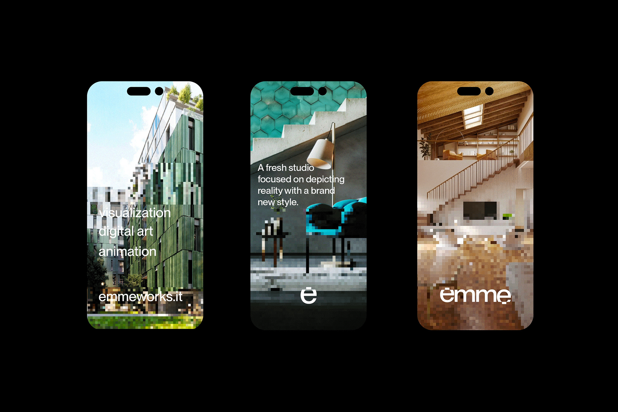
The two letters “e” (at the beginning and the end of the name) present the extreme pixelated parts and represent the work and the architectural visualization process of the studio: from the project drawing to its digital visualization.
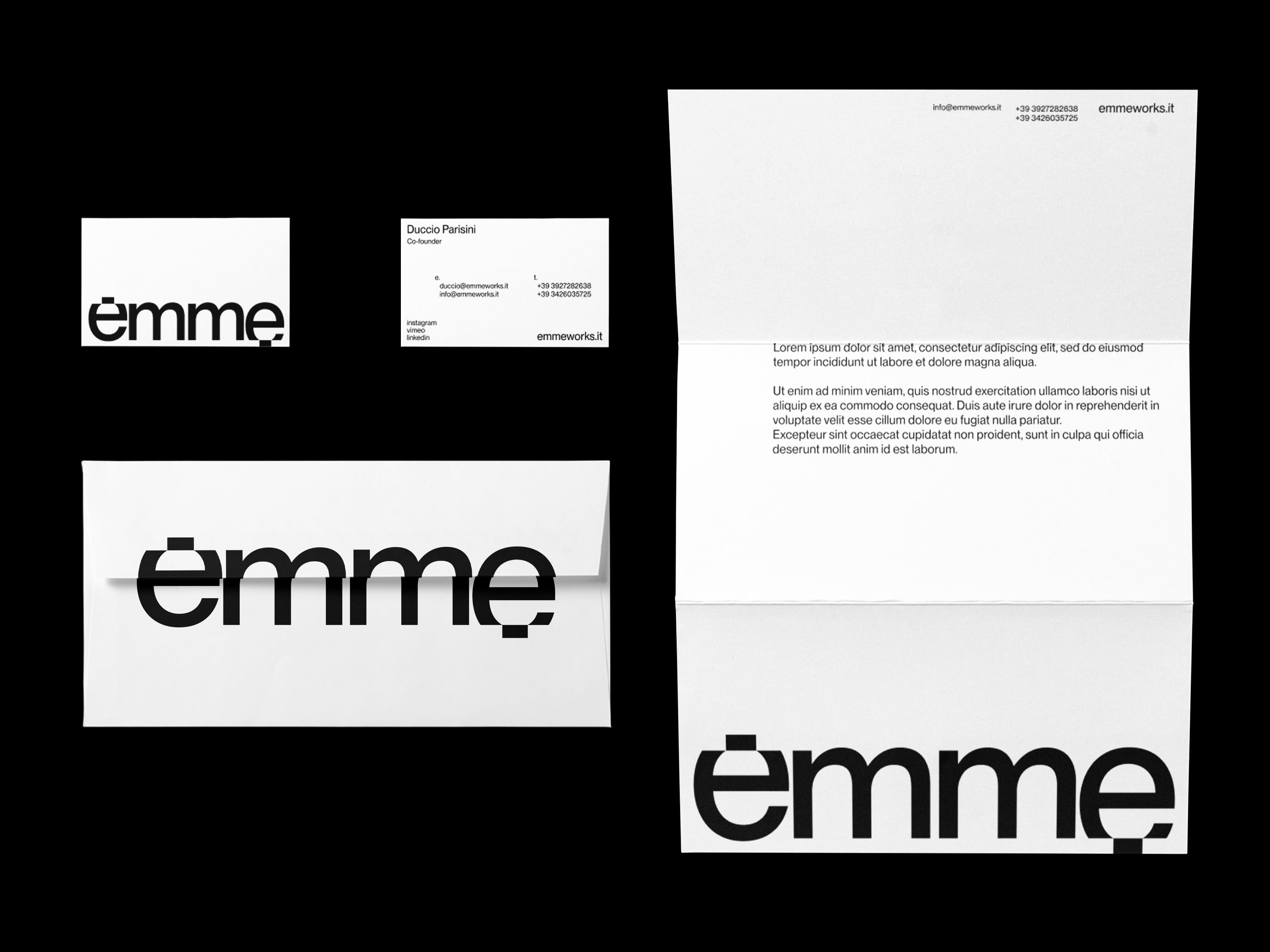
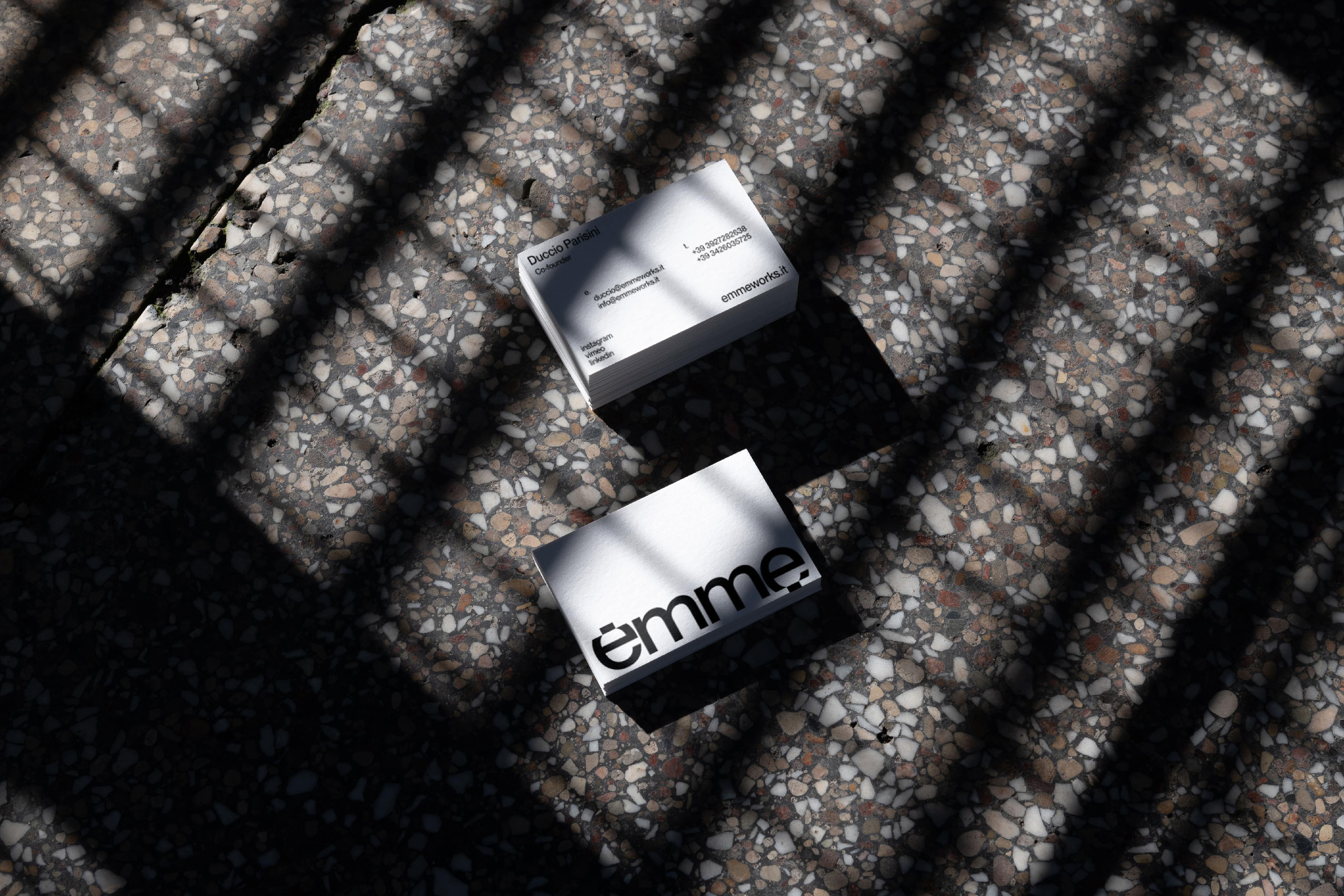
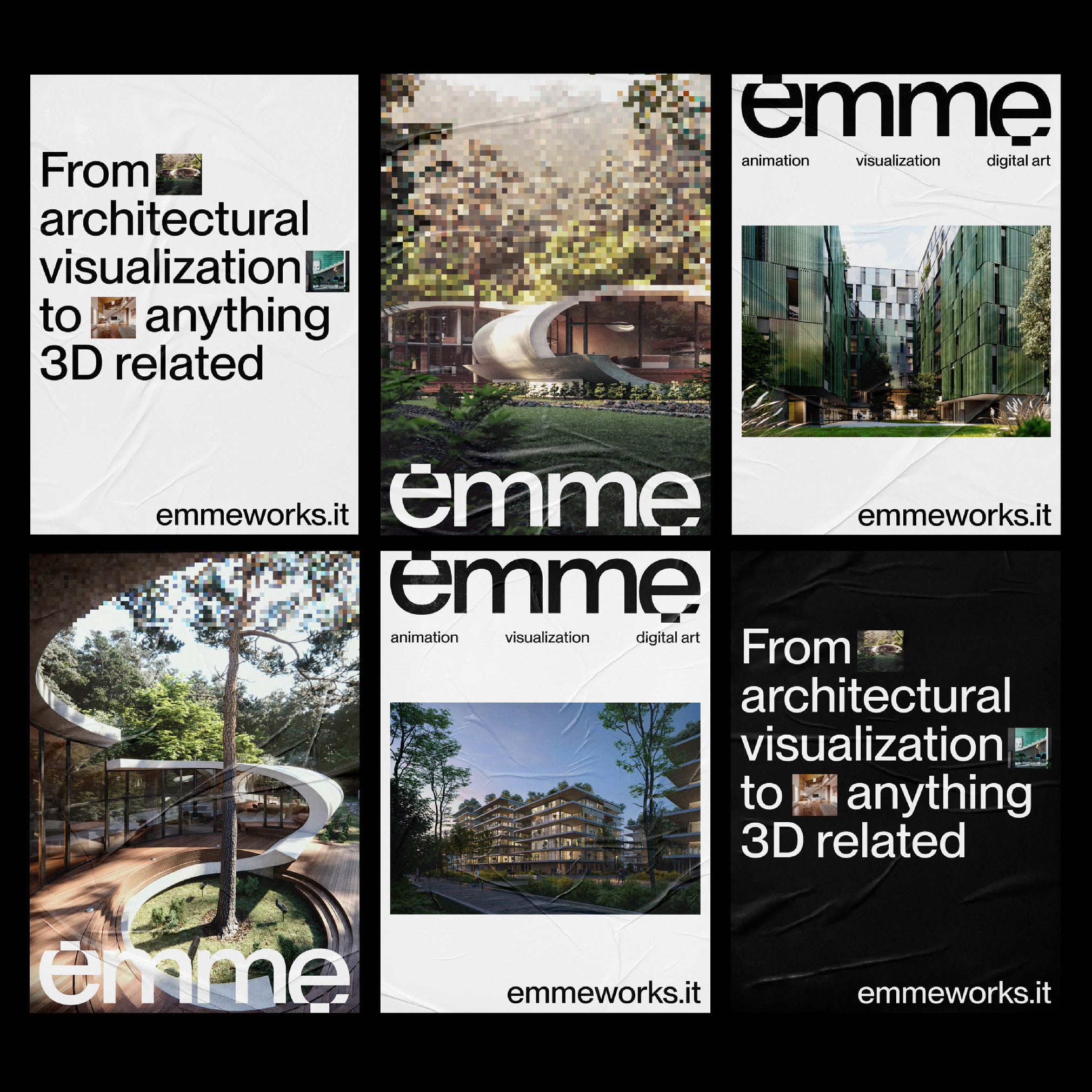
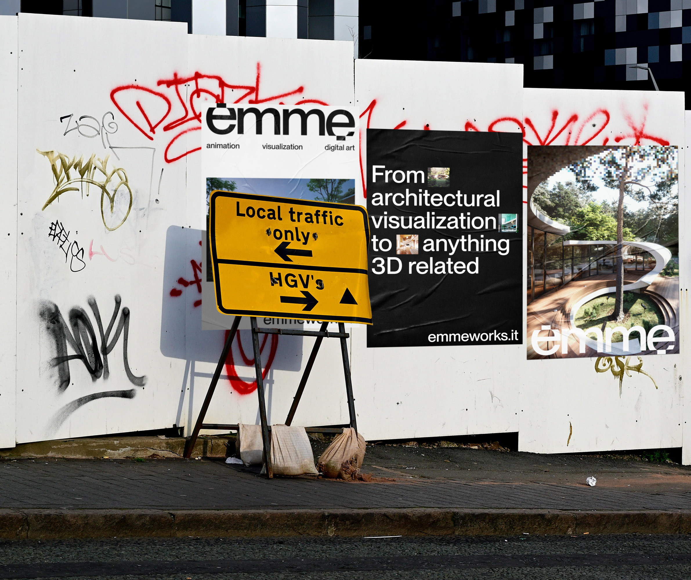
Proportions of the letter cuts in the logotype then become proportions for all stationery items, business cards, letterheads, posters, but also for graphics intended for the web, Instagram stories and other social networks.
This pixelated effect is also reflected in corporate images and videos, where renders are presented by transitions ranging from pixelated images, to definitive and sharps.
The visuals and the logotype itself are already strong enough visually, so it was decided to use white, black and some shades of gray as institutional colors, so as to highlight the images produced by the studio in communication.
The final aesthetic of the identity is an honest, minimal and impactful design that clearly shows its customers their services and the process behind it.
CREDIT
- Agency/Creative: Antonio Calvino
- Article Title: Emme Visual Identity
- Organisation/Entity: Freelance
- Project Type: Identity
- Project Status: Published
- Agency/Creative Country: Italy
- Agency/Creative City: Bologna
- Market Region: Europe
- Project Deliverables: Brand Identity
- Industry: Technology
- Keywords: 3D, Rendering, Video, Architecture, Brand Identity, Branding, Logotype
-
Credits:
Graphic Designer: Antonio Calvino


