


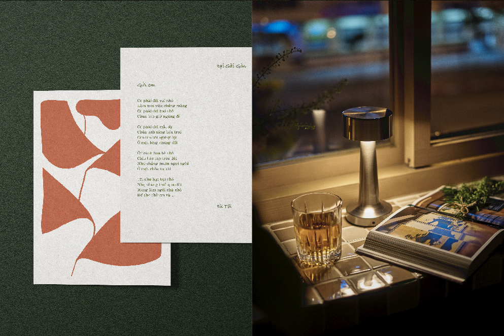
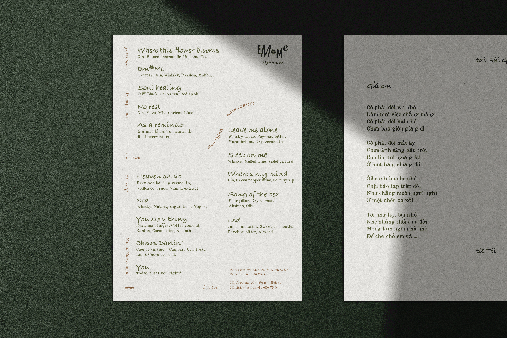
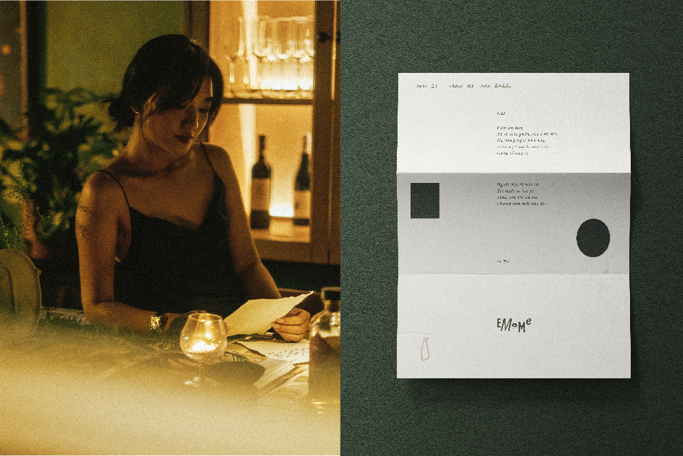
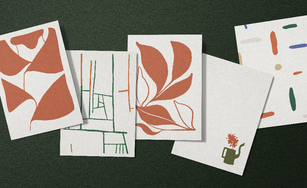
Story: EM*Me is simply a house in which the love story is shared with different schedules of ones, however. Consequently, those precious moments to be the loved one seem to cost them a fortune. Day by day, after arriving back home after work, or before his leaving, he always drop a letter as his daily routine. Either a poem or merely a question of care, either words of comfort or his expression of weakness sometimes, tightly knotted with his endless longing, they are all dedicated to his woman. Behind that idea, whenever people pay a visit to EM*Me House, another new poem is written by soul and sights.
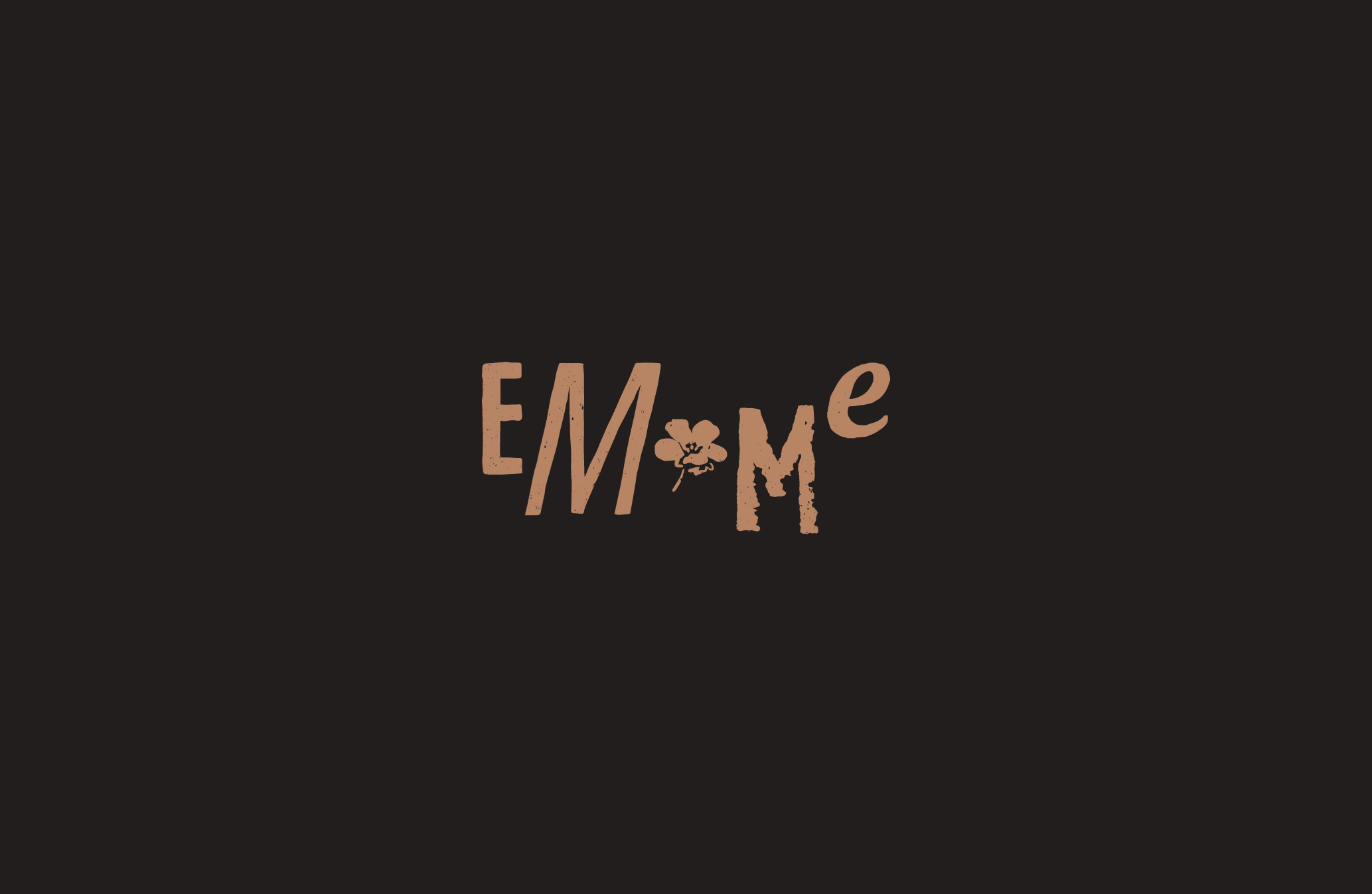
Meaning: The name “Em*me” is a witty word-play that put their love on display while this representation is both available for Vietnamese and Foreigners to spell at ease. “Em” (Vietnamese) is the lovely word indicating to anyone’s beloved person while in reverse it turns out to be “Me” (English). As shown, 2 basic letters, with a wink of order change, they grow into the 100% percent part of each other. “Em & Tôi” “You & Me” – “EM*Me” – 2 intertwines into 1.
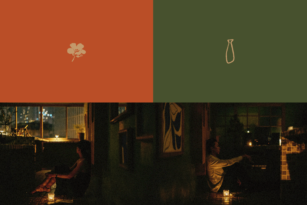
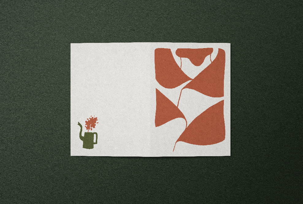
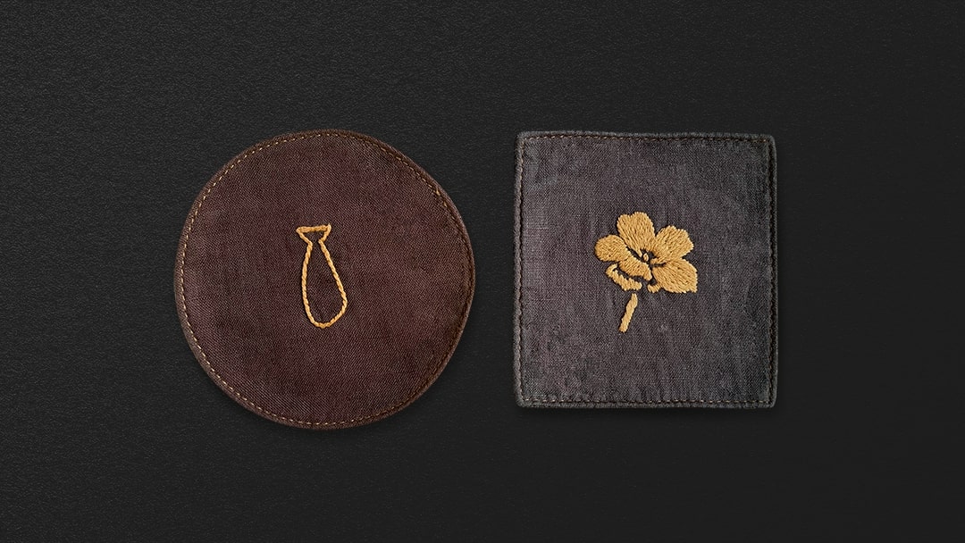
Meaning of Logo: Including 4 characters & 1 image of flower, the logo of EM*Me brings along in itself the symbolising of “Stages of Love”.
E/ At First:
The very first time that 2 strangers find out a missing puzzle of each other. Somewhere in their heart, a tiny of fluttering comes arousing slowly.
M/ Get Along: There comes M bigger than usual and its groggier posture. It undoubtedly reflects how much 2 lovers are meant to express their love, to fool around, then closely establishing a recipe of love with their own flavoring.
*/ Fall In Love: Then love blooms brightly as the milestone of both to be wholeheartedly responsible & truly dedicated to their longer pathway. Rose might appear by your consciousness when we talk about love; however, we deliberately embrace “Forget Me Not” – the one whose presence itself is the portrayal of faithfulness. Above all, no matter if their love might come to an end, the nostalgia of each other & the most beautiful things holds remained.
M/ Conflicts: The 2nd “M” with its significantly lowest position unveils the dark side of one relationship with many bruises & crumbled pieces. All the good things come together with its hardship and so does relationship. Arguments, Silence, Tantrum and Grunges build up & overshadow them two for more.
e/ “Thương”: The last letter ”E” is normalised being the only regular one & locating at the highest spot of Logo. Through many up-and-down, they together climb to the peak of love & gradually realize how meaningful the world “Thương” holds. Definition of “Thương” word comes alive vividly when they still show their big love in even small details of the most down-to-earth daily activities.
CREDIT
- Agency/Creative: Chochoi Creative
- Article Title: EM*Me Cocktail Bar Visual Brand Identity
- Organisation/Entity: Agency
- Project Type: Identity
- Project Status: Published
- Agency/Creative Country: Vietnam
- Agency/Creative City: Ho Chi Minh City
- Market Region: Asia
- Project Deliverables: Brand Design, Brand Identity, Brand Tone of Voice, Branding, Photography, Photography Styling
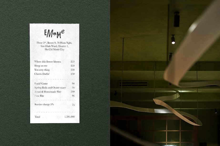
- Industry: Food/Beverage
- Keywords: EM*Me cocktail bar
-
Credits:
Creative Director: Lai Nguyen Tin


