


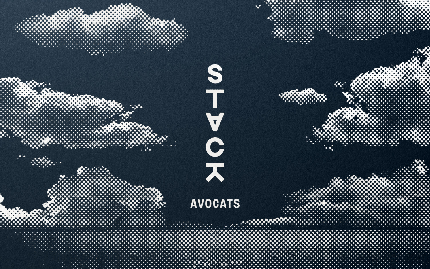
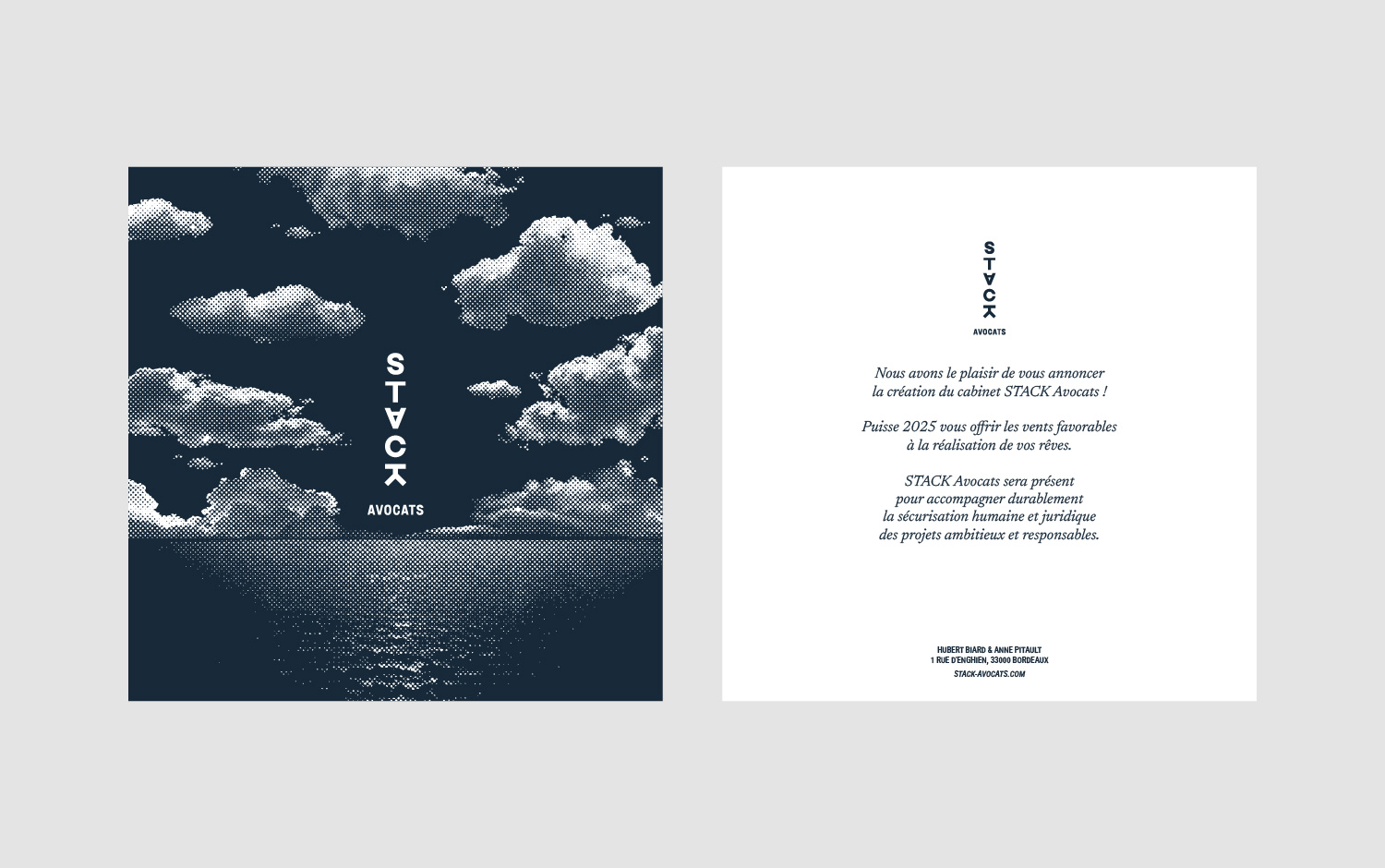
Stack was born from the encounter of two lawyers with solid and complementary backgrounds, eager to create a structure that is both unique and deeply human. Inspired by the reliefs sculpted by marine erosion, the name Stack evokes these natural pillars, isolated but resistant, shaped by time, standing firm against the elements. Like these mineral figures, the firm asserts its independent and solid position in the French legal landscape.
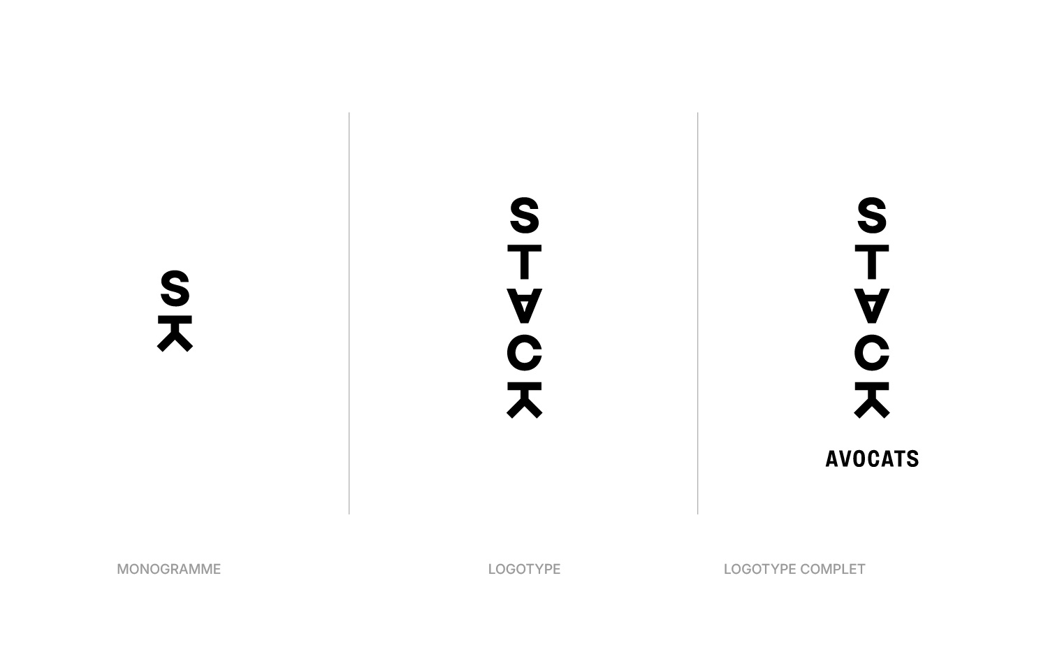
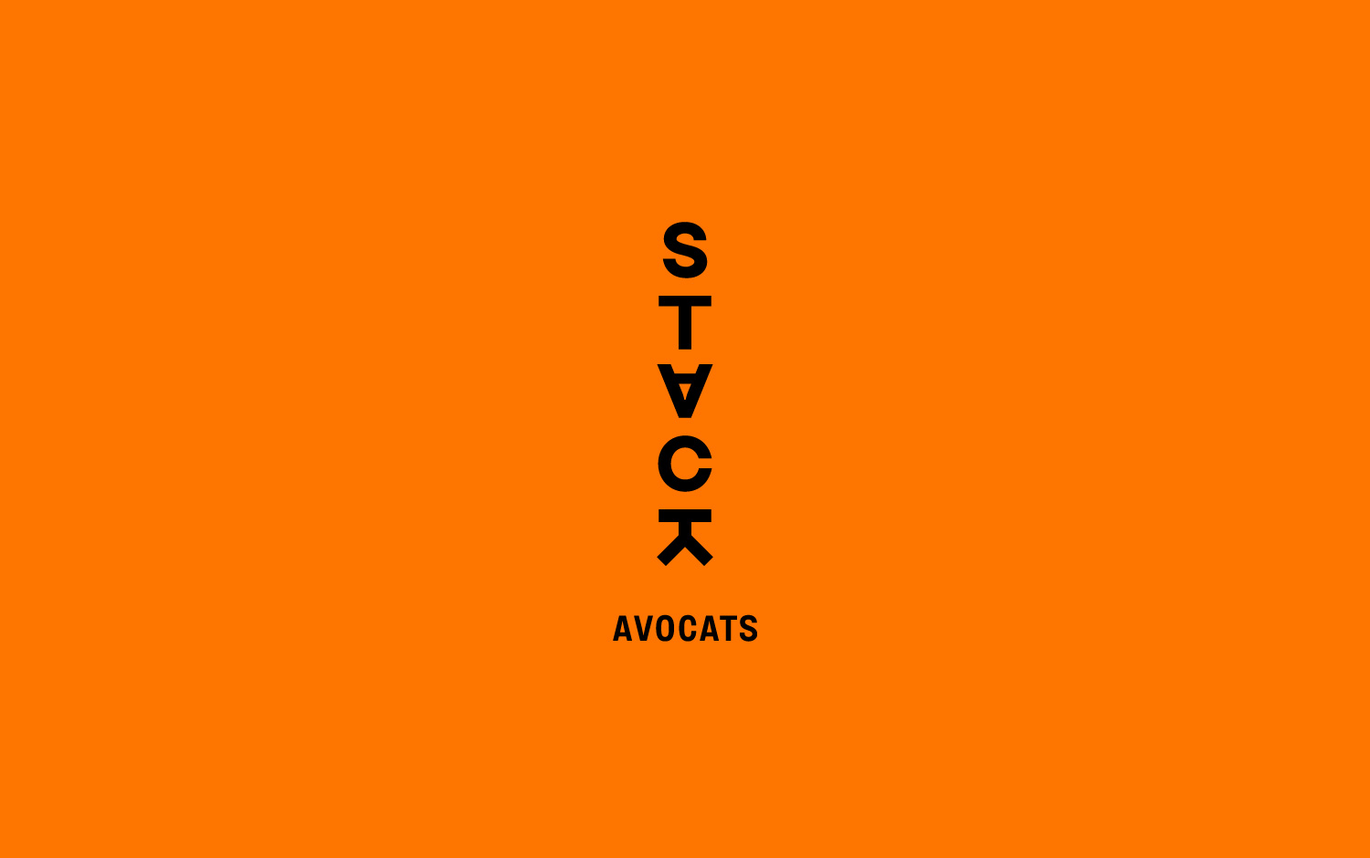
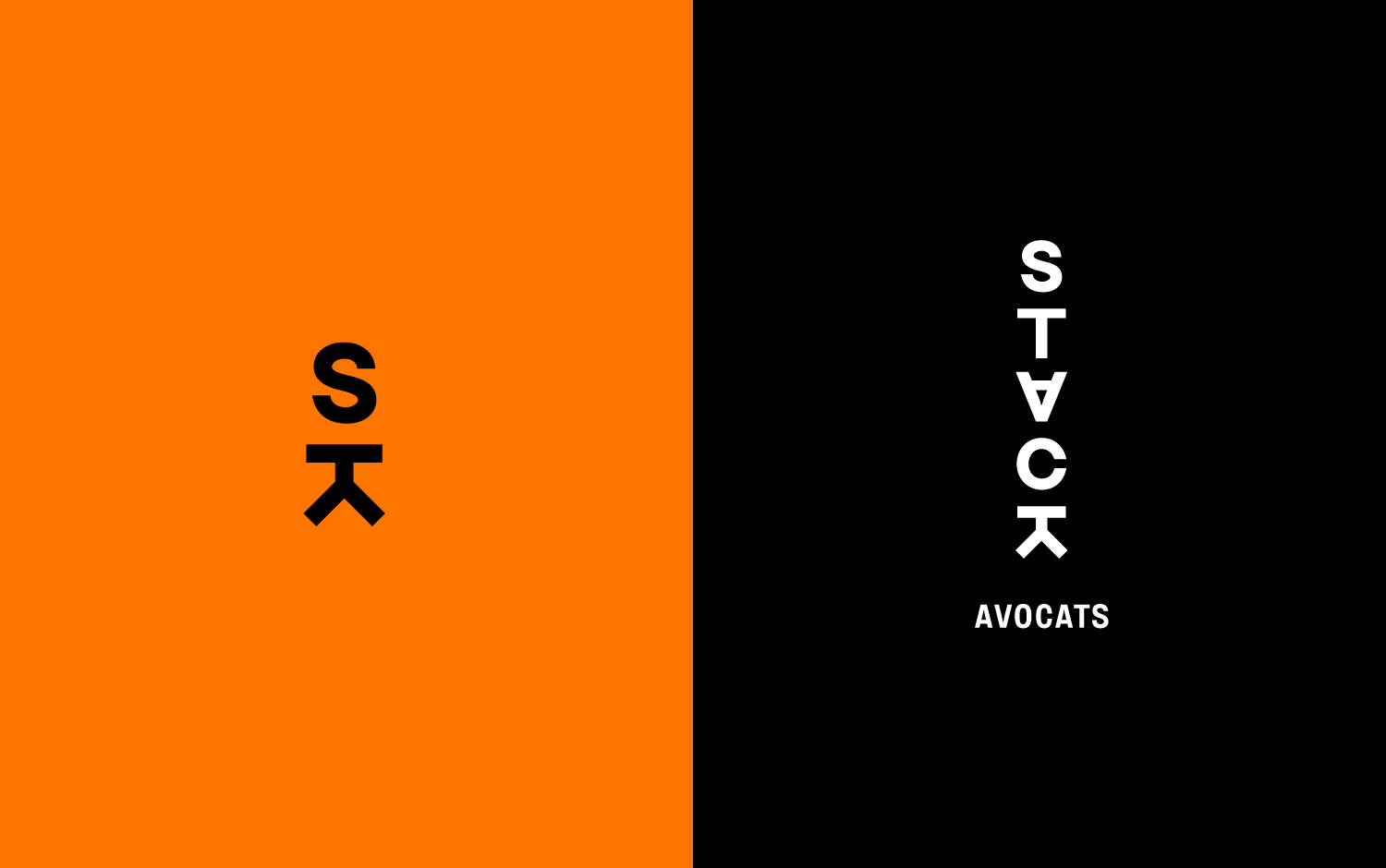
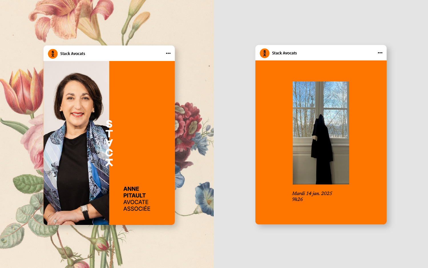
To embody this atypical positioning, Stack’s identity is based on vertical typographic work, evoking superimposition, construction, and solidity—simply a stack. The custom-drawn logotype is both structural and lively, asserting the firm’s personality in an often standardized environment.
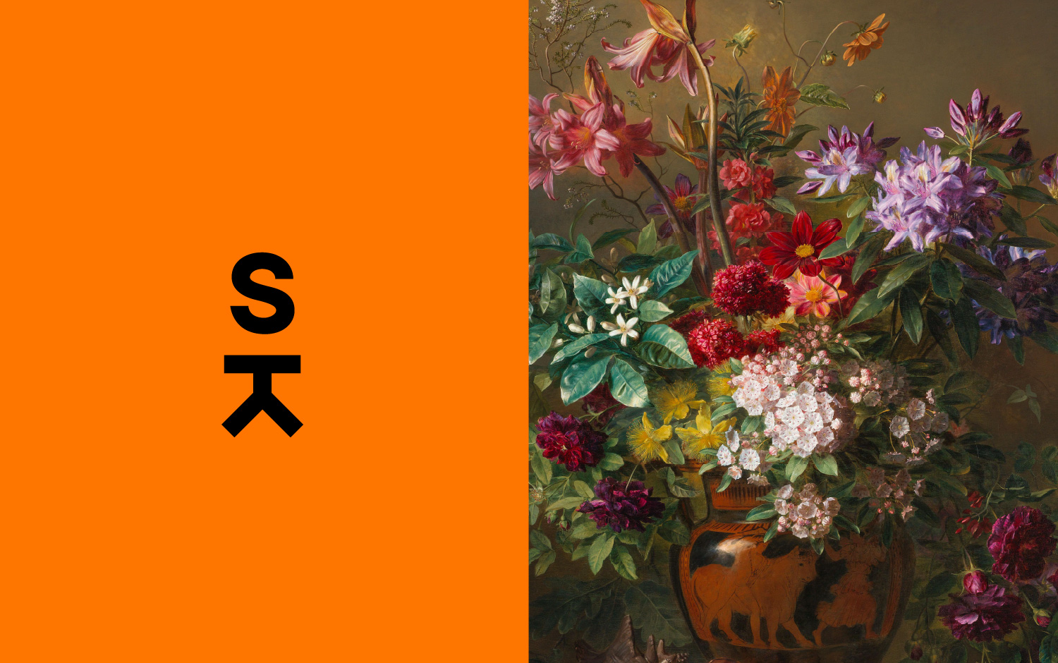
The monogram, designed for occasional use, condenses the letters S and K, like a mark subtly but distinctly imprinting the supports. It is used sparingly to better enhance its impact. The chromatic palette—a vibrant orange, balanced by black and white—conveys communicative energy, engaged optimism, and the ability to appeal to both reason and intuition.
Energetic, ambitious, reliable, curious, funny, and responsible… If Stack were a person, it would have charisma but also a taste for dialogue. Its approach combines legal expertise, mediation, and human support. It stands out with a dual competence: law and coaching, to provide strategic answers that are both technical and sensitive.
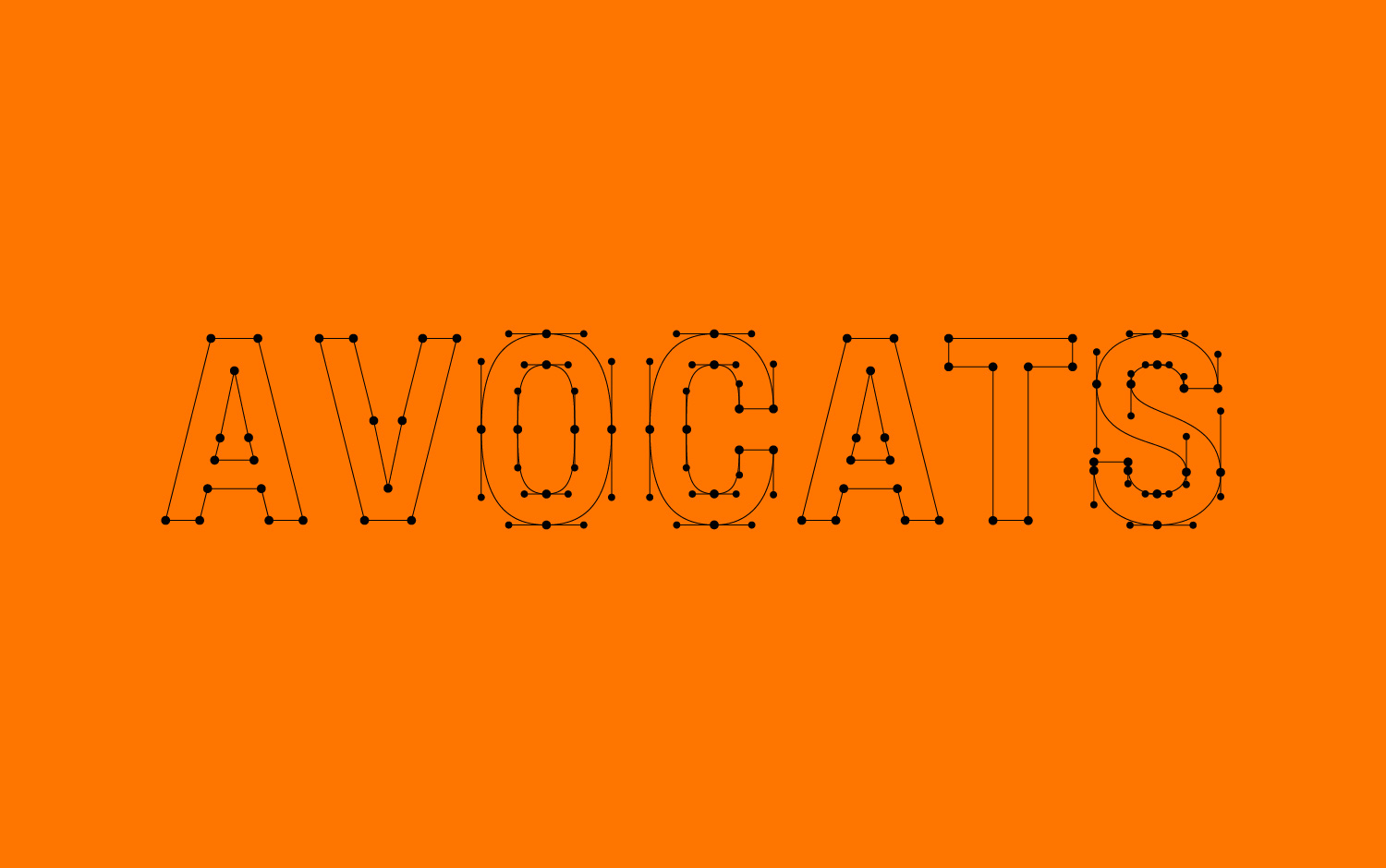
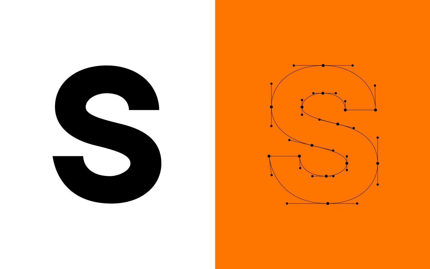
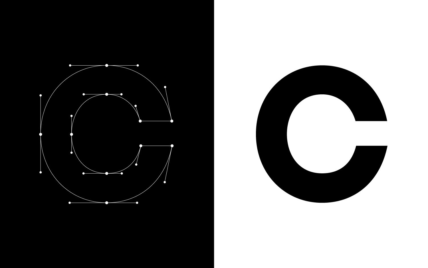
For Stack, I imagined and designed all the typographic characters to offer the brand a graphic solution worthy of the firm’s expertise and know-how. The choice of a sans-serif typography was obvious to ensure optimal vertical readability while playing with symmetry—a nod to the founding duo—and the subtle orientation of certain letters. The baseline, designed in a more condensed and sober approach, perfectly harmonizes with the vertical typographic signature, reinforcing the balance and uniqueness of the whole.
Stack’s visual identity is based on a masterful play of contrasts, embodied by a strong typographic duo: Inter and Newsreader. Inter, with its clean lines and great readability, structures the supports effectively. Coming from the world of interface and product design, it brings functional clarity, ideal for legal tools and digital supports. Newsreader, an elegant and contemporary serif, anchors the identity in a more narrative register. Its open forms and fluid rhythm evoke the literary spirit, reflection, and depth.
This duo allows for articulating rigor and sensitivity, modernity and tradition, in service of a firm that cultivates both technical excellence and relational intelligence.
CREDIT
- Agency/Creative: Emmanuel Guiho
- Article Title: Emmanuel Guiho Elevates Stack with a Human-Centered Brand System Anchored in Structure and Clarity
- Organisation/Entity: Freelance
- Project Type: Identity
- Project Status: Published
- Agency/Creative Country: France
- Agency/Creative City: Emmanuel Guiho
- Market Region: Europe
- Project Deliverables: Art Direction, Graphic Design, Typography
- Industry: Human Resources
- Keywords: law
-
Credits:
Art director & designer: Emmanuel Guiho


